
Another lesser known Hipgnosis design that I happened upon when researching the Bad Company Desolation Angeles cover a few posts below. The search begins…
Another lesser known Hipgnosis design that I happened upon when researching the Bad Company Desolation Angeles cover a few posts below. The search begins…


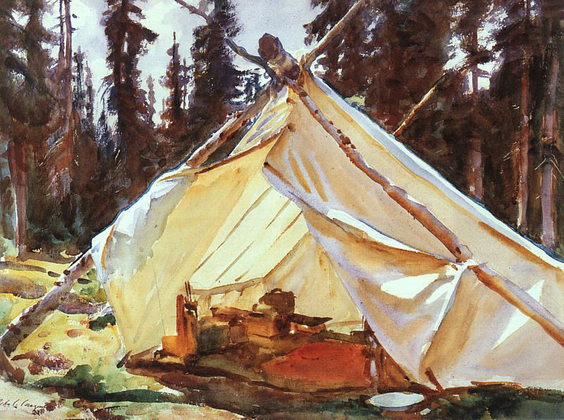
Shepelavy.com — Part IV, if I might be metal-grand & prog-rock-y about it. Untie the latch, part the canvas, pop your head out from the tent, let’s fire up the old transmitter. Is this thing on? Can you hear me now…
In 2009 I pitched camp on this modest little lagoon online. What began as a portfolio with occasional annotations tumbled into pretty steady blogging for a fat 3 years or so. More & more, however, severe advertising gales would knock out the transmitter for weeks on end. Sundry commitments were pressing. The blog contracted a virulent SQL database corruption. After a few stalled re-ignitions, things round here finally sputtered into silence around the winter of 2014.
Then Spring came, like it does, being Spring. I missed tapping these signals out into the ether, tending & fussing over my little plot of enthusiasms…So, I dusted off the redesign, gathered passels of uncollected old & new work. The code spooled out over the summer & fall.
& this so current salvo of transmissions begins… from this tiny lagoon on the clotted coastline of the interwebs, that I share with beached beatniks, old salts, venerable preps, society matrons, homespun cuties, movie stars & scientists… an endless three-hour cruise. Come aboard —
Welcome back.

We take, for this salvo, for Part IV, as our patron Eve Babitz — the besotted bardess of Los Angeles. She began her 1974 debut “Eve’s Hollywood” with a heavy lidded, tipsy & heartfelt bear hug to the city of Angels with the mother of all dedications. A manic roll call stretching accross 8 pages, a waterfall of indiscretions, influences, friends & relations. It begins as a parade of enthusasums and over 8 pages sinkins in with the weight of poetry. Let it stand in for mine then, perhaps smaller beer by the standards of art, but equal proof by weight of enthusiasm.


Right? Born and raised in Hollywood, Babitz developed a particularly acute appreciation for the essential radness of LA – the American city, sui generis –
L.A. has always been a humid jungle alive with seething L.A. projects that I guess people from other places just can’t see. It takes a certain kind of innocence to like L.A., anyway. It requires a certain plain happiness inside to be happy in L.A., to choose it and be happy buy vicodin italy here. When people are not happy, they fight against L.A. and say it’s a ‘wasteland’ and other helpful descriptions.
Most dedications sound a few notes note that hover over the first few pages . This is, rather, a motley parade – a blaring celebration that echos across the entire book – Her parents, a cat to whom she owes “Everything,” Ahmet Erteugn, the girl with the coke, the Eggs Benedict at the Beverly Wilshire, Milo Minderbider, Kim Fowley, Orson Wells and Proust, freeways, and Margret (which I hope is a deft and subtle play on Ann Margret, because, well, – Ann Margret. right?)
Her fragment on her ex- boyfriend, Ed Ruscha, is worth lingering over. It plays footsie with poetry and lies contentedly with philosophy – “Ruscha [is] a man of simple tastes – but no one makes those kind of wings, so he’s stuck with a white Rolls and no wings.”
And, as an aside, the Eggs Benedict at the Beverly Wilshire are delicious.
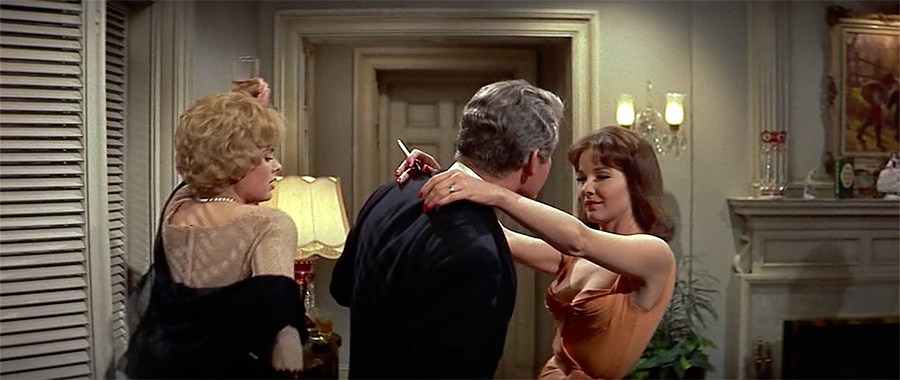
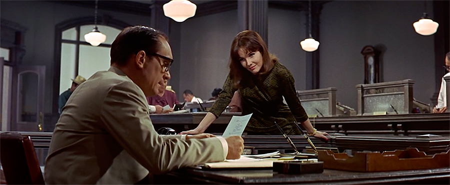

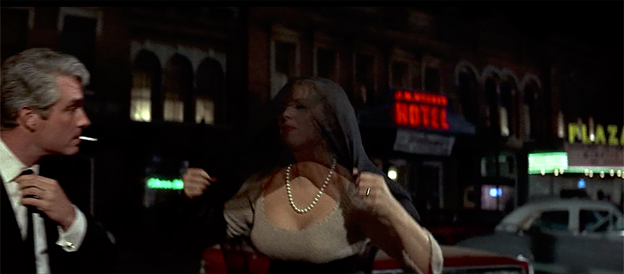
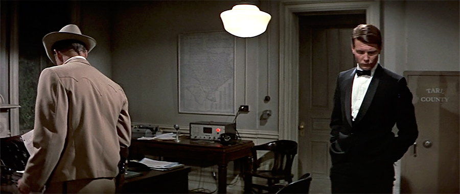
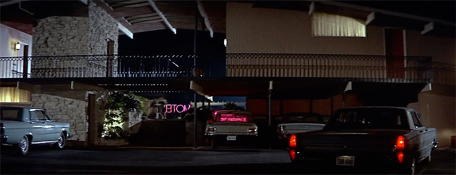
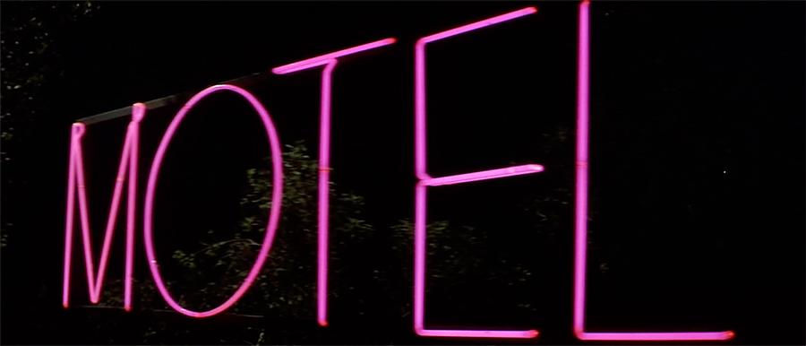
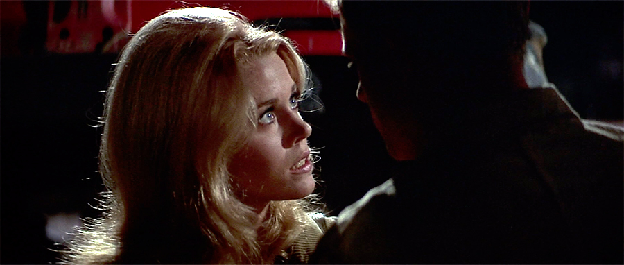
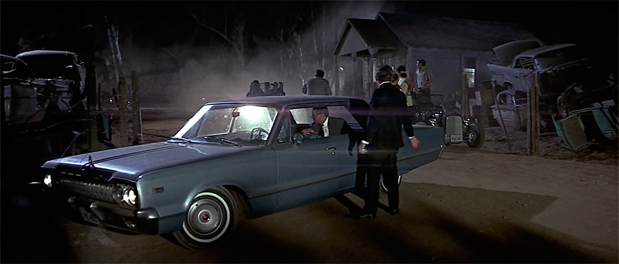
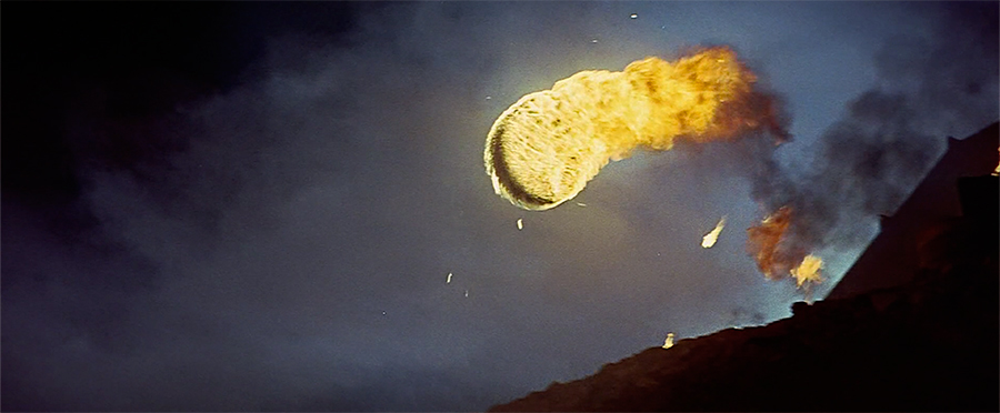
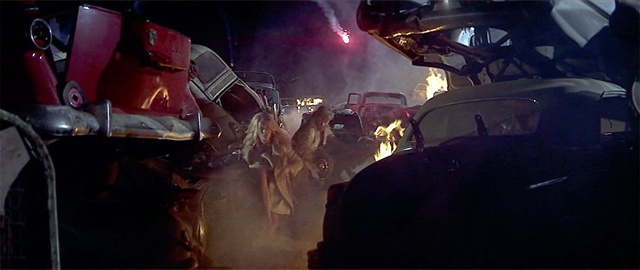
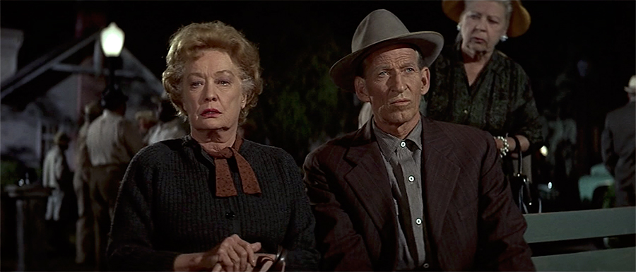
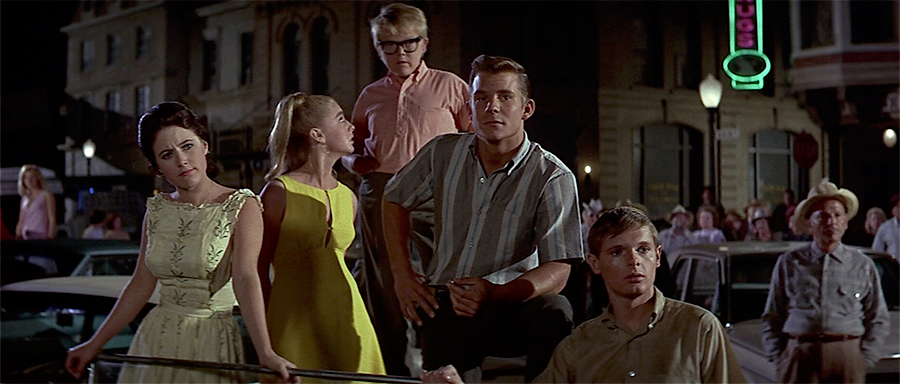
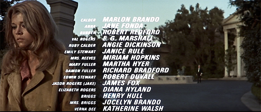
A selection of stills & credits from The Chase a long forgotten overheated soap opera once described as “Peyton Place with guns.” I came across an old review of it in the New Yorker which described it as “ an opulent melodrama, overproduced, over plotted to the point of incoherence and over directed” — like that’s a bad thing. The fact that Jane Fonda had described it as “Barbarella comes to small-town Texas” was just icing. Well worth it, and as the stills show, a handsome affair – shot by Arthur Penn in pop art, hyper composed, oversaturated Technicolor glory. The same could almost be said for deliciously mannered performances by Angie Dickinson, Robert Redford & Robert Duvall. You also get to enjoy the singular spectacle of watching Marlon Brando become less & less & less interested in actually acting at all with every successive scene. Fascinating.
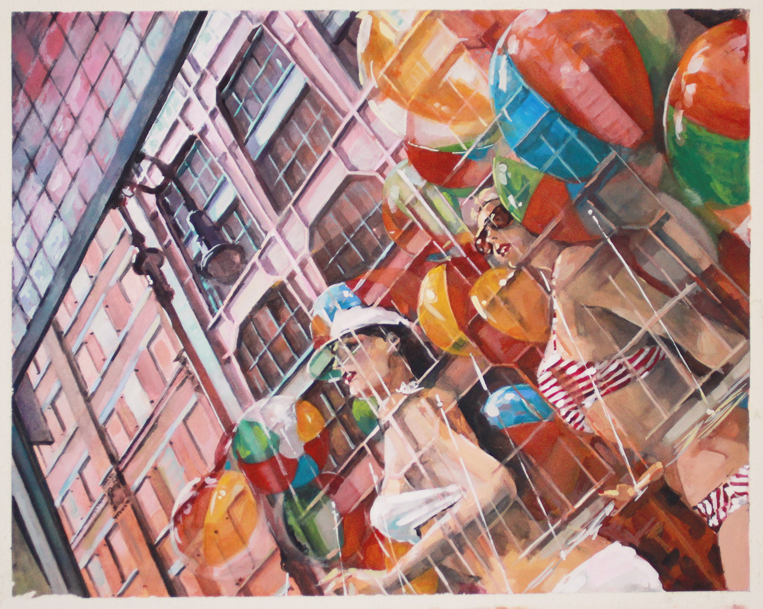
Finally posting this new-ish longform painting. Painted from a photograph. It’s in gouache and it’s about 20 inches across. If you’re so inclined, take a full gander on the portfolio page here. Enjoy.
5th & South Streets, Philadelphia
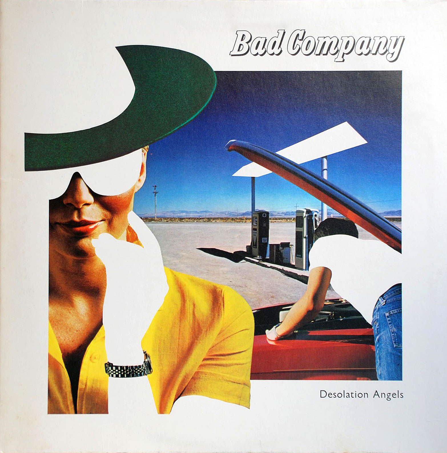

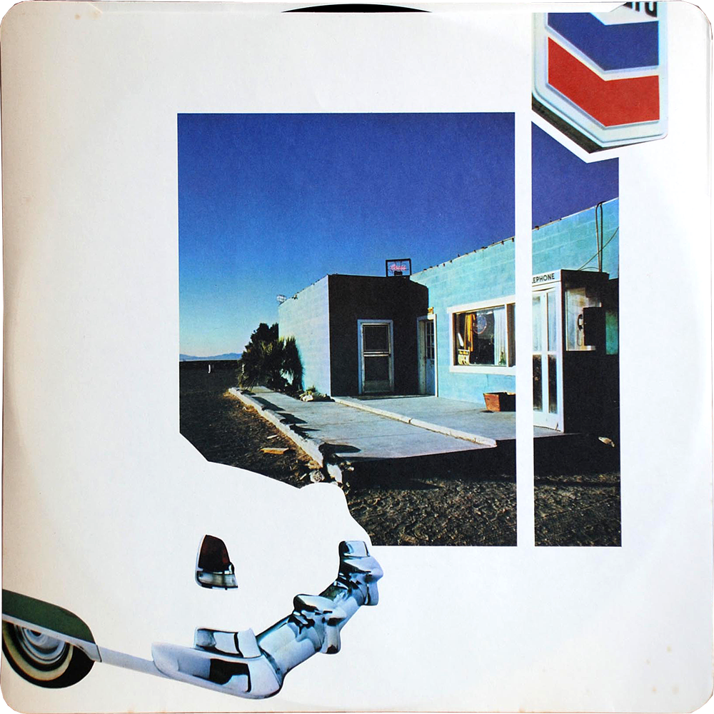
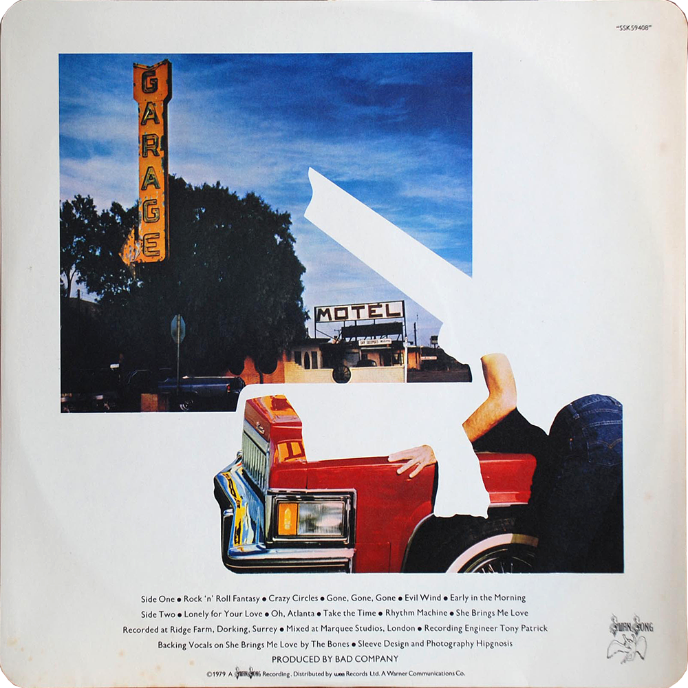
The design group Hipgnosis has been justly & exhaustively feted for thier amazing psychedelic realist album covers for Pink Floyd, Led Zeppelin, and other zonked heavyweights (an amazing gallery here, you could get lost for hours). I had no idea they were behind the artwork for Bad Company’s 1979 record Desolation Angels, which stopped me cold when I was crate digging one afternoon. It was strikingly clever example of that developing 80s graphic sensibility that found its apotheosis in Patrick Nagel’s work for Duran Duran. It has everything to do with the power of stark flat white throwing all other colors into hyper-bright neon-electric contrast — if cocaine could design album covers they would look a lot like this.


[RERUN: Hauling this out of the early days of the blog. I’ve been on a protracted vintage video game and pinball bender lately. Atari’s iPad port of my beloved Tempest is damn near perfect and I’ve been playing it a ton. As such this early appreciation of the stone cold perfection of this game has been on my mind. So, here, then…}
The screen graphics of the classic video game Tempest represent a kind of summit of design and beauty – the finest expression of a very limited language. In the case of Tempest that language was vector based rendering. Vector monitors were used in video games from the mid 70’s to the early 80’s. The technology was derived from oscilloscopes – the image is projected by an electron beam onto the glass. Image a laser light show sped up to produce a lasting image and you’ve got it…
Many classic games were made using this technology – Asteroids and Battlezone as well as the first Star Wars game. While they all had their aesthetic charms, Tempest is in a class of its own. All vector games have a certain elegance and simplicity. The problem order vicodin uk arises in the crudity of the renderings – the poor approximations of tanks, asteroids, and X-wings forever marks these games as primitive gestures of an evolving technology. Tempest is exempt because it is derived from the technology itself. What would a world defined by glowing geometric unshaded lines look like? Pretty much like Tempest.
Its beauty lies in the fact that it is in harmony with its own rules and limits. Hence the extremely elegant compositions – uncrowded, with a well balanced sense of scale. The color scheme is vibrancy itself, strong underlying blues, wonderful pops of pink, green, red, and yellow. And the physics of the electron beams give everything a deep saturated glow.
That same harmony extends to playing the game as well. Most games rely on clumsy and stunted translations of real world movements like running, jumping or flying an ostrich. Tempest moves in accordance with its nature – spinning and firing. That’s what makes it so satisfying. Once you understand its strange parameters you have a complete experience on its terms – a dynamic, I think, that is fundamental to the idea of art.


These plates are from an edition of Ivan Kotlyarevsky’s 1798 poem Eneida, a ribald retelling of Virgil’s Aeneid. Kotlyarevsky transposed Aeneas, the Trojans, and Greek mythology into the folklore of Ukrainian Cossacks. It is among the first major works written in Ukrainian, and is a cornerstone of Ukraine’s national literature. Wonderfully, it also defines the very notion of a burlesque – vulgarizing lofty notions like love, family, faith and battle, feigning seriousness in the face of absurdity, and is packed to the gills with slapstick humor, comic skits, bawdy songs, and, natch, healthy portions of friskiness…
This particular version, printed in 1969, in Kiev, Ukraine, is, simply stated, one of the most beautifully designed, illustrated, typeset and produced books I’ve ever seen. Sturdy and stout, clad in a satisfyingly course gray canvas, it opens onto a corker of a title page. From the swashbuckling script of the authors name, the elemental block-y-ness of the title, and the illustration of a muscular and languid Cossack/Trojan, it’s a bravura opening gesture. From there, graphically, the book never flags – block after block of typeset verse on heavy cream paper. But the heart of the book lies in the illustrations, by A. Bazylevych, whose style is a deft hybrid of wood block engravings, thick-lined expressive cartooning, and abstract color blocks.
My recollection of the book from childhood is profoundly visceral. I can recall my father reading vignettes that swirled thrillingly in a noggin already stuffed with mythological adventures. But it’s the illustrations that left an indelible impression. It’s a phantasmagoria of soldiers and sieges, gods and devils, maidens and crones, battles and scraps, feasts and revelries, a cosmos of melodrama. Looking at them again after a span of decades, my recollection is immediate and electric – what’s vital in art, in fiction, and in life seems to spring forth in an exuberant, lusty, unruly parade.


Over the weekend I scored Martin Amis’ The Pregnant Widow. What a knockout cover! What stuck me was the how powerful both the formal and narrative aspects of the painting were. The composition was riveting – this tightly packed moment given epic scale – and the weight of shared experience slung between the two figures was palpable. From what I know of the book’s plot and themes, which follow the tumultuous vicissitudes of a group of friends spending the summer in a remote Italian castle, it seemed a note-perfect choice – marred only by completely ham handed typesetting and design.
The painting, Il ne se plaignait jamais… (He never complained…), from 1976, is the work of the French painter Gerard Schlosser. Schlosser is most closly associated with the Narrative Figuration movement, a distinctly French mash-up of Pop and Photorealism.
His early work was rooted far more in a sexy cartoon pop aesthetic – like a combination of Guy Peellaert and Tom Wesselmann. As he evolved the work became more overtly photo-realistic, but just as meticulously staged – details are purposefully buy vicodin hp online exaggerated, extraneous objects removed, everything is framed and arranged for as much narrative impact as any comic book panel. One critic described this dynamic perfectly, that for Schlosser, “framing is never a trivial gesture. It tightens the most significant narrative element, the small detail that summarizes the essence of a moment.”
What I love about his paintings is that they transmit on four equally powerful frequencies. They are wonderfully composed realist abstractions. They contain a powerful dose of concentrated storytelling. They celebrate the figure as landscape. And they frame a vantage point that is the very definition of intimacy – conversational, sexual, relational – in a way that is incredibly potent and evocative. They’re artful, moving, brazenly sexy, and, as Blackadder might say, as French as a pair of self removing trousers.
(Schlosser’s work is scattered about the web. Most of the sites are in French. No English monograph seems to exist. There are at least three French ones, a bit pricey and all difficult, it seems, to obtain)


Some Herman Miller curios… Came across a few of these posters last weekend hanging in a excellent restaurant in Cincinnati. They were from a celebrated series of posters created by Herman Miller designer Steve Frykhom from 1970 to 1989 to announce the company’s yearly staff picnic. It began as an offhand assignment from an executive and Frykhom’s desire to satisfy a screen printing jones. The first salvo won that years AGIA award. In 1980 the Museum of Modern Art added seven posters to its permanent collection. Very few images abound online, the best are these can i buy vicodin in the uk tiny guys from the Herman Miller blog.
Below these are invitations to the 1961 opening of Herman Miller’s short-lived and Textiles & Objects Shop. It was overseen by celebrated designer Alexander Girard. It was a notion well ahead of it’s time – a rigidly curated mix of found objects as well as products and textiles he designed for Herman Miller. Both announcements feature remarkably original design styles that have come to be profoundly influential these days. Again, very little by way of imagery or further history about the shop sloshing around online.


{RERUN: Originally Published Apr 1, 2009}
In the crowded field of choice rock obscurities the Cake rank among the choicest. Musically they were a strange hybrid of Phil Spector-esque girl group, baroque folk, and weirdly medieval psychedelia – the Ronettes crossed with a a distaff Left Banke. Their considerable aura was further intensified by a wicked fashion sense and enough personal melodrama to out-beyond Beyond the Valley of the Dolls.
Besides their sonic adventurousness, the Cake is worth celebrating for the splendid design of their two sole records. The logo is a typographic masterpiece. Set in ornate hand crafted blocks and nearly square, each letter reads as both a decorative tile and as type. The motifs are a motley mix of psychedelia, Eastern European embroidery, and circus signage – a fine metaphor for the band’s composite sound. The sophomore record ups the ante with a splendid Carnaby street pop cartoon worthy of anything by Guy Peellaert or Hapshash and the Coloured Coat.
After years of scarcity, Rev-ola finally reissued both records on a single CD with generously thorough liner notes that do justice to their sound and their story.
For your pleasure, some selections.
Baby That’s Me:
Rainbow Wood:
Annabelle Clark:


The first thing I ever really used Napster for was to hunt down and assemble Brian Eno’s legendary lost vocal album My Squelchy Life, finally given official release this year.
Imagine a crinkled & warped VHS of 80’s 1-900 chat line commercials, porny aerobic videos, low-budget soft core, late night cable talk shows, with crackle on the tape, bad tracking, fuzzy scan lines & brutally oversaturated color and you have the feel of TOBACCO’s broken, cracked electronica. Unremittingly sleezy but yet so gorgeous & sexy I’ve spent the whole year fiddling with the tracking dial and not being able to look away.
All the usual camp trappings of oh-so-Morrissey-ness around the release of World Peace is None of Your Business — cancelled tours, bitter press sniping, a humdinger of a snit with new label Harvest that resulted in the album being withdrawn — obscured what a tremendous record it really was. If you told me this was a late period Smiths record from an alternate universe I’d believe you. If that sounds like heresy I don’t care — make mine Moz.
If you are predisposed, like me, to thinking ELO could use a little ABBA & ABBA use a little Van Der Graf Generator then I give you, again, after five long years — Music Go Music.
Perhaps six people total in the audience, battling a temperamental glitched out key-tar and yet for 30 minutes Scale Model inspired me to forget that I missed Berlin live this year on account of Hurricane Arthur.
Built from a lego box of identikit parts, every element & reference of the Bad Doctors’ synthed punk is obvious. And yet the ingredients never are the dish. I have yet to tire of a single song on this record.
I’ve been searching for the Fashion B-side Sodium Pentathol Negative since high school. How ace to find that the A side is also the nuts.
It never occurred to me that Goth deserved it’s own version of the legendary garage comp Nuggets. It does now. Killed By Deathrock Vol. 1 is a Rubic’s cube of bat-cave sounds — Let Kitchen & The Plastic Spoons charmingly spooky obscurity stand in for a record packed full of them.
Stumbled across Essential Logic at long last and the only word I can think of to describe them is fearless – tunes that owe nothing to anything other than their own self-willed need to exist. Punk not as a received sound & attitude but as a response to a challenge & a dare.
There is a permanent psychedelic transmitter on Mount Davidson in San Francisco. You can see it if you squint through two kaleidoscopes. So say the hippies anyway. I can hear it though, now & then and this year they spun a lot of White Fence.
Jim Roll is an old pal from my rekkid biz days. Over the past decade his restless avant-garde flecked Americana has widened & matured. Big heart, big brains, big star.
Every now and then I find myself thinking about RIOR cassettes, these little nostalgia bombs with those flat flood colors, multi-fold j-cards, and stubborn & doomed allegiance to the cassette format. One of the most coveted was the The Great New York Singles Scene compilation, showcasing debuts by Patti Smith, Television, Richard Hell along with period salvos like US Ape, Theoretical Girls & the Mumps. Came across a digitized copy this year and for all the heavy history it was the ace single by Nervus Rex that rang my bell. Like a fling with an old flame, it reminded me of all the reasons I went gonzo for power pop to begin with.
I treasure Mary Timony’s every mood, cause every mood begets a tune. Her latest, Ex Hex, is, as she put it “…what your babysitters listened to, rumbling from the Kenwood in the basement.” Perfect. Think then, of each song on her new record, Rips, as darts thrown in that very same basement — short, sharp & feathered.
Arriving at last at the intersection of Xanadu & Gerry Rafferty the New Pornographers demonstrate that all you need for a spectacular return to form is an arpeggiator.
The years best show, hand down, was Hawkwind, fronted by 74 year old psychedelic warlord Nik Turner. Flanked by Barbarellas playing vintage synths & violins, with Nicky Garratt from U.K. Subs on guitar, the band didn’t play so much as channel transmissions from beyond the fringe; waves of sax & flute, pyramids & atlantis, sonic attacks & deep space, orgon accumulations & high zonk. I got to sing the chorus of Silver Machine with Turner. I grabbed the set list and when I got home I discovered it had Roky Erickson’s phone number written on the back.
(Front cover photo by Katch Silva, back cover Hawkwind at the Boot & Saddle, September 9, 2014 Etc: This year I kept the running time under the LP limit. It just seems a decent serving size. As a result, some other notables not represented — still in deep dub, lost in Record Store Day’s re-release of Lee Perry’s Super Ape, late this year started really digging Colin Newman’s first post-wire solo record A-Z; Shellac’s Dude Incredible was a barrel-full of monkeys; Ian Anderson’s Homo Erraticus tour was a highlight, as were shows by Damned & TSOL; More Chrome & Helios Creed, The Chills BBC Sessions; Sleaford Mods, Cleaners From Venus, Fingerprintz, Palmyra Delran, and when it’s time to clean the fishtank, Exploited.)


Every time I look at these photos they light up my noggin like a pinball machine. I linger over them, careening from detail to detail, setting off little bright explosions of nostalgia, recognition, longing and sheer delight.
Some context… They’re snaps taken at a Sam Goody’s record store in mighty Paramus, New Jersey from about 1976 until 1980. They were taken by a friend of an old acquaintance of mine, and I spotted them one day out on the more distant orbits of the Facebook. The photographer, one of the employees of the shop, kindly gave me permission to post them.
I was transfixed the instant I saw them. Aesthetically they’re amazing – the pale yellow cast of the film encasing the era as if in amber. A wistful melancholy sets in when you start to weigh what we lost as a culture when we lost places like this. But it’s the people, finally – this wonderful, quirky, ramshackle cast – that really bring these photos to life.
I’ve tried many times to describe their effect on me – jury-rigging metaphors that do justice to their peculiar spell. It’s weird. I’m just old enough to recall when the texture of life felt like this. So sometimes they trigger deeply felt, familiar, yet sketchy, memories. Other times they read like fiction – especially vivid stills from a movie that one the one hand I desperately wished existed and on the other I feel like I’ve already seen. Like I said, weird.


Diagrams and fashion spreads from a book called For you! Girls! published in the Soviet Union in 1965. I found it in a profoundly random box of discarded books and cassettes in the “free trade” corner of a U-Haul self storage warehouse in Philadelphia. It was published by something like the Committee for the Literature for Popular Sciences & Medicine (My Ukrainian provides an imperfect guide to the Russian) It’s a comprehensive guide to the Soviet Girl, with a strange mix of propaganda, health and fitness tips, fashion spreads, and aspirational portraits of female astronauts, seamstresses, soldiers, and miners. Odd, fascinating, unsettling in the soullessness of the sloganeering and the gap between the lightheaded lifestyle spreads and the grey reality of Soviet life… but as often is with this stuff, aesthetically compelling – a mix of constructivist graphics, great type, and high key black and white photography.

This, I covet. It’s the original costume sketch for the Wonder Woman TV series. It was designed and drawn by Donfeld, – Hollywood bon vivant, four time Academy Award nominee for costume design – who’s heyday spanned the 60’s to the 80’s. Besides the costume for Wonder Woman, his other lasting contribution to Western culture was designing Jill St. John’s costumes in Diamonds Are Forever. All this while dedicating himself tirelessly to keeping Jacqueline Bisset looking foxy – a great, great man. Anyway, in 2005 this treasure sold for $2,390 at auction (It was originally inscribed and given by Donfeld to his good friend, actor Richard Chamberlain.) I vow to you, if I ever make my pile, someday this will hang proudly on my wall.