Author Archives: admin


Wonder Woman Costume Sketch

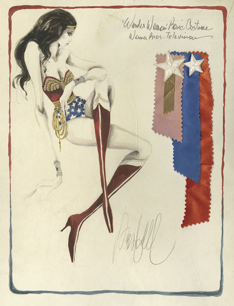
This, I covet. It’s the original costume sketch for the Wonder Woman TV series. It was designed and drawn by Donfeld, – Hollywood bon vivant, four time Academy Award nominee for costume design – who’s heyday spanned the 60’s to the 80’s. Besides the costume for Wonder Woman, his other lasting contribution to Western culture was designing Jill St. John’s costumes in Diamonds Are Forever. All this while dedicating himself tirelessly to keeping Jacqueline Bisset looking foxy – a great, great man. Anyway, in 2005 this treasure sold for $2,390 at auction (It was originally inscribed and given by Donfeld to his good friend, actor Richard Chamberlain.) I vow to you, if I ever make my pile, someday this will hang proudly on my wall.

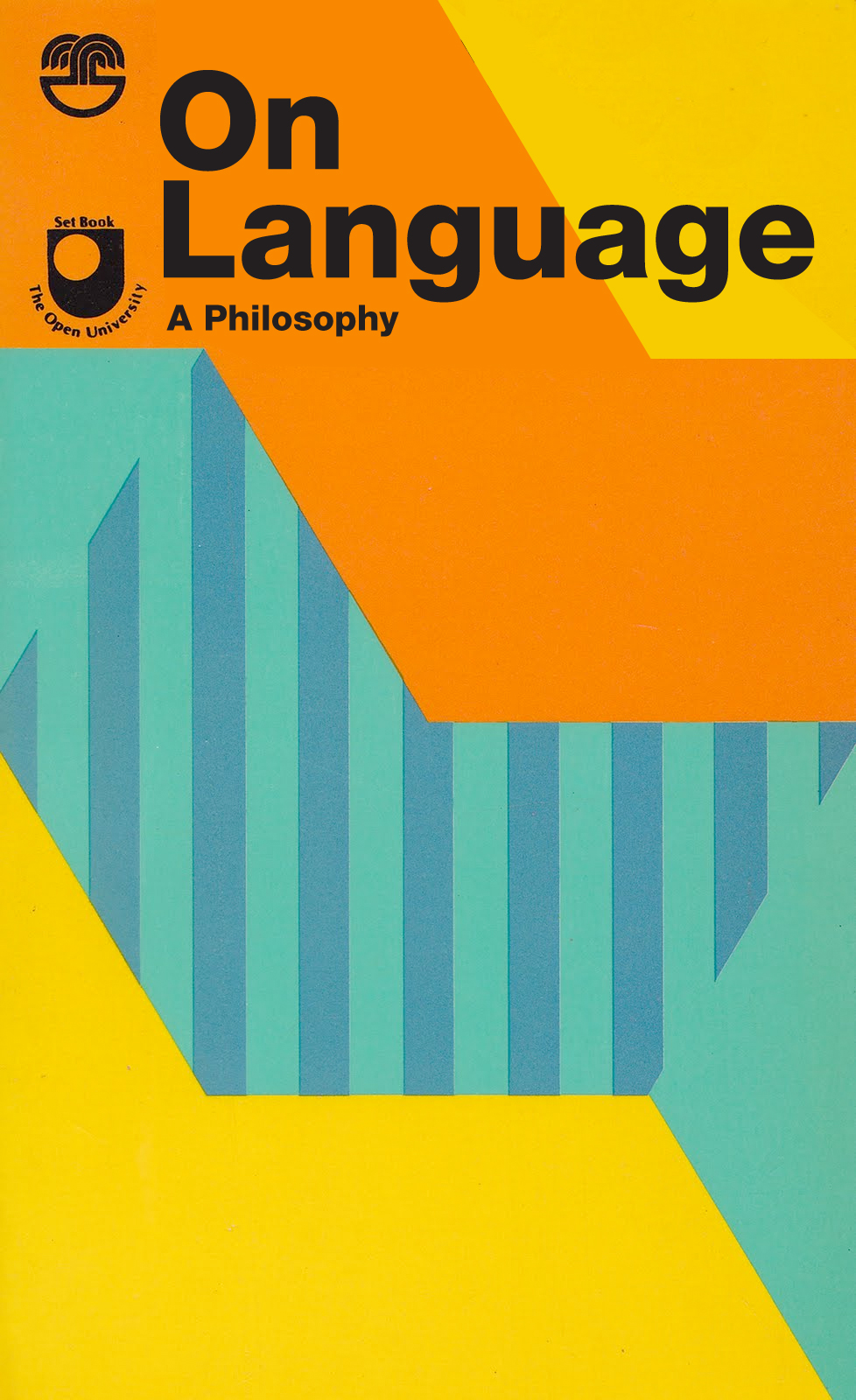
On Language…

It is not by chance, or without a deep ground in his nature, common to all his qualities, both affirmative and negative, that Lamb had an insensibility to music more absolute than can have been often shared by any human creature, or perhaps than was ever before acknowledged so candidly. The sense of music — as a pleasurable sense, or as any sense at all other than of certain unmeaning and impertinent differences in respect to high and low, sharp or flat — was utterly obliterated as with a sponge by nature herself from Lamb’s organization. It was a corollary, from the same large substratum in his nature, that Lamb had no sense of the rhythmical in prose composition. Rhythmus, or pomp of cadence, or sonorous ascent of clauses, in the structure of sentences, were effects of art as much thrown away upon him as the voice of the charmer upon the deaf adder. We ourselves, occupying the very station of polar opposition to that of Lamb, being as morbidly, perhaps, in the one excess as he in the other, naturally detected this omission in Lamb’s nature at an early stage of our acquaintance. Not the fabled Regulus, with his eyelids torn away, and his uncurtained eye-balls exposed to the noon-tide glare of a Carthaginian sun, could have shrieked with more anguish of recoil from torture than we from certain sentences and periods in which Lamb  perceived no fault at all.
– Thomas De Quincey on Charles Lamb

This excerpt of Thomas De Quincey’s operatically vicious takedown of the writing of fellow essayist Charles Lamb’s work is a treasure for three reasons. The first is the deliciously tight braiding of critical acumen and epic meanness. The second is the sheer melodrama of it all – Nature’s sponge !, the tearing of Regulus’s eyelids, shrieking in the noon-tide glare of a Carthaginian sun. Unhinged. But. There is art and wisdom buried in this empurpled soufflé of brainy spite. It has, nested in the middle, one of the most eloquent formulations of the mechanics of excellent writing. – Rhythmus, or pomp of cadence, or sonorous ascent of clauses… the structure of sentences… an indispensable sketch of the the engine that brings art to language.

Royal Bodies

Lose yourselves in this utterly engrossing essay by Hilary Mantel, currently free to read at the London Review of Books. Entitled Royal Bodies, it considers the construct of this utterly peculiar institution, it’s basest aspects and its most unworldly character, in Mantel’s typically direct, painterly, and slightly off kilter way — In looking at royalty we are always looking at what is archaic, what is mysterious by its nature, and my feeling is that it will only ever half-reveal itself… Royal persons are both gods and beasts.

Mantel wrote the incomparable historical novels Wolf Hall and Bring Up the Bodies, two thirds of a trilogy centered around Thomas Cromwell, Henry VIII, and the founding of the Anglican Church. So skewed and revelatory is her lens, and so brilliantly constructed is her authorial voice that I waited for the release of the second book with an anticipation usually reserved for a new record by a beloved band — as much as I wanted to hear the story continue, it was the style of the writing, the sound of her language that I couldn’t wait to submerge in…

The essay caused, and is still causing, a retarded kurfuffle in the UK for her gimlet eyed assessment of Kate Middleton. Umbrage, in this case, relies on classic non-reading or a stubborn non-comprehension of the essay’s essential humanism. Read on here…

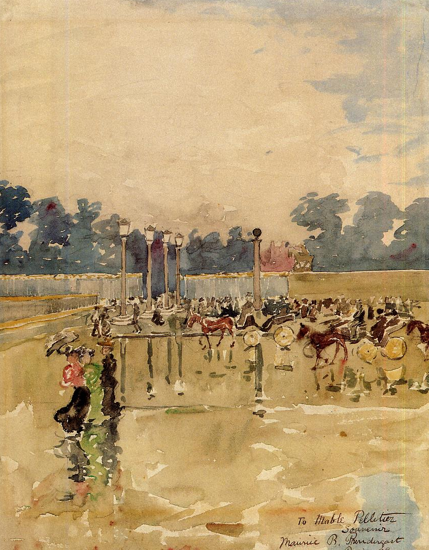
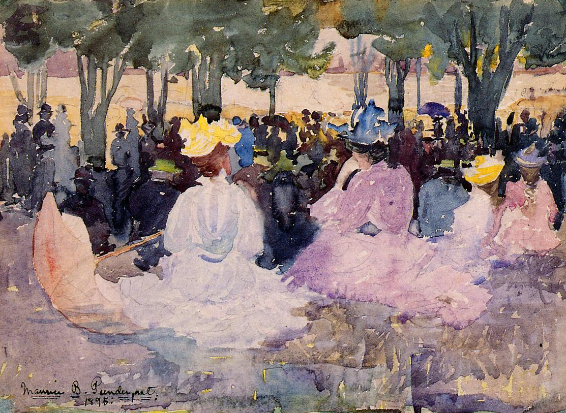
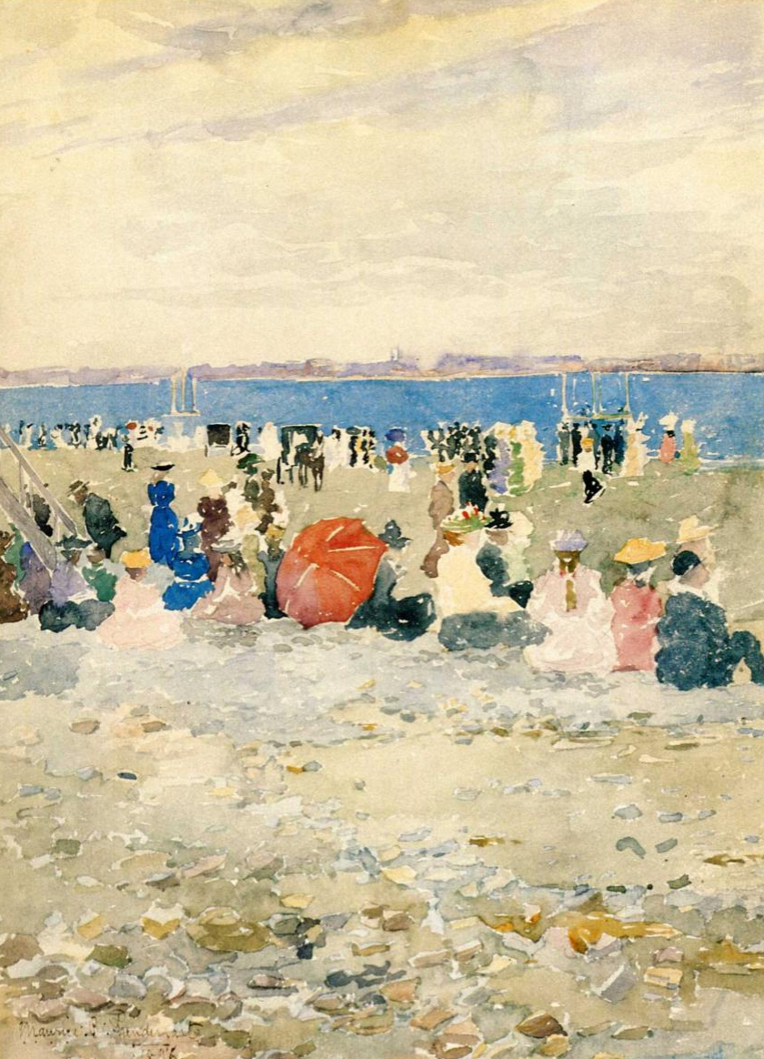
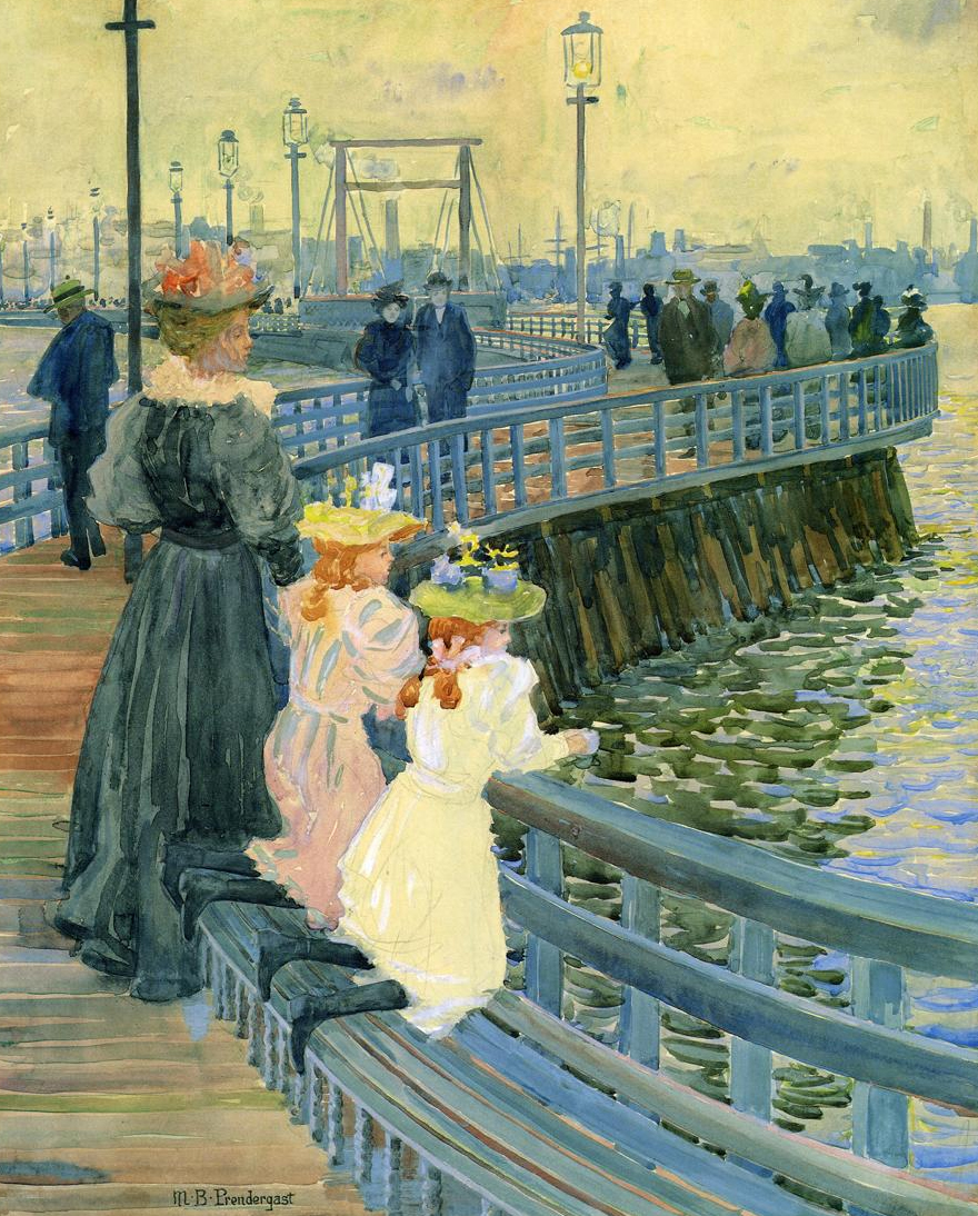
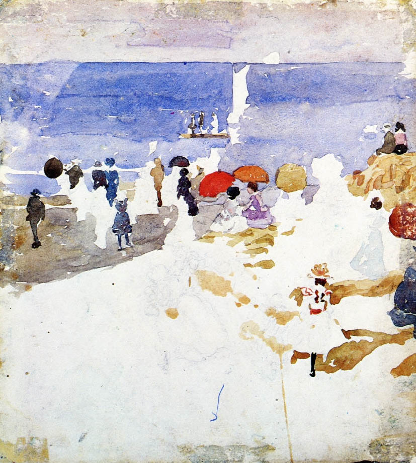
Maurice Prendergast

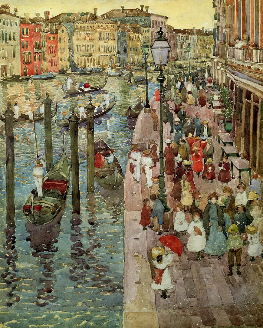
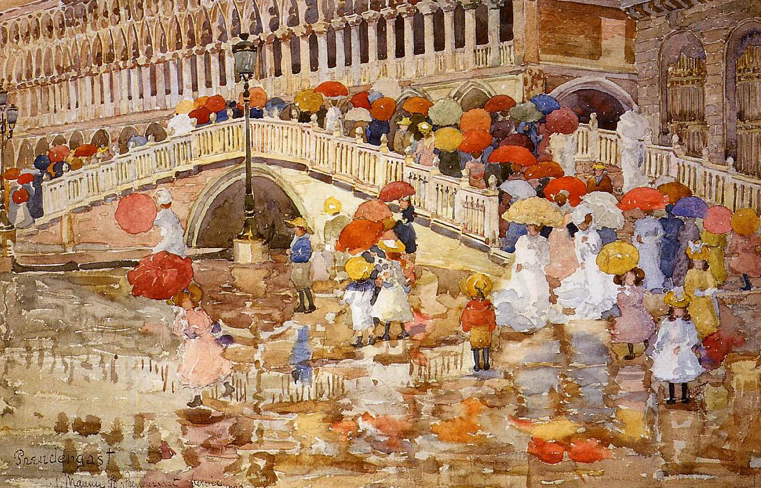
So I finally went to visit the Barnes Collection at its new home on the Philadelphia parkway. My affinity for it has always been somewhat obligatory — I know why this art matters, but have appreciated it mostly as a bridge between older traditions I adore to modern currents I admire. As before, I find myself deaf to Matisse’s signals, and still feel an abject revulsion to Renoir — the smeary, overripe nudes struck me, this time around, like they were painted with bacon fat. Feh.

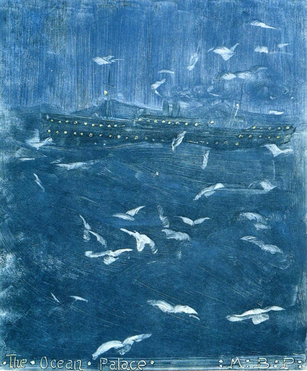
Revelatory though, were the few paintings tucked into various clumps throughout the collection by Maurice Prendergast. Each was a bravura demonstration of seeing, buy vicodin pain killers directly interpreted in painting. They were definitive and re-invigorating examples of the idea of impressionism as I understand it, painting animated by an exquisite receptivity of what it “felt like” to visually drink in a scene, its atmosphere, its flickering and transitory nature.

Later on, as I delved deeper into his work, scene after scene, I stopped thinking of them in terms of technique or theory but in terms of a kind of magic. He seemed to capture on paper an endless loop of the living essence of a moment, as if he could pin a a butterfly without stilling its movement or shimmer.


TRUE ADVENTURES IN BETTER HOMES

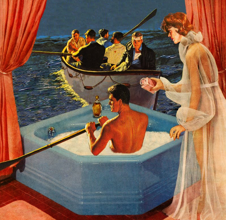
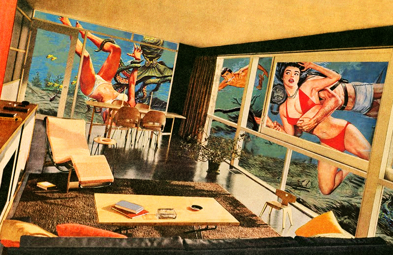
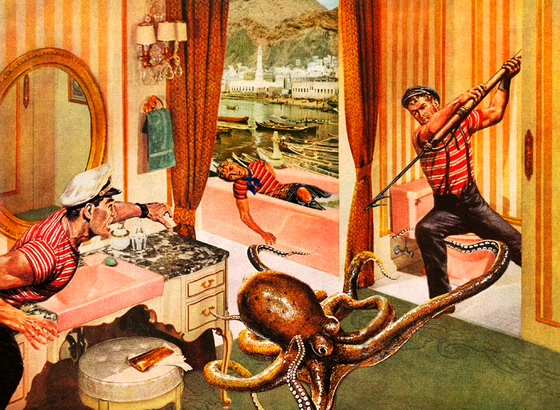
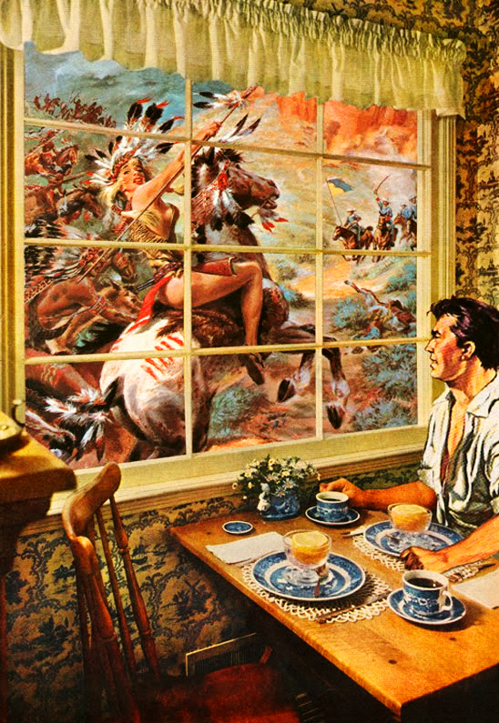
Well then — aren’t these just amazing, these collages by Nadine Boughton. Sometimes rather than launching into an extended appreciation you just want to say Fucking bravo! Seriously, bravo! …and anyway, my fellow spelunker Hannah L.’s comment in Lenscratch can scarcely be improved buy vicodin from uk upon — This is the best idea ever. Extremes that actually complement each other, ultimately reconciling with the self…. wow. Well said sister. Credit for uncovering this ace work lies with Elektra Luxx. Do pay her a visit.


To Die For

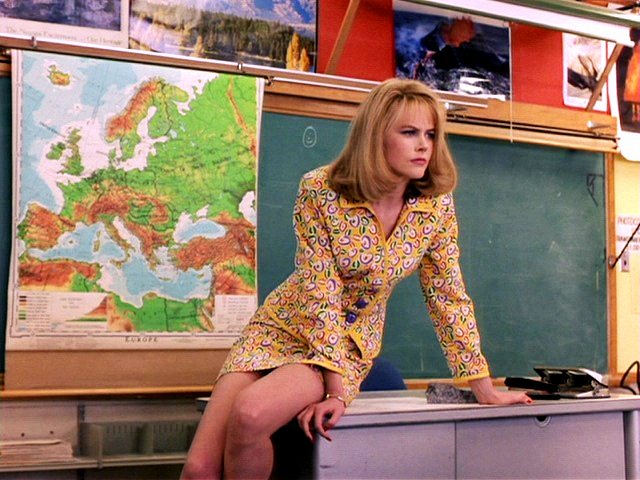
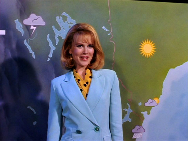
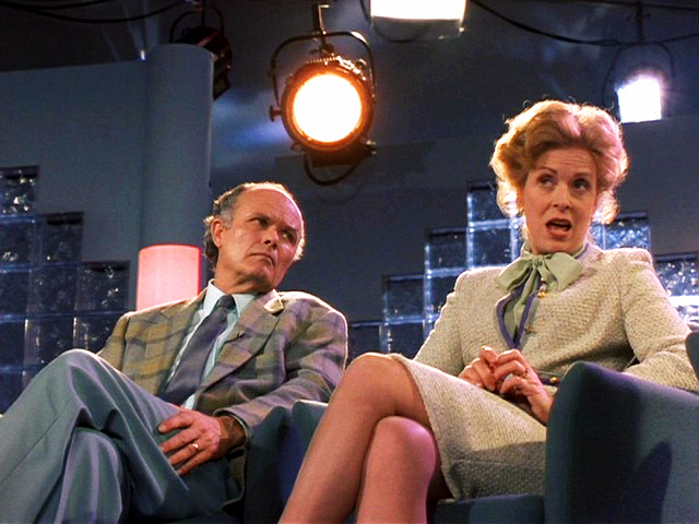
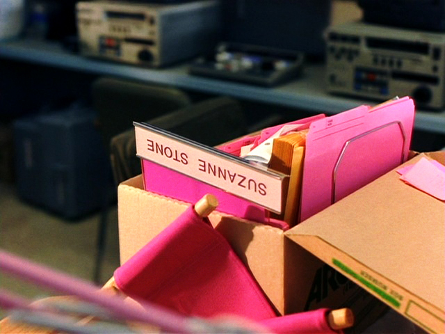
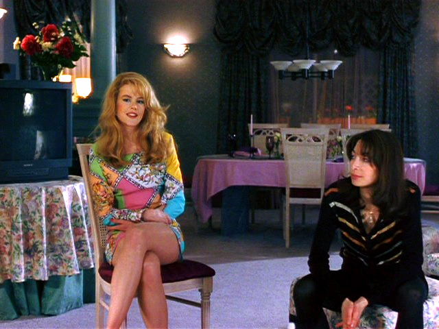
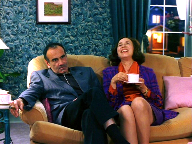
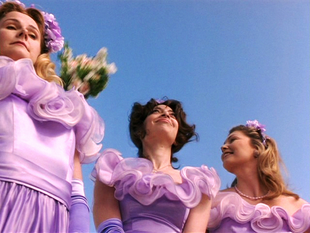
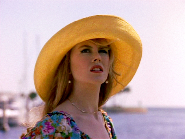
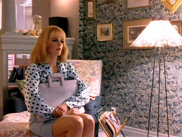
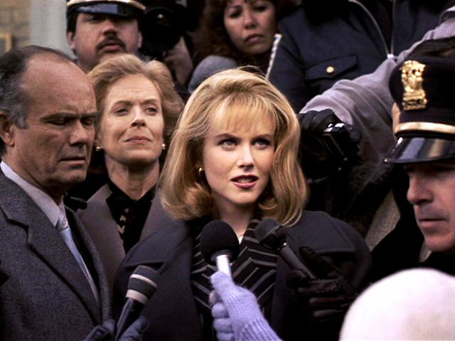
Can we take a moment to be gobsmacked by the art direction and costume design of Gus Van Sant’s To Die For? (written by the brilliant Buck Henry, in bowtie, above) Lurid, mean, lusty, sarcastic, and genuinely and absurdly fashionable in equal measure, just like the movie itself. Well worth digging up and re-watching, both for it’s delectable eye candy as well as the tart sweet taste of it’s sadly unexpired satiric cocktail —
~ 1 jigger of Hallmark
~ a generous splash of Maury Povich
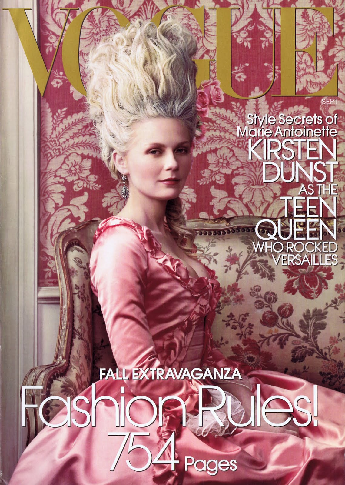
~ 1 dash of vintage Vogue
~ fresh squeezed orange juice
~ two fingers carbolic acid.
Mix well and enjoy.


Colonel Wilma Deering

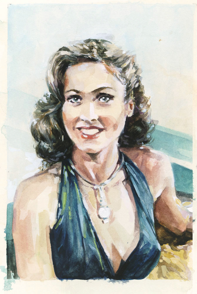
Colonel Wilma Deering — off duty, gouache on board, 9 x 6.5

So, on a lark I watched some episodes of the old 1979 series Buck Rogers in the 25th Century. Man, what a glitter encrusted sci-fi glam delight! Most of the other shlock series of the era have aged poorly, revealing more artless clunk than period charm. Not here. There’s a grin-inducing disco exhuberance to the whole affair — a vision of the future that’s equal parts Saturday morning Sinbad, Star Wars, and the roller skate fantasia Xanadu. In reading up on the show, the oddest thing I came across was a terse but enthusiastic appreciation of the show by esteemed cultural critic and poet Clive James, “Battlestar Galactica (Thames), though glaringly a cheap Star Wars rip-off, looks better on the small screen than in the cinema. The best comic strip science fiction on television at the moment, however, is Buck Rogers in the 25th Century (LWT). The hardware looks good and Wilma Deering looks simply sensational, like Wonder Woman with brains.” Amen, comrade. In commemoration, then, a quick three day sketch of the fetching Erin Grey  as the indefatigable Colonel Wilma Deering, off duty, of course.


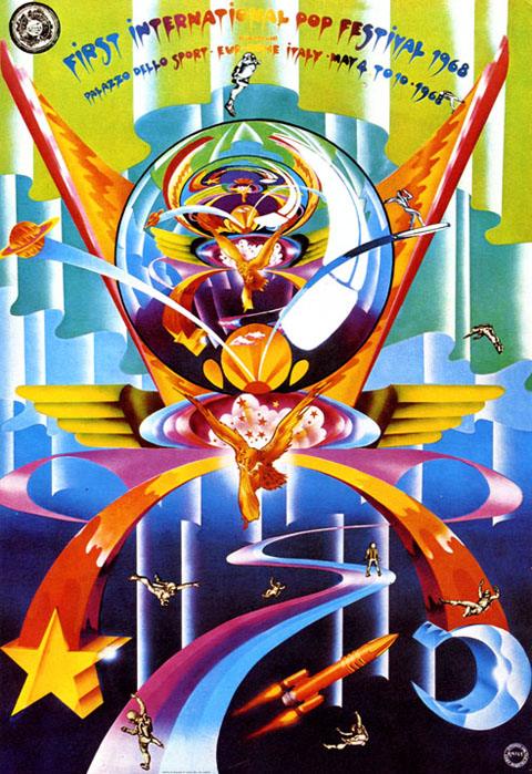
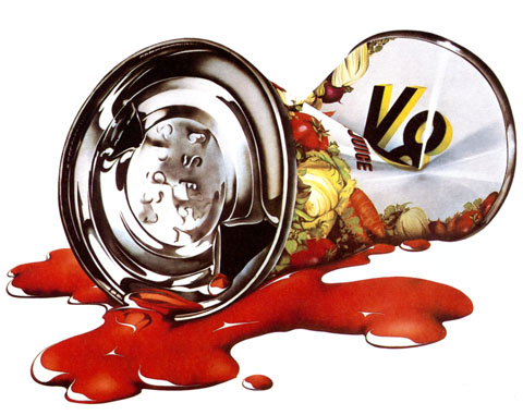
The Zonk of Michael English

english11

english21

english3

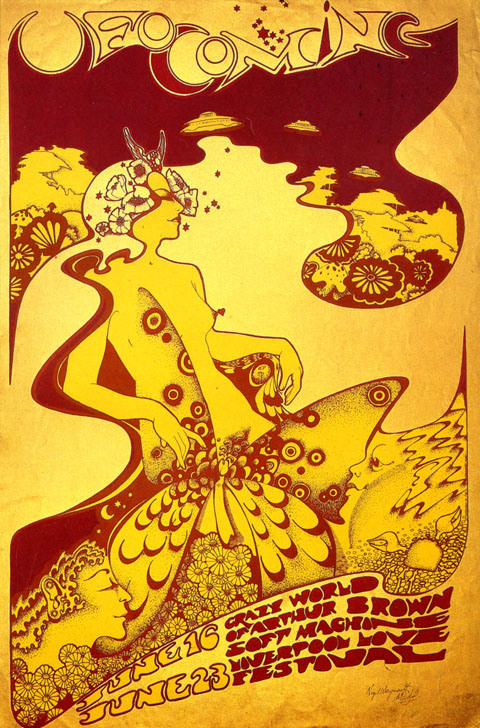
From the 60’s to the early 80’s Michael English seemed to be directly wired into each decades most adolescent, swinging, aesthetic sensibility. He began as a founding partner of Hapshash and the Coloured Coat, a design collective that specialized in gig posters and scene graphics that helped define 60’s English psychedelia (I vastly prefer this work to it’s American counterpart – it’s zonk is far sexier and literally more cosmic)

On the cusp of the 70’s an airbrush and rainbow sensibility begins to frost the work. Redolent of pinball backglass art, van conversion detailing, and late era Vargas pinups, it veers from garishly exuberant to exuberantly garish. The veneration of chrome and reflectivity carry through into the 80’s as he settled into a glossy pop-realist mode similair to the work of James Rosenquist and Tom Wesselmann. The biggest shortcoming of this period is the relentlessly juvenile subject matter – Candy bars, soda cans, glass sundae dishes predominate. The renderings however, are an exquisite case study in the late 70’s/early 80’s obsession with glossy enameled sheens and reflections.

Regardless of the era, from psych sirens and candy colored UFO’s, to chrome balls and lipgloss swirls English’s career is a overlooked layercake of guilty pleasures. (The retrospective 3D Eye, is out of print but easily found online)

Merry, Happy, Seasons, etc…

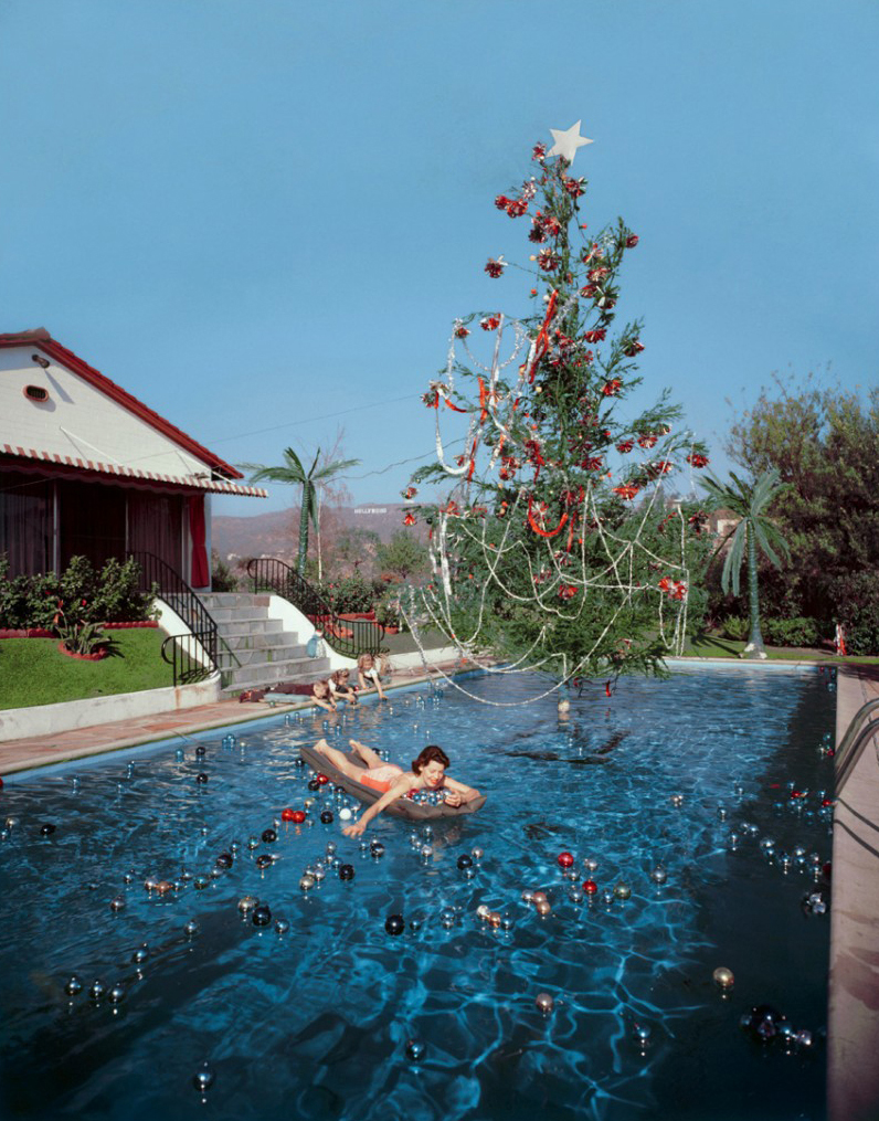
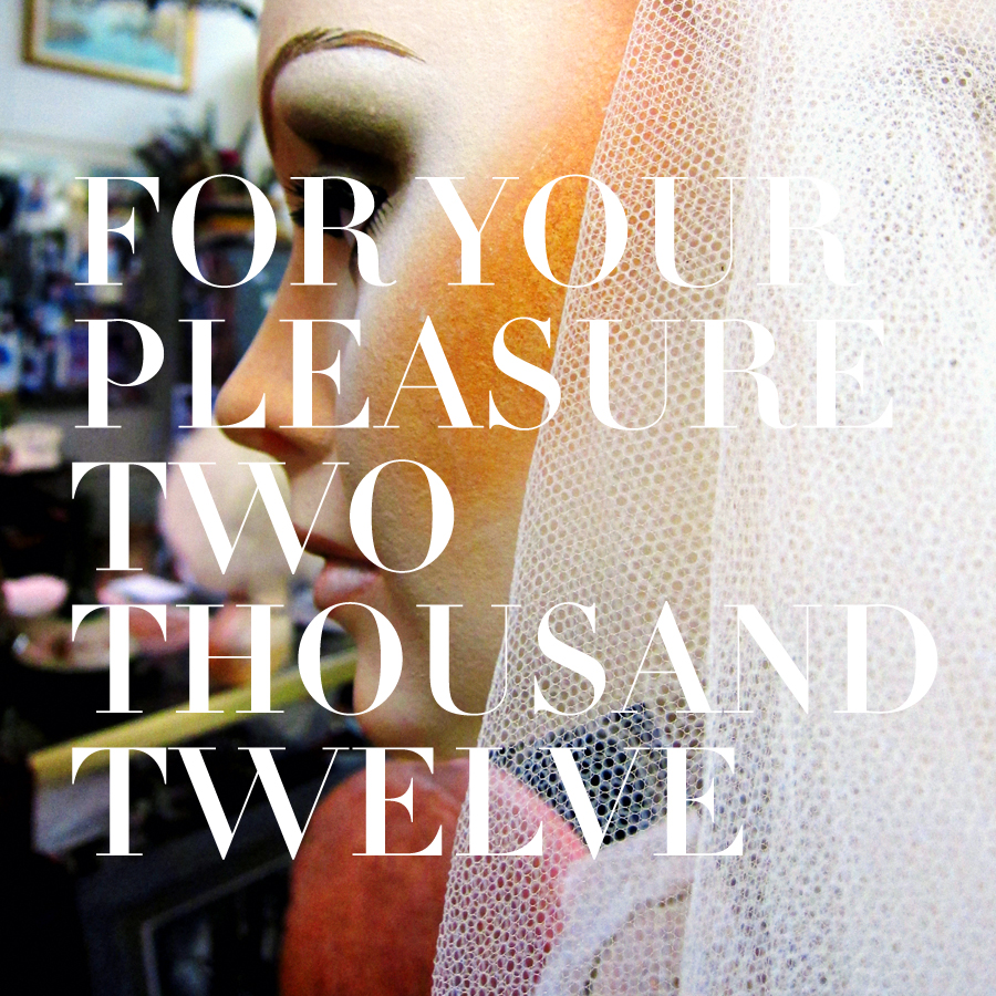
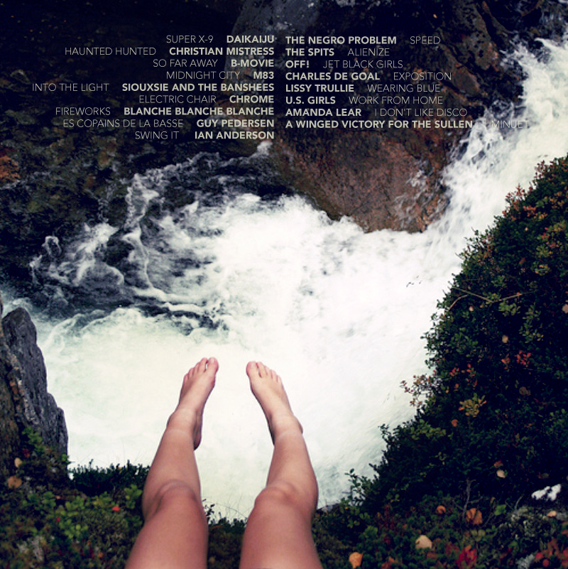
Rita Hayworth’s Hollywood Christmas. Photograph by Slim Aarons, 1955. Also, this years edition of For Your Pleasure…, my yearly music roundup, is posted below. Lots of unlikely improbable buy vicodin canada pharmacy radness this time around – metal, disco, forgotten new romantics, old punks, singing models, and an unusually high flute quotient. Download & enjoy. Until the new year, then…


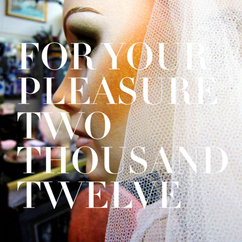
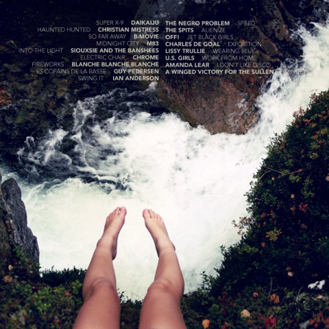
For Your Pleasure 2012

The year in music was spent under the vast shadow of Christian Mistress. This colossally awesome band rose up from the waters in early March, unbidden, unknown, and wrapped it’s massive hulk around the turntable, it’s grip unshakeable. It’s like some scruffy metal kids in Portland got a hold of the fax/phone modem contraption that synthesizes Kelly leBrock in Weird Science and shoved in pre-Bruce Dickenson Iron Maiden, Hawkwind, and — most improbably — Sandy Denny era- Fairport Convention. A lean and wooly metal monster, this Mistress, but what defines them are the rough yet transcendent vocals of frontwoman Christine Davis. Possession is thier first full-length, handily the record of the year. Everything they’ve done to date though – the Agony & Opium EP and the debut single — is simply crushing.

The only thing more absurd than the idea of a sequel to Jethro Tull’s beloved 1971 prog-rock masterpiece Thick as a Brick is how absurdly good it actually is.

M83’s Hurry Up We’re Dreaming still goes on the hi-fi just about weekly – this giant pipe organ of 80’s nostalgia remains a pure undiminished pleasure to listen to…

Blanche Blanche Blanche and US Girls beam fuzzy transmissions from deeply quirky imaginations, tuned to personal obsessions and record collections… 70’s AOR radio for the former, girl groups and glam rock for the later.

Wonderful and obscure new music appeared from two wonderful and obscure acts I thought utterly dormant – arch disco provocauter and Roxy Music cover model Amanda Lear (that’s her walking the panther on For Your Pleasure) and muscular 80’s synth band B-Movie (Nowhere Girl, a staple of the savvier 80’s hits comps)

Gobsmacking songwriter and all around American treasure Stew launched another tune into the Negro Problem’s indelible songbook.

2008’s best of included Lissy Trullie which I loved, despite being the kind of too-cool for school hipster new wave they play at photoshoots. She’s gotten a lot of jaded flak for being a singing model, hangin’ with Sevigny blah blah. Nonsense. Her full-length debut album is stunning. The downtown moves are still there, mellowed and matured by Siouxie-esque moody touches.

Speaking of Siouxie, a good portion of the year was spent channeling the summer sountrack of a precocious 16 year old Long Island girl circa 1986…

Winged Victory for the Sullen is a collaboration between Stars Of The Lid member Adam Wiltzie and composer Dustin O’Halloran. It is piano based ambient music in a Satie vien. It is simply gorgeous. Thanks gentlemen.

This year saw the US release of the legendary Des Jeunes Gens Moderns compilation documenting France’s 1978-1983 postpunk and cold wave scene – sort of a Euro-Nuggets for new wavers. Poking around the blogosphere I happened upon the swinging soundtracks of Gallic meatro Guy Peterson. A fizzy sonic tonic.

The new OFF! record sounds exactly the same as the lst four EP that preceded it, which were, collectively, my favorite record of 2010. Keith Morris continues to prove how hard and elusive it is to create pure vintage American hardcore – and how exhilarating its rush still is. Thier church basement show with the Spits was the years second best live show. Surf monsters Daikaiju’s show at tiny Kung Fu Necktie was hands down the years best. Played mostly from within the small audeince the show culmiated with the entire drum kit stacked into a giant heap over a delighted fan who drummed it from underneath. Aces. Worship psycho-surf band Daikaiju daily for good luck and health!

When my wife would go out for drinks I listened to a lot of Chrome.

[Download the comp, here.]
Hang on to yourself…

Hell yes! Essential pop wisdom courtesy of Mike Fornatale. Always remember – all our passionate affairs with the stuff we love began back then, with those first obsessions that blotted out the horizons of our imaginations. The same force that makes you, let’s say, hand draw and write a full libretto for a sequel to Aladdin Sane at 14, still order vicodin online legally powers your infatuations today. Hang on to yourself indeed.

Fornatale, by the way, is a rock lifer – raising fandom to a vocation and a formidable talent in his own right. He currently sings in the latest incarnation of the beloved baroque pop maestros The Left Banke. An appreciation from The Big Takeover can be read here.

Hmm… That’s quite a drop.

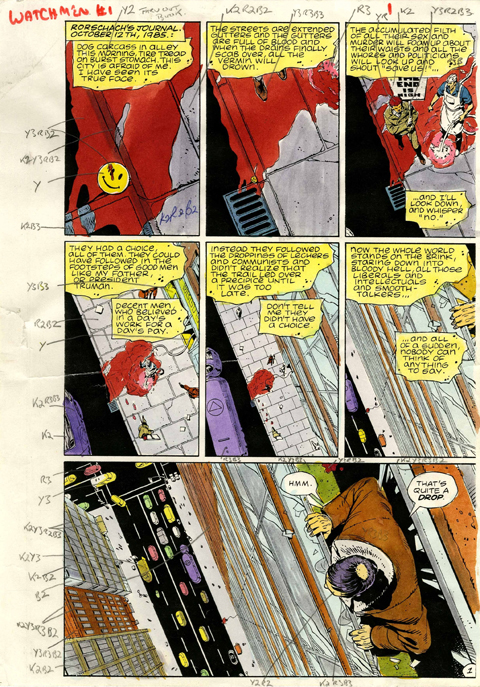
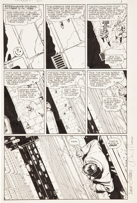
The first page of the legendary comic Watchmen sold last weekend at auction for $33,460. Aptly described as the “Call me Ishmael” of comics, it’s one of the icons of the genre. All of the formal inventiveness that author Alan Moore and artist Dave Gibbons established in their 12 issue 1986 masterpiece is prefigured here. (Fascinating to see it stark black and white – the page also came with an ace bonus, an annotated color guide. Gander here, and here at larger images) Notice especially the convergences between Rorschach’s psycho-noir-messiah narration and the visuals in each panel. This tight choreography between seemingly unrelated visual and verbal elements is one the the primary sources of the book’s tremendous impact. It adds a crucial layer to the storytelling, one uniquely rooted in the format of comic books – the ability to directly interweave elements from one part of the story into another and thereby elicit new interpretations, resonances, and meanings. Watchmen established Moore as a virtuoso of this technique. So, so good…

Great story behind the provenance of the comic page itself. It was bought in 1987, in a comic bookshop in Covent Garden one morning by a bleary-eyed, hungover Stephen “Krusher” Joule for $180. Krusher was an artist and designer who worked with Motorhead, Uriah Heep, Blondie, Sex Pistols, Hawkwind, and Japan. He designed the covers for Iron Maiden’s Live After Death and Ozzy’s Diary of a Madman. In 1982 he became the art director for the legendary British heavy metal magazine Kerrang! In short, he’s exactly the kind of wonderful freak who deserves to score the first page of the Watchmen one hungover morning for a hundred and eighty bucks.

Thanks…

Powering things down ’round here for the next week or so. Thanksgiving, etc… Porch light’s on though, if you’re here, please – by all means help yourselves to anything. More stuff soon, surely.

Ryan Donnell’s Polling Place Project

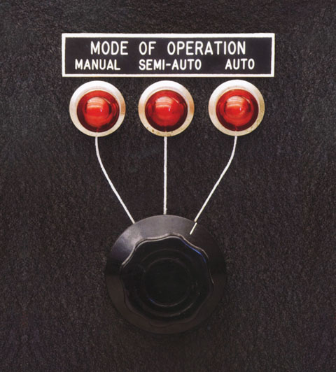
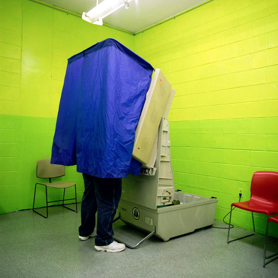
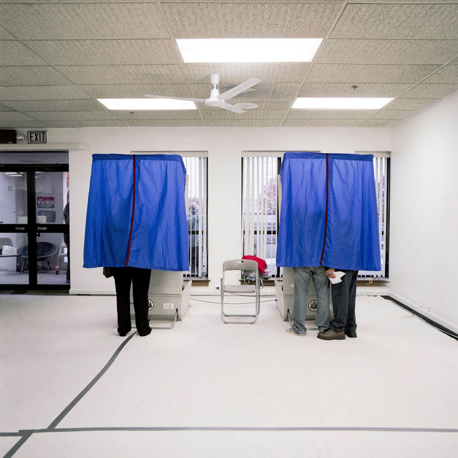
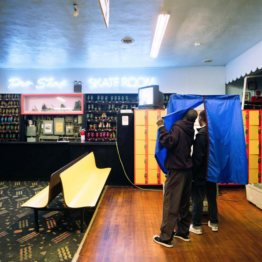
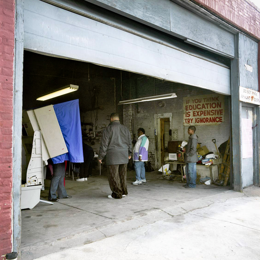
Sure, the election hoopla has settled, with the reality based community the world over oscillating between exhilaration and queasy relief. But before we return to our regularly scheduled enthusiasms let’s celebrate an easily overlooked aspect of the the kaleidoscopic nature of American democracy – the polling place. Here in Philadelphia, for instance, you’re as likely to vote in a basement party room, mosque, roller skating rink, private backyard, body shop, or wallpaper store (all above) as a school gymnasium. For documenting these unlikely outposts we have photographer  Ryan Donnell to thank. Donnell, a pal, is a savvy, gifted journalistic & commercial photographer based in Philly. Behind the Curtain is his ongoing project documenting the nation’s unlikely polling places. He’s covered Philly and Chicago and just completed a swath of Los Angeles as well. Take a gander, here … and check out the balance of Donnell’s work, here.