



Author Archives: admin


Hello. Hello.

can_you_hear_me_now tent_1 records beer Pie tent_sargent

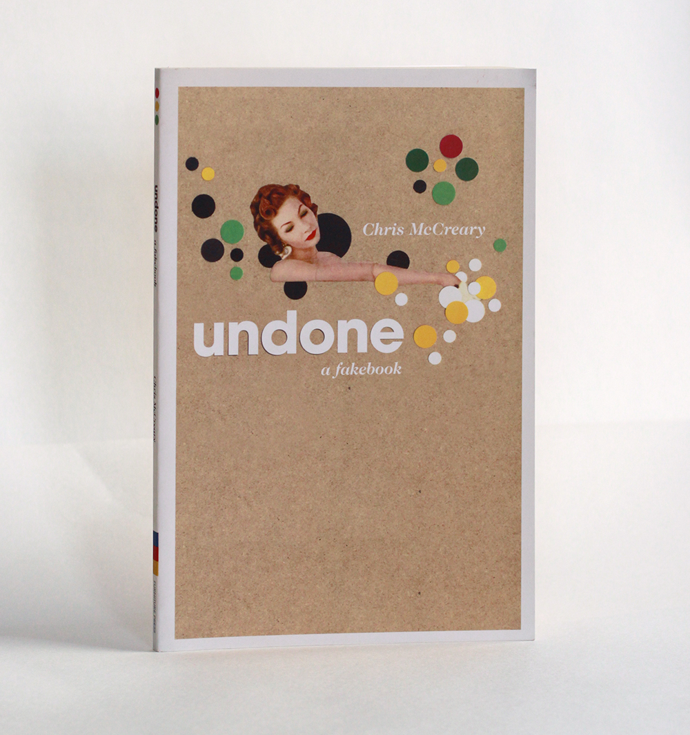
Shepelavy.com — Part IV, if I might be metal-grand & prog-rock-y about it. Untie the latch, part the canvas, pop your head out from the tent, let’s fire up the old transmitter. Is this thing on? Can you hear me now…

In 2009 I pitched camp on this modest little lagoon online. What began as a portfolio with occasional annotations tumbled into pretty steady blogging for a fat 3 years or so. More & more, however, severe advertising gales would knock out the transmitter for weeks on end. Sundry commitments were pressing. The blog contracted a virulent SQL database corruption. After a few stalled re-ignitions, things round here finally sputtered into silence around the winter of 2014.

Then Spring came, like it does, being Spring. I missed tapping these signals out into the ether, tending & fussing over my little plot of enthusiasms…So, I dusted off the redesign, gathered passels of uncollected old & new work. The code spooled out over the summer & fall.

& this so current salvo of transmissions begins… from this tiny lagoon on the clotted coastline of the interwebs, that I share with beached beatniks, old salts, venerable preps, society matrons, homespun cuties, movie stars & scientists… an endless three-hour cruise. Come aboard —

 Welcome back.

plant


Dedication

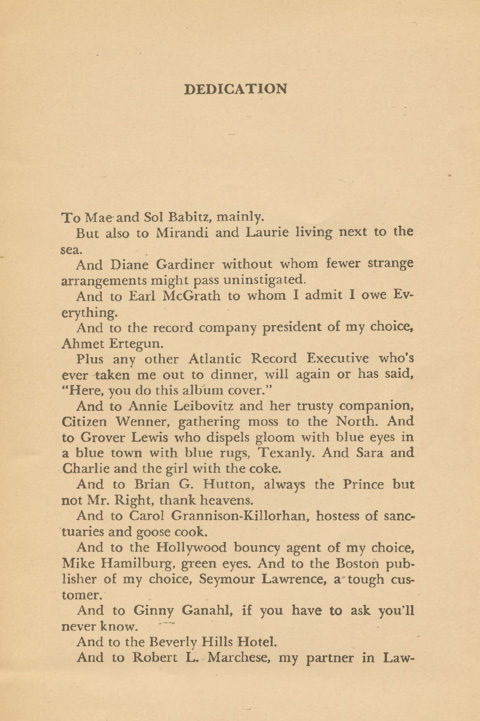
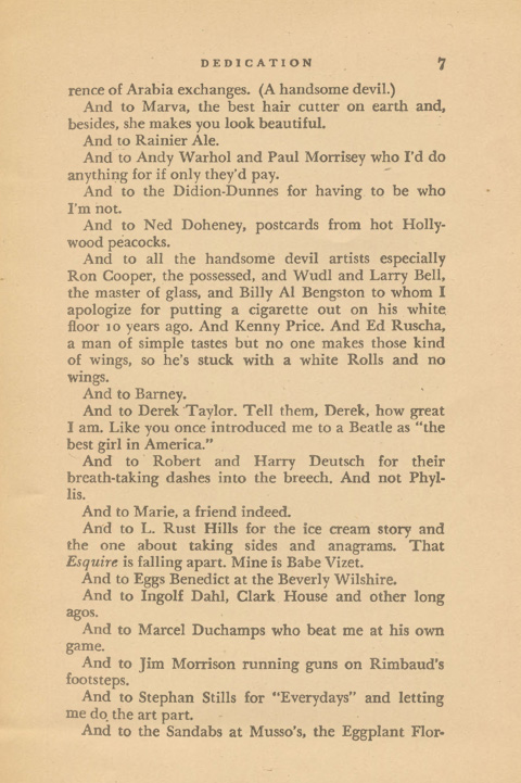
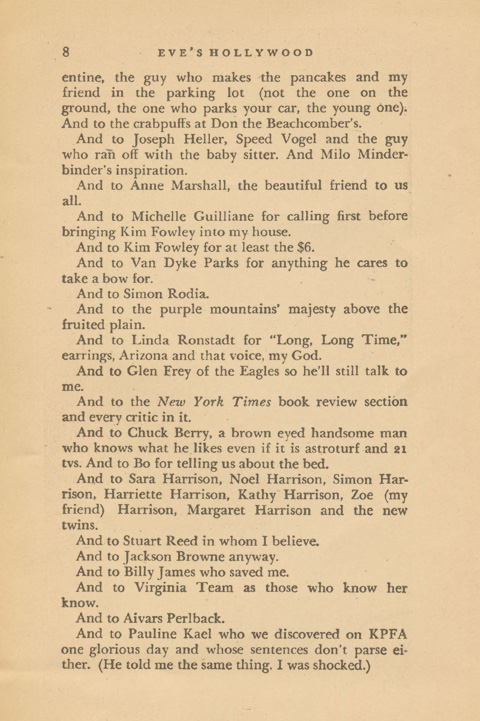
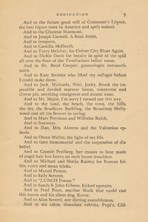
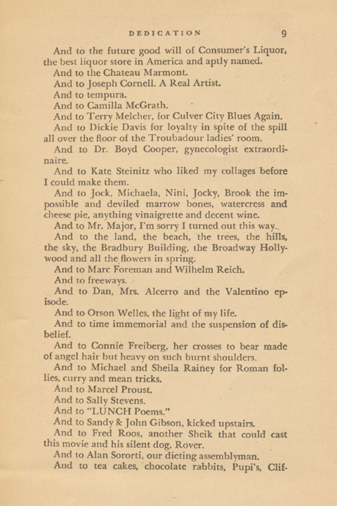
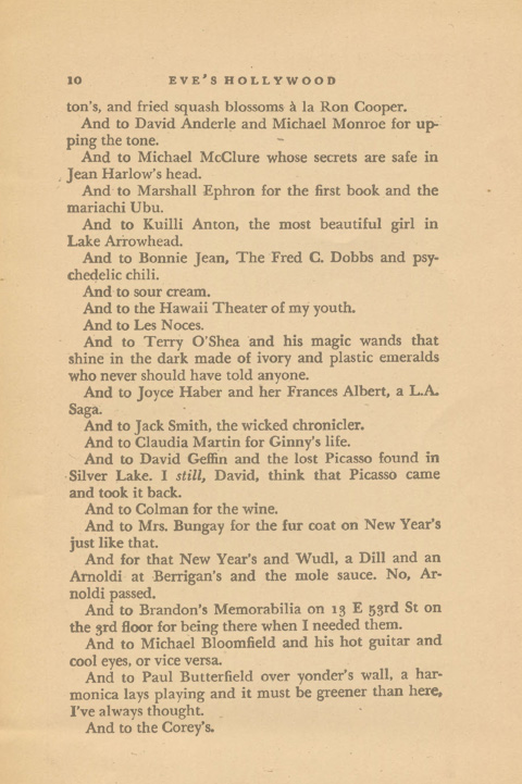
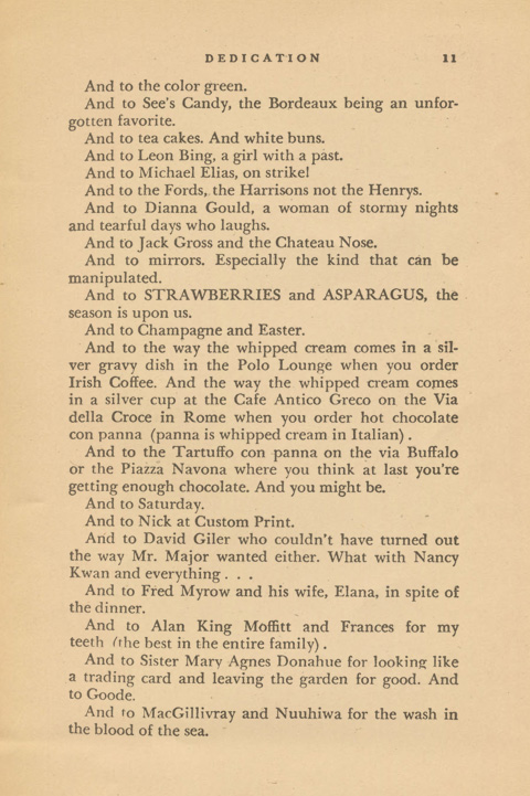
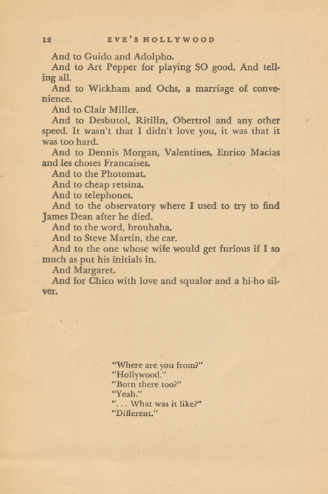
We take, for this salvo, for Part IV, as our patron Eve Babitz — the besotted bardess of Los Angeles. She began her 1974 debut “Eve’s Hollywood” with a heavy lidded, tipsy & heartfelt bear hug to the city of Angels with the mother of all dedications. A manic roll call stretching accross 8 pages, a waterfall of indiscretions, influences, friends & relations. It begins as a parade of enthusasums and over 8 pages sinkins in with the weight of poetry. Let it stand in for mine then, perhaps smaller beer by the standards of art, but equal proof by weight of enthusiasm.
Right?  Born and raised in Hollywood, Babitz developed a particularly acute appreciation for the essential radness of LA – the American city, sui generis –

L.A. has always been a humid jungle alive with seething L.A. projects that I guess people from other places just can’t see. It takes a certain kind of innocence to like L.A., anyway. It requires a certain plain happiness inside to be happy in L.A., to choose it and be happy buy vicodin italy here. When people are not happy, they fight against L.A. and say it’s a ‘wasteland’ and other helpful descriptions.

Most dedications sound a few notes note that hover over the first few pages . This is, rather, a motley parade – a blaring celebration that echos across the entire book – Her parents, a cat to whom she owes “Everything,” Ahmet Erteugn, the girl with the coke, the Eggs Benedict at the Beverly Wilshire, Milo Minderbider, Kim Fowley, Orson Wells and Proust, freeways, and Margret (which I hope is a deft and subtle play on Ann Margret, because, well, – Ann Margret. right?)

Her fragment on her ex- boyfriend, Ed Ruscha, is worth lingering over. It plays footsie with poetry and lies contentedly with philosophy – “Ruscha [is] a man of simple tastes – but no one makes those kind of wings, so he’s stuck with a white Rolls and no wings.”

And, as an aside, the Eggs Benedict at the Beverly Wilshire are delicious.

The Chase

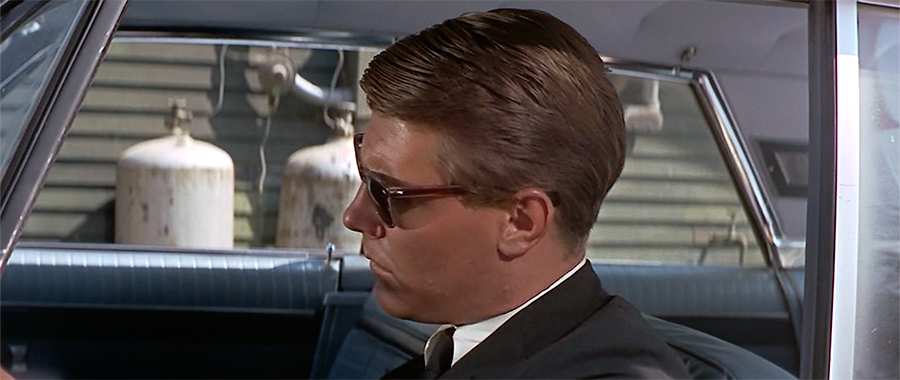
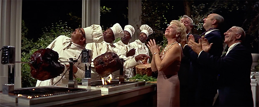
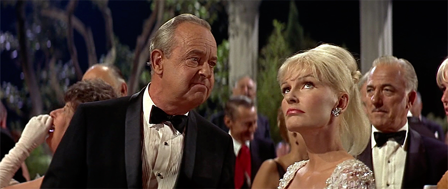
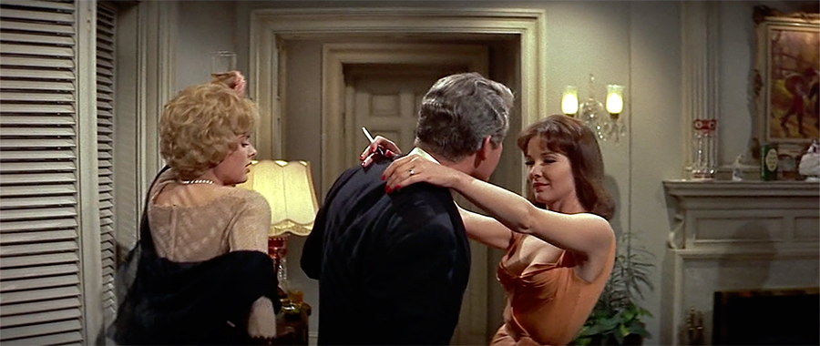
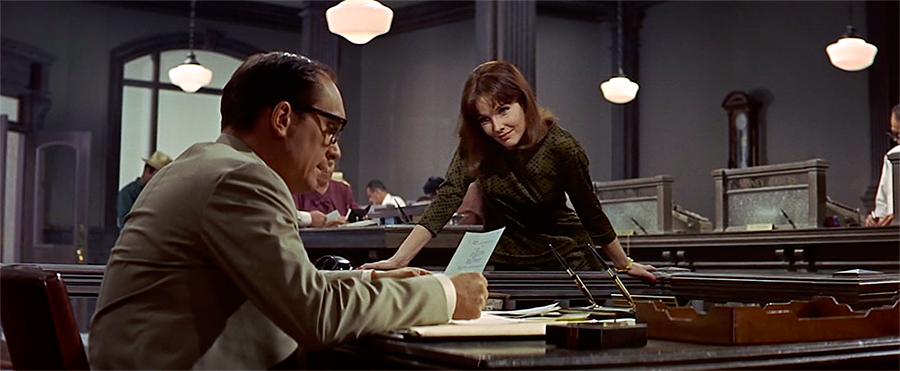
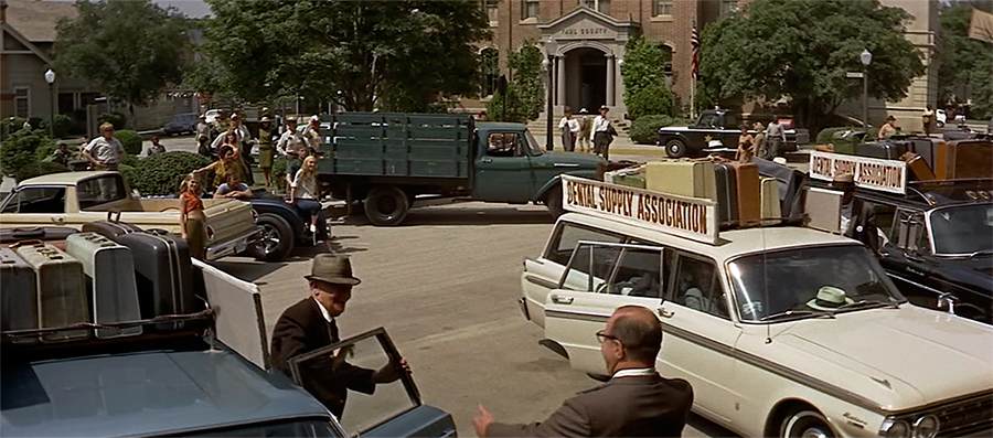
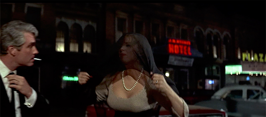
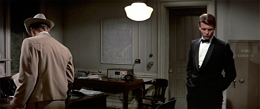
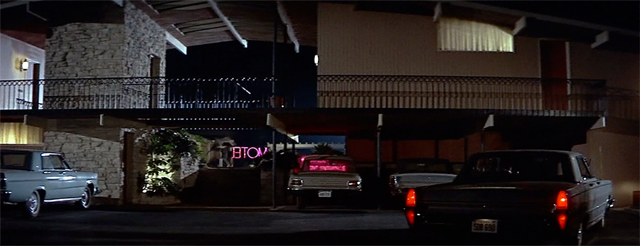
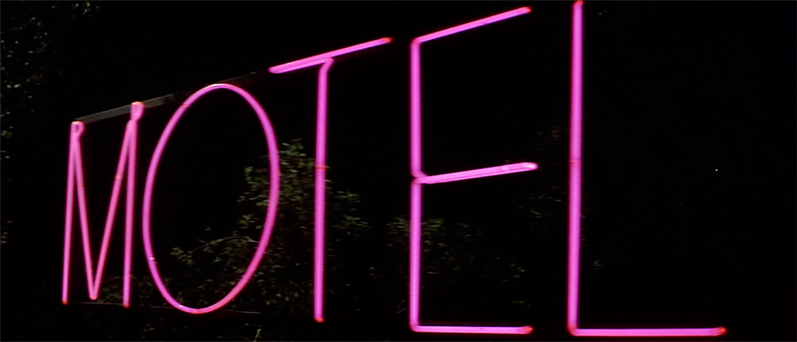
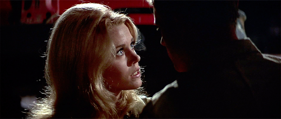
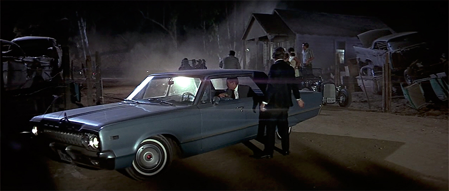
Chase_1 Chase_2 Chase_3 Chase_4 Chase_5 Chase_6 Chase_7 Chase_8 Chase_9 Chase_10 Chase_11 Chase_12 Chase_13 Chase_14 Chase_15 Chase_16 Chase_17 Chase_18 Chase_19 Chase_20

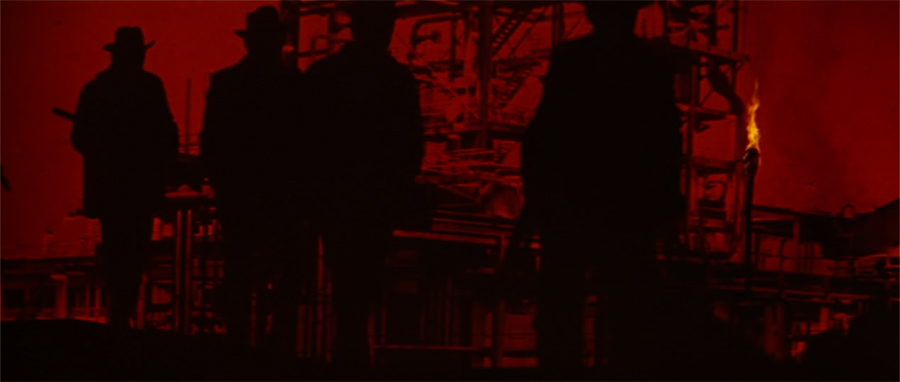
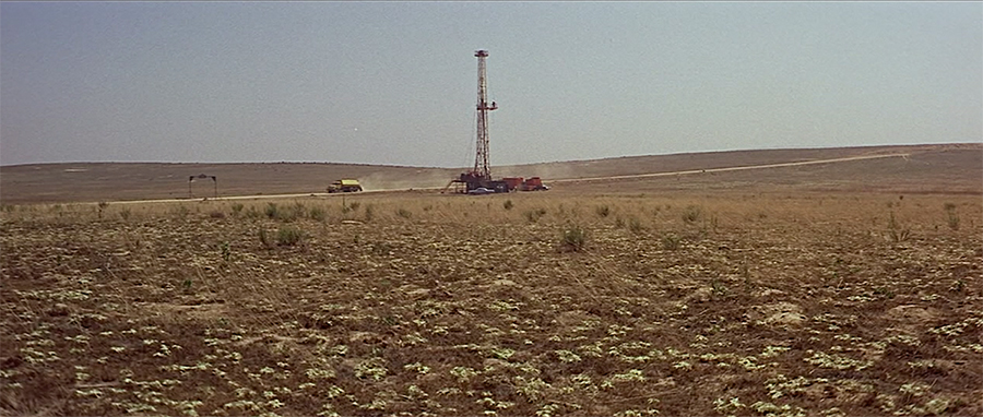
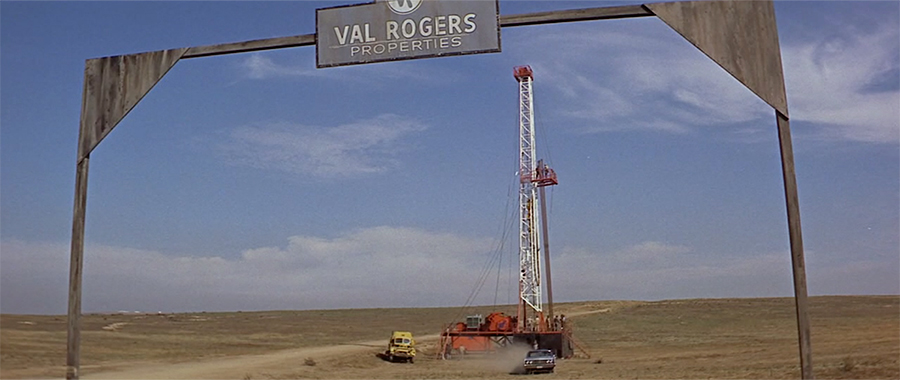
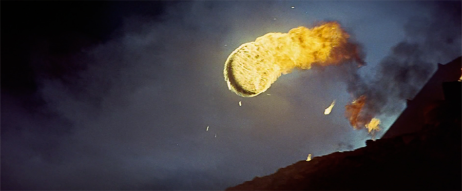
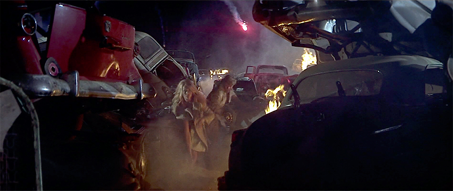
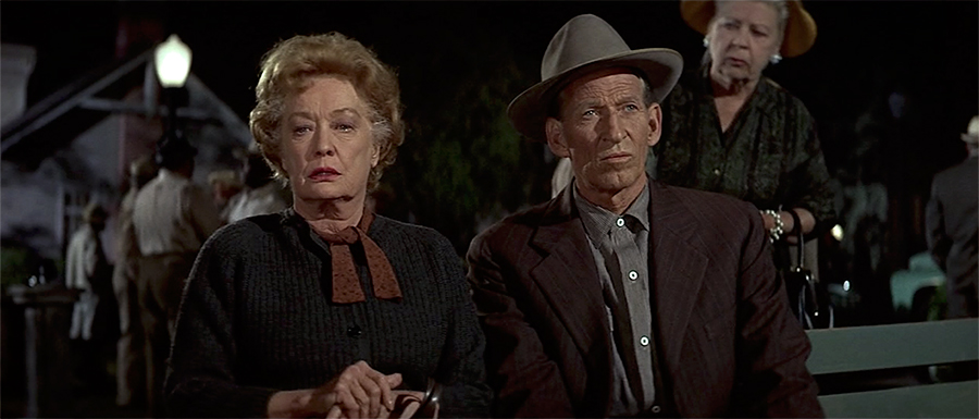
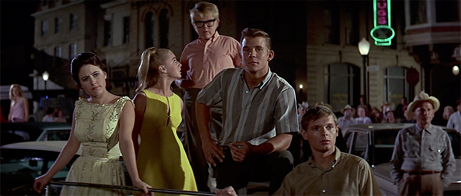
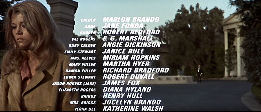
A selection of stills & credits from The Chase a long forgotten overheated soap opera once described as “Peyton Place with guns.” I came across an old review of it in the New Yorker which described it as “ an opulent melodrama, overproduced, over plotted to the point of incoherence and over directed” — like that’s a bad thing. The fact that Jane Fonda had described it as “Barbarella comes to small-town Texas” was just icing. Well worth it, and as the stills show, a handsome affair – shot by Arthur Penn in pop art, hyper composed, oversaturated Technicolor glory. The same could almost be said for deliciously mannered performances by Angie Dickinson, Robert Redford & Robert Duvall. You also get to enjoy the singular spectacle of watching Marlon Brando become less & less & less interested in actually acting at all with every successive scene. Fascinating.

Bad Company / Desolation Angels

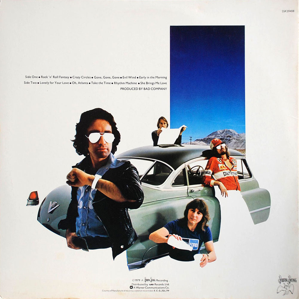
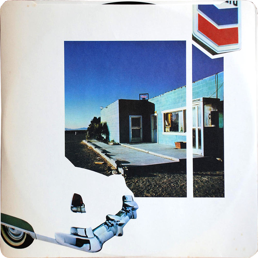
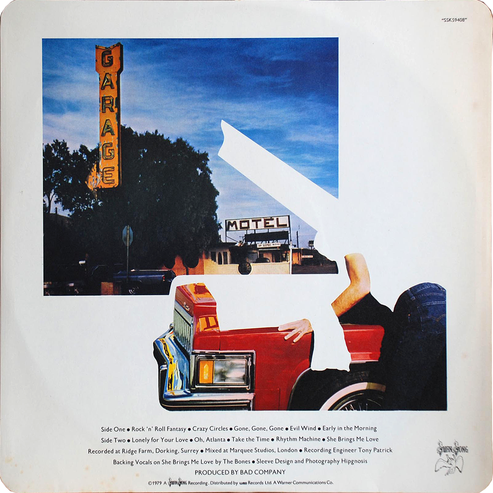
desolation-angels-front desolation-angels-back desolation-angels-inner-2 desolation-angels-inner-1

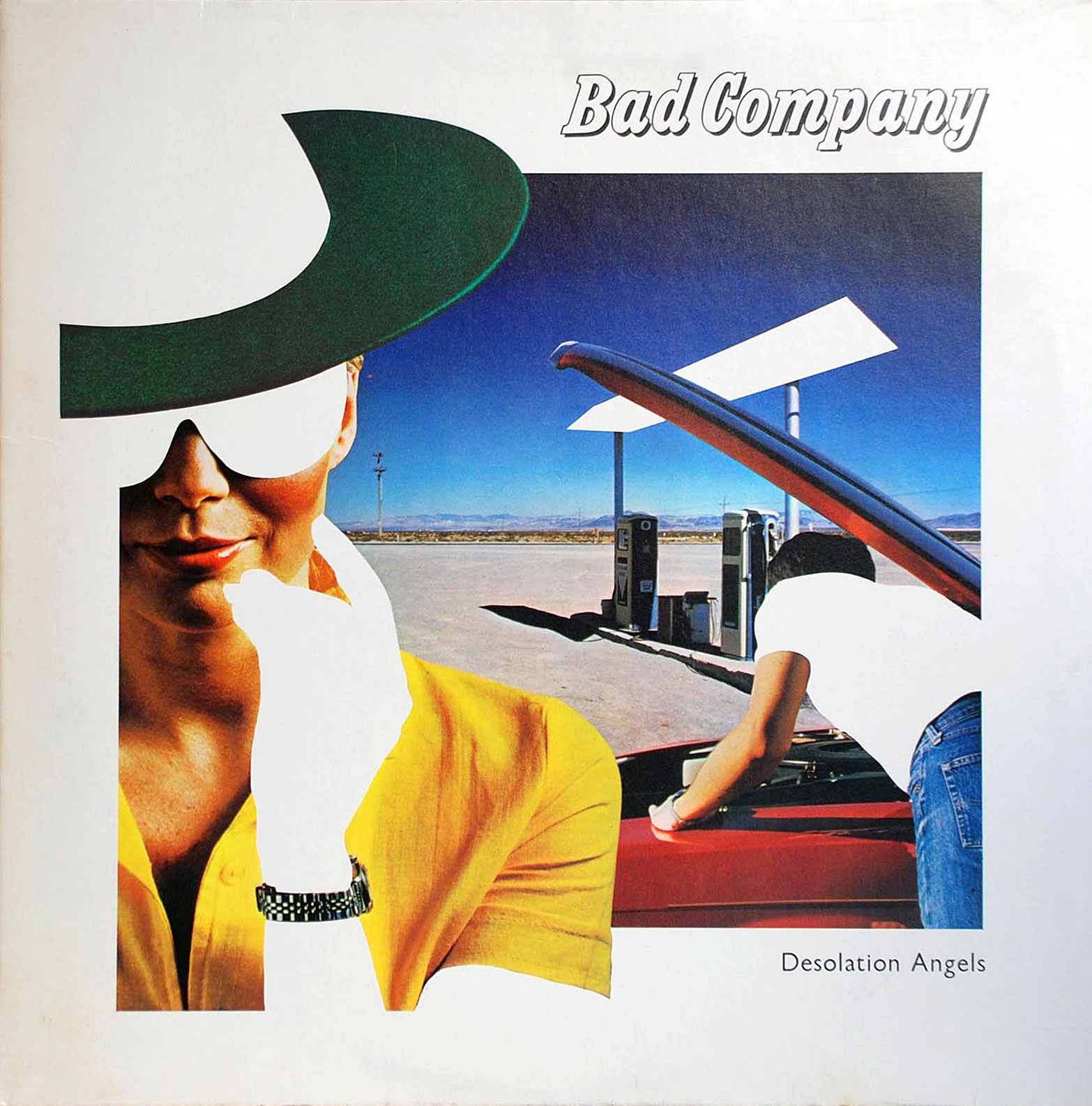
The design group Hipgnosis has been justly & exhaustively feted for thier amazing psychedelic realist album covers for Pink Floyd, Led Zeppelin, and other zonked heavyweights (an amazing gallery here, you could get lost for hours). I had no idea they were behind the artwork for Bad Company’s 1979 record Desolation Angels, which stopped me cold when I was crate digging one afternoon. It was strikingly clever example of that developing 80s graphic sensibility that found its apotheosis in Patrick Nagel’s work for Duran Duran. It has everything to do with the power of stark flat white throwing all other colors into hyper-bright neon-electric contrast — if cocaine could design album covers they would look a lot like this.

The Quintessence of Tempest

temp1

temp2

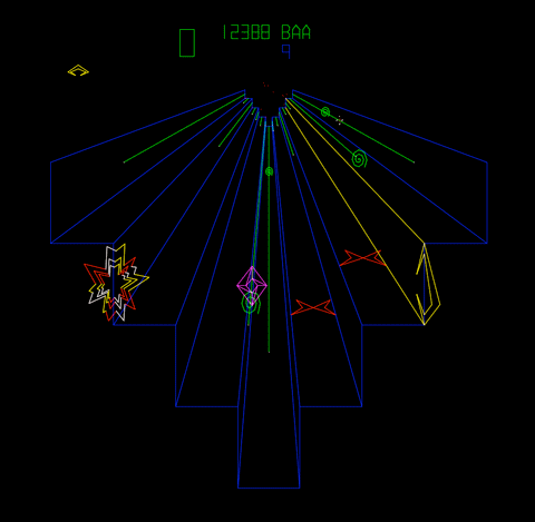
[RERUN: Hauling this out of the early days of the blog. I’ve been on a protracted vintage video game and pinball bender lately. Atari’s iPad port of my beloved Tempest is damn near perfect and I’ve been playing it a ton. As such this early appreciation of the stone cold perfection of this game has been on my mind. So, here, then…}

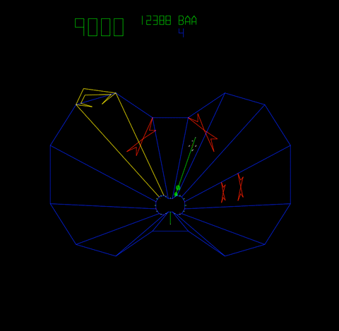
The screen graphics of the classic video game Tempest represent a kind of summit of design and beauty –  the finest expression of a very limited language. In the case of Tempest that language was vector based rendering. Vector monitors were used in video games from the mid 70’s to the early 80’s. The technology was derived from oscilloscopes – the image is projected by an electron beam onto the glass. Image a laser light show sped up to produce a lasting image and you’ve got it…

Many classic games were made using this technology – Asteroids and Battlezone as well as the first Star Wars game. While they all had their aesthetic charms, Tempest is in a class of its own. All vector games have a certain elegance and simplicity. The problem order vicodin uk arises in the crudity of the renderings – the poor approximations of tanks, asteroids, and X-wings forever marks these games as primitive gestures of an evolving technology. Tempest is exempt because it is derived from the technology itself.  What would a world defined by glowing geometric unshaded lines look like? Pretty much like Tempest.

Its beauty lies in the fact that it is in harmony with its own rules and limits. Hence the extremely elegant compositions – uncrowded, with a well balanced sense of scale. The color scheme is vibrancy itself, strong underlying blues, wonderful pops of pink, green, red, and yellow. And the physics of the electron beams give everything a deep saturated glow.

That same harmony extends to playing the game as well. Most games rely on clumsy and stunted translations of real world movements like running, jumping or flying an ostrich. Tempest moves in accordance with its nature – spinning and firing. That’s what makes it so satisfying. Once you understand its strange parameters you have a complete experience on its terms – a dynamic, I think, that is fundamental to the idea of art.

An Epic Burlesque: Kotlyarevsky’s Eneida

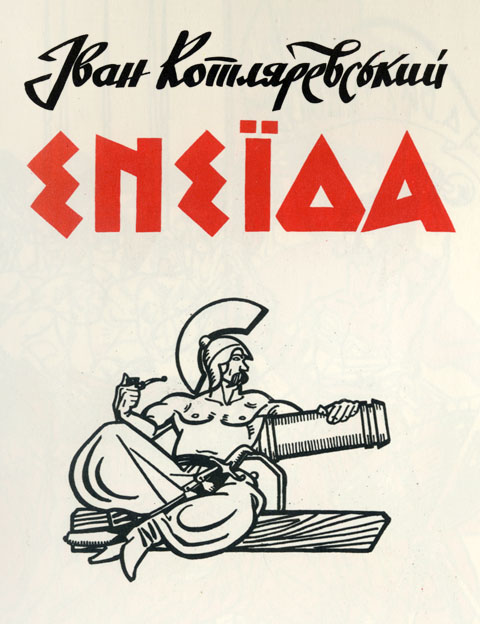
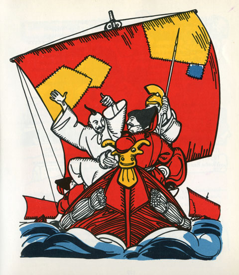
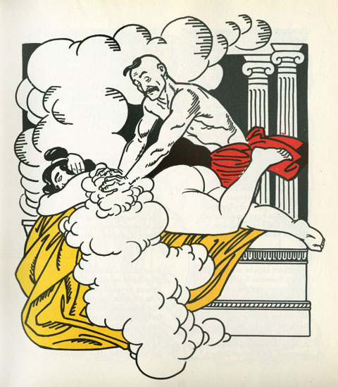
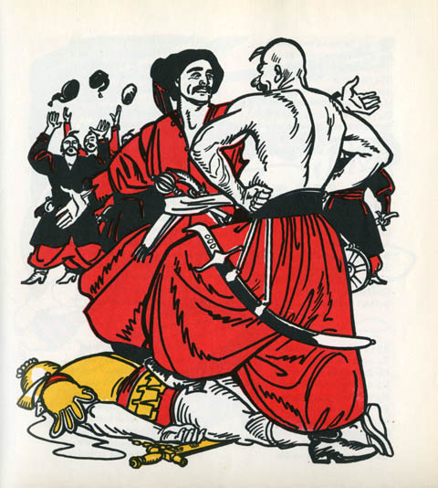
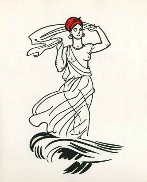
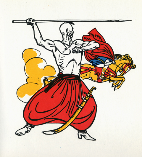
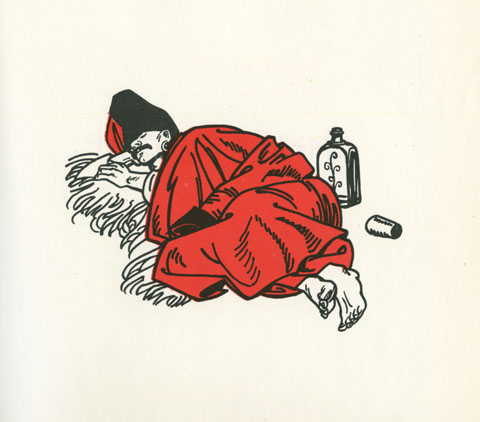
These plates are from an edition of Ivan Kotlyarevsky’s 1798 poem Eneida, a ribald retelling of Virgil’s Aeneid. Kotlyarevsky transposed Aeneas, the Trojans, and Greek mythology into the folklore of Ukrainian Cossacks. It is among the first major works written in Ukrainian, and is a cornerstone of Ukraine’s national literature. Wonderfully, it also defines the very notion of a burlesque – vulgarizing lofty notions like love, family, faith and battle, feigning seriousness in the face of absurdity, and is packed to the gills with slapstick humor, comic skits, bawdy songs, and, natch, healthy portions of friskiness…

This particular version, printed in 1969, in Kiev, Ukraine, is, simply stated, one of the most beautifully designed, illustrated, typeset and produced books I’ve ever seen. Sturdy and stout, clad in a satisfyingly course gray canvas, it opens onto a corker of a title page. From the swashbuckling script of the authors name, the elemental block-y-ness of the title, and the illustration of a muscular and languid Cossack/Trojan, it’s a bravura opening gesture. From there, graphically, the book never flags – block after block of typeset verse on heavy cream paper. But the heart of the book lies in the illustrations, by A. Bazylevych, whose style is a deft hybrid of wood block engravings, thick-lined expressive cartooning, and abstract color blocks.

My recollection of the book from childhood is profoundly visceral. I can recall my father reading vignettes that swirled thrillingly in a noggin already stuffed with mythological adventures. But it’s the illustrations that left an indelible impression. It’s a phantasmagoria of soldiers and sieges, gods and devils, maidens and crones, battles and scraps, feasts and revelries, a cosmos of melodrama. Looking at them again after a span of decades, my recollection is immediate and electric – what’s vital in art, in fiction, and in life seems to spring forth in an exuberant, lusty, unruly parade.