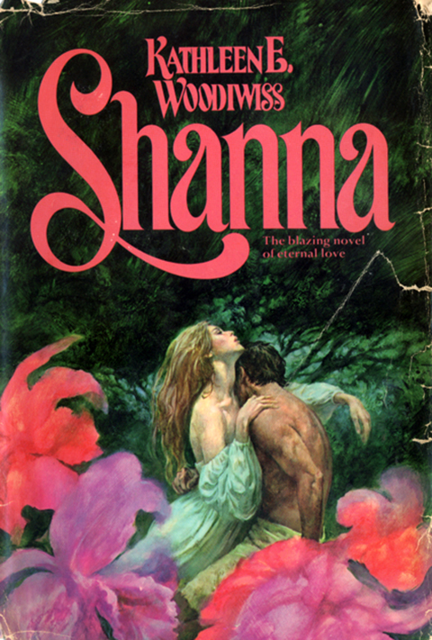
A fine specimen of Trashius Romanticus Novelus, circa 1977, excavated at the Goodwill on Rt. 73 in Maple Shade, New Jersey.
Table of Contents: Design
A fine specimen of Trashius Romanticus Novelus, circa 1977, excavated at the Goodwill on Rt. 73 in Maple Shade, New Jersey.
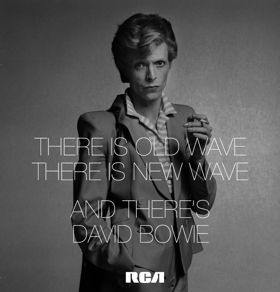
There’s a reason when the news hit that so many of us instinctively reach out and gather our memories of first hearing ChangesOneBowie / Because that wasn’t a record, it was a door. A magic door. Here’s how it was magic. Because if you knocked on it, it opened easily, and you could go in and just boogie. But. But. If you pushed on it just right, if you were bent, just so, you tumbled through — and you never stopped falling. And as you fell, year after year, your freak flag just kept unfurling. And as you fell & flew you wondered — when do I get to the bottom? And there is no bottom. It’s just Bowie all the way down. Today every freak flag flies at half mast. Goodbye David Bowie.

Another lesser known Hipgnosis design that I happened upon when researching the Bad Company Desolation Angeles cover a few posts below. The search begins…

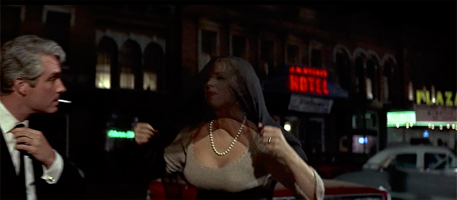
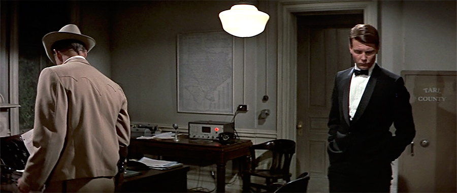
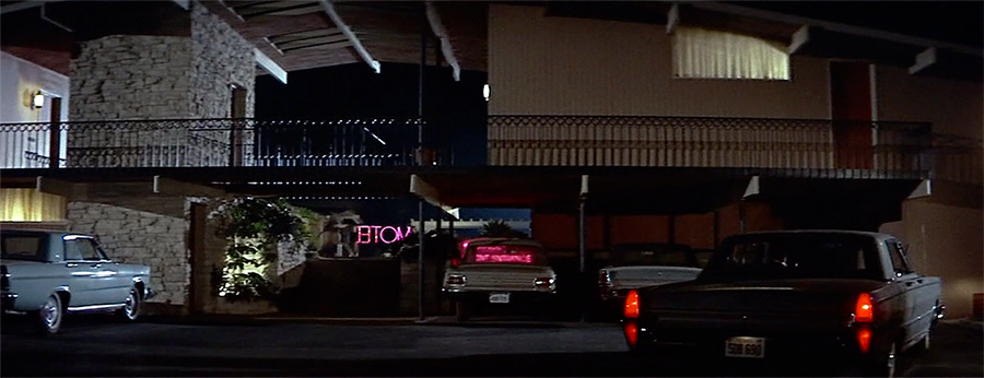
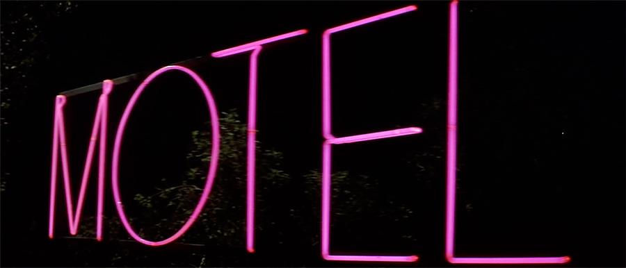
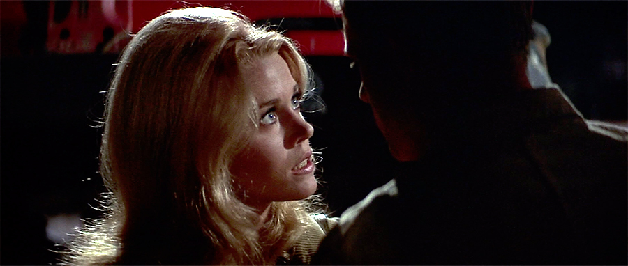
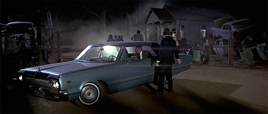
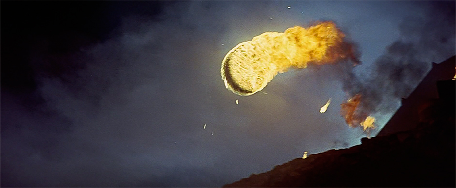
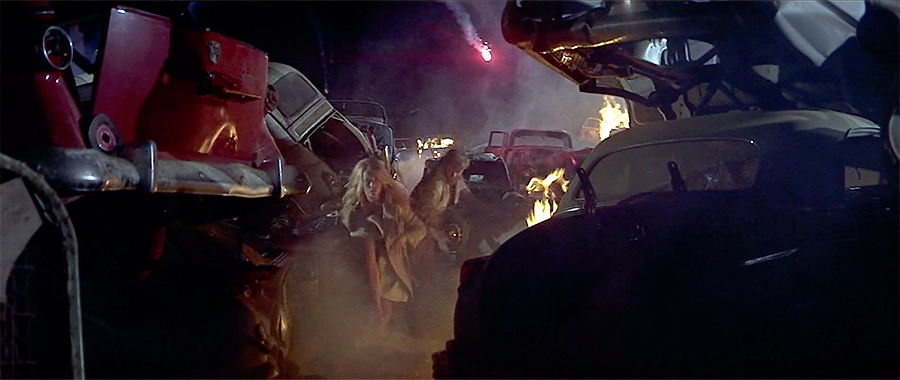
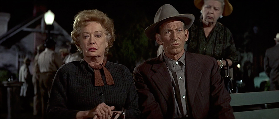
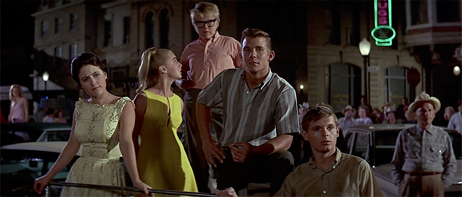
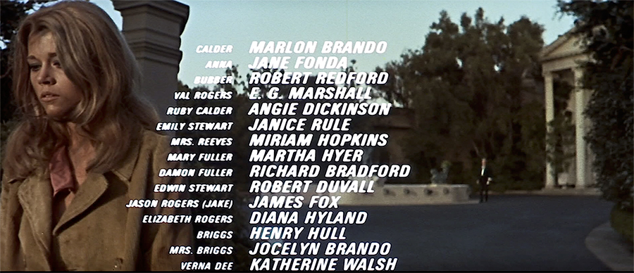
A selection of stills & credits from The Chase a long forgotten overheated soap opera once described as “Peyton Place with guns.” I came across an old review of it in the New Yorker which described it as “ an opulent melodrama, overproduced, over plotted to the point of incoherence and over directed” — like that’s a bad thing. The fact that Jane Fonda had described it as “Barbarella comes to small-town Texas” was just icing. Well worth it, and as the stills show, a handsome affair – shot by Arthur Penn in pop art, hyper composed, oversaturated Technicolor glory. The same could almost be said for deliciously mannered performances by Angie Dickinson, Robert Redford & Robert Duvall. You also get to enjoy the singular spectacle of watching Marlon Brando become less & less & less interested in actually acting at all with every successive scene. Fascinating.
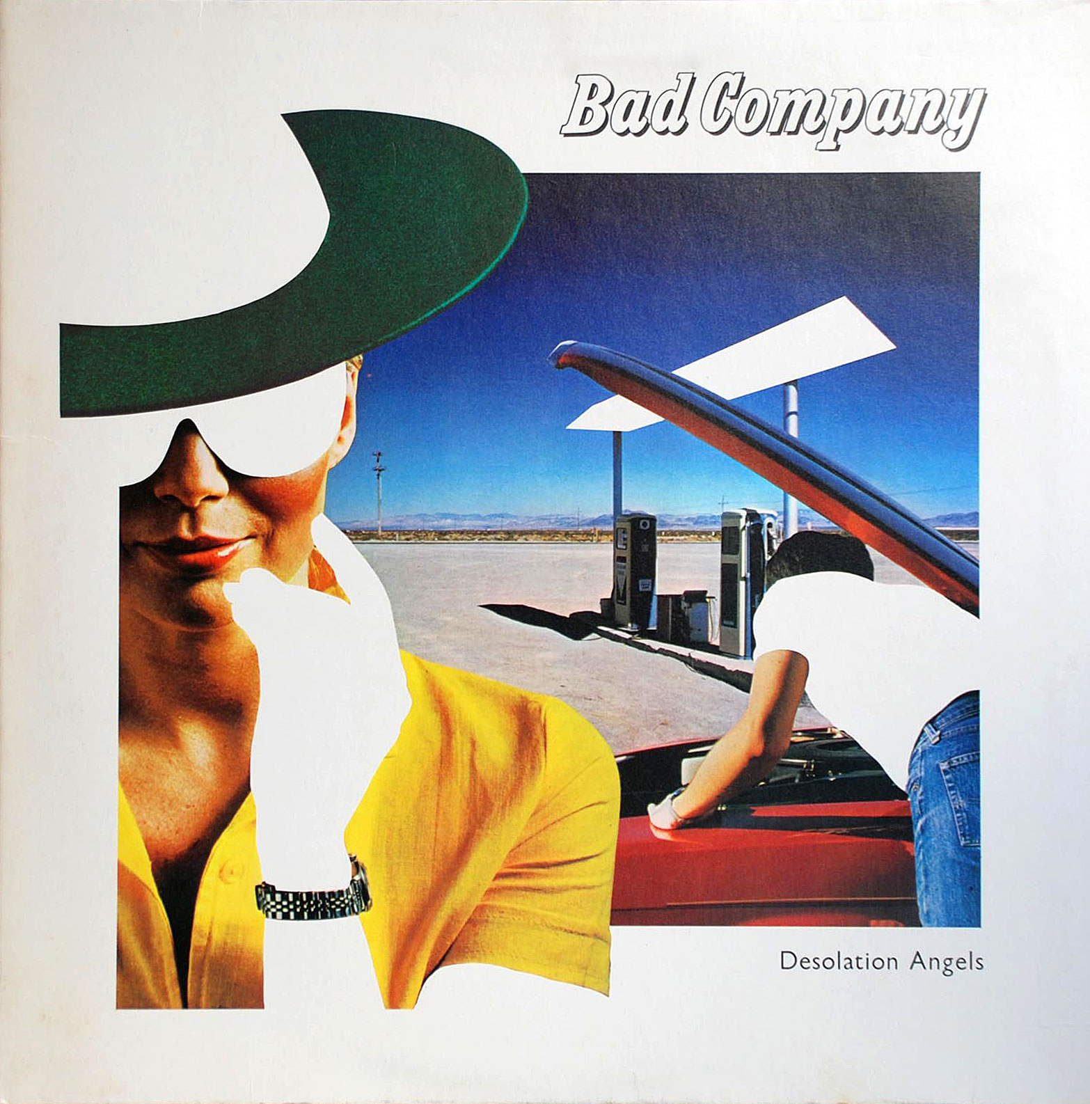

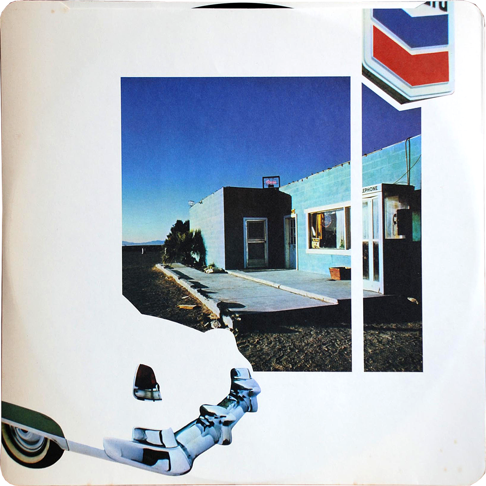
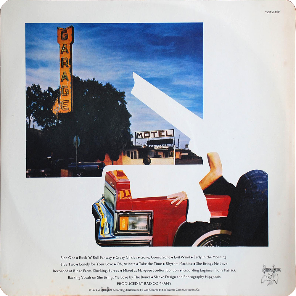
The design group Hipgnosis has been justly & exhaustively feted for thier amazing psychedelic realist album covers for Pink Floyd, Led Zeppelin, and other zonked heavyweights (an amazing gallery here, you could get lost for hours). I had no idea they were behind the artwork for Bad Company’s 1979 record Desolation Angels, which stopped me cold when I was crate digging one afternoon. It was strikingly clever example of that developing 80s graphic sensibility that found its apotheosis in Patrick Nagel’s work for Duran Duran. It has everything to do with the power of stark flat white throwing all other colors into hyper-bright neon-electric contrast — if cocaine could design album covers they would look a lot like this.


[RERUN: Hauling this out of the early days of the blog. I’ve been on a protracted vintage video game and pinball bender lately. Atari’s iPad port of my beloved Tempest is damn near perfect and I’ve been playing it a ton. As such this early appreciation of the stone cold perfection of this game has been on my mind. So, here, then…}
The screen graphics of the classic video game Tempest represent a kind of summit of design and beauty – the finest expression of a very limited language. In the case of Tempest that language was vector based rendering. Vector monitors were used in video games from the mid 70’s to the early 80’s. The technology was derived from oscilloscopes – the image is projected by an electron beam onto the glass. Image a laser light show sped up to produce a lasting image and you’ve got it…
Many classic games were made using this technology – Asteroids and Battlezone as well as the first Star Wars game. While they all had their aesthetic charms, Tempest is in a class of its own. All vector games have a certain elegance and simplicity. The problem order vicodin uk arises in the crudity of the renderings – the poor approximations of tanks, asteroids, and X-wings forever marks these games as primitive gestures of an evolving technology. Tempest is exempt because it is derived from the technology itself. What would a world defined by glowing geometric unshaded lines look like? Pretty much like Tempest.
Its beauty lies in the fact that it is in harmony with its own rules and limits. Hence the extremely elegant compositions – uncrowded, with a well balanced sense of scale. The color scheme is vibrancy itself, strong underlying blues, wonderful pops of pink, green, red, and yellow. And the physics of the electron beams give everything a deep saturated glow.
That same harmony extends to playing the game as well. Most games rely on clumsy and stunted translations of real world movements like running, jumping or flying an ostrich. Tempest moves in accordance with its nature – spinning and firing. That’s what makes it so satisfying. Once you understand its strange parameters you have a complete experience on its terms – a dynamic, I think, that is fundamental to the idea of art.


Some Herman Miller curios… Came across a few of these posters last weekend hanging in a excellent restaurant in Cincinnati. They were from a celebrated series of posters created by Herman Miller designer Steve Frykhom from 1970 to 1989 to announce the company’s yearly staff picnic. It began as an offhand assignment from an executive and Frykhom’s desire to satisfy a screen printing jones. The first salvo won that years AGIA award. In 1980 the Museum of Modern Art added seven posters to its permanent collection. Very few images abound online, the best are these can i buy vicodin in the uk tiny guys from the Herman Miller blog.
Below these are invitations to the 1961 opening of Herman Miller’s short-lived and Textiles & Objects Shop. It was overseen by celebrated designer Alexander Girard. It was a notion well ahead of it’s time – a rigidly curated mix of found objects as well as products and textiles he designed for Herman Miller. Both announcements feature remarkably original design styles that have come to be profoundly influential these days. Again, very little by way of imagery or further history about the shop sloshing around online.


Diagrams and fashion spreads from a book called For you! Girls! published in the Soviet Union in 1965. I found it in a profoundly random box of discarded books and cassettes in the “free trade” corner of a U-Haul self storage warehouse in Philadelphia. It was published by something like the Committee for the Literature for Popular Sciences & Medicine (My Ukrainian provides an imperfect guide to the Russian) It’s a comprehensive guide to the Soviet Girl, with a strange mix of propaganda, health and fitness tips, fashion spreads, and aspirational portraits of female astronauts, seamstresses, soldiers, and miners. Odd, fascinating, unsettling in the soullessness of the sloganeering and the gap between the lightheaded lifestyle spreads and the grey reality of Soviet life… but as often is with this stuff, aesthetically compelling – a mix of constructivist graphics, great type, and high key black and white photography.

This, I covet. It’s the original costume sketch for the Wonder Woman TV series. It was designed and drawn by Donfeld, – Hollywood bon vivant, four time Academy Award nominee for costume design – who’s heyday spanned the 60’s to the 80’s. Besides the costume for Wonder Woman, his other lasting contribution to Western culture was designing Jill St. John’s costumes in Diamonds Are Forever. All this while dedicating himself tirelessly to keeping Jacqueline Bisset looking foxy – a great, great man. Anyway, in 2005 this treasure sold for $2,390 at auction (It was originally inscribed and given by Donfeld to his good friend, actor Richard Chamberlain.) I vow to you, if I ever make my pile, someday this will hang proudly on my wall.


The opening credits of the Avengers in color are deservedly beloved. What struck me recently was how sharp the compositions of the main frames are, though. They make a wonderful sequence – the dirty buy vicodin 750 mg floods of color, the stark contrast, the precision staging of it all. Amazing thing is, even when frozen, they retain a jaunty swagger, the lightly hammy sophistication, and flair.


The stills above are taken from Jean-Luc Godard’s Made in USA. Made in 1966, it was an unauthorized adaptation of Donald Westlake’s the Jugger, featuring the adventures of Parker, a hard-boiled thief – the same character played by Lee Marvin in John Boorman’s 1967 classic Point Blank. (Parker was also recently adapted by Darwyn Cooke in an amazing graphic novel, the Hunter)
The movie is a squirrelly one. On the one hand, visually, it’s perfectly captivating. It is composed like a comic book, all bright colors shot rigidly against stark backgrounds.The stills speak for themselves – Scene after scene, the movie is farrago of pop art, mod fashion, and commercial signage. The dialog could be in Tasmanian and it wouldn’t matter a smidgen – it’s still a flat out sock knocker.
Which it might as well be, because the movie scarcely makes any sense at all. It’s confusing, deadpan, stiff, meandering, and plot-wise, essentially indecipherable. A decoder ring is provided on the Criterion Edition DVD in the form of a short interview with two Godard scholars. According to them, the flick is simultaneously a passionate love letter to, and a fierce rejection of, American films and culture, as well as a record of the disintegration of one of two concurrent love affairs. It is also, obviously, French. Enjoy it any way you see fit.

All designs by the inimitable Peter Sevillle (Factory Records, New Order, OMD, Durutti Column, Ultravox, Duran Duran, King Crmison…) It a’int my manifesto to buy vicodin exactly, but I’m stirred nonetheless by its brash glitz cut with a swoon for the assembly line.