The development of synthetic fabrics is a fascinating nexus of science and culture. Its history weaves through the disparate worlds of industry, warfare, design, advertising, high fashion, and mass consumption. It may be the only product that has profoundly, and equally, affected scientists, generals, housewives, and haute couture designers.
The roots of synthetic fibers lay in Paris, in the late 1700s, at the cusp of a scientific and social revolution. Éleuthère Irénée du Pont de Nemours is working as the assistant to Antoine de Lavoisier, the father of modern chemistry. In addition to his scientific pursuits, Lavoisier is also the administrator of a tax collection company, and up to his neck in the financial and political affairs of the royal French government. As the Revolution rages, Lavoiser’s neck finds itself under the guillotine. Thus abruptly ends the life of quite possibly the smartest man in all of France. Thoroughly freaked out, du Pont packs up and flees to the United States. Landing in Wilmington, Delaware, he founds E. I. du Pont de Nemours and Company, known commonly as the DuPont Company and, based on a knowledge of munitions and chemistry decades ahead of anything in the colonies, becomes an industrial powerhouse.
At the turn of the century, DuPont began experimenting with synthetic polymers. Polymer molecules can be coaxed into an extraordinary array of substances – synthetic rubber, Bakelite, neoprene, PVC, shellac, silicone and, of course, nylon, the first completely synthetic fabric.
The impact of nylon and other synthetics on fashion, warfare, commerce and culture in general is hard to overstate. The introduction of nylon stockings in the ’40s revolutionized the female silhouette and became a mass consumer sensation. The characteristics of nylon proved so useful in military applications like parachutes, tires, tents and ropes, that it was abruptly and completely withdrawn from the consumer market during the Second World War. When it was reintroduced, it promptly overturned silk’s 3000 year stranglehold on luxury, and went on to fundamentally inform the fashion of most every decade that followed: Mass luxury and convenience in the ’50s; space age pop in the ’60s; the leisure vibe of the ’70s; and the athletic glamour of the ’80s.
The full field view of the development of synthetic fabrics is ably told in the engagingly written, lavishly illustrated book Nylon: The Manmade Fashion Revolution by Susannah Handley, published in 1999 by Bloomsbury. Reading it, I found myself drawn to the visual and design legacy of DuPont’s marketing of the fabrics. At the company’s Hagley Museum and Library, a few months later, I discovered what amounted to a core sample of prevailing trends in design, typography, photography and advertising illustration over the decades.
Design for Modern Living
Nylon, Orlon, Dacron, Rayon. Acetate, Teflon, Cordura, Antron. Lycra, Corfam, Taslan, Fabrikoid, Qiana. After a while, the roll call of names begins to take on the weight of poetry. There is so much meaning projected into those names, so much technology, culture, science fiction, science fact, high fashion, mass appeal, new frontier optimism, dependability and sheer wizz-bang newness.
The names become even more evocative when expressed typographically. Fabrickoid has the sturdiness of die stamped metal. Nylon, Dacron, and Orlon evolve from compressed modern type to friendly hand drawn accessibility. Lycra gets all cute as it moves from elegant sleekness to voluptuous roundness. Antron suggests the swashy title of a romance novel, while Qiana recalls the snooty glam chic of Studio 54. Taken together, they seem to tell the story of the the second half of the twentieth century through type alone.
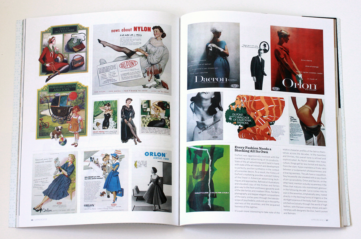
Every Fashion Needs a Stocking All It’s Own
DuPont was aggressively involved with the marketing and advertising of its products. State of the art advertising went hand in hand with state of the art research and development to perfectly position synthetics in the context of consumer desire. As a result, the history of DuPont’s marketing provides a pocket history of the finest in American advertising techniques and approaches. Refined oil illustrations and elevated copy of the ’30s and ’40s give way to the fresh and breezy gouache work of the late ’40s and ’50s. Painterly photography and dapper elegant compositions of the early ’60s pass through the kaleidoscope of psychedelia, and end up in the earthy sexiness of the ’70s, and the lacquered foxiness of the ’80s.
It’s even more interesting to take note of the relative character profiles of the fabrics themselves across the decades. In the ’20s and ’30s the overall tone is refined and sophisticated. As Nylon sweeps into mass culture, things get far less formal and starchy. From the start, Nylon maintains a frisky ratio between a fundamental wholesomeness and a bracing sexiness. The ads have a coquettish, foxy housewife vibe streaked with a racy touch of pin-up sensibility. Orlon and Dacron, on the other hand, maintain a sturdy squareness in the ’50s that matures into mainstream glamour in the ’60s. Lycra comes into its own in the ’70s, emphatically sexy, rooted directly in the fetching forms of lingerie or the skintight essence of the body itself. Qiana was pitched exclusively through the world of high fashion, with Parisian runway shows and partnerships with designers like Dior, Saint Laurent and Balmain.
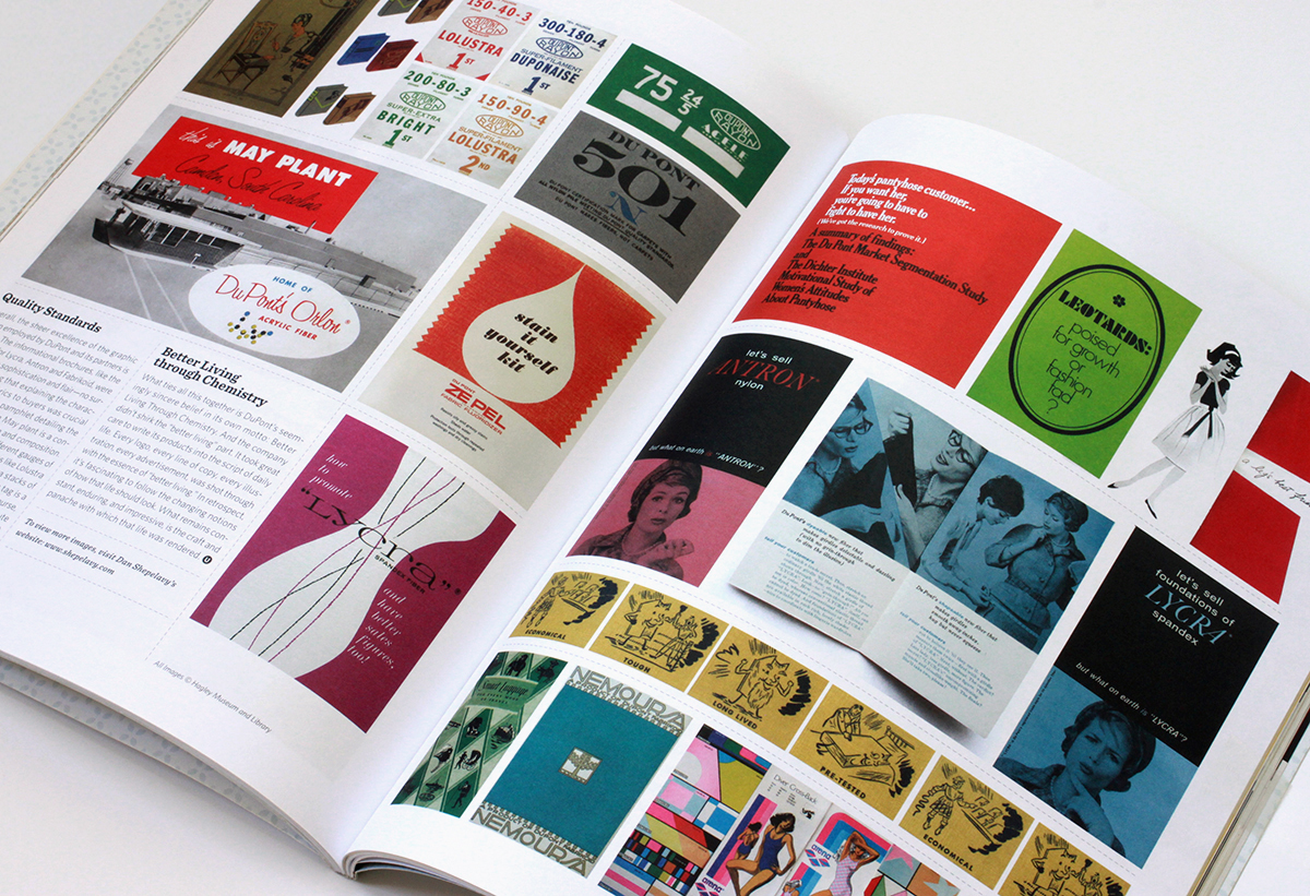
Quality Standards
Overall, the sheer excellence of the graphic design employed by DuPont and its partners is striking. Almost without exception, all the informational brochures, like the ones here for Lycra, Antron and Fabrikoid, were designed with with sophistication and flair – no surprise considering that explaining the characteristics of the fabrics to buyers was crucial to their success. The pamphlet detailing the Camden South Carolina May plant is a concise model of ’50s design and composition. The spot color tags for the different gauges of Rayon fabric, with fabulous names like Lolustra and Duponaise, are tight little Jenga stacks of type. And the “501” quality inspection tag is a veritable poem of typesetting. Then, of course, there is the very idea of the Dichter Institute Motivation Study of Women’s Attitude’s About Pantyhose. Who says advertising doesn’t contribute mightily to how we understand ourselves and our world? That handy tome, I’m sure, borders on philosophy.
Better Living Through Chemistry
What ties all this together is DuPont’s seemingly sincere belief in its own motto: Better Living Through Chemistry. And the company didn’t shirk the “better living” part. It took great care to write its products into the script of daily life. Every logo, every line of copy, every illustration, every advertisement, was shot through with the essence of “better living”. In retrospect, it’s fascinating to follow the changing notions of how that life should look. What remains constant, enduring, and impressive, is the craft and panache with which that life was rendered.
All images © Hagley Museum / DuPont. Used with permission.