
Index: Record Cover Design
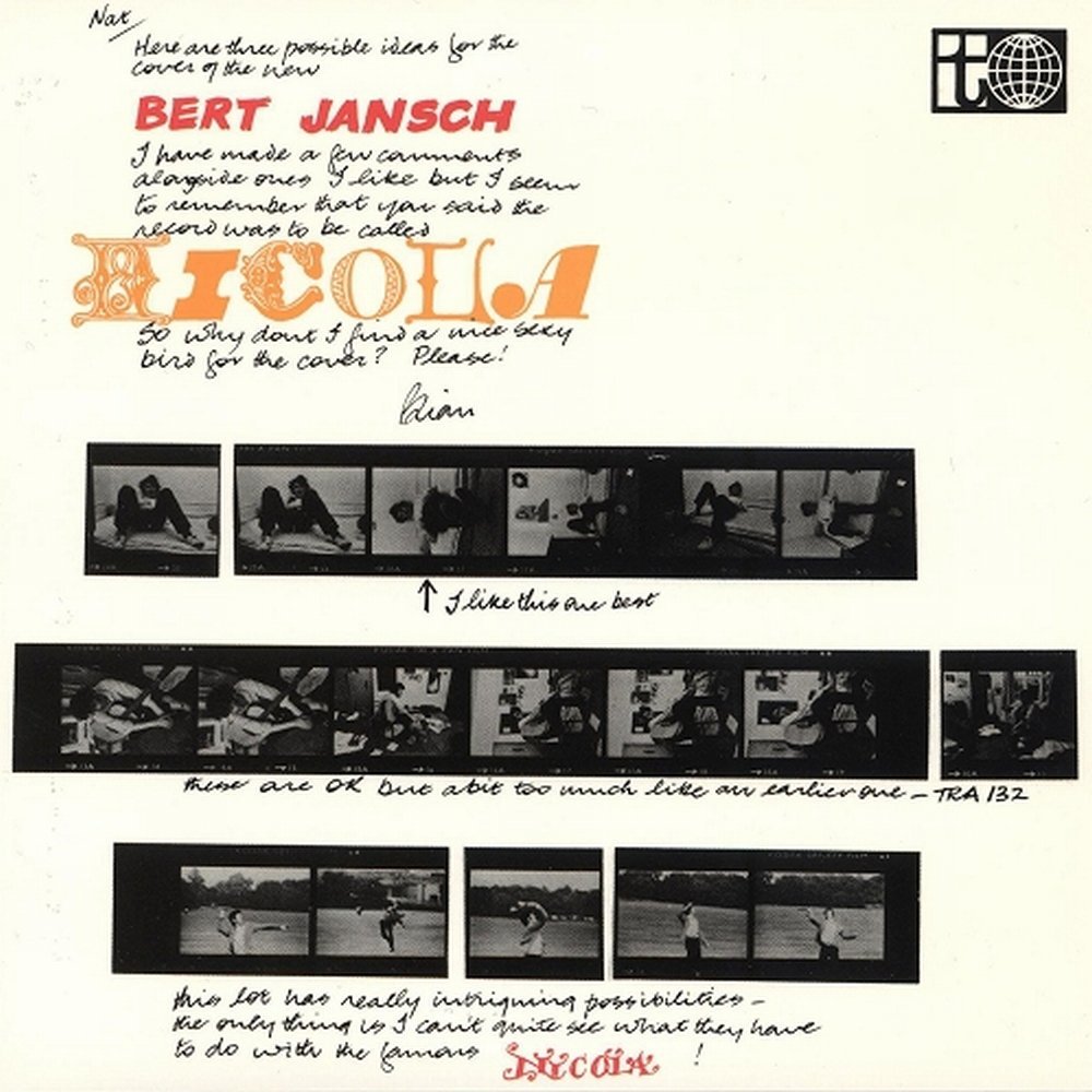
Was poking around the internet looking for a hi-res cover for this Bert Jansch double album I was digitizing. On the original twofer CD it was the size of a postage stamp. Gorgeous piece of work when you can really take it all in, no?

Another lesser known Hipgnosis design that I happened upon when researching the Bad Company Desolation Angeles cover a few posts below. The search begins…
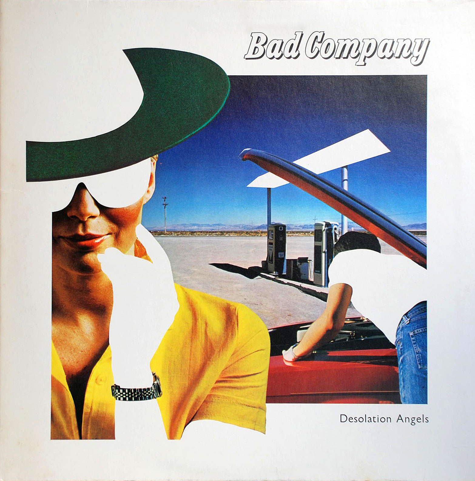

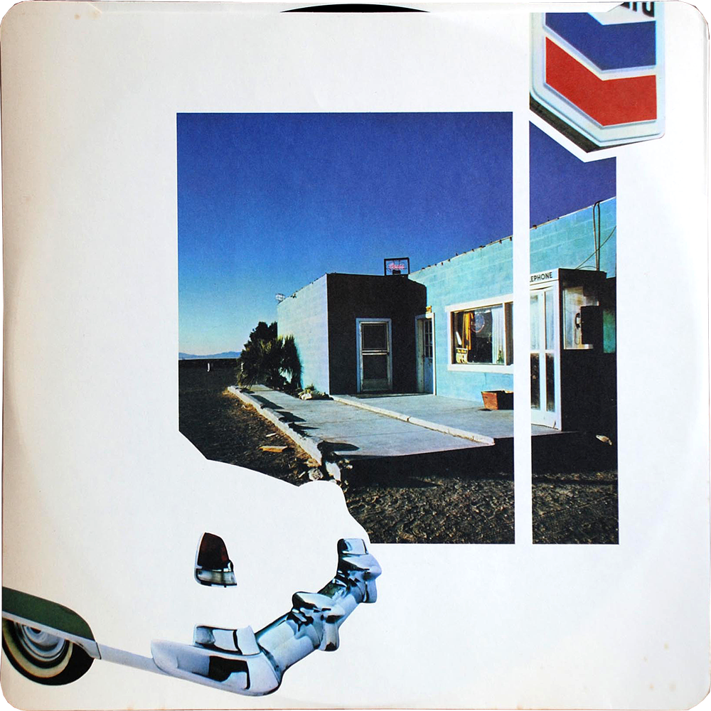
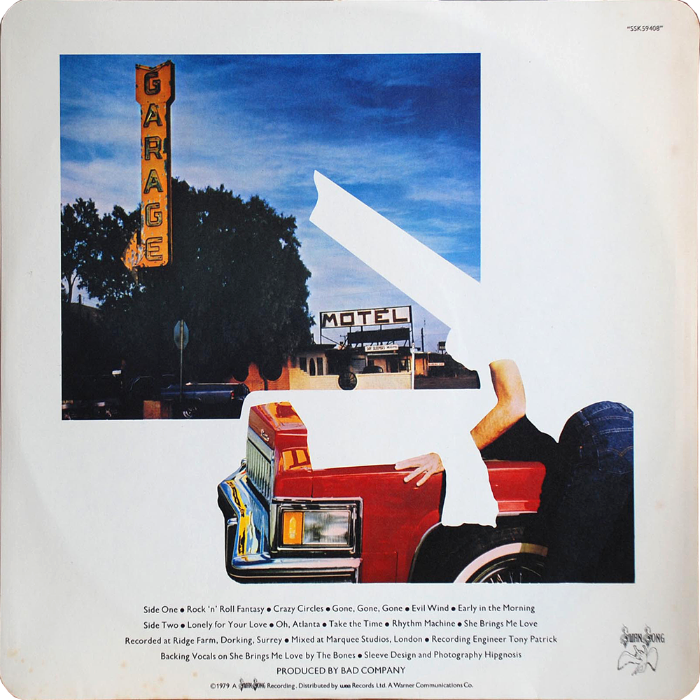
The design group Hipgnosis has been justly & exhaustively feted for thier amazing psychedelic realist album covers for Pink Floyd, Led Zeppelin, and other zonked heavyweights (an amazing gallery here, you could get lost for hours). I had no idea they were behind the artwork for Bad Company’s 1979 record Desolation Angels, which stopped me cold when I was crate digging one afternoon. It was strikingly clever example of that developing 80s graphic sensibility that found its apotheosis in Patrick Nagel’s work for Duran Duran. It has everything to do with the power of stark flat white throwing all other colors into hyper-bright neon-electric contrast — if cocaine could design album covers they would look a lot like this.

All designs by the inimitable Peter Sevillle (Factory Records, New Order, OMD, Durutti Column, Ultravox, Duran Duran, King Crmison…) It a’int my manifesto to buy vicodin exactly, but I’m stirred nonetheless by its brash glitz cut with a swoon for the assembly line.


So, recently I was over in Sweden visiting IKEA HQ (more on that, later-ish…) IKEA is located in Älmhult, a small picture postcard of a town. Quaint cobblestone square anchored by statue of Carl Linnaeus (you remember Linnaean taxonomy, yes? — three kingdoms, divided into classes, orders, families, genera, and species, eighth grade or so, feathered hair, Toughskins jeans, 3/4 black sleeved Cars T-shirt…sorry, pardon my corduroy reverie…)
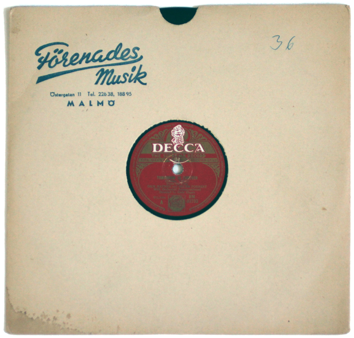
Anyway, I’m wandering around and happen upon a gas station / burger & ice cream hut / thrift store (!) where, between fan belts, spark plugs, a row of swedish potboilers, needlepoint, and axel grease, I spot these 10″ records in a crate.
What a score! Each one of these Swedish type compositions is gorgeous — and each anchored by a contrastingly dense, filagreed record label. Häftigt!


In retrospect, the album cover designs of the early releases by Public Image Limited constitute one hell of a brilliant run. By his own admission John Lydon’s music has been basically a big conceptual media prank, playing with, subverting, and looting the whole notion of the public image. Therefore it’s no surprise that packaging and design figured so heavily in his work from the very beginning.
Arguably British tabloids were the closest things in the cultural landscape, both aesthetically and attitudinally, to punk rock, so it was fitting that Never Mind The Bollocks was designed like a cross between a tabloid and a ransom note (which, incidentally is an apt description of the record itself.)
With Public Image Limited, those influences and themes became more sophisticated and overt. The mock slick magazine design of the debut was an ironic riposte to the expected image of Lydon as a young savage. This was followed by the unprecedented, and justly celebrated, configuration of 1980’s Metal Box – 3 12inch singles in a, um, metal box. After that came the aggressively sexy glamorous cover for 1981’s Flowers of Romance. Among other things, it strikingly prefigures the the snapshot aesthetic of current fashion and nightlife photographers like Nikola Tamindzic and, ugh, that skeezy doofus Terry Richardson. The sleeper of the bunch is the cover of 1983’s cynically bland cash-in Live in Tokyo – shot and composed perfectly. Dig the way the commercial riot of neon signage converges and perfectly frames the iconic PiL logo, interrupted only briefly by Lydon’s fab shiny suit.
What ties it all together is the same tension that animates the music – a constant flickering between art and commerce, sincerity and fakery, and, ultimately, what is false and worthless and what is true and enduring.
Public Image Limited: Public Image: [download]
Public Image Limited: Careering (astonishing BBC version): [download]


A boxed record set spotted in a motley pile at the Cackleberry Farm Antique Mall in Paradise, PA… Funny, Swing has always struck me as hopelessly wacka wacka, a square pantomime of exuberance and abandon – but this New Wave Cinema poster style composition and the freeze frame cutouts invest them with a crackling energy and style… a sock hop away from the iconic poster for Antonioni’s Blow Up and a frug and a boogie-woogie away from Robert Longo’s skinny tie 80′s series Men in the Cities, about which I’m reposting, below.

Everything I love about the legendary Chicago band Naked Raygun is embedded somewhere on this, the cover of their latest 7.” A foxy cat-suited astro-cutie making a space jump while trailing a 50’s era satellite is not only awesomeness incarnate, it’s a great distillation of the whole Naked Raygun vibe.
Raygun filtered basic anxieties through the context of their cultural obsessions: comics (esp. Batman,) post apocalyptic movies, cold war espionage, car mechanics, and oddball dictators, to name a few at random. The result was muscular, brainy and cool and it extended to every facet of the band – amazing songs, striking album art, and effortless swagger & charisma (plus one of the great logos in rock – that raygun-R is the only tattoo I’ve seriously considered.) Recording again after close to a decade, it’s easily my favorite record art of the year, and a most welcome return.
Naked Raygun: Just for Me (B-Side) [download]


What dandy cover art! With Cluster, it is the wonderfully plump, shiny, hand wrought type. It actually looks frosted – perfect considering Zuckerzeit is German for sugary. The Cure’s Three Imaginary Boys cover is dead on deadpan pop art. Both covers embody perfectly their respective contents – Cluster’s warm, gently insistent, pulsing analog electronics feel practically glazed in liquid sugar. As for the Cure, it captures the detached, nervous, pop vibe that lasted for one only odd and awesome record (and it’s American counterpart Boys Don’t Cry) before all the gloomy gloom…

Score! Boundless delights here – from the great spy, bossa nova soundtrack (with a killer Shirley Bassey vocal, check the opening credits here), to the cover collage itself (by pulp, buy vicodin in the uk movie poster and advertising art titan Bob Peak.) The movie itself, a second rate In Like Flint like spy spoof, so far has proved elusive….