Index: Apple //


Insanely Great

Steve Jobs changed my life three times. In 1982 the Apple II was the tractor beam (along with D&D) that pulled me into my first encounter with counterculture – the edges of the assembly language writing, phone-phreaking, copy protection cracking, dip switch flicking homebrew computer scene. It was the first time I really discovered something covert in culture. It was electric.

In 1985 I went for a routine visit to the Computer Connection outside of Albany, NY. There I saw a strange looking beige appliance looking thing. I remember, vividly, seeing a “folder” dragged into the “trash” with a “mouse.” And MacPaint. The Macintosh was the tool I would end up making my living on over the past 18 years.

My affection for older household appliances and everyday objects comes from the fact that I genuinely think they were far more attractive back then. You could sense aesthetics as a fundamental part of their design. They were also, in many cases, incredibly well manufactured. Nowadays, Apple’s products are among the few heirs to that tradition. I use them everyday to work, to read, to talk to people, to listen to music, to relax, and to look up how Nigella Lawson would make scampi with anchovies.

It’s woven up in who I am, what I do and how I live. Thanks Steve.
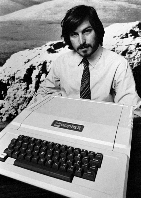
The Seventies-ness-ness of the Apple //

Recently I had to decide whether to discard my Apple //e, and found I absolutely couldn’t bear to part with it. Rather, I pulled its disparate components off storage shelves and out of boxes, dusted them off and reassembled it. Something about reconstituting it made me bond with it all over again… Then, just the other night, snowed in by a blizzard, I was watching Royal Tennenbaums for the nth time and noticed among all the other 70s bric-a-brac, an Apple //.

I know it’s playing footsie with the obvious, but it’s worth remembering what an essential artifact of 70’s design the Apple // really is.  Its introductory advert from 1977 captures that perfectly. Look at the context… It’s not set up in an office but on the wood table of a modern kitchen. It’s not stacked like a Hi-Fi system or a fused one-piece like an ordinary computer terminal. It’s spread out like a split level contemporary house. The severe contrasting angles of the case evoke 70’s architecture and furniture design much more than anything especially technological. (It shares this look with some of the better designed calculators of the period – which makes sense, given they first embodied the notion of a computer as a home appliance) The distinct beige putty color leans in nicely against the saturated, plush colors of the era – the ochres, purples, oranges and red browns. In short, the Apple // represents the hight of then-contemporary suburban design – which is why it looks just at home in the Wes Anderson’s idealized 70’s diorama as Bill Murray’s purple turtleneck and burnt sienna blazer.