
A quick, sketchy thing, based on an old Helena Rubenstein ad, painted in gouache, on 100 year old ledger paper from an evening business college that was based in Camden, NJ. (psst… this ditty’s part of the art sale, here.)
Table of Contents: Fashion
A quick, sketchy thing, based on an old Helena Rubenstein ad, painted in gouache, on 100 year old ledger paper from an evening business college that was based in Camden, NJ. (psst… this ditty’s part of the art sale, here.)


In their radness, these covers speak for themselves. What’s striking is that what they had to say was once http://laparkan.com/buy-tadalafil/ considered, while sophisticated, utterly mainstream. Oh well… just another thing to blame on the Beatles I guess…

Barbados teams with Darlene Swimwear, circa 1966, to make a level-headed, brass-tacks case for increased tourism to this picturesque island nation. Strange thing is, on closer reading, the text is a little fractured, off kilter – taking on, nearly, the cadence of verse. So here, in the spirit of summer, for your pleasure, a bit of found doggerel:
DO DO BARBADOS
Darlene does two piece for the show
at Silver Sands Beach.
Beautiful Ban-Lon
with crochet trim and boy leg.Baby pink,
Lemon,
Turquoise,
Black.Sizes 8 to 16
Do Do Barbados
Sun ceilinged, sea surrounded.
West Indian place
of happy exile.Fly BWIA
the airline of the CaribbeanA round of happy smiles
pipes you aboard.
In little less than five friendly hours
you start your island affair
with the idol of the West Indies.For flight information see your travel agent.


Stills from the 1967 mod-noir detective flick Tony Rome, starring Frank Sinatra. As a caper the movie is solid if a bit by the numbers. As eye candy, though, it’s a glazed treat. Sinatra struts though the movie dressed basically like the old I.R.S. records logo – the contrast of his black suit and fedora with the sun addled Miami backdrops is one of the movie’s chief visual order vicodin online reviews pleasures. Adding to the decor are a scrumptious Jill St. John and the fabled Fontainebleau Hotel and Casino (which was also memorably featured in Goldfinger.) The title song is a decent fuzzy lounge swinger by Nancy Sinatra and Lee Hazlewood. It was followed by the solid, if slightly shabbier sequel, Lady in Cement, with Raquel Welch providing the ornamentation and Hugo “Moogy-Moog” Montenegro providing the stellar soundtrack.


From 1915 till about 1940 or so, the Brinkley Girl cut a feverish swath through the cultural imagination. As drawn by illustrator Nell Brinkley, she was like the Gibson Girl on an absinthe bender – exuberant line, riots of splashy color, and buckets of joie de vivre. Girls obsessed over her adventures, hairstyles and fashion shifted in her wake, and she was feted in songs, films and theater.
Nell Brinkley’s specialty was the episodic themed series. Golden Eyes and Her Hero followed our heroine’s exploits and derring-do during World War One. Betty and Billy and Their Love Through the Ages, my personal favorite, featured a besotted glamorous couple in various romantic historical vignettes – intrigue in Southern plantation society, among Medieval troubadours, Phoenician swashbucklers, etc… The format begins to open up in the 20’s with sophisticated frothy flapper larks like the Fortunes of Flossie.
Fantagraphics Book’s wonderful new survey, The Brinkley Girls, collects these series and more, along with a fascinating introduction by the book’s editor, Trina Robbins. Aces.

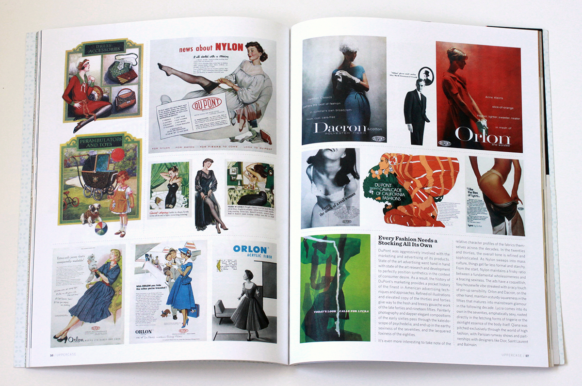
The development of synthetic fabrics is a fascinating nexus of science and culture. Its history weaves through the disparate worlds of industry, warfare, design, advertising, high fashion, and mass consumption. It may be the only product that has profoundly, and equally, affected scientists, generals, housewives, and haute couture designers.
The roots of synthetic fibers lay in Paris, in the late 1700s, at the cusp of a scientific and social revolution. Éleuthère Irénée du Pont de Nemours is working as the assistant to Antoine de Lavoisier, the father of modern chemistry. In addition to his scientific pursuits, Lavoisier is also the administrator of a tax collection company, and up to his neck in the financial and political affairs of the royal French government. As the Revolution rages, Lavoiser’s neck finds itself under the guillotine. Thus abruptly ends the life of quite possibly the smartest man in all of France. Thoroughly freaked out, du Pont packs up and flees to the United States. Landing in Wilmington, Delaware, he founds E. I. du Pont de Nemours and Company, known commonly as the DuPont Company and, based on a knowledge of munitions and chemistry decades ahead of anything in the colonies, becomes an industrial powerhouse.
At the turn of the century, DuPont began experimenting with synthetic polymers. Polymer molecules can be coaxed into an extraordinary array of substances – synthetic rubber, Bakelite, neoprene, PVC, shellac, silicone and, of course, nylon, the first completely synthetic fabric.
The impact of nylon and other synthetics on fashion, warfare, commerce and culture in general is hard to overstate. The introduction of nylon stockings in the ’40s revolutionized the female silhouette and became a mass consumer sensation. The characteristics of nylon proved so useful in military applications like parachutes, tires, tents and ropes, that it was abruptly and completely withdrawn from the consumer market during the Second World War. When it was reintroduced, it promptly overturned silk’s 3000 year stranglehold on luxury, and went on to fundamentally inform the fashion of most every decade that followed: Mass luxury and convenience in the ’50s; space age pop in the ’60s; the leisure vibe of the ’70s; and the athletic glamour of the ’80s.
The full field view of the development of synthetic fabrics is ably told in the engagingly written, lavishly illustrated book Nylon: The Manmade Fashion Revolution by Susannah Handley, published in 1999 by Bloomsbury. Reading it, I found myself drawn to the visual and design legacy of DuPont’s marketing of the fabrics. At the company’s Hagley Museum and Library, a few months later, I discovered what amounted to a core sample of prevailing trends in design, typography, photography and advertising illustration over the decades.
Design for Modern Living
Nylon, Orlon, Dacron, Rayon. Acetate, Teflon, Cordura, Antron. Lycra, Corfam, Taslan, Fabrikoid, Qiana. After a while, the roll call of names begins to take on the weight of poetry. There is so much meaning projected into those names, so much technology, culture, science fiction, science fact, high fashion, mass appeal, new frontier optimism, dependability and sheer wizz-bang newness.
The names become even more evocative when expressed typographically. Fabrickoid has the sturdiness of die stamped metal. Nylon, Dacron, and Orlon evolve from compressed modern type to friendly hand drawn accessibility. Lycra gets all cute as it moves from elegant sleekness to voluptuous roundness. Antron suggests the swashy title of a romance novel, while Qiana recalls the snooty glam chic of Studio 54. Taken together, they seem to tell the story of the the second half of the twentieth century through type alone.
Every Fashion Needs a Stocking All It’s Own
DuPont was aggressively involved with the marketing and advertising of its products. State of the art advertising went hand in hand with state of the art research and development to perfectly position synthetics in the context of consumer desire. As a result, the history of DuPont’s marketing provides a pocket history of the finest in American advertising techniques and approaches. Refined oil illustrations and elevated copy of the ’30s and ’40s give way to the fresh and breezy gouache work of the late ’40s and ’50s. Painterly photography and dapper elegant compositions of the early ’60s pass through the kaleidoscope of psychedelia, and end up in the earthy sexiness of the ’70s, and the lacquered foxiness of the ’80s.
It’s even more interesting to take note of the relative character profiles of the fabrics themselves across the decades. In the ’20s and ’30s the overall tone is refined and sophisticated. As Nylon sweeps into mass culture, things get far less formal and starchy. From the start, Nylon maintains a frisky ratio between a fundamental wholesomeness and a bracing sexiness. The ads have a coquettish, foxy housewife vibe streaked with a racy touch of pin-up sensibility. Orlon and Dacron, on the other hand, maintain a sturdy squareness in the ’50s that matures into mainstream glamour in the ’60s. Lycra comes into its own in the ’70s, emphatically sexy, rooted directly in the fetching forms of lingerie or the skintight essence of the body itself. Qiana was pitched exclusively through the world of high fashion, with Parisian runway shows and partnerships with designers like Dior, Saint Laurent and Balmain.
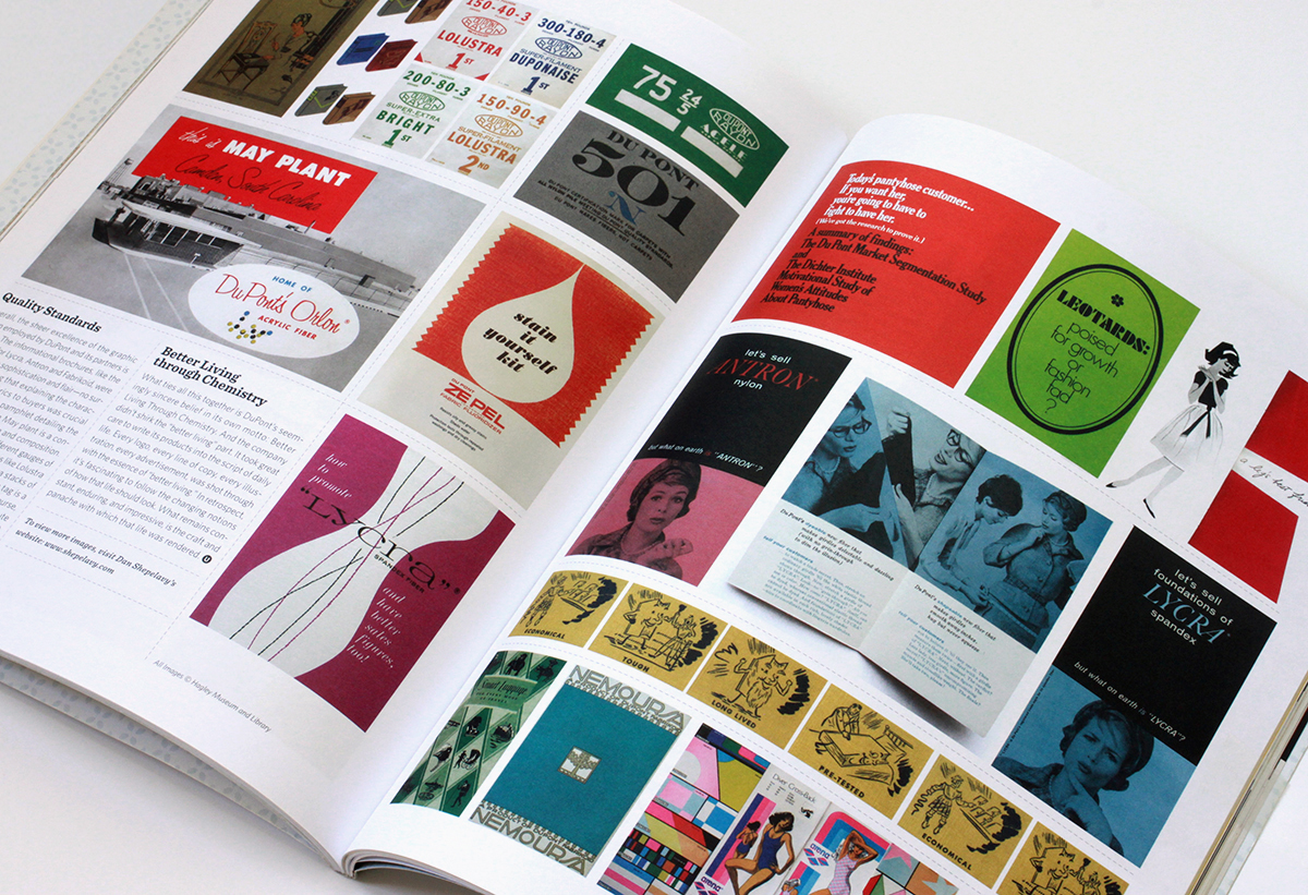
Quality Standards
Overall, the sheer excellence of the graphic design employed by DuPont and its partners is striking. Almost without exception, all the informational brochures, like the ones here for Lycra, Antron and Fabrikoid, were designed with with sophistication and flair – no surprise considering that explaining the characteristics of the fabrics to buyers was crucial to their success. The pamphlet detailing the Camden South Carolina May plant is a concise model of ’50s design and composition. The spot color tags for the different gauges of Rayon fabric, with fabulous names like Lolustra and Duponaise, are tight little Jenga stacks of type. And the “501” quality inspection tag is a veritable poem of typesetting. Then, of course, there is the very idea of the Dichter Institute Motivation Study of Women’s Attitude’s About Pantyhose. Who says advertising doesn’t contribute mightily to how we understand ourselves and our world? That handy tome, I’m sure, borders on philosophy.
Better Living Through Chemistry
What ties all this together is DuPont’s seemingly sincere belief in its own motto: Better Living Through Chemistry. And the company didn’t shirk the “better living” part. It took great care to write its products into the script of daily life. Every logo, every line of copy, every illustration, every advertisement, was shot through with the essence of “better living”. In retrospect, it’s fascinating to follow the changing notions of how that life should look. What remains constant, enduring, and impressive, is the craft and panache with which that life was rendered.
All images © Hagley Museum / DuPont. Used with permission.


Every Monday could use a little Nomi! (Nomi? huh? click here.) Herewith, please find, for your charmed enjoyment, these rather fab Klaus Nomi collages by Hormazd Narielwalla. His works mixes fashion sketches and photos clippings along with bits of bespoke Saville Row paper patterns – stylish and whimsical. More of his work here. (spotted at Madame Says, a confectionery cavalcade of fashion, art and music. Visit often.)


A small selection of ephemera used to market DuPont’s’s Lycra Spandex fabric from the late 60’s into the late 70’s…. These are taken from an article I’m writing for Uppercase Magazine. It’s a visual survey of the design and aesthetics of DuPont’s marketing of synthetic fabrics from the 1920’s to the early 80’s.
The history of the development of synthetic fabrics is a fascinating nexus of science, industry, design, advertising, fashion and culture. In turn, the same goes for focusing specifically on the marketing and promotion of the fabrics themselves. It is a rich core sample of prevailing trends in design, typography, advertising illustration and photography, etc over the decades. Anyway, while putting the piece together I was especially buy vicodin portland charmed by the different modes and looks behind Lycra… not to mention being sent into sheer nostalgic tizzy over the very idea of the Dichter Institute Motivation Study of Women’s Attitude’s About Pantyhose. Who says advertising doesn’t contribute mightily to how we understand ourselves and our world? I’m sure that handy tome borders on philosophy….
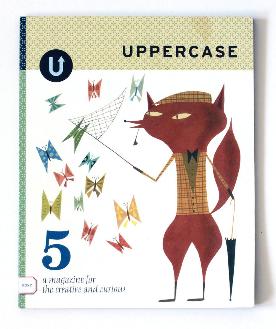
Anyway – the article will be in the fifth issue of Uppercase Magazine. A few more previews to come. Stay tuned, etc.. (If Uppercase Magazine is unfamiliar to you, well then, get yourselves over to here for a gander. A lovingly assembled magazine about beauty squirrelled away in the nooks of the everyday…My full mash note to its awesomeness is here.)

Recently I had to decide whether to discard my Apple //e, and found I absolutely couldn’t bear to part with it. Rather, I pulled its disparate components off storage shelves and out of boxes, dusted them off and reassembled it. Something about reconstituting it made me bond with it all over again… Then, just the other night, snowed in by a blizzard, I was watching Royal Tennenbaums for the nth time and noticed among all the other 70s bric-a-brac, an Apple //.
I know it’s playing footsie with the obvious, but it’s worth remembering what an essential artifact of 70’s design the Apple // really is. Its introductory advert from 1977 captures that perfectly. Look at the context… It’s not set up in an office but on the wood table of a modern kitchen. It’s not stacked like a Hi-Fi system or a fused one-piece like an ordinary computer terminal. It’s spread out like a split level contemporary house. The severe contrasting angles of the case evoke 70’s architecture and furniture design much more than anything especially technological. (It shares this look with some of the better designed calculators of the period – which makes sense, given they first embodied the notion of a computer as a home appliance) The distinct beige putty color leans in nicely against the saturated, plush colors of the era – the ochres, purples, oranges and red browns. In short, the Apple // represents the hight of then-contemporary suburban design – which is why it looks just at home in the Wes Anderson’s idealized 70’s diorama as Bill Murray’s purple turtleneck and burnt sienna blazer.


These caricatures by Tom Wolfe are excerpted from In Our Time, an illustrated patchwork of essays, observations and commentary. The jacket flap copy, while a bit foofy, is dead on – the book recalls “the palmy days when social caricature flourished in the great European satirical magazines Simplicissimus and L’Assiette au Beurre. His eye for the costumery and gesture of the moment is often as telling as his Pantagruelian appetite for the zaniness of the second half of the twentieth century, which he regards as America’s “Elizabethan period, her Bourbon Louis romp, her season of rude animal health and rising sap!” The drawings are mixed from the same ingredients as the writing: A strong base of precise observation, a jigger of affection, a generous pour of smug, swirled and served with verve and flair.


The stills above are taken from Jean-Luc Godard’s Made in USA. Made in 1966, it was an unauthorized adaptation of Donald Westlake’s the Jugger, featuring the adventures of Parker, a hard-boiled thief – the same character played by Lee Marvin in John Boorman’s 1967 classic Point Blank. (Parker was also recently adapted by Darwyn Cooke in an amazing graphic novel, the Hunter)
The movie is a squirrelly one. On the one hand, visually, it’s perfectly captivating. It is composed like a comic book, all bright colors shot rigidly against stark backgrounds.The stills speak for themselves – Scene after scene, the movie is farrago of pop art, mod fashion, and commercial signage. The dialog could be in Tasmanian and it wouldn’t matter a smidgen – it’s still a flat out sock knocker.
Which it might as well be, because the movie scarcely makes any sense at all. It’s confusing, deadpan, stiff, meandering, and plot-wise, essentially indecipherable. A decoder ring is provided on the Criterion Edition DVD in the form of a short interview with two Godard scholars. According to them, the flick is simultaneously a passionate love letter to, and a fierce rejection of, American films and culture, as well as a record of the disintegration of one of two concurrent love affairs. It is also, obviously, French. Enjoy it any way you see fit.


Another recent discovery at the Isabella Gardner Museum was the work of Leon Bakst. Bakst began his career as an illustrator, but quickly gained a reputation as a formidable painter and designer. He is best known, however, for his work in the theatre. He began a collaboration with Serge Diaghilev, the Russian art critic and founder of the Ballets Russes designing costumes and sets. By the time he became the artistic director of the Ballets Russes he was internationally famous.
That I saw his work at all at the Gardner is a blogament to their graphic power. Two small costume sketches leapt out from the top row of a dense grid of perhaps 50 small sketches and engravings that spanned from floor to ceiling. A potent mix of Slavic motifs, exuberant patterns, and fluid gestural drawing, their presence belied their tiny scale. Bakst’s versatility is tremendous – vivid and impressionistic set paintings, exquisitely sensitive drawings, and moody, stylish paintings and illustrations. The most comprehensive survey of his work, Leon Bakst: Set and Costume Designs, Book Illustrations, Paintings and Graphic Works by Irina Pruzhan is out of print, but available.


Jean-Gabriel Domergue – Came across this dandy cat’s work in a survey of art deco illustrators. The appeal lies in the mix of foxiness, style, and flamboyant draftsmanship. Also, they evoke many appealing associations: Degas, the decadent verve of Parisian poster art, and the lux, velvety pin up art of Rolf Armstrong.
Details are sketchy. He studied under Giovani Boldini, was a coveted society painter, organized many famous how to buy vicodin on the street Parisian galas and soirees, designed couture fashion, and was the curator of the Jacquemart-André Museum – a man of his time having the time of his life. Galerie de Souzy has some biographical information and offers some of his lesser work for sale. There is a small museum at his family estate in Cannes. The monograph Jean-GabrielDomergue, l’art et la mode by Gérard-Louis-Soyer is hopelessly scarce.

What a dandy little art book/scene document/memento thingy. Maripolarama is a collection of Polaroids taken in the late 70’s and early 80’s by Maripol. Her (single – natch) name contains a multitude of très fabuloso personas: Model; art director for quintessential 80’s designer Fiorucci; Madonna’s friend and her stylist during the original, classic, “Like a Virgin” period (we have her to thank for the rubber bracelets); producer of the legendary new wave art scene flick Downtown 81; and on, and on… she’s less a person that the essence of the New York post punk new wave fashion scene in human form.
Maripolorama is her raw candid, exuberant diary. It’s not really who’s in it that makes it so compelling, though. It’s how young and unguarded everyone is, how genuine and sincere they are in thier goofy exhibitionism. The group shots are especially revelatory – before they went on to become stars, icons, flameouts, poseurs, and tragedies they were all weirdo pals dressing up and running around the glittering big city.


It should be no great surprise that Marilyn Monroe slinks around the pantheon here now and then. And I’ve long harbored a particular fascination with the period surrounding her marrige to Arthur Miller. I mean, anyone looking for a rich core sample of American society, celebrity, high & low culture, etc., could do a lot worse. Recently the New Republic ran a review of a new bio of Miller assessing the notion that the Monroe marriage shattered Miller as a writer. Absorbing cultural analysis in its own right, the review also reminded me of the singular style of the images recording that surreal union.


The clue to what distinguishes Uppercase Magazine lies in its motto “A magazine for the creative and curious” It’s the “curious” – It accounts for the joyful, inclusive sense of collaboration and sharing that pervades the whole shebang. The magazine reads like a conversation between like-minded folk riffing on the impossibly cool thing they’ve drawn, thought, photographed, collected, discovered, etc. No lofty curatorial snobbishness or hipster veneration of the mindlessly shocking or willfully ugly for these cats – just a democratic spirit and a celebration of beautiful things.
Another thing – the magazine, as a project and physical object, is the very embodiment of what it celebrates. It works on a collaborative publishing model, and is designed and produced with great care and craft. Feels great in the hand. The three covers so far are stunning in their graphic impact. Folks seem keen on it too. The first two issues are sold out and subscriptions now begin with the third. The whole Uppercase venture, gallery, books, blog etc… seem of all of a piece. Well worth it. Explore here.
(Oh, and – given my affinity for the venture, I’m proud to say they’ve found room for my own contribution to it. For issue three I wrote an article exploring the radio documentaries of the classical pianist Glenn Gould, not only in terms of his own career but as a manifesto for the insatiable cultural omnivore. As you can see from the preview above, they were kind enough to include an accompanying illustration, which was a great excuse to paint one of Gould’s pop cultural obsessions, the fetching Petula Clark.)


William F. Buckley and John Kenneth Galbraith, skiing, together. The satisfactions of this photo are endless – a reminder of the notes that civilized life can strike. (image via Getty)