
Table of Contents: Technology
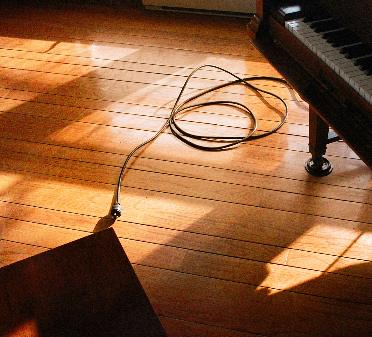
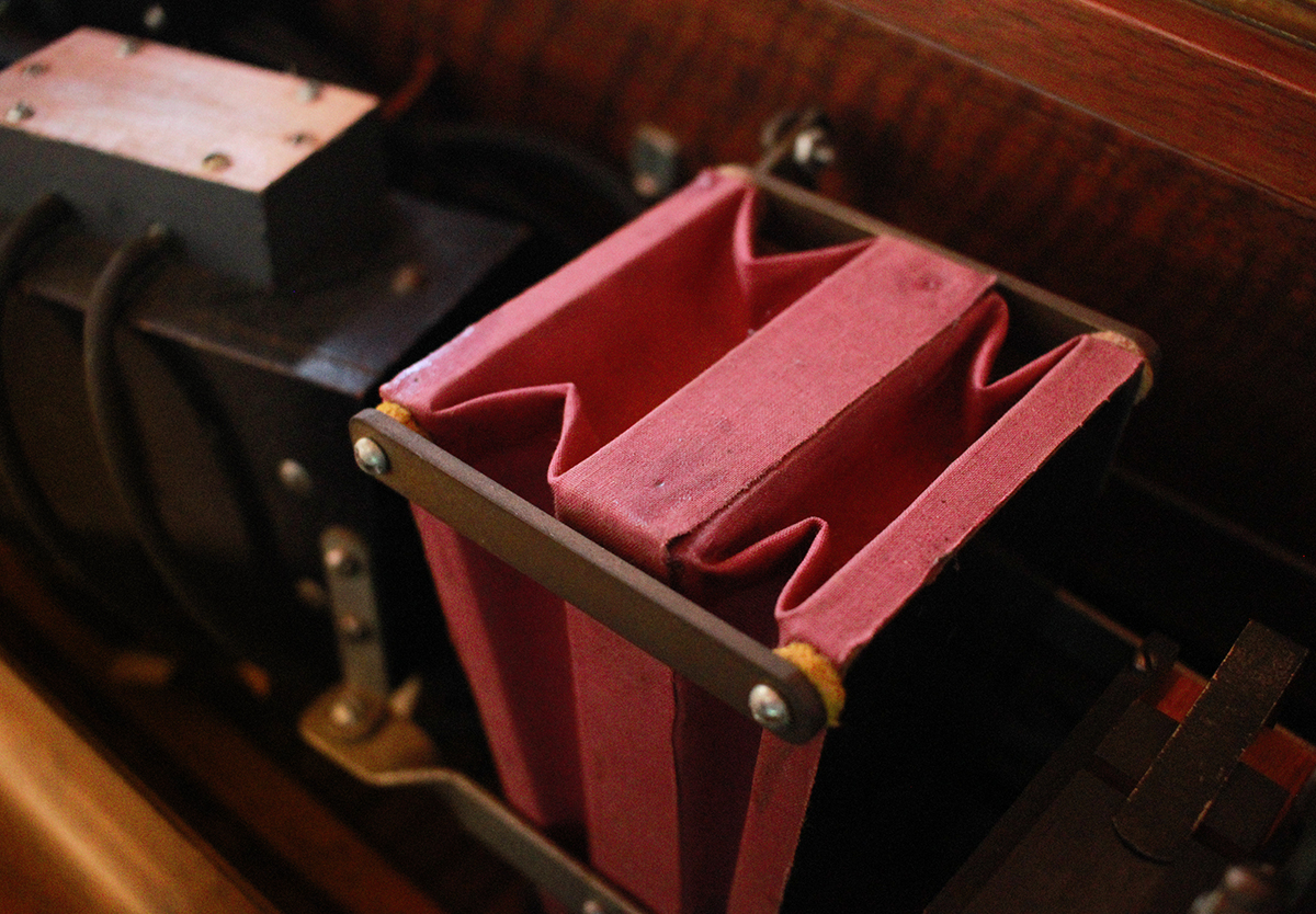
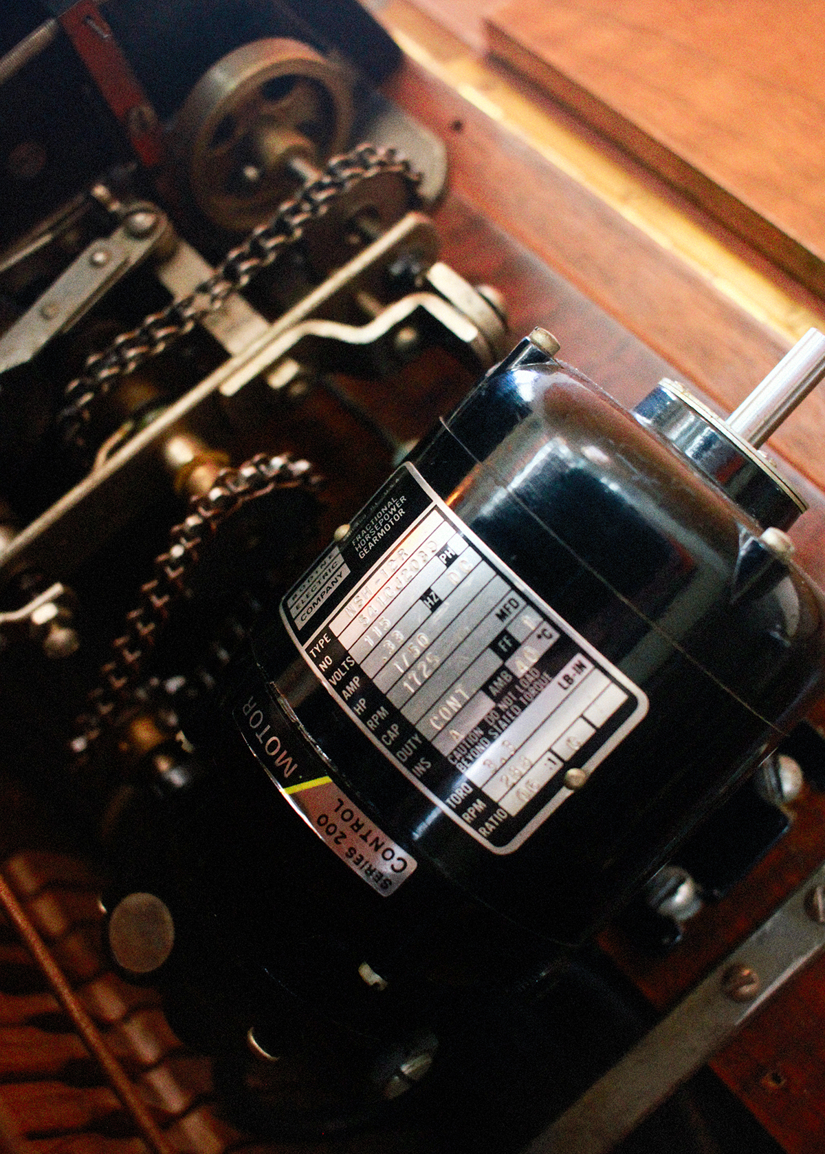
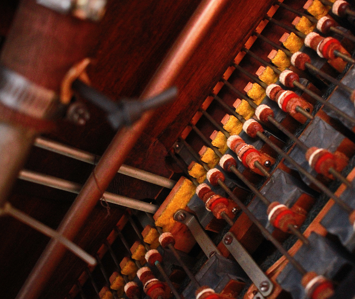
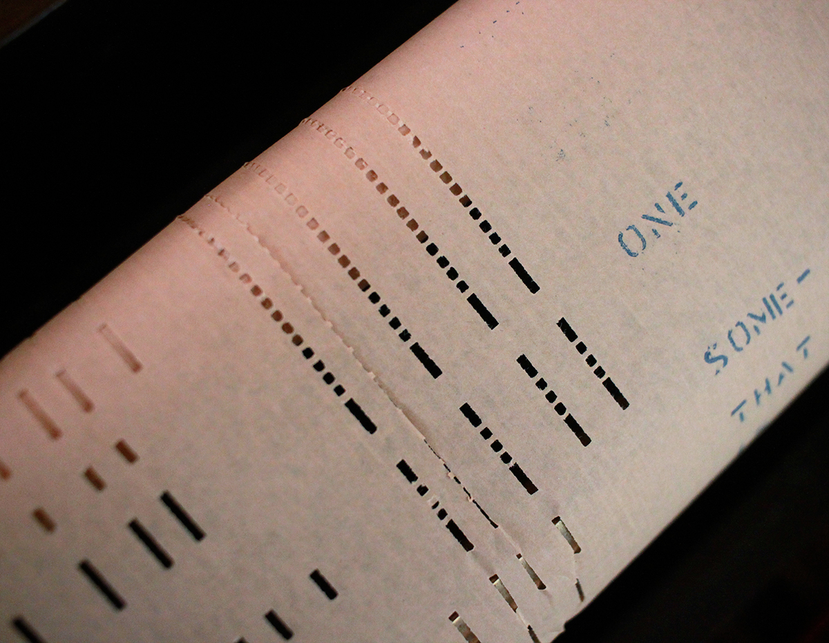
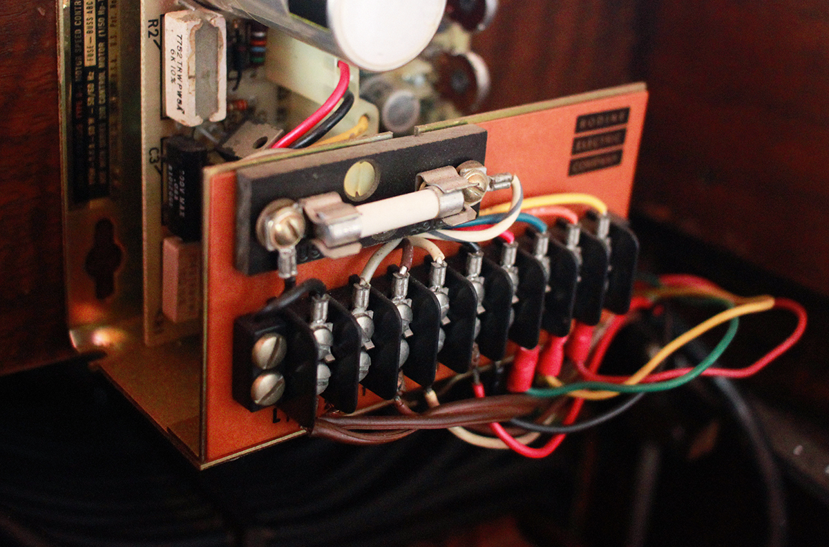
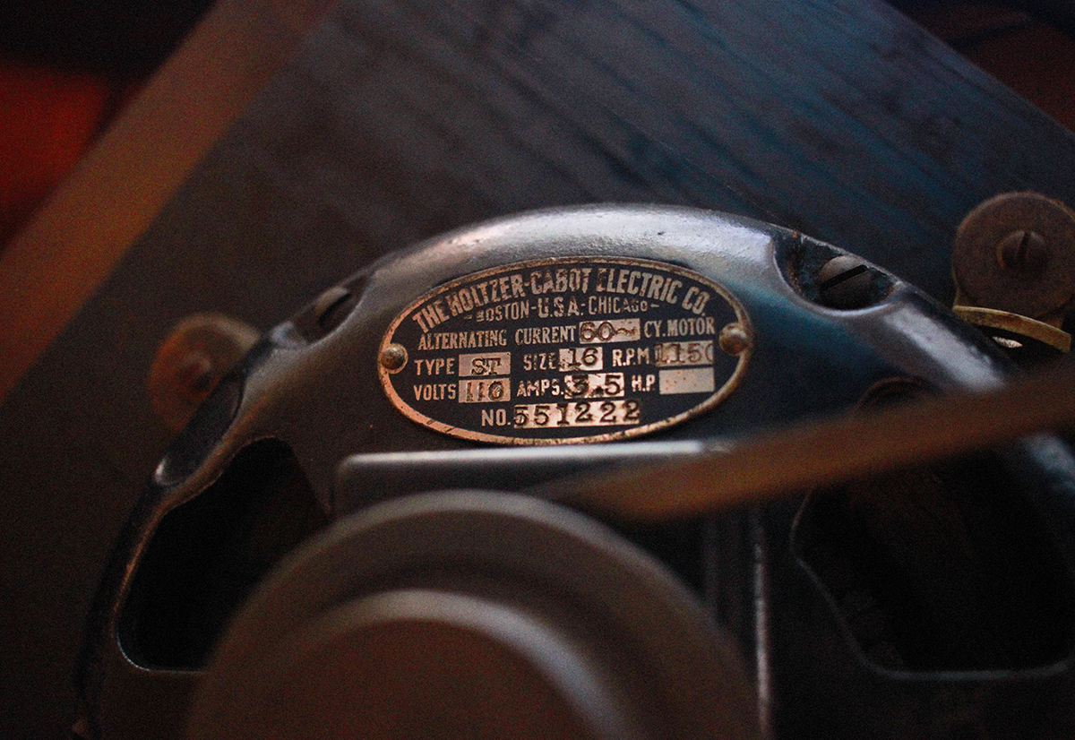
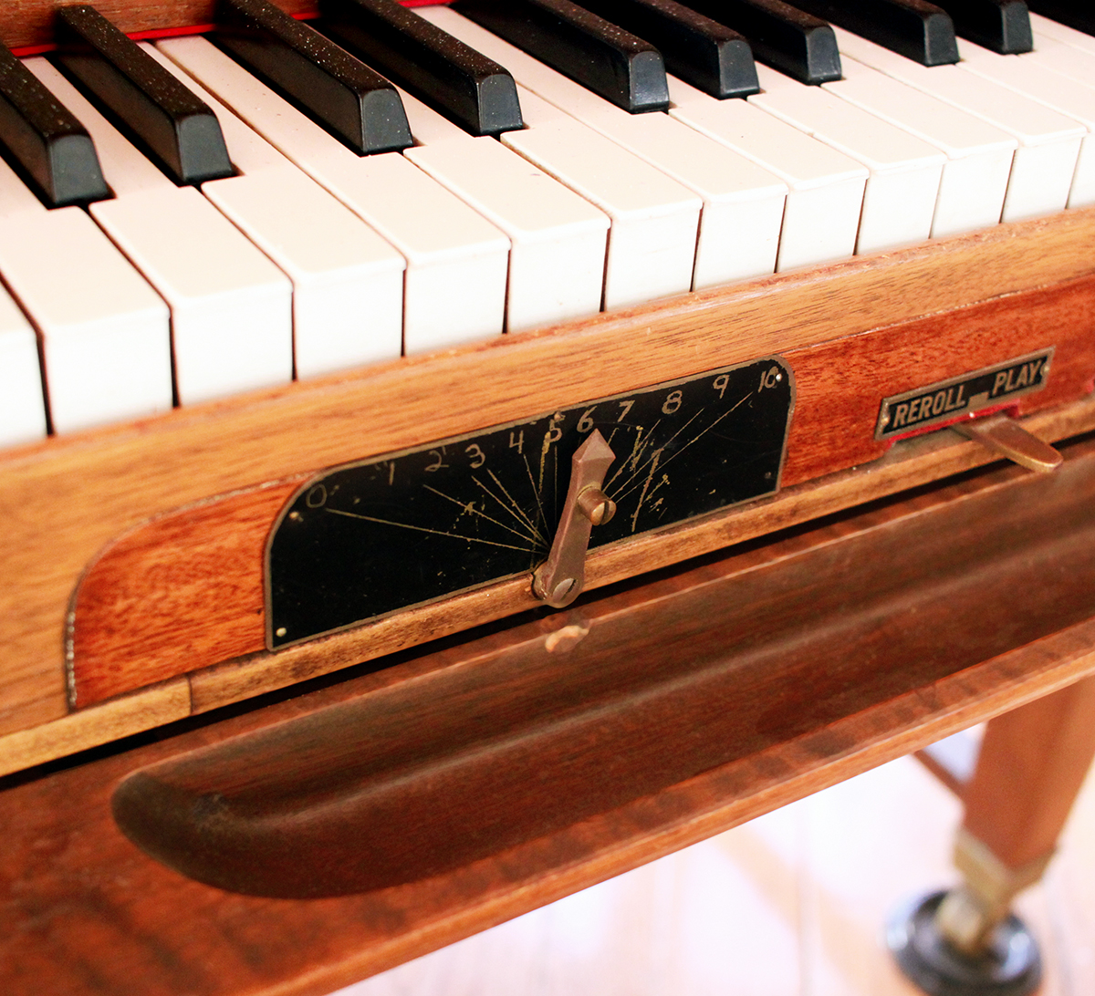
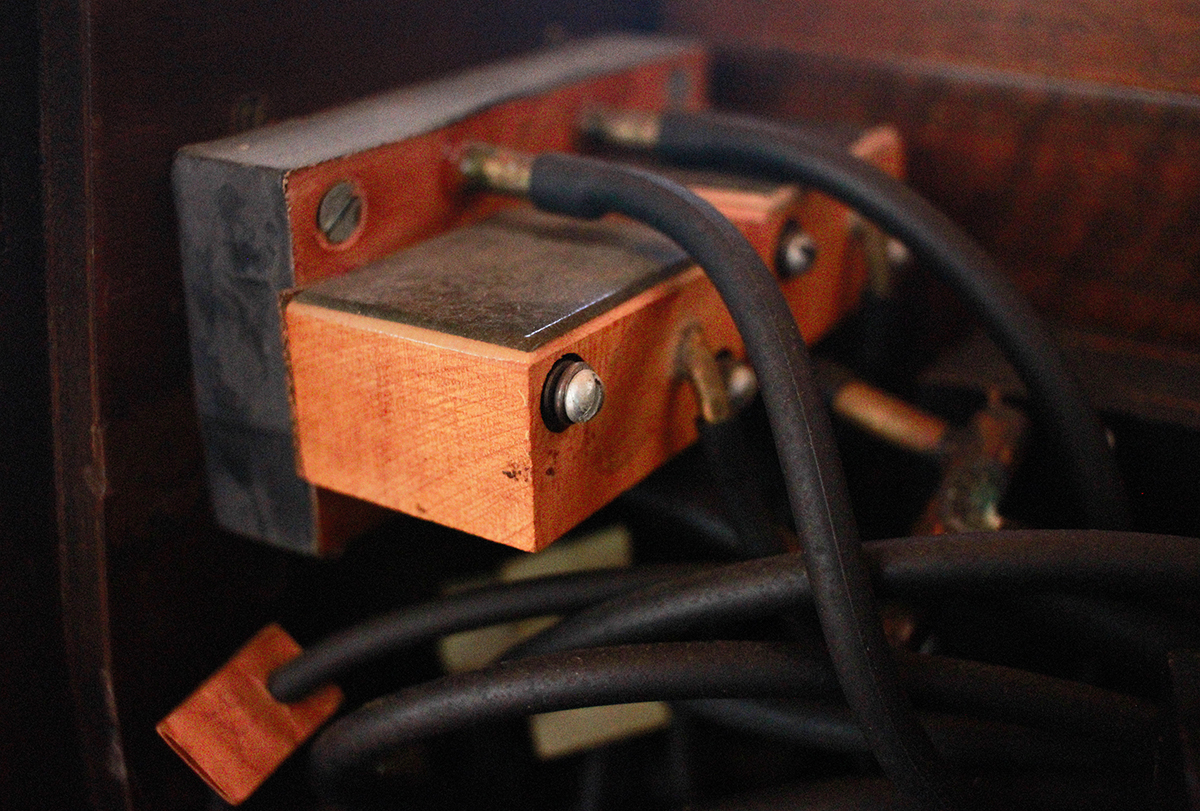
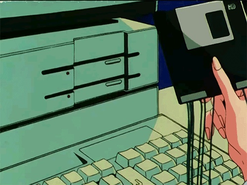
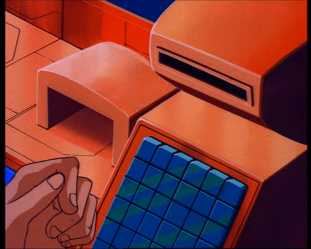
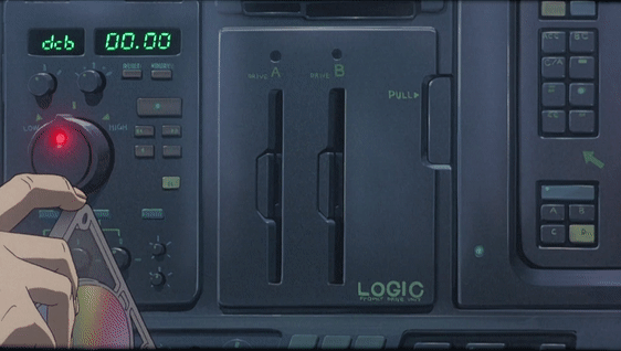
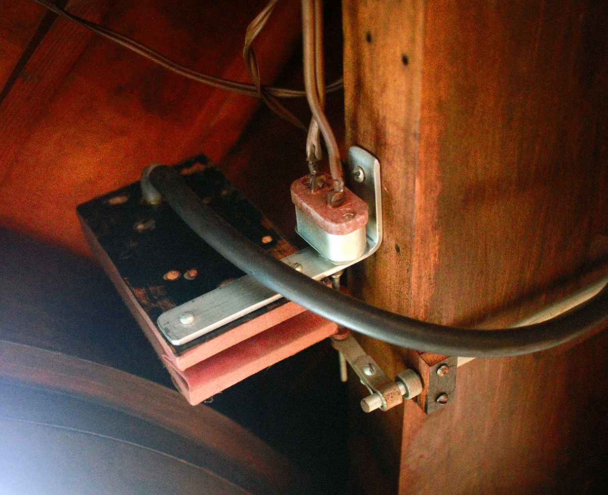 Recently I was staying in a country house in Arkville, New York, nestled in the western Catskill mountains. The house was furnished in fine, spare retail-modernist Design-Within-Reach style and, as a seemingly grand accent, featured a stately grand piano. Lovely. Easy enough to take for granted. However, my brother-in-law, a gifted musician and programmer, sensitive to things like instruments, systems and the built environment, was naturally drawn to inspect this rather grand grand piano a bit more closely. What he discovered was nothing less than an astonishment – grafted throughout the body of this Steinway piano was a massive electrical, analog, mechanical self-playing (or “reproducing”) mechanism. Just exploring the machine, with no understanding or appreciation for its functions, was incredible in itself. Exquisite construction, the combination of engineering, instrumentation and carpentry. It was also profoundly otherworldly, like actually discovering some marooned technology from an alternate steampunk version of our reality. For real.
Reading about it later only deepened my fascination. The excerpts below, taken from two restoration companies, give a sense of the breathtaking ingenuity of these devices. Consider they debuted in 1914, only a few years after commercial electricity itself…
For anyone with even a glimmer of interest I highly recommend fully going down the rabbit hole on this technology – following the technological details of how these functioned, and how the rolls were recorded – all of it. Gobsmacking.
A full history of the system can be found here. Full restoration notes can be found here and here.
The Reproducing Player Grand Piano was the most technologically advanced form of home entertainment during the early 20th Century. Designed to reproduce a live performance, these instruments could mimic every nuance of a real pianist, giving the illusion of a true live performance in real time. These instruments would have cost as much as $3,500+ new in the 1920s, the cost of a small house. The ultimate home entertainment system of the Gatsby age, these rare pianos were built in small numbers and are quite rare today.
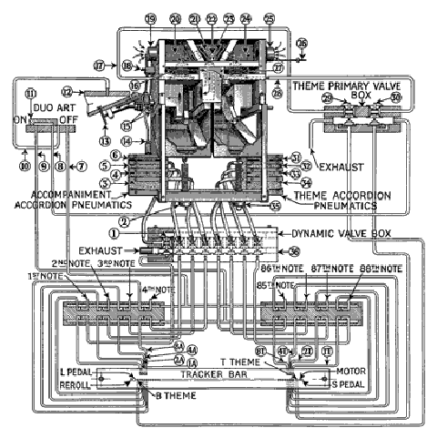
The Steinway & Sons Duo-Art player consists of over 8,200 moving parts… as in all standard reproducing pianos, an electric suction pump powers the playing mechanism and supplies a sufficient level of suction for the maximum loudness needed by the piano. Proprietary dynamic control devices reduce this suction level in various sophisticated ways so that a wide variety of dynamic effects is possible.
A perforated music roll passes over a tracker bar, which has holes in it connected via many small tubes to the individual note mechanisms of the instrument. At the left-hand edge of the music roll (and also at the right-hand, which is not shown), there are four special perforation positions which do not operate notes…the four dynamic coding perforations on the roll can be combined, allowing for sixteen degrees of dynamic control.
Duo-Art used a real-time perforator to produce an original roll as the artist played. Dynamics were not recorded automatically but were created on the roll as the artist played, by two dials and their associated mechanisms, controlled by the recording producer, who sat to the left and slightly behind the pianist.
Under the keys of the recording piano was a series of electrical contacts which ran through a cable to a separate room, where the rather noisy perforating machine was housed.
Once an Aeolian Duo-Art information original roll had been perforated, the roll was then copied to a much longer stencil roll, on thicker paper, which was then used to produce several copies for editing purposes, known as trials… Lastly, the final trial was approved and signed by the pianist, and became a pattern, to be used as a proofing copy in the manufacture of the roll for commercial sale.
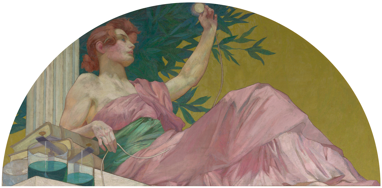
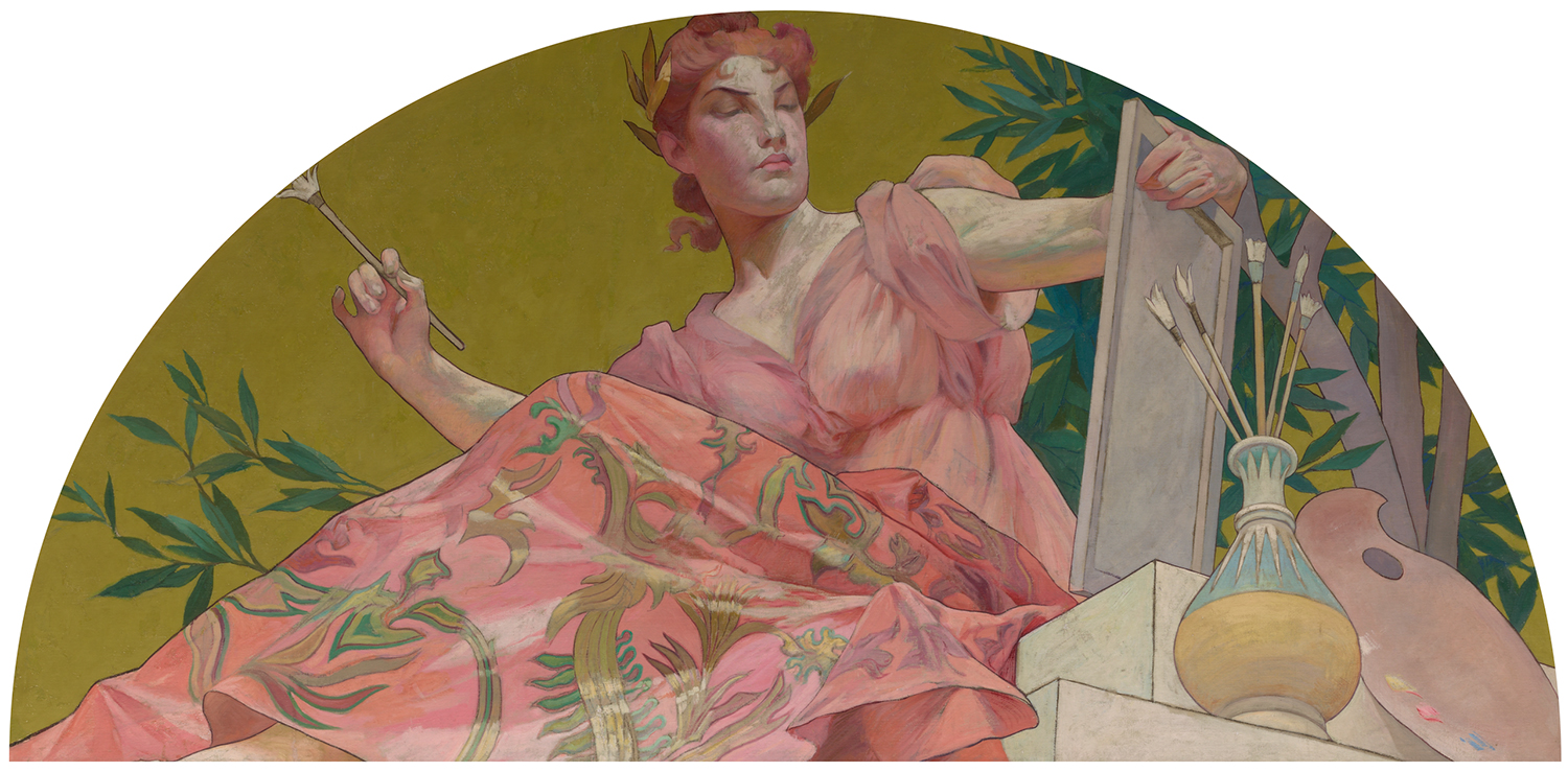
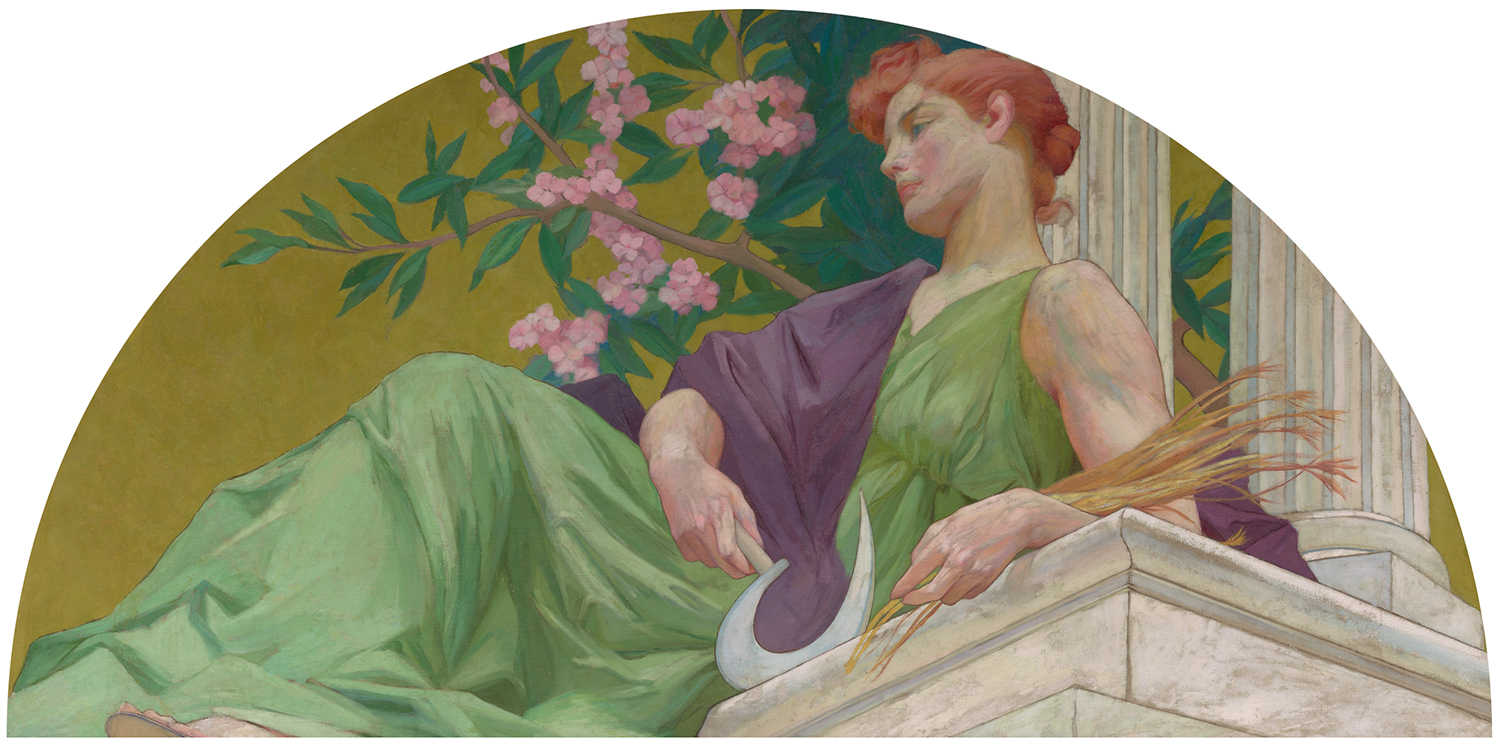
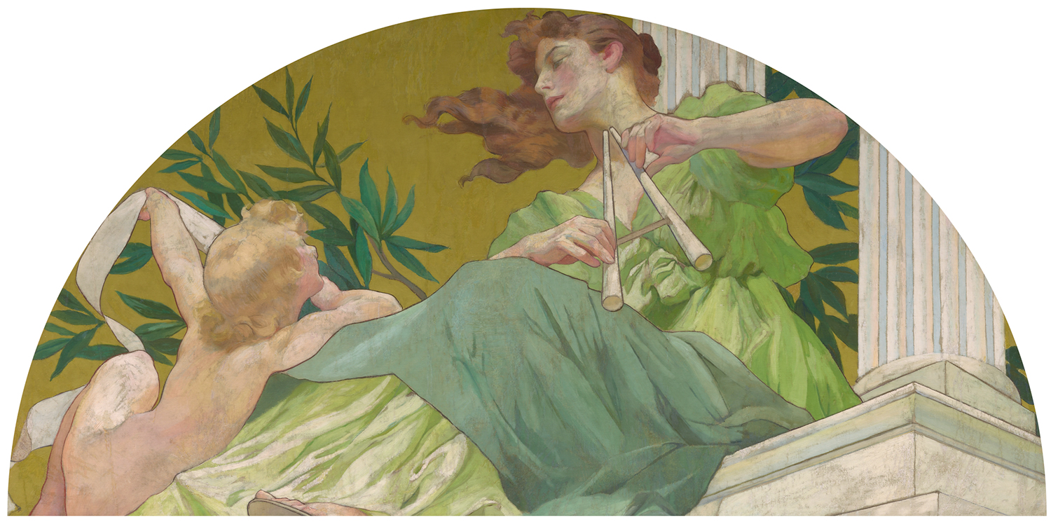
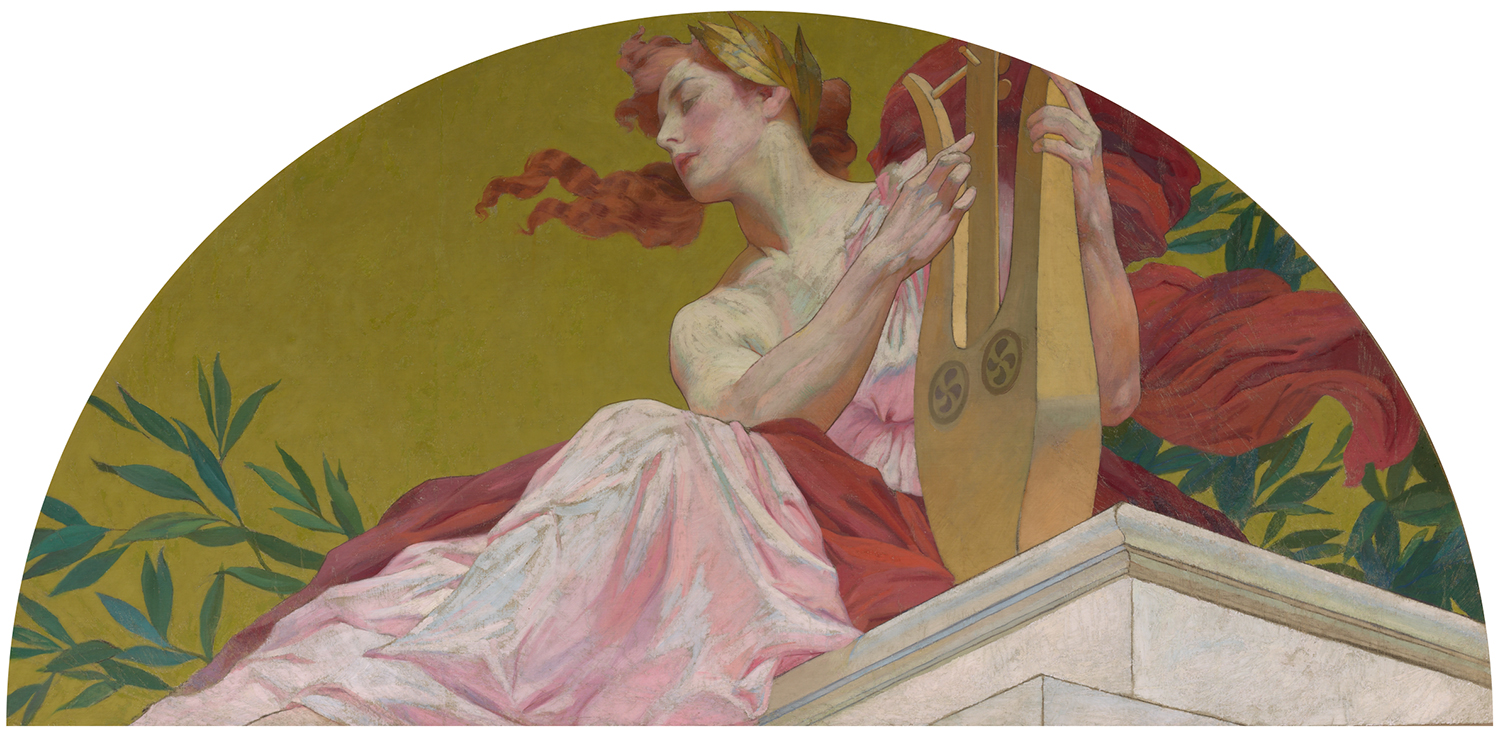
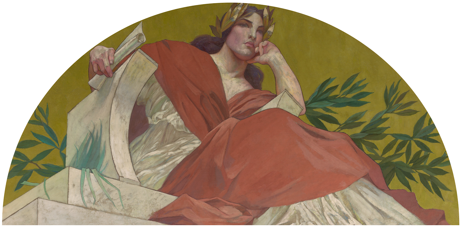
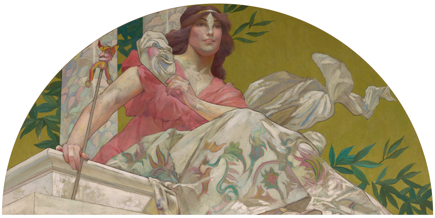
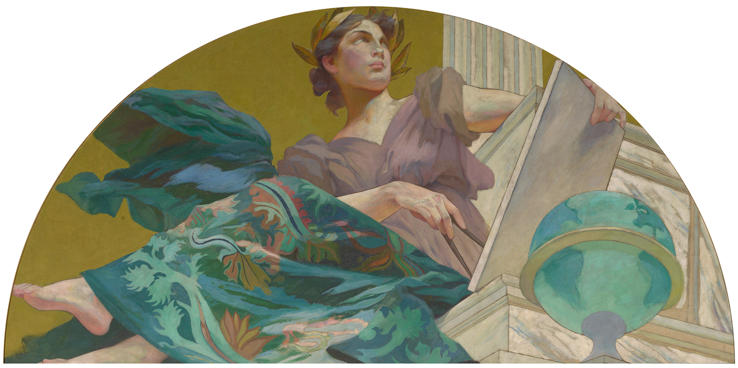 On a recent trip to the Yale University Art Gallery I was struck by these lunettes installed in a series high above the moulding of a gallery of 19th century American paintings.
Painted by by Harry Siddons Mowbray they were commissioned as part of a large decorative scheme for the New York mansion of railroad tycoon Collis Potter Huntington. Six of the muses are traditional, while Mowbray invented three new ones — Painting, Agriculture and Science and Electricity.
At first thier cumulative effect was somewhat disorienting – they’re mounted so high that they sit nearly past the terminal angle of the neck. I had to bend backwards to take them in fully. Once I could focus though, I was mesmerized. What a presence each possessed, enhanced by their slightly exaggerated perspectives. And what vivid style — watery and fluid coloring held taught by graphic contours — a gorgeous hybrid evoking academic painting, vintage advertising illustration, social realist propaganda and heroic comics. Make my muses Mowbray’s!
More information here. From the top: Muse of Electricity, Muse of Painting, Muse of Agriculture, Muse of Music, Muse of Lyric Poetry, Muse of Tragedy, Muse of Comedy, Muse of Astronomy.
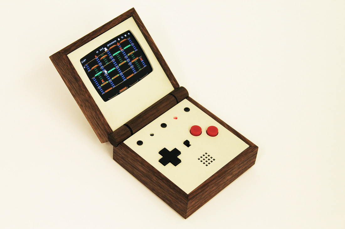
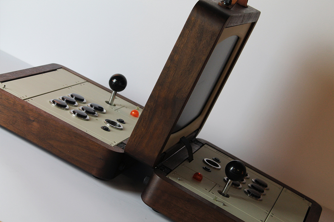
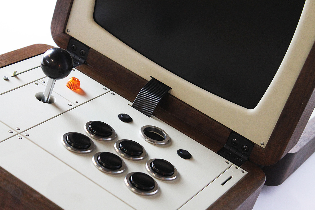
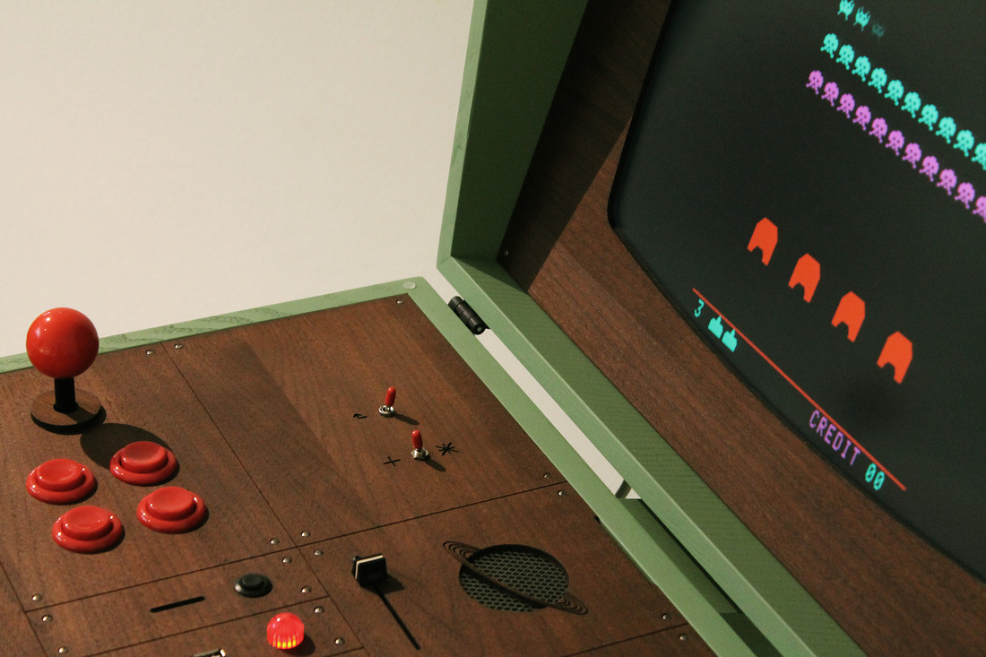
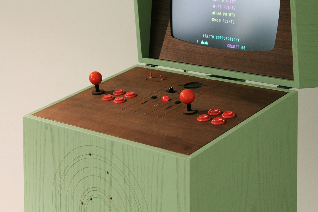
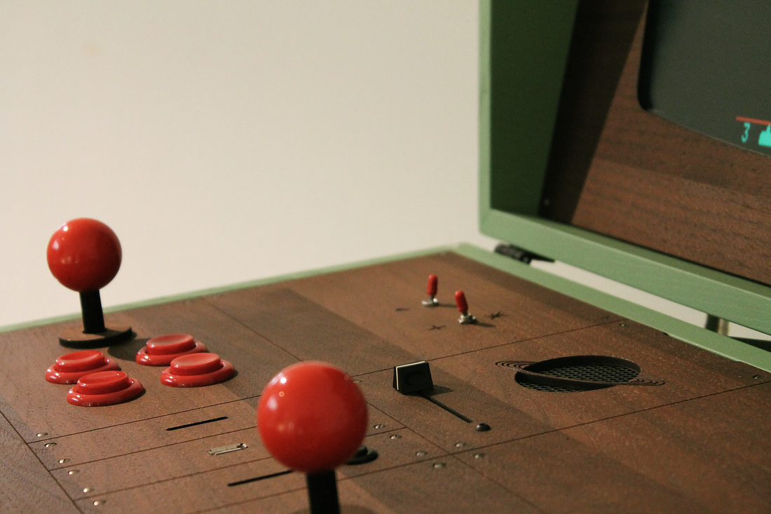
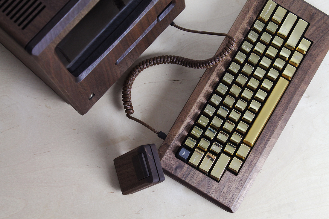
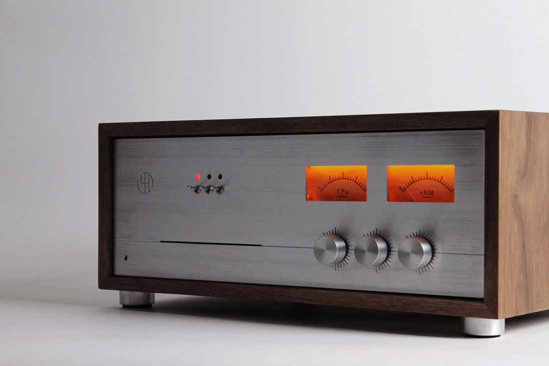
When I look at these absolutely breathtaking handmade made-to-order objects by Swedish fabircator Love Hulten, I covet.
In fact I covet three ways. At first I covet crassly, wishing I could afford these hand turned masterpieces. Then a little more thoughtfully, I covet the skills & craft to build these kinds of things myself. Then, finally, I covet philosophically, wishing that this was a genuine commercial aesthetic — that as we chase the geewhiz we’d take the texture and soul of what worked before and roll it in as we roll foward. We’ve left so many beautiful things behind.


[RERUN: Hauling this out of the early days of the blog. I’ve been on a protracted vintage video game and pinball bender lately. Atari’s iPad port of my beloved Tempest is damn near perfect and I’ve been playing it a ton. As such this early appreciation of the stone cold perfection of this game has been on my mind. So, here, then…}
The screen graphics of the classic video game Tempest represent a kind of summit of design and beauty – the finest expression of a very limited language. In the case of Tempest that language was vector based rendering. Vector monitors were used in video games from the mid 70’s to the early 80’s. The technology was derived from oscilloscopes – the image is projected by an electron beam onto the glass. Image a laser light show sped up to produce a lasting image and you’ve got it…
Many classic games were made using this technology – Asteroids and Battlezone as well as the first Star Wars game. While they all had their aesthetic charms, Tempest is in a class of its own. All vector games have a certain elegance and simplicity. The problem order vicodin uk arises in the crudity of the renderings – the poor approximations of tanks, asteroids, and X-wings forever marks these games as primitive gestures of an evolving technology. Tempest is exempt because it is derived from the technology itself. What would a world defined by glowing geometric unshaded lines look like? Pretty much like Tempest.
Its beauty lies in the fact that it is in harmony with its own rules and limits. Hence the extremely elegant compositions – uncrowded, with a well balanced sense of scale. The color scheme is vibrancy itself, strong underlying blues, wonderful pops of pink, green, red, and yellow. And the physics of the electron beams give everything a deep saturated glow.
That same harmony extends to playing the game as well. Most games rely on clumsy and stunted translations of real world movements like running, jumping or flying an ostrich. Tempest moves in accordance with its nature – spinning and firing. That’s what makes it so satisfying. Once you understand its strange parameters you have a complete experience on its terms – a dynamic, I think, that is fundamental to the idea of art.

from How Things Work, An Illustrated Encyclopedia of Technology,
Simon and Schuster, 1967 | German edition, Wie Funktioniert Das?, Institut AG, 1963

Amazing! So much purposeful human striving packed into one single frame – the bustling boogie woogie rhythms of daily life…
A fitting intersection, then, for our beloved space shuttle to cross – born of and built by the same energy and industry that powers the streets below. It’s endearing how much affection that ungainly piggyback elicits. The future was not the sleek finned swooped darts envisioned by Alex Raymond or Chesley Bonestell. The future was function begetting form – a spacecraft that looks as it must, to do what it needs to do, more Jeep than Jaguar.
Guided by technology contemporaneous with Centipede, Donkey Kong & Tempest, it broadened the perimeter of our everyday reach out into the edge of space. Because that’s the thing about the shuttle missions… they weren’t shots into the unknown, like Sir Richard Burton setting off to find the source of the Nile, or the Apollo Missions to the moon. They were meant to explore and colonize a frontier, like prospectors setting out westward to California to pan for gold, bend the direction of rivers, to make rockets and movies in the desert.
It’s why the spirit of Hedy Lamarr floats above this scene like a patron saint – a gifted, glamorous actress who, in her spare time, invented new kind of guidance system for torpedos to better fight the Nazis.
This photograph is a profound hymn to Los Angeles and the idea of California. Los Angeles will always be the most American of cities, defined by the lure of ambition and the blank canvas of possibility rather than the grids of Paris or London. Where hidden in the anonymity of deserts and stripmalls someone is manipulating the genome, making planes invisible, or writing Tootie’s dialog for an upcoming episode of Yo Gabba Gabba.
It’s where a young Gene Roddenberry would begin to write a series of TV scripts that used science fiction as a vehicle not only to boldly go where no man had gone before, but to explore the frontiers of the human condition – to muse on love, faith, friendship, and art.
It is no accident that the first space shuttle was called The Enterprise.
[Photograph by Stephen C. Confer]
We just wanted to build the best thing we could build. When you’re a carpenter making a beautiful chest of drawers, you’re not going to use a piece of plywood on the back, even though it faces the wall and nobody will ever see it. You’ll know it’s there, so you’re going to use a beautiful piece of wood on the back. For you to sleep well at night, the aesthetic, the quality, has to be carried all the way through.
– Steve Jobs, Playboy Interview, 1985

Steve Jobs changed my life three times. In 1982 the Apple II was the tractor beam (along with D&D) that pulled me into my first encounter with counterculture – the edges of the assembly language writing, phone-phreaking, copy protection cracking, dip switch flicking homebrew computer scene. It was the first time I really discovered something covert in culture. It was electric.
In 1985 I went for a routine visit to the Computer Connection outside of Albany, NY. There I saw a strange looking beige appliance looking thing. I remember, vividly, seeing a “folder” dragged into the “trash” with a “mouse.” And MacPaint. The Macintosh was the tool I would end up making my living on over the past 18 years.
My affection for older household appliances and everyday objects comes from the fact that I genuinely think they were far more attractive back then. You could sense aesthetics as a fundamental part of their design. They were also, in many cases, incredibly well manufactured. Nowadays, Apple’s products are among the few heirs to that tradition. I use them everyday to work, to read, to talk to people, to listen to music, to relax, and to look up how Nigella Lawson would make scampi with anchovies.
It’s woven up in who I am, what I do and how I live. Thanks Steve.


All languages contain terms for white and black. If a language contains three terms, then it contains a term for red. If a language contains four terms, then it contains a term for either green or yellow (but not both). If a language contains five terms, then it contains terms for both green and yellow. If a language contains six terms, then it contains a term for blue. If a language contains seven terms, then it contains a term for brown. If a language contains eight or more terms, then it contains a term for purple, pink, orange, gray, or some combination of these.
– Berlin & Kay, Basic Color Terms: Their Universality and Evolution, 1969
– Illust: Antique color wheel; Color Chart, Gerhard Richter


These irons are a sampling of the Streamlined Irons exhibit, currently installed between Terminals C and D of the Philadelphia International Airport.
Manufactured between the 1930s and 40’s the irons are from the collection of Jay Raymond, who has studied them since the 1980s. In 2008 he published Streamlined Irons, a survey and assessment of the design, manufacture, and cultural significance of these little marvels. More info on the book, which is spectacularly designed and photographed, and Raymond himself, here. Info on the exhibit here.


Some up-close 35mm shots I took recently of some miniature plane dioramas at the The Empire State Aerosciences Museum in Schenectady, New York. I love how painterly and gently surreal they appear. Larger versions here, and here. (And a heartfelt huzzah to the museum itself, a true labor of love that overcomes modest resources to create a genuinely engaging experience.)

Ok. That totally sucked. Here’s the skinny. The site got hacked early this week. Infected with bad code, malware, general hacker obnoxiousness. So the site was chloroformed, quarantined, and branded an “attack site” by Google… arrgh! A few frantic days later, with considerable help from my superb hosting service, pair.com, the WordPress community, and after a total reinstall of the blog, it’s all sorted. phew… Google has released the blog back into the general population…
The whole experience was galvanizing. First off, for anyone with any kind of a Internet presence – seriously – get to know the details of your security, and make sure it’s tight. Slightly paranoid geek tight, not 70’s suburban bicycle chain tight. The weird thing, though, was dealing with Google. !#@!$@! It underscored how much power they have over our online lives and I’ll tell you, it was disconcerting. I’m going to post on this aspect of the magilla in a few days once I have my thoughts together, but it had a real Soviet Logan’s Run Smiling Robot Takeover Westworld kinda feeling… more soon.
Welcome back.


A couple of things here… The design of the gizmo itself has some unusually jazzy touches – The in-line rule and orange drop-shadow of OHMITE. The name OHMITE – so silver age Marvel Comics, the Jack Kirby renderings basically draw themselves. The gutsy outline type of OHMITE MANUFACTURING COMPANY. The Bodoni-ish fat numbers.
It’s just rad to see such a brawny and practical buy cheap generic vicodin online tool have so much swing and style. And the numerical card is sublime… just marvel for a moment at how something so thoroughly determined by accuracy and rigor can pulse with such deft, complex rhythms and hum with such simple grace.

The development of synthetic fabrics is a fascinating nexus of science and culture. Its history weaves through the disparate worlds of industry, warfare, design, advertising, high fashion, and mass consumption. It may be the only product that has profoundly, and equally, affected scientists, generals, housewives, and haute couture designers.
The roots of synthetic fibers lay in Paris, in the late 1700s, at the cusp of a scientific and social revolution. Éleuthère Irénée du Pont de Nemours is working as the assistant to Antoine de Lavoisier, the father of modern chemistry. In addition to his scientific pursuits, Lavoisier is also the administrator of a tax collection company, and up to his neck in the financial and political affairs of the royal French government. As the Revolution rages, Lavoiser’s neck finds itself under the guillotine. Thus abruptly ends the life of quite possibly the smartest man in all of France. Thoroughly freaked out, du Pont packs up and flees to the United States. Landing in Wilmington, Delaware, he founds E. I. du Pont de Nemours and Company, known commonly as the DuPont Company and, based on a knowledge of munitions and chemistry decades ahead of anything in the colonies, becomes an industrial powerhouse.
At the turn of the century, DuPont began experimenting with synthetic polymers. Polymer molecules can be coaxed into an extraordinary array of substances – synthetic rubber, Bakelite, neoprene, PVC, shellac, silicone and, of course, nylon, the first completely synthetic fabric.
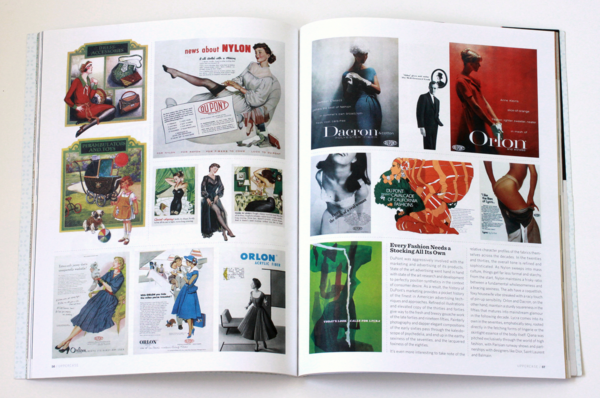
The impact of nylon and other synthetics on fashion, warfare, commerce and culture in general is hard to overstate. The introduction of nylon stockings in the ’40s revolutionized the female silhouette and became a mass consumer sensation. The characteristics of nylon proved so useful in military applications like parachutes, tires, tents and ropes, that it was abruptly and completely withdrawn from the consumer market during the Second World War. When it was reintroduced, it promptly overturned silk’s 3000 year stranglehold on luxury, and went on to fundamentally inform the fashion of most every decade that followed: Mass luxury and convenience in the ’50s; space age pop in the ’60s; the leisure vibe of the ’70s; and the athletic glamour of the ’80s.
The full field view of the development of synthetic fabrics is ably told in the engagingly written, lavishly illustrated book Nylon: The Manmade Fashion Revolution by Susannah Handley, published in 1999 by Bloomsbury. Reading it, I found myself drawn to the visual and design legacy of DuPont’s marketing of the fabrics. At the company’s Hagley Museum and Library, a few months later, I discovered what amounted to a core sample of prevailing trends in design, typography, photography and advertising illustration over the decades.
Design for Modern Living
Nylon, Orlon, Dacron, Rayon. Acetate, Teflon, Cordura, Antron. Lycra, Corfam, Taslan, Fabrikoid, Qiana. After a while, the roll call of names begins to take on the weight of poetry. There is so much meaning projected into those names, so much technology, culture, science fiction, science fact, high fashion, mass appeal, new frontier optimism, dependability and sheer wizz-bang newness.
The names become even more evocative when expressed typographically. Fabrickoid has the sturdiness of die stamped metal. Nylon, Dacron, and Orlon evolve from compressed modern type to friendly hand drawn accessibility. Lycra gets all cute as it moves from elegant sleekness to voluptuous roundness. Antron suggests the swashy title of a romance novel, while Qiana recalls the snooty glam chic of Studio 54. Taken together, they seem to tell the story of the the second half of the twentieth century through type alone.
Every Fashion Needs a Stocking All It’s Own
DuPont was aggressively involved with the marketing and advertising of its products. State of the art advertising went hand in hand with state of the art research and development to perfectly position synthetics in the context of consumer desire. As a result, the history of DuPont’s marketing provides a pocket history of the finest in American advertising techniques and approaches. Refined oil illustrations and elevated copy of the ’30s and ’40s give way to the fresh and breezy gouache work of the late ’40s and ’50s. Painterly photography and dapper elegant compositions of the early ’60s pass through the kaleidoscope of psychedelia, and end up in the earthy sexiness of the ’70s, and the lacquered foxiness of the ’80s.
It’s even more interesting to take note of the relative character profiles of the fabrics themselves across the decades. In the ’20s and ’30s the overall tone is refined and sophisticated. As Nylon sweeps into mass culture, things get far less formal and starchy. From the start, Nylon maintains a frisky ratio between a fundamental wholesomeness and a bracing sexiness. The ads have a coquettish, foxy housewife vibe streaked with a racy touch of pin-up sensibility. Orlon and Dacron, on the other hand, maintain a sturdy squareness in the ’50s that matures into mainstream glamour in the ’60s. Lycra comes into its own in the ’70s, emphatically sexy, rooted directly in the fetching forms of lingerie or the skintight essence of the body itself. Qiana was pitched exclusively through the world of high fashion, with Parisian runway shows and partnerships with designers like Dior, Saint Laurent and Balmain.
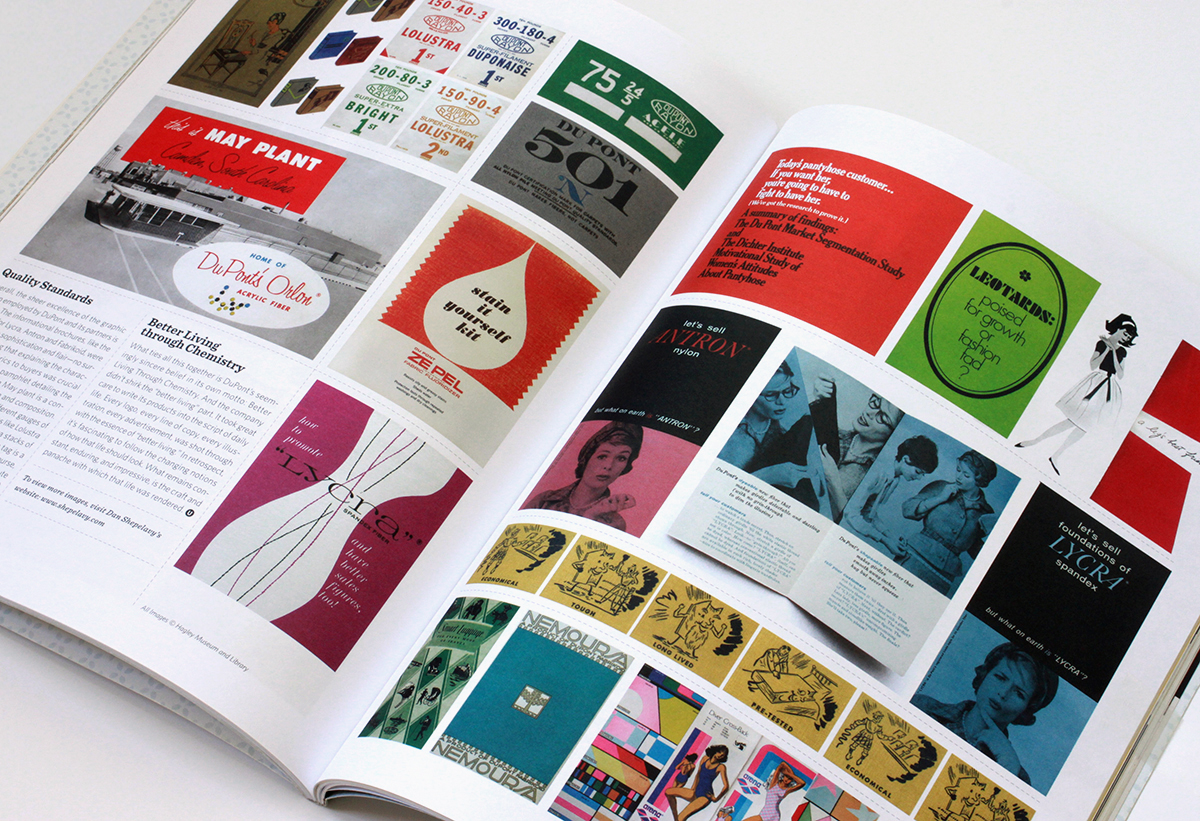
Quality Standards
Overall, the sheer excellence of the graphic design employed by DuPont and its partners is striking. Almost without exception, all the informational brochures, like the ones here for Lycra, Antron and Fabrikoid, were designed with with sophistication and flair – no surprise considering that explaining the characteristics of the fabrics to buyers was crucial to their success. The pamphlet detailing the Camden South Carolina May plant is a concise model of ’50s design and composition. The spot color tags for the different gauges of Rayon fabric, with fabulous names like Lolustra and Duponaise, are tight little Jenga stacks of type. And the “501” quality inspection tag is a veritable poem of typesetting. Then, of course, there is the very idea of the Dichter Institute Motivation Study of Women’s Attitude’s About Pantyhose. Who says advertising doesn’t contribute mightily to how we understand ourselves and our world? That handy tome, I’m sure, borders on philosophy.
Better Living Through Chemistry
What ties all this together is DuPont’s seemingly sincere belief in its own motto: Better Living Through Chemistry. And the company didn’t shirk the “better living” part. It took great care to write its products into the script of daily life. Every logo, every line of copy, every illustration, every advertisement, was shot through with the essence of “better living”. In retrospect, it’s fascinating to follow the changing notions of how that life should look. What remains constant, enduring, and impressive, is the craft and panache with which that life was rendered.
All images © Hagley Museum / DuPont. Used with permission.

Recently I had to decide whether to discard my Apple //e, and found I absolutely couldn’t bear to part with it. Rather, I pulled its disparate components off storage shelves and out of boxes, dusted them off and reassembled it. Something about reconstituting it made me bond with it all over again… Then, just the other night, snowed in by a blizzard, I was watching Royal Tennenbaums for the nth time and noticed among all the other 70s bric-a-brac, an Apple //.
I know it’s playing footsie with the obvious, but it’s worth remembering what an essential artifact of 70’s design the Apple // really is. Its introductory advert from 1977 captures that perfectly. Look at the context… It’s not set up in an office but on the wood table of a modern kitchen. It’s not stacked like a Hi-Fi system or a fused one-piece like an ordinary computer terminal. It’s spread out like a split level contemporary house. The severe contrasting angles of the case evoke 70’s architecture and furniture design much more than anything especially technological. (It shares this look with some of the better designed calculators of the period – which makes sense, given they first embodied the notion of a computer as a home appliance) The distinct beige putty color leans in nicely against the saturated, plush colors of the era – the ochres, purples, oranges and red browns. In short, the Apple // represents the hight of then-contemporary suburban design – which is why it looks just at home in the Wes Anderson’s idealized 70’s diorama as Bill Murray’s purple turtleneck and burnt sienna blazer.


I sincerely hope that author Maurice L Hartung of the University of Chicago was as impressed as I was with the cover designs to his slide rule manuals. (Also, belated congratulations to Dr. Hartung on the promotion he seems to have received between the publication of the guides.)
from How Things Work, An Illustrated Encyclopedia of Technology,
Simon and Schuster, 1967
Original German edition, Wie Funktioniert Das?, Institut AG, 1963