
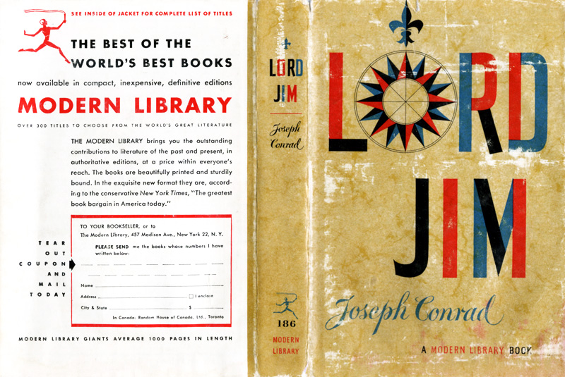
The graphic design of the various phases of the Modern Library edition is well, well trawled territory, yes, but this is a particular favorite. Every time I search through the clipping file I pull out this dust jacket and I’m flummoxed weather to frame it, paint on it, or emulate it… but I always pause to reflect on it’s graphic power. The compass rose is its aesthetic heart – its design belonging to the ages, its rendering and coloring thoroughly mid-century modern. Then there is the decorative contrast between the, again, utterly contemporary color blocking of the title, and the period flair of the authors name. Overall, these details are under-girded by two powerful compositional forces – the balance between the aged and modern background and the binding compositional echo across the spine. As for the book itself, as much as I respect it from a distance, I’d get out of its way if it were walking toward me, and on the whole I’d rather hang with Lucky Jim… [larger image]