Index: Book Design


Marshall McLuhan Book Covers

McCluhan_Cliche_To_Archetype

McLuhan_Medium_Massage

McCluhan_War_and_Peace

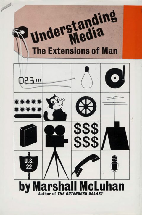
McLuhan_Understanding_Media

McLuhan_Mechanical_Bride

McLuhan_Guttenberg

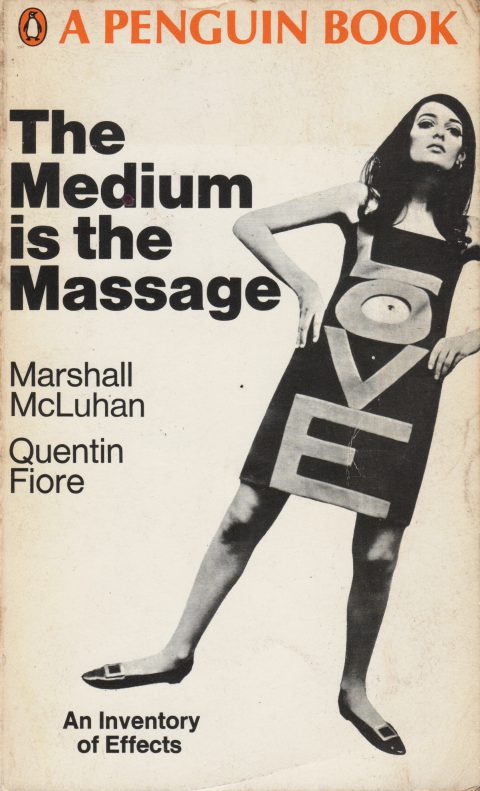
The nuances of the cover to “From Cliche to Archetype” practically make it a little poem as much as bravura instance of typographic design. The font choices are perfection — Cooper’s proud plumpness giving way to the stylish severity of Univers. The rest of the covers, better known, are equally stunning and seemingly predict entire swaths of graphic design trend. Prescient cat, this one.

Specimen

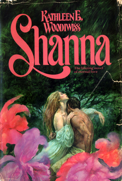
Shanna_lrg
A fine specimen of Trashius Romanticus Novelus, circa 1977, excavated at the Goodwill on Rt. 73 in Maple Shade, New Jersey.

Gerard Schlosser

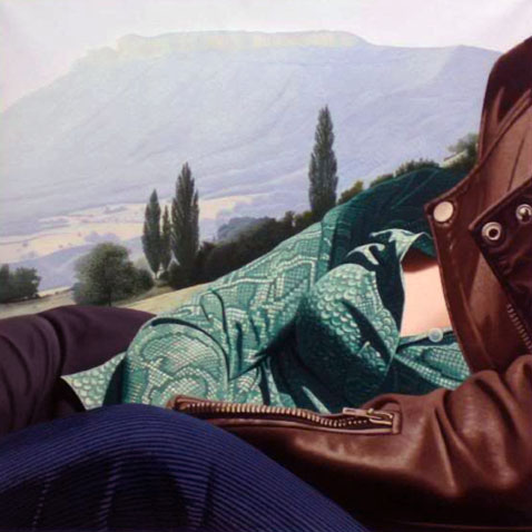
Over the weekend I scored Martin Amis’ The Pregnant Widow. What a knockout cover! What stuck me was the how powerful both the formal and narrative aspects of the painting were. The composition was riveting – this tightly packed moment given epic scale – and the weight of shared experience slung between the two figures was palpable. From what I know of the book’s plot and themes, which follow the tumultuous vicissitudes of a group of friends spending the summer in a remote Italian castle, it seemed a note-perfect choice – marred only by completely ham handed typesetting and design.

The painting, Il ne se plaignait jamais… (He never complained…), from 1976, is the work of the French painter Gerard Schlosser. Schlosser is most closly associated with the Narrative Figuration movement, a distinctly French mash-up of Pop and Photorealism.

His early work was rooted far more in a sexy cartoon pop aesthetic – like a combination of Guy Peellaert and Tom Wesselmann. As he evolved the work became more overtly photo-realistic, but just as meticulously staged – details are purposefully buy vicodin hp online exaggerated, extraneous objects removed, everything is framed and arranged for as much narrative impact as any comic book panel. One critic described this dynamic perfectly, that for Schlosser, “framing is never a trivial gesture. It tightens the most significant narrative element, the small detail that summarizes the essence of a moment.”

What I love about his paintings is that they transmit on four equally powerful frequencies. They are wonderfully composed realist abstractions. They contain a powerful dose of concentrated storytelling. They celebrate the figure as landscape. And they frame a vantage point that is the very definition of intimacy – conversational, sexual, relational – in a way that is incredibly potent and evocative. They’re artful, moving, brazenly sexy, and, as Blackadder might say, as French as a pair of self removing trousers.

(Schlosser’s work is scattered about the web. Most of the sites are in French. No English monograph seems to exist. There are at least three French ones, a bit pricey and all difficult, it seems, to obtain)

All About

allabout_rockets

allabout_beasts

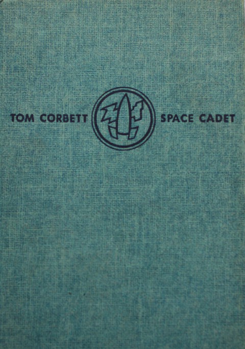
Printed in 1957, the designs of these covers are a blessed aesthetic convergence. The thick textured cloth and debossed inky black type tie them firmly to the tradition of classic childrens books. The bold spare composition and modern typesetting give them a wizz-bang new frontier coolness.

And the economy and power of those illustrations! A simple rocket and squid, as keys to the imagination, have the power of a thousand glossy covers. The effect is hypnotic. Holding these for a while you’re tempted not so much to thumb through them as to dive into the covers themselves. Just perfect.

Under the covers

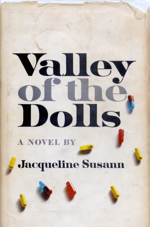
ValleyOfTheDolls

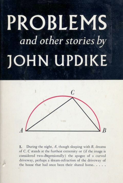
Problems_Updike

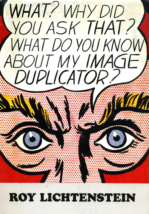
ImageDuplicator_Lichtenstein

So, recently, at one time or another I was reading these three books. As I piled then up to be re-shelved they struck me as having some strange communion with one another. Each spare, simple and striking, sharing some essential tone that I adore — perfect pop design in three modes, fashionable, nerdy, and electric. Each in there own right a great read, too. Updike and Lichtenstein need no additional cheerleading, but let me make a impassioned plea for Valley of the Dolls. What a empurpled pleasure. Read it, luxuriate in its plush vulgarity, then treat yourself to the Wiki rabbit hole you get to go down matching each character and melodramatic scenario with the real people and incidents that inspired then. Then the movie. Then the Roger Ebert / Russ Meyer luridly psychedelic quasi sequel Beyond the Valley of the Dolls. Then buy that film’s equally boss groovy soundtrack. You’re welcome.

Never Mind the Pollacks

Talking Covers, an ace new blog about book cover design, is featuring my artwork for NEVER MIND THE POLLACKS,  with my recollections along with author Neal Pollack’s… Shout-outs and walk-ons abound, including Jim Roll’s amazing record Inhabiting the Ball, my old label The Telegraph Company, and a meandering discursion on the Harvest Records roster… the blog is curated by author Sean Manning.  Neal and I are in ridiculously great company – Ben Marcus’ Flame Alphabet, Francine Prose’s My New American Life, and Love Goes to Buildings on Fire are featured, among others… check it.

Some Literature

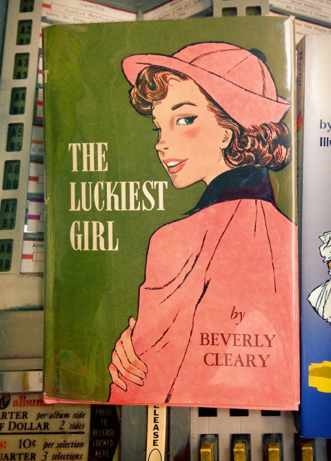
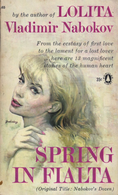
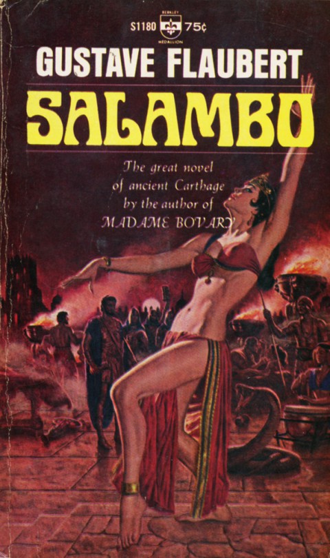
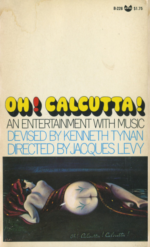
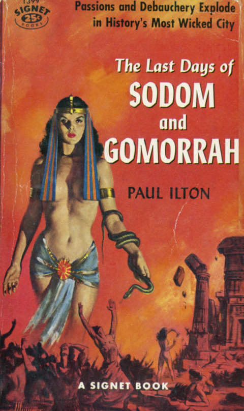
Carter Brown? Here, and more here on the blog soon-ish… On Paul Ilton nothing, sadly, but he seems learned and earnest. Not sure the wanton luridness of the cover is what he had in mind. Oh well. The rest are self evident…

A Signet Gothic

She had come back to bury the nightmare past – only to find new love and new terror…

Pour la mer et de la Lune!

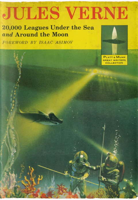
As good as it gets, as far as the futuristic sub, menacing shark, and heavy-duty diving suit genre goes. You can almost feel imagination catch fire. Oh, and to add to the radness factor, the book has its own logo – a submarine crossed with a rocket! The whole jacket is amazing, and can be seen here.

Damned Flappers

I’ve had an itch to read Fitzgerald’s The Beautiful and the Damned lately… mostly because I’ve had the phrase echoing in my noggin, thanks to an odd propensity of my iphone to play the the similarly titled song by Ultravox!

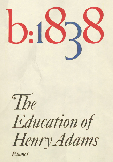
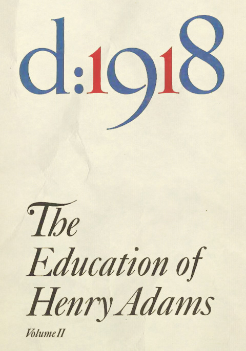
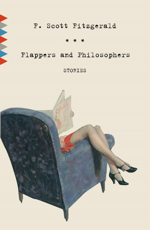
Anyway, poking around online for a suitable edition led to some fine discoveries. First and foremost are the two volumes above, designed by the able Megan Wilson. In fact her whole Vintage Classics series is gorgeously rendered – spare and powerfully evocative. Browse them, and more, on her site, here. I found Beautiful and the Damned over at the Caustic Cover Critic, an excellent Australian book design site. Its author, James Morrison was kind enough to refer me to Mme. Wilson’s work. The editions above are available, priced to move, here & here.

Ultravox!: The Wild, The Beautiful & the Damned [download]
[audio:https://shepelavy.com/audio/Ultravox_Wild_Beautiful_Damned.mp3]

Blow up Blow out

Some years ago I attended an evening of mime by Marcel Marceau, an elaborate exercise in aesthetic purification during which the audience kept applauding its own appreciation of culture and beauty, i.e., every time they thought they recognized what was supposed to be going on.

So begins Pauline Kael’s Tourist in the City of Youth – a comprehensive take-down of the circus of bullshit in, and in the wake of, Michelangelo Antonioni’s Blow-Up. Published in The New Republic in 1967, it’s a thrilling, bracing read, swinging from one exquisite demolition to the next.

She nails the hypocrisy of “highbrow” art’s seeming disdain for pop culture while simultaneously drawing strength and vitality from it. I adore her reminder that, for all the easy moralizing, the frisky, colorful, grass infused Mod scene the movie depicts seems, if not harmless, more than a little, um… fun… A big chunk of the essay dismantles the cheap profundity of lazy symbols, easy targets, and disingenuous critics:

People seem awfully eager to abandon sense and perspective and humor and put on the newest fashion in hair shirts; New York critics who are just settling into their upper-East Side apartments write as if they’re leaving for a monastery in the morning… a surprising lot of people seem willing to accept assumptions such as: the fashion photographer is symbolic of life in our society and time; he turns to easy sex because his life and ours is empty, etc. Mightn’t people like easy sex even if their lives were reasonably full? And is sex necessarily empty just because the people are strangers to each other, or is it just different? And what’s so terrible about fast, easy success? Don’t most of the people who cluck their condemnation wish they’d had it?

Aces, just aces. The whole thing is a masterpiece of dense, sharp, and admirably personal criticism, sure, but given its scope and depth it’s practically an aesthetic and cultural manifesto. She’s arguing, as always, for honesty and passion, yes – but what she’s really getting at, what she finds unforgivable, is the emotional distance, the “knowing” disconnection in both filmmakers and critics from their ostensible subject. “Love-hate is what makes drama not only exciting but possible,” and what she loathes, justly, is the lack of love.

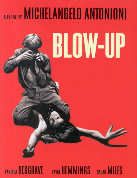
ABOVE: absolutely killer cover art for Kael’s perfectly titled 1968 collection of criticism, and the iconic poster for Blow Up (more on its graphic significance here.)

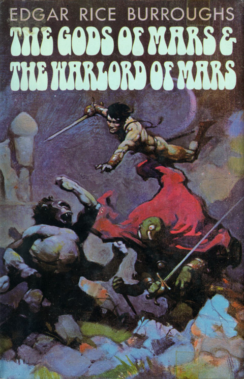
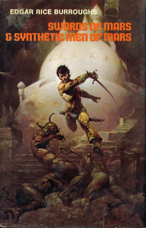
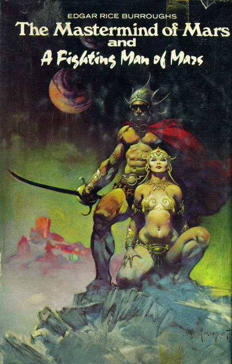
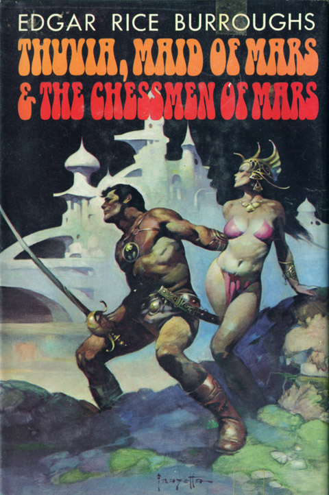
Frank Frazetta: 1928 – 2010

In weighing the loss of Frank Frazetta I think about what I always think about when I think about Frazetta – Caravaggio.

That is, he, like Caravaggio, took the fables and fantasies he passionately depicted just seriously enough, a precise ratio of rigor and rapture. It’s why the work is so powerful, so definitive – Frazetta painted with just enough supple realism, while conjuring just enough alien atmosphere, that he imbued the fantastic with the weight of fact.

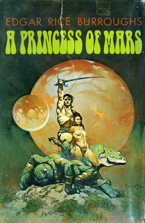
(above, Frazetta’s covers for Edgar Rice Burroughs’ John Carter of Mars series)