Index: Uppercase Magazine


Sweet Savage Love

Images and outtakes from my forthcoming article in Uppercase Magazine on romance cover art. It focuses on the formative years of the genre, in the early seventies. The liberated sensibilities inside the books called for equally brazen cover art. This need provided a welcome haven to a recently dispossessed group – the pulp and movie poster artists. In the mid sixties photography began to supplant illustration. Pressed out of the genres that made their careers, and in some cases fortunes, some illustrators retired to fine art, some to advertising. Others, in the case of Robert McGinnis and Robert Maguire – two of the absolute best, whose work is featured above – migrated to romance covers.

I did a post a while back on the same topic, focusing solely on McGinnis’ work, here. Also, while researching all of this, I came across the first four books, published in 1974/54 by Avon, that are credited launching the modern romance era – Kathleen Woodiwiss’ The Flame and the Flower and The Wolf and the Dove, as well as Rosemary Rogers’ Sweet Savage Love and Dark Fires.

Two aspects of these books had seismic implications on the genre: They were the first romance novels to be published initially as a paperback, to be distributed promiscuously and cheaply in 5 & Dimes and department stores; and the amorous coupling detailed within them got down to some frisky, frisky business. In detail. Thier ace covers are, in unfortunately lo-res, below.

Sweet Savage Love
Uppercase Magazine #10

Romance_1 Romance_2

The classic paperback “bodice-ripper” is an undeniably hot mess – the very things that make it disreputable – the tawdry, formulaic, overheated melodrama rendered in prose so purple it might as well be written in marmalade – are exactly what makes it awesome.

The modern era of the romance novel begins in 1972, with the publication of Katheleen Woodiwiss’ “The Flame and the Flower” Two things about it had seismic implications on the genre. It was one of the first romance novels to be published initially as a paperback, to be distributed promiscuously and cheaply in 5 and dimes and department stores. And, pertaining to the amorous coupling detailed within, it got down to some frisky, frisky business. In detail.

Along with giving succor and stimulation to it’s devoted readership, the modern romance novel preformed an additional cultural service. The liberated sensibilities inside the books called for equally brazen cover art. This need provided a welcome haven to a recently dispossessed cadre – the pulp and movie poster artists. In the mid sixties photography began to supplant illustration. Pressed out of the genres that made their careers, and in some cases fortunes, some illustrators retired to fine art, some to advertising. Others, in the case of Robert McGinnis and Robert Maguire – two of the absolute best – migrated to romance covers.

Robert McGinnis is one of  the deans of American illustration. His reputation rests on the more 1000 pulps that literally define the genre, as well as the iconic movie posters he did for Barbarella, Breakfast at Tiffany’s, and the Odd Couple. Running through all his work is a superb level of craft and technique. He painted the indelible James Bond posters for Thunderball, Never Say Never Again, and Diamonds are Forever. However his masterpiece may be a serial one. McGinnis did scores of covers for the long running Carter Brown crime series. Each is a lovingly painted lusty variation on a simple theme – a fetching seductress, a come hither pose, a hint of danger, and a hastily sketched background.

When you think of the classic image of the crime noir femme fatale, with her ruby lips, china white skin, mane of technicolor hair, you are thinking of the work of Robert A. Maguire. His was a rougher technique than McGinnisis’, but no less controlled. What he sacrificed in finesse he gained in melodramatic effect. He preferred slashing bands of over-saturated colors, calligraphic and sketchy brushwork, and high can you buy vicodin legally in mexico contrast, nearly electric highlights. Prolific even given the absurdly demanding standards of the day, from the 50s to the late 60’s he painted thousands of covers. Maguire did masterful work in just about every category of pulp – men’s magazines, crime novels, sexploitaiton, and lascivious historical romps.

What makes both McGinnis’s and Maguire’s romance cover paintings so compelling are the the techniques and sensibilities that they brought over from the pulps. Their penchant for eggshell hues, alabaster skin tones, muted colors and gestural brushstrokes gave the paintings a real allure. Also, they conjured powerful atmospherics – an epic historical sweep, a genuine sexiness, more than a touch of danger, and a sense of swashbuckling adventure.

Both Maguire’s and McGinnis’s paintings lift the covers from from usual ham-handed, frosted glop to the status of real melodramatic art – which requires, along with an overheated imagination, more than a fair share of skill and technique.

Maguire’s covers, while painted with vigor, hew a little closer to the conventions of the form and seldom transcend them. However, he remained a master at conjuring iconic women, and the romance paperback has seldom seen heroines as genuinely riveting and seductive.

McGinnis’s work is simply exquisite. Also the fact that he was rendering complete backgrounds in-line with the conventions of the genre gave his work and unprecedented lushness. As a painter he was in his prime, with a deftness suggestive of the the Andrew Wyeth-esqe fine art he was making concurrently.

Again, he distinguished himself over the course of a series. In this case it was the first 13 books by author Johanna Lindsey. In addition to the quality of the artwork, design-wise, they are seriously great. The typesetting is perfect in its own way and the compositions unusually dynamic and well ordered. As a exercise in serial design they are superlative, issuing forth in double-barrelled salvos of modes – color blocked, on-white, and full lurid bleeds. Aesthetically, these are the heaving peaks of the genre, simply the best romance paperback covers ever made.

(The McGinnis books are taken from my personal collection. More on his work can be found in The Paperback Covers of Robert McGinnis by Art Scott, and Tapestry: The Paintings of Robert McGinnis by Arnie & Cathy Fenner. The Maguire images are from Jim Silke’s fabulous survey Dames, Dolls & Gun Molls. Also, to anyone inclined to this stuff, I also heartily recommend the blog “Get Yer Bodices Ripped Here”)

Uppercase_10


Cereal Art

My survey of vintage cereal box designs is out now in Uppercase Magazine’s ninth issue. Some excerpts follow. Enjoy, and if your issue isn’t forthcoming, then for goodness sake, subscribe… (Uppercase? Once again, with lapel-grabbing enthusiasm, here, and here.)

Before we survey the riotous parade of cereal box art, some context is in order. You would be right in thinking breakfast cereal has been an essential staple since the time of the ancients. Well, no. It’s roots are surprisingly recent, and deeply, deeply strange.

Dry breakfast cereal emerged in the late 1800’s as part an effort by Seventh Day Adventists to create a new food to meet the strict confines of their vegetarian diet and moral codes. There is no escaping the wonderful irony that the goofy, sugary, cravenly commercial landscape we associate with breakfast cereals sprung from an attempt to create the blandest food possible. On purpose.

Aesthetically, there is a lot to admire amidst the unruly bramble of ten decades of box design. Pep – the Solar Cereal, is a case study in mid-century sci-fi, with overt nods to Alex Raymond’s Flash Gordon and Wally Wood’s EC Comics work. Kix is pure Brillo Pad pop art.

Post Raisin Bran, while less popular than its Kellogg’s doppelganger, steps out in far better outfits. Sugar Jets is a lovely artifact of New Frontier-era space mania with science textbook-like illustrations, diagrams and booklets about man-made Satellites. Super Sugar Crisp sports some sweet type.

And, in case you were wondering, Trix Rabbit did manage to score some cereal, twice, in 1976 and 1990.

Free Inside
Uppercase Magazine # 9

Cereal_1 Cereal_2 Cereal_3

Before we survey the riotous parade of cereal box art, some context is in order. You would be right in thinking breakfast cereal has been an essential staple since the time of the ancients. Well, no. It’s roots are surprisingly recent, and deeply, deeply strange.

Dry breakfast cereal emerged in the late 1800’s as part an effort by Seventh Day Adventists to create a new food to meet the strict confines of their vegetarian diet and moral codes. There is no escaping the wonderful irony that the goofy, sugary, cravenly commercial landscape we associate with breakfast cereals sprung from an attempt to create the blandest food possible. On purpose.

For the curbing of wanton desire

The modern cereal era began in 1887 with John Kellogg, operator of the restorative Battle Creek Sanitarium. Kellogg was a a follower of Reverend Sylvester Graham who, by way of a strict simple diet sought nothing less than the permanent curbing of our base sexual appetites and desire for erotic experimentation. The centerpiece of this diet was his namesake invention, the Graham cracker. One night Kellogg left boiled wheat soaking over night and accidentally created wheat flakes.  In these dried, crinkled flakes, Kellogg saw a path to righteous eating and a pious life.

His savvier – and, frankly, less unhinged – brother, Will Kellogg then reverse-engineered the process to create Corn Flakes, and in 1894 filed the patent for “Flaked Cereals and Process of Preparing Same.” The brothers then fell out over the idea of adding sugar to the flakes. John, worried as ever about wanton lasciviousness and sexual excess, opposed this blatant wickedness. Will, on the other hand, moved on and turned his attention to an idea that would eventually revolutionize product promotions – the special offer & the free prize. In 1909, Kellogg produced Funny Jungle-land Moving Pictures Booklet, a kids comic. Grocers gave one to anyone buying two boxes of Kellogg’s Corn Flakes. The promotion lasted another 23 years. He also established the conceit of a boosterish mascot – in this case a green rooster named Cornelius. Kellogg was like the Beatles of breakfast cereal – he invented every fundamental concept in the industry.  In 1928, he introduced Rice Krispies; his company then went on to develop Apple Jacks, Froot Loops, Frosted Mini-Wheats, and Special K.

Charles William Post invented Grape Nuts after visiting John Kellogg’s spa. (The perpetually mystifying name refers to a grape-like aroma that only occurs during manufacturing) Post went on to develop Alpha Bits, Cocoa & Fruity Pebbles, Honeycomb, Raisin Bran, and Shredded Wheat. In 1937 General Mills introduced Kix, the first puffed cereal. With this last development, the basic manufacturing and production foundation of the cereal industry was in place. The rest relied on a magic confluence of food coloring, sugar ratios, ornamental ingredients, graphic design and heaped dollops of advertising shenanigans.

Larger Size, More Flavors!

Aesthetically, there is a lot to admire amidst the unruly bramble of ten decades of box design. Pep – the Solar Cereal, is a case study in mid-century sci-fi, with overt nods to Alex Raymond’s Flash Gordon and Wally Wood’s EC Comics work. Kix is pure Brillo Pad pop art.

The original Froot Loops, in muted pastel surprisingly sophisticated, now sadly extint, stylish color scheme. The Rice Krispies box, with the white panel and compressed type over a full bleed photograph of an overhead product shot, remains very contemporary. Post Raisin Bran, while less popular than its Kellogg’s doppelganger, steps out in far better outfits. The 70’s also begat a pot-soaked Sid and Marty Croft- like folly called Freakies. It had a full mythology, characters named Snorkeldorf and BossMoss, and a magical quest – and it failed after four years.

Wheaties underwent a fascinating transformation from an almost American industrial tool look, to an abstract, nearly French cartoon silhouette, to the iconic jock-o-rama billboard it’s become. Sugar Jets is a lovely artifact of New Frontier-era space mania with science textbook-like illustrations, diagrams and booklets about man-made Satellites. Great typesetting abounds – Quisp, Sugar Sparkled Flakes, Super Sugar Crisp, the sturdy sans serifed Kellogg’s house style for Rice Krispies, Apple Jacks, Frosted Flakes.

Anchoring the mix is the original Corn Flakes box. In husky charcoal, muted burgundy and off-white it is a stark, well proportioned typographic structure. It looks as solid today as the day it hit shelves. Its successor, with its iconic, simple green rooster composition, is still on shelves today.

Knap! Knaetter! Knak!

Some notes regarding breakfast cereal advertising characters. The Quaker Oats man became the first registered breakfast cereal trademark in 1877. Tony the Tiger debuted in 1952, inaugurating the golden age of cereal mascots. He was subject to an election for the role, beating out Newt the Gnu, Katy the Kangaroo, Elmo the Elephant, and Tony the Tiger. Shredded Ralston must have had serious goods on Elizabeth Taylor.

Snap Crackle and Pop, introduced in the early 1930’s, are gnomes, not elves. In English it’s “Snap! Crackle! Pop!,” in Sweden, “Piff! Paff! Puff!,“ Germany, “Knisper! Knasper! Knusper!,” Mexico, “Pim! Pum! Pam!,” Finland, “Riks! Raks! Poks!,” and in South Africa, “ Knap! Knaetter! Knak!”

Mel Blanc, the beloved voice of Bugs Bunny, initially voiced Toucan Sam. Count Chocula and Franken Berry came first, in 1971. Two years later – Boo Berry, then Fruit Brute. Fruit Brute was discontinued and replaced by Fruity Yummy Mummy. Fruity Yummy Mummy fared no better than Fruit Brute.

My personal favorite is the ace propeller-headed alien known as Quisp. A friendly, zany spark plug of extraterrestrial good cheer. And, Trix Rabbit did manage to score some cereal, twice, in 1976 and 1990.

Hey Kids! Look! Inside!

In 1946, the injection mold radically changed the special in-box promotional offer. Now it was about cheap toys. Or rather, it seems, cheap submarines. Cereal brands berthed a veritable miniature fleet – a functional scale model of the USS Nautilus, courtesy of Rice Krispies; a diving, surfacing torpedo-firing USS Skate from Frosted Flakes; and a Trix-sponsored atomic sub bristling with five Polaris nuclear missiles. Navy frog-men swam in a sea of Corn Flakes. Wiz-bang Flash Gordon-esque space opera gear was also popular – ray-guns, rockets, air-cars, and the fearsome and cryptic Tobor, the Mystery Action Robot unleashed by Shredded Wheat Juniors. Once again, Corn Flakes was the pioneer here, with an absolutely gorgeous, stark, black-white-and-red Official Space Cadet equipment cut out kit.

The fading of exuberant hucksterism

Today, the cereal aisle is a far quieter, more orderly array. Many old heads still dominate the shelves – Captain Crunch, Life, Trix, Lucky Charms, Cheerios, Kix, Wheaties, Rice Crispies, Frosted Flakes, Froot Loops. All have gotten slick makeovers, and computer-generated re-renderings. Thing is, they all seem slightly forced and awkward in their shiny new duds. These days, too, all the mascots are basically in the same pose, acquiescing to what must be focus group demands  – ¾ shot, leaning slightly forward, appendage extended in a glad-handing invitation. Almost as a nod back to stodgy old John Kellogg, there is also a heavy focus on health. Which makes acres of sense, but with the unwelcome side effect of making everything more, literally, clinical. The blaring, exuberant, hucksterism of competing special offers & prizes has definitively subsided, reduced to a few desultory Nascar and movie tie ins.

It’s a weird thing to say about breakfast cereal, but for almost ¾ of a century it was an exciting time. There’s a sense of no one being in charge–like old Vegas, the wild west, the early days of the Internet, or certain fertile eras of the music business. It was a time in American consumer culture where things hadn’t settled out yet. You can feel, palpably, every one’s craft– graphic design was varied and carefully honed, prizes were complex and multi-featured, copy exuberant.  Everything aimed for silliness as a way into people’s shopping carts. It was gonzo and wacky, by design. It’s hard to imagine a time in the world of business when wacky was what sold–but it did. By the bushel.

Uppercase_9


A Ballet for Arrows
Uppercase Magazine #8

Arrows_1

I was browsing a densely packed bookstore, one where the shelves are surrounded by ever-accumulating mounds of unsorted, precariously stacked books. These reefs often contain treasures, drawing your eye in a flash of detail – a fragment of type, the shard of a phrase, a swatch of illustration.

So it was with The Technic of the Baton. It was a faded and foxed pamphlet, with its title, sub-title, description, author’s biography, and publisher’s information centered across the cover, like the radiating bones of a fish skeleton. I picked it up, and while absentmindedly flipping through it, happened upon these marvelous little diagrams.

Gorgeous, right? – What struck me immediately is their depth, which makes them read almost spatially. Their proportions are nearly that of the human figure, which gives them an uncanny physical presence. Diagram no. 6 is a particularly captivating example. The arrows dance, joined at the ends of dotted arms, bending elegantly across their lengths  – arcing & tracking together as they inscribe measures of time.

One of the joys of this little book is the melodramatic grandeur of its descriptions of conducting – “The performers should feel that the conductor feels, comprehends, and is moved; then his emotion communicates itself to those he directs, his inward fire warms them, his electric glow animates them, his force of impulse excites them; he throws around him the vital irradiations of musical art.”

The aesthetic stakes in play here imbue these simple gestures with considerable raw power. These filigrees of motion bind a roiling mass into a single organism, tease from it emphasis and color, and simultaneously transmit and evoke interpretations both subtle and profound.

All this, I think, accounts for the particular character these diagrams possess. At first glance, they are supremely simple, pleasing graphic constructions. But ponder them a moment longer, and they come alive, like arrows engaged in elegant ballet.

Uppercase_8

The Straight Shave
Uppercase Magazine #7

Shave_1 Shave_2 Shave_3

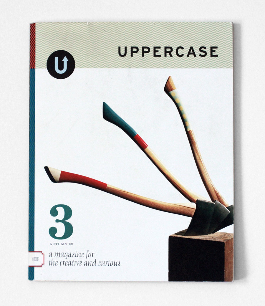
Always shave after a hot shower.  Always begin with a hot towel. Cream. Gel. Stick with Gillette. Go with Schick. You can always trust a Remington. Williams Rose Soap, Dr. Harris Arlington Shave Stick, or Bigelow Shave Cream? Shave at night. Always rinse the blade between strokes. Pat (don’t rub!) dry. Nothing but Aqua Velva. Always finish with a splash of Witch Hazel.

One of my most cherished photographs is of my grandfather shaving while I gaze up at him intently, mimicking his gestures. Whenever I linger on it, I feel the weight of that moment – but it is a good, simple weight, an uncomplicated weight. And sometimes I feel the distinct sensation, not unlike a film reversing at great speed, of things folding in and winding back to their source.

Shaving is dense with meaning. Its result is nakedly public, its practice intensely private. It’s informed by lore, oral tradition, loyalty, filial bonds, gear, principle, aesthetics, and technique. Woven into it is the obligation to pass it down to the next generation, whether as fathers, uncles, or brothers. We do it, carefully, regularly, for ourselves, and for each other – in particular for loved ones, but more broadly for everyone we might encounter – a small adjustment on behalf of society, even civilization.

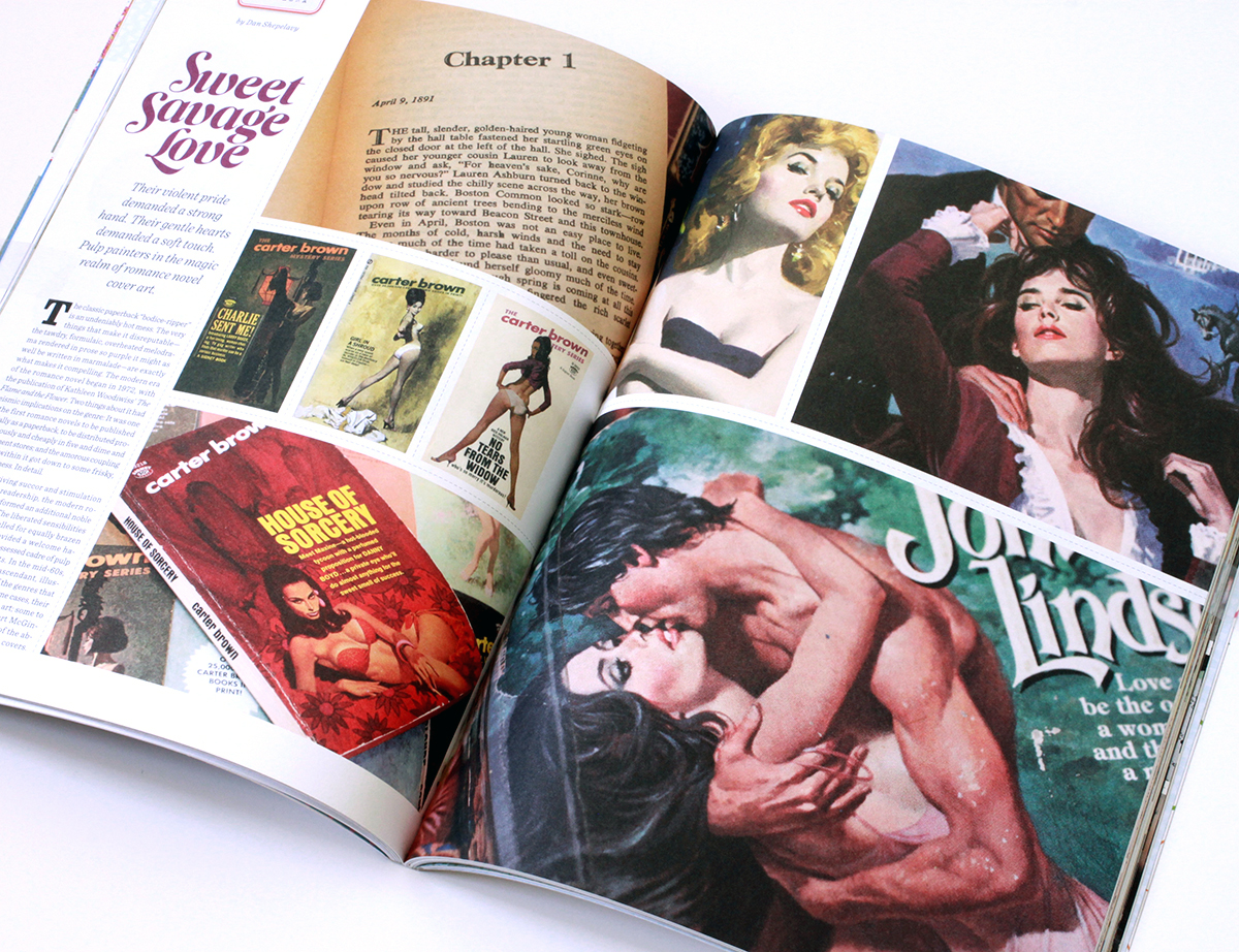
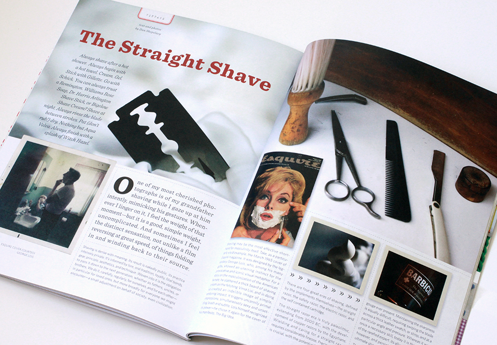
Shaving may be the most effective shorthand for masculinity itself. Take, as a particularly vivid example, the March 1965 cover of Esquire magazine. It was designed by the legendary George Lois, who, among his many gifts, showed an unerring instinct for the provocative and iconic visual metaphor. For a story on the masculinization of the American female, he slathered a thick beard of shaving cream on the fetching Virna Lisi, and in doing so created an indelible image of simple, enduring impact. It triggers uncannily primal impressions, simultaneously sexy and unsettling, brash and subtle. Lois himself recognized its power – he chose it again for the cover of his manifesto, The Big Idea.

There are four great eras of shaving, defined by the implements themselves – the straight razor, the safety razor, the electric razor, and the self contained cartridge.

The straight razor era is truly paleolithic, extending from 3000BC, with the development of copper razors by the Egyptians. Wielding and caring for a straight razor requires considerable finesse. Precise handling is crucial, with the potential for a nasty nick or gouge ever present. Maintaining the sharpness is equally difficult, requiring swiping the blade across a thick leather swatch, or strop, and at a particular angle and pressure. Whereas it was once a necessary skill, today it is the province of the rarefied expert. Its allure remains strong, however, and persists as a benchmark of the ultimate shave.

The safety razor, on the other hand, is no less than a signal achievement of the industrialized age, fulfilling the democratizing promise of mass production. It was initially invented in the 19th century by a Frenchman, Jean-Jacques Perret. In 1904, United States Patent #775,134 was granted to King C. Gillette for his version. During the first world war, Gillette cut a deal with the US military to be the exclusive supplier of this radical new convenience; by the end of the conflict, practically the entire nation had been converted to this new format.

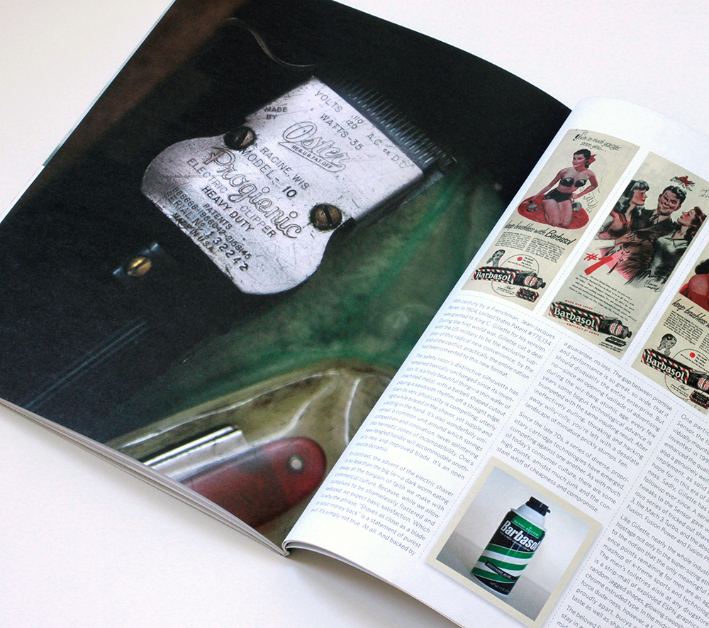
The safety razor’s distinctive silhouette has remained basically unchanged since its invention. It  is a truly beautiful thing – a thin wafer of machined metal, with a barbell shaped cutout playing a sawtooth rhythm off an a straight edge. Even its very physicality is compelling; utterly rigid while braced in the shaver, yet supple and yielding in the hand. It’s also wonderfully universal, a common unit around which springs competition and innovation, never splintering into hermetic zones of incompatibility. One’s new fangled handle will accommodate another’s new and improved blade. It’s an open source dynamic.

In scontrast, the advent of the electric shaver is no less than the big lie – a dark worm eating away at the bargain of faith we make with commercial culture. Because, while we allow ourselves to be shamelessly flattered and seduced, we expect basic satisfaction. Which is why the phrase, “Shaves as close as a blade or your money back” is a statement of purest evil. It’s simply not true. At all. And backed by a guarantee, no less. The gap between promise and performance is so great, so wide, that it should disqualify the entire enterprise. But no – since an opening fusillade of advertising during the wiz-bang atomic age, every few years some bogus technological advance is trumpeted with the same insulting result. After ineffectively pulling, thwaking and hacking away willy-nilly, you’re left with a desolate landscape of miniature prickly stumps. Feh.

Since the late ‘70s, a series of diverse, proprietary cartridge technologies have emerged, competing against one another. As with much of today’s consumer culture, there are some high points, amidst much junk and the constant whiff of cheapness and compromise.

One particular triumph was the Gillette Sensor, the first razor with twin blades individually mounted on highly responsive springs. Invented in 1990, the Sensor significantly enhanced the quality of the basic shave. It was also an genuinely well designed and handsome implement, as solid as anything you could hope for in this era of injection-mold flimsiness. Sadly, Gillette has been at a loss for a followup ever since. A series of mostly minor tweaks to the Sensor gave way to an obnoxious series of tricked out shavers – the Mach 3, the Mach 3 Turbo, and the absurd five blade Fusion, Fusion Power and Fusion Phantom.

Like Gillette, nearly the whole industry seems hostage not only to the super-sizing ethos, but to the notion that the only meaningful reference points remaining for men are an aggro mashup of x-treme sports and technology. The men’s toiletries aisle at any drugstore is a strip-mall of exploded ESPN graphics – random jagged shapes, glowing swooshes, and chrome extruded type. In the midst of this gale force dude-ness, however, a few brands stand proudly apart, buoys anchored to broader taste as well as shaving’s classic past.

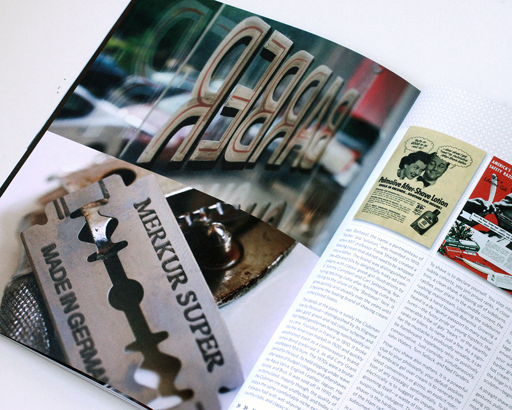
The beloved Barbasol can, still a reliable mainstay in any old-school barbershop, retains its midcentury-modern look – pop color bands and pinstripes that evoke a classic barber pole along with a distant echo of the classic PanAm logo. Barbasol, a portmanteau word of “barber” and “solution,” was invented in 1919, when MIT professor Frank Shields created a shaving cream that did not need to be whipped into a lather. The brand was distinguished in the ‘40s and ‘50s by delightfully frisky ad campaigns with classic good-girl illustrations by E. Simms Campbell and Carl Setterberg,  featuring fetching cutie after fetching cutie testifying to the allure of the “Barbasol” face. It grew quickly and steadily over the years until it became the leading brand of shaving cream in the United States.

The dandy at the party is surely the Clubman line by Penaud – distinguished by its filigreed label, gold, green and red color scheme and top-hatted gentleman leaning nonchalantly on his cane. Founded in France in 1810, it broke into the American market in 1920 and quickly

established itself as a connoisseur’s brand. James Bond preferred it, as did Cary Grant and Robert Mitchum. The 1970s were a brutal period for Penaud, its hold slipping under wave after wave of budget colognes and aftershaves like Aqua Velva, English Leather, Jaguar, Hai Karate, and Brut. It was sold off in 1990 and re-formulated. Happily though, the quality of the Clubman line was unaffected, and today it enjoys the same comfortable niche existence it always had with wet-shaving enthusiasts, country clubs, and classic barbershops.

To shave is to declare yourself. You step into subtle cohorts, you join proud ranks. A close trim, a clean shave, a lopping off of sideburns, ratifies your place in the middle current, the rushing mainstream. Lowering the sideburns extends a hand towards Bohemia. Growing a beard is a de rigueur passport to many subcultures – the fussy pride of young hipsters, the venerable tribe of gay “bears,” or the swarthy ranks of bikers, to name just a few. As a signifier the mustache is profoundly versatile; it can be flamboyant, hopelessly retro, or positively conservative. Just consider, simultaneously, John Waters, Tom Selleck, and Ned Flanders.

How you shave also matters. It is a powerful clue to your philosophy, your default position. To embrace gel over cream is to venerate the latest convenience or gizmo, an explicit rejection of any nostalgic sentimentally.  To shave electrically is to suggest an impatience with grooming itself – a waste of time and perhaps suspiciously indulgent. The committed wet-shaver is the hardcore hobbyist, close cousin of the Ham radio buff or the garage brewer, subsumed in the minutia of the craft.

In my case, I’m primarily a Gillette Sensor man. I do own a sturdy, vintage Merkur safety razor, but so far it lays mostly dormant on the vanity. Every now and then, though, I get a straight shave at John’s Barbershop in South Philadelphia. In operation since 1932, it’s a neighborhood legend, frequented, as an old newsman put it, by “surgeons and cardsharks; musicians and moochers; politicians and pool hustlers,” as well as golden age entertainers like Jerry Vale, Joey Bishop, Jimmy Durante and Robert Goulet. While its heyday may have faded, the experience that secured its reputation continues to flourish today.

As you settle into the supple leather of a vintage Belmont chair, your face is immediately enveloped in a thick, hot, wet towel. Once your whiskers have started to soften, the barber gradually works in a machine-mixed hot cream. Then he opens the razor, anchors the hinge in his palms, and – half surgeon, half sculptor – begins.

A straight shave is a dense array of little expert gestures, pulling taught and flicking, or passing along your contours in a smooth arc. Where modern shaving makes you think of your face as an upside down egg, a straight shave makes you aware of the subtlety of its construction. The barber expertly negotiates a latticework of planes, curves, and facets.

Unlike the bantering semi-alertness of a haircut, you surrender to a straight shave. You pick up snippets of conversation here and there – neighborhood bulletins and updates, a little crime, dollops of philosophy. John is a maestro of the art of conversation, with a thoughtful familiarity with his customers, a genuinely warm appreciation of the particulars, all the while deftly blending multiple private conversations into a single public one.

Then, abruptly, it’s over. For a few seconds a sensation of rawness begins to bloom, extinguished immediately by a balm of cocoa butter, then invigorated with a bracing sting of lilac.

Text and photography by Dan Shepelavy

Uppercase_7

The Straight Shave

A preview of a few photographs for my upcoming essay on shaving in issue 7 of Uppercase Magazine. It will be out this fall. They were shot mostly at John the Barbers on Wharton & 13th Street in South Philadelphia. The place is a treasure and a visit a privilege. The article features, along with my observations on the genteel art of shaving, buy vicodin usa walk-ons by Virna Lisi, John Waters, and Robert Goulet, a salute to the Gillette Sensor and Barbasol, praise for the French, a raspberry at ESPN, a brace of fetching pin-ups, and ends where these pictures began, at John the Barbers. Oh, and Uppercase Magazine? Again, with lapel-grabbing enthusiasm, here, and here.

I Want to Believe
Uppercase Magazine #6

UFO_1

I staged these UFO photographs in the late 70s, when I was 9 or so, on the front lawn of my childhood home in Liverpool, New York.  When I look at these images now, they never fail to spark a small reverie — a welcome wormhole into kidhood.

Like the photos themselves, which have yellowed & faded with age, my affinity for the images has mellowed & deepened over the years. Now I think I’m as taken with the notion of staging UFO pictures as the idea of UFOs themselves.

I think the photos capture a profound human dynamic —inventing & crafting our own fantasies, while the same time ardently longing that they actually be true. Dwelling amid the tension is much more satisfying, ultimately, than being either a gimlet eyed rationalist or a wide-eyed true believer.

Uppercase_6

Corrections

Beauty, right? I found this a few months ago rifling through files at DuPont’s Hagley Museum, doing research for my Nylon article for Uppercase Magazine (which I previewed recently, here.) A wonderful example of something so basic, so dashed off, so ordinary – some corrections on a galley proof – that happen to merge, by chance, into something really artful.

Synthetic Aesthetic
Uppercase Magazine # 5

Synthetic_1Synthetic_3Synthetic_2

The development of synthetic fabrics is a fascinating nexus of science and culture. Its history weaves through the disparate worlds of industry, warfare, design, advertising, high fashion, and mass consumption. It may be the only product that has profoundly, and equally, affected scientists, generals, housewives, and haute couture designers.

The roots of synthetic fibers lay in Paris, in the late 1700s, at the cusp of a scientific and social revolution.  Éleuthère Irénée du Pont de Nemours is working as the assistant to Antoine de Lavoisier, the father of modern chemistry. In addition to his scientific pursuits, Lavoisier is also the administrator of a tax collection company, and up to his neck in the financial and political affairs of the royal French government. As the Revolution rages, Lavoiser’s neck finds itself under the guillotine. Thus abruptly ends the life of quite possibly the smartest man in all of France. Thoroughly freaked out, du Pont packs up and flees to the United States. Landing in Wilmington, Delaware, he founds E. I. du Pont de Nemours and Company, known commonly as the DuPont Company and, based on a knowledge of munitions and chemistry decades ahead of anything in the colonies, becomes an industrial powerhouse.

At the turn of the century, DuPont began experimenting with synthetic polymers. Polymer molecules can be coaxed into an extraordinary array of substances – synthetic rubber, Bakelite, neoprene, PVC, shellac, silicone and, of course, nylon, the first completely synthetic fabric.

The impact of nylon and other synthetics on fashion, warfare, commerce and culture in general is hard to overstate. The introduction of nylon stockings in the ’40s revolutionized the female silhouette and became a mass consumer sensation. The characteristics of nylon proved so useful in military applications like parachutes, tires, tents and ropes, that it was abruptly and completely withdrawn from the consumer market during the Second World War. When it was reintroduced, it promptly overturned silk’s 3000 year stranglehold on luxury, and went on to fundamentally inform the fashion of most every decade that followed: Mass luxury and convenience in the ’50s; space age pop in the ’60s; the leisure vibe of the ’70s; and the athletic glamour of the ’80s.

The full field view of the development of synthetic fabrics is ably told in the engagingly written, lavishly illustrated book Nylon: The Manmade Fashion Revolution by Susannah Handley, published in 1999 by Bloomsbury. Reading it, I found myself drawn to the visual and design legacy of DuPont’s marketing of the fabrics. At the company’s Hagley Museum and Library, a few months later, I discovered what amounted to a core sample of prevailing trends in design, typography, photography and advertising illustration over the decades.

Design for Modern Living

Nylon, Orlon, Dacron, Rayon. Acetate, Teflon, Cordura, Antron. Lycra, Corfam, Taslan, Fabrikoid, Qiana. After a while, the roll call of names begins to take on the weight of poetry. There is so much meaning projected into those names, so much technology, culture, science fiction, science fact, high fashion, mass appeal, new frontier optimism, dependability and sheer wizz-bang newness.

The names become even more evocative when expressed typographically. Fabrickoid has the sturdiness of die stamped metal. Nylon, Dacron, and Orlon evolve from compressed modern type to friendly hand drawn accessibility. Lycra gets all cute as it moves from elegant sleekness to voluptuous roundness.  Antron suggests the swashy title of a romance novel, while Qiana recalls the snooty glam chic of Studio 54. Taken together, they seem to tell the story of the the second half of the twentieth century through type alone.

Every Fashion Needs a Stocking All It’s Own

DuPont was aggressively involved with the marketing and advertising of its products. State of the art advertising went hand in hand with state of the art research and development to perfectly position synthetics in the context of consumer desire. As a result, the history of DuPont’s marketing provides a pocket history of the finest in American advertising techniques and approaches. Refined oil illustrations and elevated copy of the ’30s and ’40s give way to the fresh and breezy gouache work of the late ’40s and ’50s. Painterly photography and dapper elegant compositions of the early ’60s pass through the kaleidoscope of psychedelia, and end up in the earthy sexiness of the ’70s, and the lacquered foxiness of the ’80s.

It’s even more interesting to take note of the relative character profiles of the fabrics themselves across the decades. In the ’20s and ’30s the overall tone is refined and sophisticated. As Nylon sweeps into mass culture, things get far less formal and starchy. From the start, Nylon maintains a frisky ratio between a fundamental wholesomeness and a bracing sexiness. The ads have a coquettish, foxy housewife vibe streaked with a racy touch of pin-up sensibility. Orlon and Dacron, on the other hand, maintain a sturdy squareness in the ’50s that matures into mainstream glamour in the ’60s. Lycra comes into its own in the ’70s, emphatically sexy, rooted directly in the fetching forms of lingerie or the skintight essence of the body itself. Qiana was pitched exclusively through the world of high fashion, with Parisian runway shows and partnerships with designers like Dior, Saint Laurent and Balmain.

Quality Standards

Overall, the sheer excellence of the graphic design employed by DuPont and its partners is striking. Almost without exception, all the informational brochures, like the ones here for Lycra, Antron and Fabrikoid, were designed with with sophistication and flair – no surprise considering that explaining the characteristics of the fabrics to buyers was crucial to their success. The pamphlet detailing the Camden South Carolina May plant is a concise model of ’50s design and composition. The spot color tags for the different gauges of Rayon fabric, with fabulous names like Lolustra and Duponaise, are tight little Jenga stacks of type. And the “501” quality inspection tag is a veritable poem of typesetting. Then, of course, there is the very idea of the Dichter Institute Motivation Study of Women’s Attitude’s About Pantyhose. Who says advertising doesn’t contribute mightily to how we understand ourselves and our world? That handy tome, I’m sure, borders on philosophy.

Better Living Through Chemistry

What ties all this together is DuPont’s seemingly sincere belief in its own motto: Better Living Through Chemistry. And the company didn’t shirk the “better living” part. It took great care to write its products into the script of daily life. Every logo, every line of copy, every illustration, every advertisement, was shot through with the essence of “better living”. In retrospect, it’s fascinating to follow the changing notions of how that life should look. What remains constant, enduring, and impressive, is the craft and panache with which that life was rendered.

All images © Hagley Museum / DuPont. Used with permission.

Uppercase_5

The Enthusiast
Uppercase Magazine #3

Glenn_Gould

…Across the province of Ontario, which I call home, Queens Highway no 17 plies for some 1000 miles through the pre-Cambrian rock of the Canadian Shield. With its east/west course deflected, where it climbs the northeast shore of Lake Superior, it appears in cartographic profile like one of those prehistoric airborne monsters which Hollywood promoted to star status in such late late show spine tinglers of the 1950s as Blood Beast From Outer Space or Beak From Beyond, and to which the fuselage design of the XB15 paid the tribute of science borrowing from art…

So begins, improbably, the narration of “The Search for Petula Clark,” one of a series of radio features the classical pianist Glenn Gould made for the CBC in the late 60’s, after his abrupt retirement from public performance. Gould’s story is often understood in terms of the standard drama of eccentric genius: young and brilliant, and yet temperamental and odd, he burned bright, was subsumed by his eccentricities, faded out, cue credits, etc. To regard Gould as the Howard Hughes of classical music may be romantic, but it obscures far more interesting motivations that led him to abandon the concert hall at the peak of his career. The radio documentaries provide not only a key to understanding Gould’s decision, but an inspiration to anyone who finds aesthetic and intellectual pleasure in the unlikeliest of places.

Described by Gould as “Contrapuntal Radio,” the documentaries were exquisite sonic constructions, built of precisely calibrated layers of voices and under-girded by a lattice of sound effects and musical passages. They were explicitly musical. Gould composed fugues of dialogue that cumulatively evoked notions greater than any of the individual sentiments themselves — like chords of language and thought. Each is narrated in Gould’s distinct voice–complete, rounded pronunciations of each word, formed without dropped syllables. Full word follows full word, separated by a crucial, clean, split second of silence in a quick, steady, hypnotic cadence.

Both in ambition and the complexity of construction, “The Search for Petula Clark” is probably the simplest of his radio features. However, it serves as a great precis of the main themes that animate Gould’s major radio works like “The Idea of North,” about the effects of living in solitude; “The Latecomers,” about Newfoundland; and profiles of composers Leopold Stokowski and Richard Strauss. One way or another they involve the discovery of deep aesthetic pleasures in the everyday, the fundamental character of ideas, and the mechanics of creativity.

As the “The Search for Petula Clark” continues, Gould drives through the remote regions of northern Canada, listening to the radio. As he passes from town to town, he compares naming conventions (Michipicoten, Jackfish, Terrace Bay) to describe three generations of settlers that have defined the region’s history. A passing observation of local real estate stratification unlocks the complex interplay of social standing, industry and the limits of upward mobility. As he heads once again into the wilderness, he sees the first of an array of relay antennae that pass radio signal deep into the endless stretches of the north. Utterly captivating, this is just Gould clearing his throat; acutely aware of cinematic staging, his introduction begins with an establishing aerial vantage, swoops down, passes over the landscape and under the wires, and pulls back up as the opening measures of Petula Clark’s “Sign of the Times” fade in and his ruminations begin.

Goodness gracious, how this cat riffs! Based on a close reading of four consecutive Clark singles (“Downtown,” “Sign of the Times,” “My Love,” and “Who Am I?”), he constructs a loose, yet full-field, theory on the distinct stages of mid-century pop stardom and sketches a pocket biography of Clark. He fuses Clark’s four singles into a coherent melodramatic arc: youthful earnestness, hope, urban vitality, romantic disillusionment, culminating in the “tenor of mindless confidence and the tone of slurred articulation… the interminable mid morning coffee hour laments of all the secret sippers of suburbia”

Along the way, Gould pauses for a hilarious, brainy and impertinent digression on the Beatles. With a sophisticated, yet idiosyncratic, musical analysis, he indicts the group as hopped-up folkie barbarians, rube minstrels filling an ageless role in cooking up a good racket. Yes, yes, so far, predictable fogey fare. Then comes a lavish testimonial to the acumen of Clark’s composing partner, Tony Hatch, remembered now mostly as a cheesy 70’s TV soundtrack hack, but once a deft and felicitous pop composer and early-60’s collaborator with Scott Walker and David Bowie. (As a prescription, Gould’s vision for popular music essentially endorses the approach embodied by decadent french pop maestro Serge Gainsbourg, especially in his magnum opus “Melody Nelson”–thoughtful orchestrations, found sound, collage, spoken word passages and soap operatic drama.)

Besides their intrinsic interest, the relevance of the radio documentaries lie in their restless curiosity. Sometimes it seems as if Gould is interviewing reality itself. They are driven by a passion to illuminate the deep worth of overlooked things. Art could be anywhere; you had to tease it out, as he put it, by keeping “all the elements in a constant state of flux, interplay, nervous agitation, so that one is buoyed aloft by the structure.”

This notion serves as a manifesto of sorts for Gould. He spent his life soaking in the details of the world around him, observing, making, tuning, recording, tweaking, sketching, musing, opining, composing. To enter into Gould’s world is not to part the curtain on a reclusive eccentric. His abandonment of performance and his subsequent work are best understood as a commitment to a life of ecstatic appreciation. It’s what makes him practically a patron saint to passionate enthusiasts. Gould devoted himself to the central preoccupation of any cultural omnivore: the development of a self sustaining aesthetic universe, with consistent rules and endlessly roiling passions, full of quirks, strangeness, and charm. Uppercase_3

Uppercase Magazine #3

uppercase

issue-3-preview

The clue to what distinguishes Uppercase Magazine lies in its motto “A magazine for the creative and curious”  It’s the “curious” – It accounts for the joyful, inclusive sense of collaboration and sharing that pervades the whole shebang. The magazine reads like a conversation between like-minded folk riffing on the impossibly cool thing they’ve drawn, thought, photographed, collected, discovered, etc. No lofty curatorial snobbishness or hipster veneration of the mindlessly shocking or willfully ugly for these cats – just a democratic spirit and a celebration of beautiful things.

Another thing – the magazine, as a project and physical object, is the very embodiment of what it celebrates.  It works on a collaborative publishing model, and is designed and produced with great care and craft. Feels great in the hand. The three covers so far are stunning in their graphic impact. Folks seem keen on it too. The first two issues are sold out and subscriptions now begin with the third. The whole Uppercase venture, gallery, books, blog etc… seem of all of a piece. Well worth it. Explore here.

(Oh, and – given my affinity for the venture, I’m proud to say they’ve found room for my own contribution to it. For issue three I wrote an article exploring the radio documentaries of the classical pianist Glenn Gould, not only in terms of his own career but as a manifesto for the insatiable cultural omnivore. As you can see from the preview above, they were kind enough to include an accompanying illustration, which was a great excuse to paint one of Gould’s pop cultural obsessions, the fetching Petula Clark.)