Index: Vintage Design


HomeMakers Bar Collages

Shepelavy_Homemaker_I Shepelavy_Homemaker_II Shepelavy_Homemaker_III
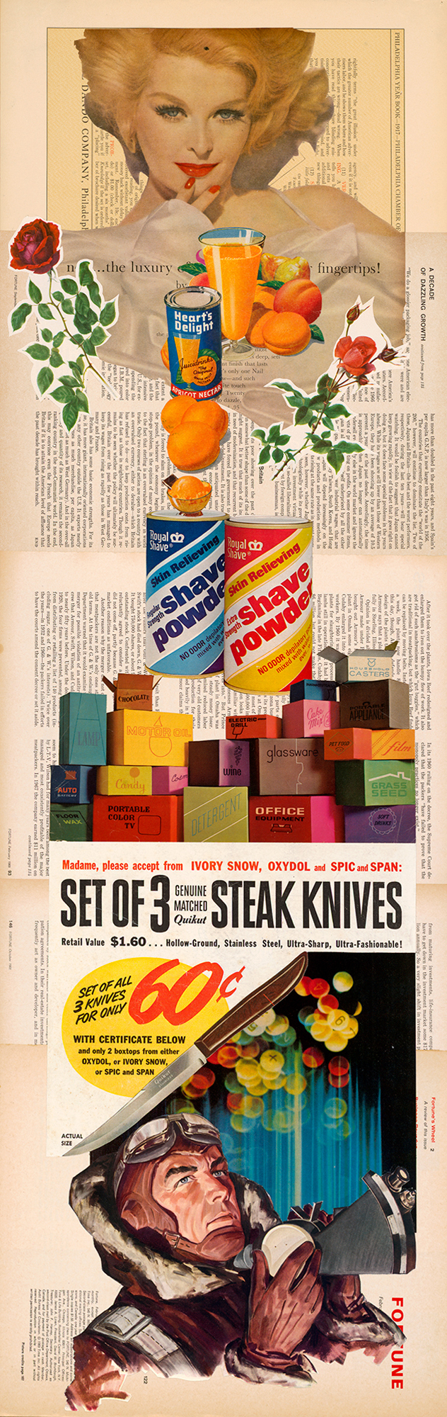
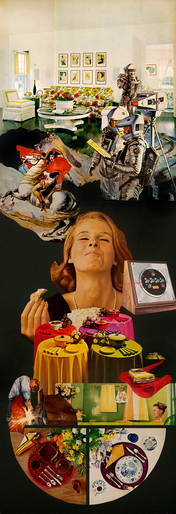
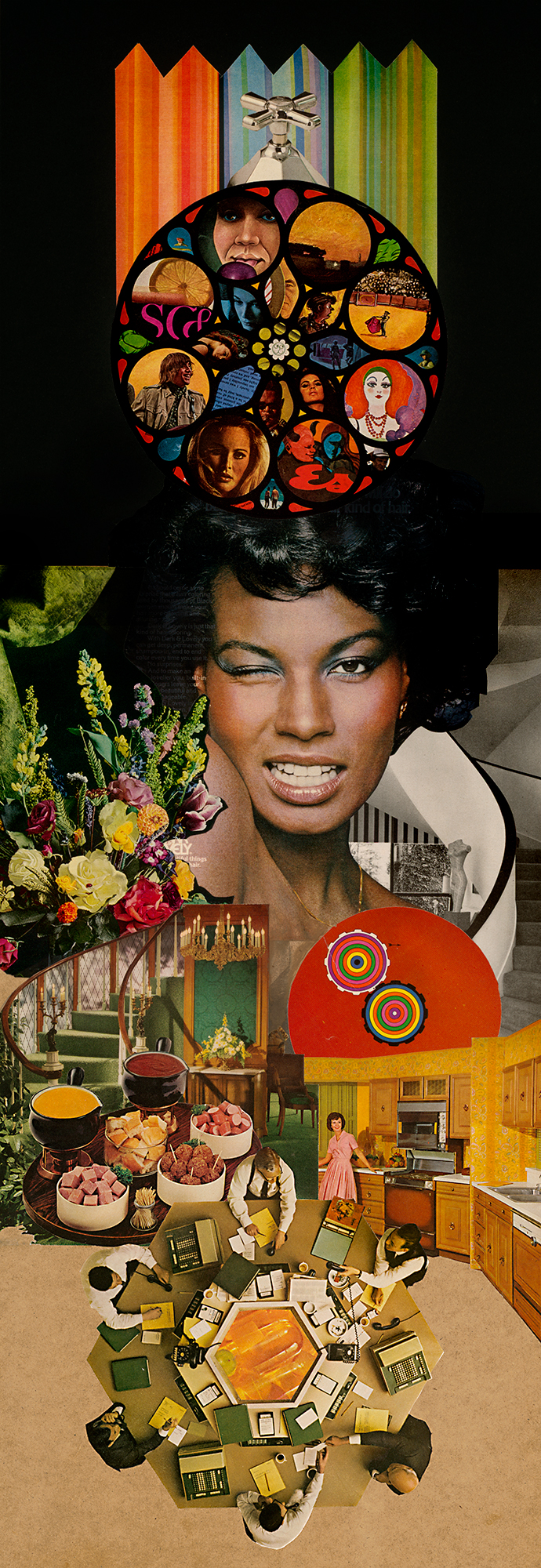
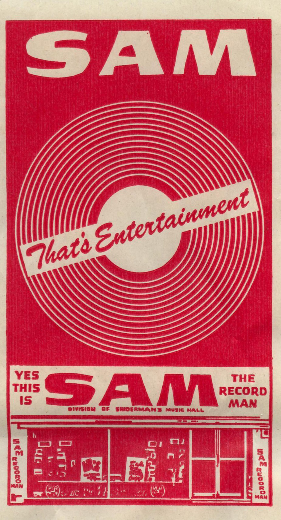
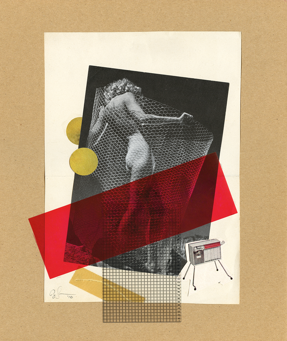
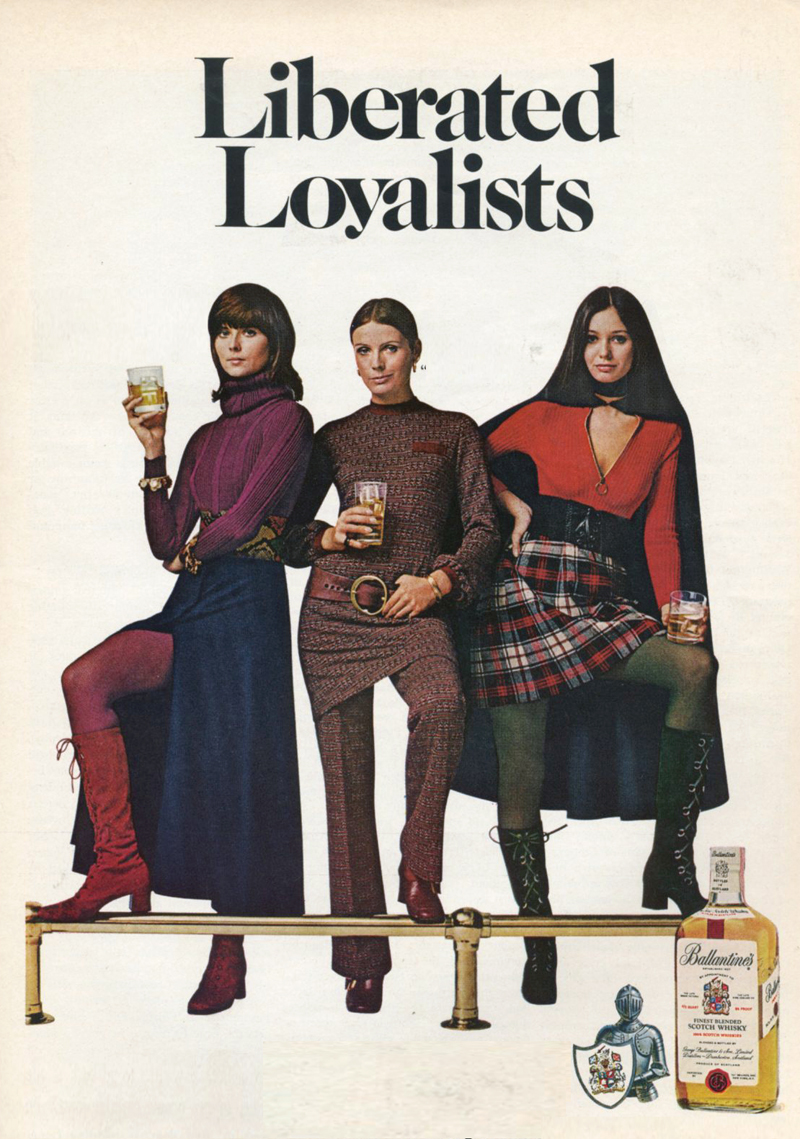
Last year I had the distinct pleasure of making these collages for the interior of HomeMakers Bar in Cincinnati. Each collage spotlights a different era – 50’s, 60’s, 70s, playfully subverting the traditional iconography of homemaking, cocktail culture, and swank entertaining. In the words of their inspired founders Julia Petiprin, Catherine Manabat, HomeMakers Bar is “a slightly retro, mostly modern cocktail bar that feels like a house party.” While I can only admire the delightful food and drink offerings virtually, I can say that the space and decor is a showstopper. It is, I think, hard to pull of something fresh in a “retro” mode and HomeMakers Bar has clearly emerged as a singular creative and culinary statement that easily transcends its original inspirations. (More interior images can be found on the portfolio page, here.)

PLAGUE UPDATE: With considerable trepidation, I checked in on HomeMakers Bar recently and was ecstatic to see that they are rising to the moment with their signature verve and flair – sharing recipes, hosting cocktail hours, workshops, hangs, and general bonhomie. If you can support them in any way, do. Fucking bravo! hiltonbet

Sam the Record Man!

Sam_Record_Man Sam_Record_Man_2 Sam_Record_Man_3Sam_Record_man_4On a recent unexpected layover in Toronto I happened to see, hoisted high, high above a gloomy black glass office building in Dundas Square, this wonderful sign. Double barreled neon flashing records proclaiming, twice, that YES, THIS IS SAM, THE RECORD MAN! YES, THIS IS SAM, THE RECORD MAN! Wonderful! Wonderful! A little research revealed the legacy of a one proud Canadian record store chain – a blaring hybrid of Crazy Eddie and Tower Records. Sigh.

Love Hulten

7472252_orig 4489489_orig 2320050_orig 282363_orig 830615_orig 4307728_orig 6678335_orig
5667556_orig

When I look at these absolutely breathtaking handmade made-to-order objects by Swedish fabircator Love Hulten, I covet.

In fact I covet three ways. At first I covet crassly, wishing I could afford these hand turned masterpieces. Then a little more thoughtfully, I covet the skills & craft to build these kinds of things myself. Then, finally, I covet philosophically, wishing that this was a genuine commercial aesthetic — that as we chase the geewhiz we’d take the texture and soul of what worked before and roll it in as we roll foward. We’ve left so many beautiful things behind.

The Quintessence of Tempest

temp1

temp2

[RERUN: Hauling this out of the early days of the blog. I’ve been on a protracted vintage video game and pinball bender lately. Atari’s iPad port of my beloved Tempest is damn near perfect and I’ve been playing it a ton. As such this early appreciation of the stone cold perfection of this game has been on my mind. So, here, then…}

The screen graphics of the classic video game Tempest represent a kind of summit of design and beauty –  the finest expression of a very limited language. In the case of Tempest that language was vector based rendering. Vector monitors were used in video games from the mid 70’s to the early 80’s. The technology was derived from oscilloscopes – the image is projected by an electron beam onto the glass. Image a laser light show sped up to produce a lasting image and you’ve got it…

Many classic games were made using this technology – Asteroids and Battlezone as well as the first Star Wars game. While they all had their aesthetic charms, Tempest is in a class of its own. All vector games have a certain elegance and simplicity. The problem order vicodin uk arises in the crudity of the renderings – the poor approximations of tanks, asteroids, and X-wings forever marks these games as primitive gestures of an evolving technology. Tempest is exempt because it is derived from the technology itself.  What would a world defined by glowing geometric unshaded lines look like? Pretty much like Tempest.

Its beauty lies in the fact that it is in harmony with its own rules and limits. Hence the extremely elegant compositions – uncrowded, with a well balanced sense of scale. The color scheme is vibrancy itself, strong underlying blues, wonderful pops of pink, green, red, and yellow. And the physics of the electron beams give everything a deep saturated glow.

That same harmony extends to playing the game as well. Most games rely on clumsy and stunted translations of real world movements like running, jumping or flying an ostrich. Tempest moves in accordance with its nature – spinning and firing. That’s what makes it so satisfying. Once you understand its strange parameters you have a complete experience on its terms – a dynamic, I think, that is fundamental to the idea of art.

Herman Miller Picnic, Textiles & Objects


Some Herman Miller curios… Came across a few of these posters last weekend hanging in a excellent restaurant in Cincinnati. They were from a celebrated series of posters created by Herman Miller designer Steve Frykhom from 1970 to 1989 to announce the company’s yearly staff picnic. It began as an offhand assignment from an executive and Frykhom’s desire to satisfy a screen printing jones. The first salvo won that years AGIA award. In 1980 the Museum of Modern Art added seven posters to its permanent collection. Very few images abound online, the best are these can i buy vicodin in the uk tiny guys from the Herman Miller blog.

Below these are invitations to the 1961 opening of Herman Miller’s short-lived and Textiles & Objects Shop. It was overseen by celebrated designer Alexander Girard. It was a notion well ahead of it’s time – a rigidly curated mix of found objects as well as products and textiles he designed for Herman Miller. Both announcements feature remarkably original design styles that have come to be profoundly influential these days. Again, very little by way of imagery or further history about the shop sloshing around online.

Soviet girl manual

Diagrams and fashion spreads from a book called For you! Girls! published in the Soviet Union in 1965. I found it in a profoundly random box of discarded books and cassettes in the “free trade” corner of a U-Haul self storage warehouse in Philadelphia. It was published by something like the Committee for the Literature for Popular Sciences & Medicine (My Ukrainian provides an imperfect guide to the Russian) It’s a comprehensive guide to the Soviet Girl, with a strange mix of propaganda, health and fitness tips, fashion spreads, and aspirational portraits of female astronauts, seamstresses, soldiers, and miners. Odd, fascinating, unsettling in the soullessness of the sloganeering and the gap between the lightheaded lifestyle spreads and the grey reality of Soviet life… but as often is with this stuff, aesthetically compelling – a mix of constructivist graphics, great type, and high key black and white photography.

Claude Chabrol: 1930-2010

A selection of some fab posters for films by pioneering French director Claude Charbol, who died this week. (Some decent obits here, and here.) A giant of French cinema, Charbol was a founding member of the French New Wave, close pals with (and somewhat of a patron to) Jean-Luc Godard, François Truffaut and Éric Rohmer. Along with Rohmer he published a seminal critical work on Alfred Hitchcock, a significant influence.

Charbol was often described in shorthand as the French Hitchcock, which is pretty dead on, adjusting a bit for time periods and sensibilities. While not strictly a formulaic filmmaker, diabolical plots, melodrama, all manner of decadence, wry humor and a general wickedness abound.

For your consideration, a passel of recommendations from his extensive oeuvre: A Double Tour, 1961 – a convoluted noir, Who’s Got the Black Box?, 1967 – shaggy, but entertaining espionage yarn,  The Unfaithful Wife, 1969 and Innocents with Dirty Hands, 1975 two chilly, melodramatic physiological thrillers, Cop Au Vin, 1985, the first of two top drawer police procedurals featuring inspector Jean Lavardin, Masques, 1987 an intriguing character-driven mystery, The Swindle 1997, a neat little caper, Merci Pour Le Chocolat, 2000 about a wealthy family’s nest of secrets, and Comedy of Power, a corporate boardroom drama. Available here, or at your fine local video store.

Hold it right there, Emma Peel!

The opening credits of the Avengers in color are deservedly beloved. What struck me recently was how sharp the compositions of the main frames are, though. They make a wonderful sequence – the dirty floods of color, the stark contrast, the precision staging of it all. Amazing thing is, even when frozen, they retain a jaunty swagger, the lightly hammy sophistication, and flair.

All aboard!

Found after a visit to the Strand book store, nested under a dust jacket flap… Best part? – other than the perfectly deployed heaviness of the design… It slid out while I when I was asked for my ticket by the conductor on a Philly buy canadian vicodin bound Amtrak train…

Crêpes?

Aren’t these the bees knees? These crêpe folding diagrams were excerpted from a cookbook that accompanied a used crepe maker I bought the other week. Printed in 1973, the thing is a compact testament to the enduring charms of simple, sturdy design – bold Akzidenz-Grotesk font, thick outlines, and a well chosen single pop color. Fin.

Irma La Douce

You’d expect the artwork for Irma La Douce to be top drawer. The pedigree is peerless – the 1963 comedy starred Jack Lemmon and Shirley MacLaine. It was directed by Billy Wilder. This bawdy confection sits in the middle of one of the insanely great runs of film making, starting with 1957’s Witness for the Prosecution, continuing with Some Like It Hot, The Apartment, Irma, the unjustly maligned Kiss Me, Stupid, The Fortune Cookie, The Private Life of Sherlock Holmes, until 1972’s Avanti!

So yes, sharp stuff – stylish and well executed modernist film poster design. It’s the depiction of MacLaine, though, in each that just knocks your socks off.  The caricature developed for the American poster captures her essence perfectly. The typically lysergic Czech poster taps into her undercurrent of sultriness. If anyone ever deserved to be described as a cocktail, it was the young Shirley MacLaine – a fizzy syrup of pixie-ish mischievousness, good-natured lasciviousness, perfectly balanced between sweet and tart.

Electrical Wiring

Found this hand painted sign in a ramshackle flea market in Shawnee Village, nestled in the Pocono Mountains – the Switzerland of Pennsylvania. It takes a brave and confident hand to render each word in a different typeface and manage to make it cohere…