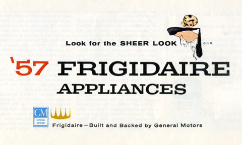
This swatch of an old ad is a poem for the eye. The different inflections of voice in each typeface and the elegant cascade from one line to the next give it a wonderfully nuanced read. I love the way the human touch of the girl is offset by the right angles of her gesture. It’s composed perfectly, like an expert round of Jenga – completely stable but full of tensions and cross balances. Good show, little layout, good show!