

Table of Contents: Art


So I finally went to visit the Barnes Collection at its new home on the Philadelphia parkway. My affinity for it has always been somewhat obligatory — I know why this art matters, but have appreciated it mostly as a bridge between older traditions I adore to modern currents I admire. As before, I find myself deaf to Matisse’s signals, and still feel an abject revulsion to Renoir — the smeary, overripe nudes struck me, this time around, like they were painted with bacon fat. Feh.
Revelatory though, were the few paintings tucked into various clumps throughout the collection by Maurice Prendergast. Each was a bravura demonstration of seeing, buy vicodin pain killers directly interpreted in painting. They were definitive and re-invigorating examples of the idea of impressionism as I understand it, painting animated by an exquisite receptivity of what it “felt like” to visually drink in a scene, its atmosphere, its flickering and transitory nature.
Later on, as I delved deeper into his work, scene after scene, I stopped thinking of them in terms of technique or theory but in terms of a kind of magic. He seemed to capture on paper an endless loop of the living essence of a moment, as if he could pin a a butterfly without stilling its movement or shimmer.
Well then — aren’t these just amazing, these collages by Nadine Boughton. Sometimes rather than launching into an extended appreciation you just want to say Fucking bravo! Seriously, bravo! …and anyway, my fellow spelunker Hannah L.’s comment in Lenscratch can scarcely be improved buy vicodin from uk upon — This is the best idea ever. Extremes that actually complement each other, ultimately reconciling with the self…. wow. Well said sister. Credit for uncovering this ace work lies with Elektra Luxx. Do pay her a visit.


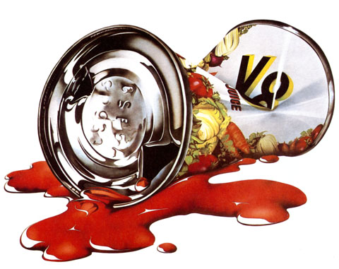
From the 60’s to the early 80’s Michael English seemed to be directly wired into each decades most adolescent, swinging, aesthetic sensibility. He began as a founding partner of Hapshash and the Coloured Coat, a design collective that specialized in gig posters and scene graphics that helped define 60’s English psychedelia (I vastly prefer this work to it’s American counterpart – it’s zonk is far sexier and literally more cosmic)
On the cusp of the 70’s an airbrush and rainbow sensibility begins to frost the work. Redolent of pinball backglass art, van conversion detailing, and late era Vargas pinups, it veers from garishly exuberant to exuberantly garish. The veneration of chrome and reflectivity carry through into the 80’s as he settled into a glossy pop-realist mode similair to the work of James Rosenquist and Tom Wesselmann. The biggest shortcoming of this period is the relentlessly juvenile subject matter – Candy bars, soda cans, glass sundae dishes predominate. The renderings however, are an exquisite case study in the late 70’s/early 80’s obsession with glossy enameled sheens and reflections.
Regardless of the era, from psych sirens and candy colored UFO’s, to chrome balls and lipgloss swirls English’s career is a overlooked layercake of guilty pleasures. (The retrospective 3D Eye, is out of print but easily found online)
Photos of the studio and work of painter Alex Russell Flint in a rambling former school house in Argenton-Chateau, France. More of his paintings, beautifully rendered weathered realist scenes and portraits, can be seen below and here.


The first page of the legendary comic Watchmen sold last weekend at auction for $33,460. Aptly described as the “Call me Ishmael” of comics, it’s one of the icons of the genre. All of the formal inventiveness that author Alan Moore and artist Dave Gibbons established in their 12 issue 1986 masterpiece is prefigured here. (Fascinating to see it stark black and white – the page also came with an ace bonus, an annotated color guide. Gander here, and here at larger images) Notice especially the convergences between Rorschach’s psycho-noir-messiah narration and the visuals in each panel. This tight choreography between seemingly unrelated visual and verbal elements is one the the primary sources of the book’s tremendous impact. It adds a crucial layer to the storytelling, one uniquely rooted in the format of comic books – the ability to directly interweave elements from one part of the story into another and thereby elicit new interpretations, resonances, and meanings. Watchmen established Moore as a virtuoso of this technique. So, so good…
Great story behind the provenance of the comic page itself. It was bought in 1987, in a comic bookshop in Covent Garden one morning by a bleary-eyed, hungover Stephen “Krusher” Joule for $180. Krusher was an artist and designer who worked with Motorhead, Uriah Heep, Blondie, Sex Pistols, Hawkwind, and Japan. He designed the covers for Iron Maiden’s Live After Death and Ozzy’s Diary of a Madman. In 1982 he became the art director for the legendary British heavy metal magazine Kerrang! In short, he’s exactly the kind of wonderful freak who deserves to score the first page of the Watchmen one hungover morning for a hundred and eighty bucks.
I must go to Nature disarmed of perspective and stretch myself like a large transparent canvas upon her in the hope http://quotecorner.com/online-pharmacy.html that, my submission being perfect, the imprint of a beautiful and useful truth would be taken. – John Updike
My favorite Doctor Seuss art by a country mile… It’s a QUANDRY, who lives on a shelf, in a hole in the ocean alone by himself. And he worries from dawn’s early light. And he worries, buy vicodin just worries, far into the night. He stands there and worries. He simply can’t stop… Is his top side his bottom? Or bottom side top? (Seuss’ September 26th, 1991,New York Times obituary, here)


Shots taken by Todd Selby of Robert Longo in his studio. For me it’s the smudgy texture of everything surrounding his deep, velvety drawings. Especially evocative are the shots of his supplies – more like mechanics gear, overlaid with an archipelago of black smears. Everything here suggests a great physicality behind the smooth rich sheen and stark contrast of his finished work. Longo has compared his drawing style to sculpture, saying “when I draw with graphite I smudge it with my fingers, move it around physically, it’s like clay. Painting is painting on the surface, covering up, where drawing is putting the picture into the paper like a photograph.”
It’s a blogament to their power that they retain a so much of this can you buy vicodin legally in canada muscularity, materiality, and weight when hung in the hermetic space of a gallery. However, they seem especially at home in the studio. It’s like seeing a big ship being assembled in dry-dock from far overhead, and seeing the complex mechanics behind something that will later glide with such heavy grace on the water.
(Below for your pleasure, are a few selections from his iconic 80’s series Men in the Cities. They have, I think, aged particularly well, and seem, now, emblematic of their era rather than beholden to it. Longo also maintains an excellent, comprehensive website with generous galleries spanning his entire career. Also, Selby’s ongoing, long running series of arty glitterati in their homes is amazing and worth checking out frequently)

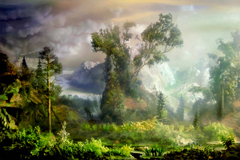
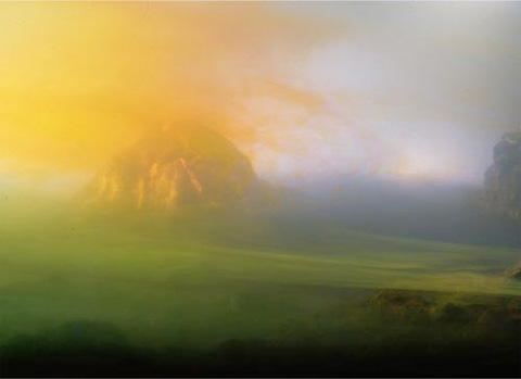
Holy cow… these landscape photographs by Kim Keever seem to indicate he’s in possession of the Genesis Device, the terraforming rocket fired off in Star Trek II: Wrath of Khan. They’re like Hudson River School paintings submerged in a lava lamp… and, they’re all composed in 200 gallon fishtanks, thusly, below. Aces. More on Keever here, and here.
This is a weird one, or at least it seems so at the moment. I was checking back in on the work of German photographer Michael Magin the other day. What I love about Magin, who works under the rubric Zeitautomatk, is his gift for framing natural and architectural forms in stark graphic compositions. Color, contrast, negative space, and abstraction are tools that, in his best work, reveal new things about the essential topography of archetypical forms – the female nude, nature, atmospheric vistas, and architectural structures.
In any case, this time, as I looked at his work, certain photos seemed to echo something familiar. After a bit of noggin racking I had it – Andrew Wyeth, specifically, his paintings and studies of his neighbor, German-born Helga Testorf.
Flipping through a Wyeth survey, I found convergence after convergence, echo after echo of poses, gestures, textures, moods, compositions. The weird thing? It’s not exactly clear that these are homages by Magin. The photos are amidst a series with a very different aesthetic agenda, ordered primarily by color tone. The ones that most strongly evoke Wyeth occur randomly in the series. But still, it seems so deliberate. She was German, he’s German… Then there’s the tree… a near twin of the tree from Wyeth’s Four Seasons portfolio.
That what is so intriguing to me, not knowing what’s going on here. I’ve thought about emailing Magin directly. I may, but not just yet. Not knowing keeps this convergence alive, the echos never settling or fading, just pinging back and forth, kept in play by uncertainty.
A little late to the Vivian Maier party, which is fitting, considering Maier never made it to her party either – in fact, knowing her, she probably wouldn’t have gone if she could… Anyhoo – what’s the fuss? It’s that Maier’s photography was discovered in a thrift auction cache a couple of years ago, some 100,000 shots, most not even processed. What scenes! Masterful, poignant and supremely artful street photography, moments equal to and anticipating Eggleston, Winograd, etc… just moldering away in a storage locker on the South Side of Chicago.
Came across her the other day in Slate’s new photo blog, Behold. Besides the sheer impact of the photos, it’s also a nourishing lesson and reminder to anyone who works at making art – that while the desire to show, share and be recognized is a powerful one, the vast share of the satisfaction comes from the privilege of doing.
More of her work here, here, biographical info here, and a great article here. Enjoy.
I. SAN FRANCISCO. Absolutely the most beautiful city in the entire world. With history, class, and cuisine, it’s a place of astounding mystery. l ask myself why I never lived
there. No answer.
2. WINSLOW, ARIZONA. An excellent stopover on P40 going east or west. Stay at la Posada, an ancient hotel with gardens, a library, art by Tina Mion, a wonderful restaurant called the Turquoise Room, and train tracks outside the back door.
3. RHYOLITE, NEVADA. A beautifully isolated mining ghost town in the dramatic setting of Death Valley. Nearby is Beatty, Nevada, with a homemade mini museum.
4. PAHRUMP, NEVADA. It’s a town that has yet to be built-not many houses, but lots of concrete curbs and partially paved streets. Somewhat of a bedroom town for Las Vegas.
5. NEW YORK CITY. It hits between the eyes. The culture is deafening, and noise is an essential ingredient. It’s the air shaft capital of the world. Everything American starts here.
6. AUSTIN, TEXAS. A beautiful town where bats live under the bridges. Home of lance Armstrong’s bicycle shop, remarkable barbecue, and lora buy vicodin shirt Reynolds’s art gallery. It’s not the musical capital of America, it’s close.
7. AMBOY, CALIFORNIA. Population: two, three, four? It’s, as they say, in the middle of nowhere. The buildings, among them Roy’s Café, are empty but very well cared
for. The post office is next to a tree lull of shoes. Desert winds, quietude…there’s something hospital clean about this tiny stop.
8. HARTSHORNE, OKLAHOMA. A lil’ country town that I always associate with my favorite baseball pitcher, Warren Spahn. It’s in the middle of America, but no way middle American.
9. SELIGMAN, ARIZONA. The Copper Cart café is all I remember. Once the fan belt capital of the world, now the interstate runs through its outhouse. A town where its past
and present are both gone-it’s worth investigating.
10. LOS ANGELES. After Oklahoma it is my adaptive home, but l only care about the central areas like Echo Park, Silver lake, Hollywood, Culver City, and Venice. On
occasion I go up to Mulholland Drive just to smell the ozone and listen to the city throb.
From W Magazine, May 2011
Illustration by Victo Ngai for a story by Peter Stamm in the May 14th order vicodin legally online issue of the New Yorker.
Captain Nemo, illustration by N.C. Wyeth from a 1918 edition of The Mysterious Island by Jules Verne. (courtesy of Mike Dubisch)
Now? Cats! Cats people, cats! This How to Draw Cats is magnificent. Walter Foster’s illustrations nail the scrappy majesty of these creatures. In every sketch I can feel their essential nature – miniature tigers that live with us, mercenary fierceness held tenuously at bay, in total, blissful, ambivalent satisfaction.