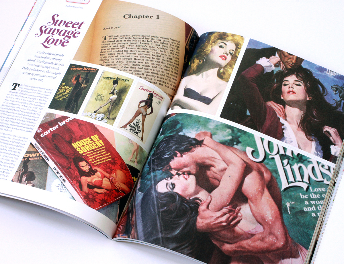
The classic paperback “bodice-ripper” is an undeniably hot mess – the very things that make it disreputable – the tawdry, formulaic, overheated melodrama rendered in prose so purple it might as well be written in marmalade – are exactly what makes it awesome.
The modern era of the romance novel begins in 1972, with the publication of Katheleen Woodiwiss’ “The Flame and the Flower” Two things about it had seismic implications on the genre. It was one of the first romance novels to be published initially as a paperback, to be distributed promiscuously and cheaply in 5 and dimes and department stores. And, pertaining to the amorous coupling detailed within, it got down to some frisky, frisky business. In detail.
Along with giving succor and stimulation to it’s devoted readership, the modern romance novel preformed an additional cultural service. The liberated sensibilities inside the books called for equally brazen cover art. This need provided a welcome haven to a recently dispossessed cadre – the pulp and movie poster artists. In the mid sixties photography began to supplant illustration. Pressed out of the genres that made their careers, and in some cases fortunes, some illustrators retired to fine art, some to advertising. Others, in the case of Robert McGinnis and Robert Maguire – two of the absolute best – migrated to romance covers.
Robert McGinnis is one of the deans of American illustration. His reputation rests on the more 1000 pulps that literally define the genre, as well as the iconic movie posters he did for Barbarella, Breakfast at Tiffany’s, and the Odd Couple. Running through all his work is a superb level of craft and technique. He painted the indelible James Bond posters for Thunderball, Never Say Never Again, and Diamonds are Forever. However his masterpiece may be a serial one. McGinnis did scores of covers for the long running Carter Brown crime series. Each is a lovingly painted lusty variation on a simple theme – a fetching seductress, a come hither pose, a hint of danger, and a hastily sketched background.
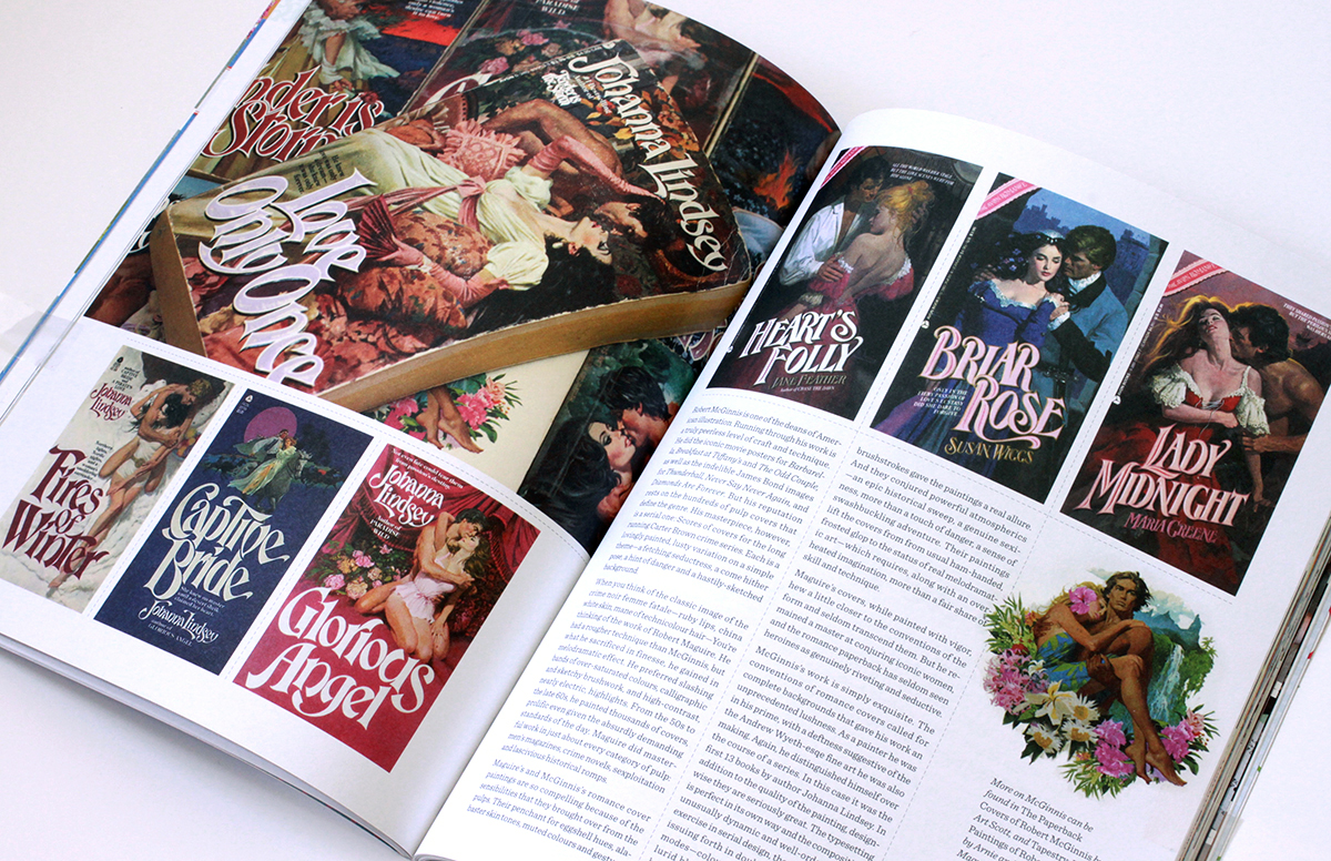
When you think of the classic image of the crime noir femme fatale, with her ruby lips, china white skin, mane of technicolor hair, you are thinking of the work of Robert A. Maguire. His was a rougher technique than McGinnisis’, but no less controlled. What he sacrificed in finesse he gained in melodramatic effect. He preferred slashing bands of over-saturated colors, calligraphic and sketchy brushwork, and high can you buy vicodin legally in mexico contrast, nearly electric highlights. Prolific even given the absurdly demanding standards of the day, from the 50s to the late 60’s he painted thousands of covers. Maguire did masterful work in just about every category of pulp – men’s magazines, crime novels, sexploitaiton, and lascivious historical romps.
What makes both McGinnis’s and Maguire’s romance cover paintings so compelling are the the techniques and sensibilities that they brought over from the pulps. Their penchant for eggshell hues, alabaster skin tones, muted colors and gestural brushstrokes gave the paintings a real allure. Also, they conjured powerful atmospherics – an epic historical sweep, a genuine sexiness, more than a touch of danger, and a sense of swashbuckling adventure.
Both Maguire’s and McGinnis’s paintings lift the covers from from usual ham-handed, frosted glop to the status of real melodramatic art – which requires, along with an overheated imagination, more than a fair share of skill and technique.
Maguire’s covers, while painted with vigor, hew a little closer to the conventions of the form and seldom transcend them. However, he remained a master at conjuring iconic women, and the romance paperback has seldom seen heroines as genuinely riveting and seductive.
McGinnis’s work is simply exquisite. Also the fact that he was rendering complete backgrounds in-line with the conventions of the genre gave his work and unprecedented lushness. As a painter he was in his prime, with a deftness suggestive of the the Andrew Wyeth-esqe fine art he was making concurrently.
Again, he distinguished himself over the course of a series. In this case it was the first 13 books by author Johanna Lindsey. In addition to the quality of the artwork, design-wise, they are seriously great. The typesetting is perfect in its own way and the compositions unusually dynamic and well ordered. As a exercise in serial design they are superlative, issuing forth in double-barrelled salvos of modes – color blocked, on-white, and full lurid bleeds. Aesthetically, these are the heaving peaks of the genre, simply the best romance paperback covers ever made.
(The McGinnis books are taken from my personal collection. More on his work can be found in The Paperback Covers of Robert McGinnis by Art Scott, and Tapestry: The Paintings of Robert McGinnis by Arnie & Cathy Fenner. The Maguire images are from Jim Silke’s fabulous survey Dames, Dolls & Gun Molls. Also, to anyone inclined to this stuff, I also heartily recommend the blog “Get Yer Bodices Ripped Here”)