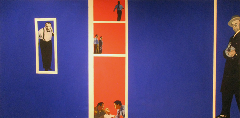
Macario Gomez, Spanish 39×27, 1963
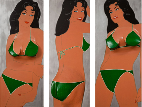
Boris Grinsson, French 63×47. 1963
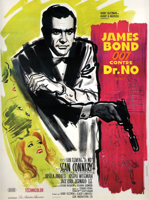
Averardo Ciriello, Italian 79×55, 1965
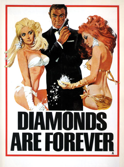
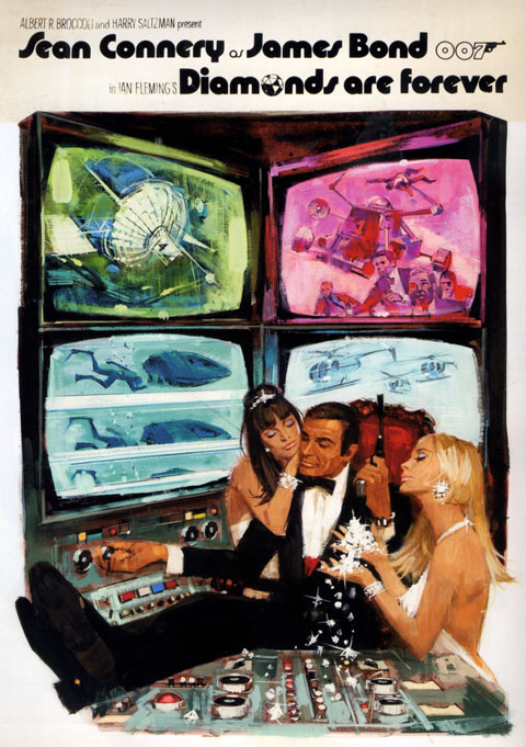
Robert McGinnis, British 30×20, 1971
Robert McGinnis, British unused art, 1971
Table of Contents: Art
Macario Gomez, Spanish 39×27, 1963
Boris Grinsson, French 63×47. 1963
Averardo Ciriello, Italian 79×55, 1965
Robert McGinnis, British 30×20, 1971
Robert McGinnis, British unused art, 1971
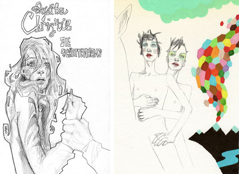
So, searching last night for some info on Berlin singer Terri Nunn (no sniggering, tough guy… Metro and Masquerade are two flat out masterpieces and Sex I’m A… is the trashy love child of Donna Summer’s I Feel Love and Serge Gainsbourg’s Je t’aime… moi non plus) and what do I come across, but these stunning illustrations by Leesa Leva. Its the tone – the mix of new wave and celebrity fixations and her delicate, sketchy technique – it’s sexy & knowing and sincere & crafty at the same time… an intoxicating mix, and a real hard one to pull off. Bravo! More of her work, and a shop, here.
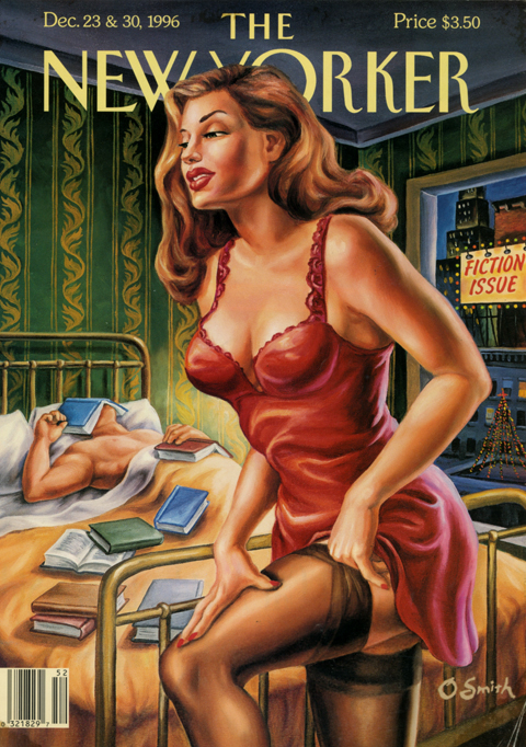
I have long adored this pair of New Yorker covers, illustrated by Owen Smith, for their attention-getting va-va-voom-ishness. The thing with Smith’s pulp derived work, though, is that it always has this aspect of impressionistic exaggeration to it, this bulging massiveness. In the past it always reminded me of social realist illustrations of the 20’s and 30’s – boxers and laborers, etc… And that thing being not my thing, that thing was always a hang up for me with Smith.
Looking again at these covers recently, his iconic flame haired femme fatale recalled something very different – the iconic flame haired femme fatales in Dante Rossetti’s Pre-Raphaelite paintings. This got me thinking… The Pre-Raphaelites rejected the classical stiffness of academic painting. They wanted to re-infuse high art with passion, detail, drama – visceral aesthetic heat. The human embodiment of that desire was more often than not a full lipped, square jawed, voluptuous, red haired fox.
That’s more like it. The echo of Pre-Raphaelite foxiness makes me like the covers even more, sure, but it also elevates them beyond “Look! Pulp! Sexy! Must not be the old starched collared, monocled New Yorker anymore!” They’re more of an articulated rallying cry – similar to the one their movie critic Pauline Kael made in the late 70’s when she titled her review collections Going Steady, I Lost it at the Movies, and Kiss Kiss Bang Bang. They insist that our encounters with culture should be lusty and passionate as well as rigorous and cerebral. Well, yes. Agreed. (This notion also happens to be the overarching theme of Rush’s song suite Cygnus X-1 Book II: Hemispheres, but that is, of course, another post….)
Dante Gabriel Rossetti (1828-1882) Lady Lilith
Dante Gabriel Rossetti (1828-1882) The Bower Meadow
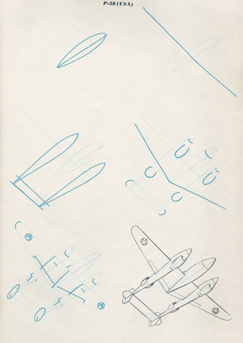
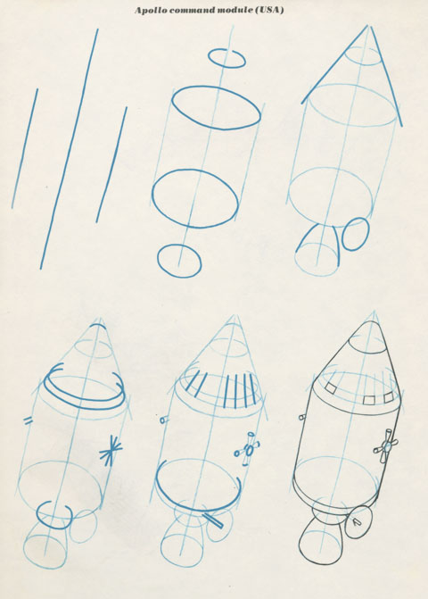
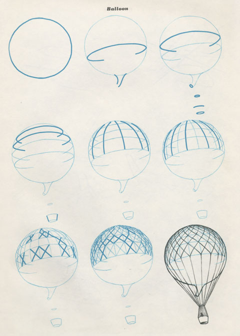
Illustrations from Draw 50 Airplanes, Aircraft, and Spacecraft, by Lee J Ames, published by Doubleday in 1977. If I remember correctly, besides following the steps accurately, a successful drawing required that you loudly mimic the sounds of the craft as you drew it.
Visual art was part and parcel of William S. Burroughs‘ entire creative project. While the writing and the biography dominated people’s perception, his creative efforts encompassed art, graphics, calligraphy, type, photography, film, assemblage, poetry, spoken word, and music.
Culture itself was his medium. For most artists this claim would be, on its face, pretentious or megalomaniacal (it feels pretentious just writing that sentence.) Burroughs was deeply sincere about it, and he pursued it with a single minded, deadpan sincerity. The cut-up was, broadly speaking, the method that he employed wherever he turned his attention. In the visual arts, that resulted in work that anticipated or was sympathetic with many fundamental currents in post-war modern art and design.
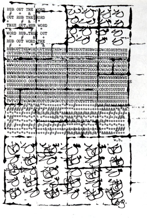
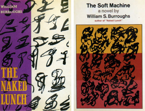
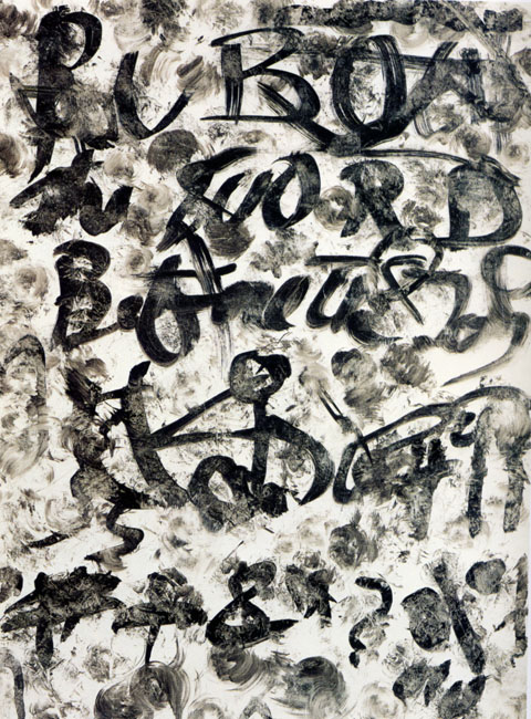
His art evolved in a fluid series of phases. The earliest work is essentially calligraphic and typographic. Words degrade into gestures and gestures gather up into words – the notion being that there is less distance between these two states that we think. Legibility and meaning are powerful, yet fragile forces – easily dissipated, scattered, and reconstituted. This notion runs through everything Burroughs does.
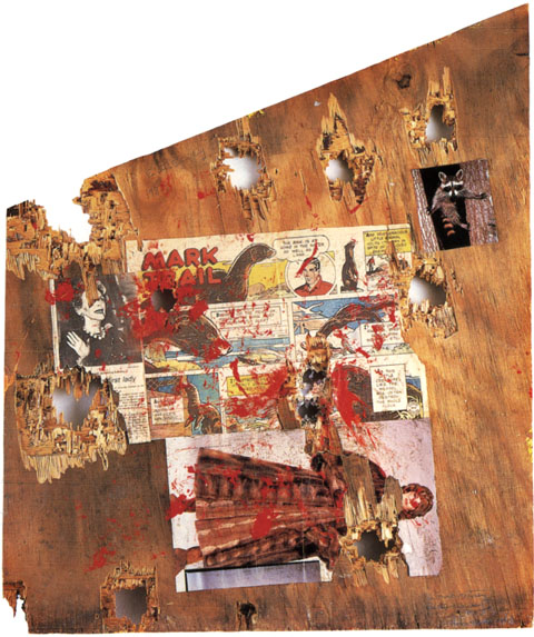
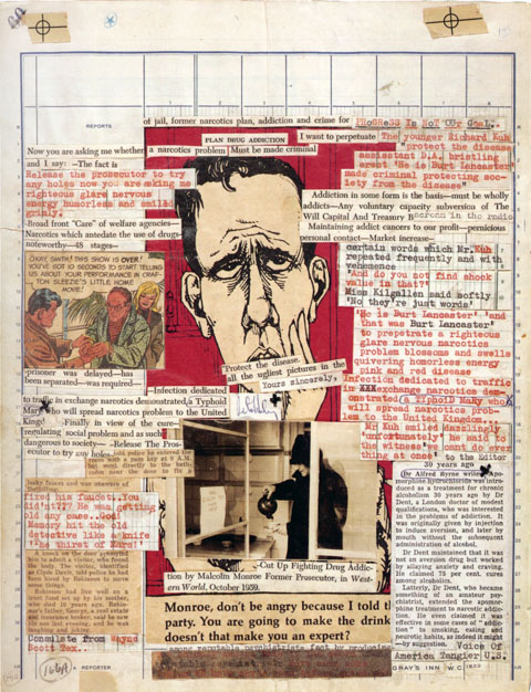
Grid systems feature prominently in his work. Most striking is his adoption of newspaper layout blue-lines as a background on which he composes gonzo gazettes. Late in his life, after his retirement to Lawrence, Kansas to live among his thoughts and his cat army, he wanders into Robert Rauschenberg territory, shotgun in hand.
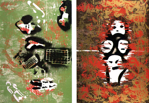
The results, his shotgun paintings, are my personal favorites – fine pop art stuff, paint splatters, comics, etc… The shotgun as a brush is both completely adolescent and yet congruent with his serious desire to blow up meaning and structure and read the resulting tea leaves. Also during this period he does a “spooky stencil” thing that I get, but falls a bit flat aesthetically (but does anticipate the original opening credits for the X-files.)
The work was collected in a great monograph called Ports of Entry: William S. Burroughs and the Arts, out of print but available, here. Also, highly recommended is the biography Literary Outlaw by Ted Morgan. It includes the following exchange: Person to Burroughs “You look like a walking corpse…” Burroughs: “Yes… but not all corpses can walk” Heh.
Mink Mutiny (recto) 1987
with Brion Gysin, Untitled (Rub Out the Word) 1965
Dust jacket illustrations for Naked Lunch, 1959 and Soft Machine, 1966
with Brion Gysin, Untitled (Addiction Plan) 1965
Envy, Gluttony, from the Seven Deadly Sins, 1992
Rub Out the Word, 1989
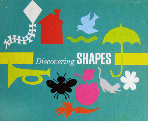
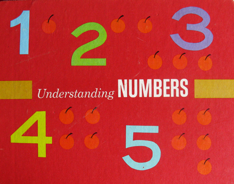
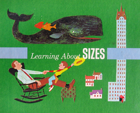
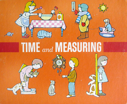
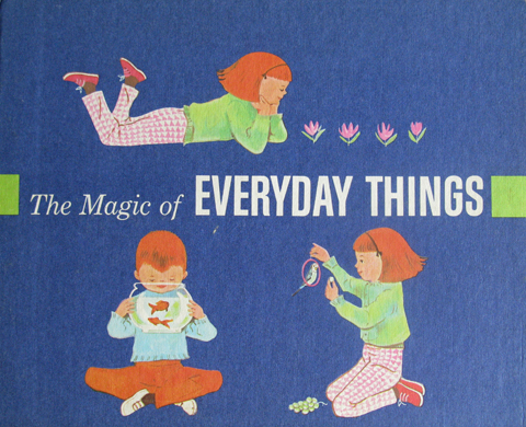
The early 70’s edition of the Encyclopedia Britannica was a three stage rocket of concentrated knowledge. The base stage was the sturdy brown and gilt edifice we all know, and remember fondly as it fades into its new role reinforcing the foundations of used bookstores the world over. The second stage was the crimson leather bound Junior edition, the starch and fibre of a million middle school book reports. The final stage was the now nearly forgotten toddler edition – “The First Adventure in Learning Program” (See a vintage ad of the whole set here.)
They where co-produced with the Golden Press folk, which goes a long way to explain their graphic excellence. At first blush, what impresses is the serial design – amazing palette, spare but strong unifying compositions and type. And a totally killer logo – the thick-lined little birdie wearing a mortarboard. But they really blow your noggin when you grok the distinct styles and nuances of the illustrations. No surprise – the volumes were illustrated by a veritable who’s who of classic kid art – Joe Kaufman, Trina Schart, JP Miller, Dagmar Wilson, June Goldsborough, Caraway, and Art Seiden. (Another post will cover the inside art of the volumes, which is just as good)
The series grouped knowledge around experiential themes like math, comprehension, metrics, etc… one, though, was much more profound – “The Magic of Everyday Things.” Basically it was a kid manifesto for the idea you can discern art, beauty, and coolness in just about anything, provided you’re receptive, enthusiastic and imaginative enough to try. An insight for a lifetime, and when I think about how long I marinated in these books as a squeaker, I figure I owe them a mighty debt. Take a bow little mortarboard birdie!
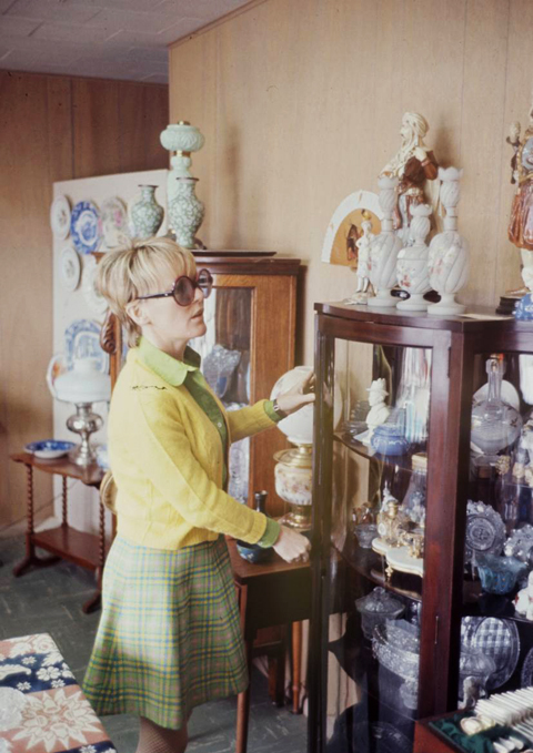
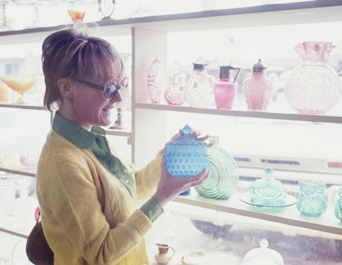
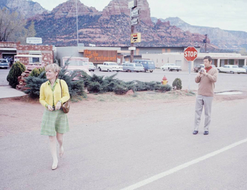
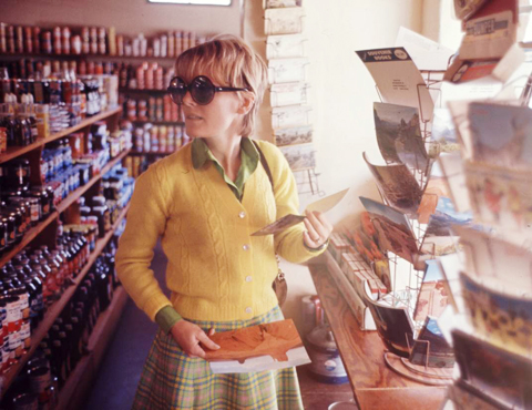
Found these while sourcing images for a painting of Petula Clark. As a photoshoot concept for a star, I’m a little confused – Let’s shoot Petula in, oh, I don’t know… Flagstaff, Arizona shopping for nick nacks, ticky tacks and postcards? As shots though, I’m besotted. Clarks’ a mod little pixie, and the photos have this great Stephen Shore, auto tourister snapshot vibe. (from the Life Magazine photo archive)
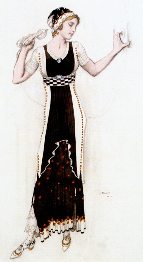
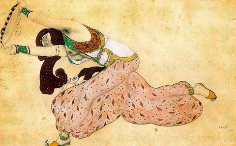
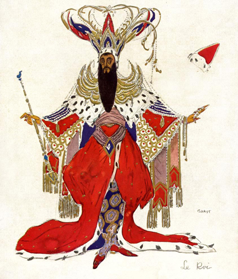
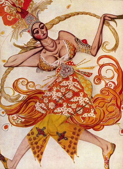
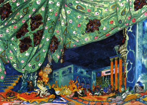
Another recent discovery at the Isabella Gardner Museum was the work of Leon Bakst. Bakst began his career as an illustrator, but quickly gained a reputation as a formidable painter and designer. He is best known, however, for his work in the theatre. He began a collaboration with Serge Diaghilev, the Russian art critic and founder of the Ballets Russes designing costumes and sets. By the time he became the artistic director of the Ballets Russes he was internationally famous.
That I saw his work at all at the Gardner is a blogament to their graphic power. Two small costume sketches leapt out from the top row of a dense grid of perhaps 50 small sketches and engravings that spanned from floor to ceiling. A potent mix of Slavic motifs, exuberant patterns, and fluid gestural drawing, their presence belied their tiny scale. Bakst’s versatility is tremendous – vivid and impressionistic set paintings, exquisitely sensitive drawings, and moody, stylish paintings and illustrations. The most comprehensive survey of his work, Leon Bakst: Set and Costume Designs, Book Illustrations, Paintings and Graphic Works by Irina Pruzhan is out of print, but available.
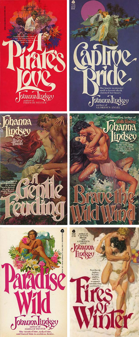
These covers were painted by Robert McGinnis, the dean of American paperback illustration. McGinnis’ reputation rests on the more 1000 pulps that literally define the genre, as well as the iconic movie posters he did for Barbarella, James Bond, and the Odd Couple. So, off the bat, they are sexy, torrid – simply killer – illustrations.
What’s more interesting is that they are the result of a fascinating development in paperback book illustration. In the early 70’s photography supplanted illustration as pulp’s preferred mode. Pressed out of the genre that made their careers, and in some cases fortunes, some illustrators retired to fine art, some to advertising. Others, in the case of McGinnis and Robert Maguire – two of the absolute best – migrated to romance covers.
What distinguished their efforts are the the noirish touches that they brought over from the pulps. Their penchant for eggshell hues, alabaster skin tones, muted colors and gestural brushstrokes gave the paintings a real allure. Also, they conjured powerful atmospherics – an epic historical sweep, a genuine sexiness, more than a touch of danger, and a sense of swashbuckling adventure.
Oh, and design-wise, these are seriously great. The typesetting is perfect in its own way and the compositions unusually dynamic and well ordered. As a exercise in serial design this Johanna Lindsay series in particular is a knockout – issuing forth in double barrelled salvos of modes – color blocked, on-white, and full lurid bleeds.
Together the design and the painting lift the covers from from usual ham handed, frosted glop to the status of real melodramatic art – which requires, along with an overheated imagination, more than a fair share of skill and technique.
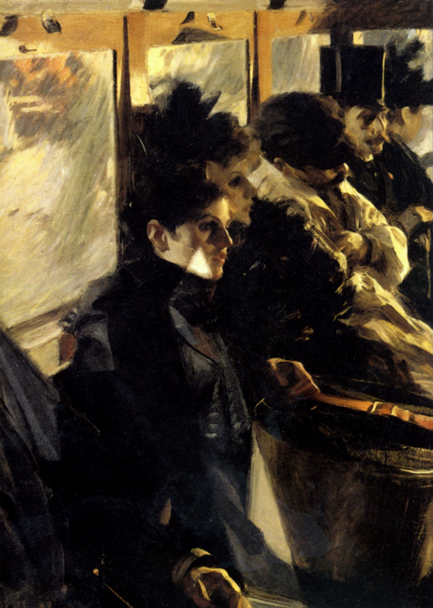
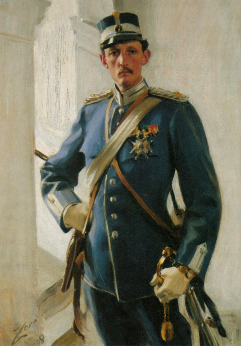
While visiting the Isabella Stewart Gardner Museum in Boston, I had my socks knocked off by The Omnibus (top), by Swedish painter Anders Zorn. Hung on a spur wall by a window, the large, imposing work exhibited the same bravura brushwork you get from John Singer Sargent – impressionism, expressionism, and realism in equal measure in each stroke. Something about the black and ochre color, though, and the stark severe angularity of the sunlight reflection lent the piece a modern, edgy, cold tone.
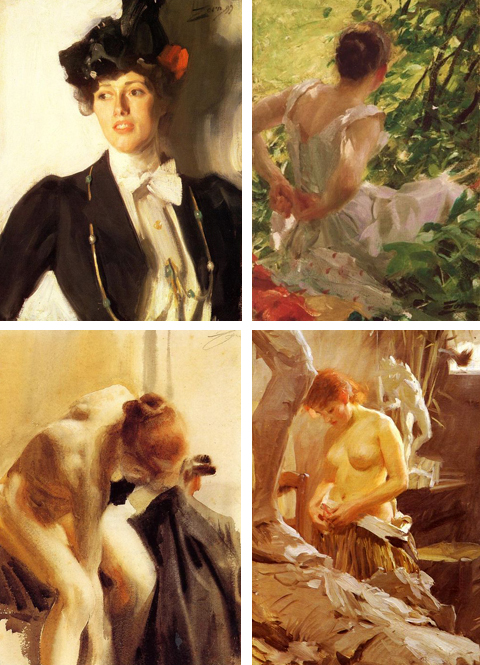
Anders was part of a circle of artists close to Isabella Gardner- others included Sargent, James McNeill Whistler, and Henry James. His work peppered the rest of the collection – small oil sketches and a series of vigorous etchings whose line work recalled that of Charles Dana Gibson’s society drawings. All beautiful.
Biographically he’s basically a Swedish Sargent – He grew wealthy and famous internationally based on his portraiture and is considered a superlative realist painter and cornerstone of his nation’s art. Oh, at 29, he was made Chevalier of the Légion d’honneur at the Exposition Universelle 1889 Paris World Fair. (Honestly, I just pasted that sentence straight from the Wikipedia entry because its so ridiculously laden with pomp. Let’s looks at that again: Chevalier of the Légion d’honneur at the Exposition Universelle 1889 Paris World Fair. I would love to make a cocktail out of that sentence…)
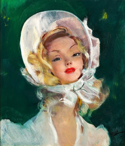
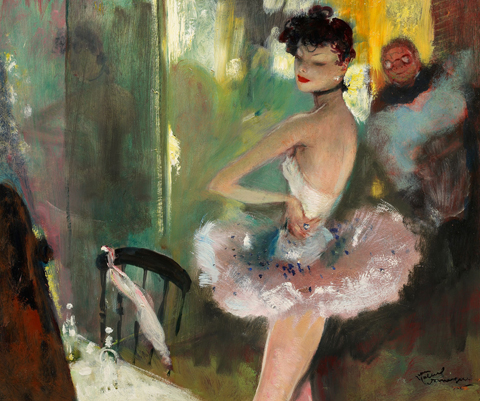
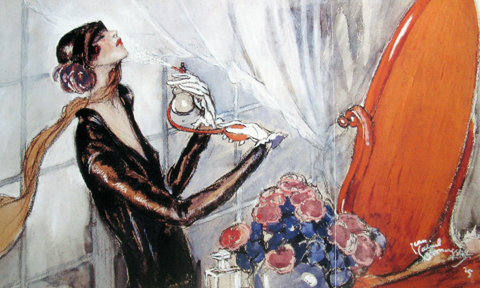
Jean-Gabriel Domergue – Came across this dandy cat’s work in a survey of art deco illustrators. The appeal lies in the mix of foxiness, style, and flamboyant draftsmanship. Also, they evoke many appealing associations: Degas, the decadent verve of Parisian poster art, and the lux, velvety pin up art of Rolf Armstrong.
Details are sketchy. He studied under Giovani Boldini, was a coveted society painter, organized many famous how to buy vicodin on the street Parisian galas and soirees, designed couture fashion, and was the curator of the Jacquemart-André Museum – a man of his time having the time of his life. Galerie de Souzy has some biographical information and offers some of his lesser work for sale. There is a small museum at his family estate in Cannes. The monograph Jean-GabrielDomergue, l’art et la mode by Gérard-Louis-Soyer is hopelessly scarce.
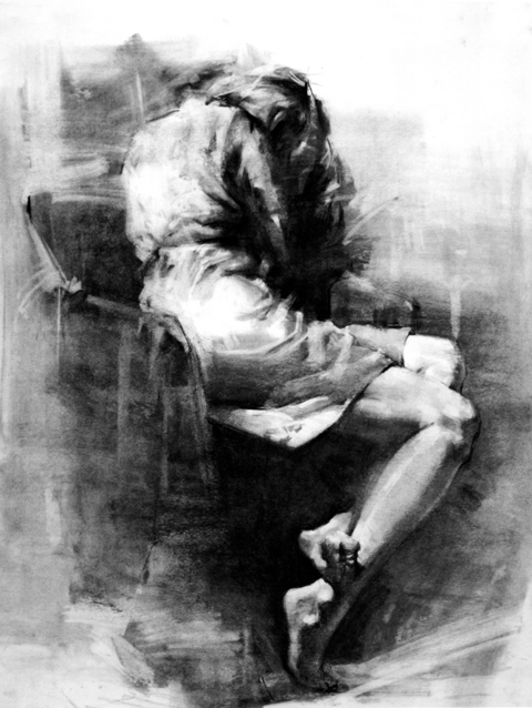
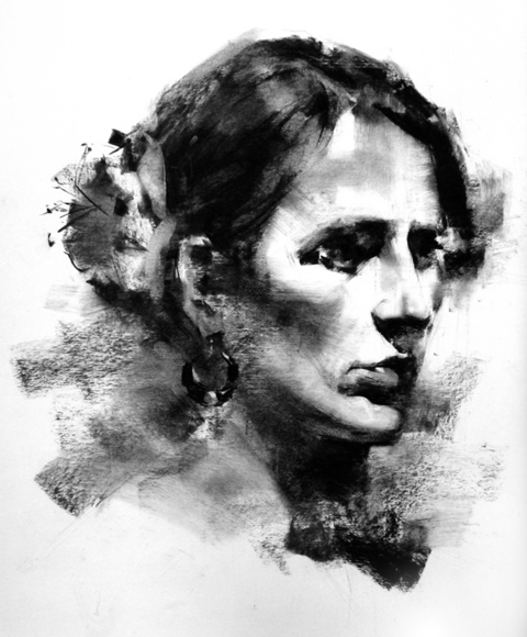
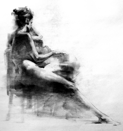
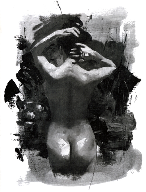
Henry Yan’s work invigorates a cliche – the notion of rendering as releasing a figure from its background. As technique, it’s thrilling – the wipes, the smears, the lifts – so much nuance teased out from a thin scrim of supple vine charcoal. Yan’s process is so evident, so dynamic that his work always seems to be in the process of making itself, which is what makes it so satisfying as art.
Yan began his art education in China. Eventually he moved to the United States where he studied at the Academy of Art College in San Francisco, where he is now a faculty member. These selections are from his book Henry Yan’s Figure Drawing: Techniques and Tips. His site, here.
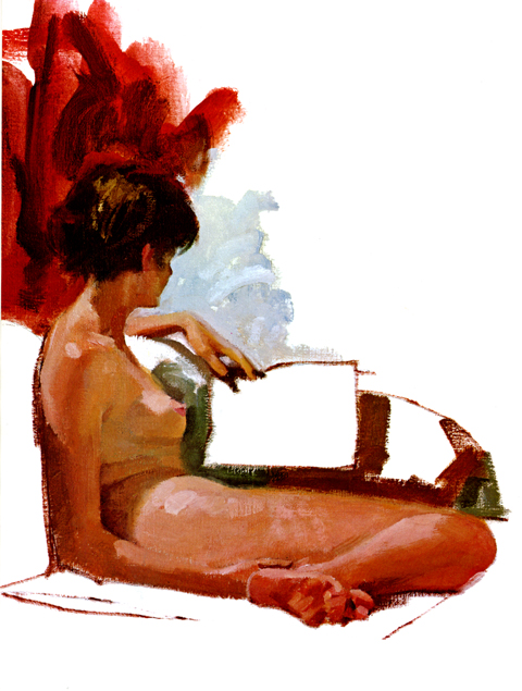
Herewith, a new short series, featuring art from old illustration guides. They have such a distinctive character that they form, I think, something of a lost genre. What defines them, and what I find so appealing, is their distinctive balance of looseness and rigor – suspended as they are between sketches and finished works.
The selections above are by Howard Forsberg. Forsberg was a commercial illustrator in the 50’s and 60’s whose clients included Coca Cola and Budweiser as well as magazines like Colliers and Woman’s Day. He also taught painting at the mecca of classic illustration techniques – the Famous Artists School in Connecticut (a subject of posts to come.)
More selections in the days ahead.
What a dandy little art book/scene document/memento thingy. Maripolarama is a collection of Polaroids taken in the late 70’s and early 80’s by Maripol. Her (single – natch) name contains a multitude of très fabuloso personas: Model; art director for quintessential 80’s designer Fiorucci; Madonna’s friend and her stylist during the original, classic, “Like a Virgin” period (we have her to thank for the rubber bracelets); producer of the legendary new wave art scene flick Downtown 81; and on, and on… she’s less a person that the essence of the New York post punk new wave fashion scene in human form.
Maripolorama is her raw candid, exuberant diary. It’s not really who’s in it that makes it so compelling, though. It’s how young and unguarded everyone is, how genuine and sincere they are in thier goofy exhibitionism. The group shots are especially revelatory – before they went on to become stars, icons, flameouts, poseurs, and tragedies they were all weirdo pals dressing up and running around the glittering big city.
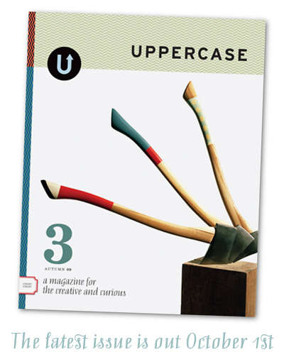
The clue to what distinguishes Uppercase Magazine lies in its motto “A magazine for the creative and curious” It’s the “curious” – It accounts for the joyful, inclusive sense of collaboration and sharing that pervades the whole shebang. The magazine reads like a conversation between like-minded folk riffing on the impossibly cool thing they’ve drawn, thought, photographed, collected, discovered, etc. No lofty curatorial snobbishness or hipster veneration of the mindlessly shocking or willfully ugly for these cats – just a democratic spirit and a celebration of beautiful things.
Another thing – the magazine, as a project and physical object, is the very embodiment of what it celebrates. It works on a collaborative publishing model, and is designed and produced with great care and craft. Feels great in the hand. The three covers so far are stunning in their graphic impact. Folks seem keen on it too. The first two issues are sold out and subscriptions now begin with the third. The whole Uppercase venture, gallery, books, blog etc… seem of all of a piece. Well worth it. Explore here.
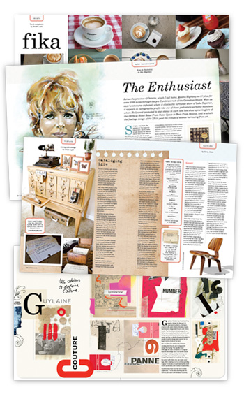
(Oh, and – given my affinity for the venture, I’m proud to say they’ve found room for my own contribution to it. For issue three I wrote an article exploring the radio documentaries of the classical pianist Glenn Gould, not only in terms of his own career but as a manifesto for the insatiable cultural omnivore. As you can see from the preview above, they were kind enough to include an accompanying illustration, which was a great excuse to paint one of Gould’s pop cultural obsessions, the fetching Petula Clark.)
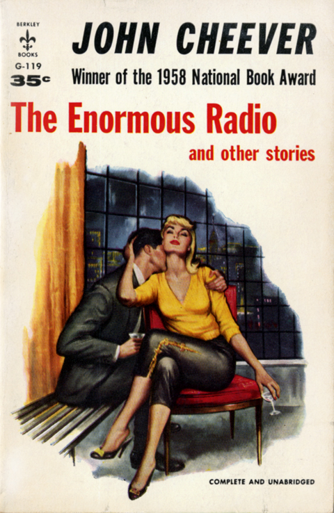
Frequent shots of Cheever lately… reviews of Blake Bailey’s recent biography hinted at a life where every phase – Manhattan writer, the suburban squire – turned out to a role propped up by a booze soaked frame of artificiality and self loathing. Like this – Cheever would walk would out of his Manhattan apartment every morning, dressed like any other Madison Avenue executive, join fellow salary men in the elevator and head down, then down some more, to the basement of his own building, and strip down to his boxers and sit down at his typewriter to write. Seriously? The sheer oddness (and Cheever-ness) of the whole scene left such an indelible impression that I wanted to re-read his stories in it’s wake… So I’ve been nursing the familiar well stocked orange doorstop with the silver “C” until I came across this sharp little jem. It’s the mass market paperback of Cheever’s second collection – the one that made his reputation. Magic! It’s like one end of a tin cup telephone with the other dangling back in the 50’s, somewhere in Cheever country. Light, tight, and springy in the hand, musty and yellowed with age, a brazen scene of urbane decadence on the cover – the aesthetics of the book an echo of the era – formal, even in sin.
Saw this, reminded me of that. (Falling Dog by Malcolm Bucknall, 1994, Bonaparte Crossing the Alps by the Great Saint Bernard Pass, Jean-Baptiste Mauzaisse after Jacques-Louis David, 1807)
So, I imagine a gizmo consisting of a sheet of heavy paper underneath four pens – red, blue, yellow, and black – held in a lattice of yarns and pulleys that lead to a net of exquisitely sensitive rubber pads. The rubber pads line the inside of a wide brimmed cloth hat. The hat is on my daughter’s head, she is on her bed, holding her stuffed manta ray and riffing on her general enthusiasm for fish, mermaids, aquatic dinosaurs, etc… the pulses of her noggin are picked up by the rubber pads and transmitted down the yarn, tugging and pulling the pens across the paper and rendering a scene that looks exactly like this print by Baltimore illustrator Jaime Zollars.