Table of Contents: Books
Score!
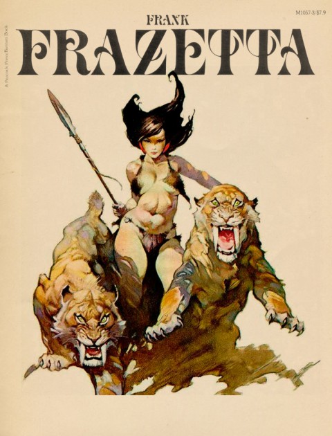
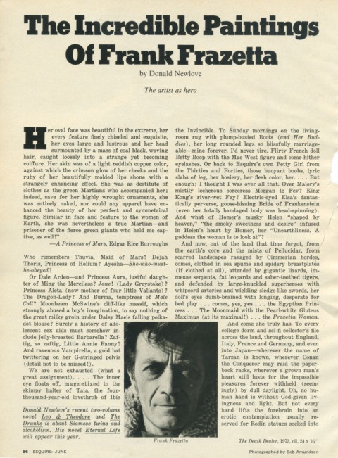
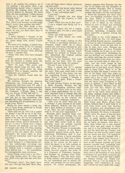
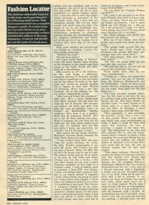
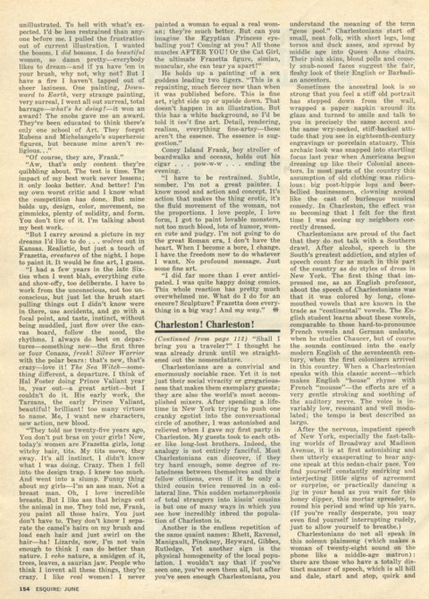
Frank Frazetta, Esquire Profile
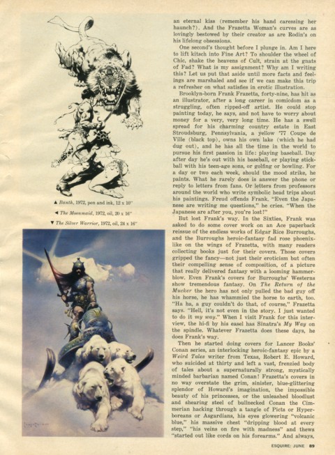
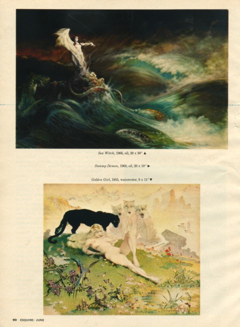
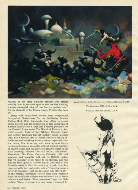
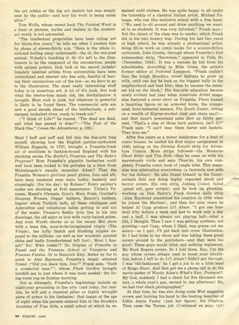
Posted below, is the complete text of a June 1977 Esquire Magazine profile of Frank Frazetta. Consider it a small bit of public service for those of us so inclined — as far as I know it is unavailable anywhere on the internets. What a gonzo article, too, a perfect example of the macho free associative style of “the New Journalism” so in vogue back then. The opening roll call of pop cult, fantasy and sci-fi cuties is hysterically engaging — Thuvia, Dejah Thoris, Ayesha, Dale Arden, Vampirella, Barbarella, Taia, Morgan Le Fey, culminating in — flabbergastingly — Homer’s Helen of Troy. It then settles into a comprehensive profile of Frazetta’s life and work. Then there’s the classic oh-so-Esquire moment where they wake Tom Wolfe up from bed (!) to opine about, high art, snobby modernism, and the muscular vitality of commercial illustration. Perfectly entertaining, and to those of us entranced with Frazetta, indispensable. Enjoy. (On screen pages below, downloadable PDF here.)
BLUE JAY
Reader, look at the plate in which are represented three individuals of this beautiful species — rogues though they be, and thieves, as l would call them, were it fit for me to pass judgment on their actions, See how each is enjoying the fruits of his knavery, sucking the egg which he has pilfered from the nest of some innocent Dove or harmless Partridge! Who could imagine that a form so graceful, arrayed by nature in a garb so resplendent, buy mexican vicodin should harbour so much mischief;—that selfishness, duplicity, and malice should form the moral accompaniments of so much physical perfection! Yet so it is, and how like beings of a much higher order, are these gay deceivers! Aye, l could write you a whole chapter on this subject, were not my task of a different nature.
— John James Audubon
John James Audubon, Birds of America, Plate 102 – engraved by R. Havell
All About


Printed in 1957, the designs of these covers are a blessed aesthetic convergence. The thick textured cloth and debossed inky black type tie them firmly to the tradition of classic childrens books. The bold spare composition and modern typesetting give them a wizz-bang new frontier coolness.
And the economy and power of those illustrations! A simple rocket and squid, as keys to the imagination, have the power of a thousand glossy covers. The effect is hypnotic. Holding these for a while you’re tempted not so much to thumb through them as to dive into the covers themselves. Just perfect.
All About


Printed in 1957, the designs of these covers are a blessed aesthetic convergence. The thick textured cloth and debossed inky black type tie them firmly to the tradition of classic childrens books. The bold spare composition and modern typesetting give them a wizz-bang new frontier coolness.
And the economy and power of those illustrations! A simple rocket and squid, as keys to the imagination, have the power of a thousand glossy covers. The effect is hypnotic. Holding these for a while you’re tempted not so much to thumb through them as to dive into the covers themselves. Just perfect.
Flight Risk
Riveting cover photograph by Martin Schoeller for the New York Times Magazine. He also shot the best photo ever of Jeff Koons, below. It’s the best photo because it trumps the billions of words this cat has kicked up in his wake and lays http://www.mindanews.com/buy-effexor/ bare the artifice, calculation, perfection, mischievousness, & joy that makes Koons at all worthwhile. Also, the ski cover looks like a vérité Phil Noto, below, below. Phil Noto? Folks… Phil Noto.
Under the covers
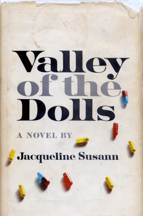
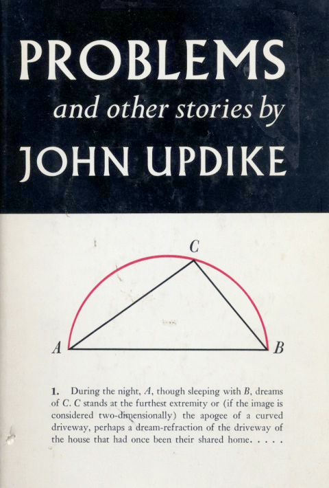
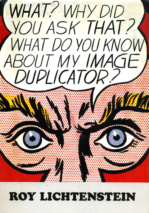
So, recently, at one time or another I was reading these three books. As I piled then up to be re-shelved they struck me as having some strange communion with one another. Each spare, simple and striking, sharing some essential tone that I adore — perfect pop design in three modes, fashionable, nerdy, and electric. Each in there own right a great read, too. Updike and Lichtenstein need no additional cheerleading, but let me make a impassioned plea for Valley of the Dolls. What a empurpled pleasure. Read it, luxuriate in its plush vulgarity, then treat yourself to the Wiki rabbit hole you get to go down matching each character and melodramatic scenario with the real people and incidents that inspired then. Then the movie. Then the Roger Ebert / Russ Meyer luridly psychedelic quasi sequel Beyond the Valley of the Dolls. Then buy that film’s equally boss groovy soundtrack. You’re welcome.
Bright Young Things
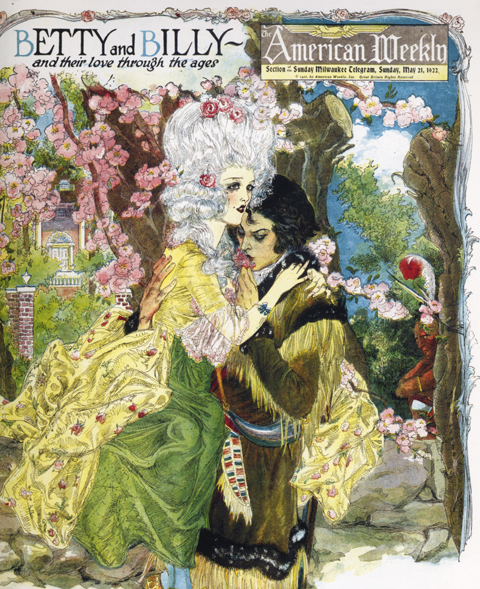

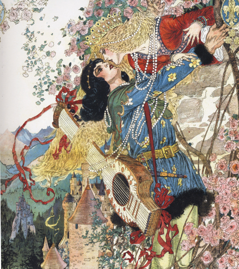
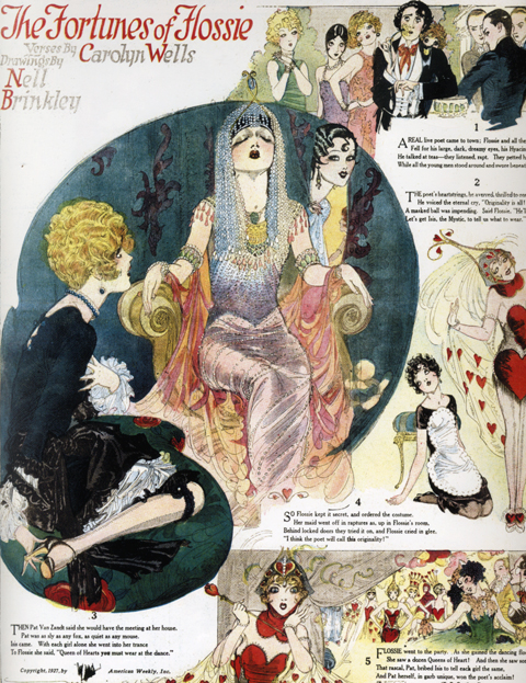
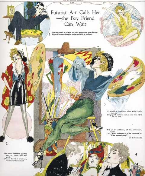
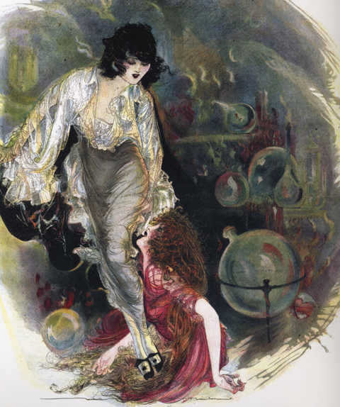
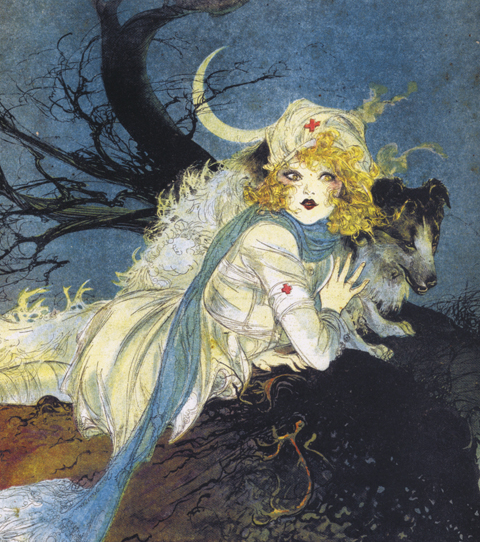
From 1915 till about 1940 or so, the Brinkley Girl cut a feverish swath through the cultural imagination. As drawn by illustrator Nell Brinkley, she was like the Gibson Girl on an absinthe bender – exuberant line, riots of splashy color, and buckets of joie de vivre. Girls obsessed over her adventures, hairstyles and fashion shifted in her wake, and she was feted in songs, films and theater.
Nell Brinkley’s specialty was the episodic themed series. Golden Eyes and Her Hero followed our heroine’s exploits and derring-do during World War One. Betty and Billy and Their Love Through the Ages, my personal favorite, featured a besotted glamorous couple in various romantic historical vignettes – intrigue in Southern plantation society, among Medieval troubadours, Phoenician swashbucklers, etc… The format begins to open up in the 20’s with sophisticated frothy flapper larks like the Fortunes of Flossie.
Fantagraphics Book’s wonderful new survey, The Brinkley Girls, collects these series and more, along with a fascinating introduction by the book’s editor, Trina Robbins. Aces.
Royal Bodies
Lose yourselves in this utterly engrossing essay by Hilary Mantel, currently free to read at the London Review of Books. Entitled Royal Bodies, it considers the construct of this utterly peculiar institution, it’s basest aspects and its most unworldly character, in Mantel’s typically direct, painterly, and slightly off kilter way — In looking at royalty we are always looking at what is archaic, what is mysterious by its nature, and my feeling is that it will only ever half-reveal itself… Royal persons are both gods and beasts.
Mantel wrote the incomparable historical novels Wolf Hall and Bring Up the Bodies, two thirds of a trilogy centered around Thomas Cromwell, Henry VIII, and the founding of the Anglican Church. So skewed and revelatory is her lens, and so brilliantly constructed is her authorial voice that I waited for the release of the second book with an anticipation usually reserved for a new record by a beloved band — as much as I wanted to hear the story continue, it was the style of the writing, the sound of her language that I couldn’t wait to submerge in…
The essay caused, and is still causing, a retarded kurfuffle in the UK for her gimlet eyed assessment of Kate Middleton. Umbrage, in this case, relies on classic non-reading or a stubborn non-comprehension of the essay’s essential humanism. Read on here…
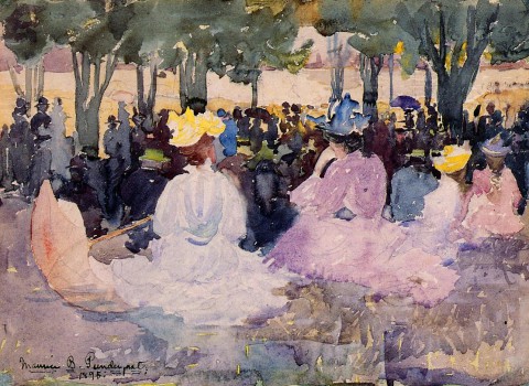
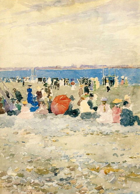
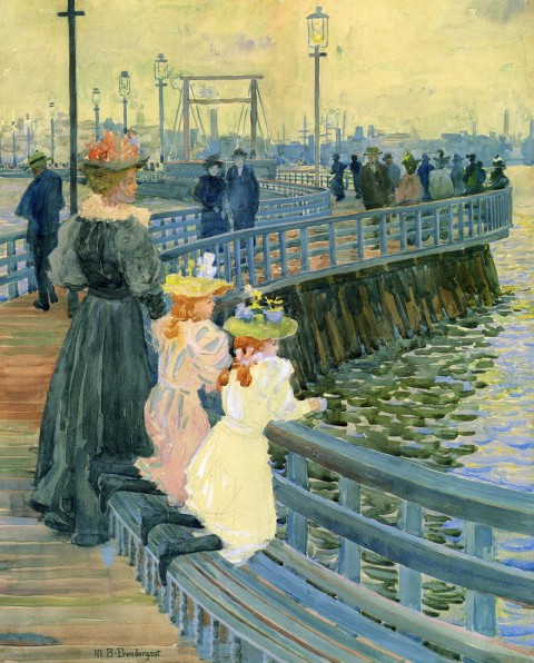
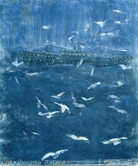
Maurice Prendergast
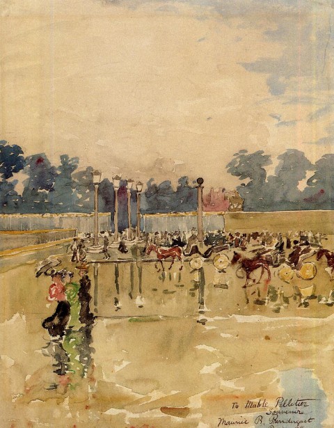
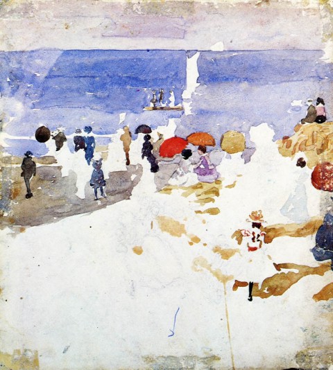
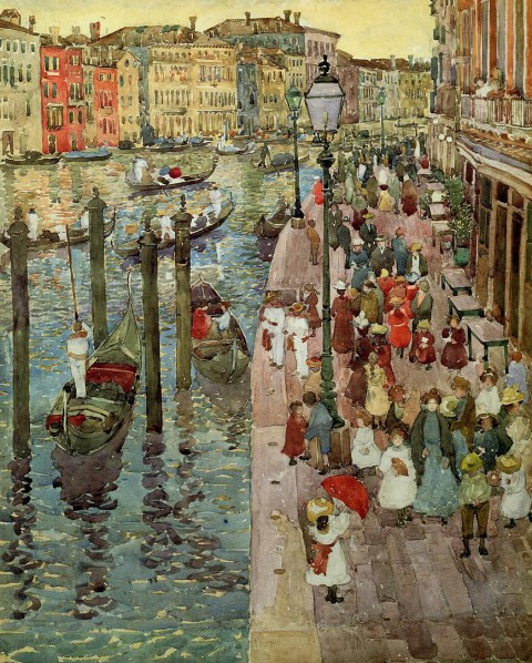
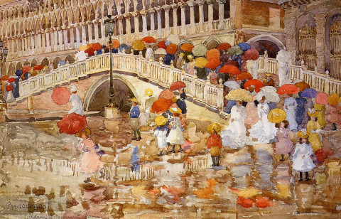
So I finally went to visit the Barnes Collection at its new home on the Philadelphia parkway. My affinity for it has always been somewhat obligatory — I know why this art matters, but have appreciated it mostly as a bridge between older traditions I adore to modern currents I admire. As before, I find myself deaf to Matisse’s signals, and still feel an abject revulsion to Renoir — the smeary, overripe nudes struck me, this time around, like they were painted with bacon fat. Feh.
Revelatory though, were the few paintings tucked into various clumps throughout the collection by Maurice Prendergast. Each was a bravura demonstration of seeing, buy vicodin pain killers directly interpreted in painting. They were definitive and re-invigorating examples of the idea of impressionism as I understand it, painting animated by an exquisite receptivity of what it “felt like” to visually drink in a scene, its atmosphere, its flickering and transitory nature.
Later on, as I delved deeper into his work, scene after scene, I stopped thinking of them in terms of technique or theory but in terms of a kind of magic. He seemed to capture on paper an endless loop of the living essence of a moment, as if he could pin a a butterfly without stilling its movement or shimmer.
Hmm… That’s quite a drop.


The first page of the legendary comic Watchmen sold last weekend at auction for $33,460. Aptly described as the “Call me Ishmael” of comics, it’s one of the icons of the genre. All of the formal inventiveness that author Alan Moore and artist Dave Gibbons established in their 12 issue 1986 masterpiece is prefigured here. (Fascinating to see it stark black and white – the page also came with an ace bonus, an annotated color guide. Gander here, and here at larger images) Notice especially the convergences between Rorschach’s psycho-noir-messiah narration and the visuals in each panel. This tight choreography between seemingly unrelated visual and verbal elements is one the the primary sources of the book’s tremendous impact. It adds a crucial layer to the storytelling, one uniquely rooted in the format of comic books – the ability to directly interweave elements from one part of the story into another and thereby elicit new interpretations, resonances, and meanings. Watchmen established Moore as a virtuoso of this technique. So, so good…
Great story behind the provenance of the comic page itself. It was bought in 1987, in a comic bookshop in Covent Garden one morning by a bleary-eyed, hungover Stephen “Krusher” Joule for $180. Krusher was an artist and designer who worked with Motorhead, Uriah Heep, Blondie, Sex Pistols, Hawkwind, and Japan. He designed the covers for Iron Maiden’s Live After Death and Ozzy’s Diary of a Madman. In 1982 he became the art director for the legendary British heavy metal magazine Kerrang! In short, he’s exactly the kind of wonderful freak who deserves to score the first page of the Watchmen one hungover morning for a hundred and eighty bucks.
Ryan Donnell’s Polling Place Project
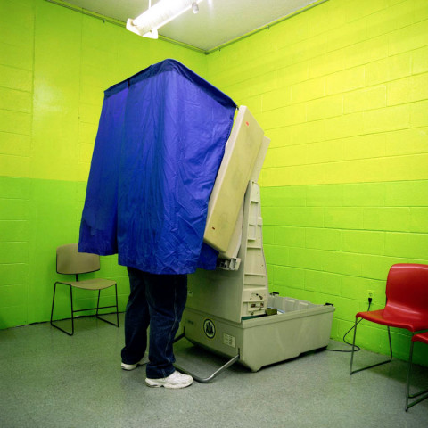
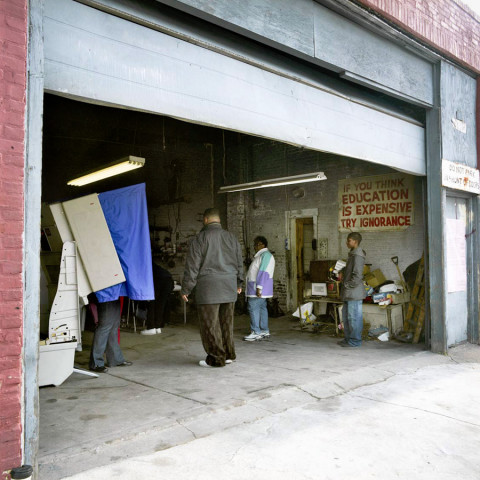
Sure, the election hoopla has settled, with the reality based community the world over oscillating between exhilaration and queasy relief. But before we return to our regularly scheduled enthusiasms let’s celebrate an easily overlooked aspect of the the kaleidoscopic nature of American democracy – the polling place. Here in Philadelphia, for instance, you’re as likely to vote in a basement party room, mosque, roller skating rink, private backyard, body shop, or wallpaper store (all above) as a school gymnasium. For documenting these unlikely outposts we have photographer Ryan Donnell to thank. Donnell, a pal, is a savvy, gifted journalistic & commercial photographer based in Philly. Behind the Curtain is his ongoing project documenting the nation’s unlikely polling places. He’s covered Philly and Chicago and just completed a swath of Los Angeles as well. Take a gander, here … and check out the balance of Donnell’s work, here.
Quandry
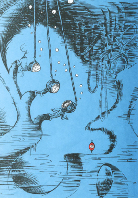
My favorite Doctor Seuss art by a country mile… It’s a QUANDRY, who lives on a shelf, in a hole in the ocean alone by himself. And he worries from dawn’s early light. And he worries, buy vicodin just worries, far into the night. He stands there and worries. He simply can’t stop… Is his top side his bottom? Or bottom side top? (Seuss’ September 26th, 1991,New York Times obituary, here)
Rare pleasures
Serielle Buchgestaltung
Serial cover designs by the German imprint Suhrkamp. Exquisite, masterful lessons in restraint and spare, deliberate composition. Suhrkamp is a 50 or so year old publisher of literature, philosophy and essays. A more, um, impressionistic description courtesy of a certain Siegfried Unseld and the inimitable Google Translate: On the question of how in the shortest form of the Suhrkamp publishing house was to characterize, I answer generally: Here are no books publish authors.
Fiction!
Illustration by Victo Ngai for a story by Peter Stamm in the May 14th order vicodin legally online issue of the New Yorker.
Never Mind the Pollacks
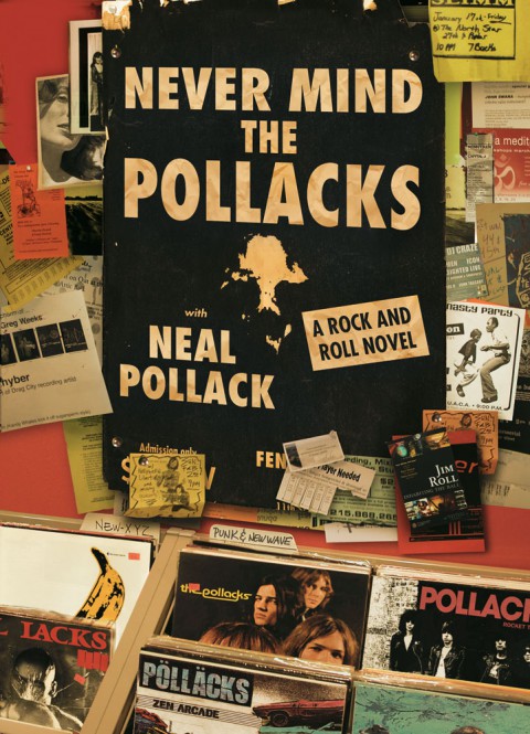
Talking Covers, an ace new blog about book cover design, is featuring my artwork for NEVER MIND THE POLLACKS, with my recollections along with author Neal Pollack’s… Shout-outs and walk-ons abound, including Jim Roll’s amazing record Inhabiting the Ball, my old label The Telegraph Company, and a meandering discursion on the Harvest Records roster… the blog is curated by author Sean Manning. Neal and I are in ridiculously great company – Ben Marcus’ Flame Alphabet, Francine Prose’s My New American Life, and Love Goes to Buildings on Fire are featured, among others… check it.
