Table of Contents: Culture


The Seventies-ness-ness of the Apple //

Recently I had to decide whether to discard my Apple //e, and found I absolutely couldn’t bear to part with it. Rather, I pulled its disparate components off storage shelves and out of boxes, dusted them off and reassembled it. Something about reconstituting it made me bond with it all over again… Then, just the other night, snowed in by a blizzard, I was watching Royal Tennenbaums for the nth time and noticed among all the other 70s bric-a-brac, an Apple //.

I know it’s playing footsie with the obvious, but it’s worth remembering what an essential artifact of 70’s design the Apple // really is.  Its introductory advert from 1977 captures that perfectly. Look at the context… It’s not set up in an office but on the wood table of a modern kitchen. It’s not stacked like a Hi-Fi system or a fused one-piece like an ordinary computer terminal. It’s spread out like a split level contemporary house. The severe contrasting angles of the case evoke 70’s architecture and furniture design much more than anything especially technological. (It shares this look with some of the better designed calculators of the period – which makes sense, given they first embodied the notion of a computer as a home appliance) The distinct beige putty color leans in nicely against the saturated, plush colors of the era – the ochres, purples, oranges and red browns. In short, the Apple // represents the hight of then-contemporary suburban design – which is why it looks just at home in the Wes Anderson’s idealized 70’s diorama as Bill Murray’s purple turtleneck and burnt sienna blazer.

Tom Wolfe Caricatures

These caricatures by Tom Wolfe are excerpted from In Our Time, an illustrated patchwork of essays, observations and commentary. The jacket flap copy, while a bit foofy, is dead on – the book recalls “the palmy days when social caricature flourished in the great European satirical magazines Simplicissimus and L’Assiette au Beurre. His eye for the costumery and gesture of the moment is often as telling as his Pantagruelian appetite for the zaniness of the second half of the twentieth century, which he regards as America’s “Elizabethan period, her Bourbon Louis romp, her season of rude animal health and rising sap!” The drawings are mixed from the same ingredients as the writing: A strong base of precise observation, a jigger of affection, a generous pour of smug, swirled and served with verve and flair.

Noir Yorker

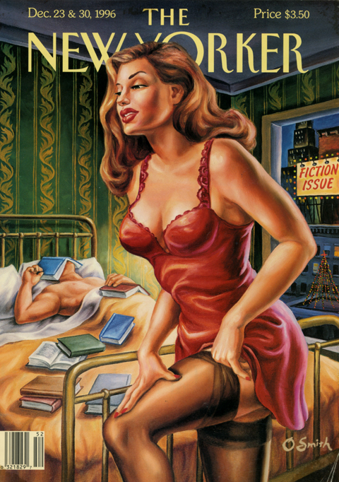
I have long adored this pair of New Yorker covers, illustrated by Owen Smith, for their attention-getting va-va-voom-ishness. The thing with Smith’s pulp derived work, though, is that it always has this aspect of impressionistic exaggeration to it, this bulging massiveness. In the past it always reminded me of social realist illustrations of the 20’s and 30’s – boxers and laborers, etc… And that thing being not my thing, that thing was always a hang up for me with Smith.

Looking again at these covers recently, his iconic flame haired femme fatale recalled something very different – the iconic flame haired femme fatales in Dante Rossetti’s Pre-Raphaelite paintings. This got me thinking… The Pre-Raphaelites rejected the classical stiffness of academic painting. They wanted to re-infuse high art with passion, detail, drama – visceral aesthetic heat. The human embodiment of that desire was more often than not a full lipped, square jawed, voluptuous, red haired fox.

That’s more like it. The echo of Pre-Raphaelite foxiness makes me like the covers even more, sure, but it also elevates them beyond “Look! Pulp! Sexy! Must not be the old starched collared, monocled New Yorker anymore!” They’re more of an articulated rallying cry – similar to the one their movie critic Pauline Kael made in the late 70’s when she titled her review collections Going Steady,  I Lost it at the Movies, and Kiss Kiss Bang Bang. They insist that our encounters with culture should be lusty and passionate as well as rigorous and cerebral. Well, yes. Agreed. (This notion also happens to be the overarching theme of Rush’s song suite Cygnus X-1 Book II: Hemispheres, but that is, of course, another post….)

Dante Gabriel Rossetti (1828-1882) Lady Lilith
Dante Gabriel Rossetti (1828-1882) The Bower Meadow

The Visual Art of William S. Burroughs

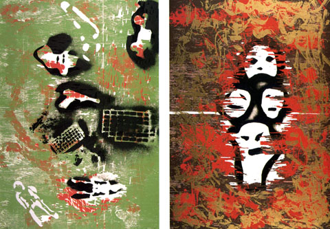
Visual art was part and parcel of William S. Burroughsentire creative project. While the writing and the biography dominated people’s perception, his creative efforts encompassed art, graphics, calligraphy, type, photography, film, assemblage, poetry, spoken word, and music.

Culture itself was his medium. For most artists this claim would be, on its face, pretentious or megalomaniacal (it feels pretentious just writing that sentence.) Burroughs was deeply sincere about it, and he pursued it with a single minded, deadpan sincerity. The cut-up was, broadly speaking, the method that he employed wherever he turned his attention. In the visual arts, that resulted in work that anticipated or was sympathetic with many fundamental currents in post-war modern art and design.

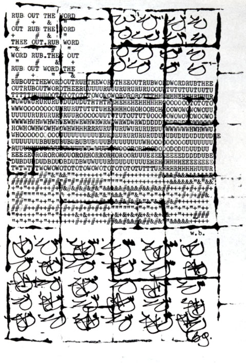
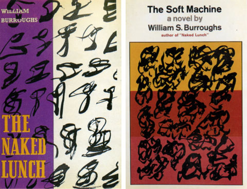
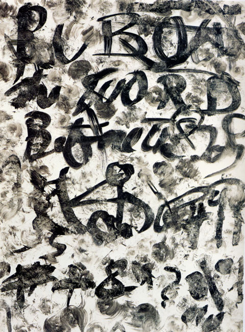
His art evolved in a fluid series of phases. The earliest work is essentially calligraphic and typographic. Words degrade into gestures and gestures gather up into words – the notion being that there is less distance between these two states that we think.  Legibility and meaning are powerful, yet fragile forces – easily dissipated, scattered, and reconstituted. This notion runs through everything Burroughs does.

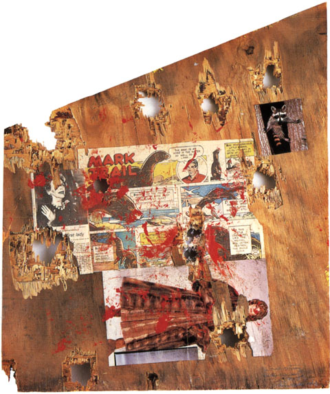
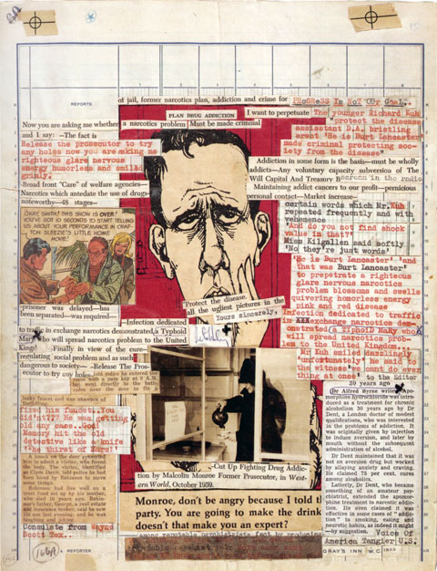
Grid systems feature prominently in his work. Most striking is his adoption of newspaper layout blue-lines as a background on which he composes gonzo gazettes. Late in his life, after his retirement to Lawrence, Kansas to live among his thoughts and his cat army, he wanders into Robert Rauschenberg territory, shotgun in hand.

The results, his shotgun paintings, are my personal favorites – fine pop art stuff, paint splatters, comics, etc…  The shotgun as a brush is both completely adolescent and yet congruent with his serious desire to blow up meaning and structure and read the resulting tea leaves. Also during this period he does a “spooky stencil” thing that I get, but falls a bit flat aesthetically (but does anticipate the original opening credits for the X-files.)

The work was collected in a great monograph called Ports of Entry: William S. Burroughs and the Arts, out of print but available, here. Also, highly recommended is the biography Literary Outlaw by Ted Morgan.  It includes the following exchange: Person to Burroughs “You look like a walking corpse…” Burroughs: “Yes… but not all corpses can walk” Heh.

Mink Mutiny (recto) 1987
with Brion Gysin, Untitled (Rub Out the Word) 1965
Dust jacket illustrations for Naked Lunch, 1959 and Soft Machine, 1966
with Brion Gysin, Untitled (Addiction Plan) 1965
Envy,  Gluttony, from the Seven Deadly Sins, 1992
Rub Out the Word, 1989

Toddler Britannica

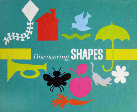
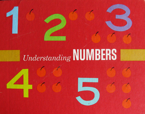
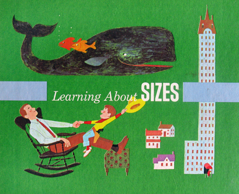
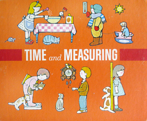
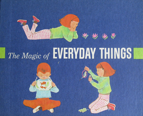
The early 70’s edition of the Encyclopedia Britannica was a three stage rocket of concentrated knowledge. The base stage was the sturdy brown and gilt edifice we all know, and remember fondly as it fades into its new role reinforcing the foundations of used bookstores the world over. The second stage was the crimson leather bound Junior edition, the starch and fibre of a million middle school book reports. The final stage was the now nearly forgotten toddler edition – “The First Adventure in Learning Program” (See a vintage ad of the whole set here.)

They where co-produced with the Golden Press folk, which goes a long way to explain their graphic excellence. At first blush, what impresses is the serial design – amazing palette, spare but strong unifying compositions and type. And a totally killer logo – the thick-lined little birdie wearing a mortarboard. But they really blow your noggin when you grok the distinct styles and nuances of the illustrations. No surprise – the volumes were illustrated by a veritable who’s who of classic kid art – Joe Kaufman, Trina Schart, JP Miller, Dagmar Wilson, June Goldsborough, Caraway, and Art Seiden. (Another post will cover the inside art of the volumes, which is just as good)

The series grouped knowledge around experiential themes like math, comprehension, metrics, etc… one, though, was much more profound – “The Magic of Everyday Things.”  Basically it was a kid manifesto for the idea you can discern art, beauty, and coolness in just about anything, provided you’re receptive, enthusiastic and imaginative enough to try. An insight for a lifetime, and when I think about how long I marinated in these books as a squeaker, I figure I owe them a mighty debt. Take a bow little mortarboard birdie!

Petula Clark

clark2

clark3

clark41

clark11

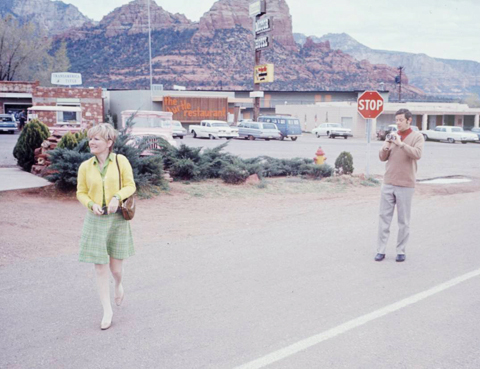
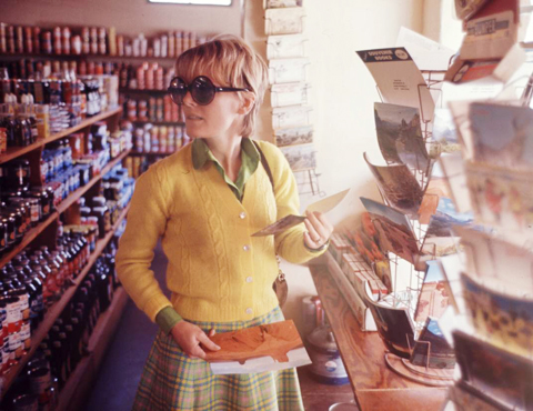
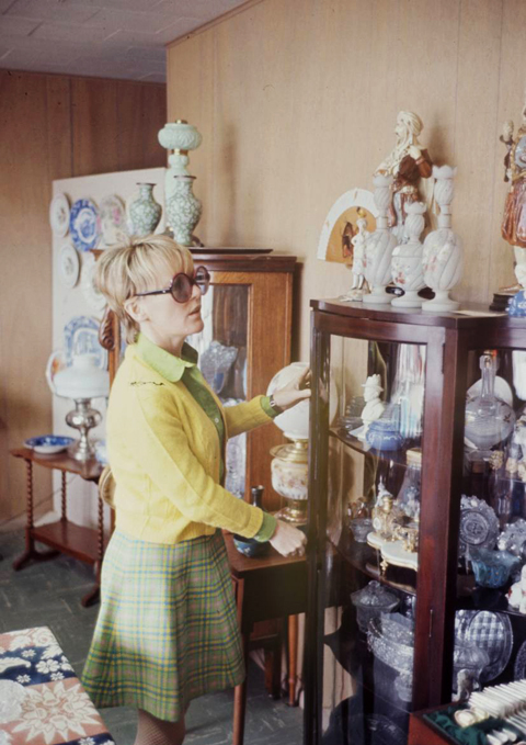
Found these while sourcing images for a painting of Petula Clark. As a photoshoot concept for a star, I’m a little confused – Let’s shoot Petula in, oh, I don’t know… Flagstaff, Arizona shopping for nick nacks, ticky tacks and postcards? As shots though, I’m besotted. Clarks’ a mod little pixie, and the photos have this great Stephen Shore, auto tourister snapshot vibe. (from the Life Magazine photo archive)

Leon Bakst

bakst_5

bakst_3

bakst_2

bakst_8

bakst_7

bakst_6

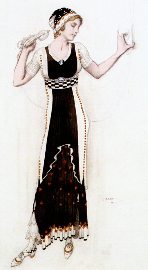
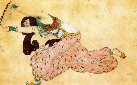
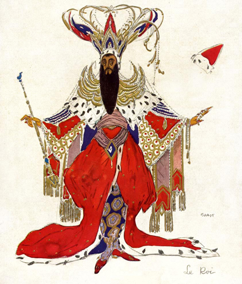
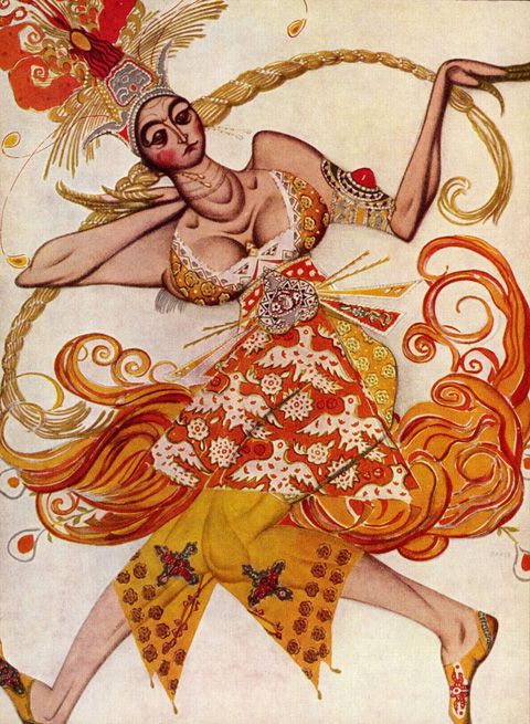
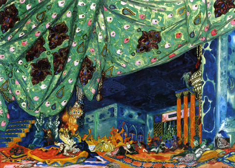
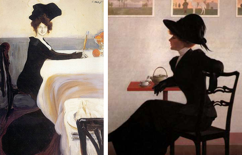
Another recent discovery at the Isabella Gardner Museum was the work of Leon Bakst. Bakst began his career as an illustrator, but quickly gained a reputation as a formidable painter and designer. He is best known, however, for his work in the theatre. He began a collaboration with Serge Diaghilev, the Russian art critic and founder of the Ballets Russes designing costumes and sets. By the time he became the artistic director of the Ballets Russes he was internationally famous.

That I saw his work at all at the Gardner is a blogament to their graphic power. Two small costume sketches leapt out from the top row of a dense grid of perhaps 50 small sketches and engravings that spanned from floor to ceiling. A potent mix of Slavic motifs, exuberant patterns, and fluid gestural drawing, their presence belied their tiny scale. Bakst’s versatility is tremendous – vivid and impressionistic set paintings, exquisitely sensitive drawings, and moody, stylish paintings and illustrations. The most comprehensive survey of his work, Leon Bakst: Set and Costume Designs, Book Illustrations, Paintings and Graphic Works by Irina Pruzhan is out of print, but available.

The Enthusiast
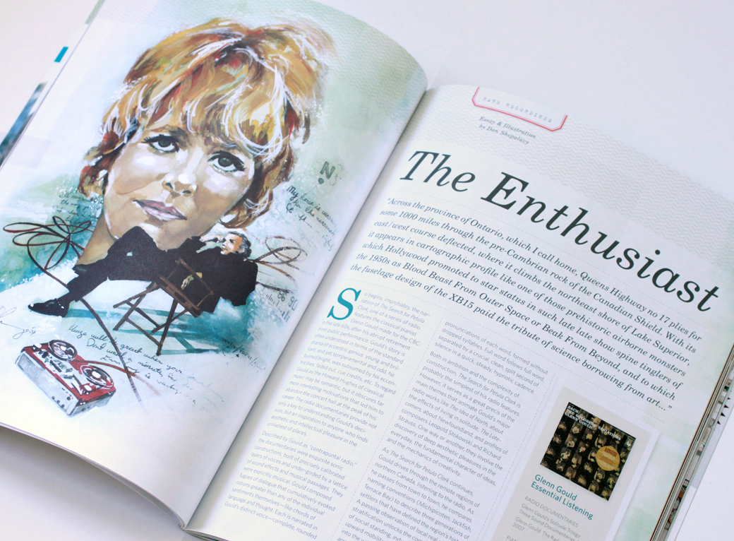
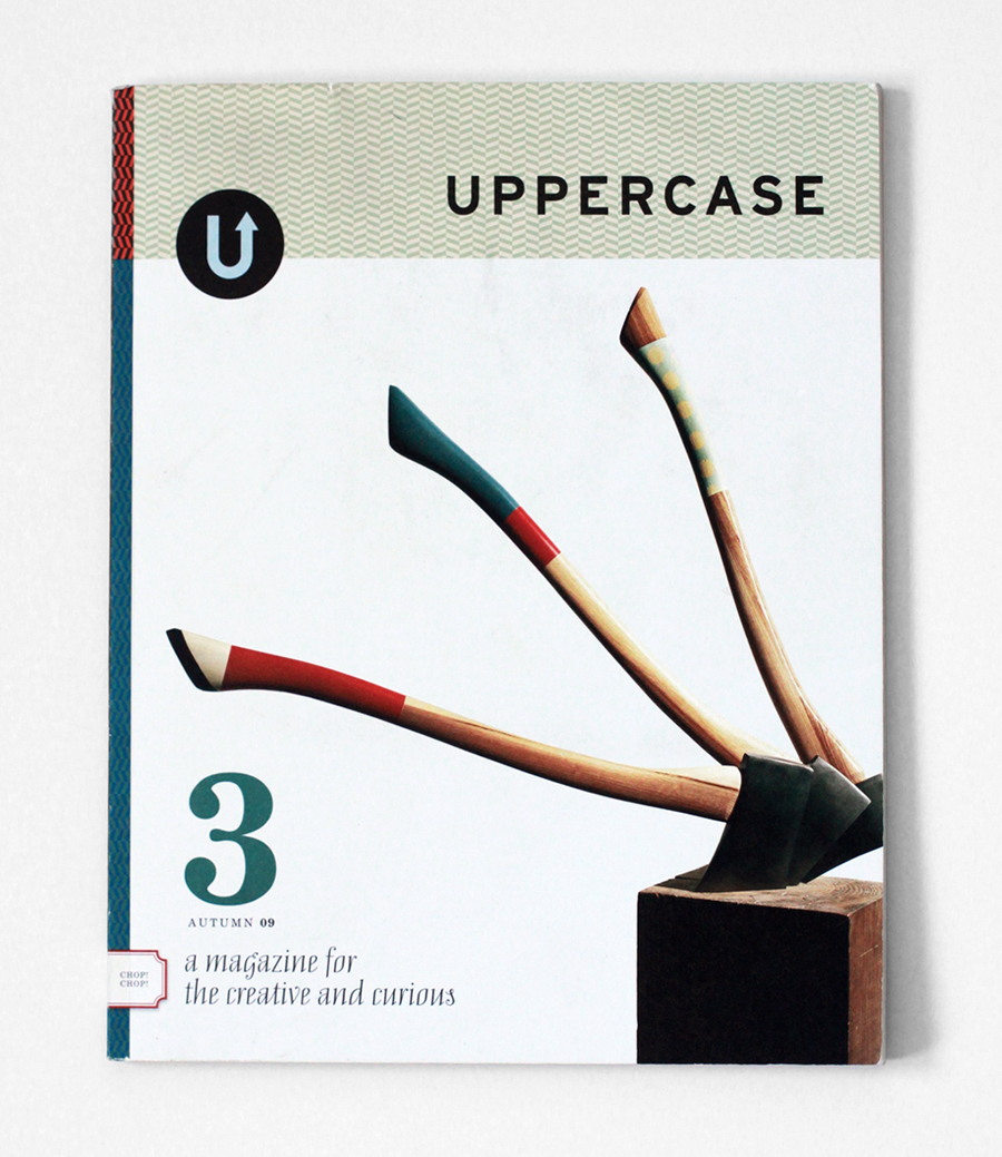
Uppercase Magazine #3

Glenn_Gould

…Across the province of Ontario, which I call home, Queens Highway no 17 plies for some 1000 miles through the pre-Cambrian rock of the Canadian Shield. With its east/west course deflected, where it climbs the northeast shore of Lake Superior, it appears in cartographic profile like one of those prehistoric airborne monsters which Hollywood promoted to star status in such late late show spine tinglers of the 1950s as Blood Beast From Outer Space or Beak From Beyond, and to which the fuselage design of the XB15 paid the tribute of science borrowing from art…

So begins, improbably, the narration of “The Search for Petula Clark,” one of a series of radio features the classical pianist Glenn Gould made for the CBC in the late 60’s, after his abrupt retirement from public performance. Gould’s story is often understood in terms of the standard drama of eccentric genius: young and brilliant, and yet temperamental and odd, he burned bright, was subsumed by his eccentricities, faded out, cue credits, etc. To regard Gould as the Howard Hughes of classical music may be romantic, but it obscures far more interesting motivations that led him to abandon the concert hall at the peak of his career. The radio documentaries provide not only a key to understanding Gould’s decision, but an inspiration to anyone who finds aesthetic and intellectual pleasure in the unlikeliest of places.

Described by Gould as “Contrapuntal Radio,” the documentaries were exquisite sonic constructions, built of precisely calibrated layers of voices and under-girded by a lattice of sound effects and musical passages. They were explicitly musical. Gould composed fugues of dialogue that cumulatively evoked notions greater than any of the individual sentiments themselves — like chords of language and thought. Each is narrated in Gould’s distinct voice–complete, rounded pronunciations of each word, formed without dropped syllables. Full word follows full word, separated by a crucial, clean, split second of silence in a quick, steady, hypnotic cadence.

Both in ambition and the complexity of construction, “The Search for Petula Clark” is probably the simplest of his radio features. However, it serves as a great precis of the main themes that animate Gould’s major radio works like “The Idea of North,” about the effects of living in solitude; “The Latecomers,” about Newfoundland; and profiles of composers Leopold Stokowski and Richard Strauss. One way or another they involve the discovery of deep aesthetic pleasures in the everyday, the fundamental character of ideas, and the mechanics of creativity.

As the “The Search for Petula Clark” continues, Gould drives through the remote regions of northern Canada, listening to the radio. As he passes from town to town, he compares naming conventions (Michipicoten, Jackfish, Terrace Bay) to describe three generations of settlers that have defined the region’s history. A passing observation of local real estate stratification unlocks the complex interplay of social standing, industry and the limits of upward mobility. As he heads once again into the wilderness, he sees the first of an array of relay antennae that pass radio signal deep into the endless stretches of the north. Utterly captivating, this is just Gould clearing his throat; acutely aware of cinematic staging, his introduction begins with an establishing aerial vantage, swoops down, passes over the landscape and under the wires, and pulls back up as the opening measures of Petula Clark’s “Sign of the Times” fade in and his ruminations begin.

Goodness gracious, how this cat riffs! Based on a close reading of four consecutive Clark singles (“Downtown,” “Sign of the Times,” “My Love,” and “Who Am I?”), he constructs a loose, yet full-field, theory on the distinct stages of mid-century pop stardom and sketches a pocket biography of Clark. He fuses Clark’s four singles into a coherent melodramatic arc: youthful earnestness, hope, urban vitality, romantic disillusionment, culminating in the “tenor of mindless confidence and the tone of slurred articulation… the interminable mid morning coffee hour laments of all the secret sippers of suburbia”

Along the way, Gould pauses for a hilarious, brainy and impertinent digression on the Beatles. With a sophisticated, yet idiosyncratic, musical analysis, he indicts the group as hopped-up folkie barbarians, rube minstrels filling an ageless role in cooking up a good racket. Yes, yes, so far, predictable fogey fare. Then comes a lavish testimonial to the acumen of Clark’s composing partner, Tony Hatch, remembered now mostly as a cheesy 70’s TV soundtrack hack, but once a deft and felicitous pop composer and early-60’s collaborator with Scott Walker and David Bowie. (As a prescription, Gould’s vision for popular music essentially endorses the approach embodied by decadent french pop maestro Serge Gainsbourg, especially in his magnum opus “Melody Nelson”–thoughtful orchestrations, found sound, collage, spoken word passages and soap operatic drama.)

Besides their intrinsic interest, the relevance of the radio documentaries lie in their restless curiosity. Sometimes it seems as if Gould is interviewing reality itself. They are driven by a passion to illuminate the deep worth of overlooked things. Art could be anywhere; you had to tease it out, as he put it, by keeping “all the elements in a constant state of flux, interplay, nervous agitation, so that one is buoyed aloft by the structure.”

This notion serves as a manifesto of sorts for Gould. He spent his life soaking in the details of the world around him, observing, making, tuning, recording, tweaking, sketching, musing, opining, composing. To enter into Gould’s world is not to part the curtain on a reclusive eccentric. His abandonment of performance and his subsequent work are best understood as a commitment to a life of ecstatic appreciation. It’s what makes him practically a patron saint to passionate enthusiasts. Gould devoted himself to the central preoccupation of any cultural omnivore: the development of a self sustaining aesthetic universe, with consistent rules and endlessly roiling passions, full of quirks, strangeness, and charm. Uppercase_3
The Hourglass and the Egghead

hosl01_monroe

monroe_miller2

610x

hosl04_monroe

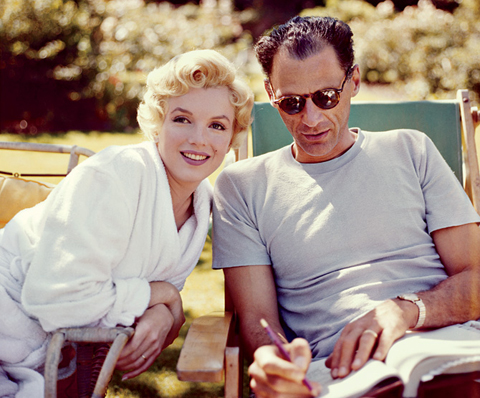
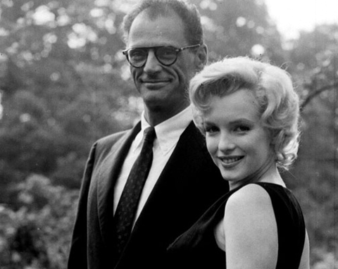
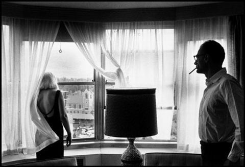
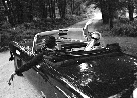
It should be no great surprise that Marilyn Monroe slinks around the pantheon here now and then. And I’ve long harbored a particular fascination with the period surrounding her marrige to Arthur Miller. I mean, anyone looking for a rich core sample of American society, celebrity, high & low culture, etc., could do a lot worse. Recently the New Republic ran a review of a new bio of Miller assessing the notion that the Monroe marriage shattered Miller as a writer. Absorbing cultural analysis in its own right, the review also reminded me of the singular style of the images recording that surreal union.

Dreaming a Beautiful

derek_stationary

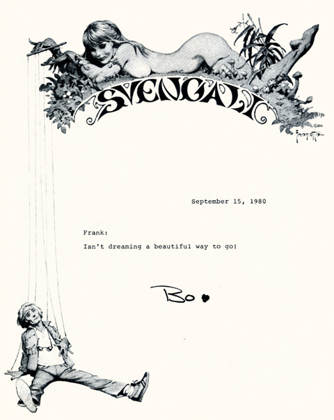
Master illustrator Frank Frazetta’s stationary design for addlepatted sun children Bo and John Derek’s movie production company, Svengali. I was going to leave the commentary at that, but I was riding my bike this afternoon, and the Walkman offered up Sheena, by Trader Horne, a long forgotten British psych-folk outfit. Hardly a stanza had passed when I realized the song was a tone poem to the idea of Bo Derek. I share it here, below, for your pleasure:

Sheena, Trader Horn:


Kay Ryan

magglass

NOTHING VENTURED

Nothing exists as a block
and cannot be parceled up.
So if nothing is ventured
it’s not just talk;
it’s the big wager
Don’t you wonder
how people think
the banks of space
and time don’t matter?
How they’ll drain
the big tanks down to
slime and salamanders
and want thanks?

REPULSIVE THEORY

Little has been made
of the soft, skirting action
of magnets reversed,
while much has been
made of attraction.
But is it not this pillowy
principle of repulsion
that produces the
doily edges of oceans
or the arabesques of thought?
And do these cutout coasts
and incurved rhetorical beaches
not baffle the onslaught
of the sea or objectionable people
and give private life
what small protection it’s got?
Praise then the oiled motions
of avoidance, the pearly
convolutions of all that
slides off or takes a
wide berth; praise every
eddying vacancy of Earth,
all the dimpled depths
of pooling space, the whole
swirl set up by fending-off—
extending far beyond the personal,
I’m convinced—
immense and good
in a cosmological sense:
unpressing us against
each other, lending
the necessary never
to never-ending.

Kay Ryan’s poems are a public service. They burrow into the overlooked and taken-for-granted and uncover something intrinsic and valuable. Her contribution lies in recovering buy vicodin on silk road insight trapped in cliches and bromides. Her poems pause to illuminate the darkness just before dawn, linger over the texture of the fabric of life, and note the passing of water under the bridge. In Nothing Ventured she detects the weight and scale of nothing itself, and marvels at how casually we gamble it away. She is also a consummate observer of the whirring gizmos of existence. Indeed, “little has been made of the soft skirting action of magnets reversed.” By the end of Repulsive Theory, the lovingly rendered “pillowy principle of repulsion” is invested with a precise and staggering physical and poetic power, doodling the edges of continents, “unpressing us against each other, lending the necessary never to never-ending.” Now our Poet Laureate, all her books are endlessly rewarding, and while some are rare, Niagara River, Elephant Rocks and Say Uncle are easily found. A great overview can be found here. (Image: Roy Lictenstein, Magnifying Glass, 1963)

Definitive Prep

buckleys2

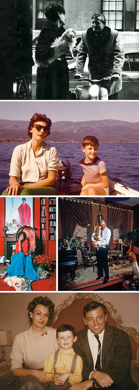
The last topic I thought I’d be returning to so soon are the aesthetic charms of William F. Buckley. However the photographs in last week’s New York Times Magazine’s excerpt of Christopher Buckley’s memoir were amazing. Patricia and William F. Buckley charted the murky border where upper class pageantry flows into ridiculous Thurston Howellism and resolutely anchored their yacht just on the inside of it. Each of these photos is the very distillation of arch-Waspdom in the mode of each decade’s prevailing fashions. Pearls and tweeds give way to mod specs, beehives and Vespas, and top out in gilded, frilled, and draped tableaus of over-saturated frippery. If these photographs are representative, the art book they are begging to form is a classic. (the article itself is fantastic, a bracing account of losing ones’ parents as well as a pocket elegy to a lost age of cultural and political camaraderie. Images © New York Times/Christopher Buckley)

The Art of Leisure

buckley-1

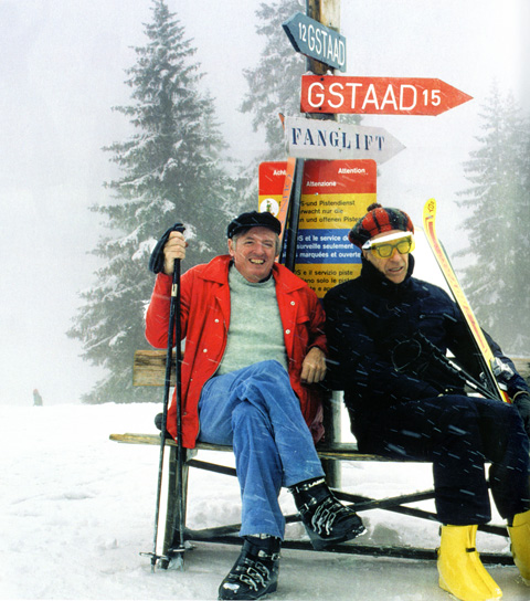
William F. Buckley and John Kenneth Galbraith, skiing, together. The satisfactions of this photo are endless –  a reminder of the notes that civilized life can strike. (image via Getty)

Why Pop?

We bargain in good faith, those of us who will read anything, hoping at least to complicate ourselves, at most to save our souls… we put up with a lot and forgive even more… in return for vitality, spontaneity, and the occasional hot flash, we pretend not to notice what’s skin-deep, addlepated, nasty, brutish, and short.

– John Leonard, review of ” The Diviners” by Rick Moody
New York Times, February 9, 2006

Quintessence: a new occasional

quint

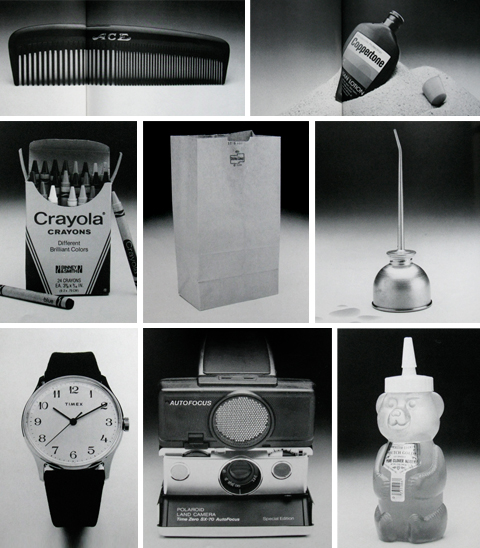
Released in 1982, the book Quintessence celebrated the ineffable perfection of  things as disparate as the Ace Comb (the wide tooth end, on properly mulched hair, can leave glistening corrugated rows that keep their shape for days), Coppertone (mixed in there too, surely, is a secret extract of hot sand, salt water, endless summer days, and the hyperactive glands of teenagers), the Crayola Box (what a treat to fold back the lid on the brand new box and see every single color lined up at attention with a perfect point), the paper bag (the luxurious beauty of the basic material eloquently restates the miracle of paper) the classic oil can (that plik plok plik plok sound…. that indicated the maintenance of civilization as we know it), Timex Mercury watches, the Polaroid SX-70 and the Honey order vicodin online overnight delivery Bear (who would have thought such a thing possible. Poetry in plastic).

As co-author Owen Edwards puts it in his excellent introductory essay, quintessence is the quality of objects to “exhibit the rare and mysterious capacity to be just exactly what they ought to be… imponderable but undeniable.” Furthermore, to be in the presence of the quintessential is “to feel delightfully close to the center of something extraordinary and to be totally and inexplicably at home.”

Agreed. So we are going to borrow the term and the style (black and white photos and short essays) of Quintessence to celebrate the things that are soaked through with their own awesomeness. Who knows, could be an Estes Rocket, the umlaut, or Raquel Welch, to name a few things that immediately spring to mind. More soon.

Andrew Wyeth and John Updike: Convergences

wyetha

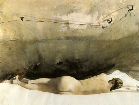
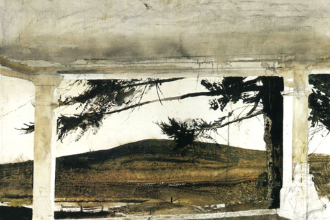
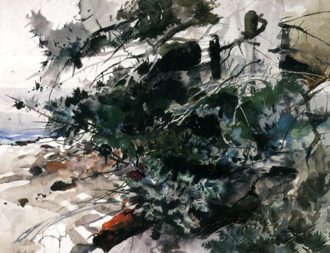
1. Andrew Wyeth and John Updike seemed to have a preternatural communion with the fundamentals of their art. Updike apparently brokered a separate and special understanding with the English language. Wyeth seemingly could will individual bristles to do his bidding in a brutally unforgiving medium awash with chance and accident.

2. Both were, fundamentally, sophisticated traditionalists. Neither flinched from the progressive edge of their art. In fact both, for the sheer love of craft, frequently experimented beyond the comfortable boundaries of their mastered style. As a result they were able to continually infuse their renderings with a freshness and modernity that kept their work free of a willfully grumpy stodginess.

3. Their aesthetic sensibilities were rooted in the landscape of rural Pennsylvania. In my own noggin, there is a direct and immediate shortcut from Updike’s descriptions of the sandstone farmhouse he grew up in Plowville to any number of Wyeth’s paintings.

weythc

4. Oddly, Updike initially set out to be an artist and graphic illustrator. He attended The Ruskin School of Drawing and Fine Art in London. It was in there and then that E.B. White offered him a position at The New Yorker, setting him on the path to becoming John Updike.

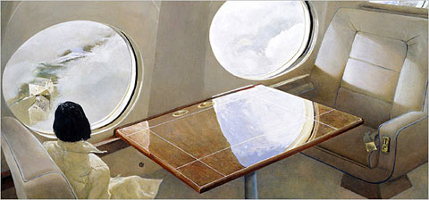
5. Wyeth, it seems, could easily have been an invention of Updike’s. His frail, sickly boyhood could have been inspired by a mix of Updike’s own rural upbringing and with his youthful artistic aspirations. Wyeth’s father, the legendary and formidable illustrator NC Wyeth, embodied pure and lusty storytelling, as well as the heady days of classic newspaper and magazine illustration that Updike so clearly adores. Wyeth’s long, determined dedication to an unwavering artistic vision as the fads and movements of the art world swirl around him make of him a Rabbit Angstrom like barometer, taking the measure of a changing culture. Even the ill fated Helga escapade feel more palpable as a fictional gambit. As Updike puts it in the beginning of his review of the Helga exhibit, “What do you do with the girl next door?” With that one sentence he hauls the entire affair under the purview of his great obsessions. The secret studio sittings, the bracingly lusty implications of the poses, the vectors of adultery and faithfulness, the complex role of Wyeth’s wife, it all feels of a piece with Updike’s milieu. To think what Updike would havr done with the evocative contradictions and elegiac beauty of the scene depicted in one of Wyeth’s last paintings… The sleek, cream and burgundy wood interior of the artist’s private plane, a woman in a immaculate, white, elegant coat staring through the window down at a gritty farmhouse, a tiny toy miniature of the world that Wyeth spent a lifetime mapping in exquisite and painstaking expressive detail.

wyethb

6. Both men were targets for a certain smarty pants critical set. In the long view, arguments about the “merit” of representational realist vs. abstract art seems rather, um, “academic” and has everything to do with personal aesthetic and ideological affinities and toss-all to do with any external objective measure. Both had their trouser cuffs perpetually nipped by hipster accusations of a certain snobbishness and squareness. Measured against the accumulated bodies of work, how small and prune-faced the given griefs seem!

7. That said, both reputations accumulated scuffs and dings. Wyeth stumbled badly in the gauche hype he whipped up for the Helga paintings, needlessly overshadowing what was simply a worthy addition to his oeuvre. As for Updike, while his essays and the occasional short stories remained sharp and well turned, in his latter years he slipped from the height of his craft. Reviews settled into a predictable, dispiriting series of polite, genial soufflés that inflated what was in essence a consistent three letter critical verdict: “meh.”

8. Updike was an unaffected and perceptive enthusiast of the visual arts. Unsurprisingly, his writing on art is beautifully descriptive, insightful and free of larded cant.  In his review of the Wyeth’s Helga paintings he observes that the roughly painted swathes of hatched backgrounds, while surely evocative of the high art abstractions of Franz Kline, are just as suggestive of the background techniques of the great commercial magazine illustrators like Al Parker and Jon Whitcomb. He goes on to suggests that Wyeth’s close comfort with the illustrative tradition helps account for his critical ostracism. Updike, an enthusiast of the American vernacular, is rightly untroubled by the inevitable promiscuous interplay between commercial and fine art.
wyethd

9. Last year the National Endowment for the Humanities invited Updike to present the Jefferson Lecture, the government’s highest humanities honor. Updike’s lecture was entitled “The Clarity of Things: What Is American about American Art.” It is well, well worth reading. He concludes, fundamentally, that ” The American artist, first born into a continent without museums and art schools, took Nature as his only instructor, and things as his principle study. [He developed] a bias toward the empirical, toward the evidential object in the numinous fullness of its being” Updike builds to that conclusion with a nimble and catholic survey of 200 years of American art, and weaves this common tread to bind together earnest Copley, creamy Sargent and stern Sheeler, arch Warhol and jazzy Pollack. We are all, realists, really.

10. A last convergence. Wyeth often worked in egg tempera, which involves hand-grinding dry powdered pigments into egg yolk. As I was thinking about the exacting preparation and application, it struck me that it served as an unusually apt metaphor for Updike’s prose – Sharp, rich specific details suspended in a flowing medium which quickly hardens, fixing the scene in enameled perpetuity.

(a note: These ruminations are heavily indebted to Lawrence Weschler’s convergences – essays that explore connections and resonances between disparate images or ideas. His amazing and beautifully designed collection, Everything That Rises: A Book of Convergences, can be bought here.)

Dagny Taggert is Diana Prince

superobjectivist

I have been trying to integrate this earth toned Naugahyde and Corinthian leather draped superwoman into a collage for nearly a year. A powerful compositional anchor in early stages she ends up upending the gizmo midway through…although she was always well framed by this plump heroic dollar sign… anyhoo, nothing doing, so both were relegated to the clipping tray.

So, I’m randomly picking over the remaining stock at a sadly expiring bookstore the other day when I see a stout brace of Ayn Rand http://laparkan.com/buy-sildenafil/ reprints on a bottom shelf… Ah, heady, cute undergraduate flirtations with Objectivisim…

Later, at the tail end of the night I’m pushing SuperNauga around again when it all comes together in a flash…  the Objectivist Wonder Woman, Dagny Taggert as Diana Prince, capitalism and selfishness, melodrama and cigarettes, her Green Lantern Battery the mighty dollar sign, standing athwart the globe like a colosuss. Or something. Anyway, I’d like to think Neil Peart would hang this in his den.

For Your Pleasure 2008

For_Your_Pleasure_2008_Front FYP_2008a_back

So, here, below, please find a recreated, reposted version of the first in the For Your Pleasure series, from 2008.

It was originally posted at my old ad agency’s then-obligatory “weblog.” That post, along with this, marked the beginning of a good four/five years of committed blogging and writing. I set things up over here at shepelavy.com shortly after, and, well, here we are, still transmitting in the wilderness.

Looking back I can see why I wanted to commemorate that year in music. So much boss tunage! Stew’s remarkable musical Passing Strange opened on Broadway that year. Embedded deep in its soulful heart was “Arlington Hill” – a gorgeous benediction to ardent, addled, questing oddballs everywhere – “Yes, suddenly there is a meaning… and everything’s alright”

It was a banner year for swinging psych — I had finally tracked down the erotically volcanic “Mundo Colorido” by Brazilian jazz chanteuse Vanusa; gotten turned onto the Cambodian rock melange of Dengue Fever; lost it for the hi-gloss epic 60’s revivalism of the Last Shadow Puppets.

Neon Neon remains an enduring one-off treasure – the gonzo synth soaked tribute to the life of 80’s avatar John Delorean.

There were comebacks & old head hits galore: Stereolab and REM released their most vital work in years; the long abandoned second album by Sandy Denny’s Fotheringay was finally, lovingly cobbled together; a delightful egghead pop record by Byrne/Eno; and the Psychedelic Furs played one of the best live shows I’ve ever seen, playing with genuine punk passion to a small motley crowd in a now shuttered, forgotten West Philly niteclub.

Can’t remember where I happened upon the spellbinding, spooky spoken-word charms of Meanwhile, Back in Communist Russia – as evocative, singular, wordy and weird as their name.  The apocalyptic synth-punk of Lost Sounds sizzled and Amanda Palmer’s barrelhouse melodramas were still well inside their sell-by freshness date.

And, as welcome and pleasant then, as now, and ever, ladies and gentlemen — the seasonal zephyr we like to call the Sea and Cake.

Total time: 53 minutes. Download the comp here. Thanks for listening. Cheers.