Table of Contents: Culture


For Your Pleasure 2013

FYP_2013_Cover

FYO_2013_Back_a

This year was ruled by bands & musicians I hold very dear dropping career defining albums out of nowhere. Albums that were reconnections, reminders & remembrances of their fundamental radness — each, though, indelibly colored by an autumnal mood, recognition of age, time & wear.

I thought the best rekkid honors were done & done as early as February with Bad Religion’s exhilarating True North — songs firing like model rocket engines, a compressed crackling burn and then, a minute or so later, lay smoldering. A career capper, a middle age manifesto, and the last classic of mid-80’s SoCal melodic hardcore.

Months later I’m in Toronto at a record shop where I finally scored the long coveted debut EP by Men Without Hats. Can that snigger, bignuts — this bands gifts are substantial & buried, like Wall of Voodoo’s, under the debris of their sky-blotting single hit. You fucking bet you can dance if you want to…

Anyway — this leads me to wonder what they’ve been up to recently. The answer? A stunner of a record, Love in the Age of War, recorded in late 2012 (news about MWOH travels slowly) on their original analog gear. It was originally titled Folk of The 80’s Part IV, thus deliberately planting it in line with the band’s killer run of raw synth records before the more painterly & ambitious Pop Goes the World. Alternately thrilling & poignant, this ruled the headphones for months.

Then Bowie drops The Next Day, the last word on last words as far as Olympian rockers go. Superfan Rick Moody nailed it in a long exegesis for the Rumpus — it’s a particularly tuned masterpiece, functioning as a hall of mirrors & memory palace of Bowies guises, obsessions, and, above all, vocals. For the heaviness of its agenda, it’s a remarkably unlabored listen — a great batch of songs, carefully & secretly handcrafted then released with Bowie’s characteristic savvy. The record cover tells you every single thing you need to know about it, a conceptually brilliant shorthand to a tremendously rich & deep listen.

Weaving amongst these heavies was the year’s big discovery — the Aussie all-lady foursome Beaches. Their second album, She Beats, was a swirly, gauzy, fuzzy, fuzzy, swirly, gauzy pleasure. Melodic swells dove in and out of  the din like dolphins, underpinned by a steady motorik beat (Harmonia’s Michael Rother guests) The grin-goosing “Chase Those Blues Away” was the tune of the year.

Welcome electronic transmissions resumed from the Boards of Canada & Barbara Morgenstern – bleeps and bloops both heavy and light.

Psych alchemist Kelley Stoltz has long completed his apprenticeship — this years Double Exposure, a fusillade of handmade pop-psych bliss, is a killer follow-up to 2010’s equally ace To Dreamers. The spellbinding cover, featuring Stoltz’s mom back in the 70’s drawing a bow in what looks like hockey pads on a shag rug backed by a large op art painting & a hi-fi, was the year’s best.

Spelunking in the shops yielded treasures galore this year — Babe Buell’s Covers Girl EP where the fetching groupie (and Arwen Undómiel’s mom) is produced by Rick Derringer, backed by the Cars, and covers Love & Iggy; James Freud’s forgotten mod/synth mashup, bought on the strength of the cover alone; vinyl versions of high-school mix-tape staples interred for decades on cassettes like Flipper’s “Ha Ha Ha,” Vagina Dentata’s legendary Darby Crash penned “Golden Boys”, Frightwig’s careening “Wanque Off Song”, and Hawaiian Pups’ resolutely odd & yet irresistible “Baby Judy.”

Nick Cave played the year’s best show. A few songs into his set at the Keswick Theatre, Cave, exasperated by the staid & respectful audience, demanded a stage rush. As a result I finally got a sustained barrage of legendary close-up Cave — thin, ungainly, tall & lanky, mustachioed, posture lurching & off kilter, reminding me of no-one as much as a demonic Fawlty Tower’s era John Cleese… a gobsmackingly riveting performance.

A few ace re-issues appeared, each a welcome surprise. Dark Entries’ collection of the early recordings by Algebra Suicide is a public service, helping to secure the legacy of the formidably talented Detroit Ukrainian poet & singer Lydia Tomkiw. And then a delightfully random Clothilde collection! Clothilde was weird salvo in the barrage of 60’s French girl pop, or ye ye. The moodiness of Francoise Hardy, the bubbly delivery of France Gall, set to ramshackle fuzz & harpsichord  constructions reminiscent of Joe Meek. Light In The Attic kicked off the Public Image Limited reissue series with a lovingly reproduced 7” of their debut single, complete with foldout faux tabloid. I’ve loved this song for over 25 years – it hasn’t lost a drop of it’s power, originality, venom, or pop and it sounds, as it always has, utterly vital.

I listened to a lot of Reggae on Sunday afternoons. Weird — music just finds you when you are ready for it, I guess.

Then out of the blue ether, the Chills drop Somewhere Beautiful, a rough & crystalline live recording of a small New Years party they played a while back. Prolific, yet sporadically recorded back in the late 80’s and early 90’s, New Zealand’s the Chills were led by the preposterously gifted, big hearted, but troubled Martin Phillipps. Their first singles, and two LPs (especially Submarine Bells) were peerless muscular, shimmering beauties. After a brush with popularity that found them recording with R.E.M. and Van Dyke Parks, Phillipps’ crushing heroin habit subsumed the band. Living hardscrabble, he managed only one more proper LP, a demos release and a home recorded 4 song EP since then — all excellent. Then this miracle. The band has more heft & swing than before, and even with a few lovely embellishment the sound is more garage-y than gossamer. Phillipps’ voice, though, is a revelation. While still melodically supple, a rawness tears through the songs, the edge of his sharp New Zealand accent present as never before. Each song is recast, invested with new energy, and inflected by real pain & directness. It’s a fucking stunner, and hands down the years best record.

DOWNLOAD THE COMP HERE. ENJOY!

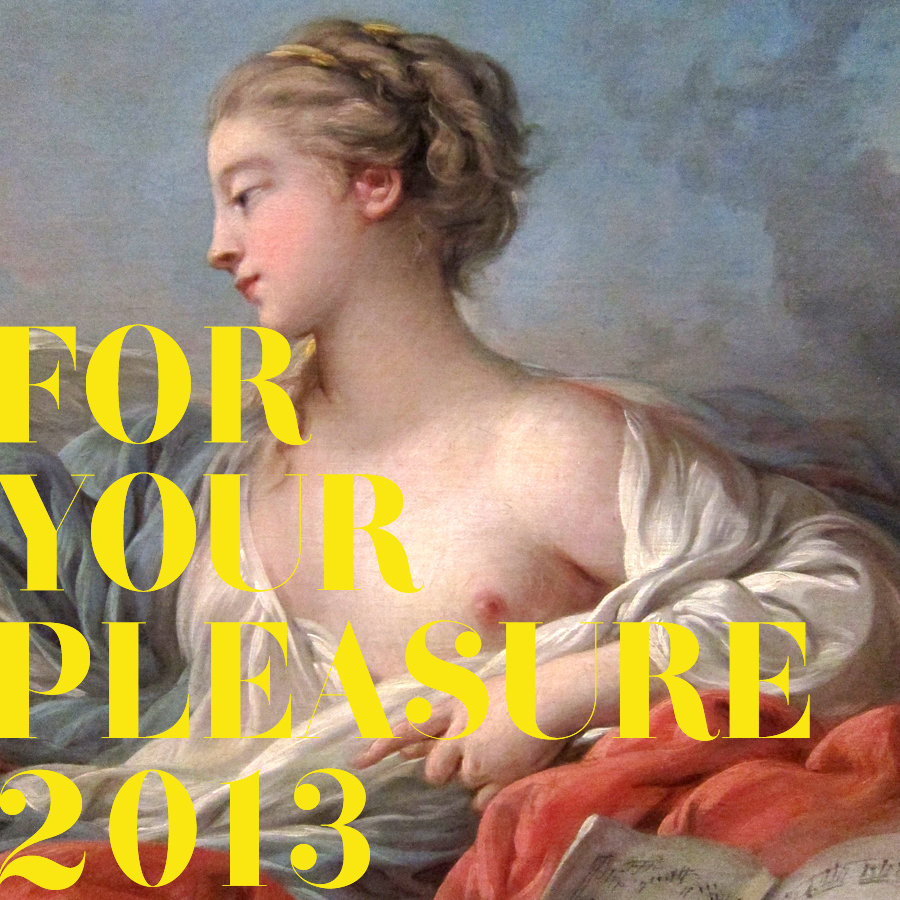
cover image: Boucher, François, Allegory of Music (detail) National Gallery, DC


thomas wilmer dewing

Thomas_Wilmer_Dewing_-_The_Spinet_-_ca._1902

Thomas-Wilmer-Dewing-xx-The-Fortune-Teller-xx-Private-Collection

Thomas Wilmer Dewing - The Recitation 1891

Thomas-Wilmer-Dewing-xx-Summer-xx-Private-Collection

The_Gossip

tumblr_m2ow91mj4w1r3fkjno1_1280

I recently took a pal to the Isabella Garder Museum in Boston. It is simply one of the most beautiful, sublime environments to take in art — it’s an indelible reminder of how central decor & architecture are to the experience of a particular artwork. That experience is especially powerful and acute in the famous “Yellow” and “Blue” rooms, where furniture, small doodles, ephemera, exquisite wallpapers, surround and mingle with masterworks by Rossetti, Sargent, Whistler and Degas.

My collegue was particulary taken with a smallish, glittering portrait of a woman (above) by Thomas Wilmer Dewing. Further research hauled up a lovely cache of paintings — most stranger & more fetching than the one in the Gardner. Turns out Dewing was a tonal painter heavily influenced by James Abbott McNeill Whistler’s work, especially his famous Nocturnes (which I also dig. I wrote about them a few years back, here. There’s also one in the Yellow Room) There’s a gauzy texture to his paintings I absolutely adore & sets them well apart from the usual parade of society portraiture and pastoral vingettes. Enjoy.

435


Guitarist Wanted

‘The Perfect Guitarist’
for Avant Rock Group
Original, creative, adaptable
melodic, fast, slow, elegant, witty
scary, stable, tricky
QUALITY MUSICIANS ONLY
‘Roxy’ 223 0296

Ad placed by Bryan Ferry in Melody Maker soliciting a guitarist to join him, Andy Mackay, and Brian Eno in the fledgling Roxy Music.

Flight Risk

Flight_Risk_Martin_Schoeller

Riveting cover photograph by Martin Schoeller for the New York Times Magazine. He also shot the best photo ever of Jeff Koons, below. It’s the best photo because it trumps the billions of words this cat has kicked up in his wake and lays http://www.mindanews.com/buy-effexor/ bare the artifice, calculation, perfection, mischievousness, & joy that makes Koons at all worthwhile. Also, the ski cover looks like a vérité Phil Noto, below, below. Phil Noto? Folks… Phil Noto.

Martin_Schoeller_Jeff_Koons


Phil_Noto_Jet_Seven


Under the covers

ValleyOfTheDolls

Problems_Updike

ImageDuplicator_Lichtenstein

So, recently, at one time or another I was reading these three books. As I piled then up to be re-shelved they struck me as having some strange communion with one another. Each spare, simple and striking, sharing some essential tone that I adore — perfect pop design in three modes, fashionable, nerdy, and electric. Each in there own right a great read, too. Updike and Lichtenstein need no additional cheerleading, but let me make a impassioned plea for Valley of the Dolls. What a empurpled pleasure. Read it, luxuriate in its plush vulgarity, then treat yourself to the Wiki rabbit hole you get to go down matching each character and melodramatic scenario with the real people and incidents that inspired then. Then the movie. Then the Roger Ebert / Russ Meyer luridly psychedelic quasi sequel Beyond the Valley of the Dolls. Then buy that film’s equally boss groovy soundtrack. You’re welcome.

High striker hierarchy

High_Striker

Saw this high striker (that’s the amusement industry term, thanks internet) in the game room of the Old Sled Works antique mall in Duncannon, PA.

So — can we take a minute to appreciate the unhinged hierarchy asserted here?

Ok, I get SISSY. Requiste aggro potshot at the weakling. Jock table stakes if you will… after that, though, we go completely bat shit. What the hell is up with GIRL CRAZY? Is that weakness? Distraction? Is it that you are so girl-besotted you can’t focus properly on wielding a giant wooden mallet?

SPACE PILOT, which arguably should be at the top, is below the NEWSBOY & BULLY cluster? They can’t mean SPACE PILOT in it’s Flash Gordon, Buck Rodgers, Han Solo sense. Or astronauts, surely. Perhaps it’s the geeky, sci-fi dreamer, the spaceship doodler? Maybe. But it says SPACE PILOT, which I remind you is below NEWSBOY & BULLY. Which is nonsense.

Look, I’m happy that NEWSBOY beats BULLY. But certainly we’re overrating the NEWSBOY. Maybe the NEWSBOY loomed larger in the macho imagination back then? But wasn’t he always more scrappy than strong? And honestlyI have a hard time believing that, all things being equal, the neighborhood BULLY couldn’t take out the local NEWSBOY.

On top of which, if you’re just a bit stronger that SPACE PILOT, you achieve the rank of BULLY? What the fuck? Is that motivating?

Then we arrive at the topsy turvy top. Let’s establish this, at the very least — by definition HERCULES and SUPERMAN top TARZAN.

In order to referee between those two I guess you could turn to DC comics, which is the only realm where HERCULES and SUPERMAN co-exist. There I suspect you’d find it nearly a dead heat strength-wise. HERCULES has the edge of godhead, and I guess is more universally powerful, lacking both the need for our Sun’s light and a vulnerability to Kryptonite. I guess this order stands, then.

But you’ve got to have a seriously warped sense of awesome to rank TARZAN above both. I’m certain the authors of this ranking did not mean to privilege his Royal roots as a Lord of Graystoke, his facility with languages, or his chivalry.

It’s the bear chested gorilla wrestling we’re talking about here. The Me-Tarzan-You-Jane over the shoulder while choking a python shit. No Krypton sci-fi nerdiness, or effeminate toga and garland with this guy…

Sigh. To scan this list is to hear Civilization crumble while a stunted macho-ness runs amok. Let’s at least, then, establish the correct order, top to bottom:

SPACE PILOT
SUPERMAN
HURCULES
SISSY
NEWSBOY
GIRL CRAZY
TARZAN
BULLY

Is this thing on?

can_you_hear_me_now

Transmissions sputter back to life… onto a fifth year of broadcasting. The signal has faded over the past year, gales of advertising mostly, then our radio tower plain and blew up (by which of course I mean a virulent SQL database corruption keelhauled my rickety, jury rigged WordPress build.) So, then, is this thing on? Are we going?

ViewOfDelft

Comrades!

I painted this figure study over a few days this summer. I walked by it one night, a month or so ago, and as I lingered for a minute and thought — that’s right — View of Delft.

Yes, as in Vermeer’s view of Delft, entitled View of Delft.

1660-61_View_of_Delft

A blasphemous chuckle, right, but gumdaggit if this sketch and title aren’t now bonded like noggin epoxy — the phrase passing over my little ditty of a painting like a sky-blotting arial banner, featherweight but indelible.

So, as I said the blogs been down for a while, swept under crosscurrents and swells of obligations, dissolutions and advertising and I’m casting about for an inaugural post and all I can think of is View of Delft.

Here’s why. Cause this blog is, if it is anything, even in this particularly unhinged association, about searching for our own little private views of Delft — little lagoons, obsessively surveyed, rendered, cleared out out by hand.

Lagoons. Because in the clotted coastline of the blogosphere, it’s what this is, really. A tiny lagoon, home to beatniks, old salts, venerable preps, society matrons, homespun cuties, movie stars and scientists… Gilligan’s wake. It’s a beachhead from which we can re-embark on our quest to find and stake out other unlikely harbors. A stretch of landscape we can fix in our minds and take a draught or a puff and contemplate, then set off satisfied.

And when others arrive, like you dear reader, perhaps you’ll survey it appreciatively, like a scoutmaster, and think “I would’ve given you a commendable. That was one of the best pitched camp sites I’ve ever seen, honestly.”

tumblr_m4r0xoeakk1qa6obyo1_12801

Or something. Are we going? Is this thing on? Is this really broadcasting if there is no one there to receive? We’ll see. More soon.

Some credits: All the weird snippets about broken and sputtering radio transmissions are taken from Shellac’s epic angular shanty “The End of Radio,” which will serve as this latest sally’s theme song. The Herculean rebuild of this leaky beached blog was coded by the gifted and rad Marcello De Feo. Check his kung-fu. It is ace. The charming illustration of Moonrise Kingdom is by Adrian Tomine.

Claude Chabrol: 1930-2010

A selection of some fab posters for films by pioneering French director Claude Charbol, who died this week. (Some decent obits here, and here.) A giant of French cinema, Charbol was a founding member of the French New Wave, close pals with (and somewhat of a patron to) Jean-Luc Godard, François Truffaut and Éric Rohmer. Along with Rohmer he published a seminal critical work on Alfred Hitchcock, a significant influence.

Charbol was often described in shorthand as the French Hitchcock, which is pretty dead on, adjusting a bit for time periods and sensibilities. While not strictly a formulaic filmmaker, diabolical plots, melodrama, all manner of decadence, wry humor and a general wickedness abound.

For your consideration, a passel of recommendations from his extensive oeuvre: A Double Tour, 1961 – a convoluted noir, Who’s Got the Black Box?, 1967 – shaggy, but entertaining espionage yarn,  The Unfaithful Wife, 1969 and Innocents with Dirty Hands, 1975 two chilly, melodramatic physiological thrillers, Cop Au Vin, 1985, the first of two top drawer police procedurals featuring inspector Jean Lavardin, Masques, 1987 an intriguing character-driven mystery, The Swindle 1997, a neat little caper, Merci Pour Le Chocolat, 2000 about a wealthy family’s nest of secrets, and Comedy of Power, a corporate boardroom drama. Available here, or at your fine local video store.

Hold it right there, Emma Peel!

The opening credits of the Avengers in color are deservedly beloved. What struck me recently was how sharp the compositions of the main frames are, though. They make a wonderful sequence – the dirty floods of color, the stark contrast, the precision staging of it all. Amazing thing is, even when frozen, they retain a jaunty swagger, the lightly hammy sophistication, and flair.

Bright Young Things

From 1915 till about 1940 or so, the Brinkley Girl cut a feverish swath through the cultural imagination. As drawn by illustrator Nell Brinkley, she was like the Gibson Girl on an absinthe bender – exuberant line, riots of splashy color, and buckets of joie de vivre. Girls obsessed over her adventures, hairstyles and fashion shifted in her wake, and she was feted in songs, films and theater.

Nell Brinkley’s specialty was the episodic themed series. Golden Eyes and Her Hero followed our heroine’s exploits and derring-do during World War One. Betty and Billy and Their Love Through the Ages, my personal favorite, featured a besotted glamorous couple in various romantic historical vignettes – intrigue in Southern plantation society, among Medieval troubadours, Phoenician swashbucklers, etc… The format begins to open up in the 20’s with sophisticated frothy flapper larks like the Fortunes of Flossie.

Fantagraphics Book’s wonderful new survey, The Brinkley Girls, collects these series and more, along with a fascinating introduction by the book’s editor, Trina Robbins. Aces.

Public Image Limited

In retrospect, the album cover designs of the early releases by Public Image Limited constitute one hell of a brilliant run. By his own admission John Lydon’s music has been basically a big conceptual media prank, playing with, subverting, and looting the whole notion of the public image. Therefore it’s no surprise that packaging and design figured so heavily in his work from the very beginning.

Arguably British tabloids were the closest things in the cultural landscape, both aesthetically and attitudinally, to punk rock, so it was fitting that Never Mind The Bollocks was designed like a cross between a tabloid and a ransom note (which, incidentally is an apt description of the record itself.)

With Public Image Limited, those influences and themes became more sophisticated and overt. The mock slick magazine design of the debut was an ironic riposte to the expected image of Lydon as a young savage. This was followed by the unprecedented, and justly celebrated, configuration of 1980’s Metal Box – 3 12inch singles in a, um, metal box. After that came the aggressively sexy glamorous cover for 1981’s Flowers of Romance. Among other things, it strikingly prefigures the the snapshot aesthetic of current fashion and nightlife photographers like Nikola Tamindzic and, ugh, that skeezy doofus Terry Richardson. The sleeper of the bunch is the cover of 1983’s cynically bland cash-in Live in Tokyo – shot and composed perfectly. Dig the way the commercial riot of neon signage converges and perfectly frames the iconic PiL logo, interrupted only briefly by Lydon’s fab shiny suit.

What ties it all together is the same tension that animates the music – a constant flickering between art and commerce, sincerity and fakery, and, ultimately, what is false and worthless and what is true and enduring.

Public Image Limited: Public Image: [download]

[audio:https://shepelavy.com/audio/PIL_PublicImage.mp3]


Public Image Limited:
Careering (astonishing BBC version): [download]

[audio:https://shepelavy.com/audio/PIL_CareeringBBCSession.mp3]

Wonder Woman Costume Sketch

This, I covet. It’s the original costume sketch for the Wonder Woman TV series. It was designed and drawn by Donfeld, – Hollywood bon vivant, four time Academy Award nominee for costume design – who’s heyday spanned the 60’s to the 80’s. Besides the costume for Wonder Woman, his other lasting contribution to Western culture was designing Jill St. John’s costumes in Diamonds Are Forever. All this while dedicating himself tirelessly to keeping Jacqueline Bisset looking foxy – a great, great man. Anyway, in 2005 this treasure sold for $2,390 at auction (It was originally inscribed and given by Donfeld to his good friend, actor Richard Chamberlain.) I vow to you, if I ever make my pile, someday this will hang proudly on my wall.

On Language…

It is not by chance, or without a deep ground in his nature, common to all his qualities, both affirmative and negative, that Lamb had an insensibility to music more absolute than can have been often shared by any human creature, or perhaps than was ever before acknowledged so candidly. The sense of music — as a pleasurable sense, or as any sense at all other than of certain unmeaning and impertinent differences in respect to high and low, sharp or flat — was utterly obliterated as with a sponge by nature herself from Lamb’s organization. It was a corollary, from the same large substratum in his nature, that Lamb had no sense of the rhythmical in prose composition. Rhythmus, or pomp of cadence, or sonorous ascent of clauses, in the structure of sentences, were effects of art as much thrown away upon him as the voice of the charmer upon the deaf adder. We ourselves, occupying the very station of polar opposition to that of Lamb, being as morbidly, perhaps, in the one excess as he in the other, naturally detected this omission in Lamb’s nature at an early stage of our acquaintance. Not the fabled Regulus, with his eyelids torn away, and his uncurtained eye-balls exposed to the noon-tide glare of a Carthaginian sun, could have shrieked with more anguish of recoil from torture than we from certain sentences and periods in which Lamb  perceived no fault at all.
– Thomas De Quincey on Charles Lamb

This excerpt of Thomas De Quincey’s operatically vicious takedown of the writing of fellow essayist Charles Lamb’s work is a treasure for three reasons. The first is the deliciously tight braiding of critical acumen and epic meanness. The second is the sheer melodrama of it all – Nature’s sponge !, the tearing of Regulus’s eyelids, shrieking in the noon-tide glare of a Carthaginian sun. Unhinged. But. There is art and wisdom buried in this empurpled soufflé of brainy spite. It has, nested in the middle, one of the most eloquent formulations of the mechanics of excellent writing. – Rhythmus, or pomp of cadence, or sonorous ascent of clauses… the structure of sentences… an indispensable sketch of the the engine that brings art to language.

Royal Bodies

Lose yourselves in this utterly engrossing essay by Hilary Mantel, currently free to read at the London Review of Books. Entitled Royal Bodies, it considers the construct of this utterly peculiar institution, it’s basest aspects and its most unworldly character, in Mantel’s typically direct, painterly, and slightly off kilter way — In looking at royalty we are always looking at what is archaic, what is mysterious by its nature, and my feeling is that it will only ever half-reveal itself… Royal persons are both gods and beasts.

Mantel wrote the incomparable historical novels Wolf Hall and Bring Up the Bodies, two thirds of a trilogy centered around Thomas Cromwell, Henry VIII, and the founding of the Anglican Church. So skewed and revelatory is her lens, and so brilliantly constructed is her authorial voice that I waited for the release of the second book with an anticipation usually reserved for a new record by a beloved band — as much as I wanted to hear the story continue, it was the style of the writing, the sound of her language that I couldn’t wait to submerge in…

The essay caused, and is still causing, a retarded kurfuffle in the UK for her gimlet eyed assessment of Kate Middleton. Umbrage, in this case, relies on classic non-reading or a stubborn non-comprehension of the essay’s essential humanism. Read on here

Maurice Prendergast

So I finally went to visit the Barnes Collection at its new home on the Philadelphia parkway. My affinity for it has always been somewhat obligatory — I know why this art matters, but have appreciated it mostly as a bridge between older traditions I adore to modern currents I admire. As before, I find myself deaf to Matisse’s signals, and still feel an abject revulsion to Renoir — the smeary, overripe nudes struck me, this time around, like they were painted with bacon fat. Feh.

Revelatory though, were the few paintings tucked into various clumps throughout the collection by Maurice Prendergast. Each was a bravura demonstration of seeing, buy vicodin pain killers directly interpreted in painting. They were definitive and re-invigorating examples of the idea of impressionism as I understand it, painting animated by an exquisite receptivity of what it “felt like” to visually drink in a scene, its atmosphere, its flickering and transitory nature.

Later on, as I delved deeper into his work, scene after scene, I stopped thinking of them in terms of technique or theory but in terms of a kind of magic. He seemed to capture on paper an endless loop of the living essence of a moment, as if he could pin a a butterfly without stilling its movement or shimmer.


Hmm… That’s quite a drop.

The first page of the legendary comic Watchmen sold last weekend at auction for $33,460. Aptly described as the “Call me Ishmael” of comics, it’s one of the icons of the genre. All of the formal inventiveness that author Alan Moore and artist Dave Gibbons established in their 12 issue 1986 masterpiece is prefigured here. (Fascinating to see it stark black and white – the page also came with an ace bonus, an annotated color guide. Gander here, and here at larger images) Notice especially the convergences between Rorschach’s psycho-noir-messiah narration and the visuals in each panel. This tight choreography between seemingly unrelated visual and verbal elements is one the the primary sources of the book’s tremendous impact. It adds a crucial layer to the storytelling, one uniquely rooted in the format of comic books – the ability to directly interweave elements from one part of the story into another and thereby elicit new interpretations, resonances, and meanings. Watchmen established Moore as a virtuoso of this technique. So, so good…

Great story behind the provenance of the comic page itself. It was bought in 1987, in a comic bookshop in Covent Garden one morning by a bleary-eyed, hungover Stephen “Krusher” Joule for $180. Krusher was an artist and designer who worked with Motorhead, Uriah Heep, Blondie, Sex Pistols, Hawkwind, and Japan. He designed the covers for Iron Maiden’s Live After Death and Ozzy’s Diary of a Madman. In 1982 he became the art director for the legendary British heavy metal magazine Kerrang! In short, he’s exactly the kind of wonderful freak who deserves to score the first page of the Watchmen one hungover morning for a hundred and eighty bucks.