
Table of Contents: Design


Acme Moth Crystals, 2011, digital
Daughter of the American Revolution, 2011, digital
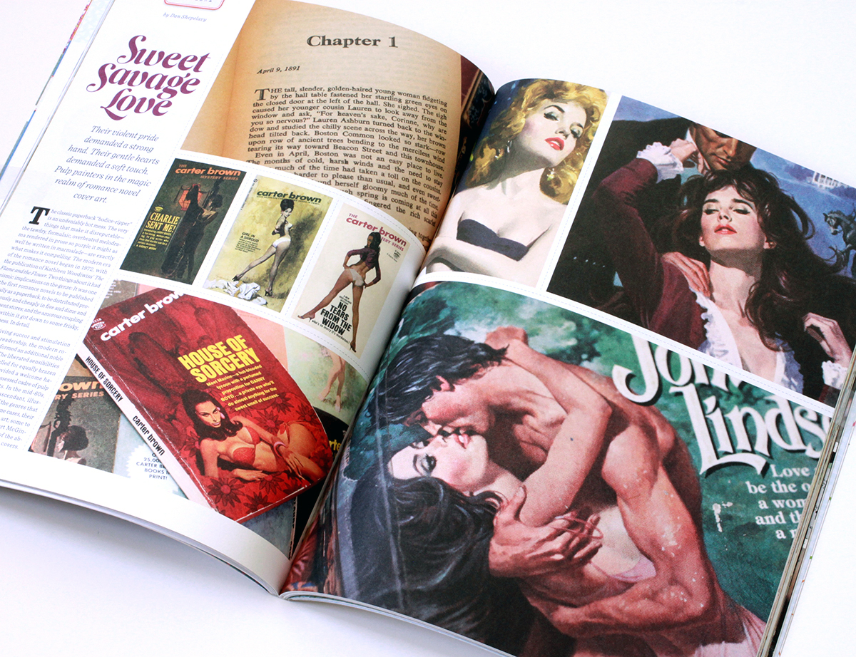
The classic paperback “bodice-ripper” is an undeniably hot mess – the very things that make it disreputable – the tawdry, formulaic, overheated melodrama rendered in prose so purple it might as well be written in marmalade – are exactly what makes it awesome.
The modern era of the romance novel begins in 1972, with the publication of Katheleen Woodiwiss’ “The Flame and the Flower” Two things about it had seismic implications on the genre. It was one of the first romance novels to be published initially as a paperback, to be distributed promiscuously and cheaply in 5 and dimes and department stores. And, pertaining to the amorous coupling detailed within, it got down to some frisky, frisky business. In detail.
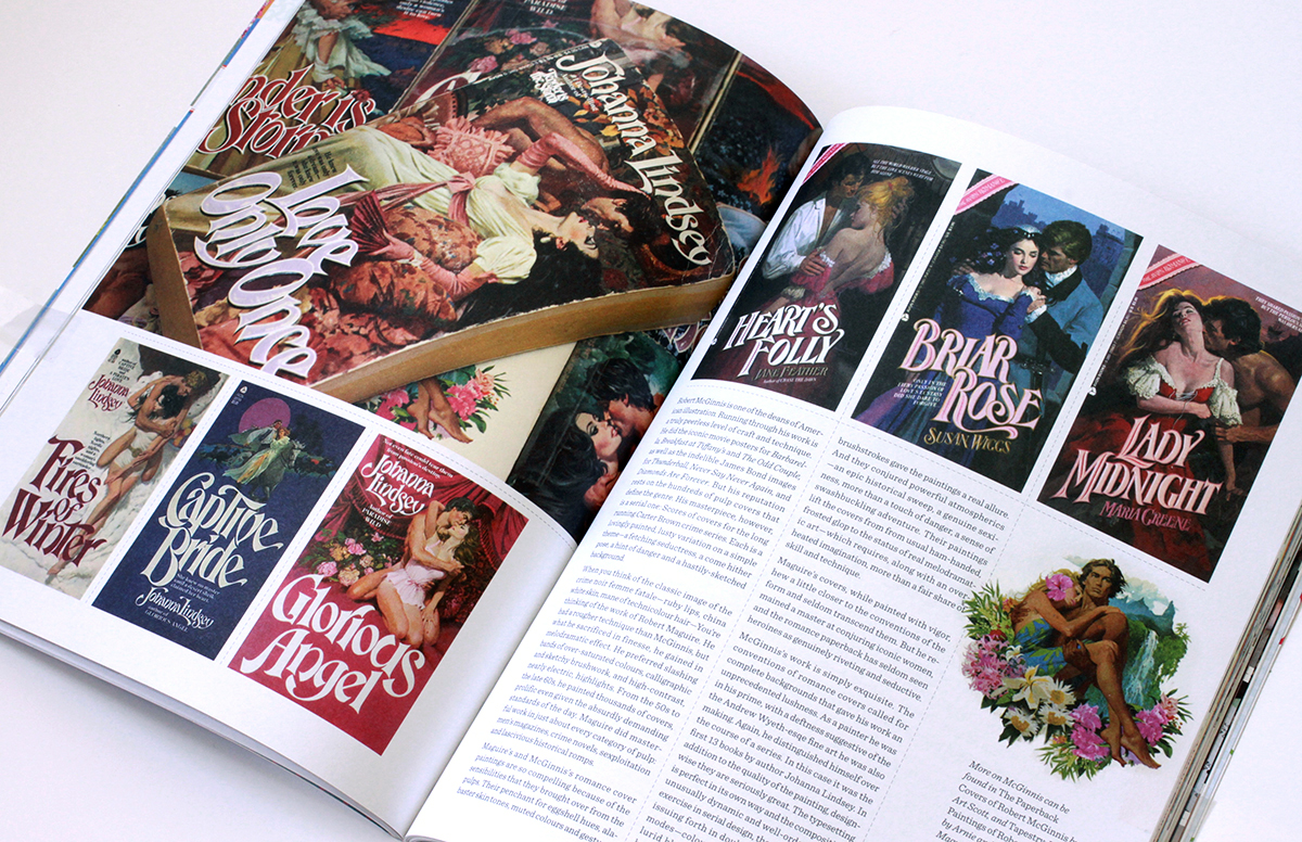
Along with giving succor and stimulation to it’s devoted readership, the modern romance novel preformed an additional cultural service. The liberated sensibilities inside the books called for equally brazen cover art. This need provided a welcome haven to a recently dispossessed cadre – the pulp and movie poster artists. In the mid sixties photography began to supplant illustration. Pressed out of the genres that made their careers, and in some cases fortunes, some illustrators retired to fine art, some to advertising. Others, in the case of Robert McGinnis and Robert Maguire – two of the absolute best – migrated to romance covers.
Robert McGinnis is one of the deans of American illustration. His reputation rests on the more 1000 pulps that literally define the genre, as well as the iconic movie posters he did for Barbarella, Breakfast at Tiffany’s, and the Odd Couple. Running through all his work is a superb level of craft and technique. He painted the indelible James Bond posters for Thunderball, Never Say Never Again, and Diamonds are Forever. However his masterpiece may be a serial one. McGinnis did scores of covers for the long running Carter Brown crime series. Each is a lovingly painted lusty variation on a simple theme – a fetching seductress, a come hither pose, a hint of danger, and a hastily sketched background.
When you think of the classic image of the crime noir femme fatale, with her ruby lips, china white skin, mane of technicolor hair, you are thinking of the work of Robert A. Maguire. His was a rougher technique than McGinnisis’, but no less controlled. What he sacrificed in finesse he gained in melodramatic effect. He preferred slashing bands of over-saturated colors, calligraphic and sketchy brushwork, and high can you buy vicodin legally in mexico contrast, nearly electric highlights. Prolific even given the absurdly demanding standards of the day, from the 50s to the late 60’s he painted thousands of covers. Maguire did masterful work in just about every category of pulp – men’s magazines, crime novels, sexploitaiton, and lascivious historical romps.
What makes both McGinnis’s and Maguire’s romance cover paintings so compelling are the the techniques and sensibilities that they brought over from the pulps. Their penchant for eggshell hues, alabaster skin tones, muted colors and gestural brushstrokes gave the paintings a real allure. Also, they conjured powerful atmospherics – an epic historical sweep, a genuine sexiness, more than a touch of danger, and a sense of swashbuckling adventure.
Both Maguire’s and McGinnis’s paintings lift the covers from from usual ham-handed, frosted glop to the status of real melodramatic art – which requires, along with an overheated imagination, more than a fair share of skill and technique.
Maguire’s covers, while painted with vigor, hew a little closer to the conventions of the form and seldom transcend them. However, he remained a master at conjuring iconic women, and the romance paperback has seldom seen heroines as genuinely riveting and seductive.
McGinnis’s work is simply exquisite. Also the fact that he was rendering complete backgrounds in-line with the conventions of the genre gave his work and unprecedented lushness. As a painter he was in his prime, with a deftness suggestive of the the Andrew Wyeth-esqe fine art he was making concurrently.
Again, he distinguished himself over the course of a series. In this case it was the first 13 books by author Johanna Lindsey. In addition to the quality of the artwork, design-wise, they are seriously great. The typesetting is perfect in its own way and the compositions unusually dynamic and well ordered. As a exercise in serial design they are superlative, issuing forth in double-barrelled salvos of modes – color blocked, on-white, and full lurid bleeds. Aesthetically, these are the heaving peaks of the genre, simply the best romance paperback covers ever made.
(The McGinnis books are taken from my personal collection. More on his work can be found in The Paperback Covers of Robert McGinnis by Art Scott, and Tapestry: The Paintings of Robert McGinnis by Arnie & Cathy Fenner. The Maguire images are from Jim Silke’s fabulous survey Dames, Dolls & Gun Molls. Also, to anyone inclined to this stuff, I also heartily recommend the blog “Get Yer Bodices Ripped Here”)


Aren’t these the bees knees? These crêpe folding diagrams were excerpted from a cookbook that accompanied a used crepe maker I bought the other week. Printed in 1973, the thing is a compact testament to the enduring charms of simple, sturdy design – bold Akzidenz-Grotesk font, thick outlines, and a well chosen single pop color. Fin.


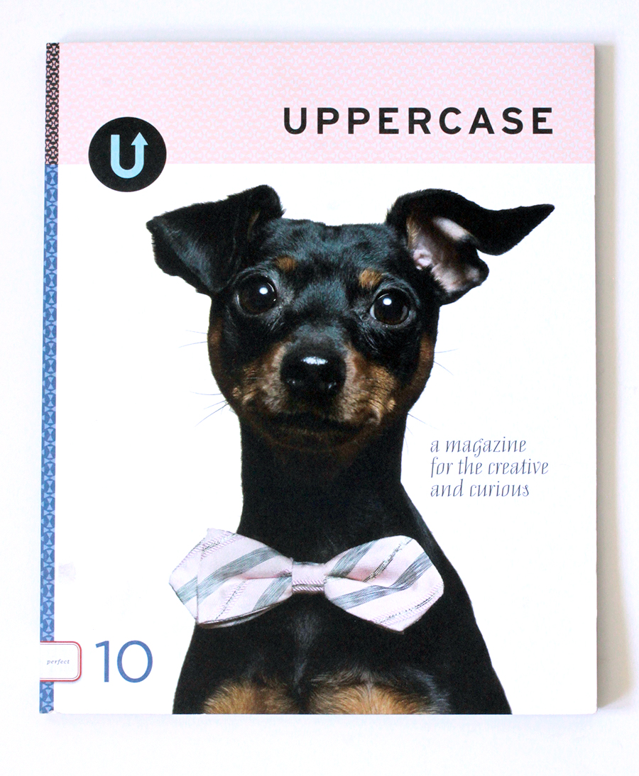
My survey of vintage cereal box designs is out now in Uppercase Magazine’s ninth issue. Some excerpts follow. Enjoy, and if your issue isn’t forthcoming, then for goodness sake, subscribe… (Uppercase? Once again, with lapel-grabbing enthusiasm, here, and here.)
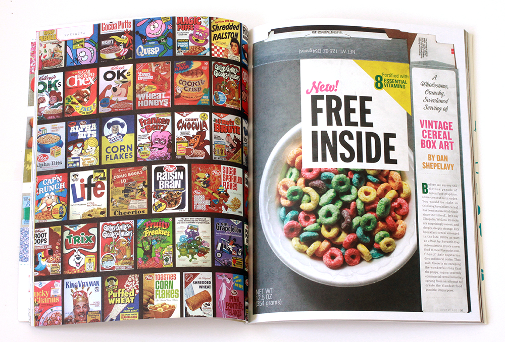
Before we survey the riotous parade of cereal box art, some context is in order. You would be right in thinking breakfast cereal has been an essential staple since the time of the ancients. Well, no. It’s roots are surprisingly recent, and deeply, deeply strange.
Dry breakfast cereal emerged in the late 1800’s as part an effort by Seventh Day Adventists to create a new food to meet the strict confines of their vegetarian diet and moral codes. There is no escaping the wonderful irony that the goofy, sugary, cravenly commercial landscape we associate with breakfast cereals sprung from an attempt to create the blandest food possible. On purpose.
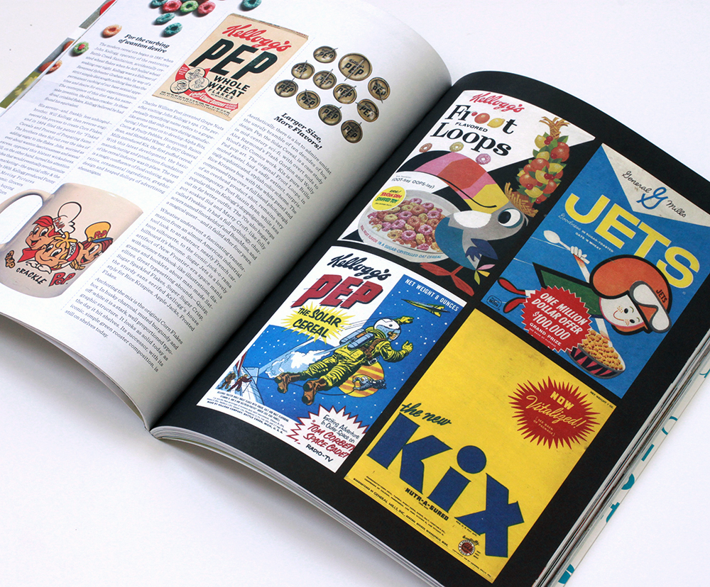
Aesthetically, there is a lot to admire amidst the unruly bramble of ten decades of box design. Pep – the Solar Cereal, is a case study in mid-century sci-fi, with overt nods to Alex Raymond’s Flash Gordon and Wally Wood’s EC Comics work. Kix is pure Brillo Pad pop art.
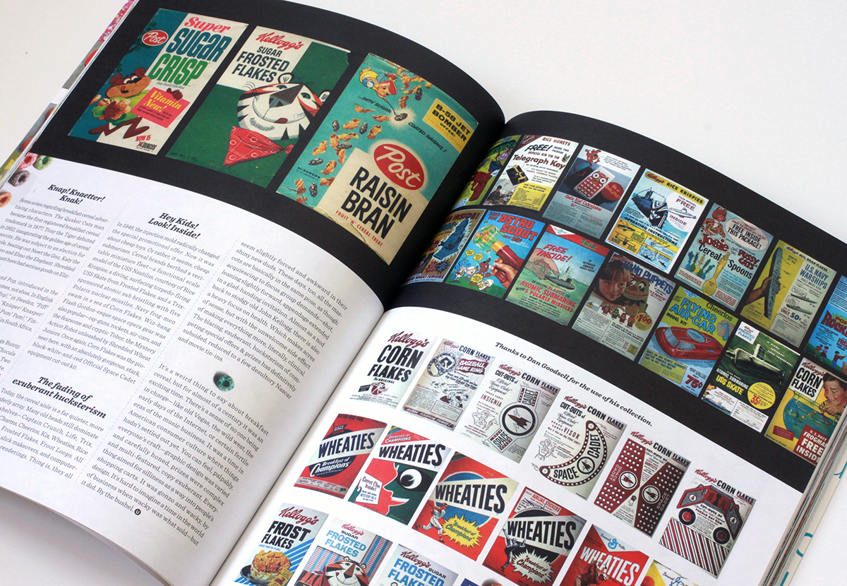
Post Raisin Bran, while less popular than its Kellogg’s doppelganger, steps out in far better outfits. Sugar Jets is a lovely artifact of New Frontier-era space mania with science textbook-like illustrations, diagrams and booklets about man-made Satellites. Super Sugar Crisp sports some sweet type.
And, in case you were wondering, Trix Rabbit did manage to score some cereal, twice, in 1976 and 1990.


A sampling of covers from about 1910-1930 from the original Life Magazine. They’re riveting, one after the other – a cavalcade of striking illustrations and successive iterations of exquisitely typeset mastheads. More from the complete run, here. Some history courtesy of David E. Sloane, author of American Humor Magazines and Comic Periodicals –
Life Magazine was designed as an American Punch; more properly, it was an outgrowth of the Harvard Lampoon, which itself was a copy of Punch. Life stood as a challenge to the recently successful Puck and Judge, both of which were full of raucous humor. Life, on the other hand, was self-consciously genteel. It ultimately succeeded so well that it became the most influential cartoon and literary humor magazine of its time, and—a fact forgotten today—itself served as the model for another humor magazine, The New Yorker.


Spectacular type specimens from the Library of Congress’ collection of turn of the century theatrical posters.


Excerpts from a folio of printer proofs and samples for the The Curtis Publishing Company. Curtis’ publications included the Ladies’ Home Journal & The Saturday Evening Post along with The American Home, Holiday, Jack & Jill, and Country Gentleman. Its old headquarters are at 6th & Walnut in Philadelphia. Inside the lobby is a Tiffany glass mosaic based on a Maxfield Parrish painting. Well worth a gander if you’re nearby. (Thanks to my colleague Nancy Logan for making the portfolio available.)


Two splendid specimens of Kabel, a geometric sans-serif typeface designed in Germany and released in 1927. Further geekery -The L’eggs name, package and logo were created by designer Roger Ferriter, working in legendary typographer Herb Lubalin‘s studio in 1969. And, of course we have the James Gang to thank for the indestructible boogie of Funk #49 – Sleep all day, out all night / I know where you’re goin’ / I don’t think that’s actin’ right / You don’t think it’s showin’, etc… (L’eggs logo from over at so much pileup)


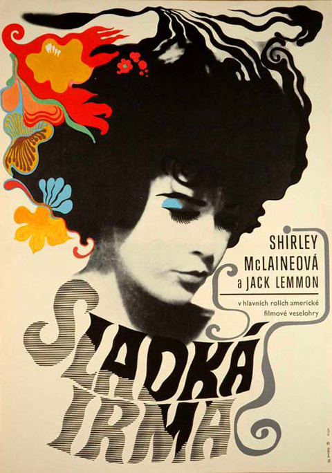
You’d expect the artwork for Irma La Douce to be top drawer. The pedigree is peerless – the 1963 comedy starred Jack Lemmon and Shirley MacLaine. It was directed by Billy Wilder. This bawdy confection sits in the middle of one of the insanely great runs of film making, starting with 1957’s Witness for the Prosecution, continuing with Some Like It Hot, The Apartment, Irma, the unjustly maligned Kiss Me, Stupid, The Fortune Cookie, The Private Life of Sherlock Holmes, until 1972’s Avanti!
So yes, sharp stuff – stylish and well executed modernist film poster design. It’s the depiction of MacLaine, though, in each that just knocks your socks off. The caricature developed for the American poster captures her essence perfectly. The typically lysergic Czech poster taps into her undercurrent of sultriness. If anyone ever deserved to be described as a cocktail, it was the young Shirley MacLaine – a fizzy syrup of pixie-ish mischievousness, good-natured lasciviousness, perfectly balanced between sweet and tart.
Before we survey the riotous parade of cereal box art, some context is in order. You would be right in thinking breakfast cereal has been an essential staple since the time of the ancients. Well, no. It’s roots are surprisingly recent, and deeply, deeply strange.
Dry breakfast cereal emerged in the late 1800’s as part an effort by Seventh Day Adventists to create a new food to meet the strict confines of their vegetarian diet and moral codes. There is no escaping the wonderful irony that the goofy, sugary, cravenly commercial landscape we associate with breakfast cereals sprung from an attempt to create the blandest food possible. On purpose.
For the curbing of wanton desire
The modern cereal era began in 1887 with John Kellogg, operator of the restorative Battle Creek Sanitarium. Kellogg was a a follower of Reverend Sylvester Graham who, by way of a strict simple diet sought nothing less than the permanent curbing of our base sexual appetites and desire for erotic experimentation. The centerpiece of this diet was his namesake invention, the Graham cracker. One night Kellogg left boiled wheat soaking over night and accidentally created wheat flakes. In these dried, crinkled flakes, Kellogg saw a path to righteous eating and a pious life.
His savvier – and, frankly, less unhinged – brother, Will Kellogg then reverse-engineered the process to create Corn Flakes, and in 1894 filed the patent for “Flaked Cereals and Process of Preparing Same.” The brothers then fell out over the idea of adding sugar to the flakes. John, worried as ever about wanton lasciviousness and sexual excess, opposed this blatant wickedness. Will, on the other hand, moved on and turned his attention to an idea that would eventually revolutionize product promotions – the special offer & the free prize. In 1909, Kellogg produced Funny Jungle-land Moving Pictures Booklet, a kids comic. Grocers gave one to anyone buying two boxes of Kellogg’s Corn Flakes. The promotion lasted another 23 years. He also established the conceit of a boosterish mascot – in this case a green rooster named Cornelius. Kellogg was like the Beatles of breakfast cereal – he invented every fundamental concept in the industry. In 1928, he introduced Rice Krispies; his company then went on to develop Apple Jacks, Froot Loops, Frosted Mini-Wheats, and Special K.
Charles William Post invented Grape Nuts after visiting John Kellogg’s spa. (The perpetually mystifying name refers to a grape-like aroma that only occurs during manufacturing) Post went on to develop Alpha Bits, Cocoa & Fruity Pebbles, Honeycomb, Raisin Bran, and Shredded Wheat. In 1937 General Mills introduced Kix, the first puffed cereal. With this last development, the basic manufacturing and production foundation of the cereal industry was in place. The rest relied on a magic confluence of food coloring, sugar ratios, ornamental ingredients, graphic design and heaped dollops of advertising shenanigans.
Larger Size, More Flavors!
Aesthetically, there is a lot to admire amidst the unruly bramble of ten decades of box design. Pep – the Solar Cereal, is a case study in mid-century sci-fi, with overt nods to Alex Raymond’s Flash Gordon and Wally Wood’s EC Comics work. Kix is pure Brillo Pad pop art.
The original Froot Loops, in muted pastel surprisingly sophisticated, now sadly extint, stylish color scheme. The Rice Krispies box, with the white panel and compressed type over a full bleed photograph of an overhead product shot, remains very contemporary. Post Raisin Bran, while less popular than its Kellogg’s doppelganger, steps out in far better outfits. The 70’s also begat a pot-soaked Sid and Marty Croft- like folly called Freakies. It had a full mythology, characters named Snorkeldorf and BossMoss, and a magical quest – and it failed after four years.
Wheaties underwent a fascinating transformation from an almost American industrial tool look, to an abstract, nearly French cartoon silhouette, to the iconic jock-o-rama billboard it’s become. Sugar Jets is a lovely artifact of New Frontier-era space mania with science textbook-like illustrations, diagrams and booklets about man-made Satellites. Great typesetting abounds – Quisp, Sugar Sparkled Flakes, Super Sugar Crisp, the sturdy sans serifed Kellogg’s house style for Rice Krispies, Apple Jacks, Frosted Flakes.
Anchoring the mix is the original Corn Flakes box. In husky charcoal, muted burgundy and off-white it is a stark, well proportioned typographic structure. It looks as solid today as the day it hit shelves. Its successor, with its iconic, simple green rooster composition, is still on shelves today.
Knap! Knaetter! Knak!
Some notes regarding breakfast cereal advertising characters. The Quaker Oats man became the first registered breakfast cereal trademark in 1877. Tony the Tiger debuted in 1952, inaugurating the golden age of cereal mascots. He was subject to an election for the role, beating out Newt the Gnu, Katy the Kangaroo, Elmo the Elephant, and Tony the Tiger. Shredded Ralston must have had serious goods on Elizabeth Taylor.
Snap Crackle and Pop, introduced in the early 1930’s, are gnomes, not elves. In English it’s “Snap! Crackle! Pop!,” in Sweden, “Piff! Paff! Puff!,“ Germany, “Knisper! Knasper! Knusper!,” Mexico, “Pim! Pum! Pam!,” Finland, “Riks! Raks! Poks!,” and in South Africa, “ Knap! Knaetter! Knak!”
Mel Blanc, the beloved voice of Bugs Bunny, initially voiced Toucan Sam. Count Chocula and Franken Berry came first, in 1971. Two years later – Boo Berry, then Fruit Brute. Fruit Brute was discontinued and replaced by Fruity Yummy Mummy. Fruity Yummy Mummy fared no better than Fruit Brute.
My personal favorite is the ace propeller-headed alien known as Quisp. A friendly, zany spark plug of extraterrestrial good cheer. And, Trix Rabbit did manage to score some cereal, twice, in 1976 and 1990.
Hey Kids! Look! Inside!
In 1946, the injection mold radically changed the special in-box promotional offer. Now it was about cheap toys. Or rather, it seems, cheap submarines. Cereal brands berthed a veritable miniature fleet – a functional scale model of the USS Nautilus, courtesy of Rice Krispies; a diving, surfacing torpedo-firing USS Skate from Frosted Flakes; and a Trix-sponsored atomic sub bristling with five Polaris nuclear missiles. Navy frog-men swam in a sea of Corn Flakes. Wiz-bang Flash Gordon-esque space opera gear was also popular – ray-guns, rockets, air-cars, and the fearsome and cryptic Tobor, the Mystery Action Robot unleashed by Shredded Wheat Juniors. Once again, Corn Flakes was the pioneer here, with an absolutely gorgeous, stark, black-white-and-red Official Space Cadet equipment cut out kit.
The fading of exuberant hucksterism
Today, the cereal aisle is a far quieter, more orderly array. Many old heads still dominate the shelves – Captain Crunch, Life, Trix, Lucky Charms, Cheerios, Kix, Wheaties, Rice Crispies, Frosted Flakes, Froot Loops. All have gotten slick makeovers, and computer-generated re-renderings. Thing is, they all seem slightly forced and awkward in their shiny new duds. These days, too, all the mascots are basically in the same pose, acquiescing to what must be focus group demands – ¾ shot, leaning slightly forward, appendage extended in a glad-handing invitation. Almost as a nod back to stodgy old John Kellogg, there is also a heavy focus on health. Which makes acres of sense, but with the unwelcome side effect of making everything more, literally, clinical. The blaring, exuberant, hucksterism of competing special offers & prizes has definitively subsided, reduced to a few desultory Nascar and movie tie ins.
It’s a weird thing to say about breakfast cereal, but for almost ¾ of a century it was an exciting time. There’s a sense of no one being in charge–like old Vegas, the wild west, the early days of the Internet, or certain fertile eras of the music business. It was a time in American consumer culture where things hadn’t settled out yet. You can feel, palpably, every one’s craft– graphic design was varied and carefully honed, prizes were complex and multi-featured, copy exuberant. Everything aimed for silliness as a way into people’s shopping carts. It was gonzo and wacky, by design. It’s hard to imagine a time in the world of business when wacky was what sold–but it did. By the bushel.


As good as it gets, as far as the futuristic sub, menacing shark, and heavy-duty diving suit genre goes. You can almost feel imagination catch fire. Oh, and to add to the radness factor, the book has its own logo – a submarine crossed with a rocket! The whole jacket is amazing, and can be seen here.

Caba et Good Luc, (Northern Liberties, Philadelphia) 35mm film


Generally, I’m not keen on Peter Max. I get it, he’s nailed some iconic images, and I firmly acknowledge the pioneering aesthetic. But, it’s just so wacka-wacka – the Billy Joel of psychedelic art is surely cruel – he’s far less hateful – but that’s what comes to mind (especially compared to the sexy sci fi kaleidoscope cool of someone like Michael English or Hapshash and the Coloured Coat.)
But these paper airplanes are splendid. They were published in a small format paperback in 1971, exhorting readers to “get your message across with a paper airplane in cosmic colors” It could be the geometric restraints on the the design, or just the small throwaway nature of the subject, but these panels are note-perfect. Even the chirpy lines like “I’m A Bird,” “I love the Earth don’t feed me to the streets,” are, like the artwork, genuinely endearing rather than cloying. Wright-on Wright Brothers, indeed!

Sonic Youth’s relationship to the visual arts is ardent and sincere. They share a sensibility with the downtown gallery scene they so clearly adore – a mix of undiscerning hipsterism & progressive aesthetic instincts. On the positive side you get Gerhard Richter’s lovely candle painting on Daydream Nation, John Fahey’s expressionistic swirl on The Eternal. On the ‘meh, there’s Christopher Wool’s clunky stencils on Rather Ripped, Mike Kelley’s smart-alecky puppet on Dirty, and Richard Prince’s lazy, easy, smeary nurse on Sonic Nurse. And then there’s Raymond Pettibon. Look, his work is unimpeachable as shorthand for the glory days of LA hardcore, but I think they think he’s a talent for the ages. Feh. To be fair, though, they did get as good of a Pettibon as you can get for Goo. Thei covers for their artier, self released SYR series have been sharp but rather perfunctory takes on classic sound library records of the 60’s and 70’s. Their latest release under the imprint, a soundtrack for the French director Fabrice Gobert’s high-school mystery Simon Werner a Disparu, is a total stunner – a gorgeous, highly graphic vignette, and ace piece of prep-school pop art!

Found this hand painted sign in a ramshackle flea market in Shawnee Village, nestled in the Pocono Mountains – the Switzerland of Pennsylvania. It takes a brave and confident hand to render each word in a different typeface and manage to make it cohere…


