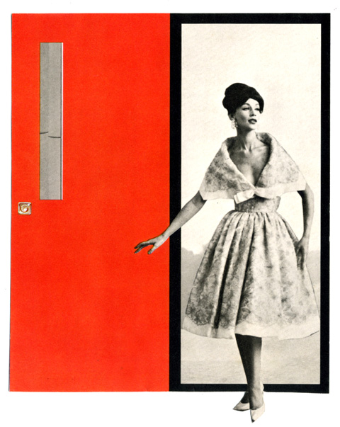
From the clipping files, a fab piece of found constructivism, courtesy of a late 50’s ad for a door manufacturer.
Table of Contents: Design

From the clipping files, a fab piece of found constructivism, courtesy of a late 50’s ad for a door manufacturer.
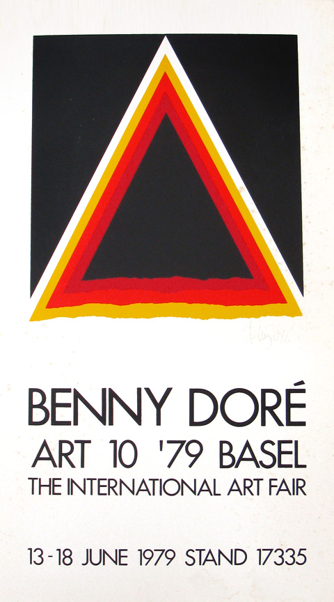
Came across this poster in the most unlikely of surroundings, at a ramshackle shore antique shack, wedged in among worn beach furniture, weathered multicolored buoys, and nautical ephemera. Sheathed in its très mod silver frame, it stood out like a lost robot. The proprietor practically paid me to take it, as if its presence was harshing the salty laid back buzz of the place. Happy to make a home for it. The graphic itself is a wonderful http://www.mindanews.com/buy-imitrex/ distillation of an emblem or insignia… it reminds me of an old summer camp sign, merit badge, or military patch. Also, it’s as fine a specimen of the Futura typeface as you could want… The whole things emanates a great late 70’s design vibe, alternately earthy, crafty, matte and clean. (Not much to add about Benny Dore himself… basically a decent Danish artist and graphic designer of local repute.)
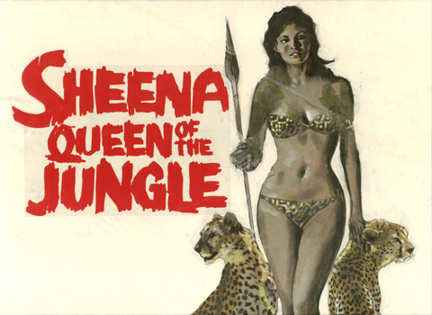
The great physicist and raconteur Richard Feynman suggested a concept in which the possible past histories of a given event have a real existence. I hope this is so, because that means there is a universe out there where the movie of Sheena, Queen of the Jungle starred Raquel Welch, with a smart and ambitious script by the screenwriters responsible for the French Connection II, with a plot that hued closely to the original 40’s Fiction House comics. Our universe is left with only this tantalizing scrap of unused concept art (which happens to be a top notch example of the gouache comp in its own right.) [larger image]
Bought this lovely Kodak guidebook at the estate sale of one L.R. Bollinger, of Niskayuna, NY, retired General Electric engineer, buy vicodin in chicago tinkerer, and avid amateur shutterbug – who also shot the Albany Rt. 9 Motel sign a few posts down.

I’ve been sorting through a big new batch of late 70’s magazines. Two things keep popping up: Phoebe Cates and adverts for Gee, Your Hair Smells Terrific! And, you know what? Dammit if the wild, bright-eyed enthusaism doesn’t get me. Every time I come across one of these ads it’s like a mental analogue of the moment when Freshen Up would squirt it’s flavor center. Delightful. So, I’m passing it along to you, reader, without comment, and intended in the same sunny spirit.
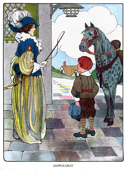
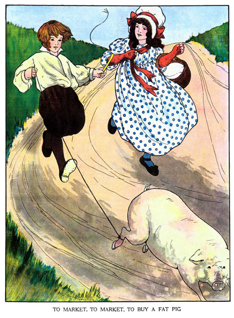
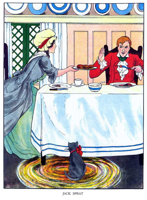
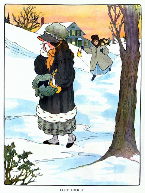
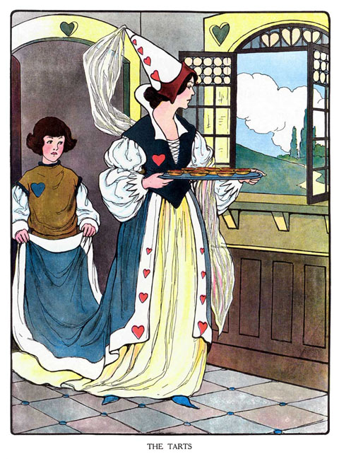
At this point, I read to my daughter from The Real Mother Goose mostly as an excuse to pour over the illustrations by Blanche Fisher Wright. Elegant and utterly charming, they sit shoulder to shoulder with the work of the great turn-of-the-century illustrators like Edward Penfield and Jesse Wilcox Smith (Philly’s own, Smith, born in Mt. Airy, studied at PAFA under Thomas Eakins and Howard Pyle at the Brandywine School) But what really captivates me about her work is the degree to which, stylistically, they recall the work of Art Nouveau http://www.health-canada-pharmacy.com masters like Alphons Mucha. They share the regal faces, flowing outlines, graphic crispness and posterlike composition. What transforms them into bewitching illustrations is her wonderful animating sense of gesture and flair for scene staging. Given her skill and achievement, her complete anonymity is surprising. Other than a few basic illustration credits, no biographical information exists online. She is absent from Walt Reed’s comprehensive Illustrator in America survey. Although The Real Mother Goose remains in print and easily available, Blanche Fisher Wright, at least for now, seems a near to complete mystery.
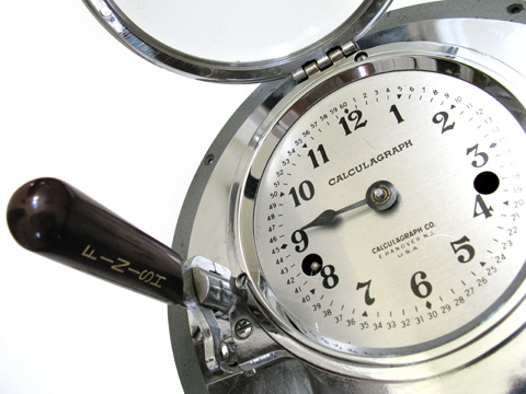
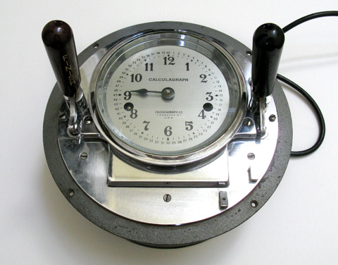
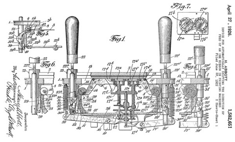
Glad you asked. It’s a Calculagraph. They were the first patented mechanical time clocks. The large wooden handles marked Start and Finish would stamp a card with elapsed times. This one in particular served in a small aeronautics company in the 50’s, went on to tabulate table fees at a pool hall, and retired to the dusty basement of my new neighbor, who sold it to me off the sidewalk this weekend for five bucks. It is now my kitchen clock.
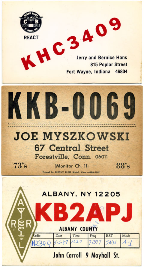
A selection of QSL cards, which are used by amateur radio buffs to confirm a two-way transmission between stations. In use since 1916, they form an endlessly fascinating spectrum of vernacular design. The selection above are from a box of a couple of hundred I bought a few years ago that http://www.besttramadolonlinestore.com just keeps yielding amazing type, illustrations, logos, insignias, scribbles and annotations. Archive sites abound online, also, a typically absorbing Wikipedia article on the history of the cards here.

As always, it’s the little things… the computer punch card holes, the Morse code perforated edge, harmonious muted color scheme, the springiness of “Secret” and the Dragnet earnestness of the disclaimer. Good show, little coupon!
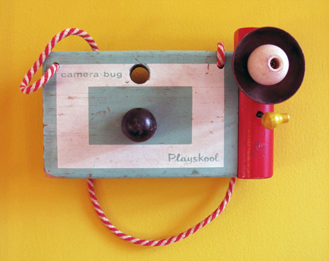
Bought and hung almost absentmindedly, over time this toy camera has become one of my most beloved objects. It exists in a perfect balance between mass production and craft, where the necessities of manufacture result not in cheap buy vicodin for cheap mimicry but inspired abstraction. Chief among its many charms is the yellow spring loaded toggle which strikes the brass flash cup and emits a jaunty sustained ping. Joy incarnate, this thing.
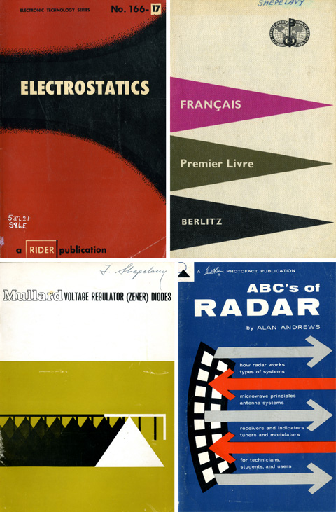
A selection of covers from lost crannies of my father’s bookshelf. Viewing them as an oblique tribute to his memory imbues their designs, for me, with a profound weight. Each is a flag unfurled in celebration of the bracing shock of the new, and the sheer exhilaration of understanding.

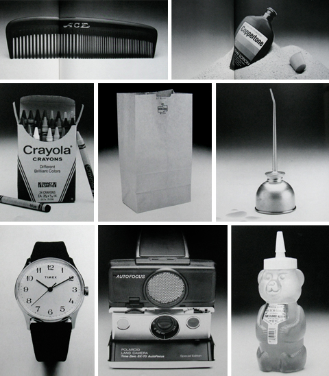
Released in 1982, the book Quintessence celebrated the ineffable perfection of things as disparate as the Ace Comb (the wide tooth end, on properly mulched hair, can leave glistening corrugated rows that keep their shape for days), Coppertone (mixed in there too, surely, is a secret extract of hot sand, salt water, endless summer days, and the hyperactive glands of teenagers), the Crayola Box (what a treat to fold back the lid on the brand new box and see every single color lined up at attention with a perfect point), the paper bag (the luxurious beauty of the basic material eloquently restates the miracle of paper) the classic oil can (that plik plok plik plok sound…. that indicated the maintenance of civilization as we know it), Timex Mercury watches, the Polaroid SX-70 and the Honey order vicodin online overnight delivery Bear (who would have thought such a thing possible. Poetry in plastic).
As co-author Owen Edwards puts it in his excellent introductory essay, quintessence is the quality of objects to “exhibit the rare and mysterious capacity to be just exactly what they ought to be… imponderable but undeniable.” Furthermore, to be in the presence of the quintessential is “to feel delightfully close to the center of something extraordinary and to be totally and inexplicably at home.”
Agreed. So we are going to borrow the term and the style (black and white photos and short essays) of Quintessence to celebrate the things that are soaked through with their own awesomeness. Who knows, could be an Estes Rocket, the umlaut, or Raquel Welch, to name a few things that immediately spring to mind. More soon.

The Please Touch Museum in Fairmount Park might be, arguably, the best kids museum on earth (museum seems like too small a word, too limiting… a multi-sensory experience is more like it, but too marketing jargon-y… perhaps one of those old –ara words like Sensorama is the most apt….) It also happens to be an endless where can you buy vicodin legally fantasia of oversized, Claus Oldenburg-y, Koons-y pop art constructions… rockets, disco balls, cars both miniature and over-sized, a squished Septa bus, a functioning supermarket, junk sculpture, and an astro-turf draped staging of Alice’s Wonderland… acres of pop eye candy in an absurdly grand frosted layer cake of a building…


Holy cow… these landscape photographs by Kim Keever seem to indicate she is in possession of a pen sized version of the Genesis Device, the terraforming rocket fired off in Star Trek II: Wrath of Khan. The best ones evoke the the grandeur of Hudson River School painter Frederic Edwin Church’s work… Actually, these are staged in an aquarium, which for me, as an amateur aquarist, makes them even more impressive. (hat tip andrew sullivan.)
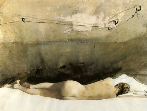
1. Andrew Wyeth and John Updike seemed to have a preternatural communion with the fundamentals of their art. Updike apparently brokered a separate and special understanding with the English language. Wyeth seemingly could will individual bristles to do his bidding in a brutally unforgiving medium awash with chance and accident.
2. Both were, fundamentally, sophisticated traditionalists. Neither flinched from the progressive edge of their art. In fact both, for the sheer love of craft, frequently experimented beyond the comfortable boundaries of their mastered style. As a result they were able to continually infuse their renderings with a freshness and modernity that kept their work free of a willfully grumpy stodginess.
3. Their aesthetic sensibilities were rooted in the landscape of rural Pennsylvania. In my own noggin, there is a direct and immediate shortcut from Updike’s descriptions of the sandstone farmhouse he grew up in Plowville to any number of Wyeth’s paintings.
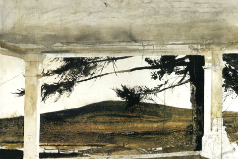
4. Oddly, Updike initially set out to be an artist and graphic illustrator. He attended The Ruskin School of Drawing and Fine Art in London. It was in there and then that E.B. White offered him a position at The New Yorker, setting him on the path to becoming John Updike.
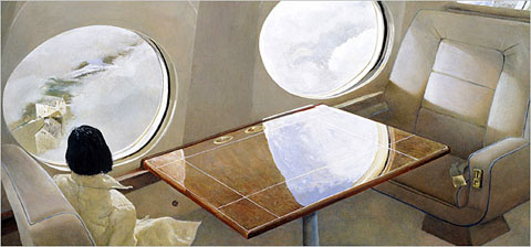
5. Wyeth, it seems, could easily have been an invention of Updike’s. His frail, sickly boyhood could have been inspired by a mix of Updike’s own rural upbringing and with his youthful artistic aspirations. Wyeth’s father, the legendary and formidable illustrator NC Wyeth, embodied pure and lusty storytelling, as well as the heady days of classic newspaper and magazine illustration that Updike so clearly adores. Wyeth’s long, determined dedication to an unwavering artistic vision as the fads and movements of the art world swirl around him make of him a Rabbit Angstrom like barometer, taking the measure of a changing culture. Even the ill fated Helga escapade feel more palpable as a fictional gambit. As Updike puts it in the beginning of his review of the Helga exhibit, “What do you do with the girl next door?” With that one sentence he hauls the entire affair under the purview of his great obsessions. The secret studio sittings, the bracingly lusty implications of the poses, the vectors of adultery and faithfulness, the complex role of Wyeth’s wife, it all feels of a piece with Updike’s milieu. To think what Updike would havr done with the evocative contradictions and elegiac beauty of the scene depicted in one of Wyeth’s last paintings… The sleek, cream and burgundy wood interior of the artist’s private plane, a woman in a immaculate, white, elegant coat staring through the window down at a gritty farmhouse, a tiny toy miniature of the world that Wyeth spent a lifetime mapping in exquisite and painstaking expressive detail.
6. Both men were targets for a certain smarty pants critical set. In the long view, arguments about the “merit” of representational realist vs. abstract art seems rather, um, “academic” and has everything to do with personal aesthetic and ideological affinities and toss-all to do with any external objective measure. Both had their trouser cuffs perpetually nipped by hipster accusations of a certain snobbishness and squareness. Measured against the accumulated bodies of work, how small and prune-faced the given griefs seem!
7. That said, both reputations accumulated scuffs and dings. Wyeth stumbled badly in the gauche hype he whipped up for the Helga paintings, needlessly overshadowing what was simply a worthy addition to his oeuvre. As for Updike, while his essays and the occasional short stories remained sharp and well turned, in his latter years he slipped from the height of his craft. Reviews settled into a predictable, dispiriting series of polite, genial soufflés that inflated what was in essence a consistent three letter critical verdict: “meh.”
8. Updike was an unaffected and perceptive enthusiast of the visual arts. Unsurprisingly, his writing on art is beautifully descriptive, insightful and free of larded cant. In his review of the Wyeth’s Helga paintings he observes that the roughly painted swathes of hatched backgrounds, while surely evocative of the high art abstractions of Franz Kline, are just as suggestive of the background techniques of the great commercial magazine illustrators like Al Parker and Jon Whitcomb. He goes on to suggests that Wyeth’s close comfort with the illustrative tradition helps account for his critical ostracism. Updike, an enthusiast of the American vernacular, is rightly untroubled by the inevitable promiscuous interplay between commercial and fine art.
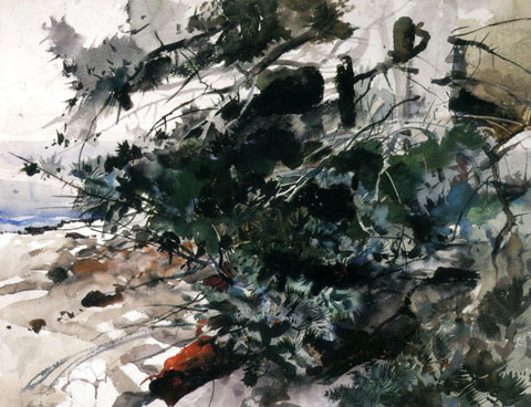
9. Last year the National Endowment for the Humanities invited Updike to present the Jefferson Lecture, the government’s highest humanities honor. Updike’s lecture was entitled “The Clarity of Things: What Is American about American Art.” It is well, well worth reading. He concludes, fundamentally, that ” The American artist, first born into a continent without museums and art schools, took Nature as his only instructor, and things as his principle study. [He developed] a bias toward the empirical, toward the evidential object in the numinous fullness of its being” Updike builds to that conclusion with a nimble and catholic survey of 200 years of American art, and weaves this common tread to bind together earnest Copley, creamy Sargent and stern Sheeler, arch Warhol and jazzy Pollack. We are all, realists, really.
10. A last convergence. Wyeth often worked in egg tempera, which involves hand-grinding dry powdered pigments into egg yolk. As I was thinking about the exacting preparation and application, it struck me that it served as an unusually apt metaphor for Updike’s prose – Sharp, rich specific details suspended in a flowing medium which quickly hardens, fixing the scene in enameled perpetuity.
(a note: These ruminations are heavily indebted to Lawrence Weschler’s convergences – essays that explore connections and resonances between disparate images or ideas. His amazing and beautifully designed collection, Everything That Rises: A Book of Convergences, can be bought here.)