My survey of vintage cereal box designs is out now in Uppercase Magazine’s ninth issue. Some excerpts follow. Enjoy, and if your issue isn’t forthcoming, then for goodness sake, subscribe… (Uppercase? Once again, with lapel-grabbing enthusiasm, here, and here.)
Before we survey the riotous parade of cereal box art, some context is in order. You would be right in thinking breakfast cereal has been an essential staple since the time of the ancients. Well, no. It’s roots are surprisingly recent, and deeply, deeply strange.
Dry breakfast cereal emerged in the late 1800’s as part an effort by Seventh Day Adventists to create a new food to meet the strict confines of their vegetarian diet and moral codes. There is no escaping the wonderful irony that the goofy, sugary, cravenly commercial landscape we associate with breakfast cereals sprung from an attempt to create the blandest food possible. On purpose.
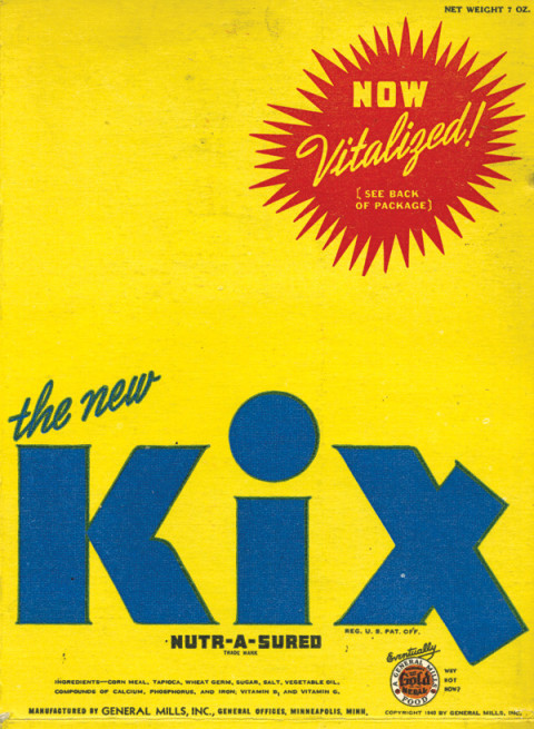
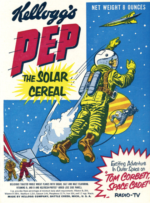
Aesthetically, there is a lot to admire amidst the unruly bramble of ten decades of box design. Pep – the Solar Cereal, is a case study in mid-century sci-fi, with overt nods to Alex Raymond’s Flash Gordon and Wally Wood’s EC Comics work. Kix is pure Brillo Pad pop art.
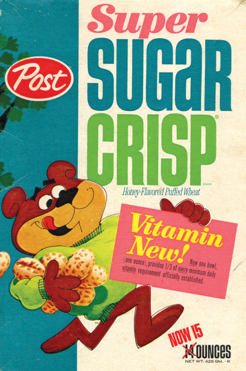
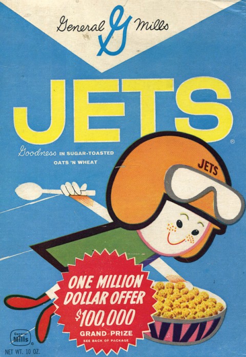
Post Raisin Bran, while less popular than its Kellogg’s doppelganger, steps out in far better outfits. Sugar Jets is a lovely artifact of New Frontier-era space mania with science textbook-like illustrations, diagrams and booklets about man-made Satellites. Super Sugar Crisp sports some sweet type.
And, in case you were wondering, Trix Rabbit did manage to score some cereal, twice, in 1976 and 1990.


