Kabel

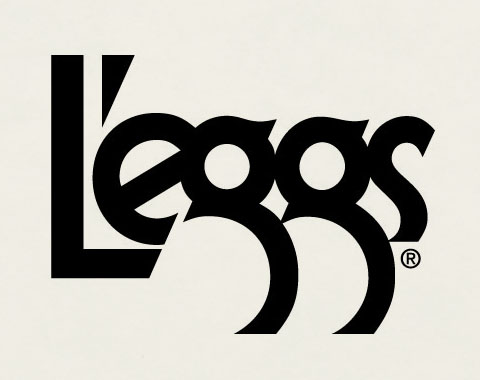
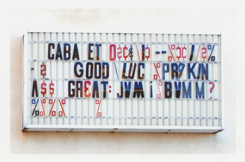
Two splendid specimens of Kabel, a geometric sans-serif typeface designed in Germany and released in 1927. Further geekery -The  L’eggs name, package and logo were created by designer Roger Ferriter, working in legendary typographer Herb Lubalin‘s studio in 1969. And, of course we have the James Gang to thank for the indestructible boogie of Funk #49Sleep all day, out all night / I know where you’re goin’ / I don’t think that’s actin’ right / You don’t think it’s showin’, etc… (L’eggs logo from over at so much pileup)

Irma La Douce

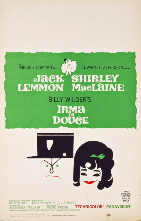
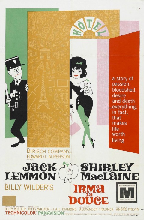
You’d expect the artwork for Irma La Douce to be top drawer. The pedigree is peerless – the 1963 comedy starred Jack Lemmon and Shirley MacLaine. It was directed by Billy Wilder. This bawdy confection sits in the middle of one of the insanely great runs of film making, starting with 1957’s Witness for the Prosecution, continuing with Some Like It Hot, The Apartment, Irma, the unjustly maligned Kiss Me, Stupid, The Fortune Cookie, The Private Life of Sherlock Holmes, until 1972’s Avanti!

So yes, sharp stuff – stylish and well executed modernist film poster design. It’s the depiction of MacLaine, though, in each that just knocks your socks off.  The caricature developed for the American poster captures her essence perfectly. The typically lysergic Czech poster taps into her undercurrent of sultriness. If anyone ever deserved to be described as a cocktail, it was the young Shirley MacLaine – a fizzy syrup of pixie-ish mischievousness, good-natured lasciviousness, perfectly balanced between sweet and tart.

Bright Young Things, Pt. 2: Bowie Edition

Fascinating! So, I’m searching online for some an image along the theme of “bright young things” to accompany last week’s post of Muriel Sparks’ poem The Yellow Room. I come across a fragmentary result identifying Evelyn Waugh’s Vile Bodies as the wellspring for David Bowie’s theatrical, spent, and off-kilter masterpiece Aladdin Sane (Vile Bodies? a hilarious, disjointed 1930’s Bright Lights Big City about the careening, hedonistic society set in the 20’s… excellent overview here.)

…the notion seemed familiar, like I had read it somewhere, but vague. The link led to a lovingly preserved recreation of a mesmerizing article from a July 1973 Circus Magazine. (On the cover Alice Cooper, Uriah Heep, free Robert Plant calendar, Seals and Crofts, and Marc Bolan)

The article was entitled “Bowie Sees America in Flames – the inside story of Aladdin Sane” This is relatively familiar territory for Bowie-philes… discussing it he’s always framed the album as Ziggy goes to America (The Velvet shout-outs, Detroit, Sunset & Vine, etc…) and discovers an near apocalyptic decadence.

In the Circus article, though, Bowie says flat out that the idea for Sane burst from him nearly fully formed while reading Vile Bodies, as the full circus of American rock celebrity and decadent notoriety is erected around him.

David Bowie sat in an overstuffed armchair in his suite aboard the ship Ellinis, returning to London from his first triumphal tour of the States. His delicate brows knit in a look of perplexed recognition as he read Evelyn Waugh’s “Vile Bodies” – a 40 year-old, futuristic novel about a society of “bright young things” whirling through lavish parties in outlandish costumes, dancing, gossiping and sipping champagne.  Suddenly David lowered the book to his lap, picked up the spiral notebook and pen sitting on the small mahogany table at his side, and began to write the words to the title song of his new LP, Aladdin Sane

“The book dealt with London in the period just before a massive, imaginary war.” David would later confide, touching one finger, with its green-painted nail, lightly to his chin.  “People were frivolous, decadent and silly.  And suddenly they were plunged into this horrendous holocaust.  They were totally out of place, still thinking about champagne and parties and dressing up.  Somehow it seemed to me that they were like people today.” But who was the frivolous, romantic young man Aladdin Sane?  At first David merely cupped his hands in a fragile cage and said “I don’t really think he’s me.”  Several days later, Bowie realised who – or rather what – the song, and in fact the entire album, were about.  “It’s my interpretation of what America means to me.  It’s like a summation of my first American tour.”

Knowing this goes along way towards explaining a distinctive stylistic coloring to the record – a dandyish swing that now makes perfect sense in light of the disjointed flapper flamboyance in Vile Bodies. (Songs like “Prettiest Star,” the title track, and especially “Lady Grinning Soul”for your pleasure, below –  are fuller, fed by their associations with the novel.)

Watching him dash away, dragging
an old bouquet-dead roses
Sake and strange divine.
Um-m-m-m-you’ll make it
Passionate bright young things,
take him away to war-
..don’t fake it.
Who’ll love Aladdin Sane
Battle cries & champagne just in
time for sunrise…

The whole article is a must read. There’s a great Philly shout out, highlighting that Bowie was “one of the even fewer rock performers to attract a following so large in one city (Philadelphia) that he was forced to play there nine nights in a row.” Also, there are walk-ones by Andy Warhol, Lou Reed, Wayne County, Iggy Pop, Cyrinda Foxe and, my personal fave, punk publicist Cherry Vanilla. (profiled a year ago on the blog, here) Seriously, read it.

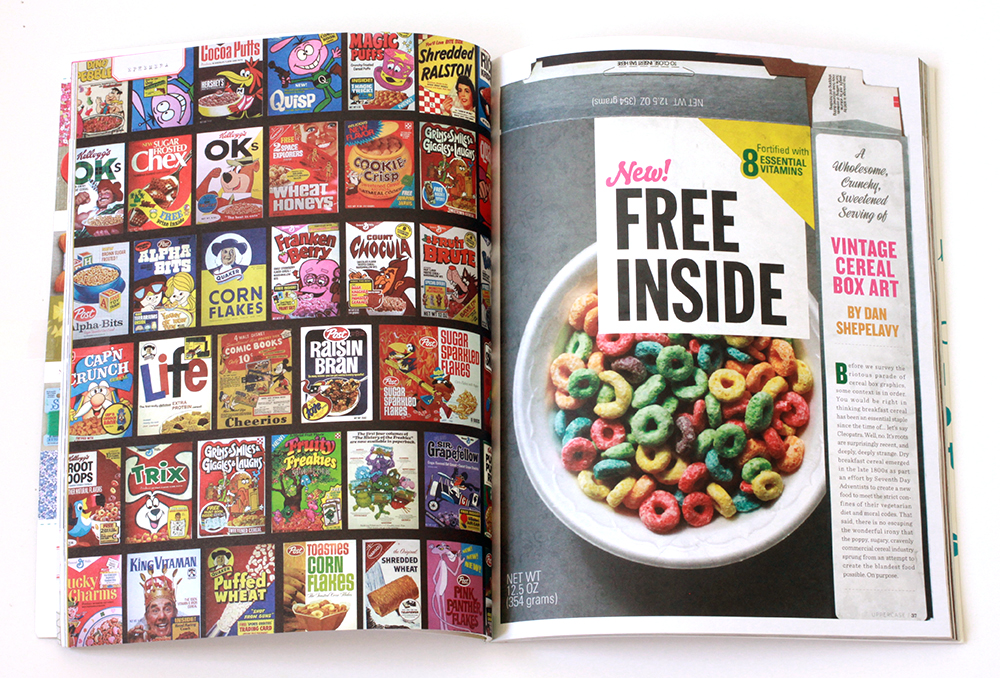
Free Inside
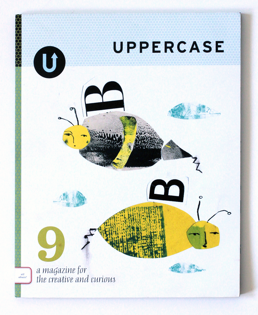
Uppercase Magazine # 9

Cereal_1 Cereal_2 Cereal_3

Before we survey the riotous parade of cereal box art, some context is in order. You would be right in thinking breakfast cereal has been an essential staple since the time of the ancients. Well, no. It’s roots are surprisingly recent, and deeply, deeply strange.

Dry breakfast cereal emerged in the late 1800’s as part an effort by Seventh Day Adventists to create a new food to meet the strict confines of their vegetarian diet and moral codes. There is no escaping the wonderful irony that the goofy, sugary, cravenly commercial landscape we associate with breakfast cereals sprung from an attempt to create the blandest food possible. On purpose.

For the curbing of wanton desire

The modern cereal era began in 1887 with John Kellogg, operator of the restorative Battle Creek Sanitarium. Kellogg was a a follower of Reverend Sylvester Graham who, by way of a strict simple diet sought nothing less than the permanent curbing of our base sexual appetites and desire for erotic experimentation. The centerpiece of this diet was his namesake invention, the Graham cracker. One night Kellogg left boiled wheat soaking over night and accidentally created wheat flakes.  In these dried, crinkled flakes, Kellogg saw a path to righteous eating and a pious life.

His savvier – and, frankly, less unhinged – brother, Will Kellogg then reverse-engineered the process to create Corn Flakes, and in 1894 filed the patent for “Flaked Cereals and Process of Preparing Same.” The brothers then fell out over the idea of adding sugar to the flakes. John, worried as ever about wanton lasciviousness and sexual excess, opposed this blatant wickedness. Will, on the other hand, moved on and turned his attention to an idea that would eventually revolutionize product promotions – the special offer & the free prize. In 1909, Kellogg produced Funny Jungle-land Moving Pictures Booklet, a kids comic. Grocers gave one to anyone buying two boxes of Kellogg’s Corn Flakes. The promotion lasted another 23 years. He also established the conceit of a boosterish mascot – in this case a green rooster named Cornelius. Kellogg was like the Beatles of breakfast cereal – he invented every fundamental concept in the industry.  In 1928, he introduced Rice Krispies; his company then went on to develop Apple Jacks, Froot Loops, Frosted Mini-Wheats, and Special K.

Charles William Post invented Grape Nuts after visiting John Kellogg’s spa. (The perpetually mystifying name refers to a grape-like aroma that only occurs during manufacturing) Post went on to develop Alpha Bits, Cocoa & Fruity Pebbles, Honeycomb, Raisin Bran, and Shredded Wheat. In 1937 General Mills introduced Kix, the first puffed cereal. With this last development, the basic manufacturing and production foundation of the cereal industry was in place. The rest relied on a magic confluence of food coloring, sugar ratios, ornamental ingredients, graphic design and heaped dollops of advertising shenanigans.

Larger Size, More Flavors!

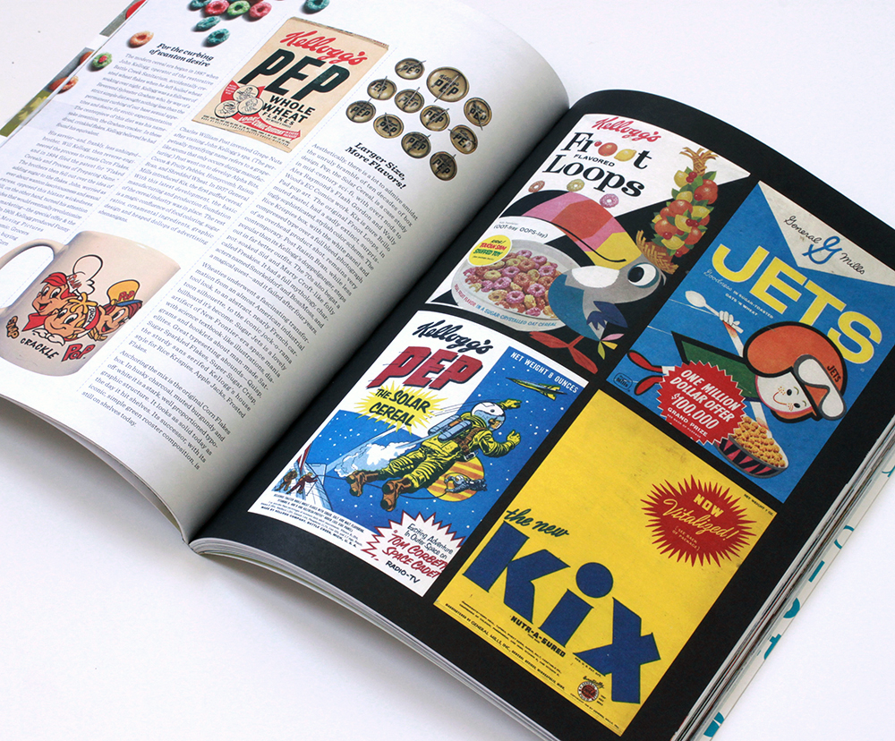
Aesthetically, there is a lot to admire amidst the unruly bramble of ten decades of box design. Pep – the Solar Cereal, is a case study in mid-century sci-fi, with overt nods to Alex Raymond’s Flash Gordon and Wally Wood’s EC Comics work. Kix is pure Brillo Pad pop art.

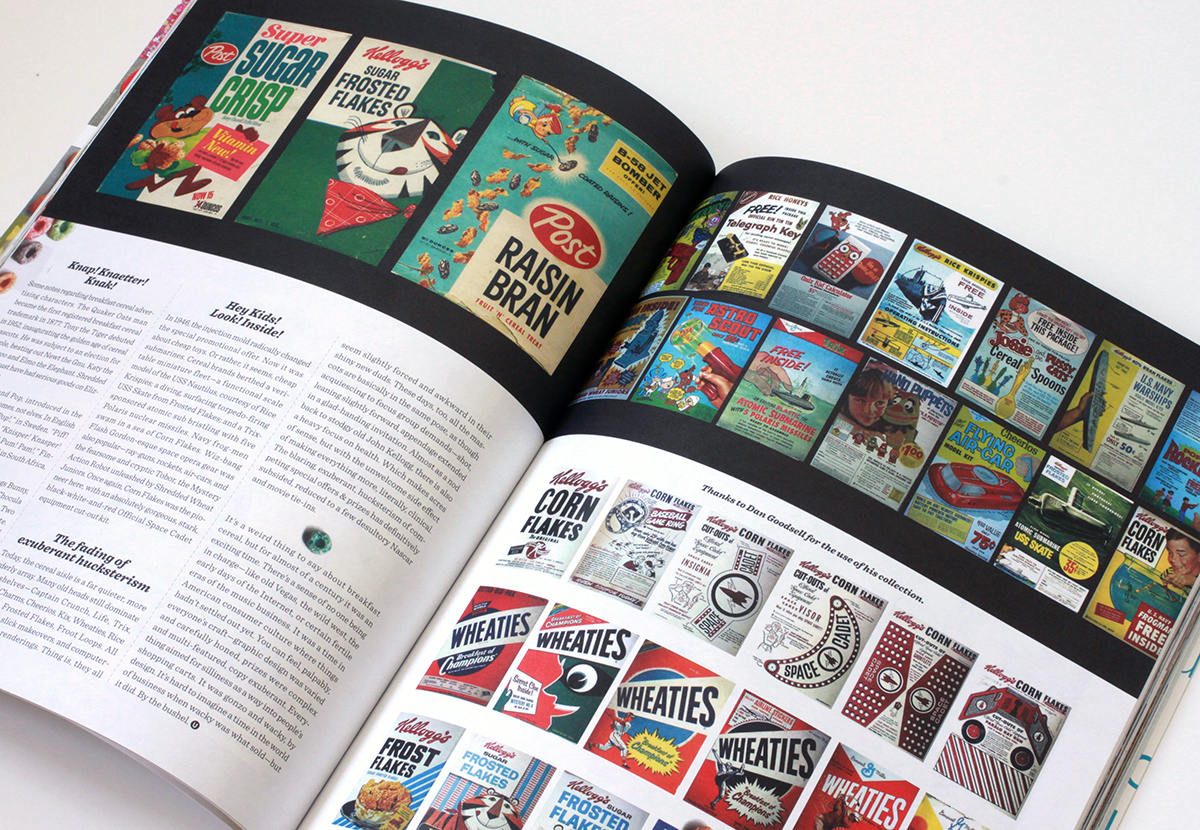
The original Froot Loops, in muted pastel surprisingly sophisticated, now sadly extint, stylish color scheme. The Rice Krispies box, with the white panel and compressed type over a full bleed photograph of an overhead product shot, remains very contemporary. Post Raisin Bran, while less popular than its Kellogg’s doppelganger, steps out in far better outfits. The 70’s also begat a pot-soaked Sid and Marty Croft- like folly called Freakies. It had a full mythology, characters named Snorkeldorf and BossMoss, and a magical quest – and it failed after four years.

Wheaties underwent a fascinating transformation from an almost American industrial tool look, to an abstract, nearly French cartoon silhouette, to the iconic jock-o-rama billboard it’s become. Sugar Jets is a lovely artifact of New Frontier-era space mania with science textbook-like illustrations, diagrams and booklets about man-made Satellites. Great typesetting abounds – Quisp, Sugar Sparkled Flakes, Super Sugar Crisp, the sturdy sans serifed Kellogg’s house style for Rice Krispies, Apple Jacks, Frosted Flakes.

Anchoring the mix is the original Corn Flakes box. In husky charcoal, muted burgundy and off-white it is a stark, well proportioned typographic structure. It looks as solid today as the day it hit shelves. Its successor, with its iconic, simple green rooster composition, is still on shelves today.

Knap! Knaetter! Knak!

Some notes regarding breakfast cereal advertising characters. The Quaker Oats man became the first registered breakfast cereal trademark in 1877. Tony the Tiger debuted in 1952, inaugurating the golden age of cereal mascots. He was subject to an election for the role, beating out Newt the Gnu, Katy the Kangaroo, Elmo the Elephant, and Tony the Tiger. Shredded Ralston must have had serious goods on Elizabeth Taylor.

Snap Crackle and Pop, introduced in the early 1930’s, are gnomes, not elves. In English it’s “Snap! Crackle! Pop!,” in Sweden, “Piff! Paff! Puff!,“ Germany, “Knisper! Knasper! Knusper!,” Mexico, “Pim! Pum! Pam!,” Finland, “Riks! Raks! Poks!,” and in South Africa, “ Knap! Knaetter! Knak!”

Mel Blanc, the beloved voice of Bugs Bunny, initially voiced Toucan Sam. Count Chocula and Franken Berry came first, in 1971. Two years later – Boo Berry, then Fruit Brute. Fruit Brute was discontinued and replaced by Fruity Yummy Mummy. Fruity Yummy Mummy fared no better than Fruit Brute.

My personal favorite is the ace propeller-headed alien known as Quisp. A friendly, zany spark plug of extraterrestrial good cheer. And, Trix Rabbit did manage to score some cereal, twice, in 1976 and 1990.

Hey Kids! Look! Inside!

In 1946, the injection mold radically changed the special in-box promotional offer. Now it was about cheap toys. Or rather, it seems, cheap submarines. Cereal brands berthed a veritable miniature fleet – a functional scale model of the USS Nautilus, courtesy of Rice Krispies; a diving, surfacing torpedo-firing USS Skate from Frosted Flakes; and a Trix-sponsored atomic sub bristling with five Polaris nuclear missiles. Navy frog-men swam in a sea of Corn Flakes. Wiz-bang Flash Gordon-esque space opera gear was also popular – ray-guns, rockets, air-cars, and the fearsome and cryptic Tobor, the Mystery Action Robot unleashed by Shredded Wheat Juniors. Once again, Corn Flakes was the pioneer here, with an absolutely gorgeous, stark, black-white-and-red Official Space Cadet equipment cut out kit.

The fading of exuberant hucksterism

Today, the cereal aisle is a far quieter, more orderly array. Many old heads still dominate the shelves – Captain Crunch, Life, Trix, Lucky Charms, Cheerios, Kix, Wheaties, Rice Crispies, Frosted Flakes, Froot Loops. All have gotten slick makeovers, and computer-generated re-renderings. Thing is, they all seem slightly forced and awkward in their shiny new duds. These days, too, all the mascots are basically in the same pose, acquiescing to what must be focus group demands  – ¾ shot, leaning slightly forward, appendage extended in a glad-handing invitation. Almost as a nod back to stodgy old John Kellogg, there is also a heavy focus on health. Which makes acres of sense, but with the unwelcome side effect of making everything more, literally, clinical. The blaring, exuberant, hucksterism of competing special offers & prizes has definitively subsided, reduced to a few desultory Nascar and movie tie ins.

It’s a weird thing to say about breakfast cereal, but for almost ¾ of a century it was an exciting time. There’s a sense of no one being in charge–like old Vegas, the wild west, the early days of the Internet, or certain fertile eras of the music business. It was a time in American consumer culture where things hadn’t settled out yet. You can feel, palpably, every one’s craft– graphic design was varied and carefully honed, prizes were complex and multi-featured, copy exuberant.  Everything aimed for silliness as a way into people’s shopping carts. It was gonzo and wacky, by design. It’s hard to imagine a time in the world of business when wacky was what sold–but it did. By the bushel.
Uppercase_9


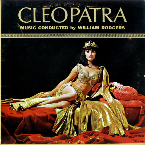
Farewell, Cleopatra…

A crop of my favorite photograph of Elizabeth Taylor. It was taken on the set of Cleopatra by Bert Stern, the photographer most famous for shooting Marilyn Monroe’s last sitting. Its smeared, caked-on, over-saturated magnificence embodies Taylor’s presence perfectly. The world is dimmer in her absence.

Pour la mer et de la Lune!

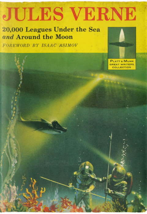
As good as it gets, as far as the futuristic sub, menacing shark, and heavy-duty diving suit genre goes. You can almost feel imagination catch fire. Oh, and to add to the radness factor, the book has its own logo – a submarine crossed with a rocket! The whole jacket is amazing, and can be seen here.

Bright Young Things, Part I


They did not intend to distinguish between the essence
Of wit and wallpaper trellis.
What they cared
Was how the appointments of the age appeared
Under the citron gaslight incandescence.

Virtue was vulgar, sin a floral passion
And death a hansom at the door, while they
Kept faith with a pomaded sense of history In their fashion.

Behind the domino, those fringed and fanned
Exclusive girls, prinked with the peacock’s eye
Noted, they believed, the trickle of a century
Like a thin umbrella in a black-gloved hand.

Yellow Book, Muriel Spark, c. 1951 (photograph, One More, by Mariczka, Kharkiv Oblast, Ukraine)

Tomas van Houtryve

Viewing these shots by documentary photographer Tomas Van Houtryve is a complicated experience. They pull powerfully at two distinct psychological strands – on the one hand they are thoroughly, almost voluptuously, gorgeous. On the other, they are deeply unsettling. In each shot, intermingled with the beauty, you can palpably feel communism’s total soul-crushing weight. They are all drawn from Van Houtryve’s ongoing project to document the last tattered communist holdouts – among them North Korea, Moldova, Laos, and China. The project is but a part of a deeply impressive body of work, all motivated by a deep, philosophical and humanitarian approach, under-girded by a superb sense of aesthetics. His work can seen here. He is also a gifted writer, and the stories behind the photographs, told on his blog, are fascinating. Start with his account of infiltrating North Korea, part one of which is here. (Hat tip Ashley Gilbertson, whose new project, Bedrooms of the Fallen, documenting the bedrooms of soldiers killed in Iraq & Afghanistan, is also well worth your attention.)

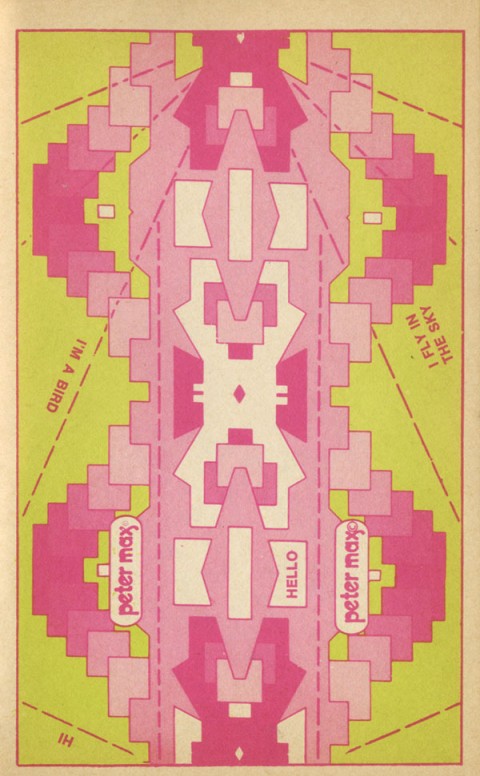
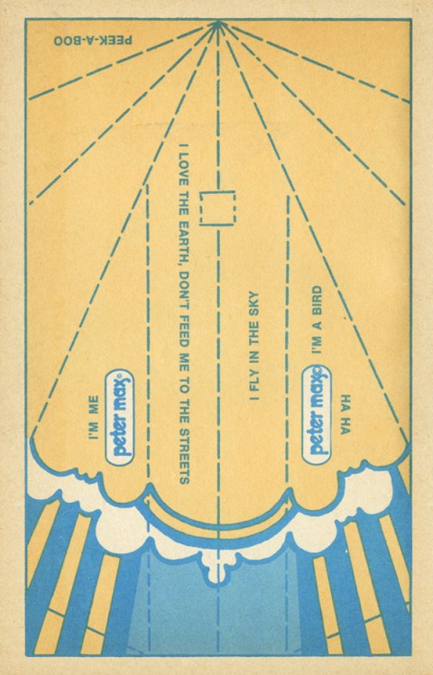
I’m a bird. Ha Ha!

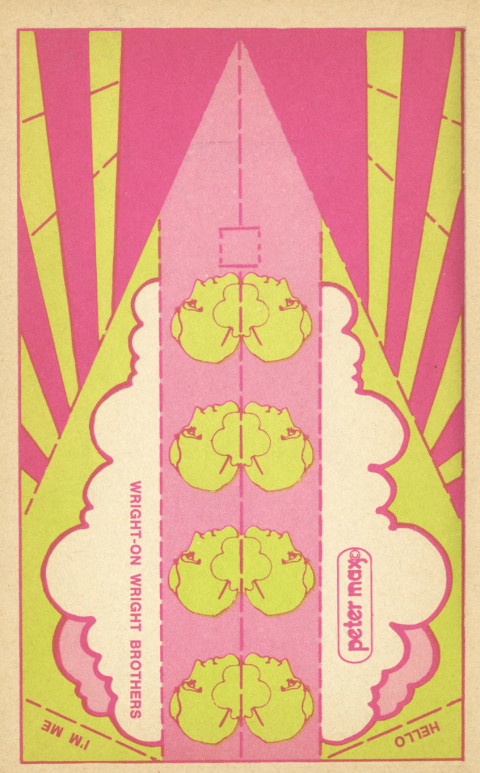
Generally, I’m not keen on Peter Max. I get it, he’s nailed some iconic images, and I firmly acknowledge the pioneering aesthetic. But, it’s just so wacka-wacka – the Billy Joel of psychedelic art is surely cruel – he’s far less hateful – but that’s what comes to mind (especially compared to the sexy sci fi kaleidoscope cool of someone like Michael English or Hapshash and the Coloured Coat.)

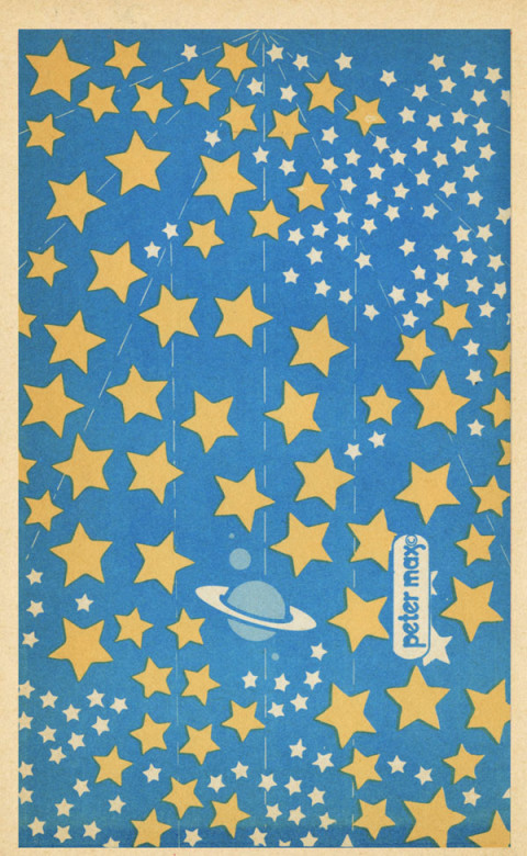
But these paper airplanes are splendid. They were published in a small format paperback in 1971, exhorting readers to “get your message across with a paper airplane in cosmic colors” It could be the geometric restraints on the the design, or just the small throwaway nature of the subject, but these panels are note-perfect. Even the chirpy lines like “I’m A Bird,” “I love the Earth don’t feed me to the streets,” are, like the artwork, genuinely endearing rather than cloying. Wright-on Wright Brothers, indeed!

Viva Jane!

Heavy advertising squalls have cruelly delayed my hearty encomium to Jane Russell. The poster for 1955’s Underwater will have to serve – it’s a testament to the sheer strength of her primal appeal. She was a veritable cinematic Helen of Troy, driving Howard Hughes bonkers, launching project after project in her honor. The whole of Underwater starring Jane Russell? Just that  – Jane Russell in a swimsuit, underwater – a lusty notion begetting an entire film. Viva, viva Jane! (Poster via Pulp International – a site well worth your frequent perusal…)
Swinburne’s Cleopatra

Batshit. Pardon the vernacular, but it’s really the only way to describe Algernon Charles Swinburne’s poem Cleopatra. What ridiculous swoops of melodrama. Overripe to the point of sugary bursting. It begins with a vivid litany of Cleopatra’s superlative qualities. It quickly unravels into a hysterical parade of phantasmagoric noodling – histories crushed under her eyelids, something about molten heaven drier than sand, and culminating in a psychedelic apocalypse. Or something. But of course it’s all a dream, but the dream of a lurid goddess, laughing with a red sweet mouth of wine, with history itself under her sway. Superb stuff, enjoy! (By the way Swinburne’s story is riveting and well, well worth reading.)

HER mouth is fragrant as a vine,
A vine with birds in all its boughs;
Serpent and scarab for a sign
Between the beauty of her brows
And the amorous deep lids divine.

Her great curled hair makes luminous
Her cheeks, her lifted throat and chin.
Shall she not have the hearts of us
To shatter, and the loves therein
To shred between her fingers thus?

Small ruined broken strays of light,
Pearl after pearl she shreds them through
Her long sweet sleepy fingers, white
As any pearl’s heart veined with blue,
And soft as dew on a soft night.

As if the very eyes of love
Shone through her shutting lids, and stole
The slow looks of a snake or dove;
As if her lips absorbed the whole
Of love, her soul the soul thereof.

Lost, all the lordly pearls that were
Wrung from the sea’s heart, from the green
Coasts of the Indian gulf-river;
Lost, all the loves of the world—so keen
Towards this queen for love of her.

You see against her throat the small
Sharp glittering shadows of them shake;
And through her hair the imperial
Curled likeness of the river snake,
Whose bite shall make an end of all.

Through the scales sheathing him like wings,
Through hieroglyphs of gold and gem,
The strong sense of her beauty stings,
Like a keen pulse of love in them,
A running flame through all his rings.

Under those low large lids of hers
She hath the histories of all time;
The fruit of foliage-stricken years;
The old seasons with their heavy chime
That leaves its rhyme in the world’s ears.

She sees the hand of death made bare,
The ravelled riddle of the skies,
The faces faded that were fair,
The mouths made speechless that were wise,
The hollow eyes and dusty hair;

The shape and shadow of mystic things,
Things that fate fashions or forbids;
The staff of time-forgotten Kings
Whose name falls off the Pyramids,
Their coffin-lids and grave-clothings;

Dank dregs, the scum of pool or clod,
God-spawn of lizard-footed clans,
And those dog-headed hulks that trod
Swart necks of the old Egyptians,
Raw draughts of man’s beginning God;

The poised hawk, quivering ere he smote,
With plume-like gems on breast and back;
The asps and water-worms afloat
Between the rush-flowers moist and slack;
The cat’s warm black bright rising throat.

The purple days of drouth expand
Like a scroll opened out again;
The molten heaven drier than sand,
The hot red heaven without rain,
Sheds iron pain on the empty land.

All Egypt aches in the sun’s sight;
The lips of men are harsh for drouth,
The fierce air leaves their cheeks burnt white,
Charred by the bitter blowing south,
Whose dusty mouth is sharp to bite.

All this she dreams of, and her eyes
Are wrought after the sense hereof.
There is no heart in her for sighs;
The face of her is more than love—
A name above the Ptolemies.

Her great grave beauty covers her
As that sleek spoil beneath her feet
Clothed once the anointed soothsayer;
The hallowing is gone forth from it
Now, made unmeet for priests to wear.

She treads on gods and god-like things,
On fate and fear and life and death,
On hate that cleaves and love that clings,
All that is brought forth of man’s breath
And perisheth with what it brings.

She holds her future close, her lips
Hold fast the face of things to be;
Actium, and sound of war that dips
Down the blown valleys of the sea,
Far sails that flee, and storms of ships;

The laughing red sweet mouth of wine
At ending of life’s festival;
That spice of cerecloths, and the fine
White bitter dust funereal
Sprinkled on all things for a sign;

His face, who was and was not he,
In whom, alive, her life abode;
The end, when she gained heart to see
Those ways of death wherein she trod,
Goddess by god, with Antony.

Sonic Youth: Simon Werner A Disparu

Sonic Youth’s relationship to the visual arts is ardent and sincere. They share a sensibility with the downtown gallery scene they so clearly adore –  a mix of undiscerning hipsterism & progressive aesthetic instincts. On the positive side you get Gerhard Richter’s lovely candle painting on Daydream Nation, John Fahey’s expressionistic swirl on The Eternal. On the ‘meh, there’s Christopher Wool’s clunky stencils on Rather Ripped, Mike Kelley’s smart-alecky puppet on Dirty, and Richard Prince’s lazy, easy, smeary nurse on Sonic Nurse. And then there’s Raymond Pettibon. Look, his work is unimpeachable as shorthand for the glory days of LA hardcore, but I think they think he’s a talent for the ages. Feh. To be fair, though, they did get as good of a Pettibon as you can get for Goo. Thei covers for their artier, self released SYR series have been sharp but rather perfunctory takes on classic sound library records of the 60’s and 70’s. Their latest release under the imprint, a soundtrack for the French director Fabrice Gobert’s high-school mystery Simon Werner a Disparu, is a total stunner – a gorgeous, highly graphic vignette, and ace piece of prep-school pop art!

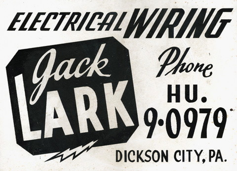
Electrical Wiring

Found this hand painted sign in a ramshackle flea market in Shawnee Village, nestled in the Pocono Mountains – the Switzerland of Pennsylvania. It takes a brave and confident hand to render each word in a different typeface and manage to make it cohere…

chronic personal tourism

We read… enraptured by [a] gallant attempt to distill a precious meaning from life’s experience – to make a spot on a globe a window into universal circumstance, and to fashion of one’s personal chronic tourism a crystal whose facts reflect an entire life…  – John Updike

Came across the Updike blurb on the back cover of Joseph Brodkey’s Watermark, a vivid personal account of his travels in Venice. What struck me first, as it always does, is the precision cut finish of the language. But as I read, and re-read the quote, it’s buy vicodin overnight impact bloomed and broadened to nothing less than a pocket manifesto. Isn’t this “gallant attempt,” this “chronic personal tourism” the very enterprise we’re up to over here. Updike nails exactly the motives behind documenting the passionate appreciation of the quintessence of things in daily life that so delight and move us. It’s not just cerebral, chin scratching, aesthetic trainspotting. It’s a double act of alchemy – to distill an essence, and to extract from that essence something fundamental to human experience.

Art: Lee Price, Cocoa Puffs, Oil on Linen, 44” x 62”