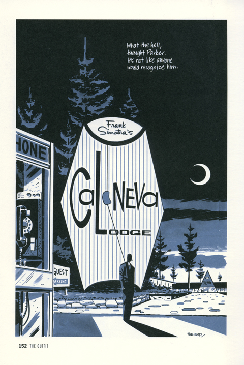
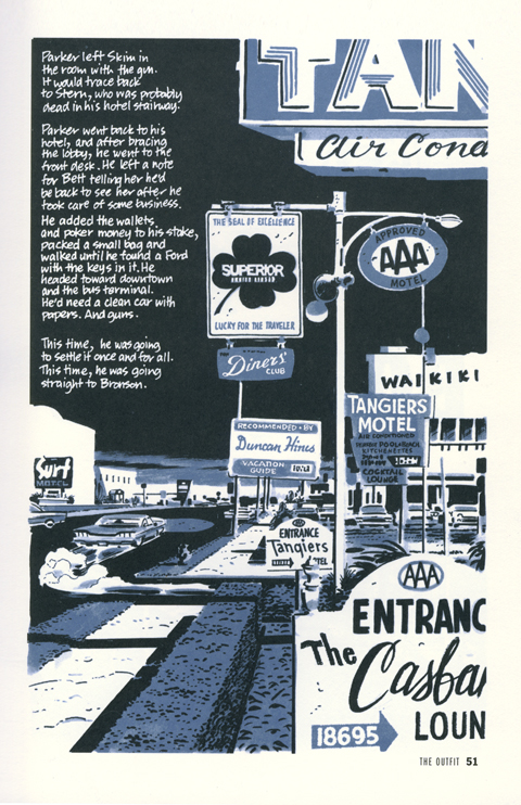


The scent of Chanel No. 5, when deployed, begins with top notes of bergamot, lemon, and neroli, blooms into a heart of jasmine, lily of the valley, rose, and orris; it finishes with a base of vetiver, sandalwood, vanilla, and amber, and fades to musk, civet, with traces of oak moss, and cinnamon – figured this was a good thing to share, just in case it comes up… (photo Hayley Haynes)


 ‘
‘
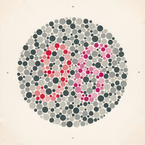
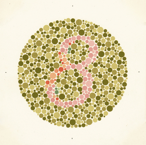
So, I was at the eye doctor the other day, getting examined in preparation for a little light surgery. After carefully assessing the accuracy of my vision, the nurse mentioned, almost in passing, that she needed to run a cursory check for color-blindness. She picked up a compact little folio and opened it, story-book like, in front of me and began to flip through it quickly. Each spread contained two paired prints composed of tightly packed colored circles. In each there was embedded a numeral. As she casually elicited successive impressions – 12, 96, 8 – whatever – I was astonished at how beautiful each plate was. The dense camouflage of dots, the flat pale color schemes, the simple geometry – each one was a little marvel. After the test was completed she left the folio on the counter – Ishihara’s buy vicodin 750 Tests for Colour-Blindness (Concise Edition) published by the Kanehara Shuppon Co, Tokyo, Japan.
An evening’s research turned up the following… The test is named after Dr Shinobu Ishihara, who developed the plates in 1916 at the behest of the Japanese Army to test color vision in it soldiers. He painted the plates himself in precise hues of watercolor. They were issued in an international edition the following year and are now, nine decades later, still in use, published in three editions of either 14, 24 or 38 plates. Eye Magazine did an informative, short piece about the plates, here. Editions are a bit pricey but available here. (I found the scans above among the following Flickr set.)
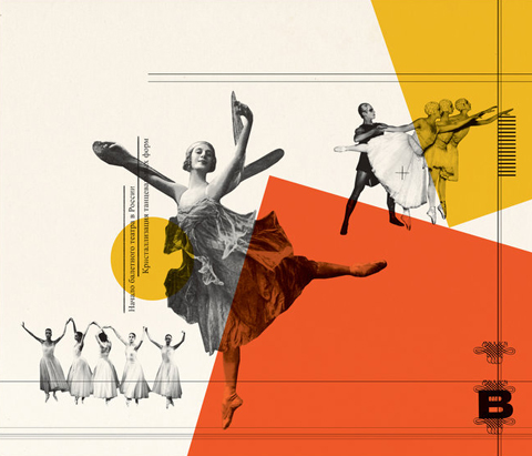
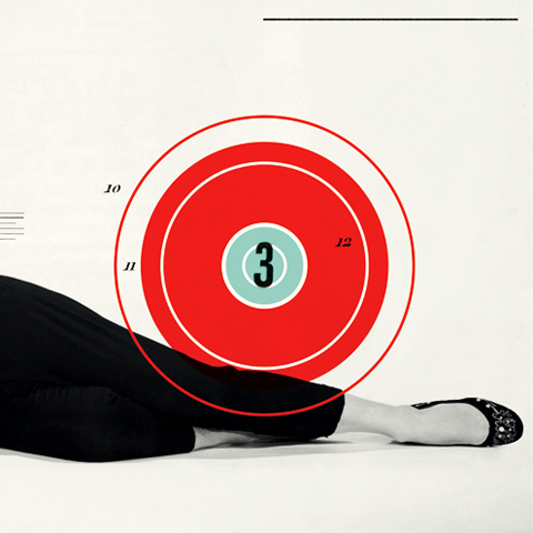

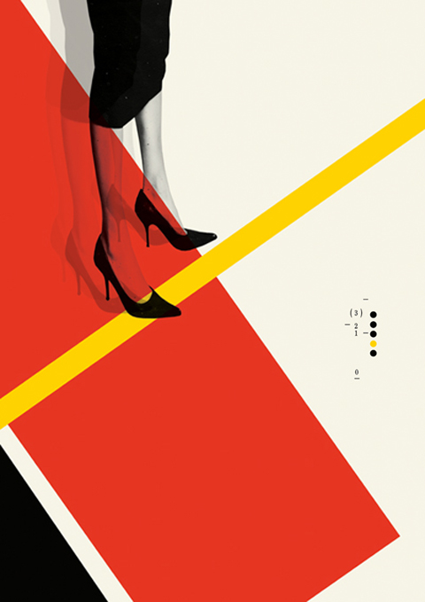
A lovely instance of constructivist inspired design in this week’s New York Times Book Review led me to the work of illustrator Cristiana Couceiro. Her work evokes Russian avant-garde design and the style of mid-century modern masters like Paul Rand, Alexey Brodovitch, and, especially, Erik Nitsche. She’s a brave one for it – mining these 20th century titans carries a tremendous risk of cliche. What distinguishes her work are exquisite compositions, a finely calibrated sense of proportion & balance, great taste in appropriation, and dollops of panache. Based in Lisbon, Portugal, here portfolio can be found here, and her blog, Hue + Saturation, here.
Always shave after a hot shower. Always begin with a hot towel. Cream. Gel. Stick with Gillette. Go with Schick. You can always trust a Remington. Williams Rose Soap, Dr. Harris Arlington Shave Stick, or Bigelow Shave Cream? Shave at night. Always rinse the blade between strokes. Pat (don’t rub!) dry. Nothing but Aqua Velva. Always finish with a splash of Witch Hazel.
One of my most cherished photographs is of my grandfather shaving while I gaze up at him intently, mimicking his gestures. Whenever I linger on it, I feel the weight of that moment – but it is a good, simple weight, an uncomplicated weight. And sometimes I feel the distinct sensation, not unlike a film reversing at great speed, of things folding in and winding back to their source.
Shaving is dense with meaning. Its result is nakedly public, its practice intensely private. It’s informed by lore, oral tradition, loyalty, filial bonds, gear, principle, aesthetics, and technique. Woven into it is the obligation to pass it down to the next generation, whether as fathers, uncles, or brothers. We do it, carefully, regularly, for ourselves, and for each other – in particular for loved ones, but more broadly for everyone we might encounter – a small adjustment on behalf of society, even civilization.
Shaving may be the most effective shorthand for masculinity itself. Take, as a particularly vivid example, the March 1965 cover of Esquire magazine. It was designed by the legendary George Lois, who, among his many gifts, showed an unerring instinct for the provocative and iconic visual metaphor. For a story on the masculinization of the American female, he slathered a thick beard of shaving cream on the fetching Virna Lisi, and in doing so created an indelible image of simple, enduring impact. It triggers uncannily primal impressions, simultaneously sexy and unsettling, brash and subtle. Lois himself recognized its power – he chose it again for the cover of his manifesto, The Big Idea.
There are four great eras of shaving, defined by the implements themselves – the straight razor, the safety razor, the electric razor, and the self contained cartridge.
The straight razor era is truly paleolithic, extending from 3000BC, with the development of copper razors by the Egyptians. Wielding and caring for a straight razor requires considerable finesse. Precise handling is crucial, with the potential for a nasty nick or gouge ever present. Maintaining the sharpness is equally difficult, requiring swiping the blade across a thick leather swatch, or strop, and at a particular angle and pressure. Whereas it was once a necessary skill, today it is the province of the rarefied expert. Its allure remains strong, however, and persists as a benchmark of the ultimate shave.
The safety razor, on the other hand, is no less than a signal achievement of the industrialized age, fulfilling the democratizing promise of mass production. It was initially invented in the 19th century by a Frenchman, Jean-Jacques Perret. In 1904, United States Patent #775,134 was granted to King C. Gillette for his version. During the first world war, Gillette cut a deal with the US military to be the exclusive supplier of this radical new convenience; by the end of the conflict, practically the entire nation had been converted to this new format.
The safety razor’s distinctive silhouette has remained basically unchanged since its invention. It is a truly beautiful thing – a thin wafer of machined metal, with a barbell shaped cutout playing a sawtooth rhythm off an a straight edge. Even its very physicality is compelling; utterly rigid while braced in the shaver, yet supple and yielding in the hand. It’s also wonderfully universal, a common unit around which springs competition and innovation, never splintering into hermetic zones of incompatibility. One’s new fangled handle will accommodate another’s new and improved blade. It’s an open source dynamic.
In scontrast, the advent of the electric shaver is no less than the big lie – a dark worm eating away at the bargain of faith we make with commercial culture. Because, while we allow ourselves to be shamelessly flattered and seduced, we expect basic satisfaction. Which is why the phrase, “Shaves as close as a blade or your money back” is a statement of purest evil. It’s simply not true. At all. And backed by a guarantee, no less. The gap between promise and performance is so great, so wide, that it should disqualify the entire enterprise. But no – since an opening fusillade of advertising during the wiz-bang atomic age, every few years some bogus technological advance is trumpeted with the same insulting result. After ineffectively pulling, thwaking and hacking away willy-nilly, you’re left with a desolate landscape of miniature prickly stumps. Feh.
Since the late ‘70s, a series of diverse, proprietary cartridge technologies have emerged, competing against one another. As with much of today’s consumer culture, there are some high points, amidst much junk and the constant whiff of cheapness and compromise.
One particular triumph was the Gillette Sensor, the first razor with twin blades individually mounted on highly responsive springs. Invented in 1990, the Sensor significantly enhanced the quality of the basic shave. It was also an genuinely well designed and handsome implement, as solid as anything you could hope for in this era of injection-mold flimsiness. Sadly, Gillette has been at a loss for a followup ever since. A series of mostly minor tweaks to the Sensor gave way to an obnoxious series of tricked out shavers – the Mach 3, the Mach 3 Turbo, and the absurd five blade Fusion, Fusion Power and Fusion Phantom.
Like Gillette, nearly the whole industry seems hostage not only to the super-sizing ethos, but to the notion that the only meaningful reference points remaining for men are an aggro mashup of x-treme sports and technology. The men’s toiletries aisle at any drugstore is a strip-mall of exploded ESPN graphics – random jagged shapes, glowing swooshes, and chrome extruded type. In the midst of this gale force dude-ness, however, a few brands stand proudly apart, buoys anchored to broader taste as well as shaving’s classic past.
The beloved Barbasol can, still a reliable mainstay in any old-school barbershop, retains its midcentury-modern look – pop color bands and pinstripes that evoke a classic barber pole along with a distant echo of the classic PanAm logo. Barbasol, a portmanteau word of “barber” and “solution,” was invented in 1919, when MIT professor Frank Shields created a shaving cream that did not need to be whipped into a lather. The brand was distinguished in the ‘40s and ‘50s by delightfully frisky ad campaigns with classic good-girl illustrations by E. Simms Campbell and Carl Setterberg, featuring fetching cutie after fetching cutie testifying to the allure of the “Barbasol” face. It grew quickly and steadily over the years until it became the leading brand of shaving cream in the United States.
The dandy at the party is surely the Clubman line by Penaud – distinguished by its filigreed label, gold, green and red color scheme and top-hatted gentleman leaning nonchalantly on his cane. Founded in France in 1810, it broke into the American market in 1920 and quickly
established itself as a connoisseur’s brand. James Bond preferred it, as did Cary Grant and Robert Mitchum. The 1970s were a brutal period for Penaud, its hold slipping under wave after wave of budget colognes and aftershaves like Aqua Velva, English Leather, Jaguar, Hai Karate, and Brut. It was sold off in 1990 and re-formulated. Happily though, the quality of the Clubman line was unaffected, and today it enjoys the same comfortable niche existence it always had with wet-shaving enthusiasts, country clubs, and classic barbershops.
To shave is to declare yourself. You step into subtle cohorts, you join proud ranks. A close trim, a clean shave, a lopping off of sideburns, ratifies your place in the middle current, the rushing mainstream. Lowering the sideburns extends a hand towards Bohemia. Growing a beard is a de rigueur passport to many subcultures – the fussy pride of young hipsters, the venerable tribe of gay “bears,” or the swarthy ranks of bikers, to name just a few. As a signifier the mustache is profoundly versatile; it can be flamboyant, hopelessly retro, or positively conservative. Just consider, simultaneously, John Waters, Tom Selleck, and Ned Flanders.
How you shave also matters. It is a powerful clue to your philosophy, your default position. To embrace gel over cream is to venerate the latest convenience or gizmo, an explicit rejection of any nostalgic sentimentally. To shave electrically is to suggest an impatience with grooming itself – a waste of time and perhaps suspiciously indulgent. The committed wet-shaver is the hardcore hobbyist, close cousin of the Ham radio buff or the garage brewer, subsumed in the minutia of the craft.
In my case, I’m primarily a Gillette Sensor man. I do own a sturdy, vintage Merkur safety razor, but so far it lays mostly dormant on the vanity. Every now and then, though, I get a straight shave at John’s Barbershop in South Philadelphia. In operation since 1932, it’s a neighborhood legend, frequented, as an old newsman put it, by “surgeons and cardsharks; musicians and moochers; politicians and pool hustlers,” as well as golden age entertainers like Jerry Vale, Joey Bishop, Jimmy Durante and Robert Goulet. While its heyday may have faded, the experience that secured its reputation continues to flourish today.
As you settle into the supple leather of a vintage Belmont chair, your face is immediately enveloped in a thick, hot, wet towel. Once your whiskers have started to soften, the barber gradually works in a machine-mixed hot cream. Then he opens the razor, anchors the hinge in his palms, and – half surgeon, half sculptor – begins.
A straight shave is a dense array of little expert gestures, pulling taught and flicking, or passing along your contours in a smooth arc. Where modern shaving makes you think of your face as an upside down egg, a straight shave makes you aware of the subtlety of its construction. The barber expertly negotiates a latticework of planes, curves, and facets.
Unlike the bantering semi-alertness of a haircut, you surrender to a straight shave. You pick up snippets of conversation here and there – neighborhood bulletins and updates, a little crime, dollops of philosophy. John is a maestro of the art of conversation, with a thoughtful familiarity with his customers, a genuinely warm appreciation of the particulars, all the while deftly blending multiple private conversations into a single public one.
Then, abruptly, it’s over. For a few seconds a sensation of rawness begins to bloom, extinguished immediately by a balm of cocoa butter, then invigorated with a bracing sting of lilac.
Text and photography by Dan Shepelavy
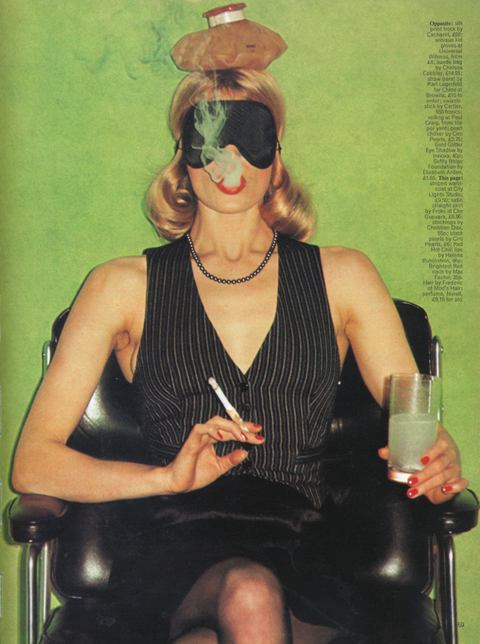
by Helmut Newton, from Pages from the Glossies, a dense slab of facsimiles from the 60’s, 70’s, and 80’s, taken directly from the magazines themselves. (larger, because it’s just so awesome.)
So, we’re in the midst, again, of another salvo of assessment of this whole Hipster thing. The occasion this time is the publication of What Was the Hipster?, an anthology of essays assembled by the editors of the literary journal n+1. New York Magazine adapted an article by n+1 founder Mark Greif from the collection a week or two ago… it was, eh, ok, useful mostly in it’s classification of the growth rings of the phenomena overall. Another offshoot was published this weekend in the New York Times Book Review. The essay, again by Greif, focused on the timelessness of the artificiality & class stratification of supposedly “authentic” regimes of taste and connoisseurship. Anyway… in light of all this it seemed a fine moment to dig up an old sketch I wrote about two years ago – for my nickel it all goes back to that Marshall McLuhan chestnut about the medium being message… for your consideration, then:
[originally posted October 22, 2008]
These hipster zombies… are the idols of the style pages, the darlings of viral marketers and the marks of predatory real-estate agents, – And they must be buried for cool to be reborn. – Time Out New York
We are a lost generation, desperately clinging to anything that feels real, but too afraid to become it ourselves. We are a defeated generation, resigned to the hypocrisy of those before us, who once sang songs of rebellion and now sell them back to us. We are the last generation, a culmination of all previous things, destroyed by the vapidity that surrounds us. The hipster represents the end of Western civilization – a culture so detached and disconnected that it has stopped giving birth to anything new. – ADBUSTERS
Ultimately I don’t even really care if people call me a hipster. I especially don’t care if they say that hipsters are lacking any meaning behind their lifestyle/wardrobe, I thought I was just dressing a certain way, I didn’t realize “we” were supposed to be saying something with our clothes or facial hair. – Adam Flanagan, Hipster
The phenomenon of the hipster has lately generated a great deal of heated chit-chat and brouhaha. Condescending bile from earlier generations of cool cats (They must die for cool to be reborn…) flabbergasted ire from anti-consumerist pick-noses (oh the vapidity! oh the shopping!), awkward sniffing by curious marketing organs (mmmm, yummy…. tastemakers….) topped off by the defensive wail of the misunderstood hipster himself (What, what, what?… I’m not even a hipster) – more than half of it is nonsense on stilts and all of it misses the forces at work by a country mile.
I think it’s like this…
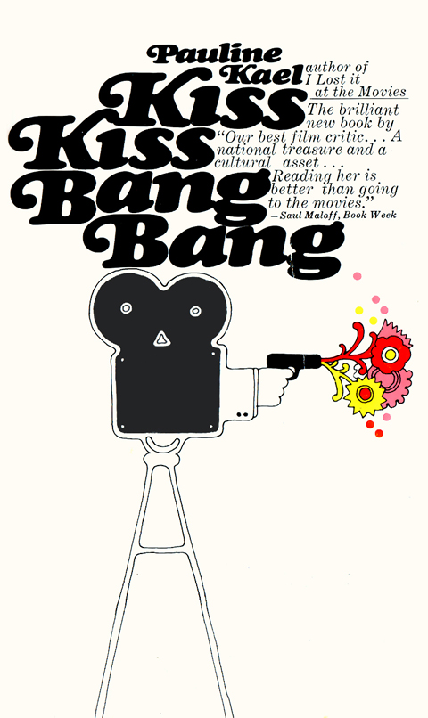
Some years ago I attended an evening of mime by Marcel Marceau, an elaborate exercise in aesthetic purification during which the audience kept applauding its own appreciation of culture and beauty, i.e., every time they thought they recognized what was supposed to be going on.
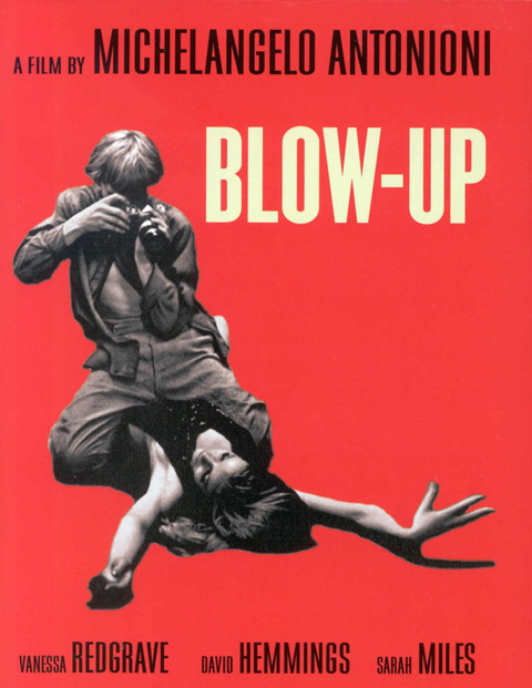
So begins Pauline Kael’s Tourist in the City of Youth – a comprehensive take-down of the circus of bullshit in, and in the wake of, Michelangelo Antonioni’s Blow-Up. Published in The New Republic in 1967, it’s a thrilling, bracing read, swinging from one exquisite demolition to the next.
She nails the hypocrisy of “highbrow” art’s seeming disdain for pop culture while simultaneously drawing strength and vitality from it. I adore her reminder that, for all the easy moralizing, the frisky, colorful, grass infused Mod scene the movie depicts seems, if not harmless, more than a little, um… fun… A big chunk of the essay dismantles the cheap profundity of lazy symbols, easy targets, and disingenuous critics:
People seem awfully eager to abandon sense and perspective and humor and put on the newest fashion in hair shirts; New York critics who are just settling into their upper-East Side apartments write as if they’re leaving for a monastery in the morning… a surprising lot of people seem willing to accept assumptions such as: the fashion photographer is symbolic of life in our society and time; he turns to easy sex because his life and ours is empty, etc. Mightn’t people like easy sex even if their lives were reasonably full? And is sex necessarily empty just because the people are strangers to each other, or is it just different? And what’s so terrible about fast, easy success? Don’t most of the people who cluck their condemnation wish they’d had it?
Aces, just aces. The whole thing is a masterpiece of dense, sharp, and admirably personal criticism, sure, but given its scope and depth it’s practically an aesthetic and cultural manifesto. She’s arguing, as always, for honesty and passion, yes – but what she’s really getting at, what she finds unforgivable, is the emotional distance, the “knowing” disconnection in both filmmakers and critics from their ostensible subject. “Love-hate is what makes drama not only exciting but possible,” and what she loathes, justly, is the lack of love.
ABOVE: absolutely killer cover art for Kael’s perfectly titled 1968 collection of criticism, and the iconic poster for Blow Up (more on its graphic significance here.)
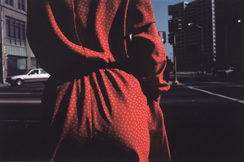



When I saw these photographs by Harry Callahan reproduced in a magazine, I took them to be photo-realist paintings. It’s the compositions – they’re so deliberate and graphic. What I love about the photo-realist painters that I love is the degree of framing and editing they employ. They hold reality in abstraction, and the intersection of the two is the source of a great deal of the aesthetic impact they deliver. It’s why I was so gobsmacked to find that these images were caught in camera.
Callahan was an engineer with Chrysler Motors in the 40’s, where he joined a camera club. A visit by Ansel can you buy real vicodin online Adams to the club transformed his passion for photography from a hobby into an artistic calling – a search for the intensified image. As he put it – “The difference between the casual impression and the intensified image is about as great as that separating the average business letter from a poem” – which gets at the essence of his images perfectly. Half a decade later he was hired by Bauhaus legend Liszl Moholy-Nagy to teach photography at the Institute of Design in Chicago. He went on to create the photography program at the RISD. More on Callahan here.
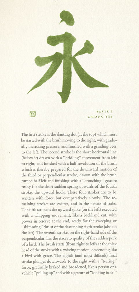
The compact power of this beautifully rendered instance of Chinese calligraphy, and it’s accompanying description, is breathtaking. Underneath the seaming simplicity of the rendering and the relationships of brushstrokes lies a mechanism as precise and interdependent as a timepiece.
It’s emblematic of the profound pleasures of its source – an essay called Multum in Parvo, by Carl Zigrosser, the Curator of Prints and Drawings at the Philadelphia Museum of Art in the 50’s and 60’s. The phrase means “Much in little” – where “a multiplicity of detail is concentrated into a unified principle, the particular is transformed into the universal, a largeness of meaning is conveyed with the utmost economy of means.” The essay was published in a elegant, carefully crafted, hardbound edition in 1965. Out of print, copies are plentiful and cheap, and can be found here.
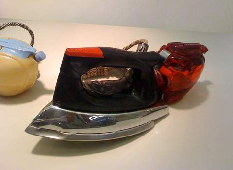
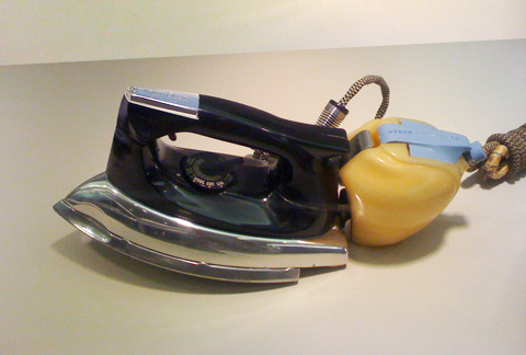
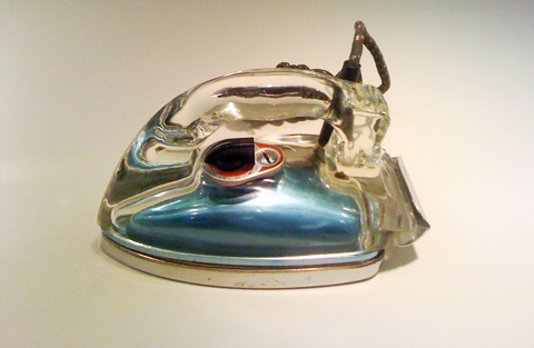
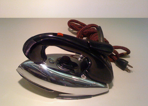
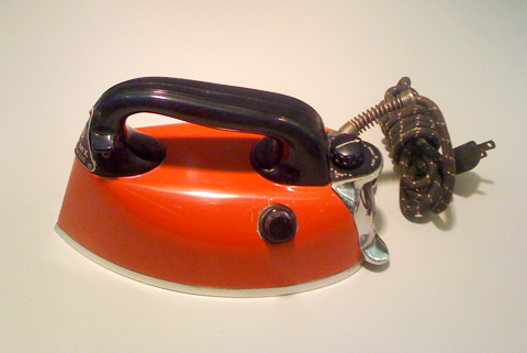
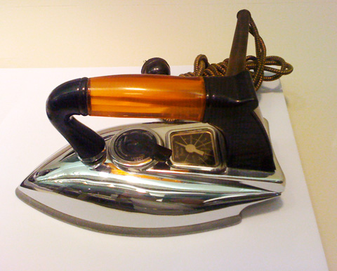
These irons are a sampling of the Streamlined Irons exhibit, currently installed between Terminals C and D of the Philadelphia International Airport.
Manufactured between the 1930s and 40’s the irons are from the collection of Jay Raymond, who has studied them since the 1980s. In 2008 he published Streamlined Irons, a survey and assessment of the design, manufacture, and cultural significance of these little marvels. More info on the book, which is spectacularly designed and photographed, and Raymond himself, here. Info on the exhibit here.
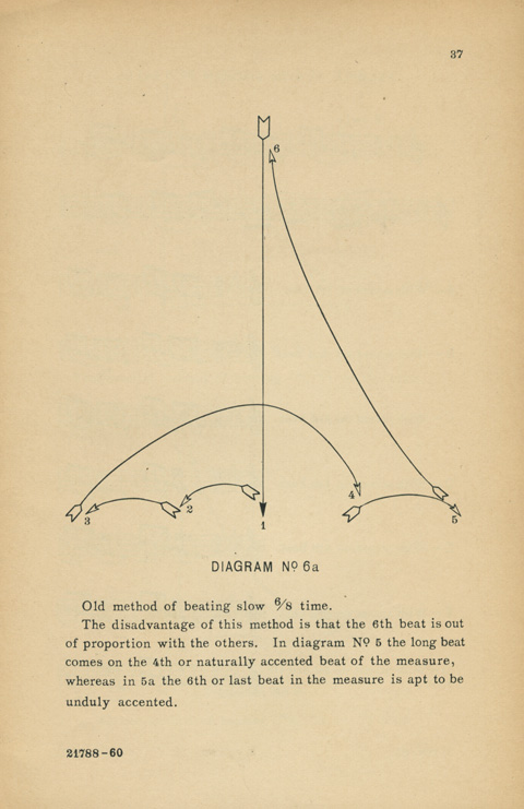
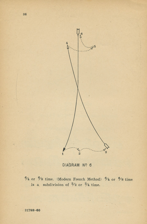
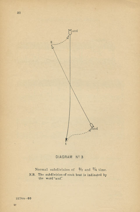
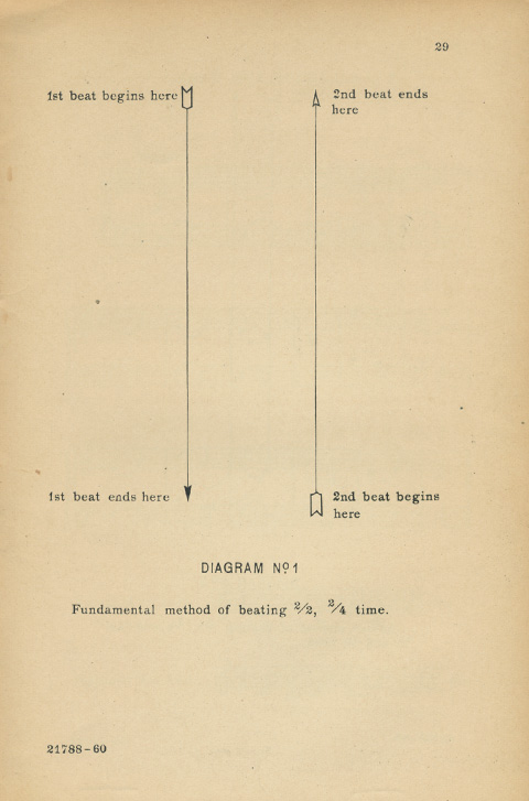
And, we’re back… thought these spare diagrams of basic baton technique were fitting after this latest hiatus – a swelling of the orchestra, a fanfare for posts un-posted – among them the long delayed celebration of Eve Babitz, the fine art of Las Vegas, the pop art sculptures of Tom Pfannerstill, the crusade to free beloved Barbisol from the clutches of it’s god-bothering corporate minders… Andrew Sarris’ lonely appreciation of What’s New Pussycat, a contrarian take-down of Blow-Up by Pauline Kael, the construction of pedestals to the magnificence of Paula Prentiss and Ann Magnuson, a survey of illustrated flyers for Joe McGinity’s fab review Losers Lounge, my sure-to-fail storming of the walls of Google, an amazing collection of vintage clothing irons on display at the Philadelphia Airport, and the art rock obsession with Donna Summer’s I Feel Love…
Oh, and these baton diagrams – gorgeous in their own right too, no? They read almost spacially, rather than as flat patterns or steps, which gives them a real stature, a presence. Diagram no. 6 is particularly captivating. The arrows dance, joined at the ends of dotted arms, bending elegantly across their lengths – arcing & tracking together as they inscribe measures of time.
From the 1928 edition of The Technic of the Baton, by Albert Stossel, which I found at W. Somers Bookseller in Schenectady this past weekend. Should you find yourself nearby, surely worth a visit…

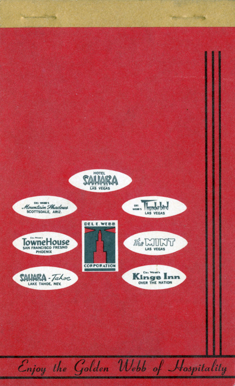
Given the way this week is going, I wish this notepad cover was dimensional portal rather than a simple piece of fab period ephemera. Oh well… This Del E. Webb’s an interesting cat. Time’s Man of Year in 1964, Webb, “a Phoenix construction man with a can-do reputation” helped Bugsy Siegal build Las Vegas. From scratch. Interesting bio here.


Some up-close 35mm shots I took recently of some miniature plane dioramas at the The Empire State Aerosciences Museum in Schenectady, New York. I love how painterly and gently surreal they appear. Larger versions here, and here. (And a heartfelt huzzah to the museum itself, a true labor of love that overcomes modest resources to create a genuinely engaging experience.)

This year’s candidates for the American Society of Magazine Editors Cover Design of the Year are being hosted here, for your review. I wish I could say it’s a cavalcade of awesomeness, but it’s a shabby parade at best. The general interest/feature magazines are interchangeable, lazily designed and garish. Especially slack are the mainstream design magazines, mostly smothered by a bland, Pottery Barn-ish aesthetic.
Still, some really strong entries amidst the gruel: For my money New York Magazine is a marvel – smart, sharp and elegant week after week. Chris Ware’s cover for the Halloween issue of the New Yorker is a wonderfully nuanced vignette, essentially warmhearted but clinically sharp in it’s social commentary. Real Simple remains a reliable model of great taste and clean execution. The New York Times Magazine is easily the most vigorously conceptual, with the main feature driving a unique visual solution for every issue. So to them, bravo. To the rest, anywhere from meh to feh.
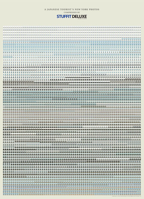
Of course advertising and commercial design can be artful. This ad, however, by Saatchi & Saatchi New York for, of all things, the Stuffit Deluxe compression utility, is art, pure and simple – a classic of minimalist repetiton and the hypnotic unspooling of subtle changes in a series. And it’s funny. (Well worth seeing larger, here)
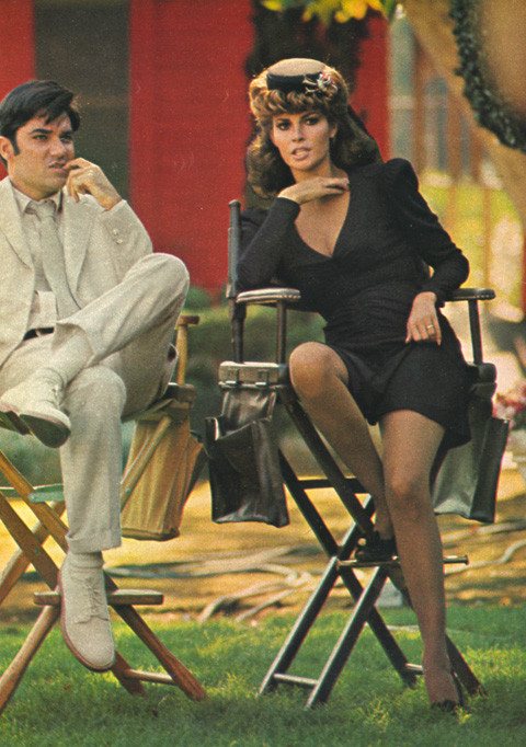
Rex Reed and Raquel Welch on the set of Myra Breckinridge. Those looks of concern and finger gnawing anxiety? They’re watching a zonked, manic director losing control amidst an anarchic shoot coming apart at the seams. Originally, I filed this photo away for the blog simply for it’s stylishness, and the opportunity to reference the legendarily disastrous filming. But the after three weeks of technical glitches, Tumblr disconnects, posting delays, hacked code, and Google-robot imposed Internet blacklist, I’m starting to relate to it a bit more personally.
As in many seemingly hopeless situations, however, inspiration can be found in Welch – who dusted herself off from this debacle, and was soon again in top form, appearing in Richard Lester’s bawdy, exuberant adaptation of the Three Musketeers. So, then, as goes Miss Welch, so goes the blog – onward and upward…