
Just gorgeous! Brian Stauffer’s lovely, evocative, spare drawing for the March 1, 2010 cover of the New Yorker.
Just gorgeous! Brian Stauffer’s lovely, evocative, spare drawing for the March 1, 2010 cover of the New Yorker.

He & She is a lost classic, a fizzy cocktail of a sitcom, with an easy going, effervescent sophistication, and starred one of the most appealing couples in showbiz… I caught wind of it after doing some digging around about Paula Prentiss after seeing her in The World of Henry Orient (itself a real gem of a flick, a quirky mid 70’s Upper East Side lark about two precocious teenage girls that form a crush on a caddish conductor played by Peter Sellers.)
It ran on CBS in 1967. Prentiss co-starred with real life husband Richard Benjamin as a young, smart and more than a little goofy New York couple. Benjamin portrayed Dick Hollister – cartoonist and creator of a popular comic strip and TV character called Jetman. Prentiss played his wife Paula, a social worker. In the annals of great screen couples they deserve to be mentioned in the same breath as The Thin Man’s Nick and Nora Charles. They’re that good – hilarious, effortlessly stylish with an infectious, natural rapport.
Equally distinguished was Jack Cassidy, Shirley Jones’ husband, and, of course David and Shaun Cassidy’s dad. He played Oscar North, the obliviously egotistical actor who played Jetman on TV. His every appearance is a veritable one man symphony of flamboyant hamminess.
The show itself is a sheer delight. Great set ups, witty dialog, and a deft mix of comedy, ranging from literate banter, absurdist humor and sheer slapstick. It was cancelled after just one season but in it lay the DNA for everything from the Bob Newhart Show and Mary Tyler Moore all the way to Fraiser. The world is a brighter funnier place for its existence. Also, Prentiss and Benjamin are still together, which adds a really sweet overtone to watching the show.
Sadly, it’s never been in circulation on DVD. It floats around in scratchy, ghostly, glitchy versions lovingly compiled off of old broadcasts and VHS tapes by fans. One version can be gotten here, from the amazing folks at modcinema, but searching around is recommended.


Seductive Subversion: Women Pop Artists 1958 – 1968, on exhibit now at three gallery spaces at Philadelphia’s University of the Arts, is the first major exhibition of female Pop artists of the era. Its quite a reclamation project – planned over the course of four years, a majority of the work has not been shown in over forty.
The usual pop concerns are in play, with a heavy emphasis on the complexities of female iconography in mass culture. The art is on the whole great, if a little roughly hewn. Gems abound – Idelle Weber’s stark http://www.mindanews.com/buy-levaquin/ geometries and silhouettes, the provocative (if a little strident) photo-montages of Martha Rosler, and Dorothy Grebenak’s hooked wool rugs of Tide boxes, and Bugatti logos. Marjorie Strider’s Green Triptych balances genuine sexiness and wry commentary in equal measure, not an easy dynamic to pull off. The show runs until March 15. A catalog is forthcoming. Check it. (Roberta Fallon and Libby Rosof’s Artblog has a nice write up about the show here.)
Martha Rosler, Family Portrait with Car, 1966-72,
Chryssa, Ampersand IV, 1965
Rosalyn Drexler, Home Movies, 1963
Marjorie Strider, Green Triptych, 1963
Joyce Wieland, Young Woman’s Blues, 1964

Reader! May your weekend be as light, refreshing, and effervescent as the sensation of Djer Kiss talcum powder, which, if you can trust the depiction above, feels like the condensed essence of an idyllic verdant garden at the foot of a towering magic castle from which issue 38 faeries, attended by 3 mischievous cherubs, all luxuriating in a river of flowers…. ‘Till next week then…


A small selection of ephemera used to market DuPont’s’s Lycra Spandex fabric from the late 60’s into the late 70’s…. These are taken from an article I’m writing for Uppercase Magazine. It’s a visual survey of the design and aesthetics of DuPont’s marketing of synthetic fabrics from the 1920’s to the early 80’s.
The history of the development of synthetic fabrics is a fascinating nexus of science, industry, design, advertising, fashion and culture. In turn, the same goes for focusing specifically on the marketing and promotion of the fabrics themselves. It is a rich core sample of prevailing trends in design, typography, advertising illustration and photography, etc over the decades. Anyway, while putting the piece together I was especially buy vicodin portland charmed by the different modes and looks behind Lycra… not to mention being sent into sheer nostalgic tizzy over the very idea of the Dichter Institute Motivation Study of Women’s Attitude’s About Pantyhose. Who says advertising doesn’t contribute mightily to how we understand ourselves and our world? I’m sure that handy tome borders on philosophy….
Anyway – the article will be in the fifth issue of Uppercase Magazine. A few more previews to come. Stay tuned, etc.. (If Uppercase Magazine is unfamiliar to you, well then, get yourselves over to here for a gander. A lovingly assembled magazine about beauty squirrelled away in the nooks of the everyday…My full mash note to its awesomeness is here.)


OK,then. Let’s get the obligatory description-by-reference out of the way… ABBA merged with the New Pornographers, under the influence of Van der Graaf Generator, the whole shebang co-produced by Giogrio Moroder and Jeff Lynne. That is, melodramatic Scandinavian pop, reinterpreted with savvy indie enthusiasm, shot through with a proggy, theatrical sensibility, and sonically alternating between pulsing euro disco and lush orchestrated pop.
But the pastiche of references does poor justice to the brilliance and originality of the record. Music Go Music sublimate their http://www.mindanews.com/buy-valtrex/ references into a set of absolutely killer songs and proceed to play the bejeebus out of them. It’s absolutely, genuinely, exhilarating. (The only trace of hipster irony I can detect is in the lazy faux squareness of the name. I mean, I’m all for plainspoken band names, but c’mon – lets try for something at least as distinct as, I dunno… Electric. Light. Orchestra….) Anyway, a quibble only. For your pleasure, 2 tracks, below. Also, a series of live performances, cryptic bio and more, here. Preview and purchase, here.
Music Go Music: I Walk Alone:
Music Go Music: Reach Out:

I know, Hallmark® holiday, yes, yes… still, love’s rad. Happy Valentines Day, all…
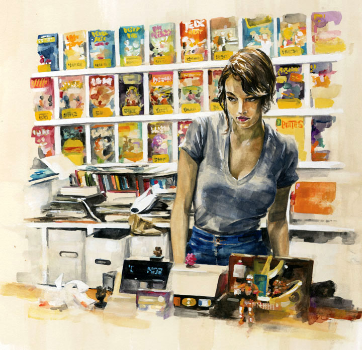
Wednesday, gouache on board, 14″ x 15,” 2010 [larger image]
Based on an amazing photo taken by Bryan Derballa for the Secret Lives series on Wired.com, featuring comic book store employees.

Recently I had to decide whether to discard my Apple //e, and found I absolutely couldn’t bear to part with it. Rather, I pulled its disparate components off storage shelves and out of boxes, dusted them off and reassembled it. Something about reconstituting it made me bond with it all over again… Then, just the other night, snowed in by a blizzard, I was watching Royal Tennenbaums for the nth time and noticed among all the other 70s bric-a-brac, an Apple //.
I know it’s playing footsie with the obvious, but it’s worth remembering what an essential artifact of 70’s design the Apple // really is. Its introductory advert from 1977 captures that perfectly. Look at the context… It’s not set up in an office but on the wood table of a modern kitchen. It’s not stacked like a Hi-Fi system or a fused one-piece like an ordinary computer terminal. It’s spread out like a split level contemporary house. The severe contrasting angles of the case evoke 70’s architecture and furniture design much more than anything especially technological. (It shares this look with some of the better designed calculators of the period – which makes sense, given they first embodied the notion of a computer as a home appliance) The distinct beige putty color leans in nicely against the saturated, plush colors of the era – the ochres, purples, oranges and red browns. In short, the Apple // represents the hight of then-contemporary suburban design – which is why it looks just at home in the Wes Anderson’s idealized 70’s diorama as Bill Murray’s purple turtleneck and burnt sienna blazer.


What dandy cover art! With Cluster, it is the wonderfully plump, shiny, hand wrought type. It actually looks frosted – perfect considering Zuckerzeit is German for sugary. The Cure’s Three Imaginary Boys cover is dead on deadpan pop art. Both covers embody perfectly their respective contents – Cluster’s warm, gently insistent, pulsing analog electronics feel practically glazed in liquid sugar. As for the Cure, it captures the detached, nervous, pop vibe that lasted for one only odd and awesome record (and it’s American counterpart Boys Don’t Cry) before all the gloomy gloom…

These here are prime examples of the work of a fab outfit called Plan Toys. Based in Thailand, totally green, committed to sustainable wages, the outfit is a model of vision, conscience and aesthetics. Everything they make is made from rubber-wood trees to old to produce latex. The textured flat pop colors? – water based stains. And the stuff is built – practically carpentered, like in the olden days. But it’s more that quality materials, progressive ideals, and great design. We are talking a totally inspired aesthetic – the world of Plan Toys is like magic dimension where everything is designed by Eero Saarinen, Alvar Aalto, Walter Gropius and overseen by the watchful eye of Chris Ware. Seriously – again – check out that toaster.
![]()

Bauhaus craft book, Aero Saarinen: TWA Terminal,
Alvar Aalto: Paimio Chair, Chris Ware: excerpt


These caricatures by Tom Wolfe are excerpted from In Our Time, an illustrated patchwork of essays, observations and commentary. The jacket flap copy, while a bit foofy, is dead on – the book recalls “the palmy days when social caricature flourished in the great European satirical magazines Simplicissimus and L’Assiette au Beurre. His eye for the costumery and gesture of the moment is often as telling as his Pantagruelian appetite for the zaniness of the second half of the twentieth century, which he regards as America’s “Elizabethan period, her Bourbon Louis romp, her season of rude animal health and rising sap!” The drawings are mixed from the same ingredients as the writing: A strong base of precise observation, a jigger of affection, a generous pour of smug, swirled and served with verve and flair.


Macario Gomez, Spanish 39×27, 1963
Boris Grinsson, French 63×47. 1963
Averardo Ciriello, Italian 79×55, 1965
Robert McGinnis, British 30×20, 1971
Robert McGinnis, British unused art, 1971


So, searching last night for some info on Berlin singer Terri Nunn (no sniggering, tough guy… Metro and Masquerade are two flat out masterpieces and Sex I’m A… is the trashy love child of Donna Summer’s I Feel Love and Serge Gainsbourg’s Je t’aime… moi non plus) and what do I come across, but these stunning illustrations by Leesa Leva. Its the tone – the mix of new wave and celebrity fixations and her delicate, sketchy technique – it’s sexy & knowing and sincere & crafty at the same time… an intoxicating mix, and a real hard one to pull off. Bravo! More of her work, and a shop, here.


Found this treasure over the holidays. It rings all the bells – charming line art and hand drawn type, gorgeously sturdy and nuanced typesetting, substantial textured stock, all printed with flair and care. Also, the recipes themselves are awesome – 50’s era comfort foods, full of egg, onion soup mix, cream, anchovy, steaks, chops, Jello, Roquefort blue and crumbled bacon. Yum.
A quick scan of the Internets yields little additional info on this cutie. Peter Pauper Press, according to their site, has been at it since 1928, but now churns out a sea of uninspired novelty books and journals that clog the front of Barnes & Noble. More sadly yet, nothing on illustrator Josephine Irwin, who, judging from this work, had quite the knack. I can tell you that its part of a series – when I found this one it was nestled with four or five of it’s siblings. I wince at not having snagged them all. Well, if you ever find yourselves on Rt. 52 between Pennsylvania and Delaware, deep in Wyeth country, the place is called Barbara’s Books….


I have long adored this pair of New Yorker covers, illustrated by Owen Smith, for their attention-getting va-va-voom-ishness. The thing with Smith’s pulp derived work, though, is that it always has this aspect of impressionistic exaggeration to it, this bulging massiveness. In the past it always reminded me of social realist illustrations of the 20’s and 30’s – boxers and laborers, etc… And that thing being not my thing, that thing was always a hang up for me with Smith.
Looking again at these covers recently, his iconic flame haired femme fatale recalled something very different – the iconic flame haired femme fatales in Dante Rossetti’s Pre-Raphaelite paintings. This got me thinking… The Pre-Raphaelites rejected the classical stiffness of academic painting. They wanted to re-infuse high art with passion, detail, drama – visceral aesthetic heat. The human embodiment of that desire was more often than not a full lipped, square jawed, voluptuous, red haired fox.
That’s more like it. The echo of Pre-Raphaelite foxiness makes me like the covers even more, sure, but it also elevates them beyond “Look! Pulp! Sexy! Must not be the old starched collared, monocled New Yorker anymore!” They’re more of an articulated rallying cry – similar to the one their movie critic Pauline Kael made in the late 70’s when she titled her review collections Going Steady, I Lost it at the Movies, and Kiss Kiss Bang Bang. They insist that our encounters with culture should be lusty and passionate as well as rigorous and cerebral. Well, yes. Agreed. (This notion also happens to be the overarching theme of Rush’s song suite Cygnus X-1 Book II: Hemispheres, but that is, of course, another post….)
Dante Gabriel Rossetti (1828-1882) Lady Lilith
Dante Gabriel Rossetti (1828-1882) The Bower Meadow


Illustrations from Draw 50 Airplanes, Aircraft, and Spacecraft, by Lee J Ames, published by Doubleday in 1977. If I remember correctly, besides following the steps accurately, a successful drawing required that you loudly mimic the sounds of the craft as you drew it.


The stills above are taken from Jean-Luc Godard’s Made in USA. Made in 1966, it was an unauthorized adaptation of Donald Westlake’s the Jugger, featuring the adventures of Parker, a hard-boiled thief – the same character played by Lee Marvin in John Boorman’s 1967 classic Point Blank. (Parker was also recently adapted by Darwyn Cooke in an amazing graphic novel, the Hunter)
The movie is a squirrelly one. On the one hand, visually, it’s perfectly captivating. It is composed like a comic book, all bright colors shot rigidly against stark backgrounds.The stills speak for themselves – Scene after scene, the movie is farrago of pop art, mod fashion, and commercial signage. The dialog could be in Tasmanian and it wouldn’t matter a smidgen – it’s still a flat out sock knocker.
Which it might as well be, because the movie scarcely makes any sense at all. It’s confusing, deadpan, stiff, meandering, and plot-wise, essentially indecipherable. A decoder ring is provided on the Criterion Edition DVD in the form of a short interview with two Godard scholars. According to them, the flick is simultaneously a passionate love letter to, and a fierce rejection of, American films and culture, as well as a record of the disintegration of one of two concurrent love affairs. It is also, obviously, French. Enjoy it any way you see fit.