Dee Doo Dah

berkin_flat2

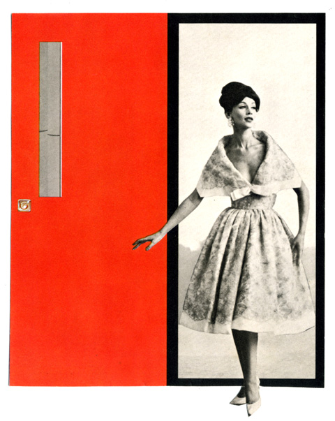
Jane, gouache on illustration board, 10″ x 10,” 2009

This little ditty of a two night sketch is my contribution to the InLiquid 10×10 Benefit. It’s based on the cover of Jane Birkin’s adorably batty 1973 record Di Doo Dah. In Liquid? Great outfit, local Philly art collective, resources network etc…  they are celebrating their 10th anniversary with a show of over 200 10″ by 10″ works. If you’re in Philly, check it here.

What’s Happening….

rucha

Okey doke. Back. Glad you are too. Not surprisingly, we’re picking up where we left off – you know, in no particular order – art, vintage illustration, glamour, technology, pop, punk, psychedelia, cats, the idea of squirrels, etc….

New stuff? Let’s see, what’s new?. Well, I swear bringing my own Ziploc bag of Fleur De Sel De Camargue Sea Salt to work may be the smartest thing I’ve done since July. I don’t care if it reminds you of Claire’s sushi lunch in the Breakfast Club – it’s magic. Unfortunately, though, it seems Project Donald Sutherland – the goal of which is to slim down to the point that I could flatteringly wear a turtleneck in the style of Donald Sutherland circa Klute, or, for that matter, James Coburn  – is not really happening. Now, Eve Babitz, who’s in that famous photograph, obscured, nude and fetching, playing chess with Marcel Duchamp. She’s happening.  Arundel, an off kilter little town in Maryland, a David Lynch by way of Robert Rauschenberg town – happening. Sketches of Jane Birkin. “The Wait” by Killing Joke. Valentina Terashkova. Edwige Fenech. Barbara Tfank. All happening. Estes Rockets have been on my mind a lot lately. And the fact that I used to play badminton with my dad when I was a kid. And finding a vintage shuttlecock made of a thick rubber and real tail feathers – lingering over contrast between the fluffy yet sturdy feathers and the powdery, matte, solid ball. Anyway, more very soon. A sketch of Jane Birkin, very probably.

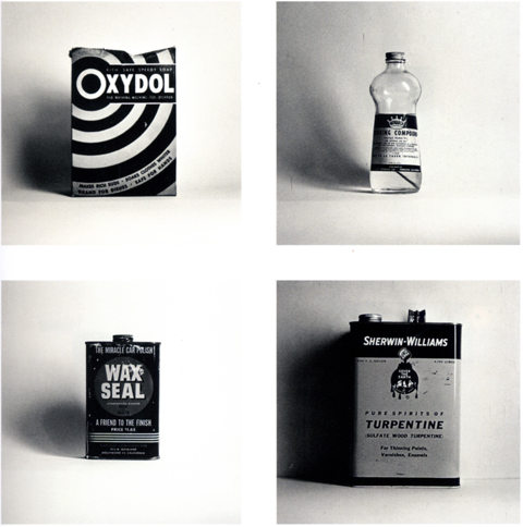
(Ed Ruscha, Oxydol, Rubbing Compound, Was Seal Car Polish, Turpentine, Gelatin silver print, 1961)

everyday things

Varshtat, gouache on illustration board, 10″ x 17,” 2009
spacer

Whew. That took long enough. Here’s a new one… a departure from exclusively figurative work, working up paintings from my own photographs. Early yet in this mode, but already deeply rewarding personally – circling around specific details indulges the miniaturist / Nicholson Baker fan in me, while testing the balance between impressionism and verisimilitude is endlessly absorbing. Nice to know a ramshackle workshop can be as compelling a subject as a young Shirley Maclaine. More upcoming.

A word on the title… Varshtat is what my father buy vicodin on the street called our workshop in Ukrainian. While this particular one was discovered during a road trip in rural New Jersey, it evokes our own perfectly. Growing up, in terms of utilitarian spaces the workshop was second in importance only to the kitchen. Now that I think about it, the satisfaction I get from realist painting, both in practice and as an observer, probably began there, with my father, losing ourselves in the underlying mechanics of everyday things. [larger image]

Summer Belle

godhelp

Those allergic to fey, turn away, now. The girl can u buy vicodin over the counter in mexico group version of Belle & Sebastian is upon us and it’s the bee’s knees. Stuart Murdoch adopts a Phil Spector/Kim Fowley role here (without, of course, the oogy, mad, leering vibe that darkens their reputations.) The tunes are elaborate, orchestrated melodic scaffolds built on the basic Belle & Sebastian model. Over them he drapes vocals one by his three belles, steps in for duets on two track, and on one brings in Neil Hannon from The Divine Comedy for a great campy cameo. The result is basically a survey of British girl group styles, from the Bacharachy swing of Sandi Shaw, to the alabaster soul of Dusty Springfield, to any number of long forgotten Decca girls like The Orchids, Louise Cordet or Susan Hampshire. It’s an incredibly rich listen – wide eyed and big hearted, swaggering and campy, and it sounds like a stack of singles and yet song by song, scene by scene, tells a story. Huzzah! Songs of the summer…

Here, for your pleasure, is a choice cut and two classic fab British girl group sides:

God Help The Girl:

Louise Cordet: Two Lovers

Susan Hampshire: When Love Is True


Under the Sea

zollano_small

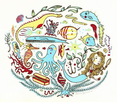
So, I imagine a gizmo consisting of a sheet of heavy paper underneath four pens – red, blue, yellow, and black – held in a lattice of yarns and pulleys that lead to a net of exquisitely sensitive rubber pads. The rubber pads line the inside of a wide brimmed cloth hat. The hat is on my daughter’s head, she is on her bed, holding her stuffed manta ray and riffing on her general enthusiasm for fish, mermaids, aquatic dinosaurs, etc… the pulses of her noggin are picked up by the rubber pads and transmitted down the yarn, tugging and pulling the pens across the paper and rendering a scene that looks exactly like this print by Baltimore illustrator Jaime Zollars.

Lord Jim! I like the cut of your jib

lordjim_small

The graphic design of the various phases of the Modern Library edition is well, well trawled territory, yes, but this is a particular favorite. Every time I search through the clipping file I pull out this dust jacket and I’m flummoxed weather to frame it, paint on it, or emulate it… but I always pause to reflect on it’s graphic power. The compass rose is its aesthetic heart – its design belonging to the ages, its rendering and coloring thoroughly mid-century modern. Then there is the decorative contrast between the, again, utterly contemporary color blocking of the title, and the period flair of the authors name. Overall, these details are under-girded by two powerful compositional forces – the balance between the aged and modern background and the binding compositional echo across the spine. As for the book itself, as much as I respect it from a distance, I’d get out of its way if it were walking toward me, and on the whole I’d rather hang with Lucky Jim[larger image]

The Notorious Landlady

notorious_poster

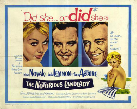
Four main dollops of delight here. (1) the world can’t have enough stylish, romantic, witty, caper movies. The Notorious Landlady is as fine an entry in the genre as you could hope for – excellent “did she or didn’t she” suspense, fab London locales, winsome romance, frothy dialog, and the funniest and most artful runaway wheelchair sequence ever filmed. (2) Jack Lemmon is, as always, good nature personified, a zephyr of good cheer (3) Sure, Kim Novak is foxy, flirty, etc… here she also directed her own costuming/wardrobe to wonderful effect. She alternates buy generic vicodin online between slightly wacky fashionista and a survey of late 50’s pinup styles – two modes which give the flick a tony flair with a consistently sexy icing. (4) Fred Astaire delivers one of the great hand talk performances of all time. I can only surmise that since he has no actual dance sequences he sublimated his moves into his hands – they are constantly in motion and once you notice them they are mesmerising, little miniature dances that embroider every scene he’s in. Top shelf entertainment, folks.

Edges

curbside_couch

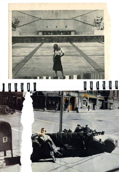
Recent sketchbook page (bottom painting by Martin Kippenberger, a “dandyish, articulate, prodigiously prolific artist who loved controversy and confrontation and combined irreverence with a passion for art,” accordinding to this, here.)

Aw Yeah Titans!

tt3
tt1
tt41
tt21
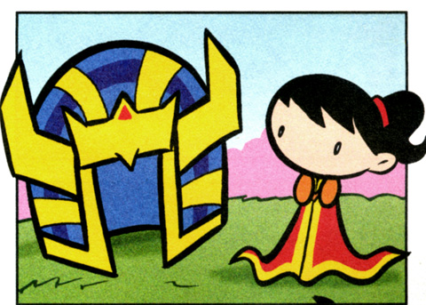
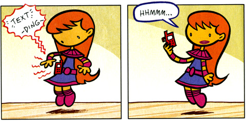
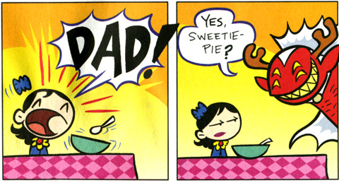
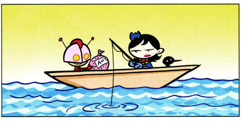
My daughter and I are both over the moon for Tiny Titans, DC Comics’ toddler takedown of their side-kick league. The graphic style is a note perfect blend of Jack Kirby’s blocky Biff! Bang! Pow! style and the emotive power and cuteness of Peanuts. The storytelling is a savvy remix of the source material – all the villains are reconfigured as hapless authority figures, all the adult superheroes as parents and guardians. The stories themselves are frothy little capers that squeakers will dig, with an additional level of meta commentary on the main DC universe for the nerds.

Dreaming a Beautiful

derek_stationary

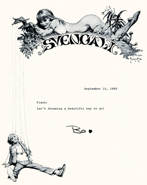
Master illustrator Frank Frazetta’s stationary design for addlepatted sun children Bo and John Derek’s movie production company, Svengali. I was going to leave the commentary at that, but I was riding my bike this afternoon, and the Walkman offered up Sheena, by Trader Horne, a long forgotten British psych-folk outfit. Hardly a stanza had passed when I realized the song was a tone poem to the idea of Bo Derek. I share it here, below, for your pleasure:

Sheena, Trader Horn:


Shore Salvage

bennydore1

Came across this poster in the most unlikely of surroundings, at a ramshackle shore antique shack, wedged in among worn beach furniture, weathered multicolored buoys, and nautical ephemera. Sheathed in its très mod silver frame, it stood out like a lost robot. The proprietor practically paid me to take it, as if its presence was harshing the salty laid back buzz of the place. Happy to make a home for it. The graphic itself is a wonderful http://www.mindanews.com/buy-imitrex/ distillation of an emblem or insignia… it reminds me of an old summer camp sign, merit badge, or military patch. Also, it’s as fine a specimen of the Futura typeface as you could want… The whole things emanates a great late 70’s design vibe, alternately earthy, crafty, matte and clean. (Not much to add about Benny Dore himself… basically a decent Danish artist and graphic designer of local repute.)