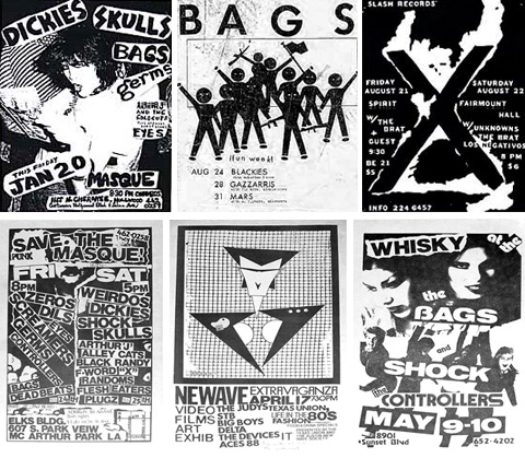
In terms of aesthetics, the classic punk rock flyer is a monument to the xerographic process. The conversion of the disparate source imagery to stark black and white is the primary source of it’s graphic power; unifying a roughly glued assemblage of random snapshots, cuttings from Seventeen, Vogue and the Orange County Register, hand drawn op art patterns and skeletons with martini glasses. The ultra high contrast exposure ladles on gobs of glamour and style. Faces loose all their middle tones, primary features gain mass and shape and everyone ends up looking like a cross between a mugshot and a Patrick Nagel painting. The effect is further enhanced by the translation of the intermediate tones into a coarse black and white grain. This texture, an important consideration in photography, is freely granted by xeroxing. The best flyers are a fusion of the direct urgency of underground publishing, order vicodin online overnight razor sharp glamour, fine art photography, the charm of the homemade, all screaming in the blaring tones of a tabloid.

Further reading: The most aesthetically rewarding period (for both music and flyers) was around 78-81, when the the notion of punk was subject to wildly different musical and stylistic interpretations. Punk rock flyer archives abound. One of the best selections is here. Also it’s well worth checking out the work of Mark Vallen. Vallen was a LA scene fixture and flyer artist (he did the original Decline of Western Civilization flyer and art for Slash magazine.) He currently works as a figurative painter and activist. His site features old flyers, albums, and fanzines, all accompanied by short thoughtful essays on punk design and scene culture. Forgive him, however, for the site design, which is comically awkward. It’s totally worth exploring fully… (flyers from Operation Phoenix Records)