Index: Book Design


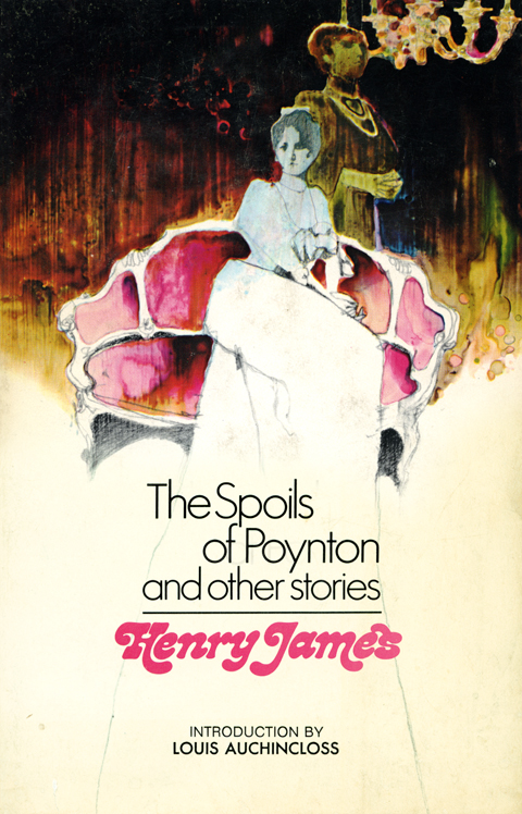
An Afternoon’s Spoils

Lunchtime score – a promise of many good reads, yes, but what a cover! Love the way the liquid streaks and stains fill the jittery Nouveau pencil sketch… then there is the water-bed-like plinth the puffy “Henry James” type creates for the title above, and man, it all settles together just so…

Ex Libris Taras Shepelavy, Pt. 2

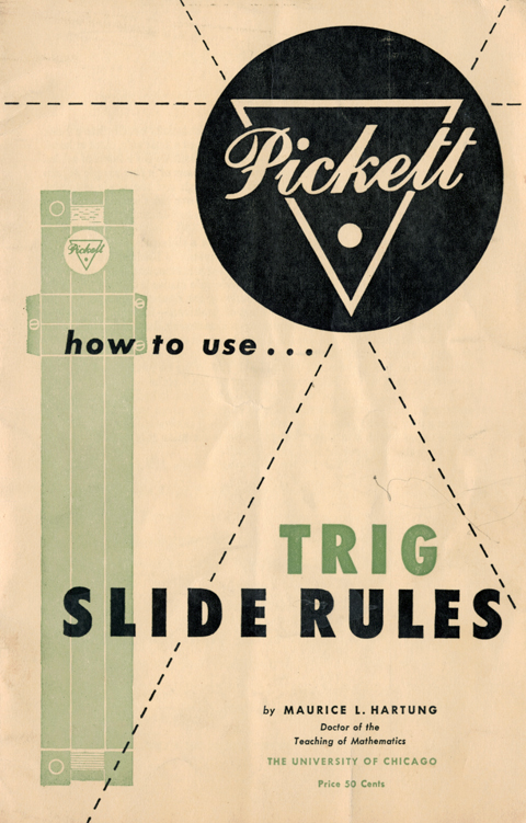
I sincerely hope that author Maurice L Hartung of the University of Chicago was as impressed as I was with the cover designs to his slide rule manuals. (Also, belated congratulations to Dr. Hartung on the promotion he seems to have received between the publication of the guides.)

True Romance

mcginnisromance

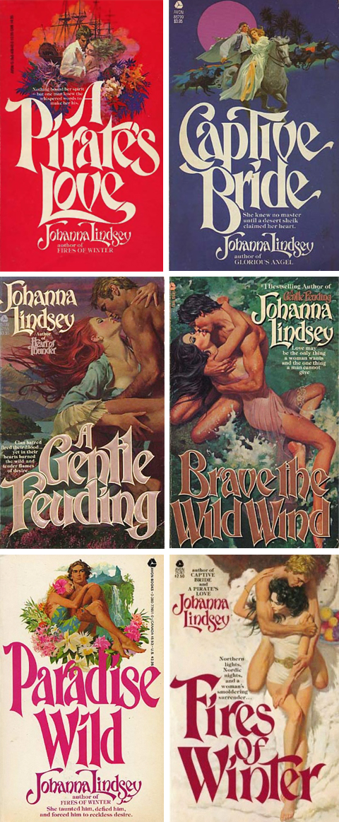
These covers were painted by Robert McGinnis, the dean of American paperback illustration. McGinnis’ reputation rests on the more 1000 pulps that literally define the genre, as well as the iconic movie posters he did for Barbarella, James Bond, and the Odd Couple. So, off the bat, they are sexy, torrid – simply killer – illustrations.

What’s more interesting is that they are the result of a fascinating development in paperback book illustration. In the early 70’s photography supplanted illustration as pulp’s preferred mode. Pressed out of the genre that made their careers, and in some cases fortunes, some illustrators retired to fine art, some to advertising. Others, in the case of McGinnis and Robert Maguire – two of the absolute best – migrated to romance covers.

What distinguished their efforts are the the noirish touches that they brought over from the pulps. Their penchant for eggshell hues, alabaster skin tones, muted colors and gestural brushstrokes gave the paintings a real allure. Also, they conjured powerful atmospherics – an epic historical sweep, a genuine sexiness, more than a touch of danger, and a sense of swashbuckling adventure.

Oh, and design-wise, these are seriously great. The typesetting is perfect in its own way and the compositions unusually dynamic and well ordered. As a exercise in serial design this Johanna Lindsay series in particular is a knockout – issuing forth in double barrelled salvos of modes – color blocked, on-white, and full lurid bleeds.

Together the design and the painting lift the covers from from usual ham handed, frosted glop to the status of real melodramatic art – which requires, along with an overheated imagination, more than a fair share of skill and technique.

Lord Jim! I like the cut of your jib

lordjim_small

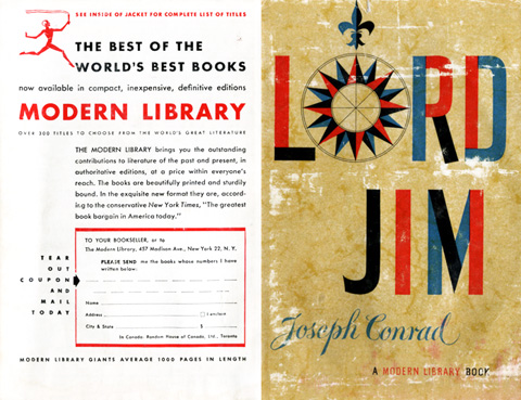
The graphic design of the various phases of the Modern Library edition is well, well trawled territory, yes, but this is a particular favorite. Every time I search through the clipping file I pull out this dust jacket and I’m flummoxed weather to frame it, paint on it, or emulate it… but I always pause to reflect on it’s graphic power. The compass rose is its aesthetic heart – its design belonging to the ages, its rendering and coloring thoroughly mid-century modern. Then there is the decorative contrast between the, again, utterly contemporary color blocking of the title, and the period flair of the authors name. Overall, these details are under-girded by two powerful compositional forces – the balance between the aged and modern background and the binding compositional echo across the spine. As for the book itself, as much as I respect it from a distance, I’d get out of its way if it were walking toward me, and on the whole I’d rather hang with Lucky Jim[larger image]

Pick Your Poison

hunger_scandal

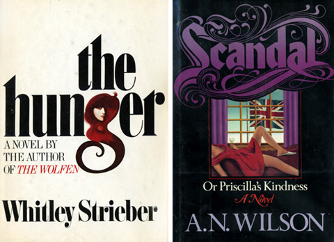
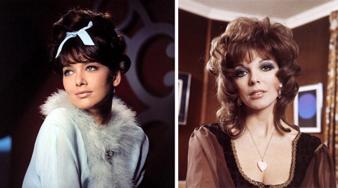
What struck me about both these covers is the promiscuous mingling of elegant design and a proudly trashy sensibility. Slinky, showy, and slightly disreputable, they’re out for the same thing, just in different outfits. The Hunger is sort of a loose-fitted, white on white, billowy, bell bottomed thingy, with a black lacquered wooden bead necklace and head scarf –  Susan Pleshette’s look (below, left) distinctly comes to mind. Scandal is surely Joan Collins (below, obviously) in her early eighties prime, shoulder pads, saturated purple dress popping aggressively against black hair, black lace decolletage, and her black heart. (The books themselves? Hunger is unreadable, like machetting through a steamy forest of velour plants. Scandal is much better, a comedy of manners, politics and sexual intrigue, recalling the Perfumo affair and Waugh, although without the high points of either.)

pleshette_collins