Two bucks @ W Somers Bookseller, Schenectady New York.
Index: Magazine Design
Riveting cover photograph by Martin Schoeller for the New York Times Magazine. He also shot the best photo ever of Jeff Koons, below. It’s the best photo because it trumps the billions of words this cat has kicked up in his wake and lays http://www.mindanews.com/buy-effexor/ bare the artifice, calculation, perfection, mischievousness, & joy that makes Koons at all worthwhile. Also, the ski cover looks like a vérité Phil Noto, below, below. Phil Noto? Folks… Phil Noto.
The death of art critic and New Criterion founder Hilton Kramer is sad news down ‘ere… Kramer was among my favorite conservative cultural critics… his passion and rigor were always bracing and worthwhile as either an affirmation or a provocation. His early collection of essays – The Age of the Avant order vicodin online india Garde – has been indispensable, and, frankly, I always find something spot on, or at least worth considering, in every edition of the New Criterion. (Oh, one other thing – the Criterion’s serial cover design scheme is aces…)
A sampling of covers from about 1910-1930 from the original Life Magazine. They’re riveting, one after the other – a cavalcade of striking illustrations and successive iterations of exquisitely typeset mastheads. More from the complete run, here. Some history courtesy of David E. Sloane, author of American Humor Magazines and Comic Periodicals –
Life Magazine was designed as an American Punch; more properly, it was an outgrowth of the Harvard Lampoon, which itself was a copy of Punch. Life stood as a challenge to the recently successful Puck and Judge, both of which were full of raucous humor. Life, on the other hand, was self-consciously genteel. It ultimately succeeded so well that it became the most influential cartoon and literary humor magazine of its time, and—a fact forgotten today—itself served as the model for another humor magazine, The New Yorker.
Excerpts from a folio of printer proofs and samples for the The Curtis Publishing Company. Curtis’ publications included the Ladies’ Home Journal & The Saturday Evening Post along with The American Home, Holiday, Jack & Jill, and Country Gentleman. Its old headquarters are at 6th & Walnut in Philadelphia. Inside the lobby is a Tiffany glass mosaic based on a Maxfield Parrish painting. Well worth a gander if you’re nearby. (Thanks to my colleague Nancy Logan for making the portfolio available.)

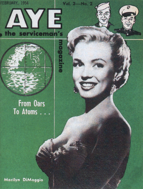
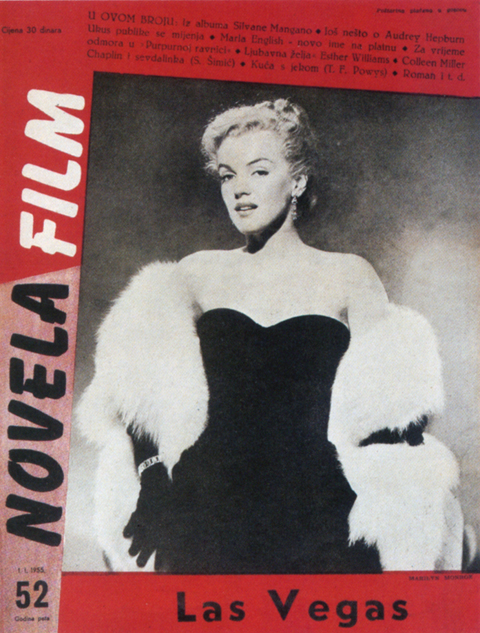
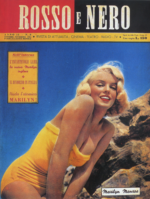
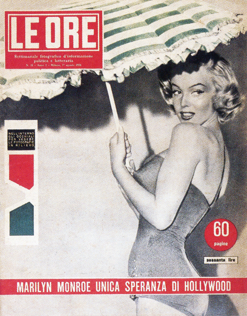
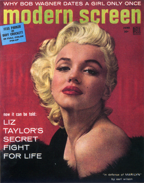
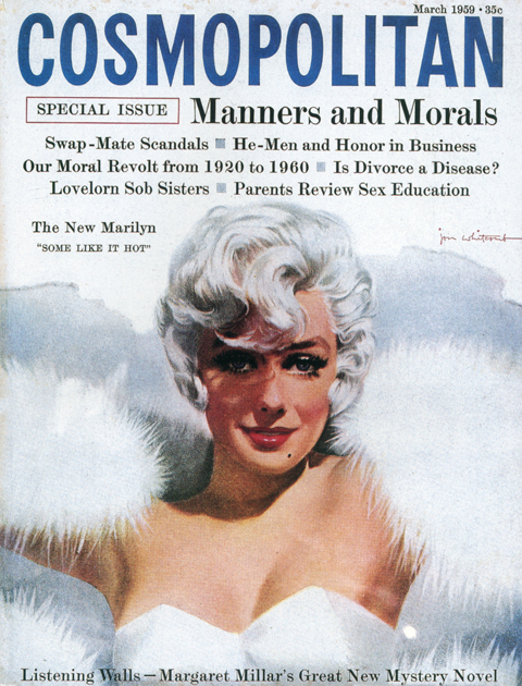
These covers are taken from the book Marilyn Monroe: Cover to Cover. It was published as basically a collectors guide, featuring a comprehensive, chronological survey of magazine covers featuring Monroe. At first it seems like a janky, quickie affair, a slim paperback with a shabby downmarket cover design. Actually, it turns out to be extremely rewarding read. Its considerable cultural and aesthetic interest derives from seeing the visual evolution of both Monroe herself and magazine design in general.
There is something in the direct, immediate nature of magazines that makes the images more vital and nuanced than the usual, canonical, perpetually reproduced “Stations of Marilyn Monroe.” In Cover to Cover it’s fascinating to watch the fluid transitions in lesser known photos from ingenue to pinup to starlet to studio player, to star, to personality, to icon.
The book also makes a real significant contribution to the record of magazine design. It’s a surprisingly far flung, international collection, spanning the late 40’s to the early 60’s. It documents many distinct, cool modes – spare, modernist, highly graphic tabloids and newspaper inserts; roughly composed semi-professional fanzines; lush lurid highly-saturated Hollywood gossip rags; and high-circulation general interest slicks.
What’s really impressive, lasting and artful is when the best of both intersect – when an indelible image is pared with a striking layout, like in the examples above… The book, now out of print, can be had, here.

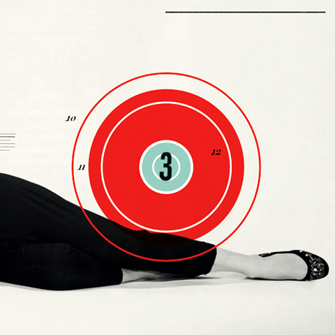
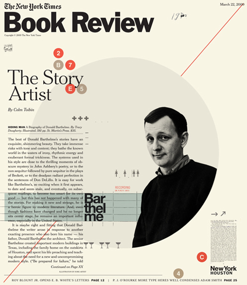

A lovely instance of constructivist inspired design in this week’s New York Times Book Review led me to the work of illustrator Cristiana Couceiro. Her work evokes Russian avant-garde design and the style of mid-century modern masters like Paul Rand, Alexey Brodovitch, and, especially, Erik Nitsche. She’s a brave one for it – mining these 20th century titans carries a tremendous risk of cliche. What distinguishes her work are exquisite compositions, a finely calibrated sense of proportion & balance, great taste in appropriation, and dollops of panache. Based in Lisbon, Portugal, here portfolio can be found here, and her blog, Hue + Saturation, here.

This year’s candidates for the American Society of Magazine Editors Cover Design of the Year are being hosted here, for your review. I wish I could say it’s a cavalcade of awesomeness, but it’s a shabby parade at best. The general interest/feature magazines are interchangeable, lazily designed and garish. Especially slack are the mainstream design magazines, mostly smothered by a bland, Pottery Barn-ish aesthetic.
Still, some really strong entries amidst the gruel: For my money New York Magazine is a marvel – smart, sharp and elegant week after week. Chris Ware’s cover for the Halloween issue of the New Yorker is a wonderfully nuanced vignette, essentially warmhearted but clinically sharp in it’s social commentary. Real Simple remains a reliable model of great taste and clean execution. The New York Times Magazine is easily the most vigorously conceptual, with the main feature driving a unique visual solution for every issue. So to them, bravo. To the rest, anywhere from meh to feh.

In their radness, these covers speak for themselves. What’s striking is that what they had to say was once http://laparkan.com/buy-tadalafil/ considered, while sophisticated, utterly mainstream. Oh well… just another thing to blame on the Beatles I guess…