Carter Brown? Here, and more here on the blog soon-ish… On Paul Ilton nothing, sadly, but he seems learned and earnest. Not sure the wanton luridness of the cover is what he had in mind. Oh well. The rest are self evident…
Index: Robert McGinnis
Carter Brown? Here, and more here on the blog soon-ish… On Paul Ilton nothing, sadly, but he seems learned and earnest. Not sure the wanton luridness of the cover is what he had in mind. Oh well. The rest are self evident…
Images and outtakes from my forthcoming article in Uppercase Magazine on romance cover art. It focuses on the formative years of the genre, in the early seventies. The liberated sensibilities inside the books called for equally brazen cover art. This need provided a welcome haven to a recently dispossessed group – the pulp and movie poster artists. In the mid sixties photography began to supplant illustration. Pressed out of the genres that made their careers, and in some cases fortunes, some illustrators retired to fine art, some to advertising. Others, in the case of Robert McGinnis and Robert Maguire – two of the absolute best, whose work is featured above – migrated to romance covers.
I did a post a while back on the same topic, focusing solely on McGinnis’ work, here. Also, while researching all of this, I came across the first four books, published in 1974/54 by Avon, that are credited launching the modern romance era – Kathleen Woodiwiss’ The Flame and the Flower and The Wolf and the Dove, as well as Rosemary Rogers’ Sweet Savage Love and Dark Fires.
Two aspects of these books had seismic implications on the genre: They were the first romance novels to be published initially as a paperback, to be distributed promiscuously and cheaply in 5 & Dimes and department stores; and the amorous coupling detailed within them got down to some frisky, frisky business. In detail. Thier ace covers are, in unfortunately lo-res, below.


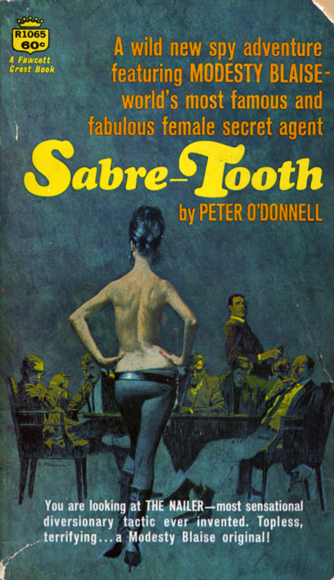
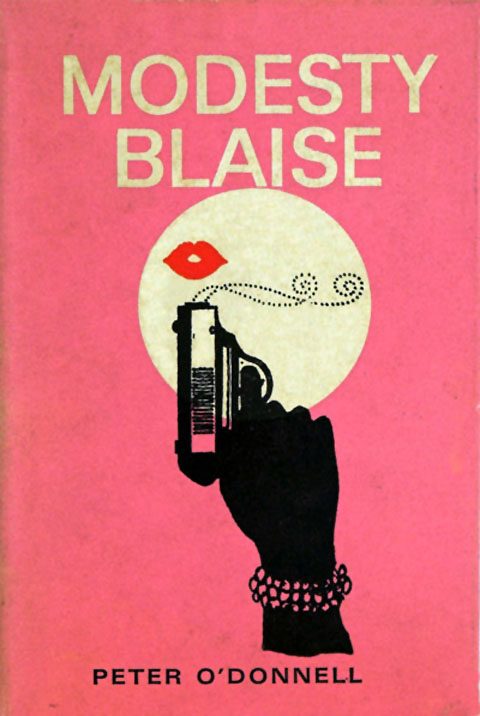
“Stateless by birth, British by choice. Multilingual. Expert at judo, karate, gem carving, smuggling, and exotic espionage techniques… Former master criminal who retired with well over a half a million sterling. Hobby: Danger… The worlds most dazzling female secret agent… Modesty Blaise.”
Blaise is the the sovereign princess of Spy-Fi, a shapely Venn diagram of the finest aspects of Flint, Helm, Palmer, and Bond. Whether in va-va-voom-ish comics or in expertly overheated novels, she was a triumph, as the New York Times put it, of the “hyperbolic imagination” of Peter O’Donnell, who died this weekend…
The thing is, the “hyperbolic can i buy vicodin in cancun imagination” is among the hardest sensibilities to wield. Kitsch, absurdity, sentimentality, schmaltz, and general idiocy lie on all sides of its narrow beam. But when expertly trained, nothing can match its light and heat – and therein lies the true measure of O’Donnell’s accomplishment and as well as the weight of his absence.
(above, pulp maestro Bob McGinnis‘s covers for the first three Modesty Blaise novels, plus the first edition of the debut)

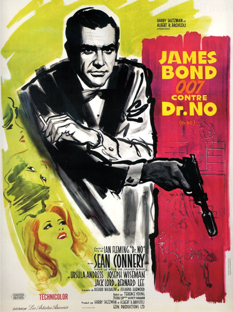

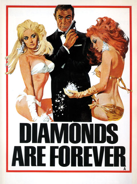
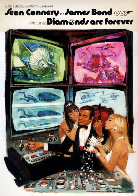
Macario Gomez, Spanish 39×27, 1963
Boris Grinsson, French 63×47. 1963
Averardo Ciriello, Italian 79×55, 1965
Robert McGinnis, British 30×20, 1971
Robert McGinnis, British unused art, 1971
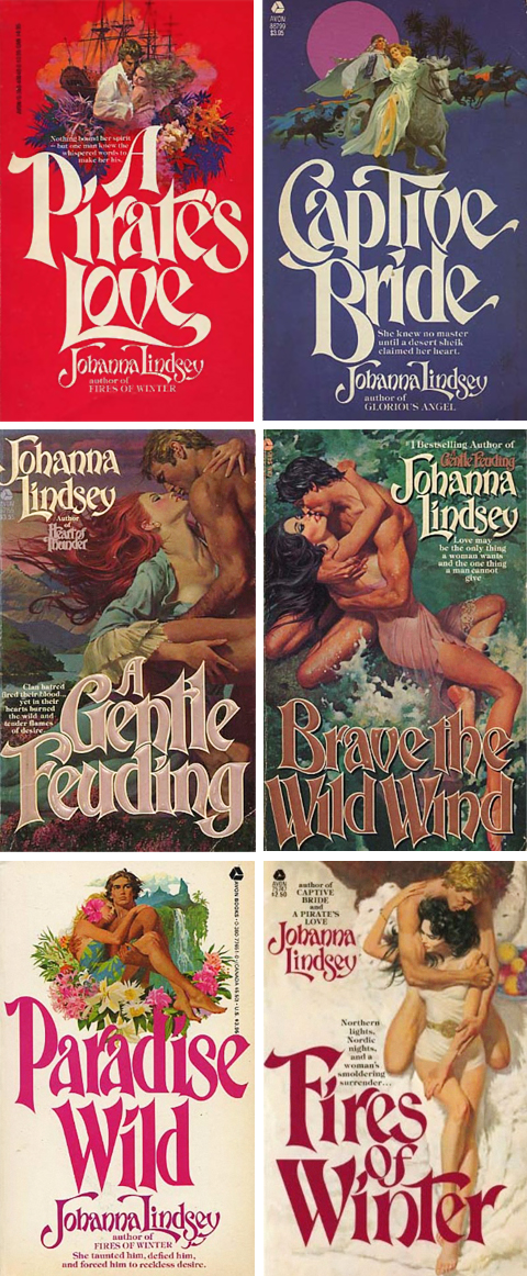
These covers were painted by Robert McGinnis, the dean of American paperback illustration. McGinnis’ reputation rests on the more 1000 pulps that literally define the genre, as well as the iconic movie posters he did for Barbarella, James Bond, and the Odd Couple. So, off the bat, they are sexy, torrid – simply killer – illustrations.
What’s more interesting is that they are the result of a fascinating development in paperback book illustration. In the early 70’s photography supplanted illustration as pulp’s preferred mode. Pressed out of the genre that made their careers, and in some cases fortunes, some illustrators retired to fine art, some to advertising. Others, in the case of McGinnis and Robert Maguire – two of the absolute best – migrated to romance covers.
What distinguished their efforts are the the noirish touches that they brought over from the pulps. Their penchant for eggshell hues, alabaster skin tones, muted colors and gestural brushstrokes gave the paintings a real allure. Also, they conjured powerful atmospherics – an epic historical sweep, a genuine sexiness, more than a touch of danger, and a sense of swashbuckling adventure.
Oh, and design-wise, these are seriously great. The typesetting is perfect in its own way and the compositions unusually dynamic and well ordered. As a exercise in serial design this Johanna Lindsay series in particular is a knockout – issuing forth in double barrelled salvos of modes – color blocked, on-white, and full lurid bleeds.
Together the design and the painting lift the covers from from usual ham handed, frosted glop to the status of real melodramatic art – which requires, along with an overheated imagination, more than a fair share of skill and technique.