


[RERUN: Originally Aired Sept. 2009 / An old favorite lost in the great SQL database corruption of 2012. I never tire of thinking about the electric confection that is Fellini & Manara’s Trip to Tulum, so here it be. Admittedly dated by my still fresh allergic rejection of the very idea of Zac Snyder’s appalling adaptation of Watchmen}
Comics, and the ghostly fascination of those paper people, paralyzed in time, marionettes without strings, unmoving, cannot be transposed to film, whose allure is motion, rhythm, dynamic. It is a radically different means of addressing the eye, a separate mode of expression. The world of comics may, in its generosity, lend scripts, characters and stories to the movies, but not its inexpressible secret power that resides in that fixity, that immobility of a butterfly on a pin. –Federico Fellini
The graphic novel Trip to Tulum has its roots in an aborted film of Fellini’s called the Journey of G Mastorna. Fellini’s entry in the “whoa… he was dead the whole time” mini genre, the movie was plagued by strange mishaps throughout its production. Already haunted by nightmares, Fellini threw in the towel after a huge Gothic church set collapsed minutes after it had been erected. The script and its attendant themes and vignettes sunk back into Fellini’s imagination. Over time bits and pieces floated to the surface in other films.
Fellini’s affection for comics and graphic storing telling is well known. In the mid 80’s, he allowed an Italian newspaper to serialise a version of the story, now called Trip to Tulum, with accompanying illustrations by Milo Manara. Manara, mostly known for his tony, Euro sci-fi erotica, is an illustrator and artist of the highest caliber. When Manara wanted to expand the story into a graphic novel, Fellini agreed, and took to the collaboration with gusto.
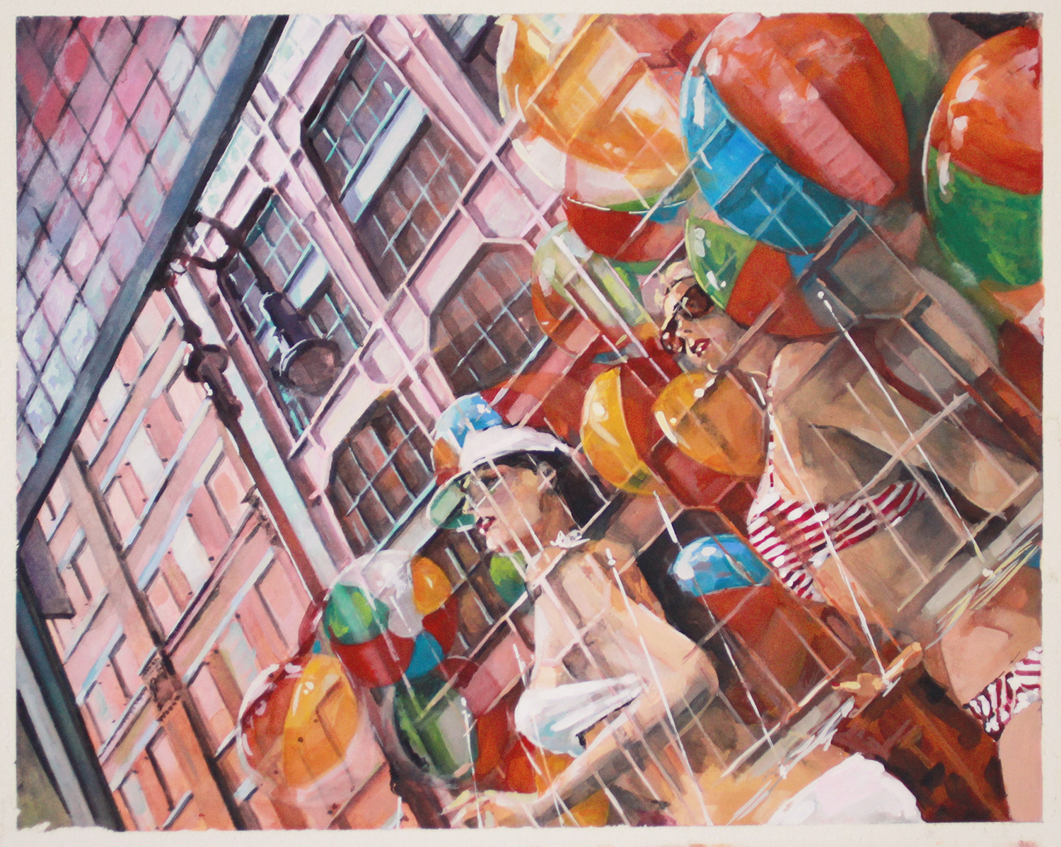
The result is simply one of the lost classics of the form. It begins with a stunning Anita Ekberg ringer finding Fellini asleep on the edge of pond in a a lush grove swept through by gusts of wind. Fellini’s hat flies off and as she reaches to grab it she falls in. Swimming after the sinking hat she descends to a vast, surreal field of sunken planes and ships. It emerges that they are all physical manifestations of Fellini’s films and unrealized notions. On one plane she finds a nattily dressed, kelp encircled Marcello Mastroianni, and…. oh never mind, from there the story just unfurls from one scene to the next like wax balls in a lava lamp… it’s a frisky fantasy adventure, a hallucinatory dream, a self referential commentary, an allegory of film-making, and finally a meditation on the creative act itself. Out of print now, copies can be found here.
(Incidentally, the Fellini quote is one of the definitive statements on the relationship between movies and comics. The notion of characters on “loan” lies at the heart of Chris Nolan’s respectful yet inspired cinematic interpretations of Batman. Its warning against literalism is precisely what an earnest vulgarian like Zach Snyder does not understand – which is why there is nothing whatsoever to be gained, and everything to be lost, in seeing Watchmen)


