


Table of Contents: Movies


Delightfully designed opening credits for the 1971 film Mrs. Pollifax – Spy. They were done by Don Record, who also did titles for flicks like Downhill Racer, Flareup, and the magnificent Cleopatra Jones. Among his oeuvre is a personal favorite – Smile, the 1970 California beauty pageant mockumentary featured in a post in the first few weeks of the blog – here.
Mrs. Pollifax is a oddball spy spoof about the recently widowed Mrs. Emily Pollifax of New Jersey. Restless and idle, she shows up at CIA headquarters looking to volunteer for spy duty. Technicolor, wood-paneled, skinny-tied hilarity ensues…


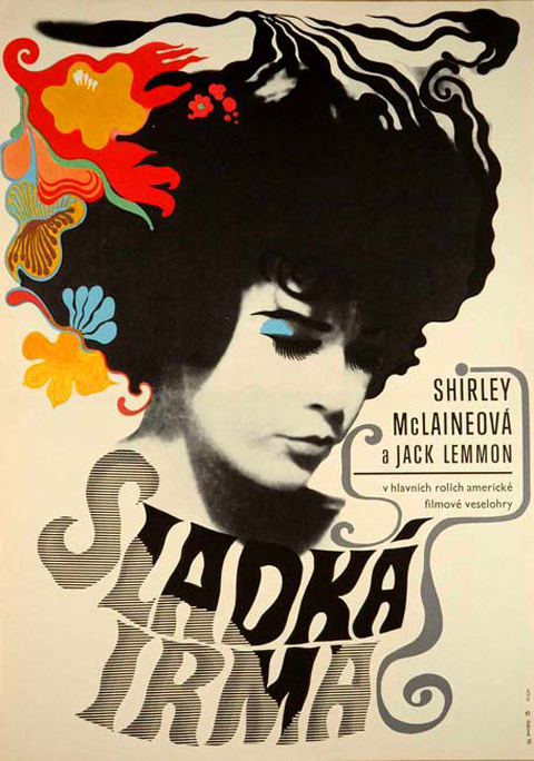
You’d expect the artwork for Irma La Douce to be top drawer. The pedigree is peerless – the 1963 comedy starred Jack Lemmon and Shirley MacLaine. It was directed by Billy Wilder. This bawdy confection sits in the middle of one of the insanely great runs of film making, starting with 1957’s Witness for the Prosecution, continuing with Some Like It Hot, The Apartment, Irma, the unjustly maligned Kiss Me, Stupid, The Fortune Cookie, The Private Life of Sherlock Holmes, until 1972’s Avanti!
So yes, sharp stuff – stylish and well executed modernist film poster design. It’s the depiction of MacLaine, though, in each that just knocks your socks off. The caricature developed for the American poster captures her essence perfectly. The typically lysergic Czech poster taps into her undercurrent of sultriness. If anyone ever deserved to be described as a cocktail, it was the young Shirley MacLaine – a fizzy syrup of pixie-ish mischievousness, good-natured lasciviousness, perfectly balanced between sweet and tart.

A crop of my favorite photograph of Elizabeth Taylor. It was taken on the set of Cleopatra by Bert Stern, the photographer most famous for shooting Marilyn Monroe’s last sitting. Its smeared, caked-on, over-saturated magnificence embodies Taylor’s presence perfectly. The world is dimmer in her absence.

Heavy advertising squalls have cruelly delayed my hearty encomium to Jane Russell. The poster for 1955’s Underwater will have to serve – it’s a testament to the sheer strength of her primal appeal. She was a veritable cinematic Helen of Troy, driving Howard Hughes bonkers, launching project after project in her honor. The whole of Underwater starring Jane Russell? Just that – Jane Russell in a swimsuit, underwater – a lusty notion begetting an entire film. Viva, viva Jane! (Poster via Pulp International – a site well worth your frequent perusal…)


A slinky, sneaky, lurid, brassy adieu to Mr. Kiss Kiss, Bang Bang – composer John Barry, who died this week. A fine profile from a few years ago, in Vanity Fair, here.


A most excellent series of handcrafted hemp-soaked vignettes by photographer Neil Krug and his wife, model Joni Harbeck. Krug had long harbored a desire to shoot in a style that would evoke Bob McGinnis’ paperback cover paintings. One frisky late night while fooling around with a Polaroid camera, some expired film, an Indian headdress and a cigarette, the couple stumbled on something close – a sunburnt, grainy buy vicodin in spain instance of pulp. This led to a formal series, Pulp, which drew on Sergio Leone westerns, weathered thrift store records, Italian giallo flicks, and woolly late night b-movies for inspiration. The project culminated in a hardbound LP sized book, available this month, here. Both their Flickr pools and websites are worth visiting – here, here, and here – as is an interview with both, here.


Few movie directors have given me more sheer pleasure than Blake Edwards, who died last week. I adore the widely underestimated 10 (1979), which over the decades has developed an undeserved and cheap reputation as merely a Bo Derek ogle-fest. Actually, it’s a sophisticated mid-life crisis farce, and perfectly illustrates the best of Edwards’ sensibility – witty, sharp, smart, brilliantly physical, elegant, bracingly vulgar, lusty, and really, really, really funny. I never tire of watching the Party (1968), Edwards’ monument to Peter Sellers’ gifts as a mimic and physical comedian (the inclusion of the fetching Claudine Longet doesn’t hurt either)
He is just as rewarding in other modes besides comedy – Experiment in Terror (1962) is a tightly wound little thriller with an ace soundtrack; Darling Lili (1969) is a fascinating passion project, a epic melodramatic spy musical starring his wife-to-be, Julie Andrews. Lili was mangled by studio interference, an experience that then inspired S.O.B. (1981), one of the great venomous Hollywood satires, starring the magnificent Richard Mulligan, from TV’s Soap.
Above all, though, I cherish the first two Clouseau flicks, The Pink Panther (1963)and Shot in the Dark (1964). (Even the trailers for these films, here & here, are fantastic.) They are supreme achievements – cathedrals of hilarity – that elicit laughter so pure, so hearty that they re-affirm, I think, something of the miracle of human existence.


These covers are taken from the book Marilyn Monroe: Cover to Cover. It was published as basically a collectors guide, featuring a comprehensive, chronological survey of magazine covers featuring Monroe. At first it seems like a janky, quickie affair, a slim paperback with a shabby downmarket cover design. Actually, it turns out to be extremely rewarding read. Its considerable cultural and aesthetic interest derives from seeing the visual evolution of both Monroe herself and magazine design in general.
There is something in the direct, immediate nature of magazines that makes the images more vital and nuanced than the usual, canonical, perpetually reproduced “Stations of Marilyn Monroe.” In Cover to Cover it’s fascinating to watch the fluid transitions in lesser known photos from ingenue to pinup to starlet to studio player, to star, to personality, to icon.
The book also makes a real significant contribution to the record of magazine design. It’s a surprisingly far flung, international collection, spanning the late 40’s to the early 60’s. It documents many distinct, cool modes – spare, modernist, highly graphic tabloids and newspaper inserts; roughly composed semi-professional fanzines; lush lurid highly-saturated Hollywood gossip rags; and high-circulation general interest slicks.
What’s really impressive, lasting and artful is when the best of both intersect – when an indelible image is pared with a striking layout, like in the examples above… The book, now out of print, can be had, here.


Some years ago I attended an evening of mime by Marcel Marceau, an elaborate exercise in aesthetic purification during which the audience kept applauding its own appreciation of culture and beauty, i.e., every time they thought they recognized what was supposed to be going on.
So begins Pauline Kael’s Tourist in the City of Youth – a comprehensive take-down of the circus of bullshit in, and in the wake of, Michelangelo Antonioni’s Blow-Up. Published in The New Republic in 1967, it’s a thrilling, bracing read, swinging from one exquisite demolition to the next.
She nails the hypocrisy of “highbrow” art’s seeming disdain for pop culture while simultaneously drawing strength and vitality from it. I adore her reminder that, for all the easy moralizing, the frisky, colorful, grass infused Mod scene the movie depicts seems, if not harmless, more than a little, um… fun… A big chunk of the essay dismantles the cheap profundity of lazy symbols, easy targets, and disingenuous critics:
People seem awfully eager to abandon sense and perspective and humor and put on the newest fashion in hair shirts; New York critics who are just settling into their upper-East Side apartments write as if they’re leaving for a monastery in the morning… a surprising lot of people seem willing to accept assumptions such as: the fashion photographer is symbolic of life in our society and time; he turns to easy sex because his life and ours is empty, etc. Mightn’t people like easy sex even if their lives were reasonably full? And is sex necessarily empty just because the people are strangers to each other, or is it just different? And what’s so terrible about fast, easy success? Don’t most of the people who cluck their condemnation wish they’d had it?
Aces, just aces. The whole thing is a masterpiece of dense, sharp, and admirably personal criticism, sure, but given its scope and depth it’s practically an aesthetic and cultural manifesto. She’s arguing, as always, for honesty and passion, yes – but what she’s really getting at, what she finds unforgivable, is the emotional distance, the “knowing” disconnection in both filmmakers and critics from their ostensible subject. “Love-hate is what makes drama not only exciting but possible,” and what she loathes, justly, is the lack of love.
ABOVE: absolutely killer cover art for Kael’s perfectly titled 1968 collection of criticism, and the iconic poster for Blow Up (more on its graphic significance here.)

Rex Reed and Raquel Welch on the set of Myra Breckinridge. Those looks of concern and finger gnawing anxiety? They’re watching a zonked, manic director losing control amidst an anarchic shoot coming apart at the seams. Originally, I filed this photo away for the blog simply for it’s stylishness, and the opportunity to reference the legendarily disastrous filming. But the after three weeks of technical glitches, Tumblr disconnects, posting delays, hacked code, and Google-robot imposed Internet blacklist, I’m starting to relate to it a bit more personally.
As in many seemingly hopeless situations, however, inspiration can be found in Welch – who dusted herself off from this debacle, and was soon again in top form, appearing in Richard Lester’s bawdy, exuberant adaptation of the Three Musketeers. So, then, as goes Miss Welch, so goes the blog – onward and upward…

Absolutely stunning Japanese movie poster for Pasolini’s bewildering art house head scratcher, Teorema.

Thou shalt not show the law defeated, or the inside of a thigh, or lace lingerie, or a dead man, or narcotics, or drinking, or an exposed bosom, gambling, a pointing vicodin to buy gun, or a tommy gun. — This 1940’s photo stacks all ten cardinal sins forbidden at the time by movie studio self-censorship regulations into a ziggurat of sin. Aces.


Stills from the 1967 mod-noir detective flick Tony Rome, starring Frank Sinatra. As a caper the movie is solid if a bit by the numbers. As eye candy, though, it’s a glazed treat. Sinatra struts though the movie dressed basically like the old I.R.S. records logo – the contrast of his black suit and fedora with the sun addled Miami backdrops is one of the movie’s chief visual order vicodin online reviews pleasures. Adding to the decor are a scrumptious Jill St. John and the fabled Fontainebleau Hotel and Casino (which was also memorably featured in Goldfinger.) The title song is a decent fuzzy lounge swinger by Nancy Sinatra and Lee Hazlewood. It was followed by the solid, if slightly shabbier sequel, Lady in Cement, with Raquel Welch providing the ornamentation and Hugo “Moogy-Moog” Montenegro providing the stellar soundtrack.


A lot will be written, understandably, about Dennis Hopper’s indelible wild-eyed performances as an actor and his stature as a cultural iconoclast. More will be written, deservedly, about his gifts as a director (his 1980’s neo-noir the Hot Spot, with Jennifer Connelly and Don Johnson is a personal favorite…) Too little, unfortunately, will be written about him as an artist – as a photographer, painter, and patron.
Hopper, for all of his hippie-savage persona (and dissolute habits), was a man of considerable aesthetic gifts and a genuine passion for art (instilled in him, in that only-in-Hollywood-sorta-way, by non other than Vincent Price)
He found his home amidst the Pop Art scene, beginning in the early 60’s. He became a friend, collector and patron to Jasper Johns, James Rosenquist , Robert Rauschenberg , and especially, Ed Ruscha. In turn, they inspired Hopper in his own photography and painting – and over the years he built up a respectable oeuvre of solid, earnest work in the genre.
His paintings are the work, in the best sense, of a gifted http://www.mindanews.com/buy-paxil/ amateur – accomplished, passionate, but with visible effort and little transcendence. His photographs, on the other hand, are far more distinguished – characterized by striking graphic compositions, technical adeptness, and a young Jane Fonda. That is, Hopper had an eye & chops, yes, but he was also, um… Dennis Hopper. As a result the photography is goosed by the presence of his fellow famous young and restless – It’s like Ruscha or William Eggleston doing Hollywood candids.
Here’s the thing though – To view Hopper as derivative is to miss what makes him matter as an artist. Genres and styles are defined by a handful of brilliant outliers, driven by a primordial vision that guides their craft. They do the heavy work of clearing spaces in the cultural landscape. The vast majority of us who want a passionate relationship with art inhabit these spaces, either as viewers, artists, critics, or patrons. Hopper’s work, for me, is a testament to that dynamic – not to defining art, as much as living within it.


My goodness, I don’t remember these being so damn good looking…..

