Index: Pop Art


Some Things I Recently Saw In France

Shepelavy_Paris_Pulpit_Mary_Magdaline Shepelavy_Paris_MaryMagdaline_Organ Shepelavy_Paris_Standard_Boulangerie Shepelavy_Paris_Versailles_4 Shepelavy_Paris_Day_of_Triffids Shepelavy_Paris_Quay Shepelavy_Paris_Versailles_2 Shepelavy_Paris_Versailles_3Shepelavy_Paris_Les_Puces Shepelavy_Paris_DIor_Barbie Shepelavy_Paris_Dunno Shepelavy_Paris_Antiques_Saint_Maximin Shepelavy_Paris_Louvre Shepelavy_Paris_Republique

The pulpit beneath a carved depiction of the daily ecstasy and rapture of Mary Magdalene, The Basilica of St Maximin, Aix-en-Provence  the pulls of a small organ in the same Basilica  a standard roadside boulangerie, the A52 at Roquevaire, Aix-en-Provence  Some opulence in the Palace of Versailles  some unruly triffids spilling out in the 7th arrondissement  a mannequin on the Rue de la Fontaine au Roi  I spy you up there, above the frieze, amidst yet more opulence in the Palace of Versailles  Welcome to the opulence of the Palace of Versailles!  a folio at Les Puces  Dior Barbie  A horn of plenty amidst the opulence of the Palace of Versailles  An antique pair amongst antiques, St Maximin, Aix-en-Provence  Caryatids by Pierre Lescot in the Louvre  Marianne above the Place de la République

Tom Pfannerstil

[RERUN] A few months ago couple of years ago I was in Vegas for that Matador @ 21 shindig… Funny thing about Vegas for the occasional Logan’s Run/Disneyland casino-plex rooted visitor – when you head out into the actual, dust-whipped city you get that slight shifted-reality feeling, like when you travel abroad. That slightly off-kilter disjointedness is one of my favorite things about wandering around Vegas. My pal & I were returning from a few hands of profitable mid-day blackjack in grubby/glammy old Vegas when we spotted an old storefront window filled with poppy pop-art looking art. We docked the Prius and headed inside.

The Trifecta Gallery is a marvel, a sharply curated mix of figurative art. The prevailing sensibility is a mix of deft technique and topical whimsy. As I was scanning a particularly dense clump of work I paused on a painting of an over-sized, flattened Sun Maid raisin box. I’m an easy mark for this kind of thing, and have always found the Sun Maid herself pretty fetching. I peered in close, to take in the detail of the piece when I noticed that the shadow it cast had dimension to it. Damn buy vicodin canada thing was a sculpture. The owner, the open, warm, enthusiastic Marty Walsh, noticed me noticing the work and came over. We got to talking and after we established our mutual fondness and amazement for the piece she took me back to look at more. Two flat files drawers full – Blistex Tubes, popcorn boxes, notepads, lip balm, and a host of to-go cups. Each one slightly larger than life, and carved into soft block of wood.

They are the work of Tom Pfannerstill, from Louisville, Kentucky. Pfannerstill retrieves “trash” from the street, or as he puts it, “markers of a time… a tiny part of the fossil record, a small archaeological artifact.” He then crafts meticulous recreations which “touch on issues of commercialism and consumerism, but are mostly intended to be subtle reminders of the temporality of all things.” That they do, quite powerfully, and they impress with their sheer bravura technique as well. The pieces are modestly priced, and available through Trifecta. Just wonderful. And if you’re in Vegas, stop in. Walsh is a delightful host, and the place is part of a ramshackle series of interconnected galleries all work poking about in…

Under the covers

ValleyOfTheDolls

Problems_Updike

ImageDuplicator_Lichtenstein

So, recently, at one time or another I was reading these three books. As I piled then up to be re-shelved they struck me as having some strange communion with one another. Each spare, simple and striking, sharing some essential tone that I adore — perfect pop design in three modes, fashionable, nerdy, and electric. Each in there own right a great read, too. Updike and Lichtenstein need no additional cheerleading, but let me make a impassioned plea for Valley of the Dolls. What a empurpled pleasure. Read it, luxuriate in its plush vulgarity, then treat yourself to the Wiki rabbit hole you get to go down matching each character and melodramatic scenario with the real people and incidents that inspired then. Then the movie. Then the Roger Ebert / Russ Meyer luridly psychedelic quasi sequel Beyond the Valley of the Dolls. Then buy that film’s equally boss groovy soundtrack. You’re welcome.

The Zonk of Michael English

english11

english21

english3

From the 60’s to the early 80’s Michael English seemed to be directly wired into each decades most adolescent, swinging, aesthetic sensibility. He began as a founding partner of Hapshash and the Coloured Coat, a design collective that specialized in gig posters and scene graphics that helped define 60’s English psychedelia (I vastly prefer this work to it’s American counterpart – it’s zonk is far sexier and literally more cosmic)

On the cusp of the 70’s an airbrush and rainbow sensibility begins to frost the work. Redolent of pinball backglass art, van conversion detailing, and late era Vargas pinups, it veers from garishly exuberant to exuberantly garish. The veneration of chrome and reflectivity carry through into the 80’s as he settled into a glossy pop-realist mode similair to the work of James Rosenquist and Tom Wesselmann. The biggest shortcoming of this period is the relentlessly juvenile subject matter – Candy bars, soda cans, glass sundae dishes predominate. The renderings however, are an exquisite case study in the late 70’s/early 80’s obsession with glossy enameled sheens and reflections.

Regardless of the era, from psych sirens and candy colored UFO’s, to chrome balls and lipgloss swirls English’s career is a overlooked layercake of guilty pleasures. (The retrospective 3D Eye, is out of print but easily found online)

ED RUSCHA’S TOP TEN TOWNS

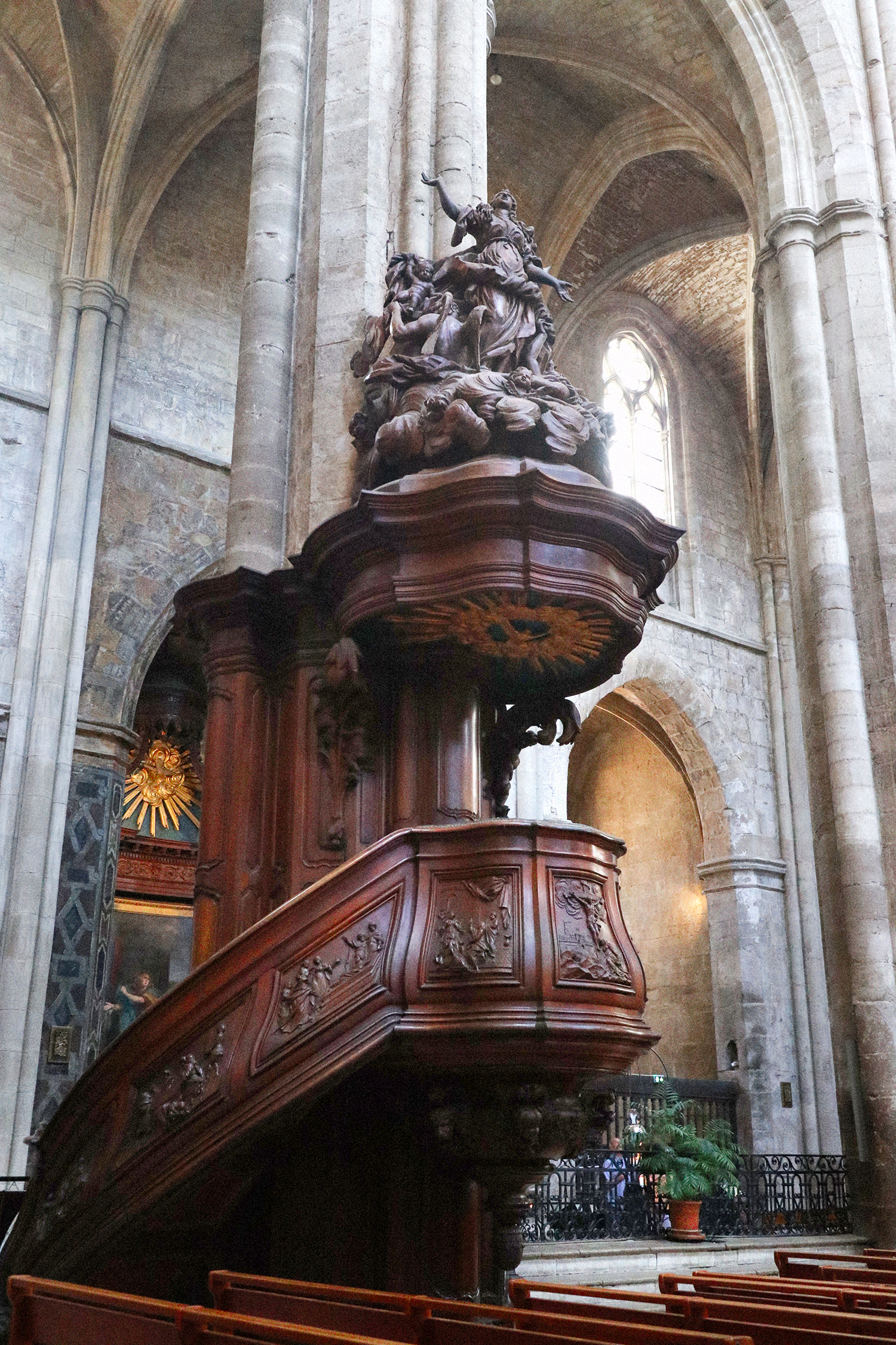
I. SAN FRANCISCO. Absolutely the most beautiful city in the entire world. With history, class, and cuisine, it’s a place of astounding mystery. l ask myself why I never lived
there. No answer.

2. WINSLOW, ARIZONA. An excellent stopover on P40 going east or west. Stay at la Posada, an ancient hotel with gardens, a library, art by Tina Mion, a wonderful restaurant called the Turquoise Room, and train tracks outside the back door.

3. RHYOLITE, NEVADA. A beautifully isolated mining ghost town in the dramatic setting of Death Valley. Nearby is Beatty, Nevada, with a homemade mini museum.

4. PAHRUMP, NEVADA. It’s a town that has yet to be built-not many houses, but lots of concrete curbs and partially paved streets. Somewhat of a bedroom town for Las Vegas.

5. NEW YORK CITY. It hits between the eyes. The culture is deafening, and noise is an essential ingredient. It’s the air shaft capital of the world. Everything American starts here.

6. AUSTIN, TEXAS. A beautiful town where bats live under the bridges. Home of lance Armstrong’s bicycle shop, remarkable barbecue, and lora buy vicodin shirt Reynolds’s art gallery. It’s not the musical capital of America, it’s close.

7. AMBOY, CALIFORNIA. Population: two, three, four? It’s, as they say, in the middle of nowhere. The buildings, among them Roy’s Café, are empty but very well cared
for. The post office is next to a tree lull of shoes. Desert winds, quietude…there’s something hospital clean about this tiny stop.

8. HARTSHORNE, OKLAHOMA. A lil’ country town that I always associate with my favorite baseball pitcher, Warren Spahn. It’s in the middle of America, but no way middle American.

9. SELIGMAN, ARIZONA. The Copper Cart café is all I remember. Once the fan belt capital of the world, now the interstate runs through its outhouse. A town where its past
and present are both gone-it’s worth investigating.

10. LOS ANGELES. After Oklahoma it is my adaptive home, but l only care about the central areas like Echo Park, Silver lake, Hollywood, Culver City, and Venice. On
occasion I go up to Mulholland Drive just to smell the ozone and listen to the city throb.

From W Magazine, May 2011

The Adventures of Mr & Mrs Jim & Ron

Flipping through a dense stack of auction catalogs I came across this oddity – an unassuming, glossy softcover book with a cheap, haphazardly typeset title, The Adventures of Mr and Mrs Jim and Ron. It’s a 1970 collaboration between poet Ron Padgett and pop expressionist artist Jim Dine.

The poems are just fantastic – prime specimens of a sort I’m a helpless sucker for. They’re short dreamy little narratives, shot through with strange shifts, breaks and fissures amongst the phrases. Odd juxtapositions emerge, only to be smoothed together by easy grammatical connections. It’s like a slow pan across a radio dial tuned to the psychic landscape of America – pocket buy vicodin reviews dramas, aspirations, product instructions, laconic observations, snippets of philosophy, fragment of bracing truths. They evoke, at times, Lydia Davis’ flash fiction, Ann Magnuson and Laurie Anderson’s brainy free associative monologues, Eve Babitz’s LA stories. Silver Jew David Berman’s poems too, here and there. Based on this book, this Padgett cat should be a joy to explore.

Jim Dine’s artwork is ok. I like Dine fine, and some of it’s sharp and smart (like the excerpts above), but the bulk of it is a too doodle-y and dashed off compared to the well turned poems they accompany. Still, the whole book is well worth tracking down.

Robert Longo’s Place

Shots taken by Todd Selby of Robert Longo in his studio. For me it’s the smudgy texture of everything surrounding his deep, velvety drawings. Especially evocative are the shots of his supplies – more like mechanics gear, overlaid with an archipelago of black smears. Everything here suggests a great physicality behind the smooth rich sheen and stark contrast of his finished work. Longo has compared his drawing style to sculpture, saying “when I draw with graphite I smudge it with my fingers, move it around physically, it’s like clay. Painting is painting on the surface, covering up, where drawing is putting the picture into the paper like a photograph.”

It’s a testament to their power that they retain a so much of this can u order vicodin online muscularity, materiality, and weight when hung in the hermetic space of a gallery. However, they seem especially at home in the studio. It’s like seeing a big ship being assembled in dry-dock from far overhead, and seeing the complex mechanics behind something that will later glide with such heavy grace on the water.

(Below for your pleasure, are a few selections from his iconic 80’s series Men in the Cities. They have, I think, aged particularly well, and seem, now, emblematic of their era rather than beholden to it. Longo also maintains an excellent, comprehensive website with generous galleries spanning his entire career. Also, Selby’s ongoing, long running series of arty glitterati in their homes is amazing and worth checking out frequently)

The Art of Dennis Hopper

A lot will be written, understandably, about Dennis Hopper’s indelible wild-eyed performances as an actor and his stature as a cultural iconoclast. More will be written, deservedly, about his gifts as a director (his 1980’s neo-noir the Hot Spot, with Jennifer Connelly and Don Johnson is a personal favorite…) Too little, unfortunately, will be written about him as an artist – as a photographer, painter, and patron.

Hopper, for all of his hippie-savage persona (and dissolute habits), was a man of considerable aesthetic gifts and a genuine passion for art (instilled in him, in that only-in-Hollywood-sorta-way, by non other than Vincent Price)

He found his home amidst the Pop Art scene, beginning in the early 60’s. He became a friend, collector and patron to Jasper Johns, James Rosenquist , Robert Rauschenberg , and especially, Ed Ruscha. In turn, they inspired Hopper in his own photography and painting – and over the years he built up a respectable oeuvre of solid, earnest work in the genre.

His paintings are the work, in the best sense, of a gifted http://www.mindanews.com/buy-paxil/ amateur – accomplished, passionate, but with visible effort and little transcendence. His photographs, on the other hand, are far more distinguished – characterized by striking graphic compositions, technical adeptness, and a young Jane Fonda. That is, Hopper had an eye & chops, yes, but he was also, um… Dennis Hopper. As a result the photography is goosed by the presence of his fellow famous young and restless – It’s like Ruscha or William Eggleston doing Hollywood candids.

Here’s the thing though – To view Hopper as derivative is to miss what makes him matter as an artist. Genres and styles are defined by a handful of brilliant outliers, driven by a primordial vision that guides their craft. They do the heavy work of clearing spaces in the cultural landscape. The vast majority of us who want a passionate relationship with art inhabit these spaces, either as viewers, artists, critics, or patrons. Hopper’s work, for me, is a testament to that dynamic – not to defining art, as much as living within it.

Seductive Subversion: A Survey of Women Pop Artists ’58 – ’68

Seductive Subversion: Women Pop Artists 1958 – 1968, on exhibit now at three gallery spaces at Philadelphia’s University of the Arts, is the first major exhibition of female Pop artists of the era. Its quite a reclamation project – planned over the course of four years, a majority of the work has not been shown in over forty.

The usual pop concerns are in play, with a heavy emphasis on the complexities of female iconography in mass culture. The art is on the whole great, if a little roughly hewn. Gems abound – Idelle Weber’s stark http://www.mindanews.com/buy-levaquin/ geometries and silhouettes, the provocative (if a little strident) photo-montages of Martha Rosler, and Dorothy Grebenak’s hooked wool rugs of Tide boxes, and Bugatti logos. Marjorie Strider’s Green Triptych balances genuine sexiness and wry commentary in equal measure, not an easy dynamic to pull off. The show runs until March 15. A catalog is forthcoming. Check it. (Roberta Fallon and Libby Rosof’s Artblog has a nice write up about the show here.)

Martha Rosler, Family Portrait with Car, 1966-72,
Chryssa, Ampersand IV, 1965
Rosalyn Drexler, Home Movies, 1963
Marjorie Strider, Green Triptych, 1963
Joyce Wieland, Young Woman’s Blues, 1964

Scrambled Metrics & Mixed Signals

colson8

colson5

colson3

colson4

colson1

Inert and broken rulers measuring only their own lengths, street signs so densely clustered they tie the very idea of place into a thick knot, stadium diagrams and timetables rotated and overprinted until they blur into unparsable eddies of information… at the heart of Greg Colson’s work lies a desire to scramble, smear, or re-frame the established order of things meant to communicate a sense of order. That all the work still emanates a steady signal of pure information imbues it with a bracing clarity, while the degree to which familiar information is scrambled accounts for it’s fascinating power.  I discovered Colson’s work in a remaindered copy of Giuseppe Panza: Memories of a Collector. Panza was a fervent enthusiast of post WWII modern art and among the earliest collectors of Rauchenburg, Rothko, Kline, and Lichtenstein (and a foundational donor to the Los Angeles Contemporary Art Museum). The book abounds in seminal and lesser known works by the greats (his Franz Kline collection is definitive) as well as top shelf lesser known artists, like Colson. Huge score, still in print, available here.

Mimmo Rotella

rotelli4

marylin

pepsi

As with most great pop art, the pleasures of Mimmo Rotella’s decollages are simple ones – expressive technique, flashy subjects, and a lusty joie de vive. Rotella tore away at lurid, glamorous and melodramatic Italian ads and movie posters, ripping and chemically dissolving them into something essential. In each case what is revealed is a burst of pure expression: shards of glamour, rough tapestries of melodrama, and blurts of type. Although critical appreciations of his work are often barnacled with pomo foolishness, they lead to fascinating places. He was a member of a European variant of Pop art called Nouveau Réalisme, which was founded in Paris by Yves Klein. Related philosophically and aesthetically to the Dada and Fluxus movements, it will certainly be a subject of further research… (By the way, what is it with all the Italians around here lately? Boldini, Disco Volante, now Rotella, an upcoming post on Virna Lisi…)

Why Pop?

We bargain in good faith, those of us who will read anything, hoping at least to complicate ourselves, at most to save our souls… we put up with a lot and forgive even more… in return for vitality, spontaneity, and the occasional hot flash, we pretend not to notice what’s skin-deep, addlepated, nasty, brutish, and short.

– John Leonard, review of ” The Diviners” by Rick Moody
New York Times, February 9, 2006