Index: Typography


Marshall McLuhan Book Covers

McCluhan_Cliche_To_Archetype

McLuhan_Medium_Massage

McCluhan_War_and_Peace

McLuhan_Understanding_Media

McLuhan_Mechanical_Bride

McLuhan_Guttenberg

The nuances of the cover to “From Cliche to Archetype” practically make it a little poem as much as bravura instance of typographic design. The font choices are perfection — Cooper’s proud plumpness giving way to the stylish severity of Univers. The rest of the covers, better known, are equally stunning and seemingly predict entire swaths of graphic design trend. Prescient cat, this one.

Some Swedish Type

Swedish_Record_Typography_2

Swedish_Record_Typography_3

Swedish_Record_Typography_1

So, recently I was over in Sweden visiting IKEA HQ (more on that, later-ish…) IKEA is located in Älmhult, a small picture postcard of a town. Quaint cobblestone square anchored by statue of Carl Linnaeus (you remember Linnaean taxonomy, yes? — three kingdoms, divided into classes, orders, families, genera, and species, eighth grade or so, feathered hair, Toughskins jeans, 3/4 black sleeved Cars T-shirt…sorry, pardon my corduroy reverie…)

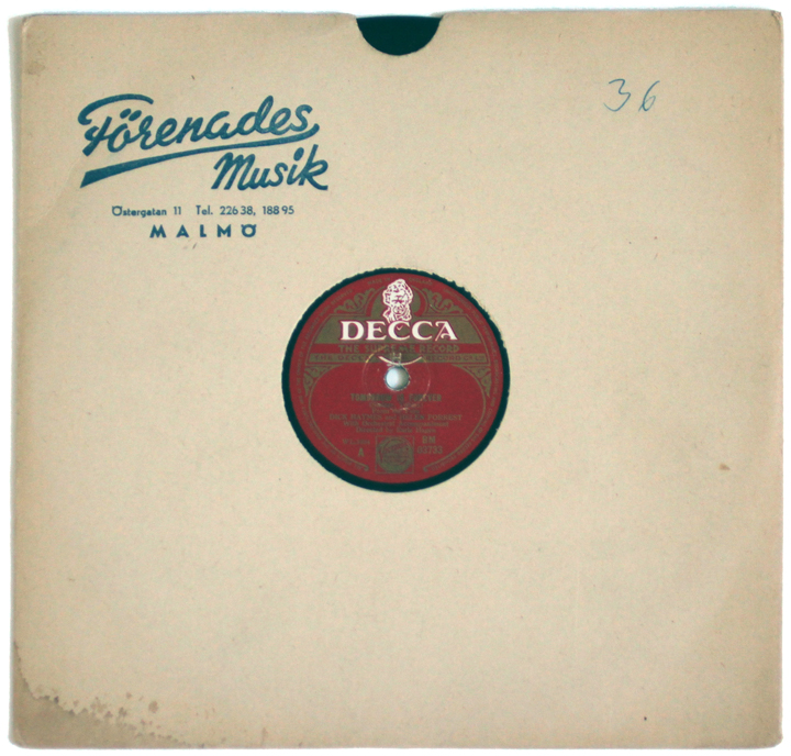
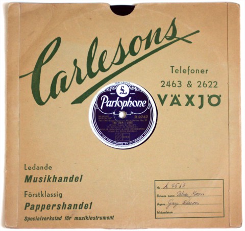
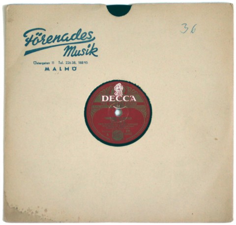
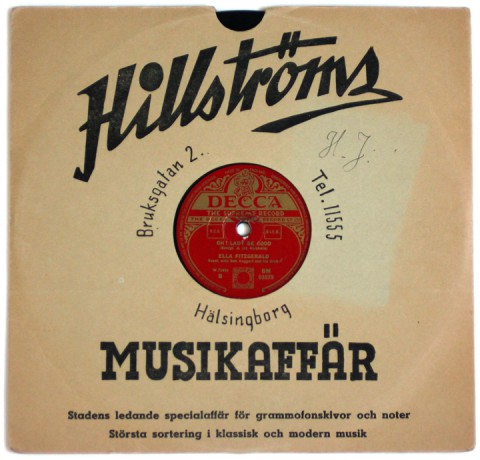
Anyway, I’m wandering around and happen upon a gas station / burger & ice cream hut / thrift store (!) where, between fan belts, spark plugs, a row of swedish potboilers, needlepoint, and axel grease, I spot these 10″ records in a crate.

What a score! Each one of these Swedish type compositions is gorgeous — and each anchored by a contrastingly dense, filagreed record label. Häftigt!

Etaoin Shrdlu

Etaoin Shrdlu – pronounced “eh-tay-oh-in shird-loo” – is a sounding out of the twelve most common letters in English, in order of frequency of use. The expression goes back to the days of linotype typesetting machines. (As an aside, if your unfamiliar with the details of this fantastic gizmo, spare a moment for the wiki entry… the thing’s an engineering marvel, and the lingo that sprouted out around it’s operation is wonderfully quirky) According to the internets “Were one to run a finger down the first and then second left-hand vertical banks of six keys on a linotype machine, it would produce the words etaoin shrdlu. Linotype machines were sometimes tested in this manner. Once in a while, a careless linotype machine operator would fail to throw his test lines away, and that phrase would mysteriously show up in published material. The full sequence is etaoin shrdlu cmfgyp wbvkxj qz.” Now you know, in case it comes up.

Sweet Savage Love

Images and outtakes from my forthcoming article in Uppercase Magazine on romance cover art. It focuses on the formative years of the genre, in the early seventies. The liberated sensibilities inside the books called for equally brazen cover art. This need provided a welcome haven to a recently dispossessed group – the pulp and movie poster artists. In the mid sixties photography began to supplant illustration. Pressed out of the genres that made their careers, and in some cases fortunes, some illustrators retired to fine art, some to advertising. Others, in the case of Robert McGinnis and Robert Maguire – two of the absolute best, whose work is featured above – migrated to romance covers.

I did a post a while back on the same topic, focusing solely on McGinnis’ work, here. Also, while researching all of this, I came across the first four books, published in 1974/54 by Avon, that are credited launching the modern romance era – Kathleen Woodiwiss’ The Flame and the Flower and The Wolf and the Dove, as well as Rosemary Rogers’ Sweet Savage Love and Dark Fires.

Two aspects of these books had seismic implications on the genre: They were the first romance novels to be published initially as a paperback, to be distributed promiscuously and cheaply in 5 & Dimes and department stores; and the amorous coupling detailed within them got down to some frisky, frisky business. In detail. Thier ace covers are, in unfortunately lo-res, below.

Crêpes?

Aren’t these the bees knees? These crêpe folding diagrams were excerpted from a cookbook that accompanied a used crepe maker I bought the other week. Printed in 1973, the thing is a compact testament to the enduring charms of simple, sturdy design – bold Akzidenz-Grotesk font, thick outlines, and a well chosen single pop color. Fin.

Kabel

Two splendid specimens of Kabel, a geometric sans-serif typeface designed in Germany and released in 1927. Further geekery -The  L’eggs name, package and logo were created by designer Roger Ferriter, working in legendary typographer Herb Lubalin‘s studio in 1969. And, of course we have the James Gang to thank for the indestructible boogie of Funk #49Sleep all day, out all night / I know where you’re goin’ / I don’t think that’s actin’ right / You don’t think it’s showin’, etc… (L’eggs logo from over at so much pileup)