Index: Vintage Design


Marilyn Monroe: Cover to Cover

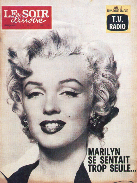
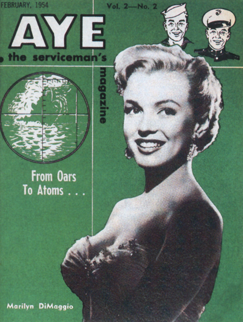
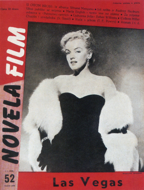
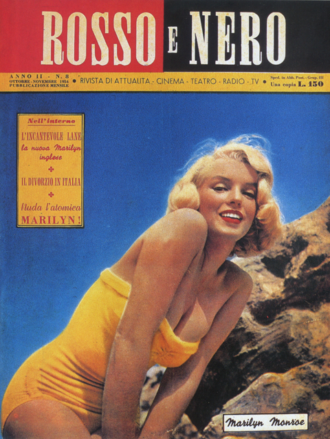
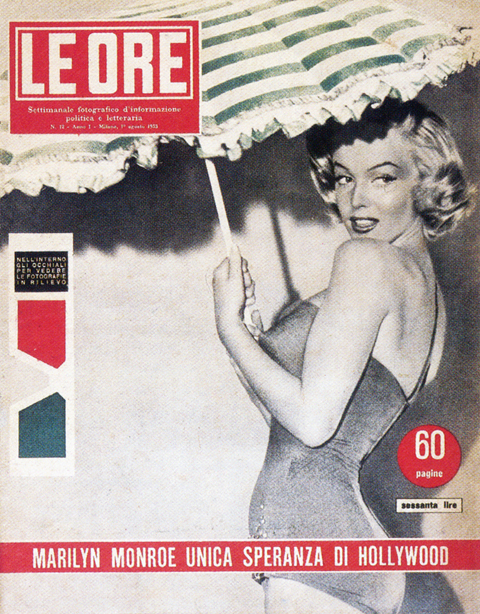
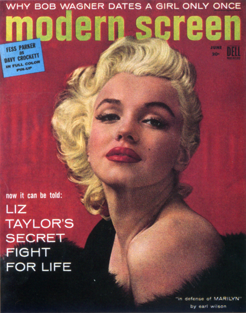
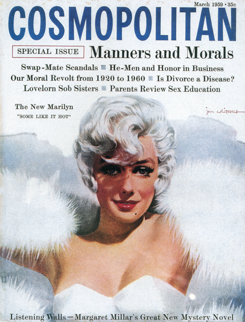
These covers are taken from the book Marilyn Monroe: Cover to Cover. It was published as basically a collectors guide, featuring a comprehensive, chronological survey of magazine covers featuring Monroe. At first it seems like a janky, quickie affair, a slim paperback with a shabby downmarket cover design. Actually, it turns out to be extremely rewarding read. Its considerable cultural and aesthetic interest derives from seeing the visual evolution of both Monroe herself and magazine design in general.

There is something in the direct, immediate nature of magazines that makes the images more vital and nuanced than the usual, canonical, perpetually reproduced “Stations of Marilyn Monroe.” In Cover to Cover it’s fascinating to watch the fluid transitions in lesser known photos from ingenue to pinup to starlet to studio player, to star, to personality, to icon.

The book also makes a real significant contribution to the record of magazine design. It’s a surprisingly far flung, international collection, spanning the late 40’s to the early 60’s. It documents many distinct, cool modes – spare, modernist, highly graphic tabloids and newspaper inserts; roughly composed semi-professional fanzines; lush lurid highly-saturated Hollywood gossip rags; and high-circulation general interest slicks.

What’s really impressive, lasting and artful is when the best of both intersect – when an indelible image is pared with a striking layout, like in the examples above… The book, now out of print, can be had, here.

Ishihara Test for Color Blindness

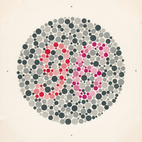
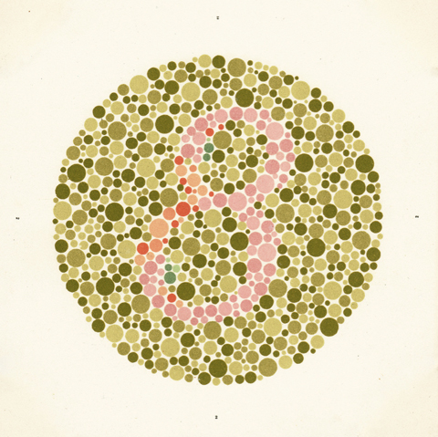
So, I was at the eye doctor the other day, getting examined in preparation for a little light surgery. After carefully assessing the accuracy of my vision, the nurse mentioned, almost in passing, that she needed to run a cursory check for color-blindness. She picked up a compact little folio and opened it, story-book like, in front of me and began to flip through it quickly. Each spread contained two paired prints composed of tightly packed colored circles. In each there was embedded a numeral. As she casually elicited successive impressions – 12, 96, 8 – whatever – I was astonished at how beautiful each plate was. The dense camouflage of dots, the flat pale color schemes, the simple geometry – each one was a little marvel. After the test was completed she left the folio on the counter – Ishihara’s buy vicodin 750 Tests for Colour-Blindness (Concise Edition) published by the Kanehara Shuppon Co, Tokyo, Japan.

An evening’s research turned up the following… The test is named after Dr Shinobu Ishihara, who developed the plates in 1916 at the behest of the Japanese Army to test color vision in it soldiers. He painted the plates himself in precise hues of watercolor. They were issued in an international edition the following year and are now, nine decades later, still in use, published in three editions of either 14, 24 or 38 plates. Eye Magazine did an informative, short piece about the plates, here. Editions are a bit pricey but available here. (I found the scans above among the following Flickr set.)

Wish I was here…

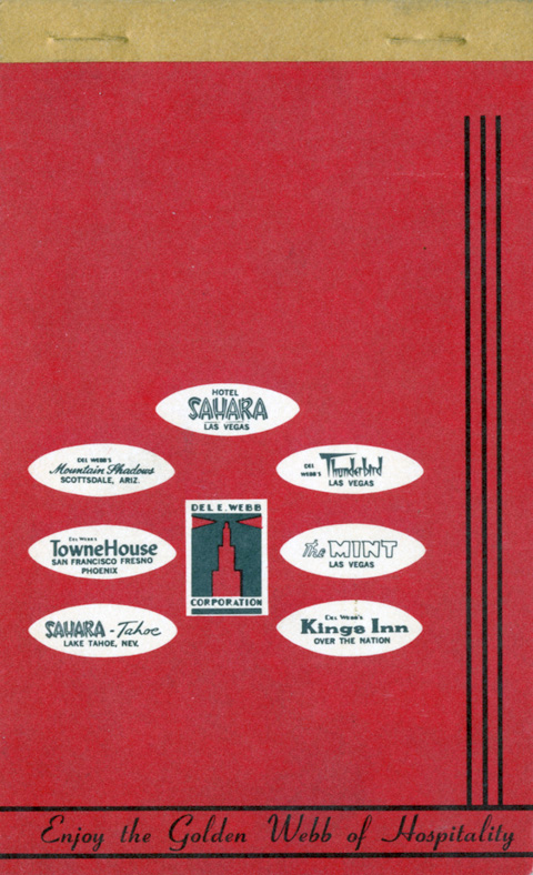
Given the way this week is going, I wish this notepad cover was dimensional portal rather than a simple piece of fab period ephemera. Oh well… This Del E. Webb’s an interesting cat. Time’s Man of Year in 1964, Webb, “a  Phoenix construction man with a can-do reputation” helped Bugsy Siegal build Las Vegas. From scratch. Interesting bio here.

Slide Rules


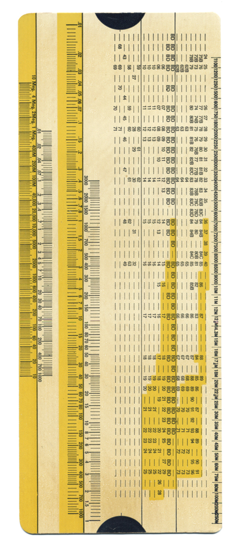
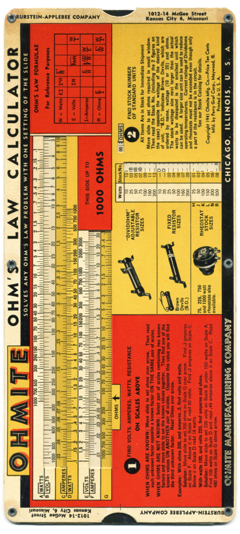
A couple of things here… The design of the gizmo itself has some unusually jazzy touches – The in-line rule and orange drop-shadow of OHMITE. The name OHMITE – so silver age Marvel Comics, the Jack Kirby renderings basically draw themselves. The gutsy outline type of OHMITE MANUFACTURING COMPANY. The Bodoni-ish fat numbers.

It’s just rad to see such a brawny and practical buy cheap generic vicodin online tool have so much swing and style. And the numerical card is sublime… just marvel for a moment at how something so thoroughly determined by accuracy and rigor can pulse with such deft, complex rhythms and hum with such simple grace.

A sliver of the Seventies…

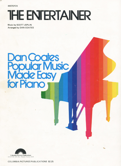
I was upstate recently, visiting family HQ, and while combing though the bookshelves I found these beautiful music sheets for Scott Joplin’s ragtime classic The Entertainer (you know, the opening credits to “The Sting” – and the infernal refrain from a million confounded ice cream trucks…) I especially love the sheer Apple ][-ishness of the Dan Coates version. And it does get me thinking buy vicodin topix about how much great 70’s design I must have marinated in at the time, scarcely aware. (Incidentally, it also occurs to me now that my piano teacher at the time had a white long haired cat that looked exactly like Ernst Stavro Blofeld’s cat and that during instruction, it too occasionally sat in his lap. Hurm… go figure.)

Erik Nitsche


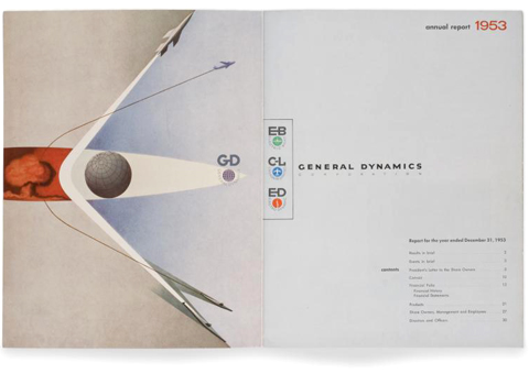
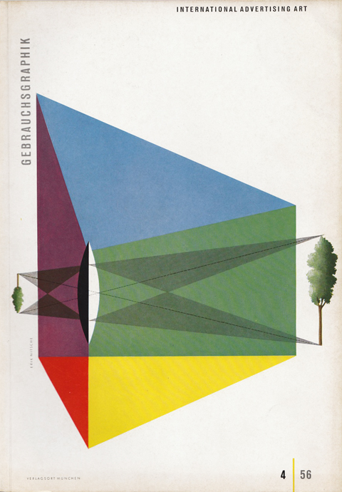
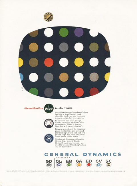
I like my Modernism with club soda and two limes… Which is why I am so taken with the work of Erik Nitsche; it is positively effervescent.

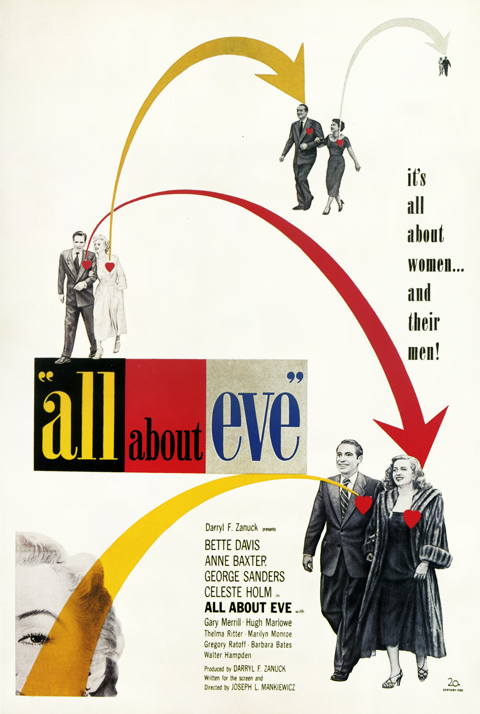
My affection for his work is rooted in repeated sightings of the same thing – his poster for the Betty Davis showbiz melodrama All About Eve. It’s one of my favorite pieces of design… the cutout photos, clean but playful layout, and the signature Missile Command-esqe fusillade of arrows. I’m struck every time I come across it, and it has been big influence on my aesthetic, especially my collage work.

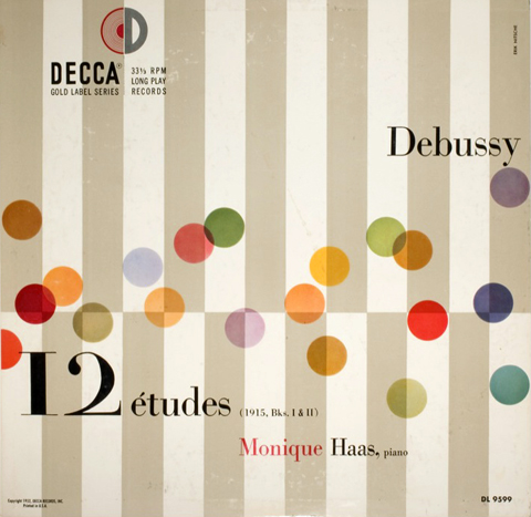
I finally did further research and discovered a wealth of amazing, brilliantly composed and crafted design that has since slipped under the waterline. Nitsche worked for a broad spectrum of clients including General Dynamics, Decca Records, Revlon, Saks Fifth Avenue, MOMA, 20th Centrury Fox, and the Container Corporation of America. Or to put it another way, across virtually the entire cultural landscape.

Poring over his work made me think of the title of a famous Mondrian – Broadway Boogie Woogie. It’s the painting whose emanations border on music, where the grid begins to pulse and shimmy. Piece after piece of Nitsche’s had this almost musical vitality – a backbeat of patterns and repetition over which he improvised variations punctuated with perfectly deployed grace notes and accents.

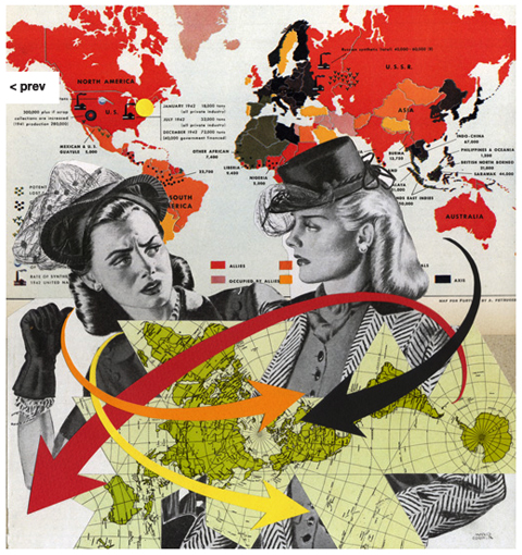
There doesn’t seem to be a published monograph or survey of his work, but you can cinch one together from across the inter-web. U&lc and New York Times Book Review art director Steven Heller wrote an excellent short biography and career assessment for Typotheque called the Reluctant Modernist that is well worth reading. BustBright, the after-hours studio of Los Angeles designers Katie Varrati and Derrick Schultz, maintains an excellent and growing Flickr survey of his work… and below you’ll find my own homage to Nitsche from a few years back:

Risk, 12″x 12″ Collage on board, 2008

Back to the Future

Near as I can figure, the only way to explain the frequency and quality of 70’s designs that kept turning up as I was trawling the antique circuit of Bethany Beach, Delaware this past weekend is this…. Someone in my vicinity with wizardly control of time was struggling buy vicodin thailand mightily to conjure a temporal shift back to 1978. Billy Joel’s wretched My Life crackled through the ectoplasm as they wrestled to control their magic. Occasionally time would tear, and when it did, prime pieces of Carter era ephemera would slip through the rift…

The Fuse box

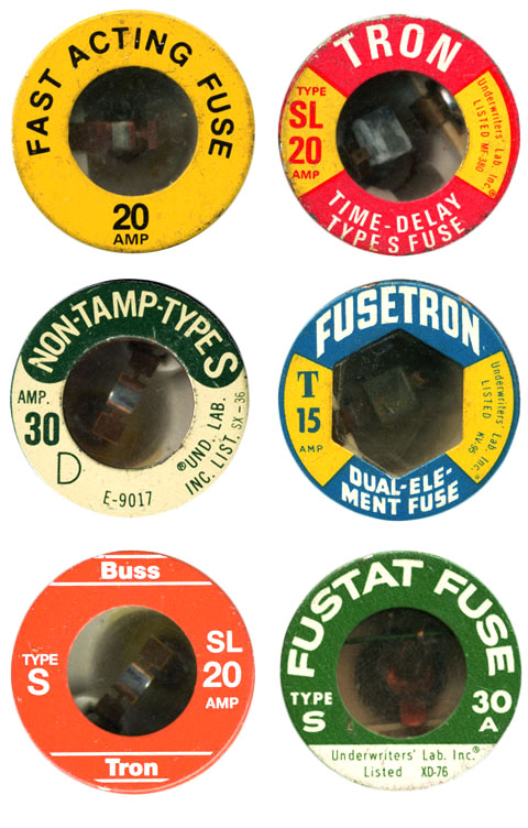
Found a small sack of vintage fuses in my basement a few weekends ago, a long neglected flea market score. Regret is just another name for forgetting to continue collecting vintage fuses. Rats!

The Aesthetics of Synthetics: Lycra

A small selection of ephemera used to market DuPont’s’s Lycra Spandex fabric from the late 60’s into the late 70’s…. These are taken from an article I’m writing for Uppercase Magazine. It’s a visual survey of the design and aesthetics of DuPont’s marketing of synthetic fabrics from the 1920’s to the early 80’s.

The history of the development of synthetic fabrics is a fascinating nexus of science, industry, design, advertising, fashion and culture. In turn, the same goes for focusing specifically on the marketing and promotion of the fabrics themselves. It is a rich core sample of prevailing trends in design, typography, advertising illustration and photography, etc over the decades. Anyway, while putting the piece together I was especially buy vicodin portland charmed by the different modes and looks behind Lycra… not to mention being sent into sheer nostalgic tizzy over the very idea of the Dichter Institute Motivation Study of Women’s Attitude’s About Pantyhose. Who says advertising doesn’t contribute mightily to how we understand ourselves and our world? I’m sure that handy tome borders on philosophy….

Anyway – the article will be in the fifth issue of Uppercase Magazine. A few more previews to come. Stay tuned, etc.. (If Uppercase Magazine is unfamiliar to you, well then, get yourselves over to here for a gander. A lovingly assembled magazine about beauty squirrelled away in the nooks of the everyday…My full mash note to its awesomeness is here.)

The Seventies-ness-ness of the Apple //

Recently I had to decide whether to discard my Apple //e, and found I absolutely couldn’t bear to part with it. Rather, I pulled its disparate components off storage shelves and out of boxes, dusted them off and reassembled it. Something about reconstituting it made me bond with it all over again… Then, just the other night, snowed in by a blizzard, I was watching Royal Tennenbaums for the nth time and noticed among all the other 70s bric-a-brac, an Apple //.

I know it’s playing footsie with the obvious, but it’s worth remembering what an essential artifact of 70’s design the Apple // really is.  Its introductory advert from 1977 captures that perfectly. Look at the context… It’s not set up in an office but on the wood table of a modern kitchen. It’s not stacked like a Hi-Fi system or a fused one-piece like an ordinary computer terminal. It’s spread out like a split level contemporary house. The severe contrasting angles of the case evoke 70’s architecture and furniture design much more than anything especially technological. (It shares this look with some of the better designed calculators of the period – which makes sense, given they first embodied the notion of a computer as a home appliance) The distinct beige putty color leans in nicely against the saturated, plush colors of the era – the ochres, purples, oranges and red browns. In short, the Apple // represents the hight of then-contemporary suburban design – which is why it looks just at home in the Wes Anderson’s idealized 70’s diorama as Bill Murray’s purple turtleneck and burnt sienna blazer.

Queen of Hearts Cookbook

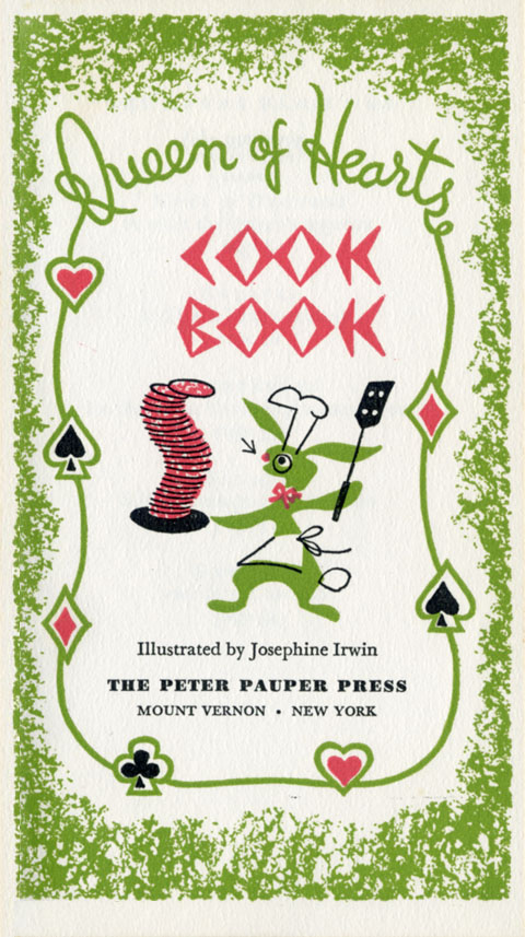
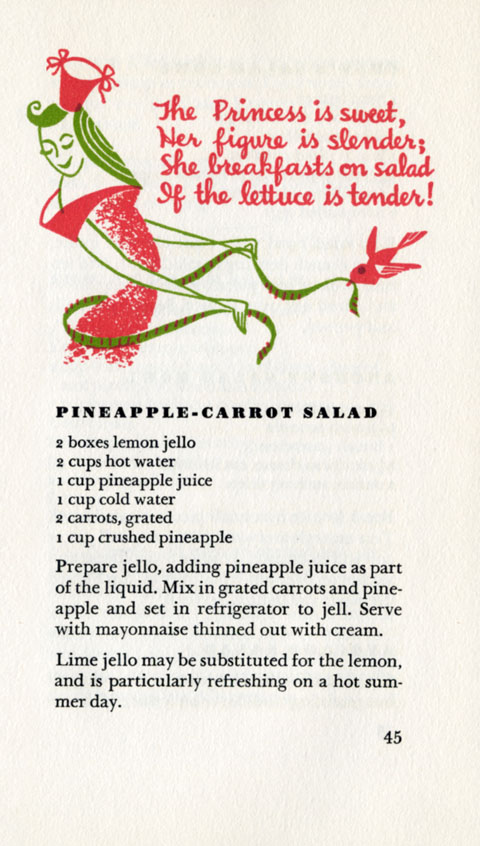
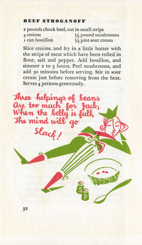
Found this treasure over the holidays. It rings all the bells – charming line art and hand drawn type, gorgeously sturdy and nuanced typesetting, substantial textured stock, all printed with flair and care. Also, the recipes themselves are awesome – 50’s era comfort foods, full of egg, onion soup mix, cream, anchovy, steaks, chops, Jello, Roquefort blue and crumbled bacon. Yum.

A quick scan of the Internets yields little additional info on this cutie. Peter Pauper Press, according to their site, has been at it since 1928, but now churns out a sea of uninspired novelty books and journals that clog the front of Barnes & Noble. More sadly yet, nothing on illustrator Josephine Irwin, who, judging from this work, had quite the knack. I can tell you that its part of a series – when I found this one it was nestled with four or five of it’s siblings. I wince at not having snagged them all. Well, if you ever find yourselves on Rt. 52 between Pennsylvania and Delaware, deep in Wyeth country, the place is called Barbara’s Books….

Toddler Britannica

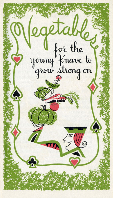
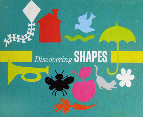
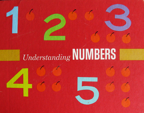
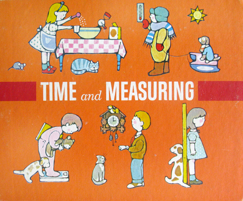
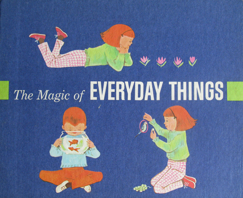
The early 70’s edition of the Encyclopedia Britannica was a three stage rocket of concentrated knowledge. The base stage was the sturdy brown and gilt edifice we all know, and remember fondly as it fades into its new role reinforcing the foundations of used bookstores the world over. The second stage was the crimson leather bound Junior edition, the starch and fibre of a million middle school book reports. The final stage was the now nearly forgotten toddler edition – “The First Adventure in Learning Program” (See a vintage ad of the whole set here.)

They where co-produced with the Golden Press folk, which goes a long way to explain their graphic excellence. At first blush, what impresses is the serial design – amazing palette, spare but strong unifying compositions and type. And a totally killer logo – the thick-lined little birdie wearing a mortarboard. But they really blow your noggin when you grok the distinct styles and nuances of the illustrations. No surprise – the volumes were illustrated by a veritable who’s who of classic kid art – Joe Kaufman, Trina Schart, JP Miller, Dagmar Wilson, June Goldsborough, Caraway, and Art Seiden. (Another post will cover the inside art of the volumes, which is just as good)

The series grouped knowledge around experiential themes like math, comprehension, metrics, etc… one, though, was much more profound – “The Magic of Everyday Things.”  Basically it was a kid manifesto for the idea you can discern art, beauty, and coolness in just about anything, provided you’re receptive, enthusiastic and imaginative enough to try. An insight for a lifetime, and when I think about how long I marinated in these books as a squeaker, I figure I owe them a mighty debt. Take a bow little mortarboard birdie!

Ex Libris Taras Shepelavy, Pt. 2

I sincerely hope that author Maurice L Hartung of the University of Chicago was as impressed as I was with the cover designs to his slide rule manuals. (Also, belated congratulations to Dr. Hartung on the promotion he seems to have received between the publication of the guides.)

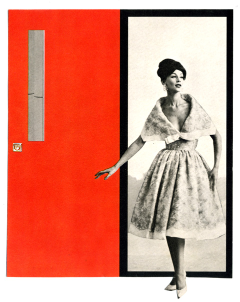
For your pleasure, a layout…

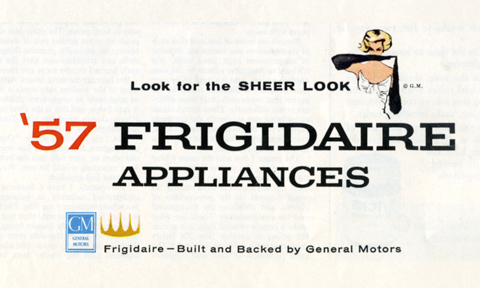
frigidaire

This swatch of an old ad is a poem for the eye. The different inflections of voice in each typeface and the elegant cascade from one line to the next give it a wonderfully nuanced read. I love the way the human touch of the girl is offset by the right angles of her gesture. It’s composed perfectly, like an expert round of Jenga – completely stable but full of tensions and cross balances. Good show, little layout, good show!

Gee, Indeed!

geeyourhair
I’ve been sorting through a big new batch of late 70’s magazines. Two things keep popping up: Phoebe Cates and adverts for Gee, Your Hair Smells Terrific! And, you know what? Dammit if the wild, bright-eyed enthusaism doesn’t get me. Every time I come across one of these ads it’s like a mental analogue of the moment when Freshen Up would squirt it’s flavor center. Delightful. So, I’m passing it along to you, reader, without comment, and intended in the same sunny spirit.