

Index: Vintage Illustration


These plates are from an edition of Ivan Kotlyarevsky’s 1798 poem Eneida, a ribald retelling of Virgil’s Aeneid. Kotlyarevsky transposed Aeneas, the Trojans, and Greek mythology into the folklore of Ukrainian Cossacks. It is among the first major works written in Ukrainian, and is a cornerstone of Ukraine’s national literature. Wonderfully, it also defines the very notion of a burlesque – vulgarizing lofty notions like love, family, faith and battle, feigning seriousness in the face of absurdity, and is packed to the gills with slapstick humor, comic skits, bawdy songs, and, natch, healthy portions of friskiness…
This particular version, printed in 1969, in Kiev, Ukraine, is, simply stated, one of the most beautifully designed, illustrated, typeset and produced books I’ve ever seen. Sturdy and stout, clad in a satisfyingly course gray canvas, it opens onto a corker of a title page. From the swashbuckling script of the authors name, the elemental block-y-ness of the title, and the illustration of a muscular and languid Cossack/Trojan, it’s a bravura opening gesture. From there, graphically, the book never flags – block after block of typeset verse on heavy cream paper. But the heart of the book lies in the illustrations, by A. Bazylevych, whose style is a deft hybrid of wood block engravings, thick-lined expressive cartooning, and abstract color blocks.
My recollection of the book from childhood is profoundly visceral. I can recall my father reading vignettes that swirled thrillingly in a noggin already stuffed with mythological adventures. But it’s the illustrations that left an indelible impression. It’s a phantasmagoria of soldiers and sieges, gods and devils, maidens and crones, battles and scraps, feasts and revelries, a cosmos of melodrama. Looking at them again after a span of decades, my recollection is immediate and electric – what’s vital in art, in fiction, and in life seems to spring forth in an exuberant, lusty, unruly parade.


Diagrams and fashion spreads from a book called For you! Girls! published in the Soviet Union in 1965. I found it in a profoundly random box of discarded books and cassettes in the “free trade” corner of a U-Haul self storage warehouse in Philadelphia. It was published by something like the Committee for the Literature for Popular Sciences & Medicine (My Ukrainian provides an imperfect guide to the Russian) It’s a comprehensive guide to the Soviet Girl, with a strange mix of propaganda, health and fitness tips, fashion spreads, and aspirational portraits of female astronauts, seamstresses, soldiers, and miners. Odd, fascinating, unsettling in the soullessness of the sloganeering and the gap between the lightheaded lifestyle spreads and the grey reality of Soviet life… but as often is with this stuff, aesthetically compelling – a mix of constructivist graphics, great type, and high key black and white photography.
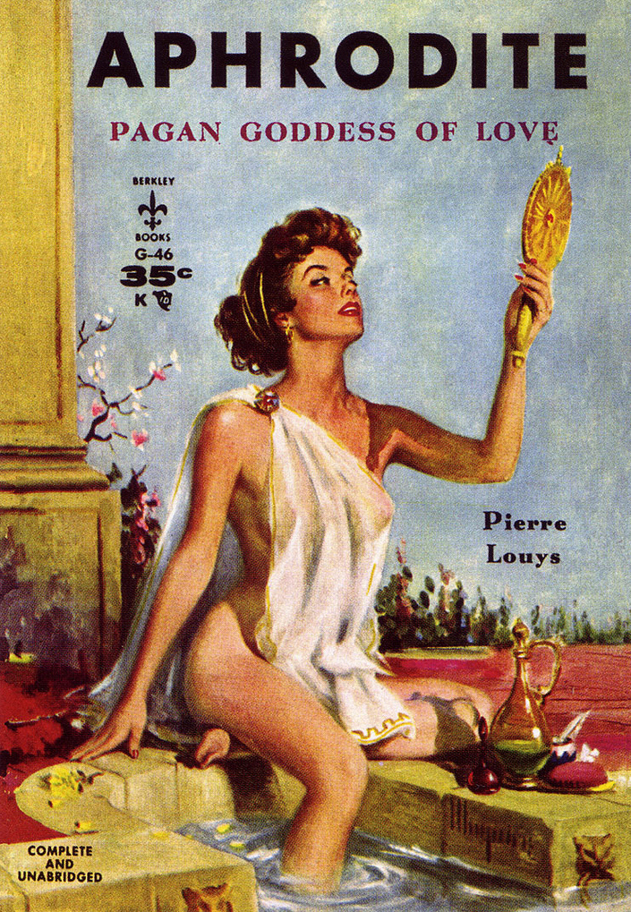
Aphrodite by Robert McGuire, Berkley Books
By now we have been thoroughly disabused of the notion, so heavily advocated by Clement Greenberg, that abstraction was, at last, a pure art “inflated by illegitimate content,” as he claimed in the November 1949 issue of the Partisan Review. Abstraction would therefore be able to cleanse the world of the intellect of any contamination by low-level kitsch. But most of us have since come to understand that kitsch inevitably contaminates every form of human creativity. There is so much heartless and mindless abstract kitsch found on the walls of mansions owned by the rulers of the universe that it is no longer possible to privilege abstraction over any other form of artistic expression. It is therefore meaningless to brand as kitsch only illustration – or comicbook art, or pulp magazine covers. Most of it is, but so is most of contemporary “high” art: the popular arts still have at least certain technical standards that can help us separate the kitsch from the corn.
– Bram Dijkstra

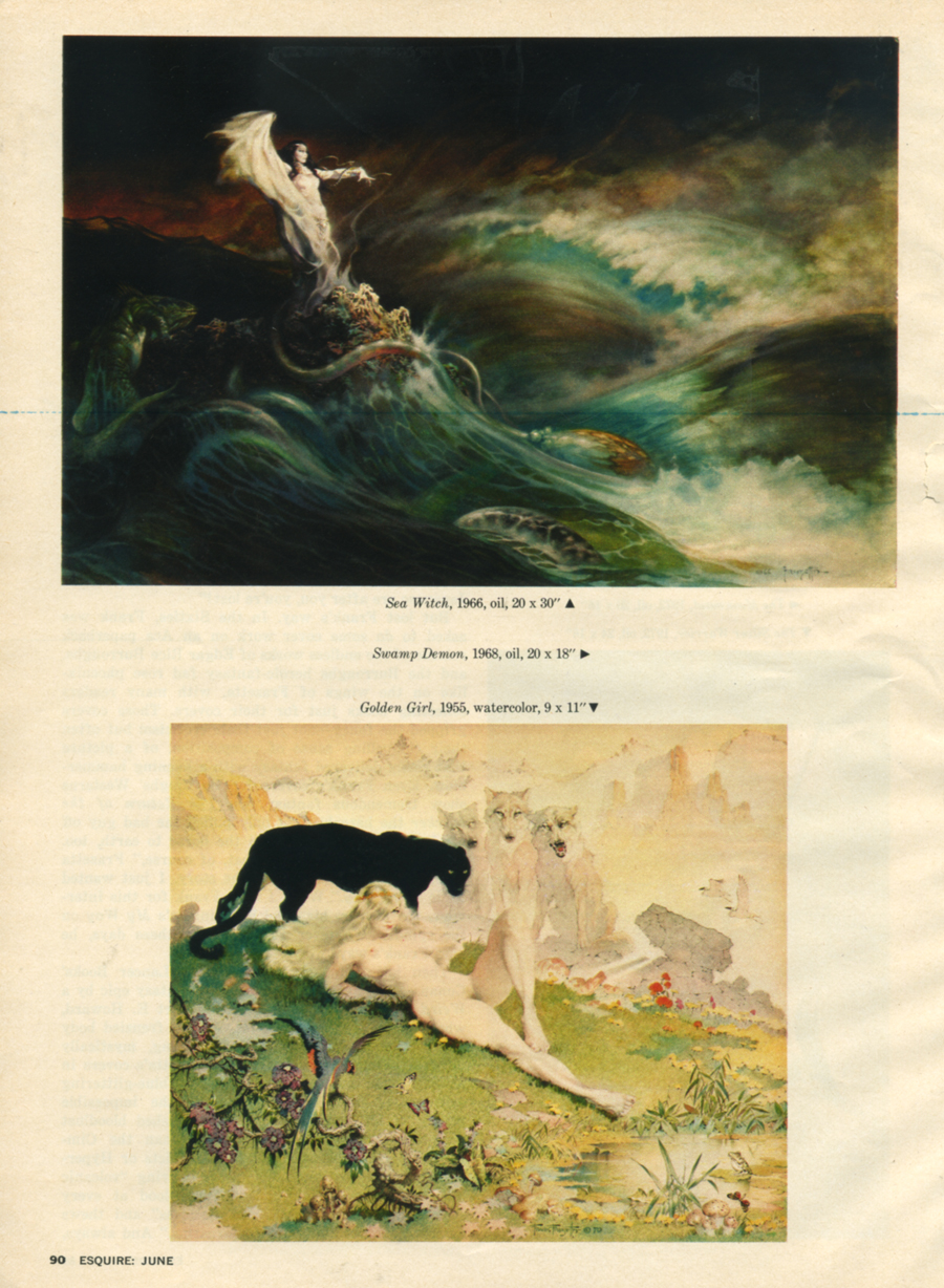
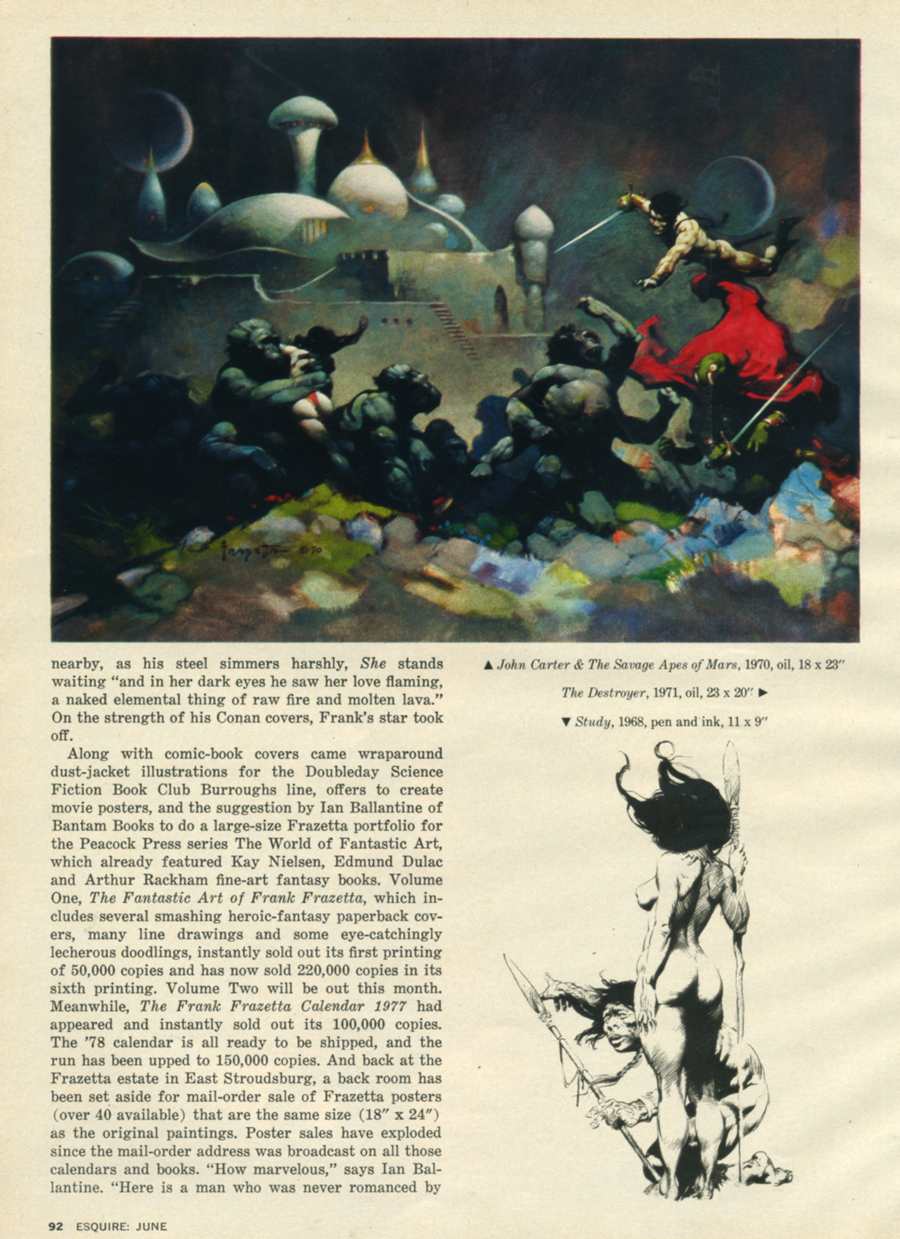
Posted below, is the complete text of a June 1977 Esquire Magazine profile of Frank Frazetta. Consider it a small bit of public service for those of us so inclined — as far as I know it is unavailable anywhere on the internets. What a gonzo article, too, a perfect example of the macho free associative style of “the New Journalism” so in vogue back then. The opening roll call of pop cult, fantasy and sci-fi cuties is hysterically engaging — Thuvia, Dejah Thoris, Ayesha, Dale Arden, Vampirella, Barbarella, Taia, Morgan Le Fey, culminating in — flabbergastingly — Homer’s Helen of Troy. It then settles into a comprehensive profile of Frazetta’s life and work. Then there’s the classic oh-so-Esquire moment where they wake Tom Wolfe up from bed (!) to opine about, high art, snobby modernism, and the muscular vitality of commercial illustration. Perfectly entertaining, and to those of us entranced with Frazetta, indispensable. Enjoy. (On screen pages below, downloadable PDF here.)


A selection of some fab posters for films by pioneering French director Claude Charbol, who died this week. (Some decent obits here, and here.) A giant of French cinema, Charbol was a founding member of the French New Wave, close pals with (and somewhat of a patron to) Jean-Luc Godard, François Truffaut and Éric Rohmer. Along with Rohmer he published a seminal critical work on Alfred Hitchcock, a significant influence.
Charbol was often described in shorthand as the French Hitchcock, which is pretty dead on, adjusting a bit for time periods and sensibilities. While not strictly a formulaic filmmaker, diabolical plots, melodrama, all manner of decadence, wry humor and a general wickedness abound.
For your consideration, a passel of recommendations from his extensive oeuvre: A Double Tour, 1961 – a convoluted noir, Who’s Got the Black Box?, 1967 – shaggy, but entertaining espionage yarn, The Unfaithful Wife, 1969 and Innocents with Dirty Hands, 1975 two chilly, melodramatic physiological thrillers, Cop Au Vin, 1985, the first of two top drawer police procedurals featuring inspector Jean Lavardin, Masques, 1987 an intriguing character-driven mystery, The Swindle 1997, a neat little caper, Merci Pour Le Chocolat, 2000 about a wealthy family’s nest of secrets, and Comedy of Power, a corporate boardroom drama. Available here, or at your fine local video store.


From 1915 till about 1940 or so, the Brinkley Girl cut a feverish swath through the cultural imagination. As drawn by illustrator Nell Brinkley, she was like the Gibson Girl on an absinthe bender – exuberant line, riots of splashy color, and buckets of joie de vivre. Girls obsessed over her adventures, hairstyles and fashion shifted in her wake, and she was feted in songs, films and theater.
Nell Brinkley’s specialty was the episodic themed series. Golden Eyes and Her Hero followed our heroine’s exploits and derring-do during World War One. Betty and Billy and Their Love Through the Ages, my personal favorite, featured a besotted glamorous couple in various romantic historical vignettes – intrigue in Southern plantation society, among Medieval troubadours, Phoenician swashbucklers, etc… The format begins to open up in the 20’s with sophisticated frothy flapper larks like the Fortunes of Flossie.
Fantagraphics Book’s wonderful new survey, The Brinkley Girls, collects these series and more, along with a fascinating introduction by the book’s editor, Trina Robbins. Aces.

Captain Nemo, illustration by N.C. Wyeth from a 1918 edition of The Mysterious Island by Jules Verne. (courtesy of Mike Dubisch)


Now? Cats! Cats people, cats! This How to Draw Cats is magnificent. Walter Foster’s illustrations nail the scrappy majesty of these creatures. In every sketch I can feel their essential nature – miniature tigers that live with us, mercenary fierceness held tenuously at bay, in total, blissful, ambivalent satisfaction.

Found after a visit to the Strand book store, nested under a dust jacket flap… Best part? – other than the perfectly deployed heaviness of the design… It slid out while I when I was asked for my ticket by the conductor on a Philly buy canadian vicodin bound Amtrak train…


Jack Gaughan, preliminary color sketch for Worlds Best Science Fiction, acrylic on board, 4.25 x 7.25

…Oh, and Saturday night? Sure… It’ll be the usual crowd. Cliff & Vera. Rosa’s pals… Some champagne, some dancing… some ditties around the piano, and yea, Pamela’s bringing the cheetahs again. At the very least, stop by… (Charles Copeland, original interior illustration for Men, May 1960)


Now these are a blast. Superman’s girlfriend Lois Lane in the late 60’s and early 70’s underwent a kaleidoscopic recombination of her character. It was a result of a desire by DC Comics to extend the line of superhero stories to girls who were captivated by romance comics. What they arrived at was an exuberant pop cultural mashup.
The comics are a swirling melange of styles – the overheated emotional sakes & teary cliches of the romance yarns; the can-do spunky mystery vibe of Nancy Drew. Light moments of the basic superhero world blow in and out, and sometimes there are gales of sci-fi weirdness. Compositionally, it’s the classic Lichtenstein/pop art configurations, and the art is as fine an example of va-va-voomish good girl art as you could hope for.
Wonder Woman was swept up in these currents as well – reconfigured as an Emma Peel-eque Mod avenger. Also, great fun. I wrote more about that era here, and the books were recently collected by DC. For Lois Lane, you’re still gonna haunt long boxes.
(Also to those interested in this confluence of styles and sensibilities there’s a great site that explores them – Sequential Crush, which is a blog devoted to preserving the memory of romance comic books and the creative teams that published them throughout the 1960s and 1970s. The woman who edits it, Jacque Nodell, also published a PDF of a lecture she gave on the topic. It’s called The Look of Love – The Romantic Era of DC’s Lois Lane, Supergirl and Wonder Woman. It’s a great read, smart, and replete with well chosen art. The blog is just as ace. Go, poke around.)


Images and outtakes from my forthcoming article in Uppercase Magazine on romance cover art. It focuses on the formative years of the genre, in the early seventies. The liberated sensibilities inside the books called for equally brazen cover art. This need provided a welcome haven to a recently dispossessed group – the pulp and movie poster artists. In the mid sixties photography began to supplant illustration. Pressed out of the genres that made their careers, and in some cases fortunes, some illustrators retired to fine art, some to advertising. Others, in the case of Robert McGinnis and Robert Maguire – two of the absolute best, whose work is featured above – migrated to romance covers.
I did a post a while back on the same topic, focusing solely on McGinnis’ work, here. Also, while researching all of this, I came across the first four books, published in 1974/54 by Avon, that are credited launching the modern romance era – Kathleen Woodiwiss’ The Flame and the Flower and The Wolf and the Dove, as well as Rosemary Rogers’ Sweet Savage Love and Dark Fires.
Two aspects of these books had seismic implications on the genre: They were the first romance novels to be published initially as a paperback, to be distributed promiscuously and cheaply in 5 & Dimes and department stores; and the amorous coupling detailed within them got down to some frisky, frisky business. In detail. Thier ace covers are, in unfortunately lo-res, below.


A sampling of covers from about 1910-1930 from the original Life Magazine. They’re riveting, one after the other – a cavalcade of striking illustrations and successive iterations of exquisitely typeset mastheads. More from the complete run, here. Some history courtesy of David E. Sloane, author of American Humor Magazines and Comic Periodicals –
Life Magazine was designed as an American Punch; more properly, it was an outgrowth of the Harvard Lampoon, which itself was a copy of Punch. Life stood as a challenge to the recently successful Puck and Judge, both of which were full of raucous humor. Life, on the other hand, was self-consciously genteel. It ultimately succeeded so well that it became the most influential cartoon and literary humor magazine of its time, and—a fact forgotten today—itself served as the model for another humor magazine, The New Yorker.


Excerpts from a folio of printer proofs and samples for the The Curtis Publishing Company. Curtis’ publications included the Ladies’ Home Journal & The Saturday Evening Post along with The American Home, Holiday, Jack & Jill, and Country Gentleman. Its old headquarters are at 6th & Walnut in Philadelphia. Inside the lobby is a Tiffany glass mosaic based on a Maxfield Parrish painting. Well worth a gander if you’re nearby. (Thanks to my colleague Nancy Logan for making the portfolio available.)


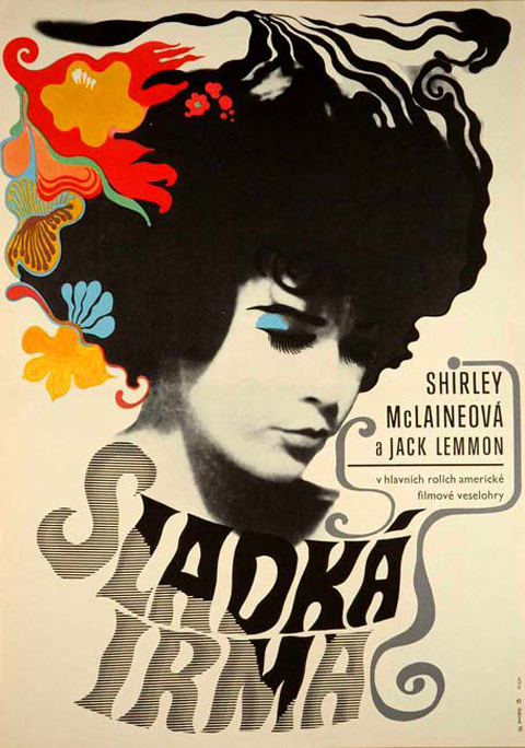
You’d expect the artwork for Irma La Douce to be top drawer. The pedigree is peerless – the 1963 comedy starred Jack Lemmon and Shirley MacLaine. It was directed by Billy Wilder. This bawdy confection sits in the middle of one of the insanely great runs of film making, starting with 1957’s Witness for the Prosecution, continuing with Some Like It Hot, The Apartment, Irma, the unjustly maligned Kiss Me, Stupid, The Fortune Cookie, The Private Life of Sherlock Holmes, until 1972’s Avanti!
So yes, sharp stuff – stylish and well executed modernist film poster design. It’s the depiction of MacLaine, though, in each that just knocks your socks off. The caricature developed for the American poster captures her essence perfectly. The typically lysergic Czech poster taps into her undercurrent of sultriness. If anyone ever deserved to be described as a cocktail, it was the young Shirley MacLaine – a fizzy syrup of pixie-ish mischievousness, good-natured lasciviousness, perfectly balanced between sweet and tart.
