Table of Contents: Art


Fellini & the Allure of Comics

tulum4a

tulum3a

tulum2a

tulum1a

[RERUN: Originally Aired Sept. 2009 / An old favorite lost in the great SQL database corruption of 2012. I never tire of thinking about the electric confection that is Fellini & Manara’s Trip to Tulum, so here it be. Admittedly dated by my still fresh allergic rejection of the very idea of Zac Snyder’s appalling adaptation of Watchmen}

Comics, and the ghostly fascination of those paper people, paralyzed in time, marionettes without strings, unmoving, cannot be transposed to film, whose allure is motion, rhythm, dynamic. It is a radically different means of addressing the eye, a separate mode of expression. The world of comics may, in its generosity, lend scripts, characters and stories to the movies, but not its inexpressible secret power that resides in that fixity, that immobility of a butterfly on a pin. –Federico Fellini

The graphic novel Trip to Tulum has its roots in an aborted film of Fellini’s called the Journey of G Mastorna. Fellini’s entry in the “whoa… he was dead the whole time” mini genre, the movie was plagued by strange mishaps throughout its production. Already haunted by nightmares, Fellini threw in the towel after a huge Gothic church set collapsed minutes after it had been erected. The script and its attendant themes and vignettes sunk back into Fellini’s imagination. Over time bits and pieces floated to the surface in other films.

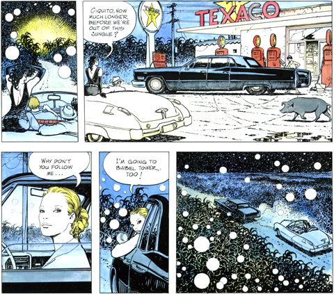
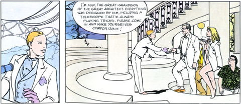
Fellini’s affection for comics and graphic storing telling is well known. In the mid 80’s, he allowed an Italian newspaper to serialise a version of the story, now called Trip to Tulum, with accompanying illustrations by Milo Manara. Manara, mostly known for his tony, Euro sci-fi erotica, is an illustrator and artist of the highest caliber. When Manara wanted to expand the story into a graphic novel, Fellini agreed, and took to the collaboration with gusto.

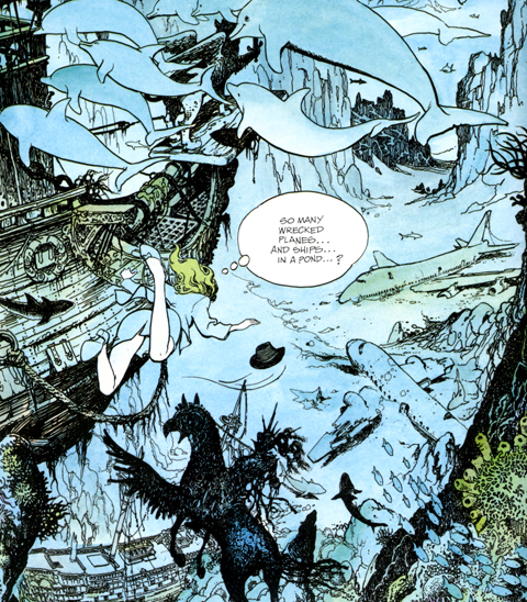
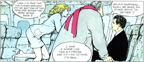
The result is simply one of the lost classics of the form. It begins with a stunning Anita Ekberg ringer finding Fellini asleep on the edge of pond in a a lush grove swept through by gusts of wind. Fellini’s hat flies off and as she reaches to grab it she falls in. Swimming after the sinking hat she descends to a vast, surreal field of sunken planes and ships. It emerges that they are all physical manifestations of Fellini’s films and unrealized notions. On one plane she finds a nattily dressed, kelp encircled Marcello Mastroianni, and…. oh never mind, from there the story just unfurls from one scene to the next like wax balls in a lava lamp… it’s a frisky fantasy adventure, a hallucinatory dream, a self referential commentary, an allegory of film-making, and finally a meditation on the creative act itself. Out of print now, copies can be found here.

(Incidentally, the Fellini quote is one of the definitive statements on the relationship between movies and comics. The notion of characters on “loan” lies at the heart of Chris Nolan’s respectful yet inspired cinematic interpretations of Batman. Its warning against literalism is precisely what an earnest vulgarian like Zach Snyder does not understand – which is why there is nothing whatsoever to be gained, and everything to be lost, in seeing Watchmen)
Tom Pfannerstil

[RERUN] A few months ago couple of years ago I was in Vegas for that Matador @ 21 shindig… Funny thing about Vegas for the occasional Logan’s Run/Disneyland casino-plex rooted visitor – when you head out into the actual, dust-whipped city you get that slight shifted-reality feeling, like when you travel abroad. That slightly off-kilter disjointedness is one of my favorite things about wandering around Vegas. My pal & I were returning from a few hands of profitable mid-day blackjack in grubby/glammy old Vegas when we spotted an old storefront window filled with poppy pop-art looking art. We docked the Prius and headed inside.

The Trifecta Gallery is a marvel, a sharply curated mix of figurative art. The prevailing sensibility is a mix of deft technique and topical whimsy. As I was scanning a particularly dense clump of work I paused on a painting of an over-sized, flattened Sun Maid raisin box. I’m an easy mark for this kind of thing, and have always found the Sun Maid herself pretty fetching. I peered in close, to take in the detail of the piece when I noticed that the shadow it cast had dimension to it. Damn buy vicodin canada thing was a sculpture. The owner, the open, warm, enthusiastic Marty Walsh, noticed me noticing the work and came over. We got to talking and after we established our mutual fondness and amazement for the piece she took me back to look at more. Two flat files drawers full – Blistex Tubes, popcorn boxes, notepads, lip balm, and a host of to-go cups. Each one slightly larger than life, and carved into soft block of wood.

They are the work of Tom Pfannerstill, from Louisville, Kentucky. Pfannerstill retrieves “trash” from the street, or as he puts it, “markers of a time… a tiny part of the fossil record, a small archaeological artifact.” He then crafts meticulous recreations which “touch on issues of commercialism and consumerism, but are mostly intended to be subtle reminders of the temporality of all things.” That they do, quite powerfully, and they impress with their sheer bravura technique as well. The pieces are modestly priced, and available through Trifecta. Just wonderful. And if you’re in Vegas, stop in. Walsh is a delightful host, and the place is part of a ramshackle series of interconnected galleries all work poking about in…

Seeing Clearly

celmins

Ocean, 1975 Vija Celmins / drypoint on paper

What we call seeing a thing clearly, is only seeing enough of it to make out what it is; this point of intelligibility varying in distance for different magnitudes and kinds of things, while the appointed quality of mystery remains nearly the same for all. Thus: throwing an open book and an embroidered handkerchief on a lawn, at a distance of a half a mile, we cannot tell which is which: that is the point of mystery for the whole of those things. They are merely white spots of indistinct shape. We approach them, and perceive that one is a book, the other a handkerchief but cannot read the one or trace the embroidery of the other. The mystery has ceased to be in the whole things, and has gone into their details. We go nearer; and can now read the text and trace the embroidery, but cannot see the fibers of the paper or the tread. The mystery has gone into a fourth place, where it must stay until we take a microscope, which will send it into a fifty, sixth, hundredth or thousandth place. —John Ruskin on the picturesque sublime

Juxtaposition by Dave Hickey25 Women: ESSAYS ON THEIR ART, 2016 / Univ. of Chicago Press

Blackstar

bowie_LP_1024x1024

So, Bowies’ Blackstar arrived, finally — ordered while Bowie was earthbound, listened to when he wasn’t. Let me see if I can get this exactly right — it’s the first & last classic Bowie record since Let’s Dance.

Bowie played rock like Duchamp-ian chess. Each classic Bowie album occupied & held a square on the board. The records are “about” the move, so they work as self contained experiences — they point inward, ultimately.

This is why the whole “best album since Scary Monsters” critical framing misunderstands Bowie. Although he released some great salvos since Let’s Dance, they didn’t represent moves to a new square. Sometimes, like Earthling, he deftly rode a cultural or aesthetic wave, othertimes like Heathen or even The Next Day they were grand & vital reprises of old glories.

Blackstar is, before it is anything, a bracingly new statement. The avant-jazz hybrid he’s synthesized here is — once again, like all classic Bowie — an occupying move. The album refers, thrillingly, only to itself. There’s a new sound & vision here — skronky, sinewy, dubby… What a triumph!

Honestly, I was wary of listening, & crabby that I hadn’t the opportunity to hear it at at least once as the work of a living artist. I shouldn’t have fretted. Rather than a melancholy encomium, a stately funeral parade, it was the best & most unexpected gift of all — The last classic Bowie album: Space Oddity, Man Who Sold the World, Hunky Dory, Ziggy, Aladdin Sane, Diamond Dogs, Young Americans, Station to Station, Low, Heroes, Scary Monsters, Let’s Dance, Blackstar.

Turn and face the strange

English singer, musician and actor David Bowie, 1974. (Photo by Terry O'Neill/Hulton Archive/Getty Images)

There’s a reason when the news hit that so many of us instinctively reach out and gather our memories of first hearing ChangesOneBowie / Because that wasn’t a record, it was a door. A magic door. Here’s how it was magic. Because if you knocked on it, it opened easily, and you could go in and just boogie. But. But. If you pushed on it just right, if you were bent, just so, you tumbled through — and you never stopped falling. And as you fell, year after year, your freak flag just kept unfurling. And as you fell & flew you wondered — when do I get to the bottom? And there is no bottom. It’s just Bowie all the way down. Today every freak flag flies at half mast. Goodbye David Bowie.

Outwit Grand Moff Tarkin — Again!

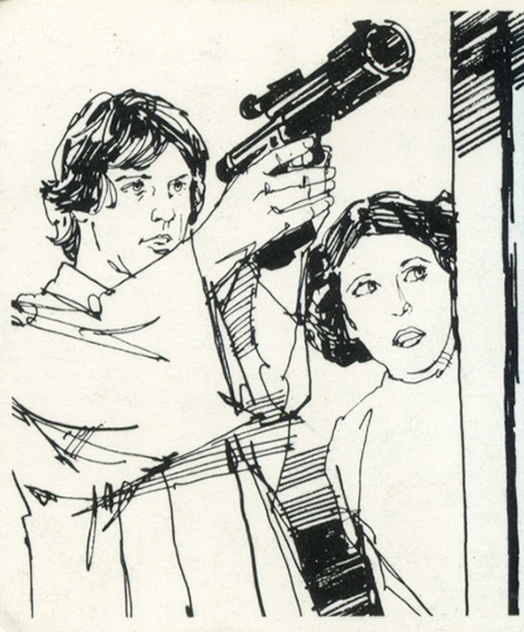
=StarWars_Cards10 StarWars_Cards7 StarWars_Cards6 StarWars_Cards11 StarWars_Cards12 StarWars_Cards5 StarWars_Cards8 StarWars_Cards9 StarWars_Cards1 StarWars_Cards3 StarWars_Cards4StarWars_Cards13 StarWars_Cards14 StarWars_Cards2

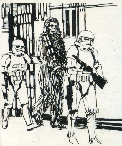
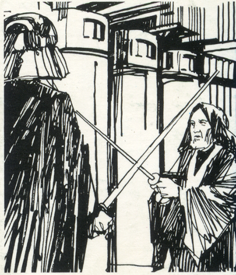
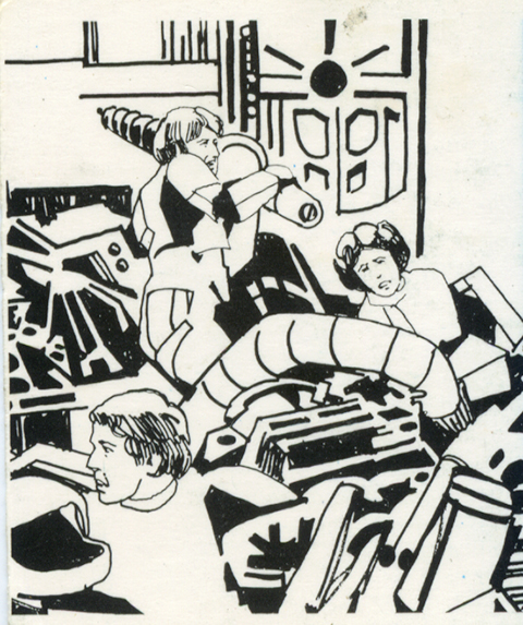
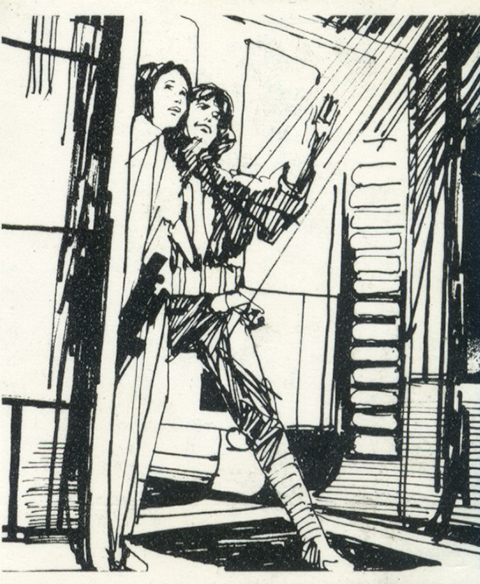
My last flareup of Star Wars fever — These illustrations were featured on the playing cards included with Escape from Death Star board game. Playing it again out of sheer nostalgia confirmed my vague memory of the game itself as pretty janky. I was struck, however, by these quick, scratchy, pen & ink sketches of iconic scenes from the movie. More than anything they reminded me of Jim Holdaway’s classic Modesty Blaise newspaper strip that ran throughout the 1960s. In any case, just hanging this small bit of ephemera here on the Internet in case anybody needs it.

Also while we’re the closing subject I’ll leave you with the smartest pop cultural assessment I’ve read of the new flick, the essence of the original, the folly of the prequels (of which I’m finally mostly persuaded, although I’m still with Kevin Smith on Sith) — Our Star Wars Holiday Special by Aaron Bady in The New Iquiry:

[The prequels] were marred by horrific writing and joyless characters, of course, but those superficial failings pale in comparison (or resulted buy vicodin los angeles from) the more fundamental underlying problem: they tried so hard to explain that they killed the joy of the thing itself… How did Anakin Skywalker become Darth Vader? How did the republic fall? Where did the emperor come from? How did Luke and Leia end up separated, who is Obi Wan Kenobi, and where are all the mothers in this universe? These are not plot holes; these are the dark matter that holds the galaxy together… Instead of placing their faith in the force—the way an open-mouthed child lets the storyteller carry them off—the prequels tried to explain what the force really was and worked so hard at it that they made the entire thing tedious and boring. They turned their targeting computer back on.

It also has perceptive & compact assessments of Star Trek vs Star Wars and why JJ Abrams’ approach arguably disfigured the former while revitalizing the latter (again persuasive personally, but my imaginative stake in Trek is much looser so I think the reboots are mostly a gas) With this, then — nerd. Out.

Portraits by Don Bachardy

DonBachardy_NatalieWood MarleneDietrich (1)MichaelYork AngelaLansbury JaneFonda Vija-Clemins-1978 EdRuscha Richard-Diebenkorn-1972 TeriGarr

A selection of exquisite portraits by Don Bachardy — the longtime partner of author Christopher Isherwood. He’s often featured in appraisals of of Isherwood as a somewhat benighted boy toy, more made of their age difference & his feathered California handsomeness than his formidable gifts & sensitivities as a portrait artist. I came to find this work in the context of an an article that made a passing mention of a Bachardy buy vicodin with credit card portrait of Terry Garr. As my fasination with Garr runs deep, down the well I dove, looking for the portrait. I found it among the rest of these delightfully rendered portraits. Enjoy. Great interview with Bachardy, now 80, here. A another, along with a review of the compendium of these portraits, Hollywood, here.

(above Natalie Wood, Marlene Dietrich, Michael York, Angela Lansbury, Jane Fonda, artists Vija Clemins, Ed Ruscha, Richard Diebenkorn, her awesomeness Terri Garr)

Hello. Hello.

can_you_hear_me_now tent_1 records beer Pie tent_sargent

Shepelavy.com — Part IV, if I might be metal-grand & prog-rock-y about it. Untie the latch, part the canvas, pop your head out from the tent, let’s fire up the old transmitter. Is this thing on? Can you hear me now…

In 2009 I pitched camp on this modest little lagoon online. What began as a portfolio with occasional annotations tumbled into pretty steady blogging for a fat 3 years or so. More & more, however, severe advertising gales would knock out the transmitter for weeks on end. Sundry commitments were pressing. The blog contracted a virulent SQL database corruption. After a few stalled re-ignitions, things round here finally sputtered into silence around the winter of 2014.

Then Spring came, like it does, being Spring. I missed tapping these signals out into the ether, tending & fussing over my little plot of enthusiasms…So, I dusted off the redesign, gathered passels of uncollected old & new work. The code spooled out over the summer & fall.

& this so current salvo of transmissions begins… from this tiny lagoon on the clotted coastline of the interwebs, that I share with beached beatniks, old salts, venerable preps, society matrons, homespun cuties, movie stars & scientists… an endless three-hour cruise. Come aboard —

 Welcome back.

plant


Bad Company / Desolation Angels

desolation-angels-front desolation-angels-back desolation-angels-inner-2 desolation-angels-inner-1

The design group Hipgnosis has been justly & exhaustively feted for thier amazing psychedelic realist album covers for Pink Floyd, Led Zeppelin, and other zonked heavyweights (an amazing gallery here, you could get lost for hours). I had no idea they were behind the artwork for Bad Company’s 1979 record Desolation Angels, which stopped me cold when I was crate digging one afternoon. It was strikingly clever example of that developing 80s graphic sensibility that found its apotheosis in Patrick Nagel’s work for Duran Duran. It has everything to do with the power of stark flat white throwing all other colors into hyper-bright neon-electric contrast — if cocaine could design album covers they would look a lot like this.

The Quintessence of Tempest

temp1

temp2

[RERUN: Hauling this out of the early days of the blog. I’ve been on a protracted vintage video game and pinball bender lately. Atari’s iPad port of my beloved Tempest is damn near perfect and I’ve been playing it a ton. As such this early appreciation of the stone cold perfection of this game has been on my mind. So, here, then…}

The screen graphics of the classic video game Tempest represent a kind of summit of design and beauty –  the finest expression of a very limited language. In the case of Tempest that language was vector based rendering. Vector monitors were used in video games from the mid 70’s to the early 80’s. The technology was derived from oscilloscopes – the image is projected by an electron beam onto the glass. Image a laser light show sped up to produce a lasting image and you’ve got it…

Many classic games were made using this technology – Asteroids and Battlezone as well as the first Star Wars game. While they all had their aesthetic charms, Tempest is in a class of its own. All vector games have a certain elegance and simplicity. The problem order vicodin uk arises in the crudity of the renderings – the poor approximations of tanks, asteroids, and X-wings forever marks these games as primitive gestures of an evolving technology. Tempest is exempt because it is derived from the technology itself.  What would a world defined by glowing geometric unshaded lines look like? Pretty much like Tempest.

Its beauty lies in the fact that it is in harmony with its own rules and limits. Hence the extremely elegant compositions – uncrowded, with a well balanced sense of scale. The color scheme is vibrancy itself, strong underlying blues, wonderful pops of pink, green, red, and yellow. And the physics of the electron beams give everything a deep saturated glow.

That same harmony extends to playing the game as well. Most games rely on clumsy and stunted translations of real world movements like running, jumping or flying an ostrich. Tempest moves in accordance with its nature – spinning and firing. That’s what makes it so satisfying. Once you understand its strange parameters you have a complete experience on its terms – a dynamic, I think, that is fundamental to the idea of art.

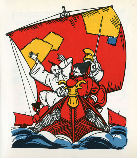
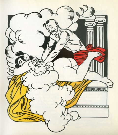
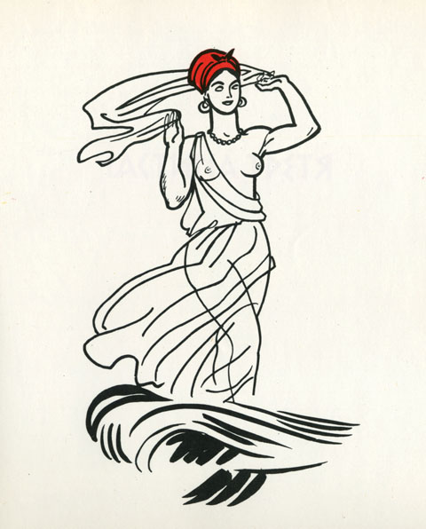
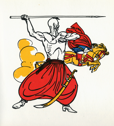
An Epic Burlesque: Kotlyarevsky’s Eneida

These plates are from an edition of Ivan Kotlyarevsky’s 1798 poem Eneida, a ribald retelling of Virgil’s Aeneid. Kotlyarevsky transposed Aeneas, the Trojans, and Greek mythology into the folklore of Ukrainian Cossacks. It is among the first major works written in Ukrainian, and is a cornerstone of Ukraine’s national literature. Wonderfully, it also defines the very notion of a burlesque – vulgarizing lofty notions like love, family, faith and battle, feigning seriousness in the face of absurdity, and is packed to the gills with slapstick humor, comic skits, bawdy songs, and, natch, healthy portions of friskiness…

This particular version, printed in 1969, in Kiev, Ukraine, is, simply stated, one of the most beautifully designed, illustrated, typeset and produced books I’ve ever seen. Sturdy and stout, clad in a satisfyingly course gray canvas, it opens onto a corker of a title page. From the swashbuckling script of the authors name, the elemental block-y-ness of the title, and the illustration of a muscular and languid Cossack/Trojan, it’s a bravura opening gesture. From there, graphically, the book never flags – block after block of typeset verse on heavy cream paper. But the heart of the book lies in the illustrations, by A. Bazylevych, whose style is a deft hybrid of wood block engravings, thick-lined expressive cartooning, and abstract color blocks.

My recollection of the book from childhood is profoundly visceral. I can recall my father reading vignettes that swirled thrillingly in a noggin already stuffed with mythological adventures. But it’s the illustrations that left an indelible impression. It’s a phantasmagoria of soldiers and sieges, gods and devils, maidens and crones, battles and scraps, feasts and revelries, a cosmos of melodrama. Looking at them again after a span of decades, my recollection is immediate and electric – what’s vital in art, in fiction, and in life seems to spring forth in an exuberant, lusty, unruly parade.

Gerard Schlosser

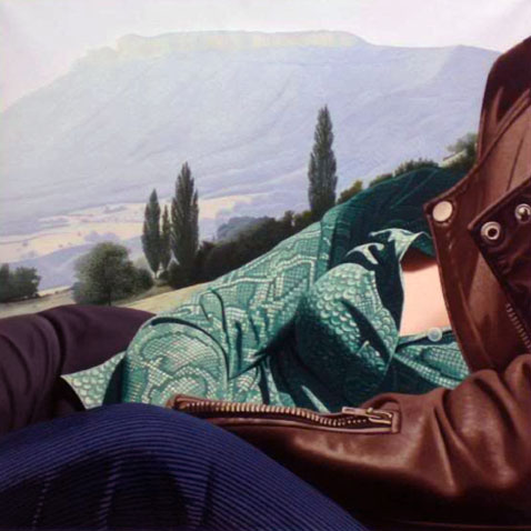
Over the weekend I scored Martin Amis’ The Pregnant Widow. What a knockout cover! What stuck me was the how powerful both the formal and narrative aspects of the painting were. The composition was riveting – this tightly packed moment given epic scale – and the weight of shared experience slung between the two figures was palpable. From what I know of the book’s plot and themes, which follow the tumultuous vicissitudes of a group of friends spending the summer in a remote Italian castle, it seemed a note-perfect choice – marred only by completely ham handed typesetting and design.

The painting, Il ne se plaignait jamais… (He never complained…), from 1976, is the work of the French painter Gerard Schlosser. Schlosser is most closly associated with the Narrative Figuration movement, a distinctly French mash-up of Pop and Photorealism.

His early work was rooted far more in a sexy cartoon pop aesthetic – like a combination of Guy Peellaert and Tom Wesselmann. As he evolved the work became more overtly photo-realistic, but just as meticulously staged – details are purposefully buy vicodin hp online exaggerated, extraneous objects removed, everything is framed and arranged for as much narrative impact as any comic book panel. One critic described this dynamic perfectly, that for Schlosser, “framing is never a trivial gesture. It tightens the most significant narrative element, the small detail that summarizes the essence of a moment.”

What I love about his paintings is that they transmit on four equally powerful frequencies. They are wonderfully composed realist abstractions. They contain a powerful dose of concentrated storytelling. They celebrate the figure as landscape. And they frame a vantage point that is the very definition of intimacy – conversational, sexual, relational – in a way that is incredibly potent and evocative. They’re artful, moving, brazenly sexy, and, as Blackadder might say, as French as a pair of self removing trousers.

(Schlosser’s work is scattered about the web. Most of the sites are in French. No English monograph seems to exist. There are at least three French ones, a bit pricey and all difficult, it seems, to obtain)

Herman Miller Picnic, Textiles & Objects


Some Herman Miller curios… Came across a few of these posters last weekend hanging in a excellent restaurant in Cincinnati. They were from a celebrated series of posters created by Herman Miller designer Steve Frykhom from 1970 to 1989 to announce the company’s yearly staff picnic. It began as an offhand assignment from an executive and Frykhom’s desire to satisfy a screen printing jones. The first salvo won that years AGIA award. In 1980 the Museum of Modern Art added seven posters to its permanent collection. Very few images abound online, the best are these can i buy vicodin in the uk tiny guys from the Herman Miller blog.

Below these are invitations to the 1961 opening of Herman Miller’s short-lived and Textiles & Objects Shop. It was overseen by celebrated designer Alexander Girard. It was a notion well ahead of it’s time – a rigidly curated mix of found objects as well as products and textiles he designed for Herman Miller. Both announcements feature remarkably original design styles that have come to be profoundly influential these days. Again, very little by way of imagery or further history about the shop sloshing around online.

More Cake, Please…

cake1

cake3

{RERUN: Originally Published Apr 1, 2009}
 In the crowded field of choice rock obscurities the Cake rank among the choicest. Musically they were a strange hybrid of Phil Spector-esque girl group, baroque folk, and weirdly medieval psychedelia – the Ronettes crossed with a a distaff Left Banke. Their considerable aura was further intensified by a wicked fashion sense and enough personal melodrama to out-beyond Beyond the Valley of the Dolls.

Besides their sonic adventurousness, the Cake is worth celebrating for the splendid design of their two sole records. The logo is a typographic masterpiece. Set in ornate hand crafted blocks and nearly square, each letter reads as both a decorative tile and as type. The motifs are a motley mix of psychedelia, Eastern European embroidery, and circus signage – a fine metaphor for the band’s composite sound. The sophomore record ups the ante with a splendid Carnaby street pop cartoon worthy of anything by Guy Peellaert or Hapshash and the Coloured Coat.

After years of scarcity, Rev-ola finally reissued both records on a single CD with generously thorough liner notes that do justice to their sound and their story.

For your pleasure, some selections.

Baby That’s Me:

Rainbow Wood:

Annabelle Clark: