Table of Contents: Art


Herman Miller Picnic, Textiles & Objects


Some Herman Miller curios… Came across a few of these posters last weekend hanging in a excellent restaurant in Cincinnati. They were from a celebrated series of posters created by Herman Miller designer Steve Frykhom from 1970 to 1989 to announce the company’s yearly staff picnic. It began as an offhand assignment from an executive and Frykhom’s desire to satisfy a screen printing jones. The first salvo won that years AGIA award. In 1980 the Museum of Modern Art added seven posters to its permanent collection. Very few images abound online, the best are these can i buy vicodin in the uk tiny guys from the Herman Miller blog.

Below these are invitations to the 1961 opening of Herman Miller’s short-lived and Textiles & Objects Shop. It was overseen by celebrated designer Alexander Girard. It was a notion well ahead of it’s time – a rigidly curated mix of found objects as well as products and textiles he designed for Herman Miller. Both announcements feature remarkably original design styles that have come to be profoundly influential these days. Again, very little by way of imagery or further history about the shop sloshing around online.

More Cake, Please…

cake1

cake3

{RERUN: Originally Published Apr 1, 2009}
 In the crowded field of choice rock obscurities the Cake rank among the choicest. Musically they were a strange hybrid of Phil Spector-esque girl group, baroque folk, and weirdly medieval psychedelia – the Ronettes crossed with a a distaff Left Banke. Their considerable aura was further intensified by a wicked fashion sense and enough personal melodrama to out-beyond Beyond the Valley of the Dolls.

Besides their sonic adventurousness, the Cake is worth celebrating for the splendid design of their two sole records. The logo is a typographic masterpiece. Set in ornate hand crafted blocks and nearly square, each letter reads as both a decorative tile and as type. The motifs are a motley mix of psychedelia, Eastern European embroidery, and circus signage – a fine metaphor for the band’s composite sound. The sophomore record ups the ante with a splendid Carnaby street pop cartoon worthy of anything by Guy Peellaert or Hapshash and the Coloured Coat.

After years of scarcity, Rev-ola finally reissued both records on a single CD with generously thorough liner notes that do justice to their sound and their story.

For your pleasure, some selections.

Baby That’s Me:

Rainbow Wood:

Annabelle Clark:


Standards

Robert_McGuire_Aphrodite
Aphrodite by Robert McGuire, Berkley Books

By now we have been thoroughly disabused of the notion, so heavily advocated by Clement Greenberg, that abstraction was, at last, a pure art “inflated by illegitimate content,” as he claimed in the November 1949 issue of the Partisan Review. Abstraction would therefore be able to cleanse the world of the intellect of any contamination by low-level kitsch. But most of us have since come to understand that kitsch inevitably contaminates every form of human creativity. There is so much heartless and mindless abstract kitsch found on the walls of mansions owned by the rulers of the universe that it is no longer possible to privilege abstraction over any other form of artistic expression. It is therefore meaningless to brand as kitsch only illustration – or comicbook art, or pulp magazine covers. Most of it is, but so is most of contemporary “high” art: the popular arts still have at least certain technical standards that can help us separate the kitsch from the corn.
– Bram Dijkstra

Frank Frazetta, Esquire Profile

Frazetta_main

Posted below, is the complete text of a June 1977 Esquire Magazine profile of Frank Frazetta. Consider it a small bit of public service for those of us so inclined — as far as I know it is unavailable anywhere on the internets. What a gonzo article, too, a perfect example of the macho free associative style of “the New Journalism” so in vogue back then. The opening roll call of pop cult, fantasy and sci-fi cuties is hysterically engaging — Thuvia, Dejah Thoris, Ayesha, Dale Arden, Vampirella, Barbarella, Taia, Morgan Le Fey, culminating in — flabbergastingly — Homer’s Helen of Troy. It then settles into a comprehensive profile of Frazetta’s life and work. Then there’s the classic oh-so-Esquire moment where they wake Tom Wolfe up from bed (!) to opine about, high art, snobby modernism, and the muscular vitality of commercial illustration. Perfectly entertaining, and to those of us entranced with Frazetta, indispensable. Enjoy. (On screen pages below, downloadable PDF here.)

Frazetta_Esquire_1Frazetta_Esquire_2Frazetta_Esquire_3Frazetta_Esquire_4Frazetta_Esquire_5Frazetta_Esquire_6Frazetta_Esquire_7Frazetta_Esquire_8Frezetta_Esquire_9

Recipie

SAVILLE POSTER-YELLOW

tumblr_med5idZ86W1rc22qso1_1280

petersaville_gtf_gagosianposter_web

All designs by the inimitable Peter Sevillle (Factory Records, New Order, OMD, Durutti Column, Ultravox, Duran Duran, King Crmison…) It a’int my manifesto to buy vicodin exactly, but I’m stirred nonetheless by its brash glitz cut with a swoon for the assembly line.

Perfect Storm

PerfStr

Simply wonderful illustration by the crushingly deft Tomer Hanuka. Perfectly evocative of the languid coziness of city snowstorms. Also happens to be an uncanny rendering of my old bedroom window overlooking Williamsburg, Brooklyn. It takes a lot to make me miss living in New York City. Well done.

BLUE JAY

Illustrations of animal and wildlife

Reader, look at the plate in which are represented three individuals of this beautiful species — rogues though they be, and thieves, as l would call them, were it fit for me to pass judgment on their actions, See how each is enjoying the fruits of his knavery, sucking the egg which he has pilfered from the nest of some innocent Dove or harmless Partridge! Who could imagine that a form so graceful, arrayed by nature in a garb so resplendent, buy mexican vicodin should harbour so much mischief;—that selfishness, duplicity, and malice should form the moral accompaniments of so much physical perfection! Yet so it is, and how like beings of a much higher order, are these gay deceivers! Aye, l could write you a whole chapter on this subject, were not my task of a different nature.

John James Audubon

John James Audubon, Birds of America, Plate 102 – engraved by R. Havell


thomas wilmer dewing

Thomas_Wilmer_Dewing_-_The_Spinet_-_ca._1902

Thomas-Wilmer-Dewing-xx-The-Fortune-Teller-xx-Private-Collection

Thomas Wilmer Dewing - The Recitation 1891

Thomas-Wilmer-Dewing-xx-Summer-xx-Private-Collection

The_Gossip

tumblr_m2ow91mj4w1r3fkjno1_1280

I recently took a pal to the Isabella Garder Museum in Boston. It is simply one of the most beautiful, sublime environments to take in art — it’s an indelible reminder of how central decor & architecture are to the experience of a particular artwork. That experience is especially powerful and acute in the famous “Yellow” and “Blue” rooms, where furniture, small doodles, ephemera, exquisite wallpapers, surround and mingle with masterworks by Rossetti, Sargent, Whistler and Degas.

My collegue was particulary taken with a smallish, glittering portrait of a woman (above) by Thomas Wilmer Dewing. Further research hauled up a lovely cache of paintings — most stranger & more fetching than the one in the Gardner. Turns out Dewing was a tonal painter heavily influenced by James Abbott McNeill Whistler’s work, especially his famous Nocturnes (which I also dig. I wrote about them a few years back, here. There’s also one in the Yellow Room) There’s a gauzy texture to his paintings I absolutely adore & sets them well apart from the usual parade of society portraiture and pastoral vingettes. Enjoy.

435


Flight Risk

Flight_Risk_Martin_Schoeller

Riveting cover photograph by Martin Schoeller for the New York Times Magazine. He also shot the best photo ever of Jeff Koons, below. It’s the best photo because it trumps the billions of words this cat has kicked up in his wake and lays http://www.mindanews.com/buy-effexor/ bare the artifice, calculation, perfection, mischievousness, & joy that makes Koons at all worthwhile. Also, the ski cover looks like a vérité Phil Noto, below, below. Phil Noto? Folks… Phil Noto.

Martin_Schoeller_Jeff_Koons


Phil_Noto_Jet_Seven


Some Swedish Type

Swedish_Record_Typography_2

Swedish_Record_Typography_3

Swedish_Record_Typography_1

So, recently I was over in Sweden visiting IKEA HQ (more on that, later-ish…) IKEA is located in Älmhult, a small picture postcard of a town. Quaint cobblestone square anchored by statue of Carl Linnaeus (you remember Linnaean taxonomy, yes? — three kingdoms, divided into classes, orders, families, genera, and species, eighth grade or so, feathered hair, Toughskins jeans, 3/4 black sleeved Cars T-shirt…sorry, pardon my corduroy reverie…)

Anyway, I’m wandering around and happen upon a gas station / burger & ice cream hut / thrift store (!) where, between fan belts, spark plugs, a row of swedish potboilers, needlepoint, and axel grease, I spot these 10″ records in a crate.

What a score! Each one of these Swedish type compositions is gorgeous — and each anchored by a contrastingly dense, filagreed record label. Häftigt!

Is this thing on?

can_you_hear_me_now

Transmissions sputter back to life… onto a fifth year of broadcasting. The signal has faded over the past year, gales of advertising mostly, then our radio tower plain and blew up (by which of course I mean a virulent SQL database corruption keelhauled my rickety, jury rigged WordPress build.) So, then, is this thing on? Are we going?

ViewOfDelft

Comrades!

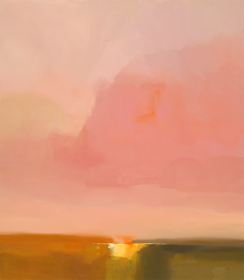
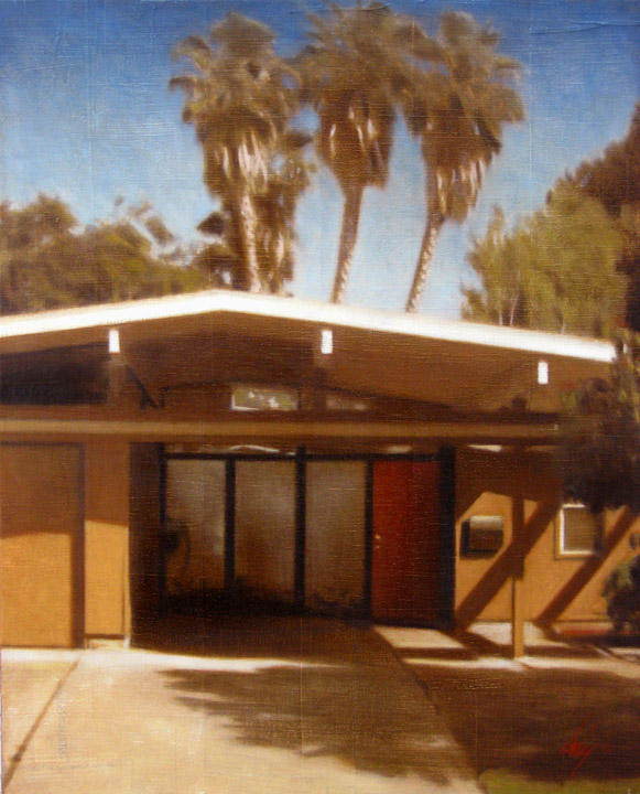
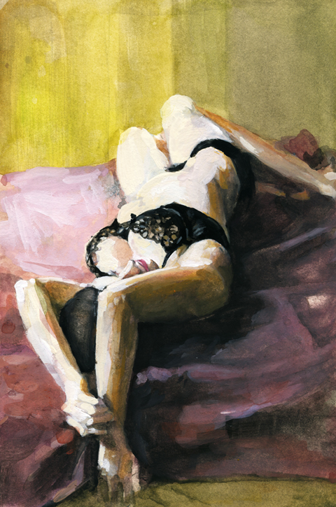
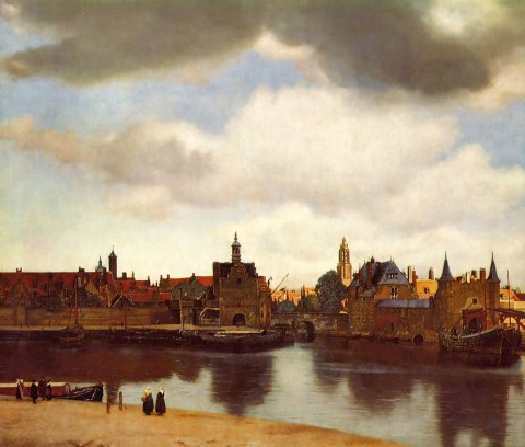
I painted this figure study over a few days this summer. I walked by it one night, a month or so ago, and as I lingered for a minute and thought — that’s right — View of Delft.

Yes, as in Vermeer’s view of Delft, entitled View of Delft.

1660-61_View_of_Delft

A blasphemous chuckle, right, but gumdaggit if this sketch and title aren’t now bonded like noggin epoxy — the phrase passing over my little ditty of a painting like a sky-blotting arial banner, featherweight but indelible.

So, as I said the blogs been down for a while, swept under crosscurrents and swells of obligations, dissolutions and advertising and I’m casting about for an inaugural post and all I can think of is View of Delft.

Here’s why. Cause this blog is, if it is anything, even in this particularly unhinged association, about searching for our own little private views of Delft — little lagoons, obsessively surveyed, rendered, cleared out out by hand.

Lagoons. Because in the clotted coastline of the blogosphere, it’s what this is, really. A tiny lagoon, home to beatniks, old salts, venerable preps, society matrons, homespun cuties, movie stars and scientists… Gilligan’s wake. It’s a beachhead from which we can re-embark on our quest to find and stake out other unlikely harbors. A stretch of landscape we can fix in our minds and take a draught or a puff and contemplate, then set off satisfied.

And when others arrive, like you dear reader, perhaps you’ll survey it appreciatively, like a scoutmaster, and think “I would’ve given you a commendable. That was one of the best pitched camp sites I’ve ever seen, honestly.”

tumblr_m4r0xoeakk1qa6obyo1_12801

Or something. Are we going? Is this thing on? Is this really broadcasting if there is no one there to receive? We’ll see. More soon.

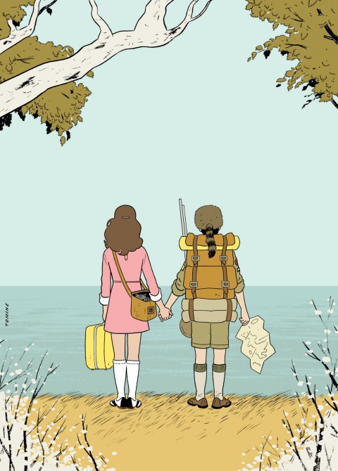
Some credits: All the weird snippets about broken and sputtering radio transmissions are taken from Shellac’s epic angular shanty “The End of Radio,” which will serve as this latest sally’s theme song. The Herculean rebuild of this leaky beached blog was coded by the gifted and rad Marcello De Feo. Check his kung-fu. It is ace. The charming illustration of Moonrise Kingdom is by Adrian Tomine.

Dreaming a Beautiful

derek_stationary

Master illustrator Frank Frazetta’s stationary design for addlepatted sun children Bo and John Derek’s movie production company, Svengali. I was going to leave the commentary at that, but I was riding my bike this afternoon, and the Walkman offered up Sheena, by Trader Horne, a long forgotten British psych-folk outfit. Hardly a stanza had passed when I realized the song was a tone poem to the idea of Bo Derek. I share it here, below, for your pleasure:

Sheena, Trader Horn:


Bright Young Things

From 1915 till about 1940 or so, the Brinkley Girl cut a feverish swath through the cultural imagination. As drawn by illustrator Nell Brinkley, she was like the Gibson Girl on an absinthe bender – exuberant line, riots of splashy color, and buckets of joie de vivre. Girls obsessed over her adventures, hairstyles and fashion shifted in her wake, and she was feted in songs, films and theater.

Nell Brinkley’s specialty was the episodic themed series. Golden Eyes and Her Hero followed our heroine’s exploits and derring-do during World War One. Betty and Billy and Their Love Through the Ages, my personal favorite, featured a besotted glamorous couple in various romantic historical vignettes – intrigue in Southern plantation society, among Medieval troubadours, Phoenician swashbucklers, etc… The format begins to open up in the 20’s with sophisticated frothy flapper larks like the Fortunes of Flossie.

Fantagraphics Book’s wonderful new survey, The Brinkley Girls, collects these series and more, along with a fascinating introduction by the book’s editor, Trina Robbins. Aces.