Full stop, comma, white. / Random ephemera / Brock Davis
Table of Contents: Design


Shots taken by Todd Selby of Robert Longo in his studio. For me it’s the smudgy texture of everything surrounding his deep, velvety drawings. Especially evocative are the shots of his supplies – more like mechanics gear, overlaid with an archipelago of black smears. Everything here suggests a great physicality behind the smooth rich sheen and stark contrast of his finished work. Longo has compared his drawing style to sculpture, saying “when I draw with graphite I smudge it with my fingers, move it around physically, it’s like clay. Painting is painting on the surface, covering up, where drawing is putting the picture into the paper like a photograph.”
It’s a blogament to their power that they retain a so much of this can you buy vicodin legally in canada muscularity, materiality, and weight when hung in the hermetic space of a gallery. However, they seem especially at home in the studio. It’s like seeing a big ship being assembled in dry-dock from far overhead, and seeing the complex mechanics behind something that will later glide with such heavy grace on the water.
(Below for your pleasure, are a few selections from his iconic 80’s series Men in the Cities. They have, I think, aged particularly well, and seem, now, emblematic of their era rather than beholden to it. Longo also maintains an excellent, comprehensive website with generous galleries spanning his entire career. Also, Selby’s ongoing, long running series of arty glitterati in their homes is amazing and worth checking out frequently)

A boxed record set spotted in a motley pile at the Cackleberry Farm Antique Mall in Paradise, PA… Funny, Swing has always struck me as hopelessly wacka wacka, a square pantomime of exuberance and abandon – but this New Wave Cinema poster style composition and the freeze frame cutouts invest them with a crackling energy and style… a sock hop away from the iconic poster for Antonioni’s Blow Up and a frug and a boogie-woogie away from Robert Longo’s skinny tie 80′s series Men in the Cities, about which I’m reposting, below.
Serial cover designs by the German imprint Suhrkamp. Exquisite, masterful lessons in restraint and spare, deliberate composition. Suhrkamp is a 50 or so year old publisher of literature, philosophy and essays. A more, um, impressionistic description courtesy of a certain Siegfried Unseld and the inimitable Google Translate: On the question of how in the shortest form of the Suhrkamp publishing house was to characterize, I answer generally: Here are no books publish authors.
I. SAN FRANCISCO. Absolutely the most beautiful city in the entire world. With history, class, and cuisine, it’s a place of astounding mystery. l ask myself why I never lived
there. No answer.
2. WINSLOW, ARIZONA. An excellent stopover on P40 going east or west. Stay at la Posada, an ancient hotel with gardens, a library, art by Tina Mion, a wonderful restaurant called the Turquoise Room, and train tracks outside the back door.
3. RHYOLITE, NEVADA. A beautifully isolated mining ghost town in the dramatic setting of Death Valley. Nearby is Beatty, Nevada, with a homemade mini museum.
4. PAHRUMP, NEVADA. It’s a town that has yet to be built-not many houses, but lots of concrete curbs and partially paved streets. Somewhat of a bedroom town for Las Vegas.
5. NEW YORK CITY. It hits between the eyes. The culture is deafening, and noise is an essential ingredient. It’s the air shaft capital of the world. Everything American starts here.
6. AUSTIN, TEXAS. A beautiful town where bats live under the bridges. Home of lance Armstrong’s bicycle shop, remarkable barbecue, and lora buy vicodin shirt Reynolds’s art gallery. It’s not the musical capital of America, it’s close.
7. AMBOY, CALIFORNIA. Population: two, three, four? It’s, as they say, in the middle of nowhere. The buildings, among them Roy’s Café, are empty but very well cared
for. The post office is next to a tree lull of shoes. Desert winds, quietude…there’s something hospital clean about this tiny stop.
8. HARTSHORNE, OKLAHOMA. A lil’ country town that I always associate with my favorite baseball pitcher, Warren Spahn. It’s in the middle of America, but no way middle American.
9. SELIGMAN, ARIZONA. The Copper Cart café is all I remember. Once the fan belt capital of the world, now the interstate runs through its outhouse. A town where its past
and present are both gone-it’s worth investigating.
10. LOS ANGELES. After Oklahoma it is my adaptive home, but l only care about the central areas like Echo Park, Silver lake, Hollywood, Culver City, and Venice. On
occasion I go up to Mulholland Drive just to smell the ozone and listen to the city throb.
From W Magazine, May 2011
Talking Covers, an ace new blog about book cover design, is featuring my artwork for NEVER MIND THE POLLACKS, with my recollections along with author Neal Pollack’s… Shout-outs and walk-ons abound, including Jim Roll’s amazing record Inhabiting the Ball, my old label The Telegraph Company, and a meandering discursion on the Harvest Records roster… the blog is curated by author Sean Manning. Neal and I are in ridiculously great company – Ben Marcus’ Flame Alphabet, Francine Prose’s My New American Life, and Love Goes to Buildings on Fire are featured, among others… check it.
Carter Brown? Here, and more here on the blog soon-ish… On Paul Ilton nothing, sadly, but he seems learned and earnest. Not sure the wanton luridness of the cover is what he had in mind. Oh well. The rest are self evident…

Blue Box of Death, 2011
This masterwork of smartaleckery comes courtesy of Styron Lundberg, a Parisian designer. More work here, all smart, but this one here’s a homer…
Etaoin Shrdlu – pronounced “eh-tay-oh-in shird-loo” – is a sounding out of the twelve most common letters in English, in order of frequency of use. The expression goes back to the days of linotype typesetting machines. (As an aside, if your unfamiliar with the details of this fantastic gizmo, spare a moment for the wiki entry… the thing’s an engineering marvel, and the lingo that sprouted out around it’s operation is wonderfully quirky) According to the internets “Were one to run a finger down the first and then second left-hand vertical banks of six keys on a linotype machine, it would produce the words etaoin shrdlu. Linotype machines were sometimes tested in this manner. Once in a while, a careless linotype machine operator would fail to throw his test lines away, and that phrase would mysteriously show up in published material. The full sequence is etaoin shrdlu cmfgyp wbvkxj qz.” Now you know, in case it comes up.
The death of art critic and New Criterion founder Hilton Kramer is sad news down ‘ere… Kramer was among my favorite conservative cultural critics… his passion and rigor were always bracing and worthwhile as either an affirmation or a provocation. His early collection of essays – The Age of the Avant order vicodin online india Garde – has been indispensable, and, frankly, I always find something spot on, or at least worth considering, in every edition of the New Criterion. (Oh, one other thing – the Criterion’s serial cover design scheme is aces…)
Found after a visit to the Strand book store, nested under a dust jacket flap… Best part? – other than the perfectly deployed heaviness of the design… It slid out while I when I was asked for my ticket by the conductor on a Philly buy canadian vicodin bound Amtrak train…
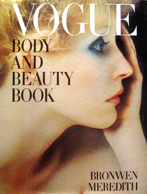
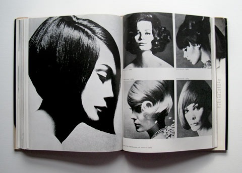
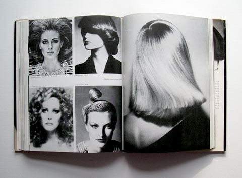
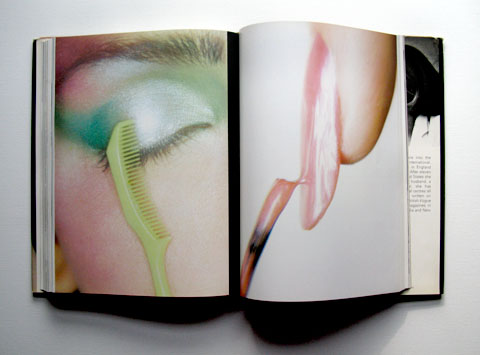
A text book, literally, of 70’s glamour and style, with every stylistic permutation extensively covered and visually documented. It features in-depth case studies on Twiggy, Françoise Hardy, Jean Shrimpton, Verushka, etc. The book itself is a gem – in fact, one its chief pleasures is the contrast between the impeccably elegant design and the exuberance of the looks http://laparkan.com/buy-vardenafil/ themselves. The supporting diagrams (including detailed schematics of every single iconic 70’s hairstyle) are worthy of their own post and will be featured later. Oh, and the authors name, Bronwen Meredith, is as peerless an embodiment of the era as you could hope for – a perfect blend of the earth-toned and the tony.
Flipping through a dense stack of auction catalogs I came across this oddity – an unassuming, glossy softcover book with a cheap, haphazardly typeset title, The Adventures of Mr and Mrs Jim and Ron. It’s a 1970 collaboration between poet Ron Padgett and pop expressionist artist Jim Dine.
The poems are just fantastic – prime specimens of a sort I’m a helpless sucker for. They’re short dreamy little narratives, shot through with strange shifts, breaks and fissures amongst the phrases. Odd juxtapositions emerge, only to be smoothed together by easy grammatical connections. It’s like a slow pan across a radio dial tuned to the psychic landscape of America – pocket buy vicodin reviews dramas, aspirations, product instructions, laconic observations, snippets of philosophy, fragment of bracing truths. They evoke, at times, Lydia Davis’ flash fiction, Ann Magnuson and Laurie Anderson’s brainy free associative monologues, Eve Babitz’s LA stories. Silver Jew David Berman’s poems too, here and there. Based on this book, this Padgett cat should be a joy to explore.
Jim Dine’s artwork is ok. I like Dine fine, and some of it’s sharp and smart (like the excerpts above), but the bulk of it is a too doodle-y and dashed off compared to the well turned poems they accompany. Still, the whole book is well worth tracking down.
For your pleasure, an oddly charming, earnest, hippy-dippy photo recreation of Manet’s The Luncheon on the Grass from an old 1970 photography annual.
Just fabulous… Photo by May Lin Le Goff for Test Shoot Gallery / Singapore; Everybody’s got their predilections, yes? Well, one of mine is a soft spot for supermarkets as photoshoot backdrops.
A moment’s rest at the Rochester Institute of Technology, between two immense murals by Joseph Albers meant to evoke the equally brilliant Kodak logo. Aces.
Fashions, Bill Blass… Trimline® phone, your Bell Telephone business office – reads the tweaked out copy on this gem of an advertisement http://www.cheapambienpriceonline.com obviously composed during a brief moment when the entire country was on an epic cocaine bender…
This age needs [artists] who are filled with the strength of their cultures and do not transcend the limits of their age, but, working within the times, bring what is peculiar to the moment to glory. We need great artists who are willing to accept restrictions, and who love their environments with such vitality that they can produce an epic out of the Protestant ethic. — John Updike, 1951
We just wanted to build the best thing we could build. When you’re a carpenter making a beautiful chest of drawers, you’re not going to use a piece of plywood on the back, even though it faces the wall and nobody will ever see it. You’ll know it’s there, so you’re going to use a beautiful piece of wood on the back. For you to sleep well at night, the aesthetic, the quality, has to be carried all the way through.
– Steve Jobs, Playboy Interview, 1985
Delightfully designed opening credits for the 1971 film Mrs. Pollifax – Spy. They were done by Don Record, who also did titles for flicks like Downhill Racer, Flareup, and the magnificent Cleopatra Jones. Among his oeuvre is a personal favorite – Smile, the 1970 California beauty pageant mockumentary featured in a post in the first few weeks of the blog – here.
Mrs. Pollifax is a oddball spy spoof about the recently widowed Mrs. Emily Pollifax of New Jersey. Restless and idle, she shows up at CIA headquarters looking to volunteer for spy duty. Technicolor, wood-paneled, skinny-tied hilarity ensues…