
Looking good, little science book, looking good…

Looking good, little science book, looking good…
This one time, in the Seventies…, gouache, 14″ x 10,” 2010
A quick-ish, sketch-ish, ditty based on an snap from an old photo annual.
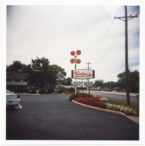
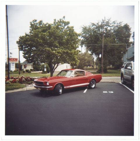
Hooray! The weather has turned, spring sprung, etc… which means, once again, Weber’s is on the menu! Not just an orange Doo Wop-style car hop with a mechanized retro asterisk sign serving simple burgers and home made root beer, but a roadside oasis and an enduring buy vicodin from canada monument to warm weather good times. Route 38 in Cherry Hill, in lovely southern New Jersey.
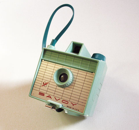
(These photos were shot a couple of years ago with the Savoy, below, a corker of a fixed focus medium format plastic toy camera.)

Zakuski (sketch), gouache on board, 7″x5″ – Another quick ditty for form and color…

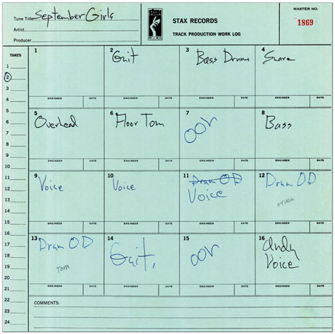
Big Star’s September Gurls and the Kinks’ Waterloo Sunset – Their respective jaw dropping awesomeness is well established and beyond dispute, yes, and Waterloo is held by many to be the most sheerly beautiful song rock and roll has produced. Still, for the past couple of days I’ve see-saw-ing wildly between them trying to decide, in the end, which song is just a bit more gorgeous.
What’s fascinating about the songs how similar they are – from a certain vantage, they are practically cousins. Musically they share a basic structure – a seemingly haphazard and unstable combination of gossamer delicacy and muscular sinew. That fragile balance underscores the the poignancy of each song perfectly – in the case of Waterloo a single life affirming moment when Paradise blooms on earth – while with Gurls, the way we drift back and forth from heartache to resignation and back again. And each seems on the verge of flying apart, mimicking the impermanence, hence the magic, of life itself.
I dunno… I think in the end September Gurls gets the nod. When I fall down the rabbit hole of Waterloo Sunset my reverie is intense but short. The sunset is Ray Davies’ vision, not mine, and it never really transfers. Where as with Gurls, the needle always drops down somewhere deep in my memories and I feel like I could fall between the spaces of “I loved you” and “Well never mind” and September and December forever.
Big Star: September Gurls:
Kinks: Waterloo Sunset:
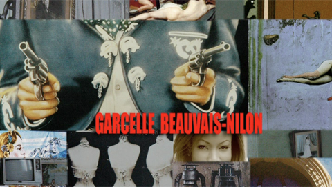
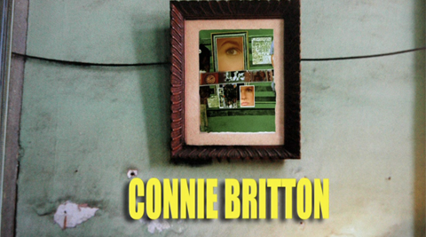
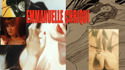

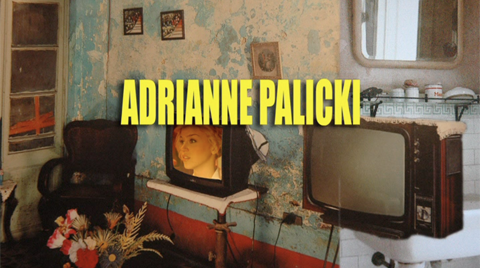

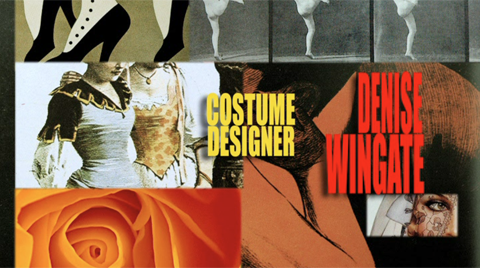

Stills from the fantastic opening credits from the flick Women in Trouble, directed by Sebastien Guterrez, just out on DVD. Very reminiscent of the work of Los Angeles based collagist Alexis Smith. Smith is among my absolute favorite artists – inexplicably examples of her work are really scarce online. (That will be addressed, soon, in a future post. For now, a smattering here.) Basically she’s the Hannah Hoch of Hollywood, using the deadpan Dada grammar of collage to reconfigure and re frame shards of entertainment culture in poignant and profound ways…. which is what I love about the Women in Trouble credits. Gorgeous!
Anyway, the movie follows the intertwining bottle rocket trails of 8 or so LA women in the course of a single madcap day. One reviewer compared it to George Cuckor’s the Women if it were directed by Pedro Almodóvar. Right on, broadly speaking. The debt to Almodóvar is deep, explicit and acknowledged – strong sexy female leads, bracing vulgarity, and genuine pathos, all swirling in a melodramatic bisque. It’s really good – not one for the ages, but a fab, saucy entertainment with heart.
It’s charm, however, is burnished by unexpectedly satisfying details in and surrounding the flick… The design in support of the film is excellent – besides the credit sequence, the title type and the sixties pop inspired poster are particularly good. Oh, and the the soundtrack is by pop-psych legend Robin Hitchcock.
The biggest surprise, however, is this whole Carla Gugino/Elektra Luxx thing. Let me explain. Gugino has had a solid string of TV and movie roles, playing an agent on Entourage, and the lead role in the detective drama Karen Sisco. She’s also known for the small but geek-fave role as the original Sally Jupiter in the Watchmen adaptation… In Women in Trouble Gugino plays blue movie star Elektra Luxx.
So, ostensibly to promote Women in Trouble, she launches a blog behind the persona of Luxx. So far, standard viral promo fare, right? Well, during the past year she’s saluted cats as disparate as Modesty Blaise actress Monica Viiti, Bedazzled director Stanley Donnen, Giant Sand’s Howe Gelb, and synth maestro Geogrio Moroder. She penned a mash note to beloved Rochester garage legends the Chesterfield Kings, and is breathlessly awaiting the release of the new New Pornographers album. She clued readers into the obscure lo-fi psych of the Capstan Shafts. She posted the single best pictures of Linda Carter as Wonder Women ever. And she celebrates every weekend by posting glamour shots of, at first, Anita Ekberg, and now Sophia Loren. And, in an uncanny overlap with this here blog, posted not only about God Help the Girl, the distaff spin off of Belle & Sebastian, but a wrote an appreciation of the obscure Fellini/Manara comic Trip To Tullum.
All in all, a staggering level of hep-ness… As a result, my enthusiasm for her enthusiasms certainly gooses my enthusiasm for the movie. In any case, Women in Trouble is well worth seeing, the credits deserve a huzzah for thier artfulness, and Carla Gugino/Elektra Luxx’s blog is well, well, worth visiting regularly. Good show all around!

The development of synthetic fabrics is a fascinating nexus of science and culture. Its history weaves through the disparate worlds of industry, warfare, design, advertising, high fashion, and mass consumption. It may be the only product that has profoundly, and equally, affected scientists, generals, housewives, and haute couture designers.
The roots of synthetic fibers lay in Paris, in the late 1700s, at the cusp of a scientific and social revolution. Éleuthère Irénée du Pont de Nemours is working as the assistant to Antoine de Lavoisier, the father of modern chemistry. In addition to his scientific pursuits, Lavoisier is also the administrator of a tax collection company, and up to his neck in the financial and political affairs of the royal French government. As the Revolution rages, Lavoiser’s neck finds itself under the guillotine. Thus abruptly ends the life of quite possibly the smartest man in all of France. Thoroughly freaked out, du Pont packs up and flees to the United States. Landing in Wilmington, Delaware, he founds E. I. du Pont de Nemours and Company, known commonly as the DuPont Company and, based on a knowledge of munitions and chemistry decades ahead of anything in the colonies, becomes an industrial powerhouse.
At the turn of the century, DuPont began experimenting with synthetic polymers. Polymer molecules can be coaxed into an extraordinary array of substances – synthetic rubber, Bakelite, neoprene, PVC, shellac, silicone and, of course, nylon, the first completely synthetic fabric.
The impact of nylon and other synthetics on fashion, warfare, commerce and culture in general is hard to overstate. The introduction of nylon stockings in the ’40s revolutionized the female silhouette and became a mass consumer sensation. The characteristics of nylon proved so useful in military applications like parachutes, tires, tents and ropes, that it was abruptly and completely withdrawn from the consumer market during the Second World War. When it was reintroduced, it promptly overturned silk’s 3000 year stranglehold on luxury, and went on to fundamentally inform the fashion of most every decade that followed: Mass luxury and convenience in the ’50s; space age pop in the ’60s; the leisure vibe of the ’70s; and the athletic glamour of the ’80s.
The full field view of the development of synthetic fabrics is ably told in the engagingly written, lavishly illustrated book Nylon: The Manmade Fashion Revolution by Susannah Handley, published in 1999 by Bloomsbury. Reading it, I found myself drawn to the visual and design legacy of DuPont’s marketing of the fabrics. At the company’s Hagley Museum and Library, a few months later, I discovered what amounted to a core sample of prevailing trends in design, typography, photography and advertising illustration over the decades.
Design for Modern Living
Nylon, Orlon, Dacron, Rayon. Acetate, Teflon, Cordura, Antron. Lycra, Corfam, Taslan, Fabrikoid, Qiana. After a while, the roll call of names begins to take on the weight of poetry. There is so much meaning projected into those names, so much technology, culture, science fiction, science fact, high fashion, mass appeal, new frontier optimism, dependability and sheer wizz-bang newness.
The names become even more evocative when expressed typographically. Fabrickoid has the sturdiness of die stamped metal. Nylon, Dacron, and Orlon evolve from compressed modern type to friendly hand drawn accessibility. Lycra gets all cute as it moves from elegant sleekness to voluptuous roundness. Antron suggests the swashy title of a romance novel, while Qiana recalls the snooty glam chic of Studio 54. Taken together, they seem to tell the story of the the second half of the twentieth century through type alone.
Every Fashion Needs a Stocking All It’s Own
DuPont was aggressively involved with the marketing and advertising of its products. State of the art advertising went hand in hand with state of the art research and development to perfectly position synthetics in the context of consumer desire. As a result, the history of DuPont’s marketing provides a pocket history of the finest in American advertising techniques and approaches. Refined oil illustrations and elevated copy of the ’30s and ’40s give way to the fresh and breezy gouache work of the late ’40s and ’50s. Painterly photography and dapper elegant compositions of the early ’60s pass through the kaleidoscope of psychedelia, and end up in the earthy sexiness of the ’70s, and the lacquered foxiness of the ’80s.
It’s even more interesting to take note of the relative character profiles of the fabrics themselves across the decades. In the ’20s and ’30s the overall tone is refined and sophisticated. As Nylon sweeps into mass culture, things get far less formal and starchy. From the start, Nylon maintains a frisky ratio between a fundamental wholesomeness and a bracing sexiness. The ads have a coquettish, foxy housewife vibe streaked with a racy touch of pin-up sensibility. Orlon and Dacron, on the other hand, maintain a sturdy squareness in the ’50s that matures into mainstream glamour in the ’60s. Lycra comes into its own in the ’70s, emphatically sexy, rooted directly in the fetching forms of lingerie or the skintight essence of the body itself. Qiana was pitched exclusively through the world of high fashion, with Parisian runway shows and partnerships with designers like Dior, Saint Laurent and Balmain.
Quality Standards
Overall, the sheer excellence of the graphic design employed by DuPont and its partners is striking. Almost without exception, all the informational brochures, like the ones here for Lycra, Antron and Fabrikoid, were designed with with sophistication and flair – no surprise considering that explaining the characteristics of the fabrics to buyers was crucial to their success. The pamphlet detailing the Camden South Carolina May plant is a concise model of ’50s design and composition. The spot color tags for the different gauges of Rayon fabric, with fabulous names like Lolustra and Duponaise, are tight little Jenga stacks of type. And the “501” quality inspection tag is a veritable poem of typesetting. Then, of course, there is the very idea of the Dichter Institute Motivation Study of Women’s Attitude’s About Pantyhose. Who says advertising doesn’t contribute mightily to how we understand ourselves and our world? That handy tome, I’m sure, borders on philosophy.
Better Living Through Chemistry
What ties all this together is DuPont’s seemingly sincere belief in its own motto: Better Living Through Chemistry. And the company didn’t shirk the “better living” part. It took great care to write its products into the script of daily life. Every logo, every line of copy, every illustration, every advertisement, was shot through with the essence of “better living”. In retrospect, it’s fascinating to follow the changing notions of how that life should look. What remains constant, enduring, and impressive, is the craft and panache with which that life was rendered.
All images © Hagley Museum / DuPont. Used with permission.
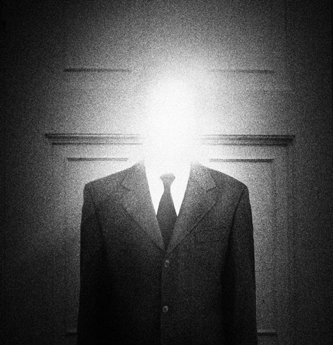


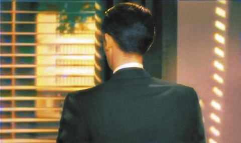
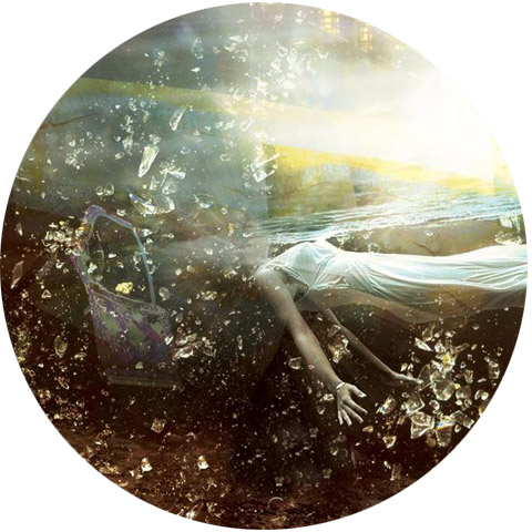
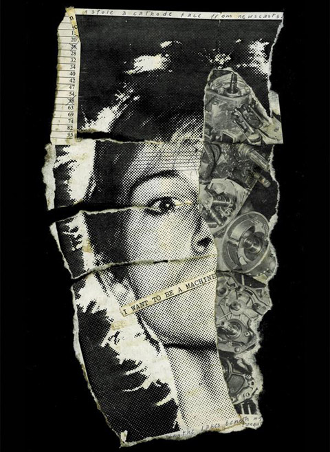
Some photographs and art by John Foxx. Foxx, driven to merge his love of the cracked pop art of Roxy Music with the exhilarating rush and tabloid sensibilities of the Sex Pistols, formed the first, and still astonishing, version of Ultravox! He left to pursue purely electronic music, and under the name Dennis Leigh, established himself as a successful graphic designer and artist, working on book covers for Salman Rushdie and Anthony Burgess, among others.
Critic Robert Christgau offered a typically astringent and succinct summation of Ultravox! – “John Foxx’s detached, creamy baritone works against the instrumentation’s electronic cast for a streamlined rocksy music that suits titles like “Dislocation” and “Someone Else’s Clothes.” But unlike Bryan Ferry Foxx talks as if he’s detached clean through, unlike Brian Eno he’s encumbered by delusions of existential significance, and unlike both he’s never funny”
Dead on, yes, but… Foxx’s detachment and existential musings led him to the two great themes that have animated his work ever since – the idea of the Quiet Man and London Overgrown. From these two themes he has build a rich, self sustaining aesthetic world that comprises music, photography, fashion, and in a modest way, philosophy.
The Quiet Man is, in essence, a new wave take on the man with the grey flannel suit which Foxx inhabits, literally. Dressed in an ordinary grey suit, Foxx embarks on long treks where he explores the full texture of urban anonymity. London Overgrown is a sustained rumination on nature subsuming the modern urban landscape. His musings on both, well worth reading, can be found here, on his comprehensive blog/site.
What is worthwhile here are not the themes themselves – as notions they are familiar to any thoughtful person – but the quality body of work Foxx has wrought from them. The first three Ultravox! records, the pioneering solo work like the minimalist synth of Metamatic, the pastoral electronic pop of the Garden, ambient pieces, and his continued and concurrent exploration of these themes in music, video, photography, and writing, are all worthwhile.
He has a great new single out under the moniker John Foxx and the Maths, aptly described by the UK Arts Desk as ” a very deliberate step back into his own past for a couple of songs that sound as if they were minted in 1980… a of old analogue sounds in collaboration with producer and synthesizer archivist extraordinaire, Benge. Both songs are flecked with requisite android moodiness but stand up in their own right rather than sounding like retro pastiches.” Available on itunes here. More selections below.
Ultravox!: Young Savage (Peel Session):
Ultravox!: Artifical Life:


Random signage moments snagged during a picture perfect morning stroll to work.


Had the good fortune of attending the reception for Edel Rodriguez’s small, dense, eclectic and impressive show at UArts last week. The exhibit, a retrospective of his work from 1990 from the past 20 years, featured an wide selection of drawings, paintings and posters. The work ranged from editorial work from Time, Newsweek, and the New Yorker to Broadway posters to children’s books and a passel of personal work. The common thread – an exuberant line, broad textured use of color, and wonderfully deft technique.
Cool chap as well, enthusiastic and open… we took to talking about a piece I was quite taken with – a mono-print of a fetching museum guard from a series commissioned by German Playboy. To my delight Edel sent me the balance of the prints, a few which I’ve excerpted above. They’re all great, but the museum guard is the cats pajamas… Enjoy, and if you are in Philly, see the show here: UArts Anderson Hall, Von Hess Gallery, 7th Floor, 333 S. Broad St. It’ll be up till May. More on Edel Rodriguez here, and here.
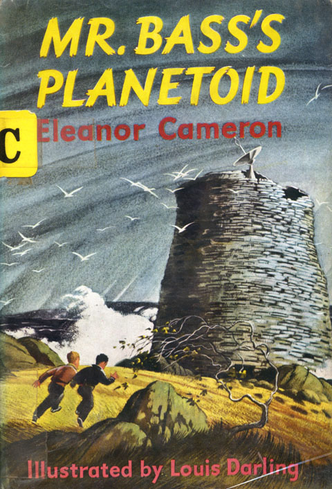
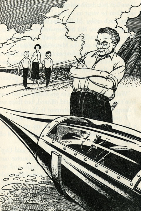


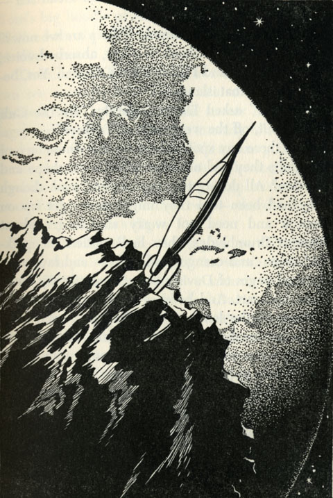
Simply magical illustrations by Louis Darling for Eleanor Cameron’s 1958 young adult lark, Mr. Bass’s Planetoid. The book is the third in the six volume Mushroom Planet series. The books follow the adventures of two young boys, David and Chuck, and their travels to the Mushroom Planet, a small class M moon in an invisible orbit 50,000 miles from Earth covered in various types of mushrooms and populated by little green people.
I love how Darling’s illustrations merge the feel of classic mid-century boys adventure books with the epic, scientifically rigorous space art pioneered by artists like Chesley Bonestell.
The book has some personal significance as well. It’s like this – The whole Mushroom Planet series begins when the two boys, spurred by a mysterious newspaper advert, construct a rocket from everyday materials. Well, when I was a squirt, my cousin can i buy vicodin in cozumel convinced me, beyond a shadow of a doubt, that I could build my own functional rocket. More about that in this post, here, but suffice it to say, I spent the better part of that summer absolutely sure I was space bound.
The vividness of my belief was, to this day, one of the most powerful manifestations of my imagination. So when my cousin brought over Mr. Bass’s Planetoid recently, it was quite something to feel that childhood fantasia reduced to an idea in a book I was holding in my hand 30 years later. Rather than a cold shower of demystification, though, the moment gave a fresh gloss to a tired conceit – the power of the best fiction and art to make imagination tangible.
{RERUN: Originally aired Feb 28, 2009}
Terraform, collage on particle board, 19″x7,” 2009

Still buried deep in the sequin mines. Sigh. As such, it’s re-runs all week, featuring posts from the blog’s struggling first season.

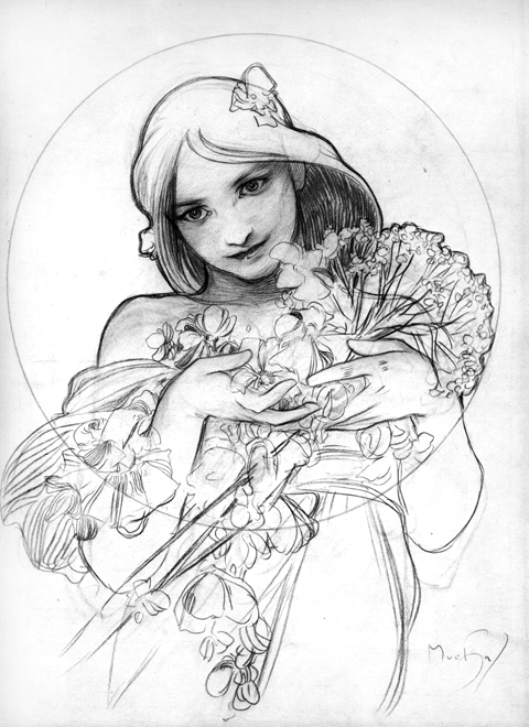
Still buried under a mountain of advertising. Meanwhile, some preparatory drawings by Alphonse Mucha, just cause they’re breathtaking and beautiful and it’s Monday…

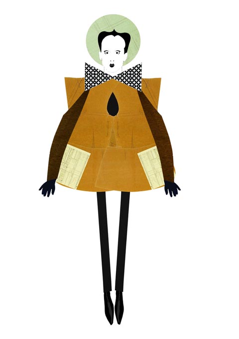

Every Monday could use a little Nomi! (Nomi? huh? click here.) Herewith, please find, for your charmed enjoyment, these rather fab Klaus Nomi collages by Hormazd Narielwalla. His works mixes fashion sketches and photos clippings along with bits of bespoke Saville Row paper patterns – stylish and whimsical. More of his work here. (spotted at Madame Says, a confectionery cavalcade of fashion, art and music. Visit often.)