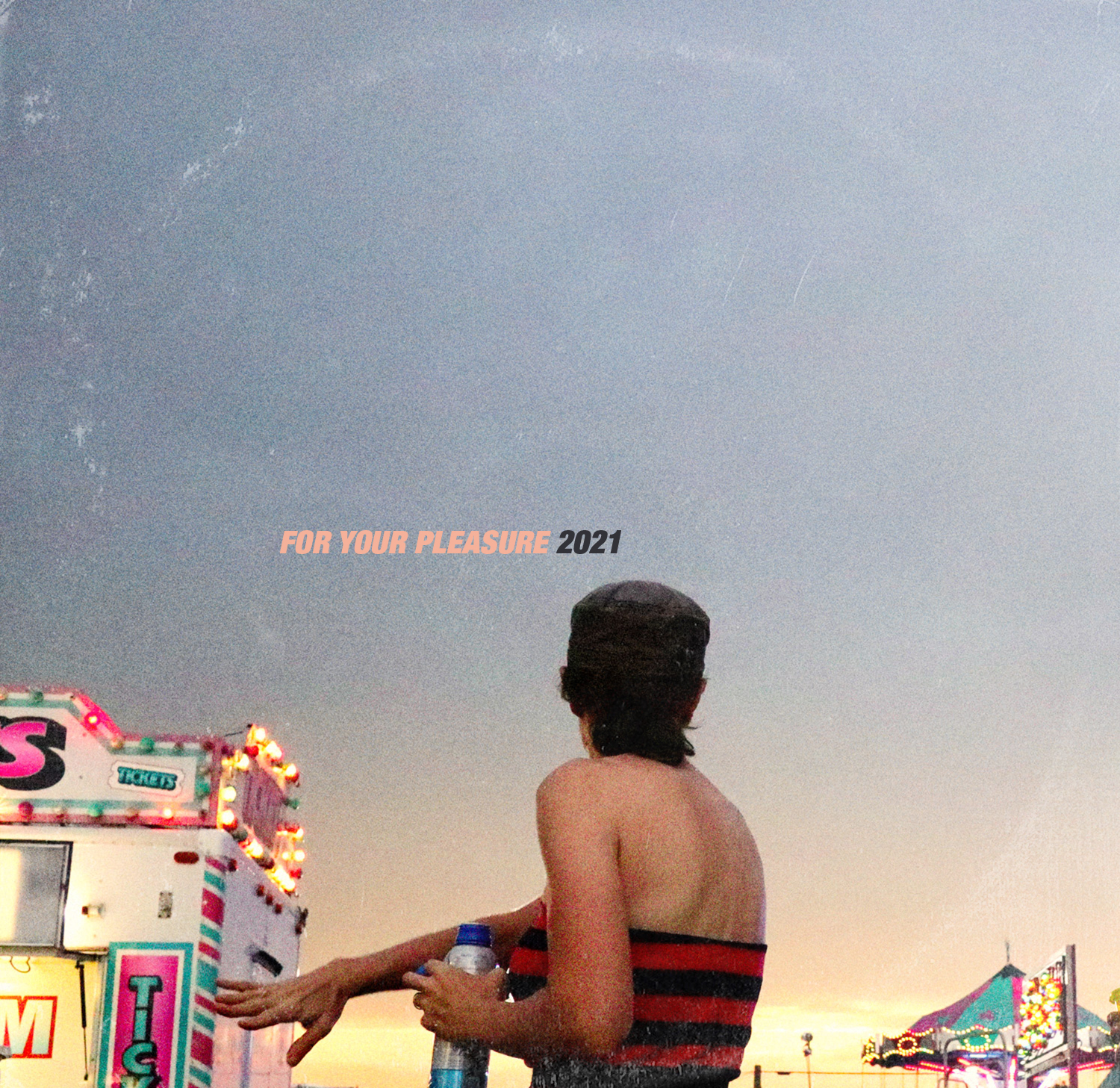
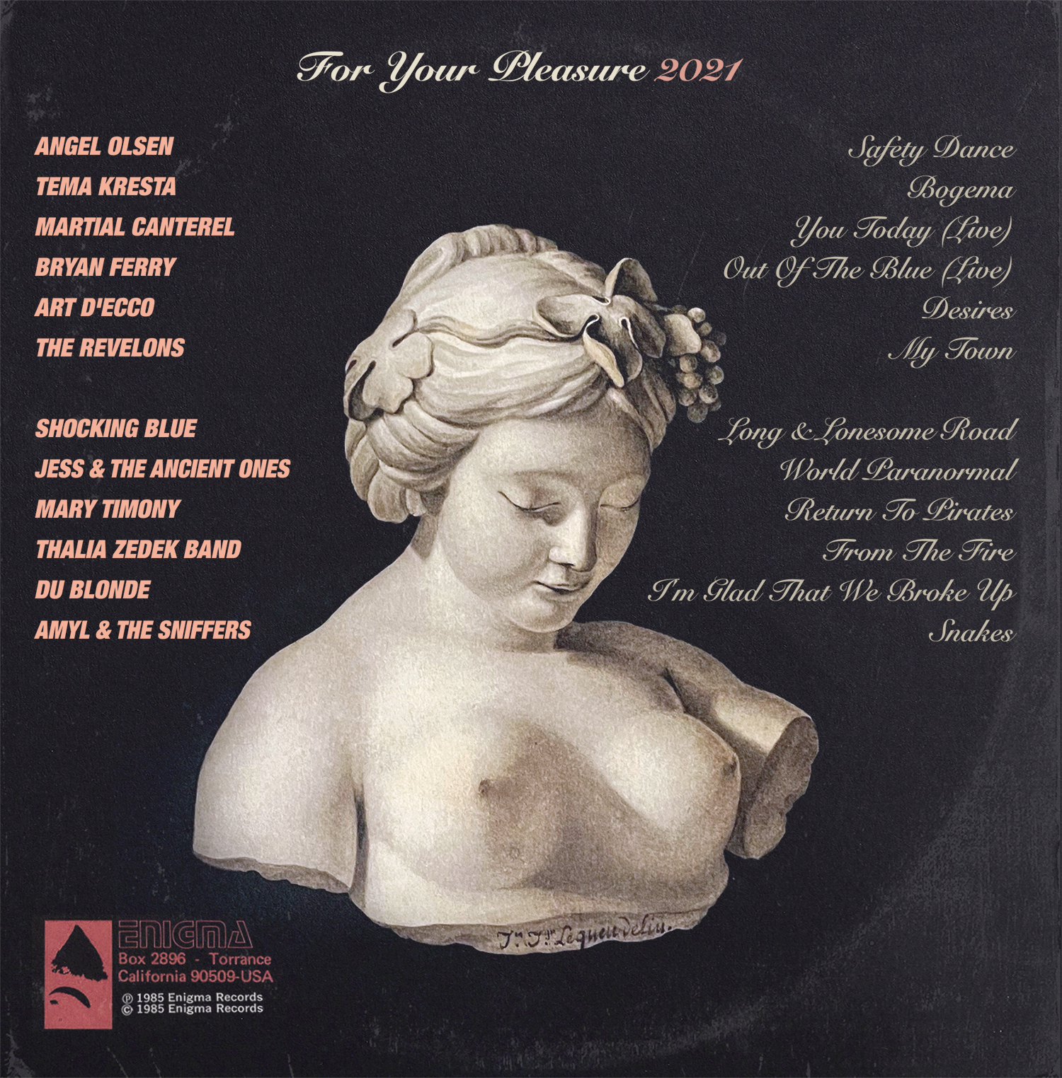
socisoci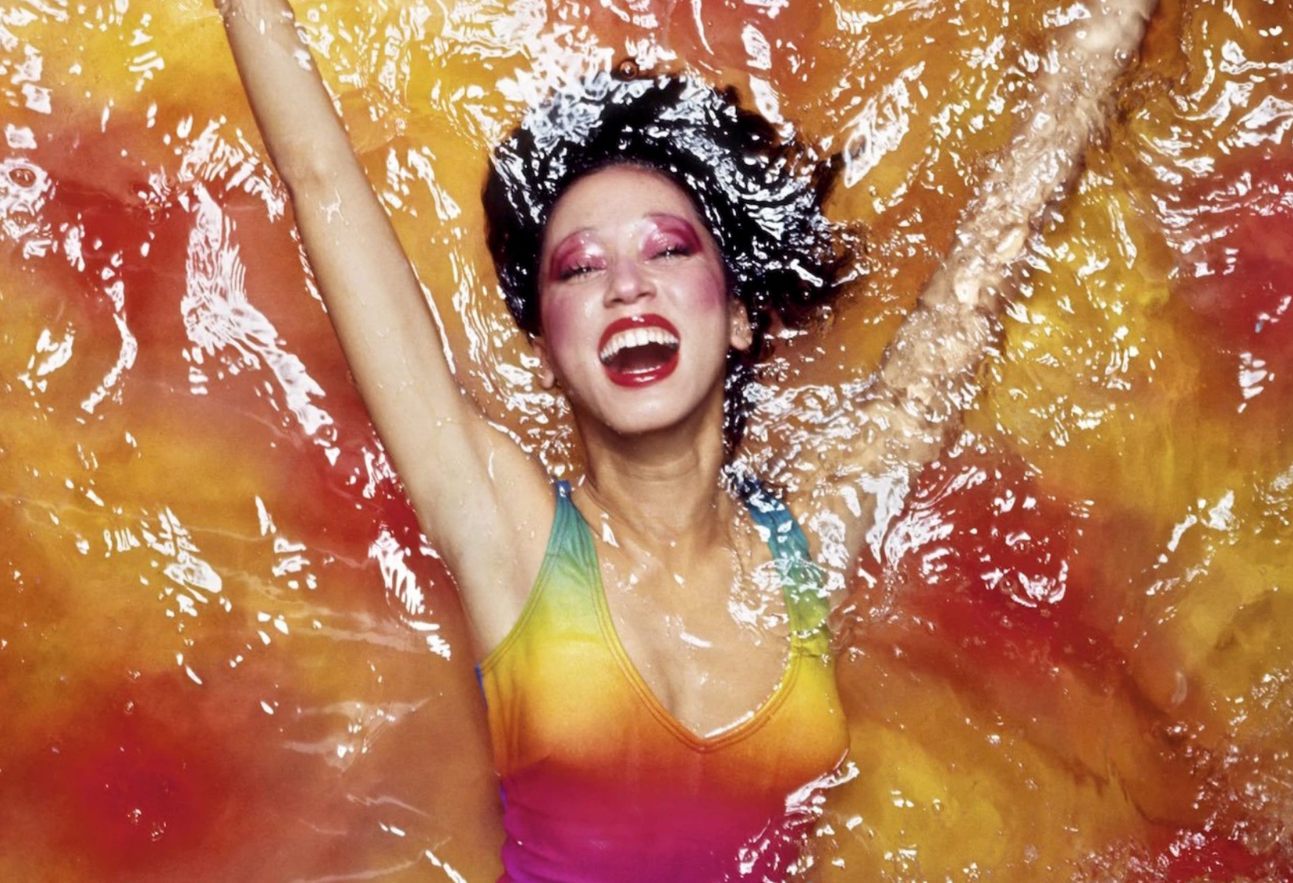


The model and muse Pat Cleveland, challenged to explain why fashion (so frivolous! so repressive!) mattered, answered:
People hang on to fashion as it were the breath of life because it takes you into a world that protects you from the evils of boredom and loneliness and ugliness…. it lets you recognize beauty. And as long as you recognize beauty, you can have it in your life.
The musings of a model… it’s so easy to be cavalier and look past its implications. But a moment’s reflection will remind you that boredom, loneliness, and ugliness stretch eternally from the bedroom of the alienated kid to the killing fields. Thus reminded, you realize what Cleveland is saying is that simply being able to recognize beauty can make and save your life.
Cleveland’s quote is never far from my mind, especially nowadays, and I thought of it instantly when I heard that Dave Hickey – my favorite art & cultural critic – had died.
Because if Hickey showed us anything, across all his work and writing, it was that that art (or really beauty) is as plentiful and free as air. And like air (or really oxygen) it is both a nourishment and a fuel. And what it can fuel, quite literally if we care to tap it, is each and every one of us, alone and together; Hickey believed that art could fuel nothing less than a clean-burning, convivial, sustainable, self-replenishing democracy.
This wasn’t wooly aesthetic utopianism – to Hickey it was plain empirical fact. The boon and bane of being self-aware animals is that our beings require two types of sustenance, one for our bodies, the other for our minds. We live on bread and roses.
However, the quality of nourishment matters enormously – dirty fuel can make us run hot but will inevitably, over time, wear us down and out. The crudest fuels, like their terrestrial counterparts, spring from deep in our animal past – fear, tribal solidarity, worship. But, as we evolve another energy emerges — culture. Culture, as Brian Eno memorably defined it, as everything we do that sheer survival doesn’t require. This was, and remains, the lasting human miracle — our ability to self-generate interlocking, intersecting, interdependent federations of affinity.
It’s why Hickey riffed so much on small scale mercantilism – when he talked about “art” he really meant anything that could be appreciated and exchanged. And when he talked abut “beauty” he meant anything that moved and grooved you; You knew it when you saw it, it stimulated you and it formed a loose, joyous bond — for a moment or a lifetime — between you and any other single human who shared that groove.
Hickey therefore believed our happiest communal configuration was the marketplace, the gallery, the festival, the concert, the suk, or bazaar. In these sites of easy-going exchange and transmission curiosity can encourage among us what obligation or morality might sternly demand. What results is a stable, aerated, sloshy and unruly freedom for and amongst folk – a democracy.
But culture, as a vivifying fuel, is both potent and fragile. And, more crucially and fatefully, it is a direct and lethal threat to all the other modes of human motivation. Because free flowing culture and exchange dissolves and neutralizes our other major propellents: fear, tribal solidarity, worship.
It’s why, from the vantage point of the boot or the lectern, culture must be always be mediated, subjugated, tamed. The academy shrouds it in mystification; revolutionaries harness it to the movement; clerics denounce it as a false idol; reactionaries press it into propaganda… Mediated culture is always either a con or an expression of oppressive power – often both. These enduring, awful energies share a common ethos — to free us from freeing ourselves.
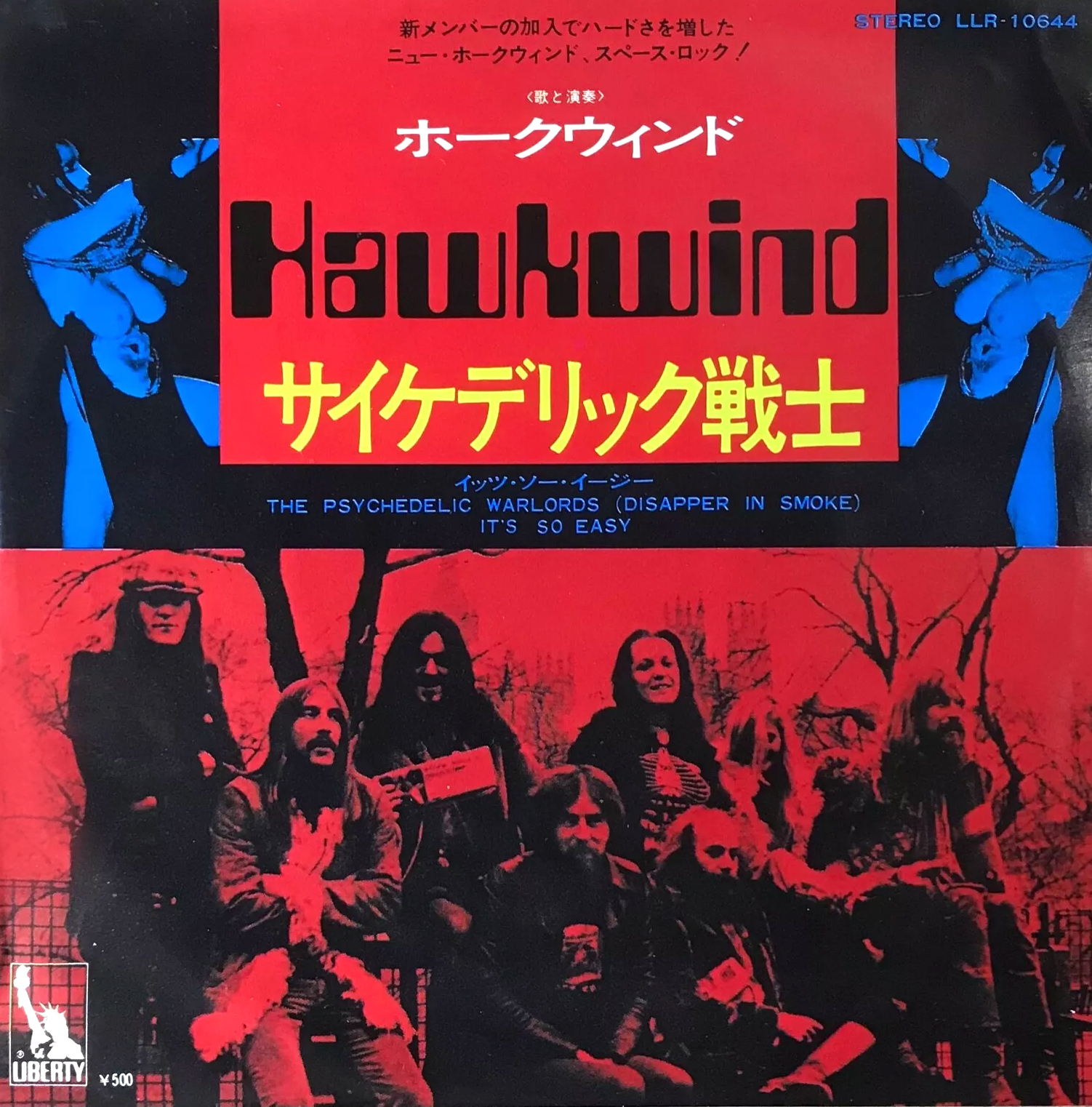
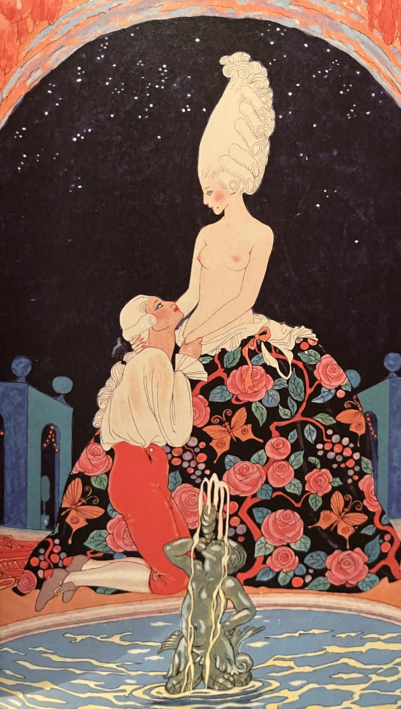
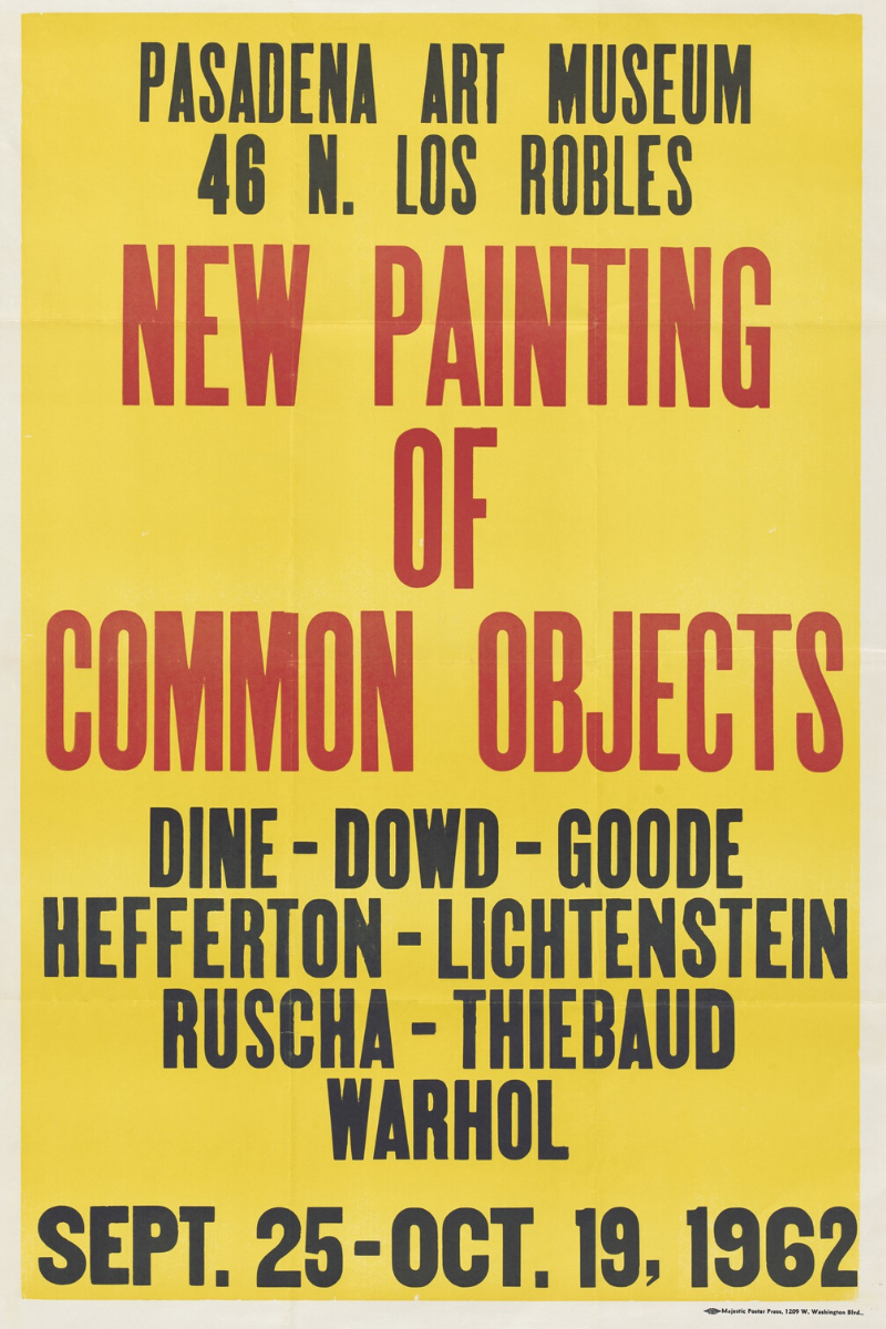
This, then, is where the Las Vegas princelings Siegfried & Roy burst be-sequined into the picture (or Waylon Jennings, or custom car culture, or, or…) and why Dave Hickey insisted they mattered. It shows how much we’ve adopted the framing of mediated culture that in death Hickey has been mostly presented as a caustic intellectual provocateur with some wacky low-brow tastes. Those above the common fray could cluck along knowingly as he shoved these preening Teutonic popinjays and their slinky white tigers back at the obscurantist priesthood of high culture.
Fuck that. Seriously – fuck that. Sigfried & Roy matter because they make certain people as deliriously happy as Jean-Michel Basquiat or Jesus. And celebrating that, depending on your vantage point, is either an existential threat or the saving grace of our species…
Because to admit Siegfried & Roy into the palace of beauty and truth is to admit that grace and happiness are where we find them. That everybody’s got a thing and that is the beginning of our commonalities, not the end. That we will come into our own not by purification but by miscegenation. That we will find our best selves not by sniffing out the slightest bit of heresy but by honoring the merest flicker of common affinity.
Throughout his wild life Hickey undertook this fight with lusty joy and unflagging verve. However, towards the end we know Hickey grew despondent and depressed. The furnace of our current conflicts grows ever hungrier and demands a vast and ongoing subjugation of culture to feed it.1 Conscripted into tribes we recede more and more from direct, unruly contact with one another. Our ability to freely eat, dance, and fuck across our ingrown and proscribed borders becomes harder and harder. As walled gardens, moated citadels, and hermetic bubbles rise, thicken and harden all we hear in our heads is the beating of the drums. It’s all a giant fucking bummer, and Dave Hickey died feeling pretty fucking bummed out.
I sympathize. And it’s hard, really hard, not to buckle, subsumed and surrounded by this wasteful moronic inferno — but I will remain forever hopeful because I once had a vision of another possible future in, of course, Dave Hickey’s beloved city of Las Vegas.
Fremont Street is a covered open air promenade that houses the casinos and parlors of “Old Vegas.” Along its length a constant churning river of people flows in and out, around street performers, vendors, hucksters, entertainers. It is the very living model of a bazaar, of endlessly intertwining desires, appetites, talents & gifts.
I was parked underneath the gyrating caryatids atop the Coyote Ugly bar and began to take in the crowd. Spreading out in every direction was the single most organically diverse crowd I had ever encountered. To attempt a descriptive cataloging would be to instantly diminish the nearly psychedelic impact of human variety on display.
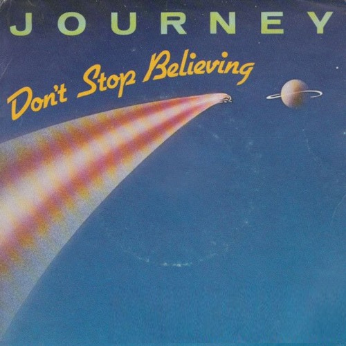
At the very end of the street was a stage on which a band was playing. The band was a Voltron robot of American mass-cult tastes – a hunky cowboy, a sexy belter, a toasting rapper, a goateed hipster, a scraggly hesher, etc… Everyone could sing and everyone could play and as they made their way through America’s pop culture songbook the band would reconfigure accordingly. And as each song cast its particular spell receptive segments of the crowd would begin to woop and shimmy while the rest amiably continued their rambles and their revelry… the vibe as groovy and genial as you could ever hope for.
Then, the sexy belter announced that they had one more song left – a really special song. “Do you like Journey?” she belted. The crowd returned a rolling roar of affirmation, enthusiastic but hardly electric. Sensing the need to take it all up a few notches she belted again — “Do you guys believe? Do you? Do you? Don’t! Don’t stop! Don’t. Stop. Belivin!!!”
And on cue the grand opening bars of the song unfurled, the band swung into it, and the whole crowd, seemingly each and every soul, together, boarded the the midnight train, together, going it didn’t matter to where, goin’ anywhere. And this mass, this disparate mass bloomed into a common moment, singing, dancing, bellowing in unison – strangers all, up and down the boulevard, among the streetlights, people, living… just to find emotion, somewhere… somewhere in the night…
I wept then, and I’m on the verge of weeping again just recalling this moment of pure total human communion. Because left to our selves we can be magic, just for a moment, just for 4 minutes or so. Which is just enough to save us. We could agree on one big, essential yet insignificant thing and feel rapture on earth, born aloft on nothing more than the fusion of loose human affinity. When the song passed so did the moment and people sifted back into their swirling groups with a glow verging on the post-coital.
Look — there will always be shit to do. There will be death and want, and riding along gleefully, there will be assholes trying to feed us their dirty fuel. But fortified by good cheer and good company mountains will move. It’s a beautiful feeling, happiness. Don’t stop believing.
Goodbye and thank you Dave Hickey.
1 This is why it’s so important to totally refuse conscription in the culture wars. To say, like Hickey, NO – Not even a little. Nope. Because it’s more than a bad strategy – it’s the anti-life equation itself.
It’s naive to ignore that in traditional war & conflict, once enjoined, culture plays a central role. It’s drafted, along with every other available resource, into the cause. What’s ultimately catastrophic is purposefully transforming violent conflict into cultural conflict. We toyed dangerously with this during the Cold War and are now fully sinking into it domestically and across the globe – the “weaponization” of culture itself as a direct proxy for combat and jockeying for power.
Because again, culture withers under conscription and captivity. In traditional wars this was collateral damage. When culture war is the war the psychic damage is primary… we’re literally driving ourselves mad.
This doesn’t mean the abandonment of politics and engagement. In fact, being able to draw on the genuine sustenance of culture and beauty can fortify us for the necessary fights for a just world. But if we burn up culture to fuel our politics, what exactly are we fighting for? What will be left? We need bread AND roses to flourish (This question is explored stirringly in Rebecca Solnit’s brilliant and necessary new book Orwell’s Roses.)
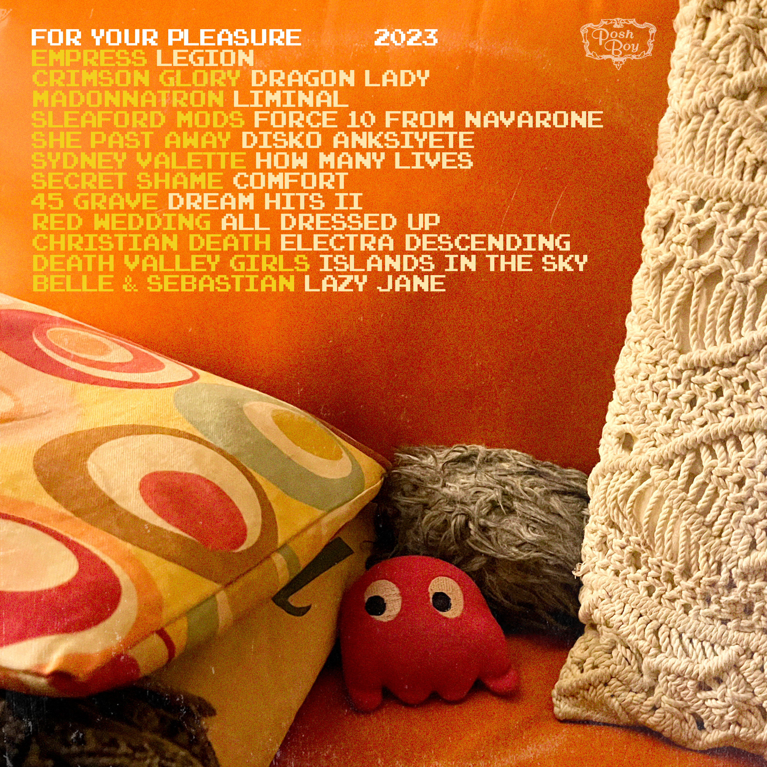
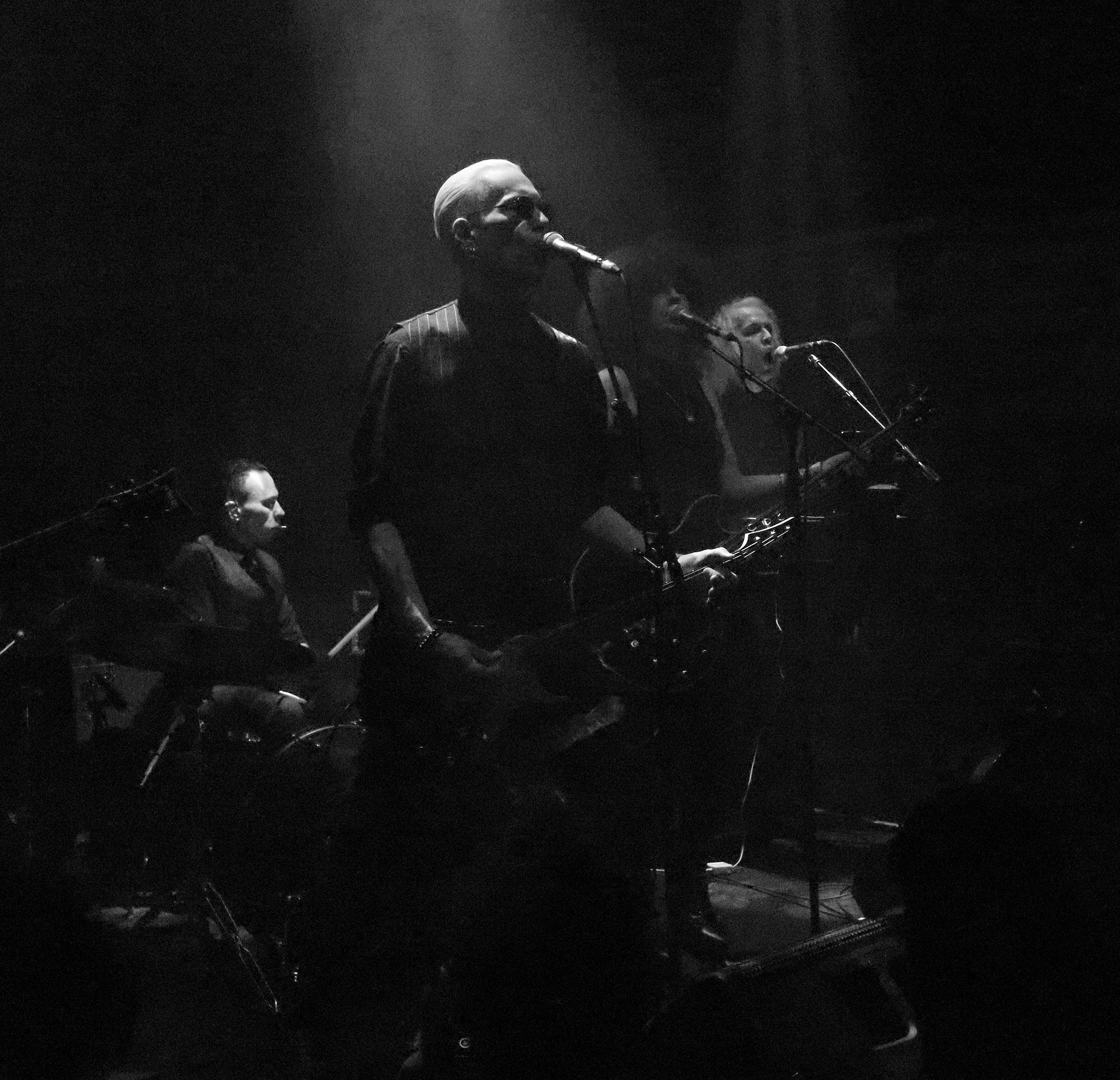
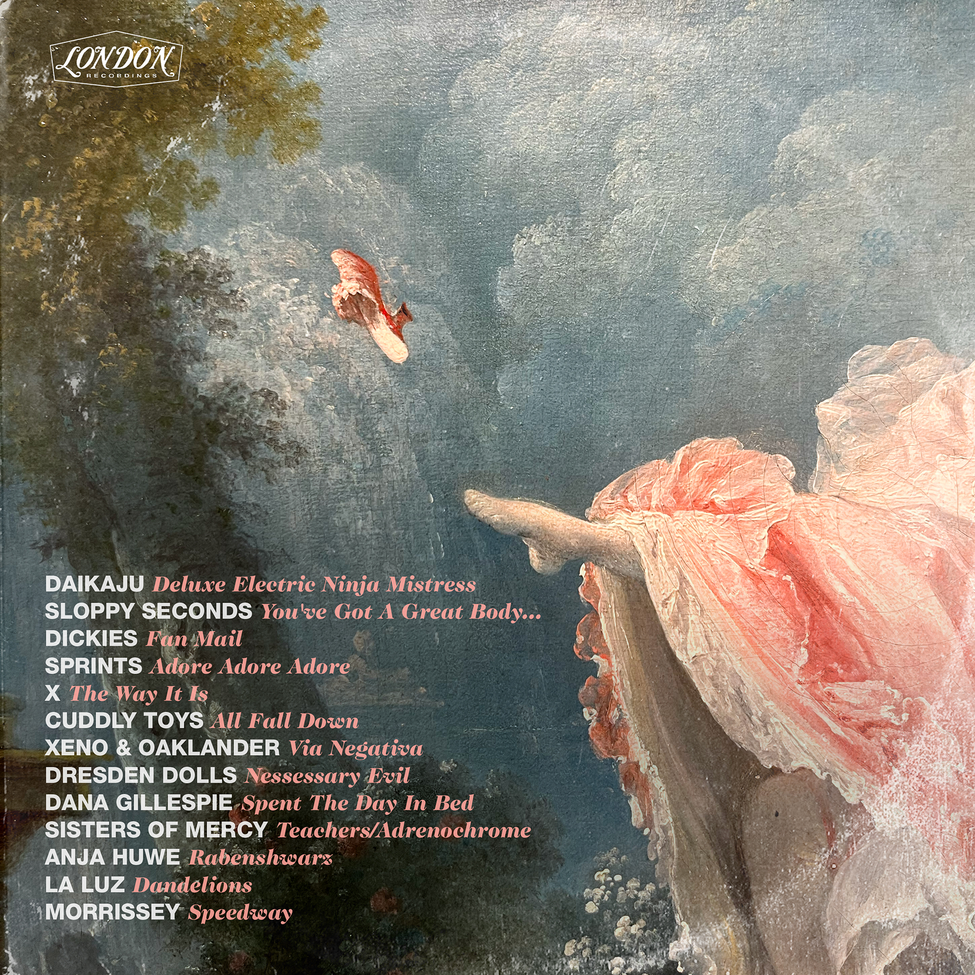 Adore. Adore. Adore — Sprints set the year ablaze last January with their blistering, barnstorming & breathless debut Letter To Self. A record, like the cover art, full of red swirling fire — young & hungry, they know… Like I knew, when I heard the Dickies for the first time as a teenager — that if the Ramones pointed to NY & the Dickies to Los Angeles then my heart belonged out west; when they brought their pop-junk ramalama to Allentown this year they didn’t seem to quite know where they were – for me it was Homecoming. Which I guess makes the Sloppy Seconds show Prom Night – my wife & I have been ardent fans of these heartfelt vulgarians for three decades, ever since I pulled a promo CD of theirs out from an ignominious pile at the college paper we both worked at; The flames cooled around X a long time ago – black as an ember, they take their leave, but not before one last smoky bonfire.


